What you need to know
- The Material 3 Expressive redesign has landed on Chrome for Android, bringing it in line with Google’s newer app visuals.
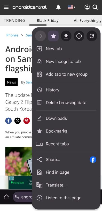
- The three-dot menu now highlights key actions like bookmark and refresh inside neat circular icons.
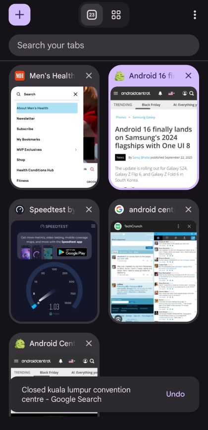
- Chrome's Tab Grid now features rounded elements, clearer tab groups, and a dynamic color theme that matches your wallpaper.
Enjoy our content? Make sure to set Android Central as a preferred source in Google Search, and find out why you should so that you can stay up-to-date on the latest news, reviews, features, and more.
Google has officially finished its visual overhaul of Chrome, with the browser's Android app finally receiving the Material 3 Expressive redesign, a look that other Google apps like Messages and Contacts have been sporting for a while.
Starting with version 141, Chrome on Android has begun rolling out a visual refresh that wraps the familiar browser in a slightly bolder, cleaner coat. As reported by 9to5Google, the rollout has been completed for most users, marking the end of the gradual deployment that began in late August.
Now, tapping the three-dot menu brings forward key actions (forward, bookmark, download, site info, refresh) inside circular icons.
In the Tab Grid view, the “+” for opening a new tab now lives inside a rounded square, and tabs, Incognito, and Groups all have clearer containers. Dynamic Color theming is applied (so it adapts to your wallpaper or chosen palette).
No functional shake-up
Despite the splashier look, Chrome didn’t adjust button sizes or radically alter list-views or settings pages. It’s more a cosmetic refresh than a full redesign. The browser’s interface remains familiar enough that you won’t feel lost.
That means if you’re used to how Chrome worked before, you’ll still feel right at home. The update is more about aligning with Google’s broader design language across apps than reinventing everything.
There are smaller details, too. Watch as a page loads, and you'll notice a segmented progress indicator with rounded corners. Similarly, when you visit a website you've already bookmarked, the star icon in the menu will now have a rounded square background.
If you haven’t seen the new look yet, there’s a reason: the rollout is server-side. That means even if your Chrome version says 141 or higher, you may still be waiting for the visual switch to hit your device. Quick tip: force-stop the app (via Android Settings → Apps → Chrome → Force Stop) and then reopen it. That sometimes triggers the update faster.