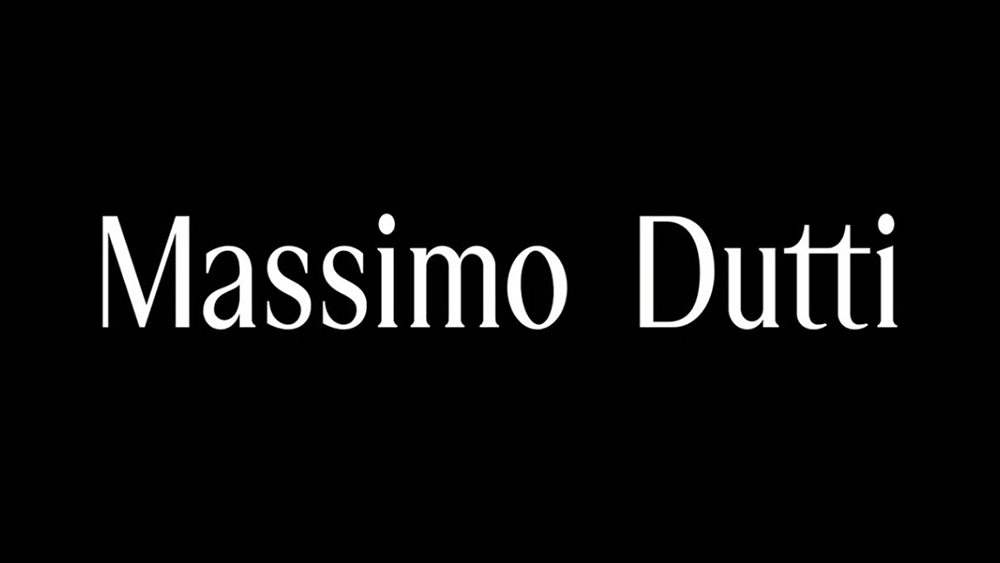
Another fashion logo has succumb to the trend. Massimo Dutti, a Spanish high-street brand from the same stable as Zara, has ditched its quirky cursive logo for a cleaner, more subtle look. In doing so, it follows a long line of fashion brands that have simplified and flattened their logos in recent years.
Cursive logos in particular are increasingly being consigned to the past. Even the Johnson & Johnson logo, one of the oldest logos that was still in use, ditched the script recently. Those bemoaning the explosion of super-minimalist sans serif logotypes can at least be take solace in the fact that Massimo Dutti has gone for a serif typeface. But there's a little detail that's irritating people... Is that a double space between Massimo and Dutti?
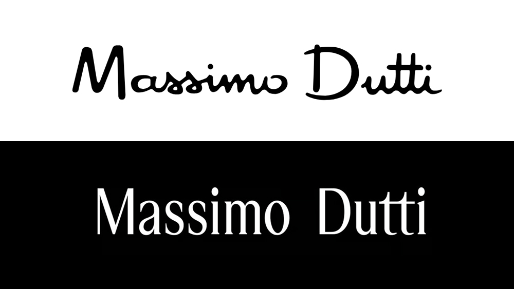
Those who argue that contemporary logos all look the same are probably not going to think highly of the Massimo Dutti rebranding. The previous Massimo Dutti logo was certainly unique, a little quirky in the form of the letters. Now the brand's gone for a clean, tall serif typeface as part of a broader rebranding.
According to the Inditex-owned brand, the value of the new logo “lies in how a series of apparently subtle elements are decisive when it comes to reflecting the personality of the firm and an aesthetic rooted "in the here and now.”
Over on social media, people hate it, naturally. 'Cheap', 'nasty' and 'inelegant' are some of the most frequent epithets on Instagram, and some are even vowing never to buy the brand's clothes again as a result.
Some people were even personally moved by the design change. "My heart's actually a little broken, mourning the loss of something so classic, elegant and original about the previous logo that brought a luxury sentiment to the clothes I bought even as a fast fashion brand," one person wrote. "I look at this and I see cheap. I see cheap = I feel the clothes are cheap." "It looks like they failed at their dutti," someone else quipped.
Others just can't oversee the double spacing between the two words in the brand name, or the illusion of an extra space. Some say it gives the impression of a mistake, but we assume it was entirely intentional. "You could drive a truck between the 'O' and 'D'," one of our readers wrote on Facebook. "It looks like it was made by an intern using Canva," someone else alleged. Ouch.
Are people getting a bit carried away? The logo does look a bit like what might come as the default font in a website template aimed at a fashion brand. But part of the reason it looks wrong may be because we're not used to it, while we were used to the previous design.
Some have defended the new identity. "Realistically, a fashion brand often does not have to have a bombastic logo, especially if it was created after WW2. The only exception that confirms the rule is Versace, because it is an extremely story-telling brand," one person wrote, calling for calm. However, the strength of the reaction show just how much customers connect to a brand identity, and what's at stake with a radical rebranding.
We thought we had seen signs the trend towards simpler logos might be reversing. The new Burberry logo took things in the other direction. We can at least be happy that Coca-Cola is not only keeping its cursive logo but now embracing the many hand-drawn Coca-Cola logo variations around the world.