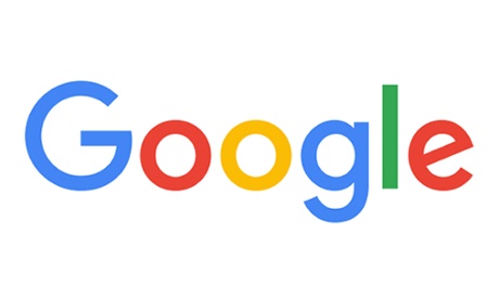
If you thought your eyes were playing up when you looked at Google’s homepage today, fret not. They’ve just changed their logo.
The new sans-serif design is the biggest revamp since 1999 and is a bid to reflect the development of the company. As mentioned in a blogpost, “Google has changed a lot over the past 17 years – from the range of our products to the evolution of their look and feel.
“Meanwhile, we’re bidding adieu to the little blue ‘g’ icon and replacing it with a four-color ‘G’ that matches the logo.”
But we liked the little ‘g’! Can you do any better? Share your new logo designs with us and we’ll publish the best ones in a gallery on the site.
- GuardianWitness is the home of readers’ content on the Guardian. Contribute your video, pictures and stories, and browse news, reviews and creations submitted by others. Posts will be reviewed prior to publication on GuardianWitness, and the best pieces will feature on the Guardian site.