BrewDog's finding its personality again. The Scottish brewer burst onto the UK craft beer scene back in 2007 with its edgy branding and promptly gobbled up a hefty market share. Then it suddenly came of age with a surprisingly sensible rebrand in 2020 ("neutered", we called it at the time).
Five years later, it's rediscovering its rebellious spirit with new packaging designs that seem almost a rejection of that last refresh. A midlife crisis, or has BrewDog finally found its way?
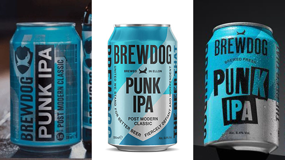
Branding experts will often tell you that consistency is everything. That's why you need a brand manual with a limit of three typefaces that must each be used in specific situations. That can be totally valid. But consistency in brand typography can be overrated when you're an anarchic craft brewer that takes on sexism in the strangest way and calls out the prime minister with a 'Lie-PA'.
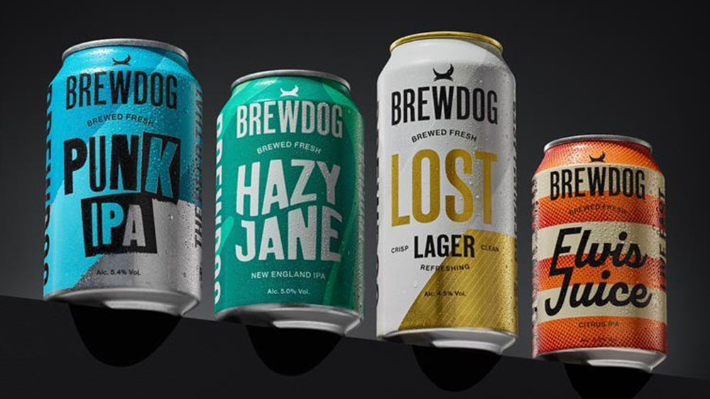
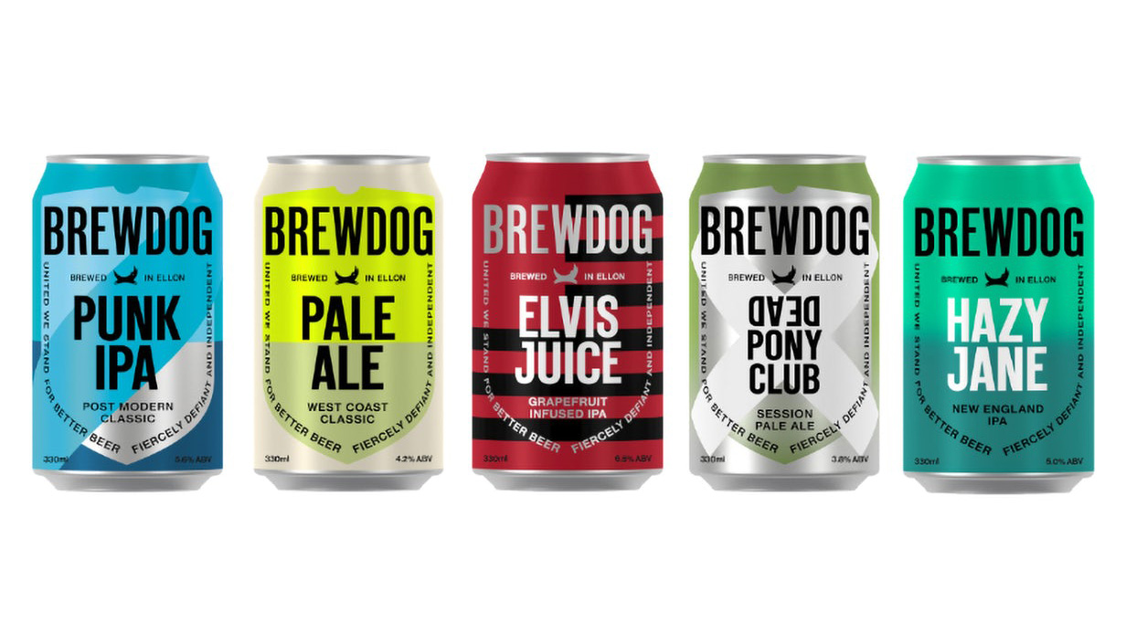
It seems BrewDog has now realised that a standardised all-caps sans is more 'corporate larger' than freshly brewed real ale. It's planning to gradually roll out new packaging designs and typography for its core range of beers, including Punk IPA, Hazy Jane, Lost Lager and Elvis Juice.
The aim is to give each beer a clearer individual identity while keeping the previous colour palette. The BrewDog logo remains the same, but each product name has its own font design and graphic elements. And Punk IPA actually looks punk... or at least like it once saw a Sex Pistols album cover in a record shop.
“This is the start of a new era for BrewDog. The new packaging will do something we have always sought to do right from the start – disrupt the category,” Lauren Carrol, the company’s chief operating officer says.
There's a new tagline too: 'Brewed fresh', which the brand says it will wear as a badge of honour.
For more of the week's news branding news, check out the clever new Vitaminwater logo and the demise of McDonald's CosMc's.