The word ‘olive’ may be more generally associated with the finishing flourish to a martini, but in the interiors world, it’s even more appetizing. Sitting on the edgier end of the green spectrum, the color speaks of understated sophistication, and decorating with olive green channels the soothing beauty of nature with a moody, organic depth.
Understated yet profoundly grounding, olive is green at its most grown-up. Tiptoeing the line between color and neutrality, it’s at once pigmented yet feels innately muted, like something dug from the soil rather than designed or decided.
Olive green paint is earthy, but not quite muddy — a quietly luxurious hue with a subtle, subdued richness that doesn’t fade into the background but doesn’t clamor for attention either.
This shade is the true definition of ‘timeless’. In the home, decorating with green in a beautiful olive hue somehow seems ancient, yet familiar and fresh; like it’s always been there and can endure any passing trend with dignity, while never falling out of the loop. Merging the tonal palette of beiges, browns, and grays with the vitality of green, it anchors spaces with ease and quiet character, creating depth without drama, and color without confusion.
Softly spoken but undeniably elegant, olive green is stepping forward as the modern neutral. Here’s how (and why) to decorate with olive green in your interiors.
1. Understand the Quiet Power of Olive Green
Olive is a color that resists easy categorization. Poised somewhere between avocado, moss, army green, and sage, olive also nudges into brown and gray-yellow territory, giving it its trademark weathered, almost desaturated cast. It also veers a little into yellow to take on warmth, so it can also appear unexpectedly golden.
Where emeralds dazzle, pea brightens, celadon cools, jade calms, lime zings, and mint refreshes, olive leans back, serene and self-assured, summoning images of rustic landscapes, lichen-covered stone, sun-dappled leaves, and ancient groves.
As well as the natural, it can also be a vintage-inspired color, carrying echoes of the past — of sun-washed canvas, weathered ceramics, and dusty book covers — giving it the essence of being long-lived, or like a memory in color form.
“Olive green is a hugely versatile color which brings depth, warmth, and natural balance to a room. It can feel earthy and calming, making it inherently grounding,” says Ali Johnson, joint director of Otta Design. “It behaves almost like a neutral, subtle enough, but adding more interest than gray or beige.”
There’s an enduring element to decorating with olive green that makes it somehow work across styles, settings, and attitudes alike. “Olive green is always a good choice,” enthuses Louise Copeland, principal designer at L.B. Copeland Interior Design. “It’s so versatile; I consider it a classic neutral. It can be a warm, inviting base for an entire room, or serve as the perfect accent in both calm palettes and more vibrant, colorful spaces.”
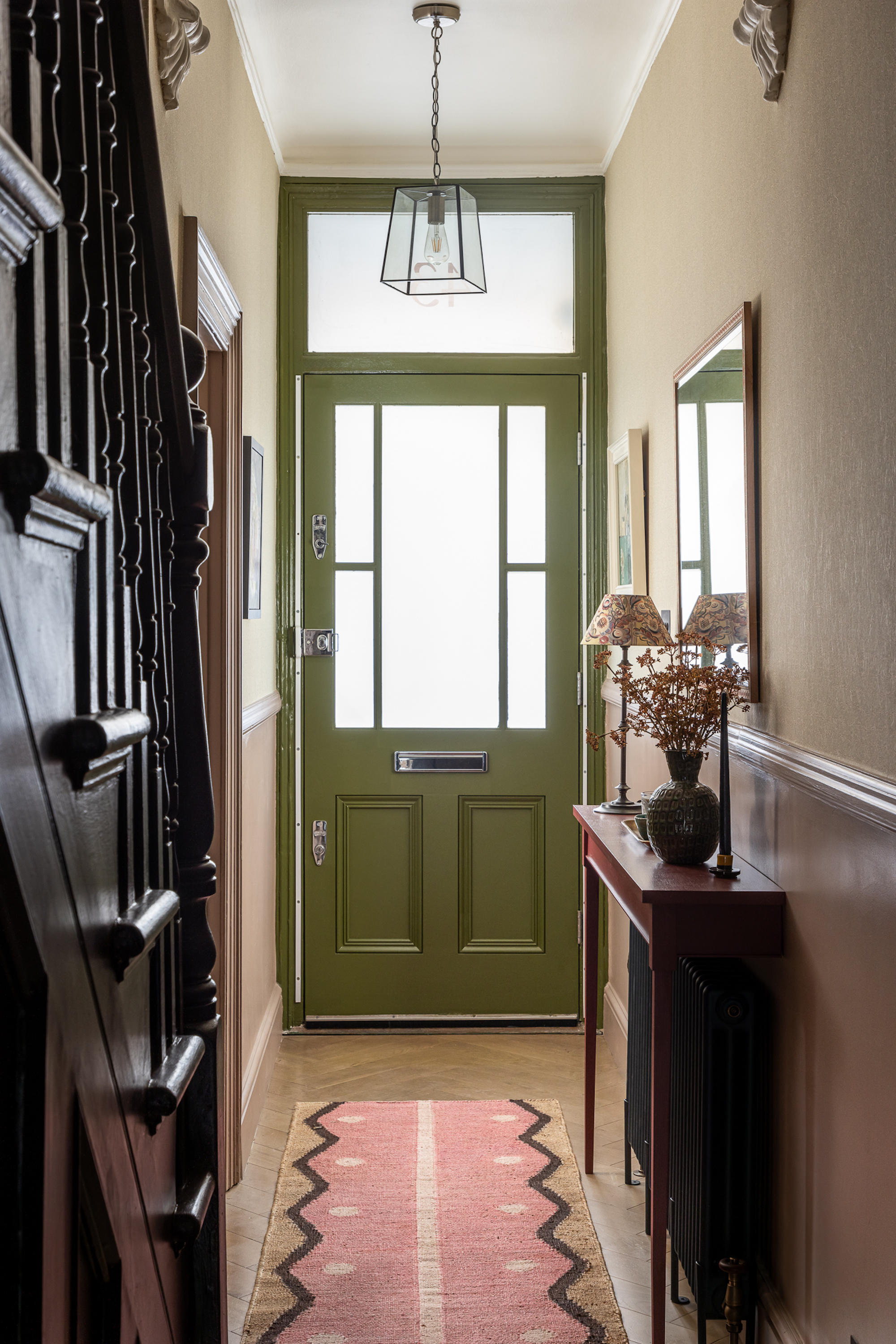
This stunning Olive Green color works perfectly for the front door in this hallway and is well complemented by the plum color used on the staircase.
Preference Red is a rich, deep red that gives a luxurious warmth to this hallway, whilst complementing olive green perfectly.
This earthy shade, is the ideal warm neutral that seamlessly blends with both colors in this hallway and naturally complements olive green.
2. Capture the Olive Aura
You won't necessarily notice olive green immediately, but it will make you feel centered and content regardless. Decorating with olive green has a way of creating stillness and intuitive ease, like the trace of perfume or a flicker of memory, wrapping you in its layer of comfort and belonging while not even needing you to notice it.
Despite being a rather specific name, olive green is gloriously multifaceted. Do you mean a dusty, almost-gray green? A deep and rich, almost khaki green? A pale, subdued yellow-green? A rugged and practical military-esque green? A fresh, herby, sage-y green? Or the classic shaken-not-stirred brownish yellowish green? It typically splits into two halves — the gentle and the not-so gentle, something more akin to a pastel and something darker, that seems like it slowly grew in the shadows of the forest floor.
“Nature-inspired olive green can create a feeling of calm, and lighter olive tones can feel uplifting and fresh, perfect for smaller or sunny rooms,” says Ali Johnson. “Combined with classic soft neutrals and warm wood tones, it feels grounded and balanced.”
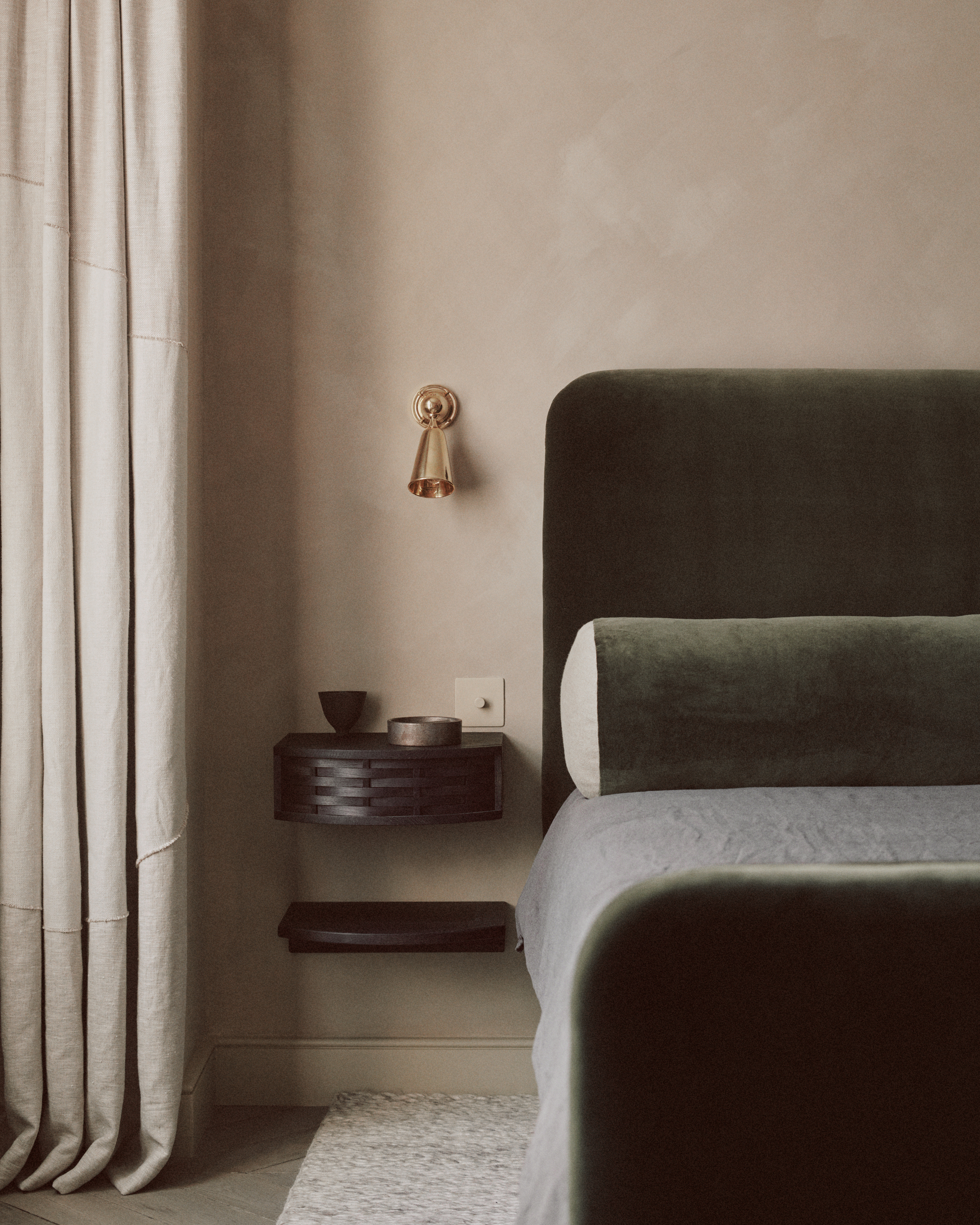
Then there’s its other side. The bolder, sultrier side. The more encompassing side. “Deeper tones are ideal for creating a cozy, enveloping feeling in a darker room, which might be used for snug or library,” Ali says.
It has a tactile, slightly velvety presence — deep enough to center a space, but not so dense that it overwhelms. “Olive green can be relatively moody,” says interior designer Louise Copeland. “If olive is the dominant color in a space, its depth of color creates a rich, cozy environment. That said, one great thing about olive is that it isn't so dark that it completely darkens the space, so the room can still feel nice and bright.”
And despite its cool complexion, when used to color drench, the hue becomes intense, potent, and authoritative. “It’s a color that can cocoon you with calm and warmth,” agrees Sophie Chapman, interior designer at The Vawdrey House.
For a space like your bedroom where you want to channel comfort, opt for a dark, moody olive in a velvet, like this cushion cover.
3. THE TWO SIDES OF OLIVE
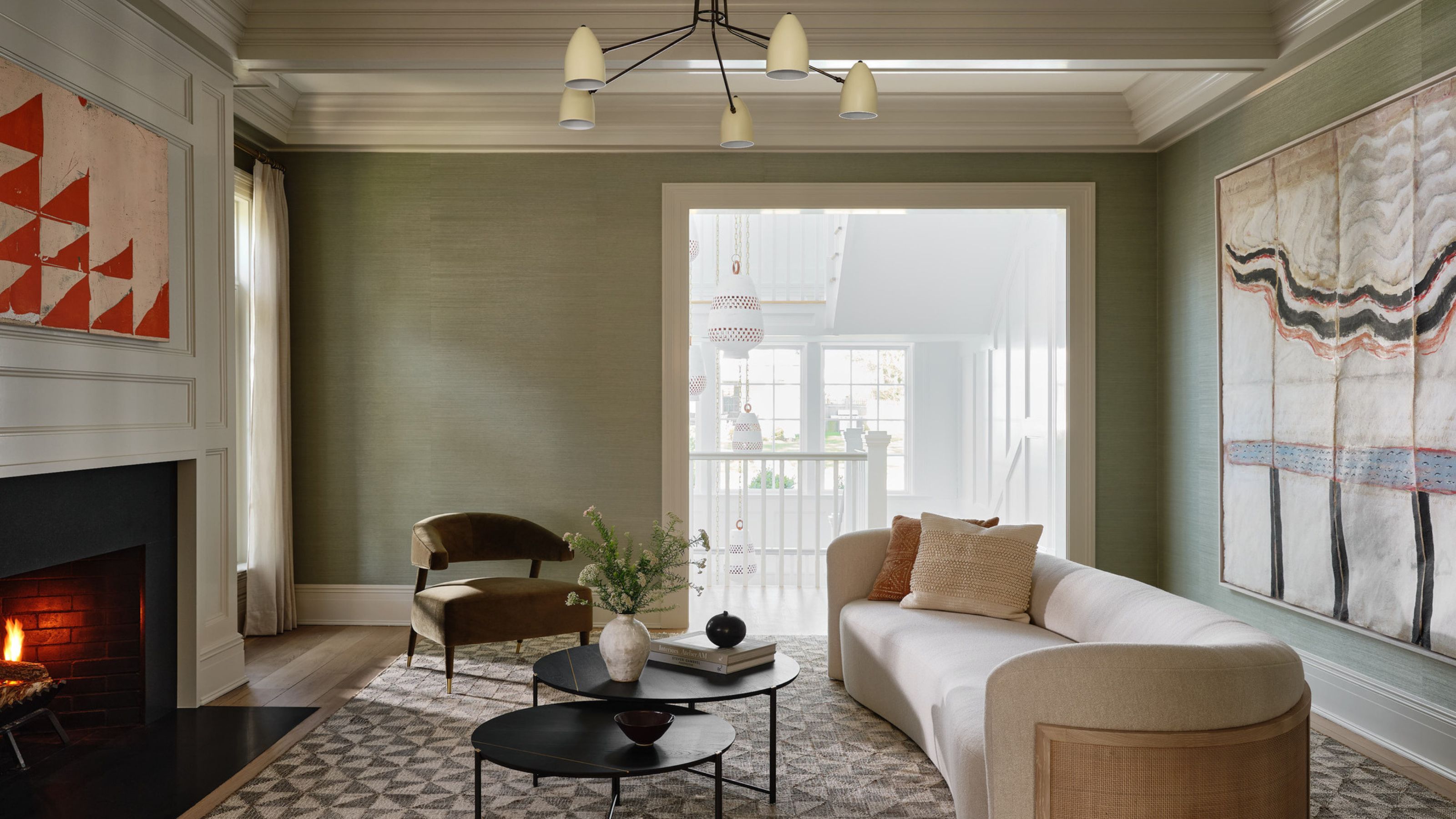
For a quick start to decorating with olive green, decide if you want a paler, more airy olive or a more intense, richer shade. The understated softness of lighter tones allows them to act almost like a neutral, with just enough green mixed in for them to feel fresh and organic without taking over a space.
Light olives sit quietly in the background, allowing architectural details or furniture to (initially) draw the eye while still visually adding weight to the space. Try pairing olive green with washed-out woods for a botanical hit, combined with a contemporary, clean yet comforting feel, and to bring a touch of the outdoors in without being one of the more expected greens.
Light olives are a smart choice for spaces such as living rooms, kitchens, or bedrooms to create a soothing vibe that still has a little kick, or in in-between areas such as hallways or landings, where they can mute the shift between rooms while still feeling wonderfully intentional.
Darker olive shades bring depth and a hushed air of drama. Their brown undertone makes them friendly, warm, and easy to live with, while the sharper green/yellow element creates a distinctive finish that sets olive apart from the likes of navy, charcoal, or cocoa.
Working most impactfully as wrap-around color on all four walls (and perhaps the ceiling), this is a hue suited to rooms designed for retreat and relaxation. Try it in a snug, dining room or study, where its immersive quality can enhance intimacy and focus, or in small, overlooked spaces like downstairs bathrooms, where it can add unexpected personality and a sense of polish.
What gives olive its charm is in its contradiction as part neutral, part statement. “The key with olive is understanding its versatility — it has a beautiful softness that feels grounded and calm, yet it can also be rich and moody depending on how you use it. Treat it like a colored neutral,” says Louise Copeland. “It pairs effortlessly with natural textures — rattan, linen, aged wood — and sits beautifully in both traditional and contemporary spaces. It’s one of those shades that instantly adds warmth, depth, and quiet character.”
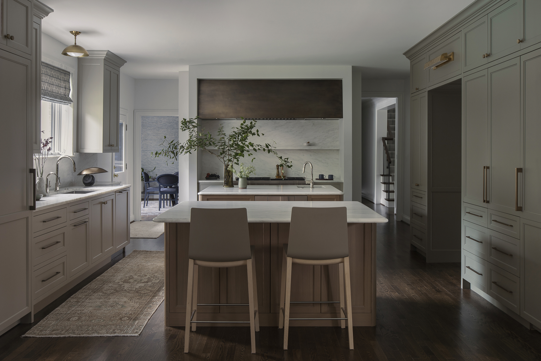
Whether you’re after delicacy or impact, there’s an olive for it. “In bedrooms opt for mild, muted olives which are calm and tranquil while in snugs, studies or libraries lean in darker shades, which feel comforting and cocooning,” suggests Ali Johnson. “We tend to use lighter sage green kitchens to bring warmth, especially when paired with antique brass and wood. For larger rooms, we use olive as an accent, and in smaller rooms, just go for it and color drench the space.”
4. Shades That Complement

Straddling both the verdant world and the land of the neutrals, decorating with olive green has the color superpower of teaming beautifully with a huge list of other hues. Such chameleon-like quality makes it a dream to add into palettes, and used cleverly, it can temper overly sweet shades or lift the more serious ones. With colors that go with olive green, it holds its own while bringing out the best of others.
Olive is a team player. Prettiness? Polish? Power? Poise? Pep? Decorating with olive green can make just about anything happen. “My favorite colors to pair it with are an aubergine or any variety of pink," says Louise Copeland. "Pairing olive with lighter whites, creams, and beiges gives you a more preppy look, while pairing it with richer neutrals like chocolate or cinnamon or with highly saturated colors gives it a bit more edge.”
Because it sits so comfortably between hot and cold, decorating with olive green opens the door to unexpected but harmonious combinations. “Olive’s earthy undertones blend seamlessly with lots of colors, making it feel like a rich neutral,” says Ali Johnson. “It can feel fresh and tailored with white, and earthy and harmonious with brown and cream. We love to use it with autumnal tones like mustard and burnt orange to create schemes which feel balanced with just enough energy, and possibly our favorite combo is olive with blush pink, which softens and stabilizes its moody depth by adding some femininity."
To build on olive’s earthiness, layer in ochre yellow or rusty red, to add life, add apple green or lemon, extend the brooding atmosphere with navy or stormy blue, or go luxe with teal or oxblood.
Olive also shines in schemes that favour texture, contrast, and a more tactile approach. “Olive and black pair well for a smart, urban, industrial feel — try it with aged metal for an edgy kitchen,” says Sophie Chapman. “Olive and cream are natural and textural like a collage of trees, grasses, and reeds with limestone, or combine olive and pink terracotta for a warm, enveloping feel. If you want to dive into the depth of the color, pair it with coral pink and gold, moody lighting, and glazed terracotta tiles in a powder room — it will be quite the destination!”
Decorating with olive green is the perfect choice for someone who is finding themselves bored of neutrals, but not quite brave enough to start dabbling with brighter, bolder colors in the home.
For some specific inspiration, we've found the best olive green living room ideas to show you have you can start to integrate this shade into your scheme.