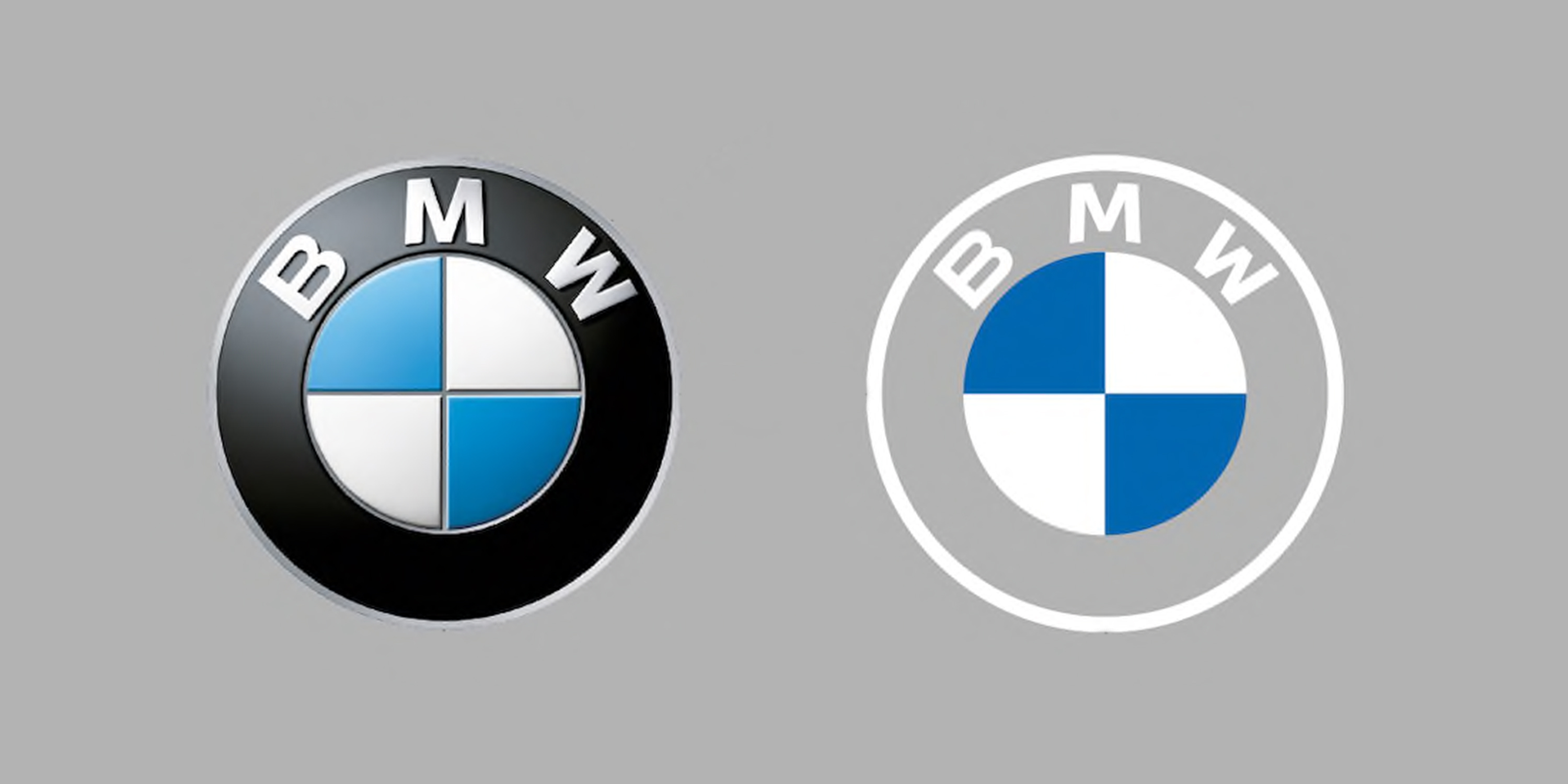
Over the last few years it seems like every car brand under the sun has revealed a new logo. And they've mostly followed the same formula – flattening the existing design into a more digital friendly format whilst preserving the heritage of the original. Back in 2020, the trend was arguably kicked off by BMW, whose simplified redesign we called one of the best of the 2020s.
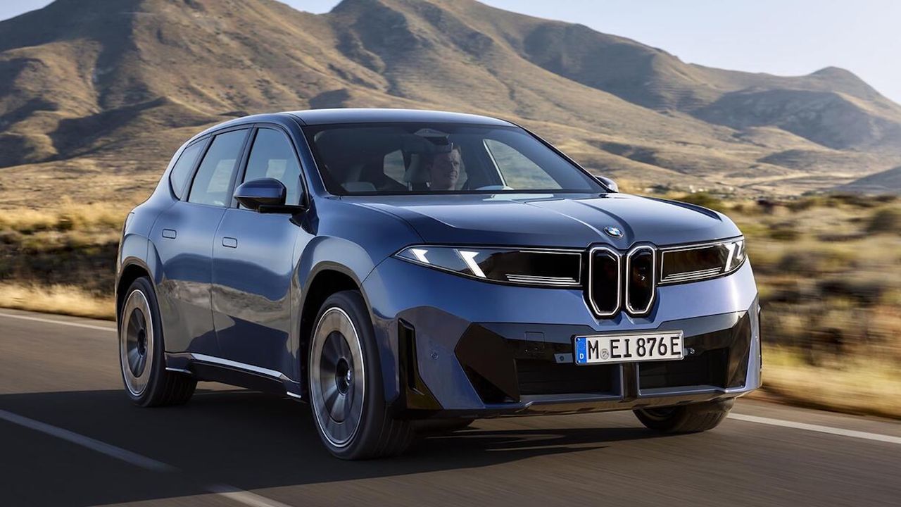
But it seems BMW hasn't finished tweaking. The brand launched its new iX3 electric car at the Munich Motor Show last week. but people are only just noticing that as well as a bold new design language for the car itself, the model also introduced a tweaked emblem, further refining one of the best car logos ever.
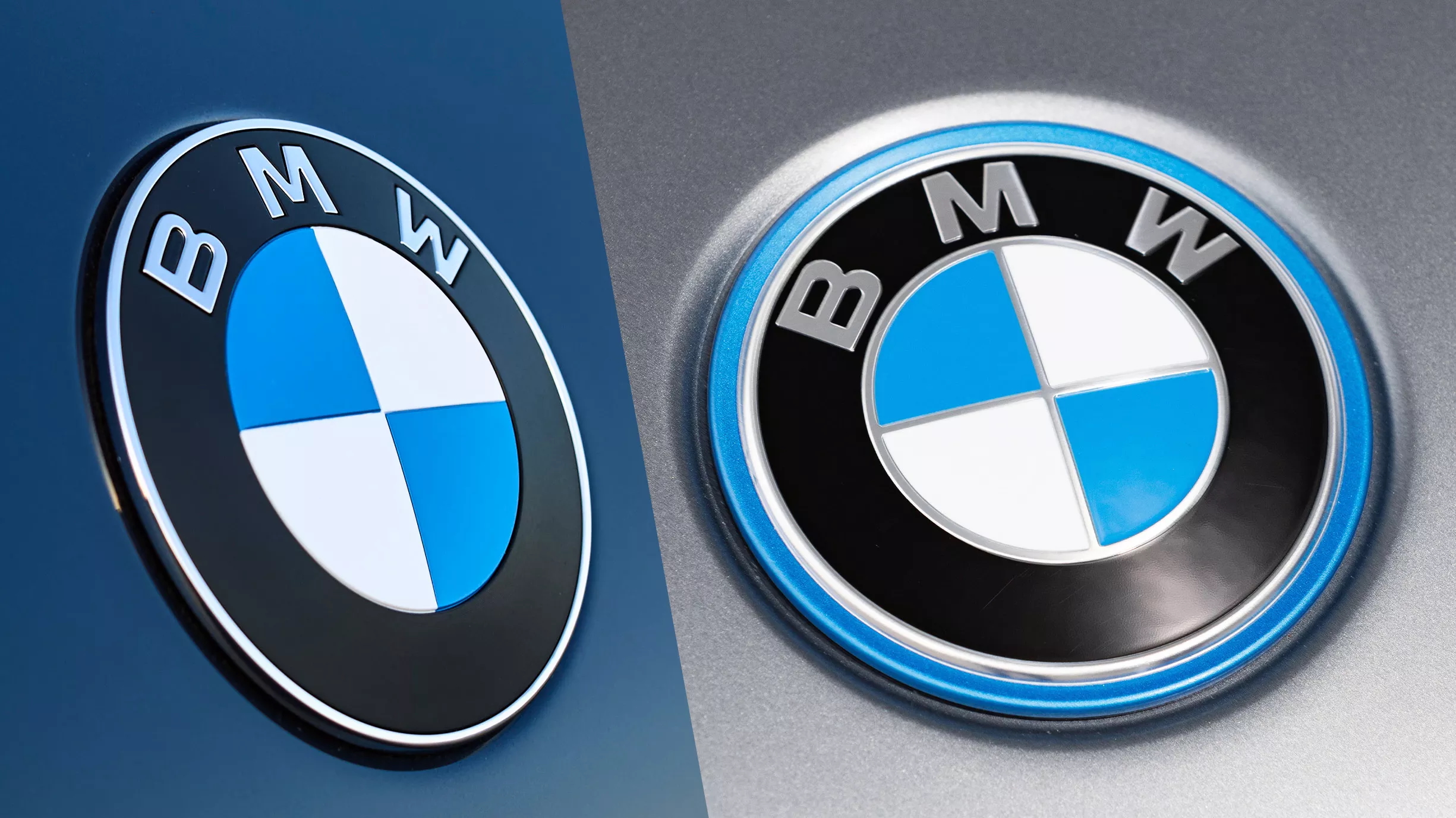
While 2020's simplified logo has been appearing on the brand's advertising materials for half a decade now, it has been yet to make its way to the cars themselves. Instead, the emblem on vehicles was more decorative, featuring chrome borders around the ring, and grey dividing lines between the two colours of the inner logo (which is definitely not a propellor).
But with the iX3, that simplified design language finally comes to the car itself. Gone are the borders and dividing lines, as the chrome layers are removed to allow for a much flatter shape. The change appears to have gone unnoticed among BMW fans, and was only picked up by Carscoops this weekend.
If anything, it's nice to see BMW adopt more consistency across its brand, with the discrepancies between its on-vehicle and digital logos scrubbed away. Indeed, we've seen plenty of examples of car brands unveiling new logos without quite having to put them on the bonnets themselves. That said, we'd rather the controversial new Range Rover logo sticks to the screen.