
Google, the company now owned by Alphabet, (do keep up) has unveiled a new logo, replacing probably the best known tech branding in the world. The new logo, in a typeface cheekily (but accurately) titled “product sans” is thought to be cleaner and easier to read but also – crucially – quicker to load.
This isn’t the first time Google has played around with its logo, previous changes include the time the company altered the kerning (positioning of the letters), shifting the “g” and “l” letters by a single pixel each (see below).
Tech companies seem to like tinkering, frequently. Here’s five other distinct redesigns:
Air BnB
The rental website and app hit the headlines in July 2014 with its redesigned logo, which it named the Bélo. Air BnB called the logo “the universal symbol of belonging”, but to everybody else it looked like the universal symbol of vaginas. Online media, however, love things that look like vaginas – canoes, football stadia – so the new logo racked up a lot of publicity.
It quickly became the butt of jokes and memes, and people also pointed out it was very similar to the logo of tech firm Automation Anywhere.
Yahoo
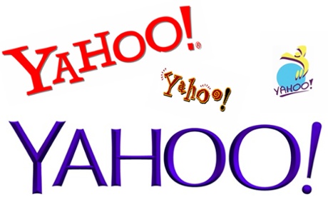
Yahoo’s original logo was literally just the word “Yahoo” in Times New Roman font. It wasn’t exactly grabbing. Later iterations just resembled awkward ClipArt, so it was about time for a lick of paint when the Yahoo logo was redesigned in 2013. Chief executive Marissa Mayer, along with an intern, designed the new branding over a single weekend, describing it as “whimsical, yet sophisticated”.
“I’m not a pro, but I know enough to be dangerous”, Mayer said, of her Adobe Illustrator skills. Total badass.
Microsoft
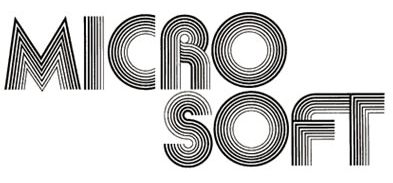
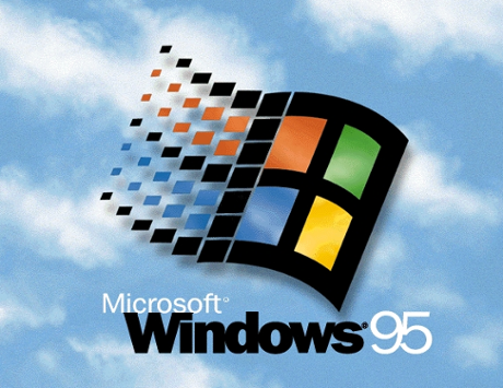
Microsoft’s first logo was so 70s, which was appropriate, given that Microsoft began life in 1975. Still one of the coolest tech logos, it had an arcade feel about it. One of the later and most loved logos, introduced in 1984, featured an italicised typeface, and was familiar to PC users for almost a quarter of a century (see below).
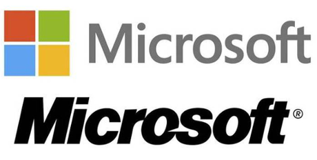
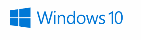
The current Microsoft logo, rendered in the Segoe typeface and which came into being in 2012, is completely dull. But that hasn’t stopped the company issuing guidelines on how to use it.
AOL
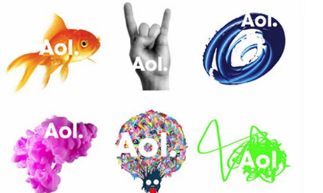
AOL, or America Online, to give the company its full title, has had many logos over the years. There’s even been a version consisting of the Brazilian flag. The current branding however was introduced in 2009. A series of logos features photos of a goldfish, a cassette type, an astronaut and a bunch of scribble. The designer, Wolff Olins, is also the man responsible for the London 2012 Olympic games logo. The less said about that the better.
The current AOL logo is set in a typeface similar to Futura, and without the brand’s older play button or triangle element.
Windows
In contrast to its parent company, Microsoft, the Windows operating systems package is constantly changing. Apparently, Windows has gone through more logos in the past 20 years than any other tech product, but the flying window, properly introduced in Windows 3.1, has remained consistent in the designs. You can see all of the past Windows logo designs (pre-Windows 10) here.
The current logo, which was unveiled in September 2014 ahead of the summer 2015 release of Windows 10, follows on from the Windows 8 iteration. It’s less interesting, but I guess blue is the warmest colour.


