You're not in the minority if you spend hours browsing paint colors online, sampling them to find the perfect shade for your walls, only to default to painting the ceiling bright white. Indeed, there seems to be an unspoken rule that ceilings must be painted white, but the emerging paint trick known as ceiling blurring says otherwise.
Instead of playing it safe with white ceilings, ceiling blurring is the technique of continuing the wall color onto the fifth wall, but in a slightly lighter shade to gently draw the eye upwards and, crucially, avoid the harsh contrast that stark white often creates. While this ceiling idea works in basically any type of room, it's especially effective in small rooms where the lack of contrast helps to make the space feel larger.
Here, interior designers explain all you need to know about this clever paint trick – from the best paint shades to use to the most flattering finishes – along with stylish examples to inspire your next decorating project.
What is Ceiling Blurring?
'When considering how to paint a room, it can be tempting to default to a white ceiling,' says Ruth Mottershead, creative director at Little Greene. 'However, a far more cohesive scheme can be achieved by considering the ceiling as part of the room’s overall palette. Using a softer tone on the ceiling, known as "ceiling blurring", softens edges rather than making the ceiling a focal point, creating a more seamless and enveloping feel.'
Essentially, ceiling blurring is where the same color as the walls is used on the ceiling, but in a lighter tone. 'The graduation in color is gentle on the eye, helping the ceiling feel less imposing and the room more harmonious,' adds Ruth.
Not only does this paint trick avoid the harsh contrast of a white ceiling with a bolder color on the walls, but it can help to make small, boxy rooms feel more expansive – guiding the eye upward without a strong endpoint.
While bold, colorful shades allow for a fun, unexpected look for ceiling blurring, it works with any color palette, from neutrals to bright tones. 'Soft, neutral, natural, and stone-inspired colors work beautifully within a graduated scheme, creating a sense of calm and restoration,' explains Ruth. 'By moving from deeper, richer tones to lighter, airier shades, the room achieves a natural, effortless flow, where colors gently combine.'
When it comes to choosing the right paint finishes, Ruth recommends going for a matte finish: 'the surface feels soft to the eye and rich to the touch, diffusing light gently and adding subtle depth.'
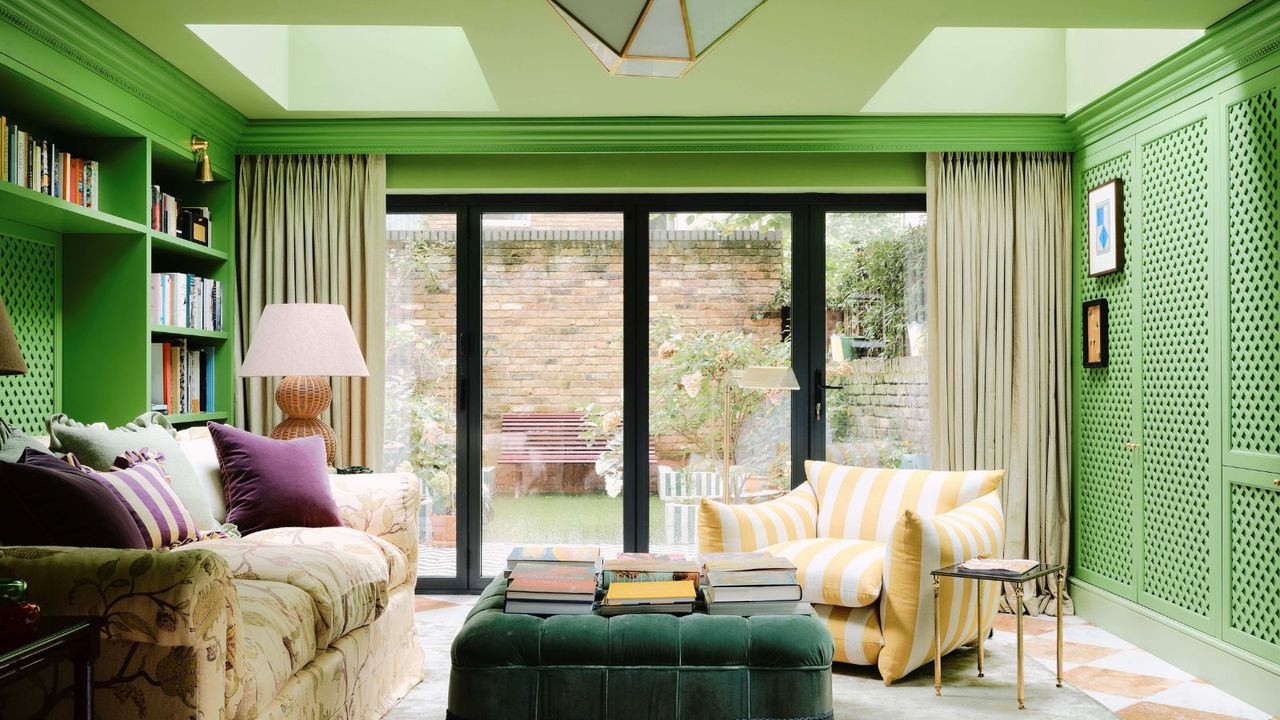
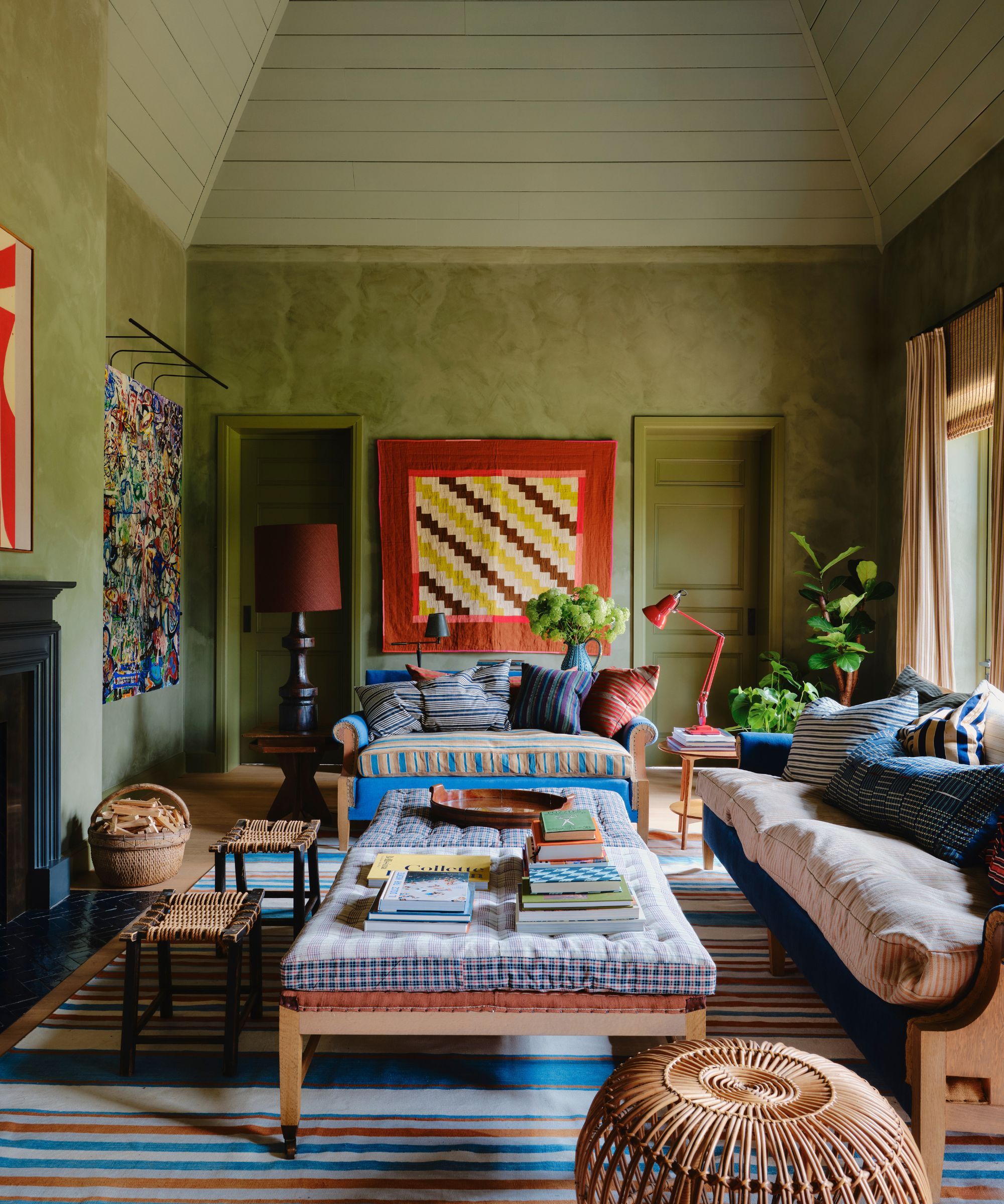
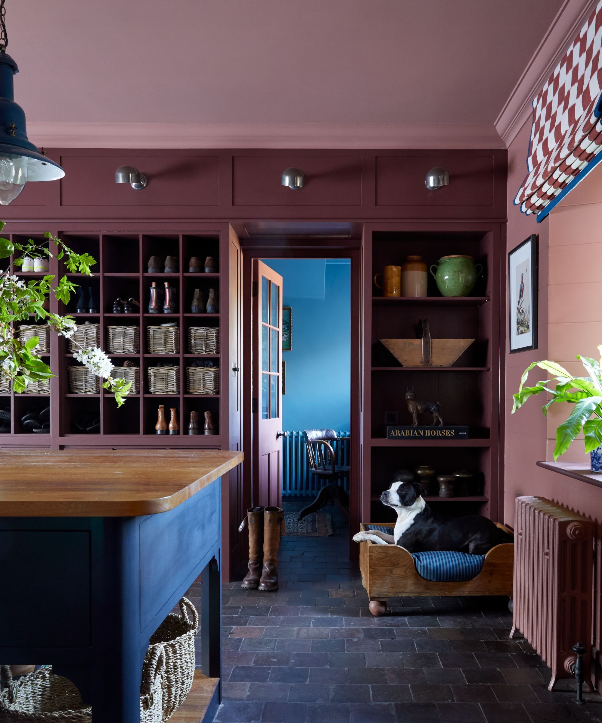
Stylish Examples of Ceiling Blurring to Inspire Your Project
From bedrooms to kitchens, ceiling blurring works as a clever paint technique in lots of rooms, enhancing its proportions and making a space feel soft, cozy, and considered.
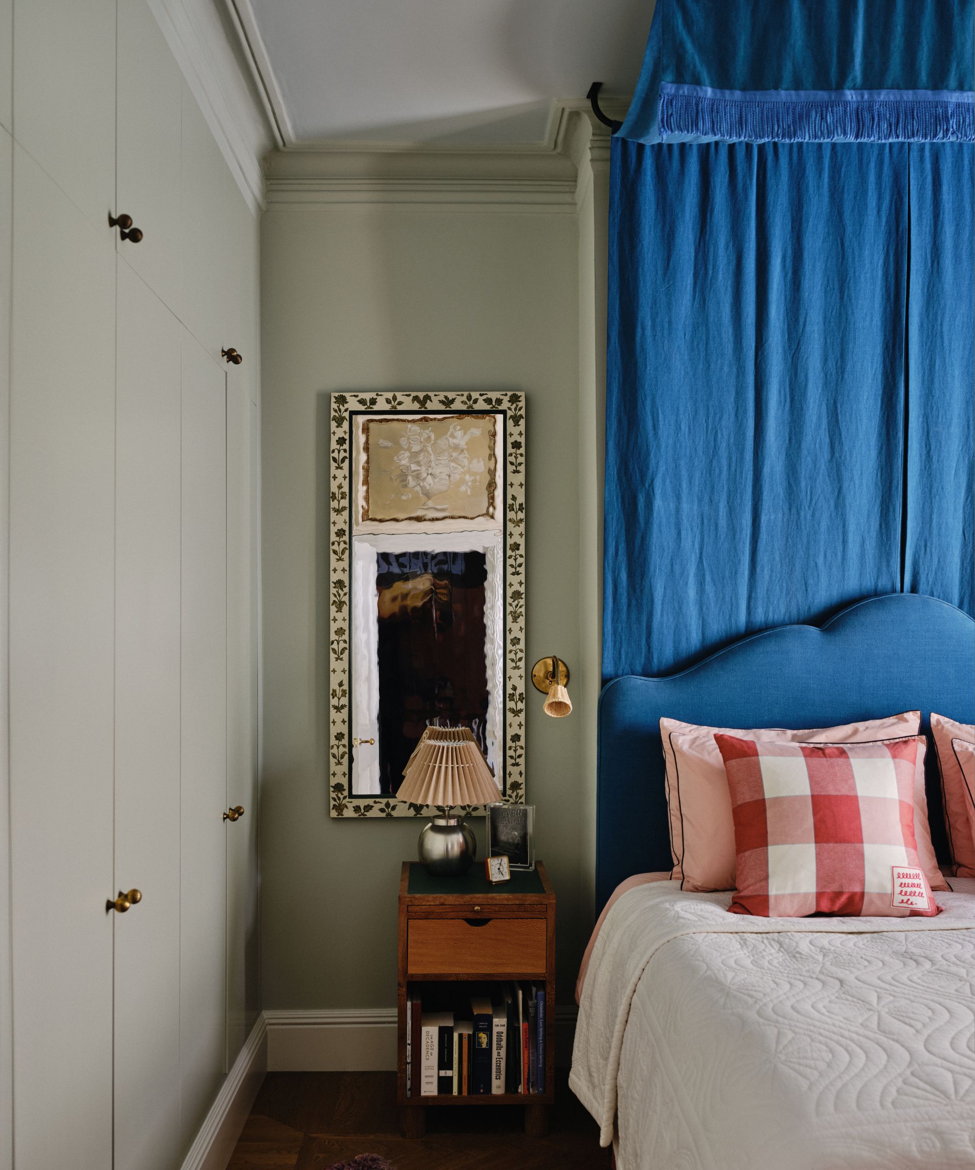
'In bedrooms, ceiling blurring works particularly well, as the sense of continuity helps the space feel calm,' says Dominic Myland, CEO of Mylands. In this bedroom, a gray-green paint was used on the walls and doors (Mylands' Lamb's Ear BH.06), while a lighter gray-green, Uncle Maths BH.05, was used on the ceiling.
'In rooms with detailed trimwork or architectural moldings, it can be effective to carry the wall color up and across these features, using the ceiling as a subtle point of contrast,' adds Dominic. 'This approach allows the architectural details to remain defined, while still maintaining an easy transition between the wall and ceiling.'
Before choosing colors for your scheme, keep in mind the difference between light and darker palettes. 'Using two different paints in the same lighter tone helps reflect natural light, making a space feel more open, while two deeper shades can create a more intimate atmosphere,' says Dominic. 'In both cases, matching tones closely maintains a sense of continuity and blurs the boundary between wall and ceiling.'
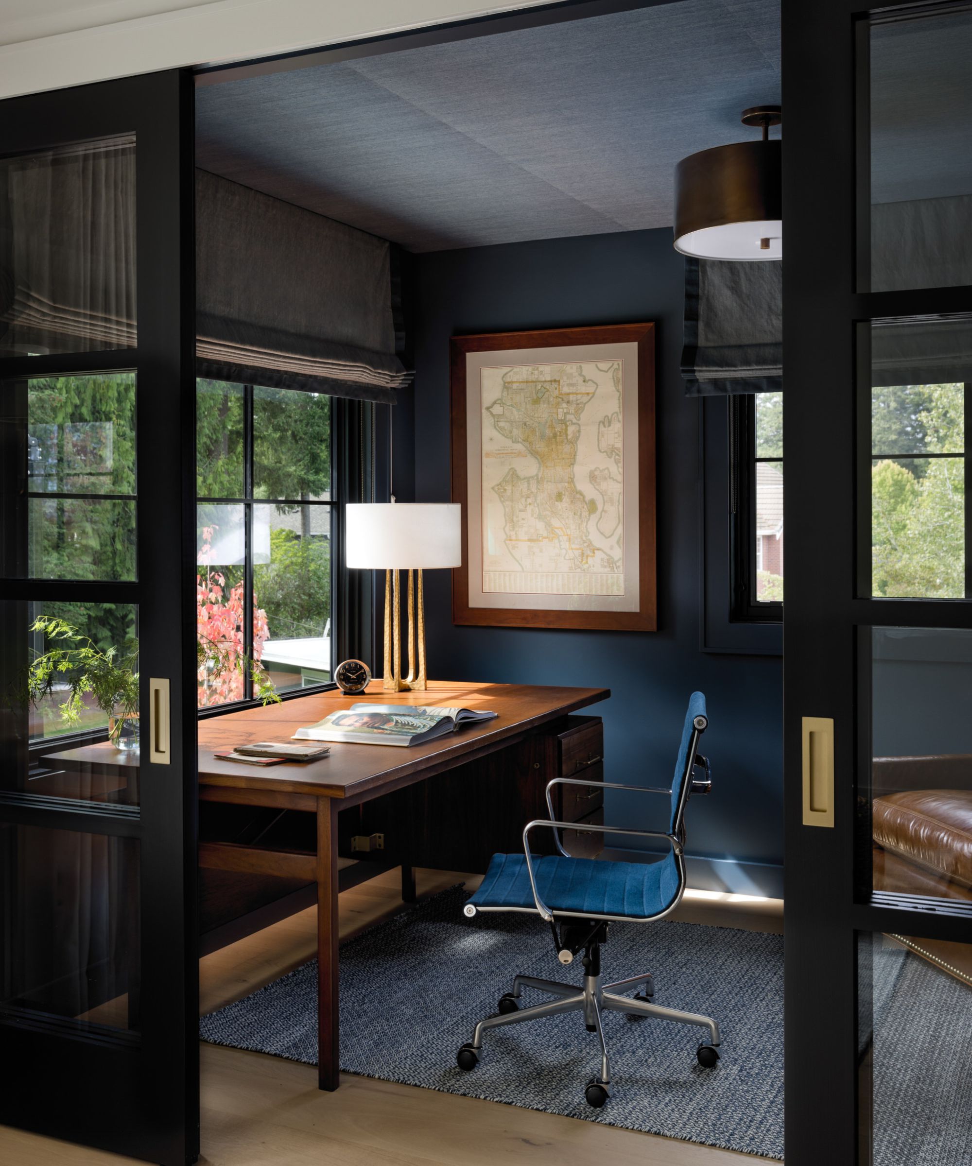
Using wallpaper in place of paint on the ceiling can create a similar effect, while adding extra depth and movement to the space. In this home office, a textured sisal wallcovering in a muted shade of blue was used on the ceiling, while a dark blue paint, Sherwin-Williams' Sea Serpent, was used on the walls.
'The client wanted a dramatic and moody feel in this study, so Sea Serpent was a great fit for the walls,' explains the Washington-based designer Shannon Adamson. 'The sisal lends a subtle texture to the space and helps with sound absorption. It also keeps the ceiling from feeling too heavy and oppressive, which can happen when deeper paint colors are continued onto the ceiling, even in smaller spaces.'
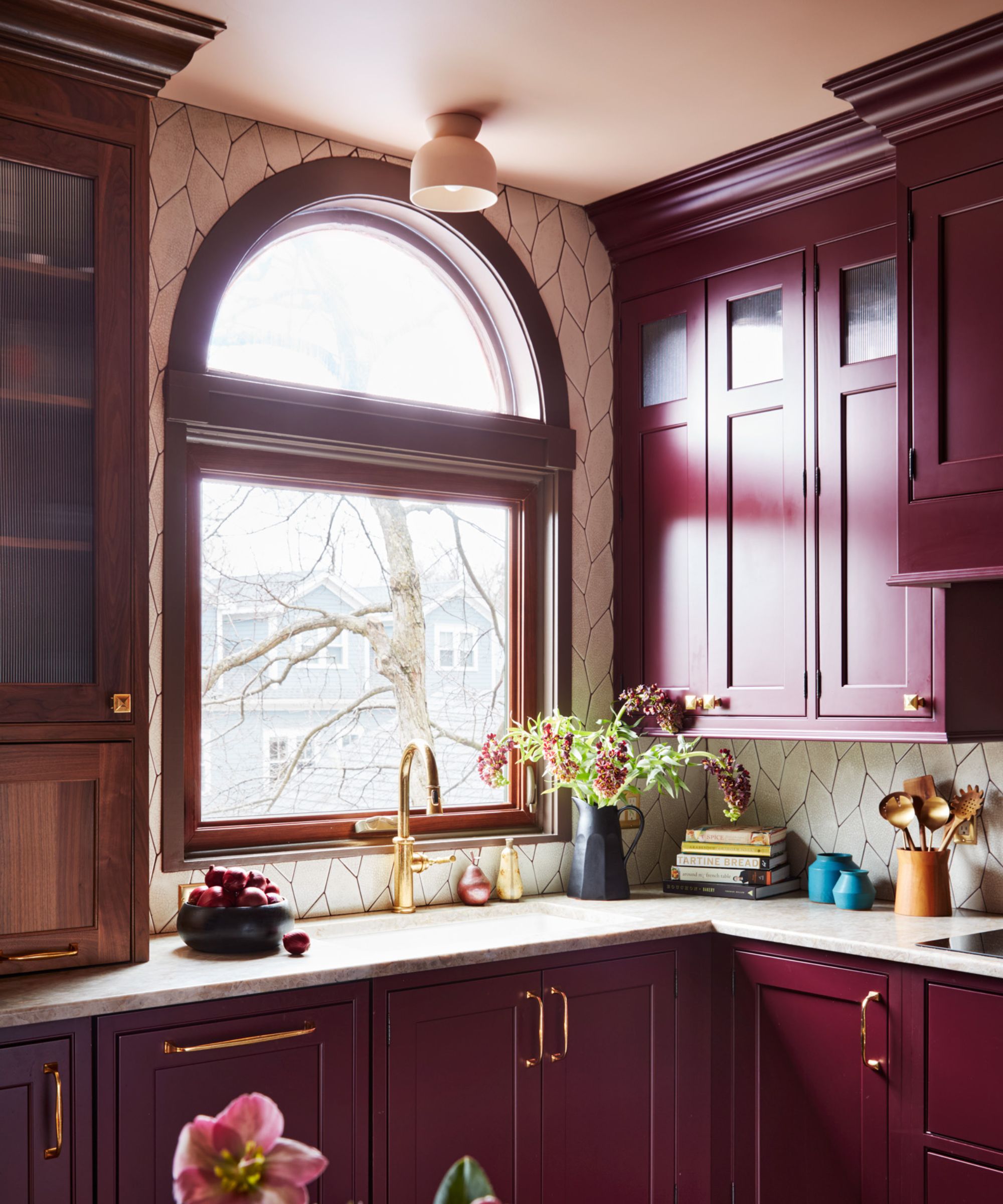
In kitchens with full-height cabinetry, you can follow the same approach to ceiling blurring, painting cabinets in a richer color, and then using a lighter version on the ceiling.
'For this kitchen, I wanted to maintain a burgundy color scheme for the cabinetry, painting them a shade of Brinjal,' says the designer Cecilia Casagrande of Boston-based Casagrande Studio. 'I also chose Setting Plaster for the ceiling color to complement the cabinets and prevent them from overwhelming the space, as can happen with dark cabinets and white ceilings. In this case, the ceiling plays a significant role in the overall design.'
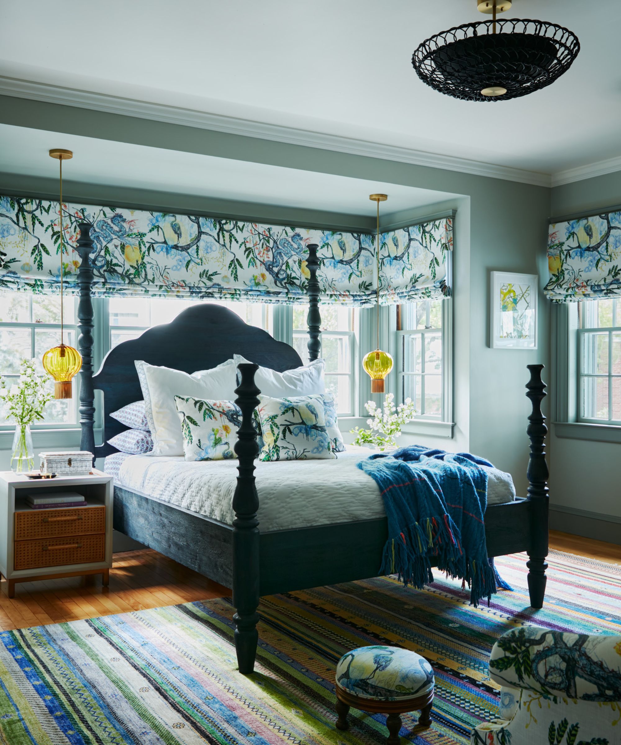
Light gray-green paints work wonderfully in bedrooms, setting a tranquil feel, and taking them onto the ceiling creates a cocooning effect. 'For this bedroom, our goal was to create a relaxing atmosphere that showcased the beautiful window treatments,' says Cecilia. The designer settled on Farrow & Ball's Mizzle for the walls, with the slightly lighter tone of Cromarty for the ceiling. 'This subtle color change added a touch of brightness without altering the overall aesthetic,' says Cecilia.
Not only does painting the fifth wall a tonal version of the wall color create a cohesive, soft look and create the illusion of more height in small spaces, but it also feels more current than bright white ceilings that can come across as dated. If you're looking for some inspiration for choosing a color palette for this paint trick, browse the bold shades that transform small rooms.
Love beautiful design ideas, expert advice, and inspiring decor trends? Sign up for our newsletter and get the latest features delivered straight to your inbox.