
Last week I was: playing way too much of the Battlefield 6 open beta.
This week I've been: continuing to play way too much of the Battlefield 6 open beta now that it's returned for one more weekend.
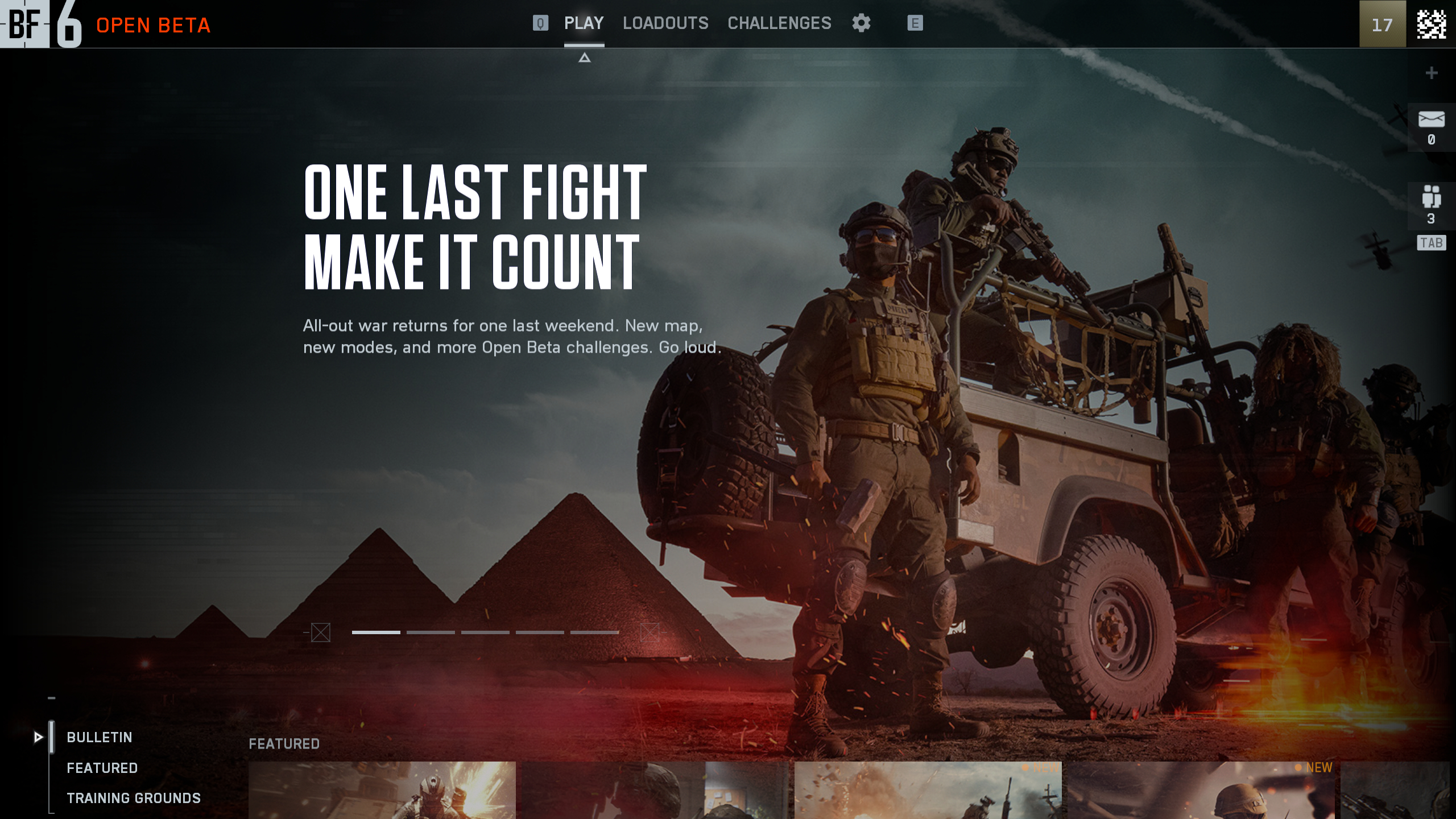
As much as I've been enjoying the Battlefield 6 open beta, I can't deny that sinking feeling the moment I booted it up and was met by Netflix's home screen; tile after tile of curated playlists requiring you to horizontally scroll as if I'm searching through swathes of algorithmically pre-destined TV shows for my next binge. Unfortunately, I'm not trying to pick my next show; I'm just trying to queue for a match of closed weapons Rush.
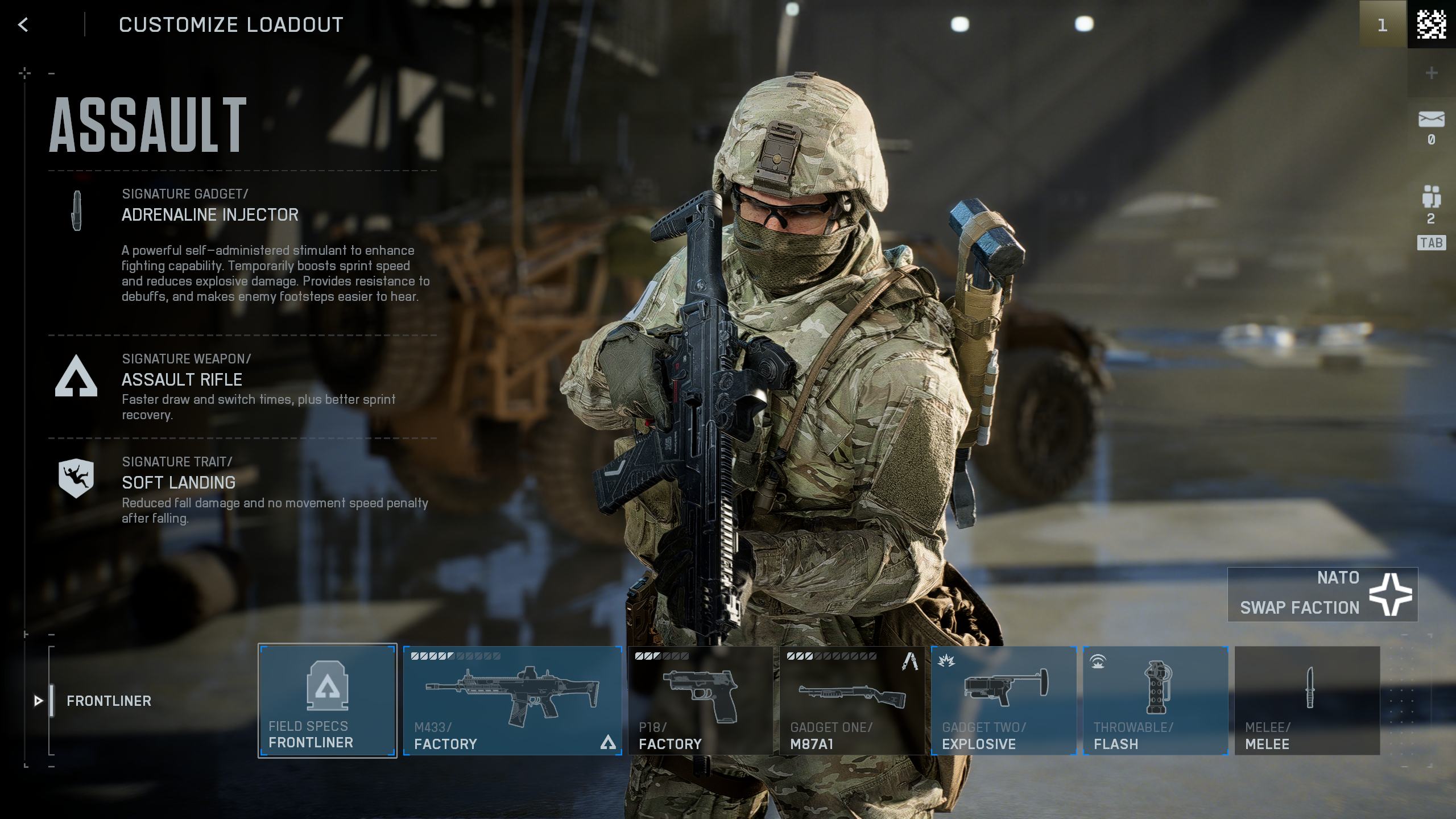
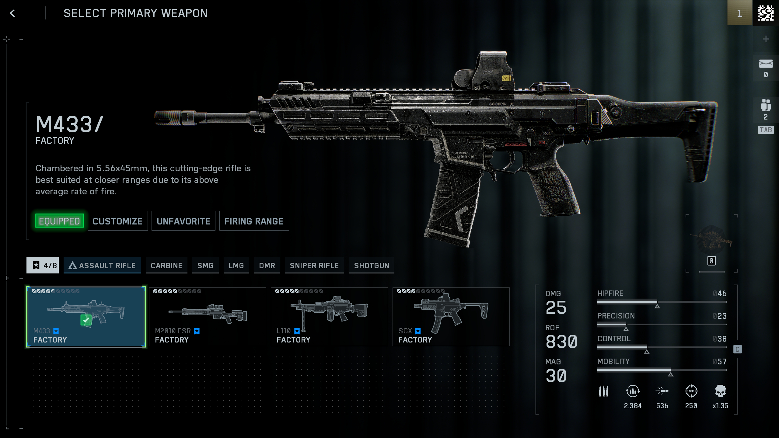
Plus, it's not limited to just the main menu, either, as everything from the loadout screen to the settings page is full of annoying tiles and horizontal scrolling that's especially awkward for a mouse. It's fiddly just to swap weapons or attachments, at times.
Thankfully, I'm not alone in my dislike of the streaming service-style menus, as it's already been the source of both controversy and conspiracy. Not only does the main menu look naff and very much feel designed for a controller, but so far in the Battlefield 6 open beta, its curated playlist picks have buried the popular closed weapons modes so far to the right that it's not even visible without scrolling.
I, for one, quite liked Battlefield 3's heart-rate-like health bar, but there's no shot we'll ever be seeing that again.
After only a few days since we've all had hands on with Battlefield 6, I've already seen feedback and even fan redesigns pile up. And despite creative director Thomas Andersson expressing that Battlefield Studios is open to this feedback—going so far as to say "it's not hard-coded UI", so it can "act in seconds to something that feels like it’s troubling"—I can't help but feel like we won't be ditching these Call of Duty menus anytime soon.
During the beta, we've already seen very reactive changes to this main menu in line with the developer's comments, but these have generally been simple playlist alterations and moving things around. Hell, we've even seen the addition of a custom playlist tool so you can set preferences for individual maps and modes. Still, it's not exactly the complete redesign we're all hoping for.
Menu concept by me from r/Battlefield
One of my favourite suggestions so far is by Reddit user 'Oninyourfly', who has redesigned the entire main menu to be more in line with the older games in the series: All the modes are listed vertically, and even the loadout screen has been given a much-needed makeover. It's somehow more stylish than the menu we have right now, while also being much simpler and easier to navigate.
Given that the tile-based "default smart TV app" interface is all the rage these days, with the likes of Call of Duty already having been mocked for years for similar reasons, I fear we're stuck with it. At least the in-game HUD is good, even if it lacks some of the pizzazz of older Battlefield games—I, for one, quite liked Battlefield 3's heart-rate-like health bar, but there's no shot we'll ever be seeing that again.