Home decorator and content creator Leah Hodson is one of Ideal Home's new Open House contributors, sharing her thoughts on overhauling a home with clever DIY and decorating tricks. See the rest of her articles here.
Every autumn when big paint brands release their Colour of the Year, I wonder how I am going to use that shade of paint in my very neutral home. Am I about to be pressured into painting my home Living Coral or Classic Blue? These shades always look incredible on Pinterest, but I don’t think I’d be able to put up with it surrounding me in real life!
If you’re like me, fear not. The COTYs (Colour of the Year) and colour trends for 2026 are surprisingly soft and easy to adapt to your neutral home. Here’s how each brand’s 2026 pick can actually work for me, my calm home, and my beige-loving heart.
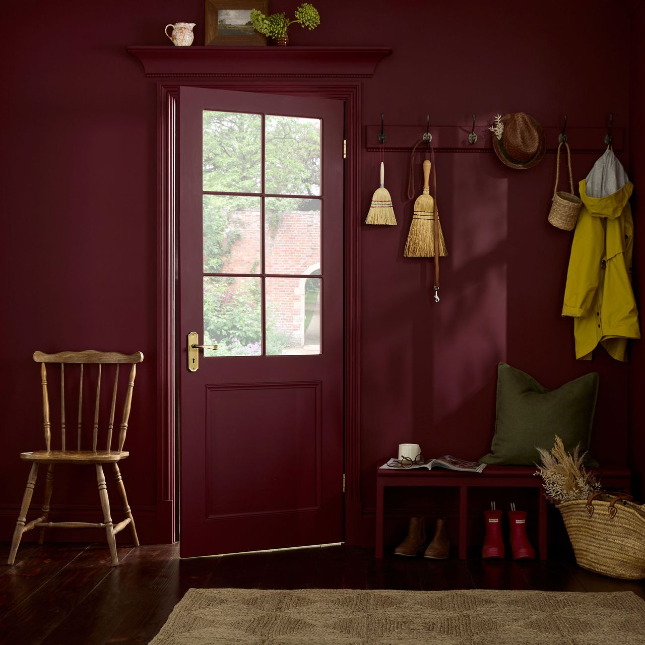
Graham & Brown: Divine Damson
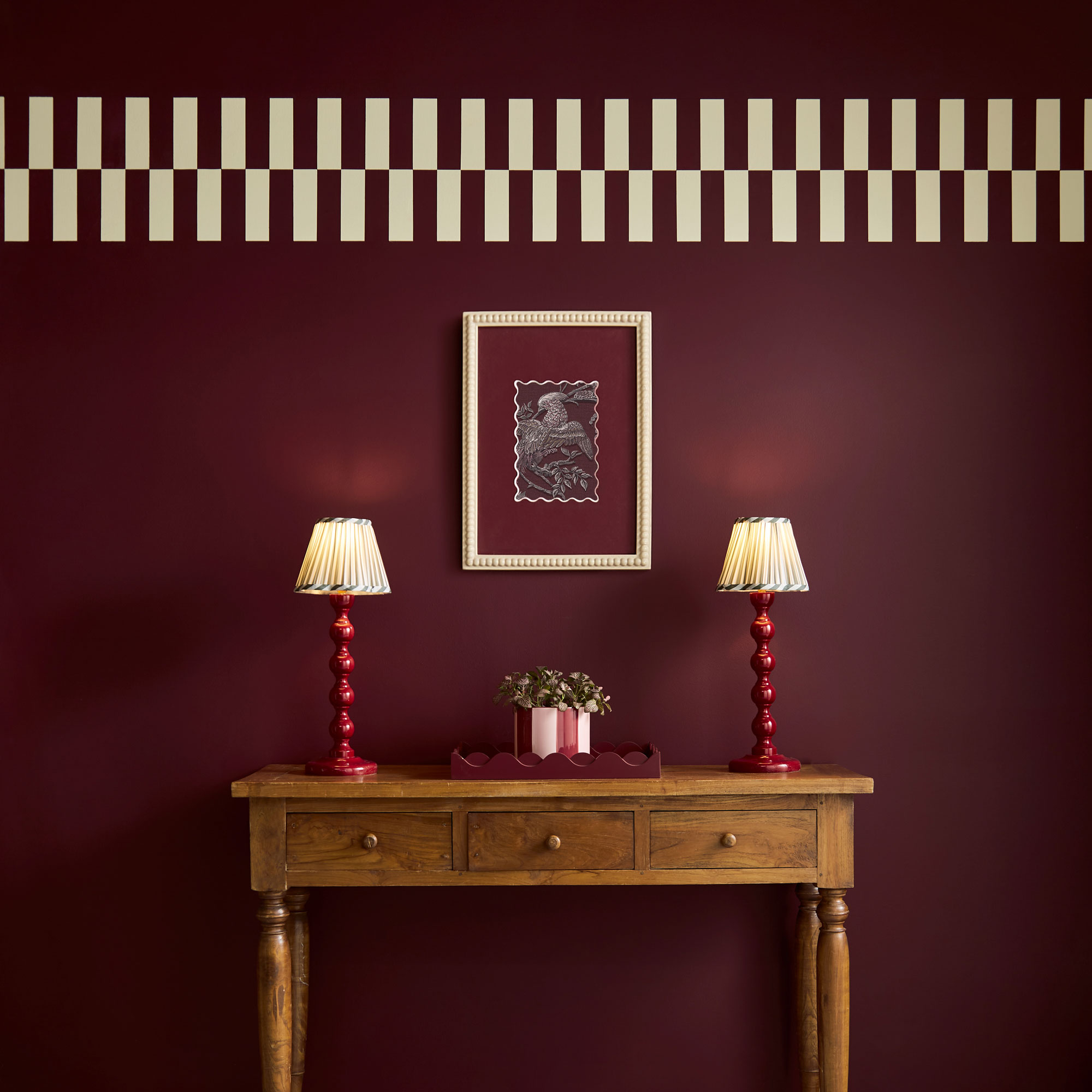
Divine Damson may look dramatic, but it’s actually a grounded brown with a tinge of red. Perfect if you want to dip your toe into darker colours without going all in.
Pair Graham & Brown's Divine Damson with creamy neutrals, warm woods and a hint of brass for the perfect sprinkle of luxury. I think it works beautifully on interior doors, especially in narrow hallways, adding instant depth and drama without overwhelming the space. And if you’re feeling brave, Divine Damson will completely transform any large piece of furniture into a true statement feature.
Little Greene: Adventurer
Little Greene’s Adventurer is a rich, velvety, aubergine shade. Almost like a sophisticated shadow, I’d love to pair it with a soft pink for an effortless, chic combination!
Try going bold in your cloakroom, where I always think the small space can handle a lot more drama than you think. Adventurer is perfect for this! It instantly adds depth, character and a rich, cocooning feel. If painting the whole room feels a little daunting, try it on a half wall with panelling for a softer, cosier take. Or take it to the ceiling for a statement contrast that still feels intimate and intentional.
Dulux: Slow Swing
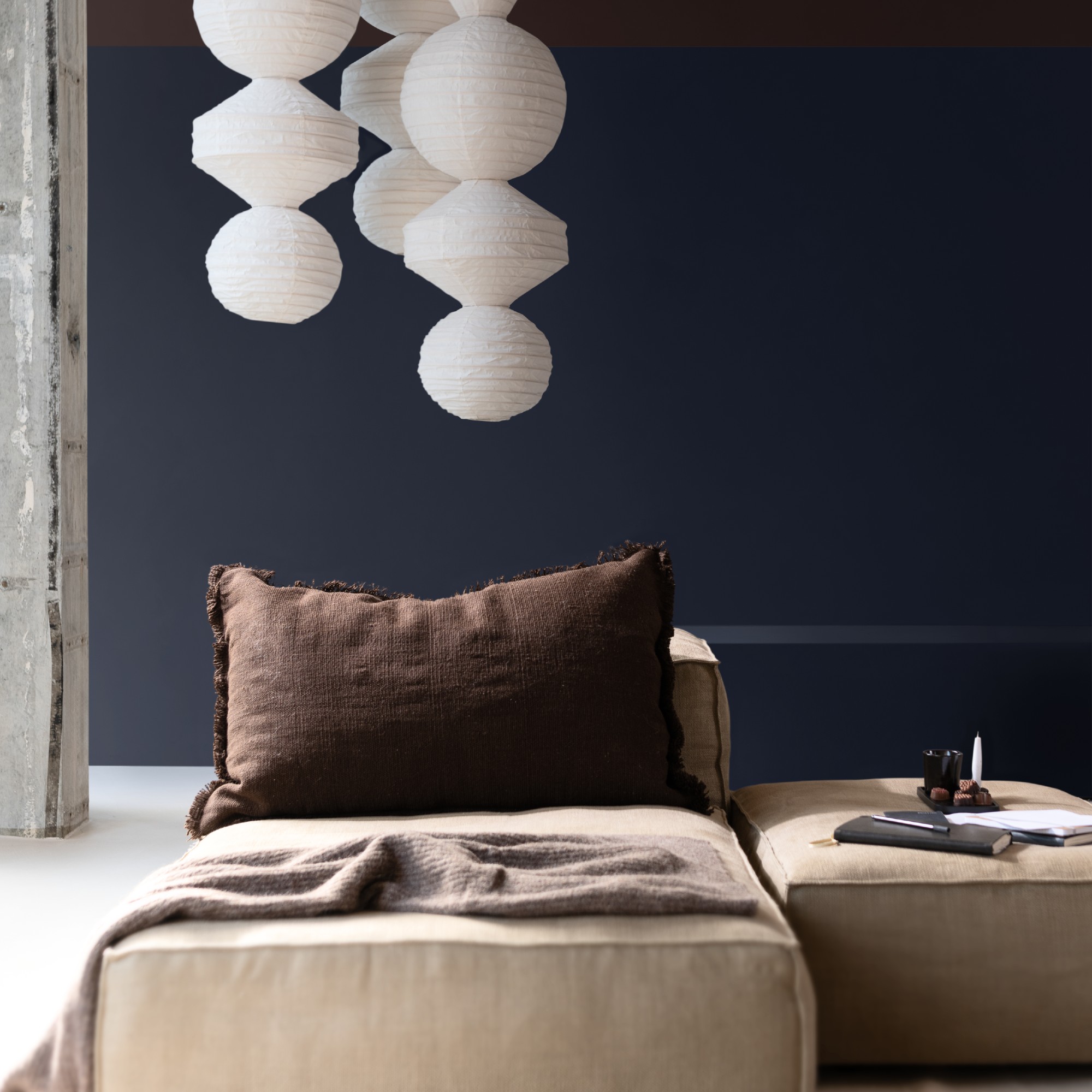
Dulux went bold with three Colours of the Year for 2026 - all blues - but Slow Swing has my heart! It’s inky, calm and grounding - very charcoal-meets-navy than anything traditionally blue.
Slow Swing feels made for a home office, especially when it’s paired with dark woods. It instantly creates that moody, sophisticated…I mean business energy - the kind that makes you sit a little straighter at your desk. Add a gorgeous statement light and it’s all confidence and focus by day… then the moment the big light goes off, the room softens into the cosiest, after hours retreat. It’s the perfect balance of sharp and snug.
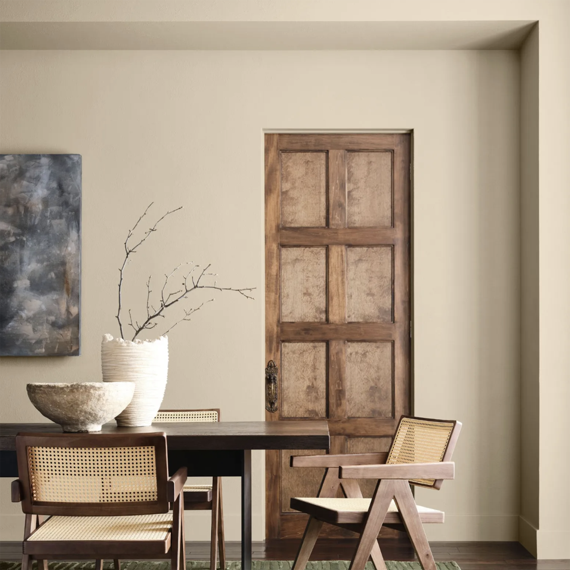
Earthborn: Freckle
I’ve personally used Freckle (can’t get enough of it on my stairs mural) and it’s such a versatile colour, being a naturally occurring shade. It’s warm, earth(born)y and beautifully matte in Earthborn’s claypaint finish. Freckle is an immediate “yes” for anyone who wants an elevated neutral that still feels natural.
Freckle is a brilliant choice for north-facing rooms if you worry that traditional terracottas can look too orange or harsh in cooler light. Because it’s softer, it adds warmth without tipping into pumpkin territory. In a north-facing space, where light is naturally flatter and cooler, Freckle gently balances things out, making the room feel cosy rather than cold.
Benjamin Moore: Silhouette AF-655
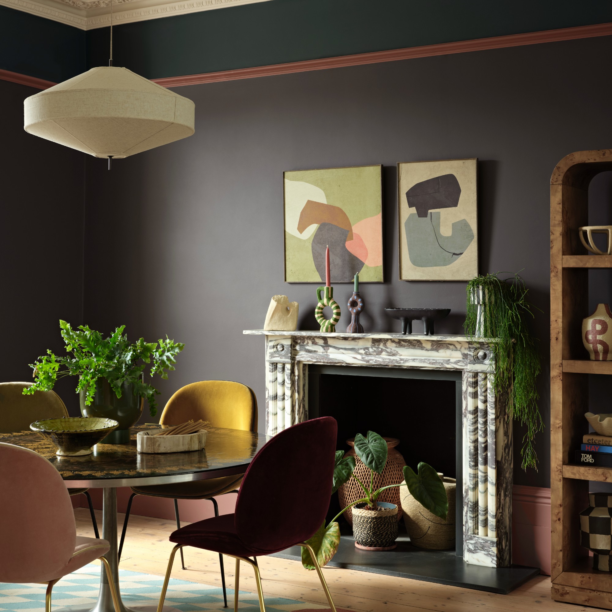
Silhouette is a deep brown with a charcoal undertone. It’s moody, elegant, and irresistibly calming. It can be used to create drama but also be really subtle when needed.
If you’re anything like me, Benjamin Moore's Silhouette might be the most daunting of the COTY to imagine living with! But lean into its moodiness and use it where the darkness feels intentional - a snug, a media room, or anywhere you want the space to feel cocooning and cinematic. In rooms like these, its depth doesn’t feel heavy, it feels considered.
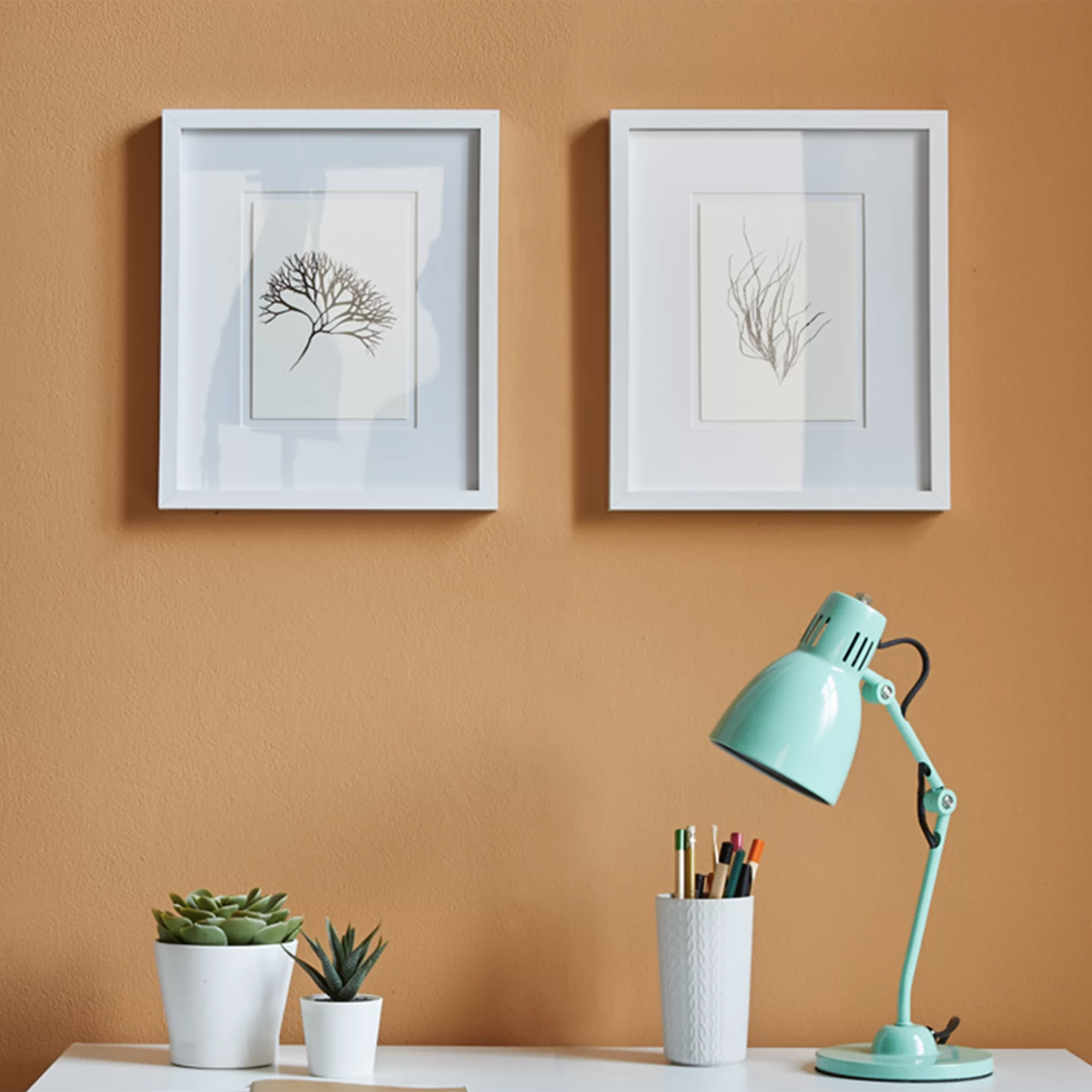
Sherwin-Williams: Universal Khaki
This is probably the safest COTY of the entire lineup! It’s a mid tone neutral that easily pulls a room together. I love that Universal Khaki goes with absolutely everything - I know most of you don’t need suggestions on how to use this gorgeous neutral shade!
Use Universal Khaki to create a room that looks traditional, beautifully put together and looks timeless rather than stuffy. Its warm undertone gives the room a sense of quiet sophistication, especially when layered with rich wood furniture and tailored soft furnishings.
Valspar: Warm Eucalyptus
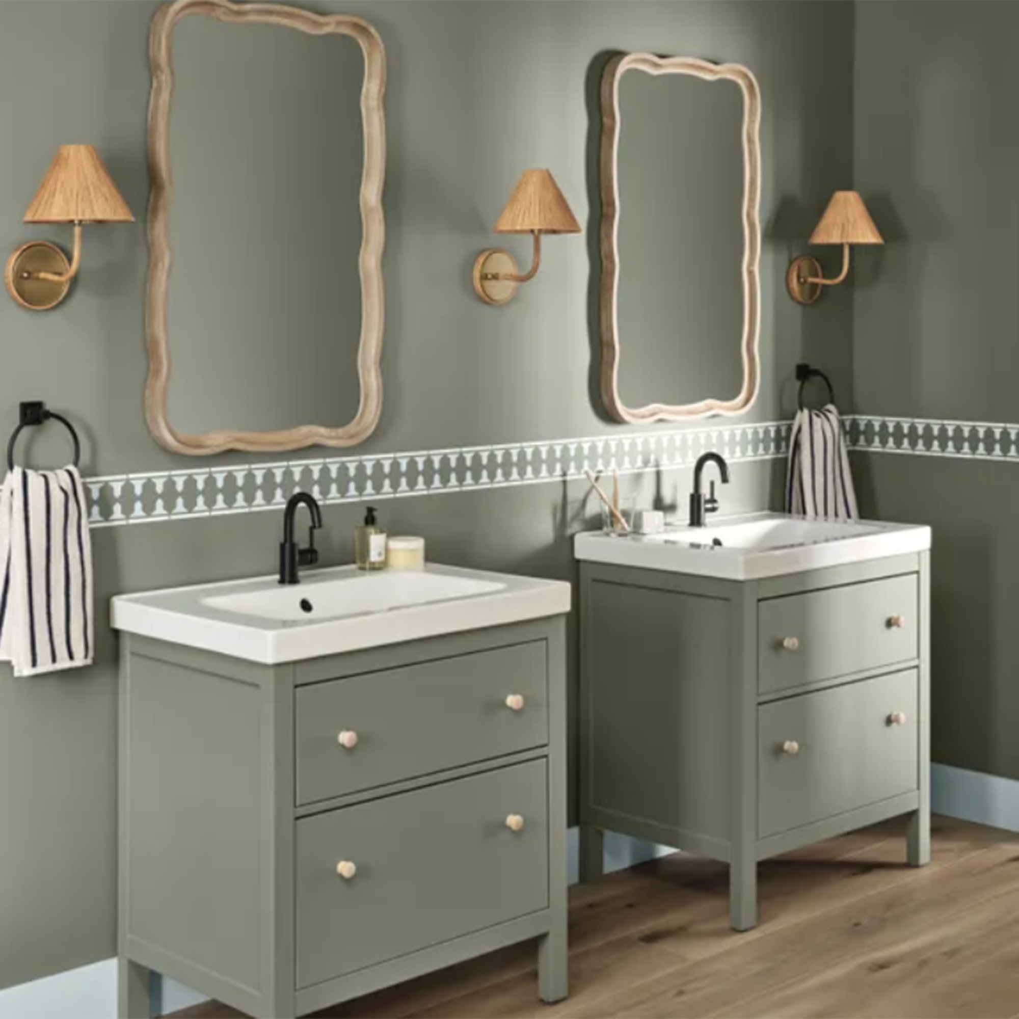
If you want a hint of colour but still want your home to feel calm and neutral, Warm Eucalyptus is the perfect muted green. It’s the millennial’s answer to grey, the kind of colour that makes you think “I don’t do colour… but maybe just this once.”
Use Warm Eucalyptus to transform your bathroom into the spa-like sanctuary we all dream about. Its soft, nature-inspired green instantly brings a sense of calm and balance, while pairing beautifully with natural woods, stone accents, and crisp white towels. The result is a restful, grounded space that feels both luxurious and effortlessly serene.
Bottom line, you don’t have to fear COTY! It doesn't have to feel daunting, or like a new trend is being forced upon you. See it as suggestions that these colours will work in any modern home, and just might be your next favourite colour! The wonderful thing about the 2026 COTY lineup is that none of these shades demand a total palette reboot. Instead, they are deeper, richer versions of the neutrals we already love. If you’re a beige loyalist, this might be your invitation, not to abandon your palette, but to gently evolve it! Small doses, thoughtful placement, lots of texture… and suddenly colour will become a part of your neutral universe!