The road to a new iOS release can be a bumpy one, with Apple's initial splashy announcement giving way to months of beta testing. As developers and impatient users alike pore over every design detail, bugs and imperfections and inevitably rear their heads. And it seems Apple is listening extra closely to feedback for iOS 26.
Liquid Glass, Apple's new design language, has hogged headlines since its unveiling at the start of this month, with the transparent elements and ostentatious animations raising eyebrows. But one particular detail caused early adopters more consternation than the rest.
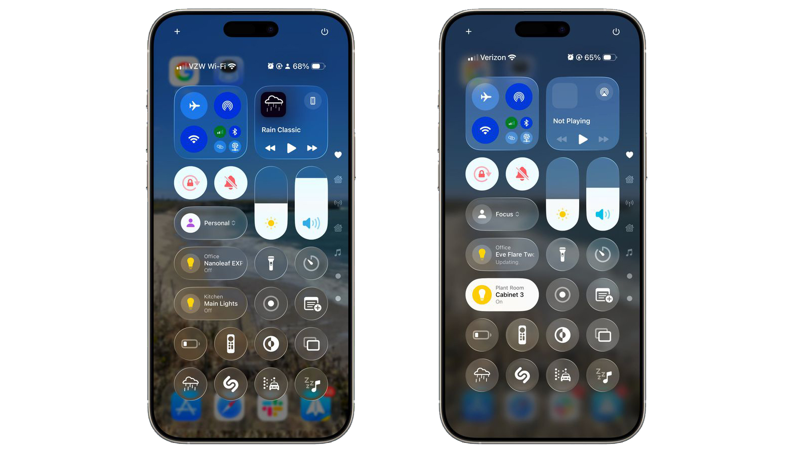
The appearance of iOS 26's Control Centre on iPhone was criticised for being too transparent, with the colourful home screen icons proving distracting. The whole thing was a bit of a mess – but Apple has dialled things right down in the new iOS 26 beta.
Wow, the Control Centre on iOS 26 is so full of distraction. pic.twitter.com/fnkbPbvFhHJune 9, 2025
Not only has the blur effect been heightened, dimming those background items, but the Control Centre buttons themselves are now less transparent. The overall effect is that of a Control Centre that's much easier to look at.
Time will tell how many other fixes Apple will deploy over the process, but often the final release looks notably different to what developers first played with in beta 1. But one thing's for sure – this is looking like the most significant iPhone software redesigns we've seen in years.