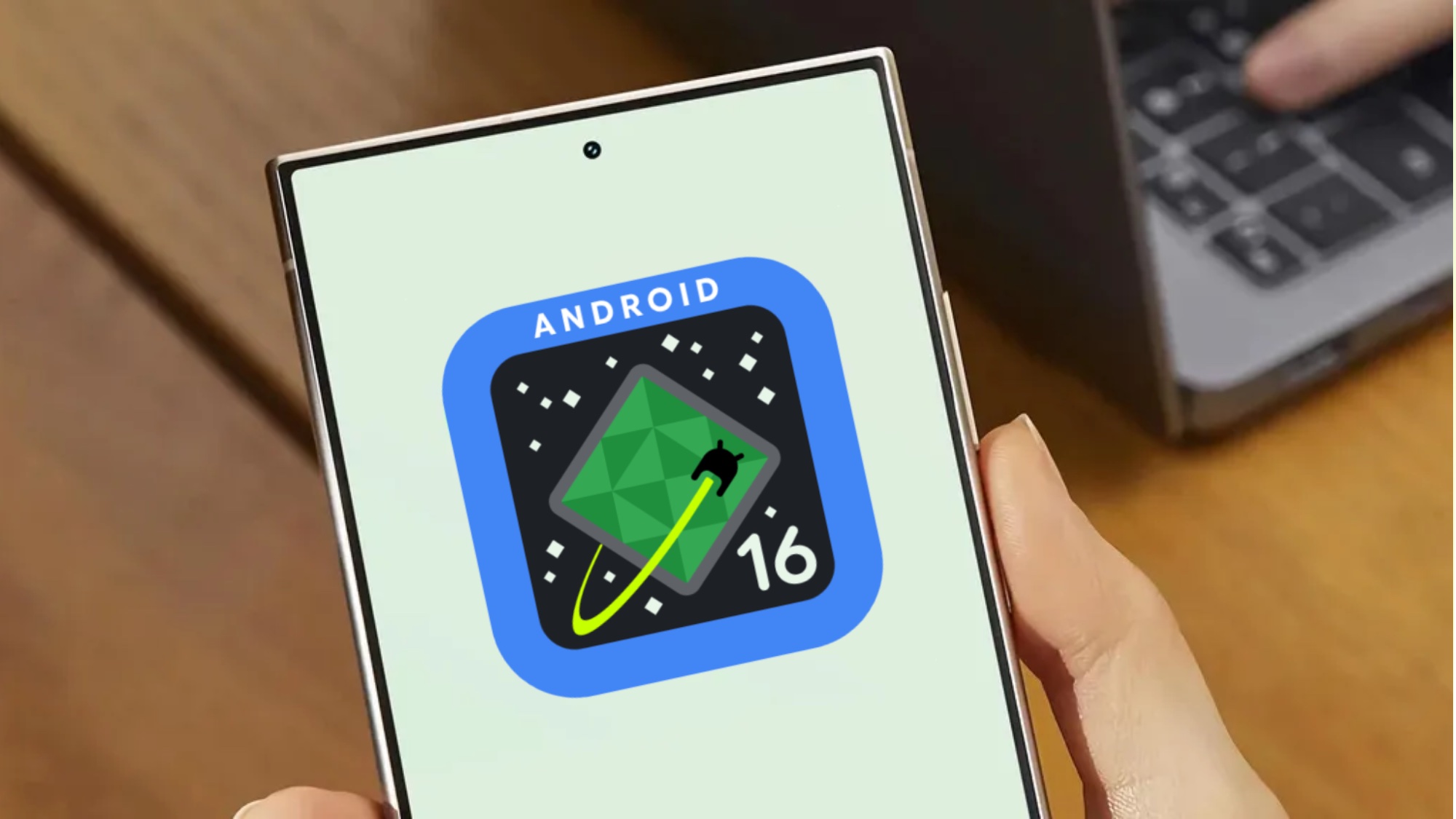
The design of Android 16 just got revealed early, as Google seemingly accidentally published a blog about its “Material 3 Expressive concept” detailing how and why things are about to look different.
Despite pulling the page offline, 9to5Google grabbed the text and images, with the Wayback Machine also showing a partially indexed version of the page.
We assume that this page was meant to be shown off alongside the official announcement of Material 3 Expressive and Android 16's stable version at the Android Show and Google I/O later this month.
However, thanks to whatever mistake Google made, we get an extensive sneak peek to check out right now.
What does Expressive mean here?
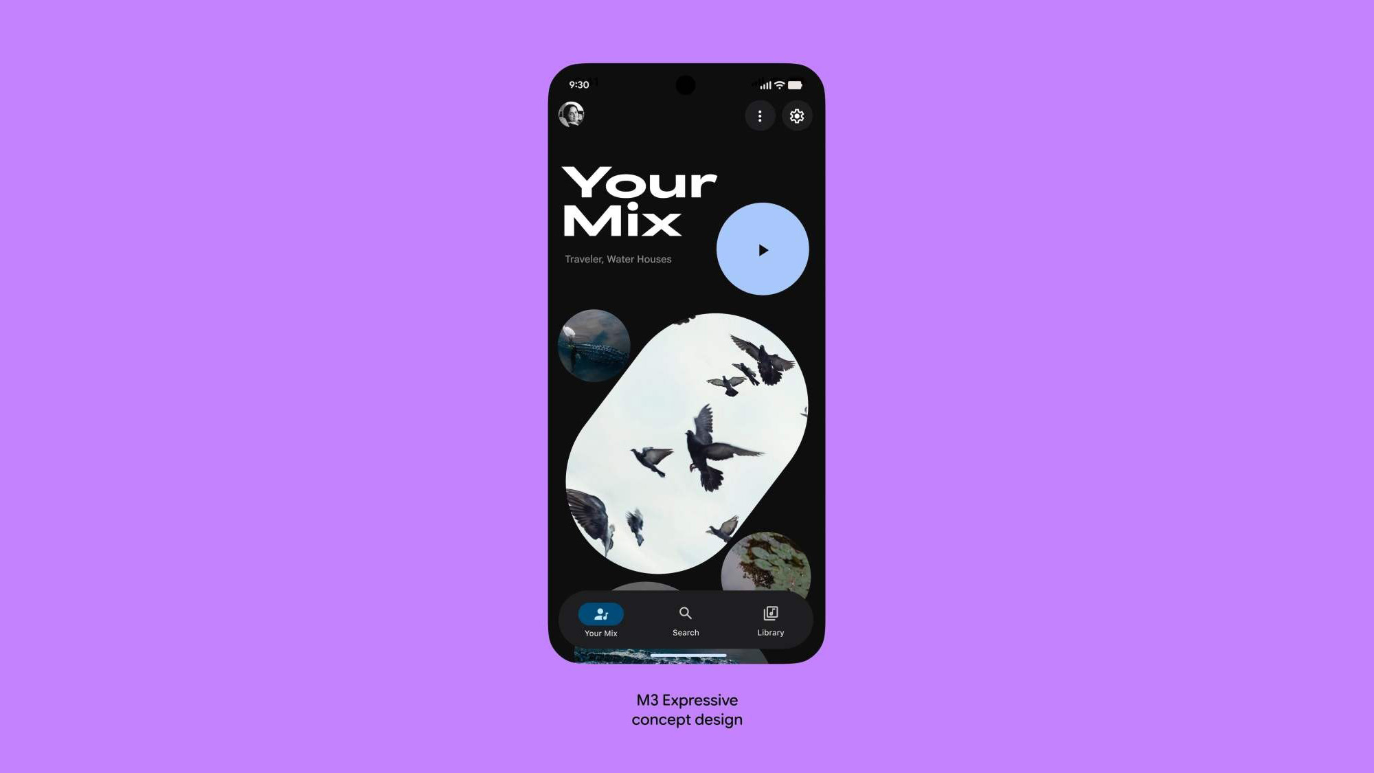
When you cut through Google's emotive language, it seems that its aim with Material 3 Expressive was to take the principles of its current "Material You" language and make it more attractive and usable, along with apps that are more distinct from one another. That has required huge amounts of research, the blog post explains, involving both talking to thousands of users and getting data from them via lab tests like eye tracking and usability experiments.
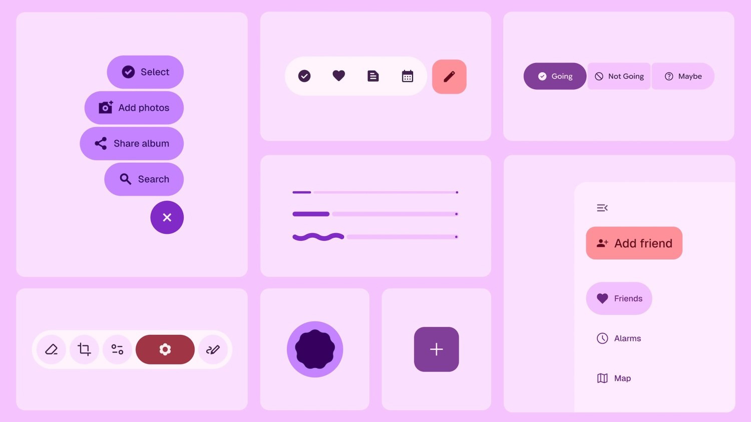
The result is a focus on "color, shape, size, motion and containment," which seems to translate to new shapes and highlights to help group or split up functions in logical ways, such as larger icons to help users navigate and tap their way through interfaces more quickly. That seemingly applies whether the user is young or old, too, with the over-45s apparently getting to grips with the new design as well as their more sprightly counterparts.
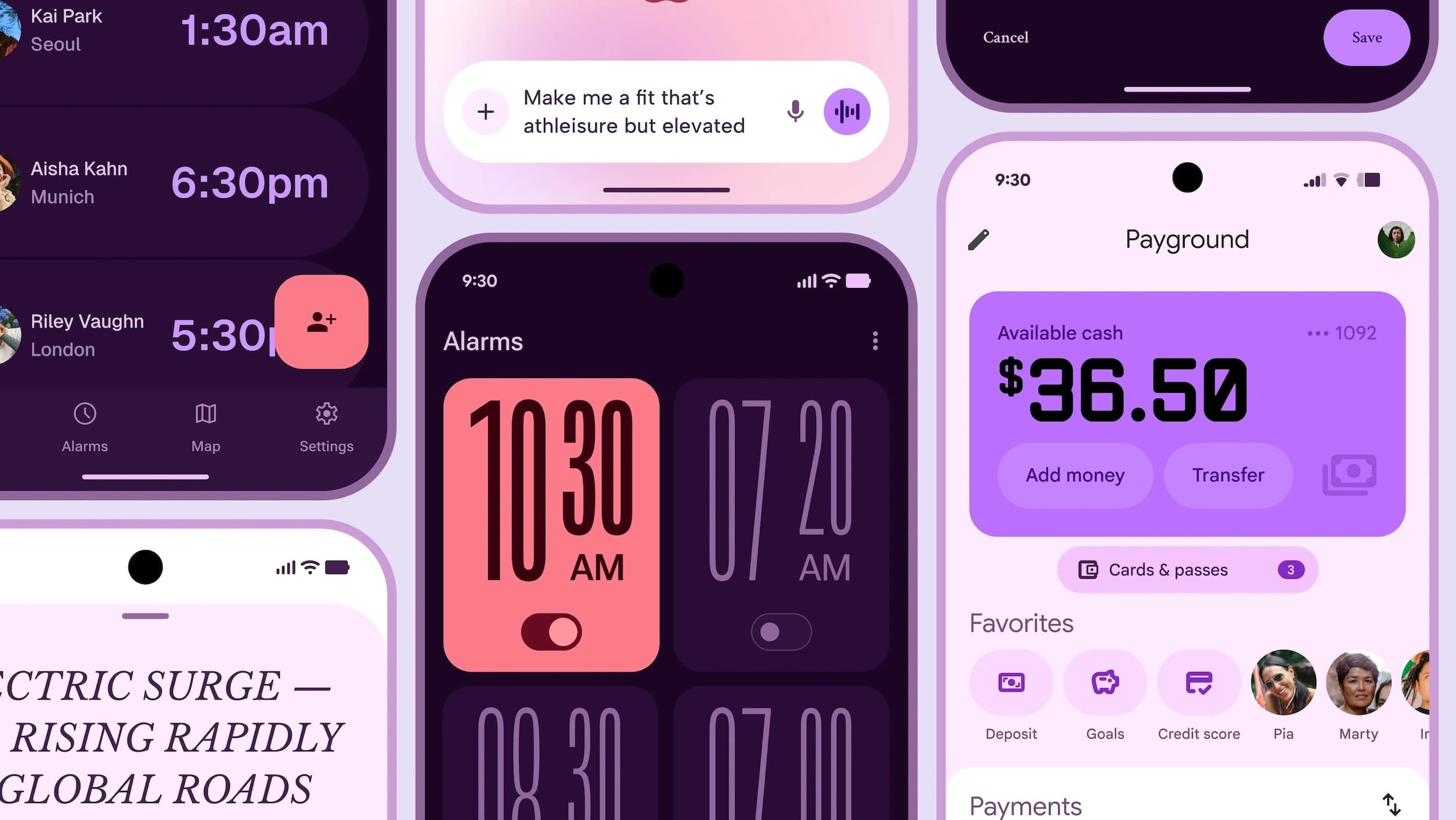
Going through the images, we can also see common elements like floating toolbars with rounded corners that give more prominence to the background, and a whole lot of purple iconography, with pink/red accents to highlight the important parts.
The result, Google claims, is an interface that is apparently more popular with users than Apple's Human Interface Guidelines for iOS developers. Material 3 Expressive is supposedly seen as "cooler," too, according to Google's testing.
Prepare for dilution
It's a little confusing to see that the previous Android 16 design leak, with its new status bar icons, new fonts and shapes and big rework of the quick settings shade, looks nothing like this. But remember that Material 3 Expressive is only a concept rather than a specific roadmap for Android interface design.
Expect to see a watered-down version of this slowly appear separately from the rollout of Android 16, perhaps making its first big entrance just in time for the Pixel 10's launch, like we saw with the Material You design and the Pixel 6 series in 2021.
We'll have to try Android 16 and Material 3 Expressive-based apps for ourselves to know for sure how Google's changes have impacted Android's look and usability. But with the Android Show coming on May 13, and Google I/O on May 20, there's hopefully only a couple of weeks to wait until we can do that.