Purple Rain, Paint it Black, Red Red Wine — some of the most iconic songs of all time are intrinsically linked to color. And, in my mind at least, yellow belongs to Coldplay — sorry to The Beatles and their submarine.
However, what tint, tone, or shade of yellow the band's best-known song brings to mind is another question. I think I've always been led by the slightly haunting melody of the song and the picture of the overcast beach from the Yellow music video into imagining it as something quite pallid, but as Jane Boddy, the creative director at the Pantone Color Institute and Livingetc's own color expert, points out: "Really, it's a song of optimism and feelings of love, joy, and happiness."
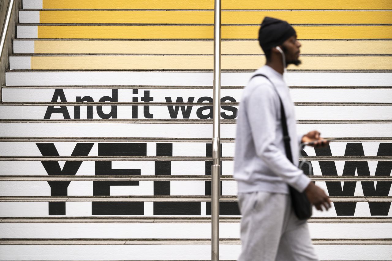
To mark 25 years of the song, and to coincide with Coldplay's headline shows at Wembley starting this week, color forecaster Jane has created a new installation for the steps at Wembley Park, inspired by Yellow. Not only in lyrics, with the steps emblazoned with "And It Was All Yellow", but a rolling gradient of yellows that match the emotional peaks and troughs of the song.
Undoubtedly, you're about to see these yellow steps all over your Instagram feed for the next week, but want to know the secret behind them? I asked Jane to walk us through the process, what the color yellow means to her, and decide once and for all: what color actually is 'Coldplay Yellow'?

At first glance, this installation, named 'Yellow 25', might just look like a Pantone color chip, customized for Coldplay's tenure at Wembley; however, each step is a very specific yellow color, corresponding with the journey of the song.
"I listened to the song a lot, and carefully mapped out its structure," Jane tells me, "identifying the chorus, verses, and the bridge." From there, the color expert "tracked the emotional progression within each section: starting softly, and gradually building. Based on this, I selected nuanced shades that corresponded to these emotional states, drawing on the psychological associations between colors, lyrics, and the music itself."
Think of it as color psychology in action.
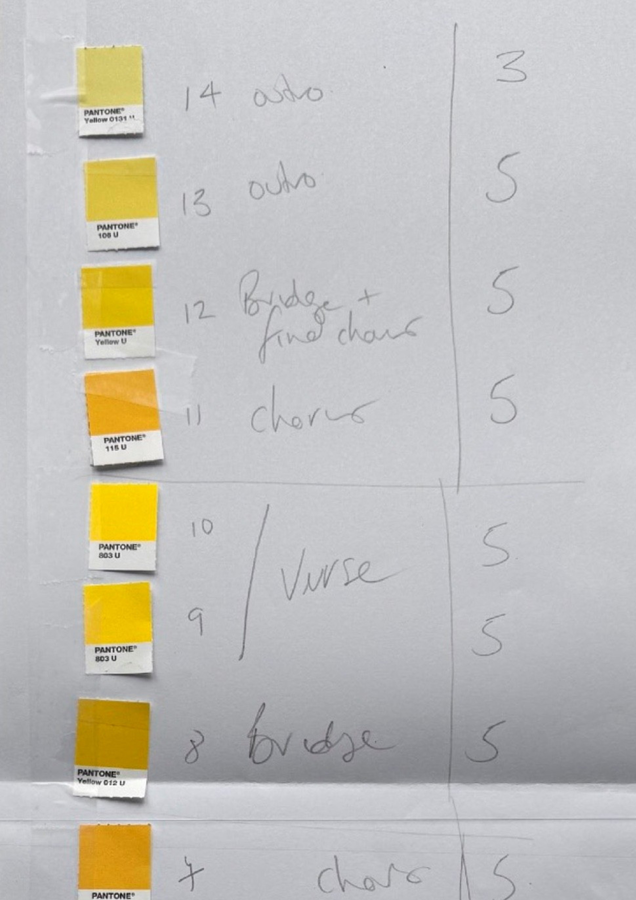
"At the beginning, the yellows are muted and pale, soft like first light, reflecting the tentative and vulnerable opening of the track," Janes explains. "As the verses unfold, the tones become brighter and more defined, echoing the song’s growing emotional clarity. The chorus bursts into rich, saturated golds, glowing, immersive and full of intensity, capturing the raw sincerity at the heart of the song."
"The bridge rises to peak brightness, almost electric, a dazzling yellow that conveys the emotional climax where the music feels too powerful to contain. From there, the tones ease back into steady, glowing hues, carrying warmth and continuity as the energy begins to settle. The outro returns to gentler shades, but with new resonance, a golden haze that feels resolved and content."
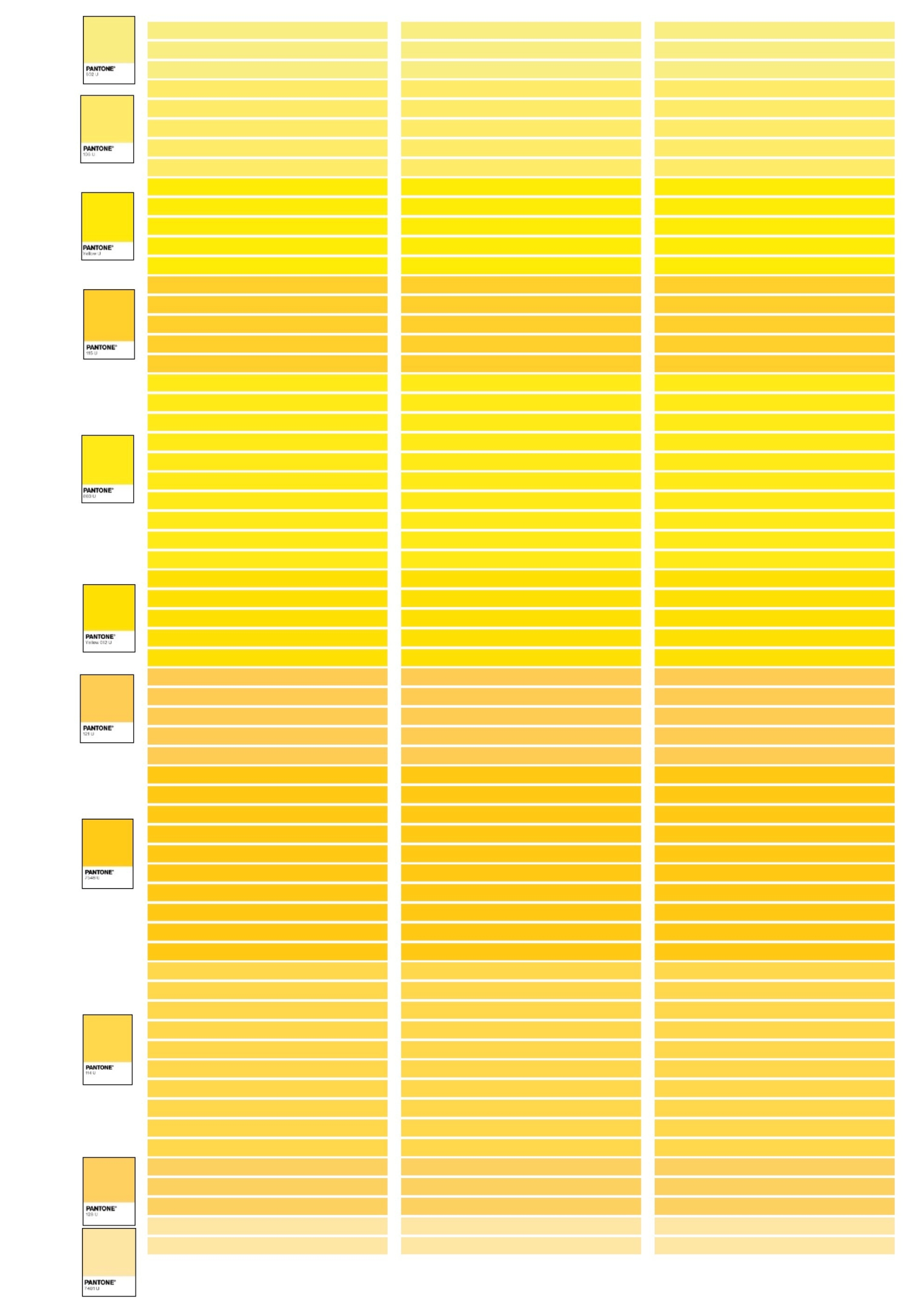
According to Jane's sketches, there are 14 different yellows used in the installation, but which is the true hue of 'Coldplay yellow'? "I think I would take Yellow U — to give it its Pantone name. This level represents the bridge where the music and lyrics reach peak happiness."
It's a color that lends itself equally well to joyful interiors, too — in fact, it's almost a perfect match for our yellow color trend Mid-Summer Citrine.

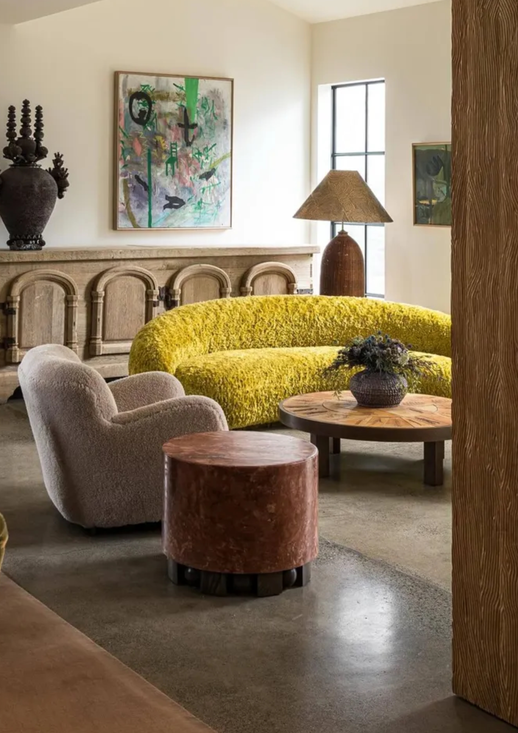
I love the boldness of this color in combination with other saturated colors.
Joyful stripes and bright sunshine yellow capture the spirit of this shade.
Bright yellow gets brighter thanks to an atmospheric table lamp.
The stepped design of this vase feels appropriate for recreating the feel.
Go big on yellow with a statement side table to bring energy to your space.
Yellow is such an emotive color, that it's no surprise it creates such a connection through a song, or installation, like this. "I think people often picture one single shade when they think of yellow, but it’s so much more layered than that," Jane says. "Lighter yellows can feel gentle and uplifting, while deeper, richer yellows have a completely different kind of energy. With the steps, I wanted people to experience that range for themselves and maybe walk away seeing color in a more nuanced way."
The immersive aspect was at the heart of the project from start to finish. "For me, the most important part was capturing the feeling of the color and visualizing the connection between the song and the different levels of yellow. I wanted people to experience it in a way that feels almost like stepping inside the song itself."