When you move into a new home, the chances are your taste in decor will differ from that of the previous owners. So when Jess and husband Oliver, along with their two children, bought their four-bedroom Victorian terraced house in Hove, East Sussex, and found the decor to be lacking any personality, they decided to make their own mark on the space.
They began by stripping back all the decor to neutrals, built an open-plan extension at the rear of the house, then began to add colour to each room to make the family home the joyful space it is now.
Here, Jess talks us through each room and what they did to make it truly theirs...
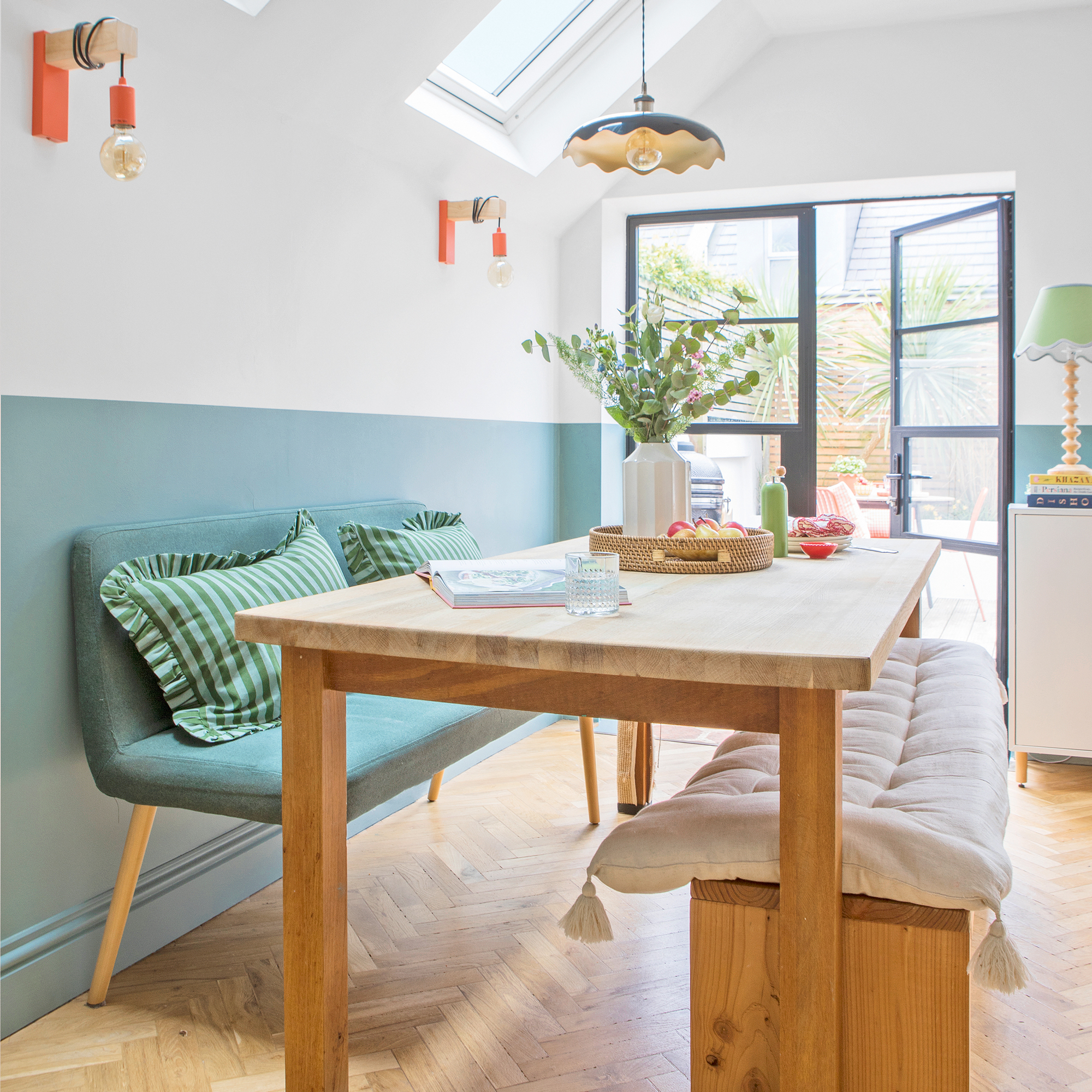
‘Painting the lower half of the walls in Farrow & Ball’s Sardine estate emulsion, a gorgeous soft blue, was a practical decision to hide the children’s grubby marks, but it’s also made the room feel warmer and more inviting.'
'The tone works beautifully with the orange accents and pops of colour, creating a lovely balance of style and practicality.'
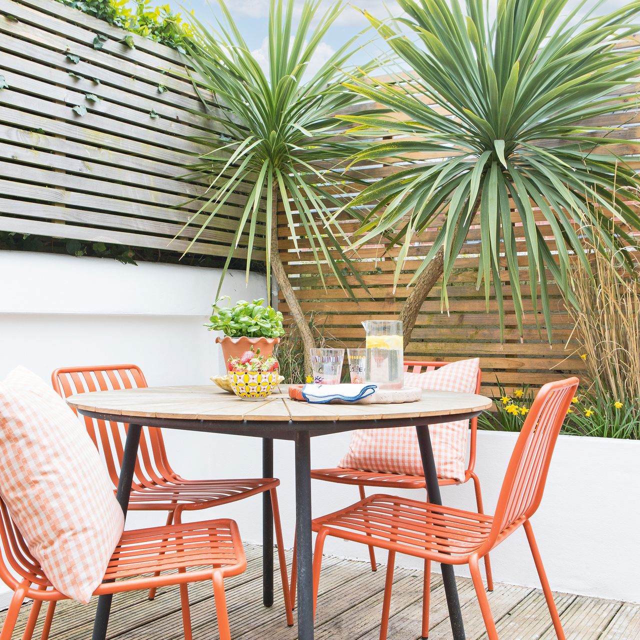
‘Our old galley kitchen was completely separate from the dining room, which didn’t work for our growing family. We knew we needed a more open and practical space, so we added a side return and reconfigured the downstairs layout, transforming it into a spacious family area.'
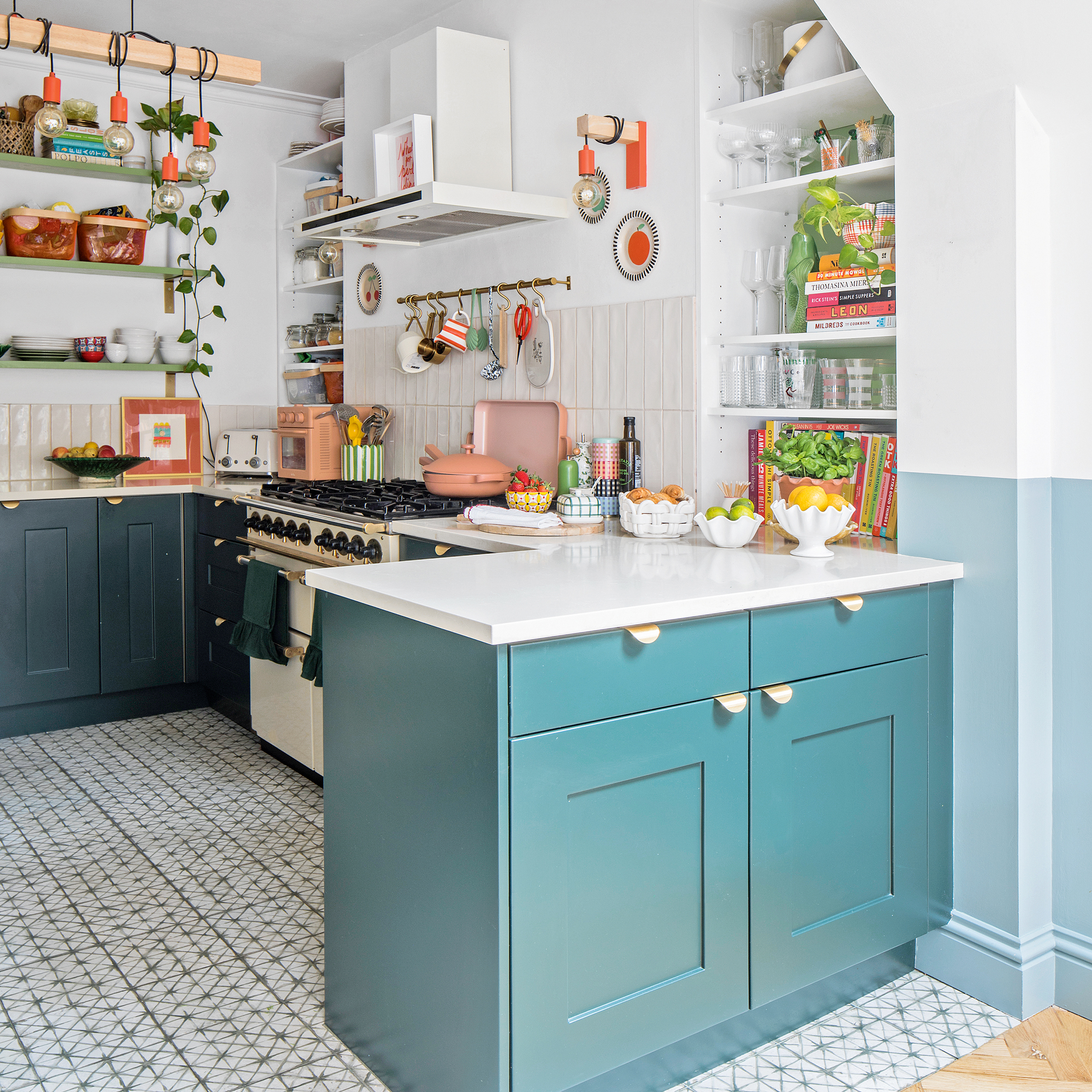
'It was important to me that I could cook and still keep an eye on the children, so the kitchen was designed with a peninsula, which naturally separates it from the rest of the room, but keeps the feeling of space, with easy access to the dining table and the rest of the living space.
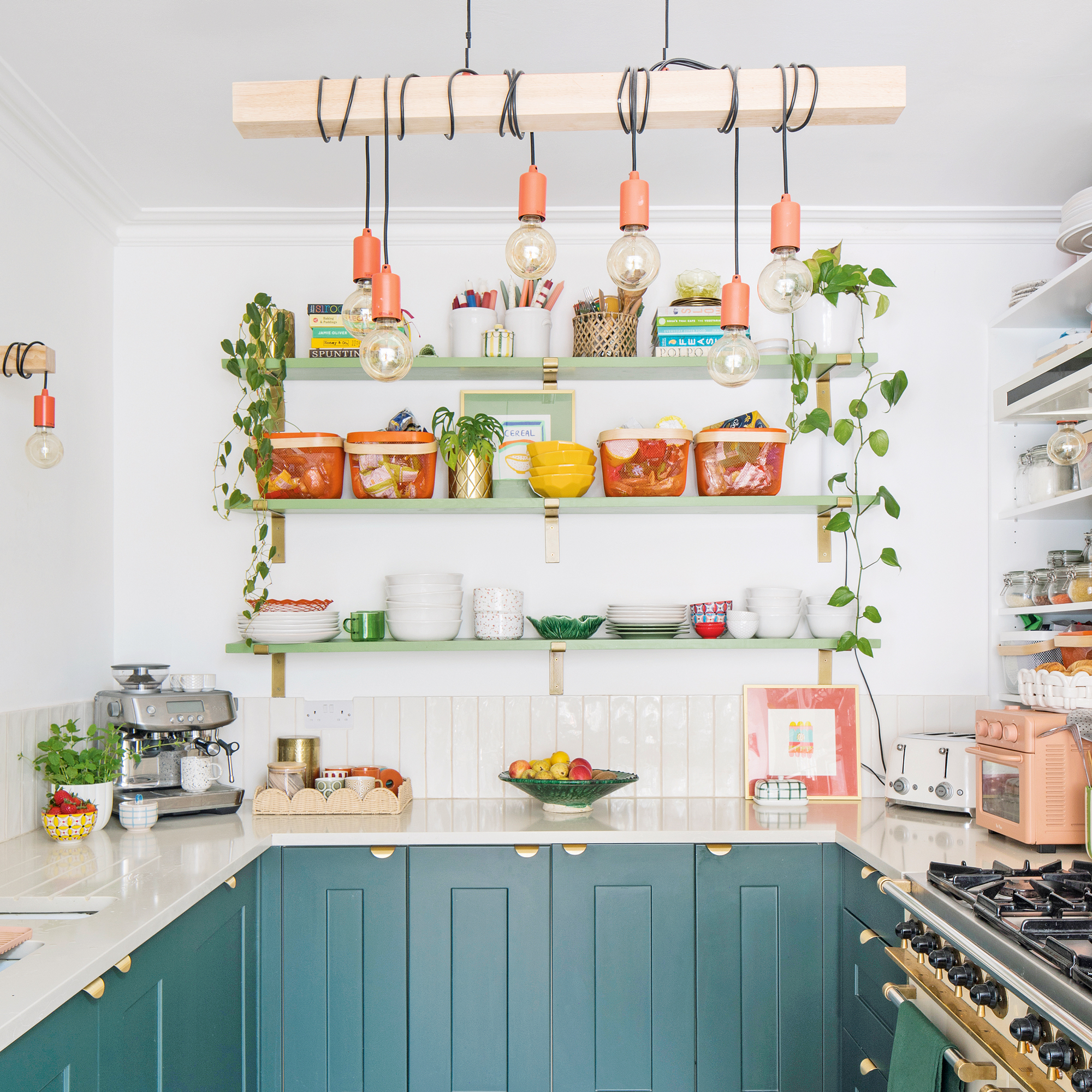
‘Oliver and I really thought about how we wanted our kitchen to look and work for us. I didn’t want wall cupboards cluttering up the back wall, so we decided on a mix of fitted cabinetry and built-in shelving.'
'The wooden shelves are painted in Farrow & Ball's Yeabridge Green estate eggshell, and have brass brackets to match the kitchen handles. They're perfect for storing jars and baskets, keeping everything in easy reach.'
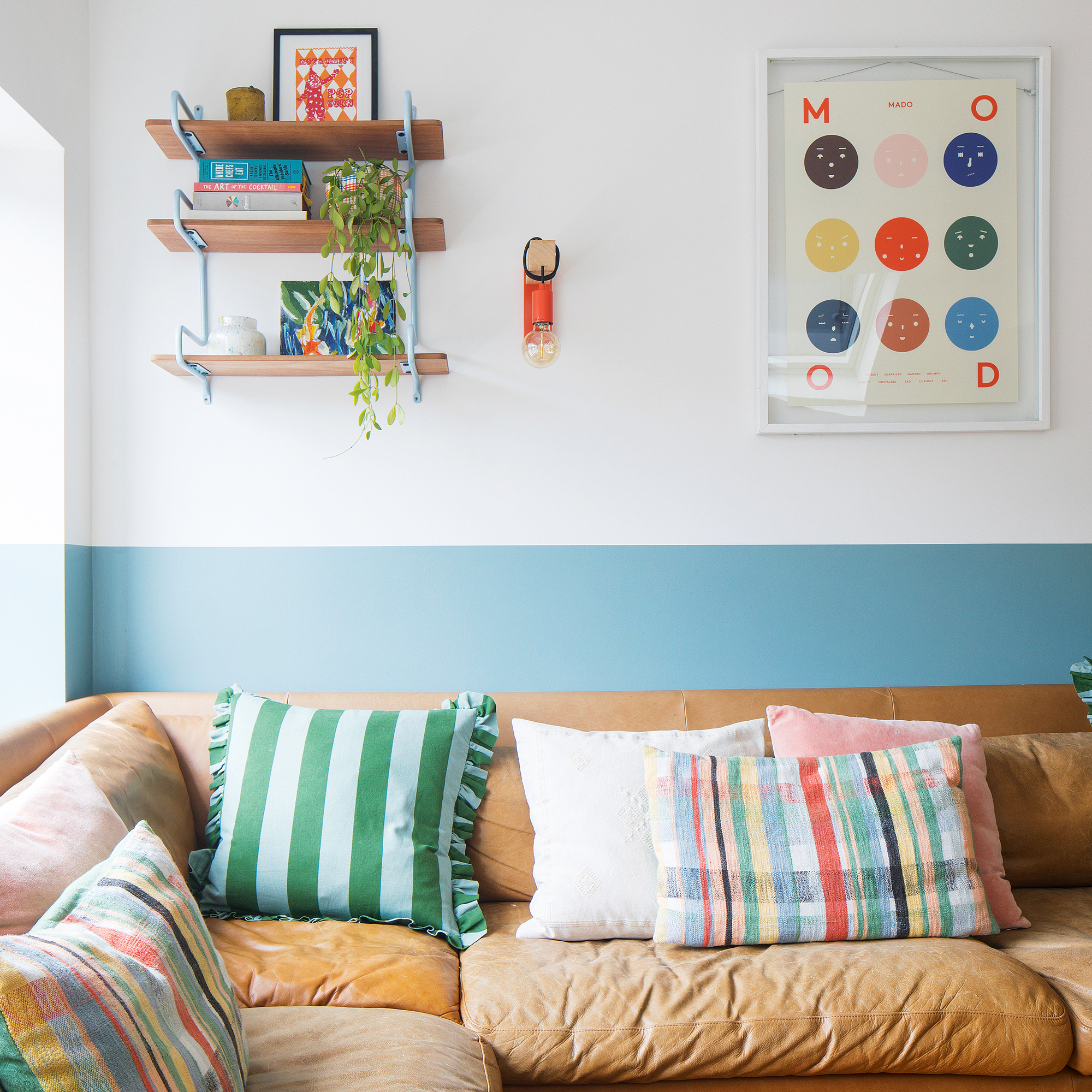
‘Throughout our home, the walls are filled with artwork I’ve collected over the years – mostly modern, playful prints or bold typography. Each one adds lovely character to the space, making our home feel personal and full of life.’
'The leather sofa - the Eton sofa from Habitat- came with us from our last home. It gets jumped on all the time, and the table is always covered in arts and crafts. It’s the perfect space for family life - relaxed and easy to live in.'
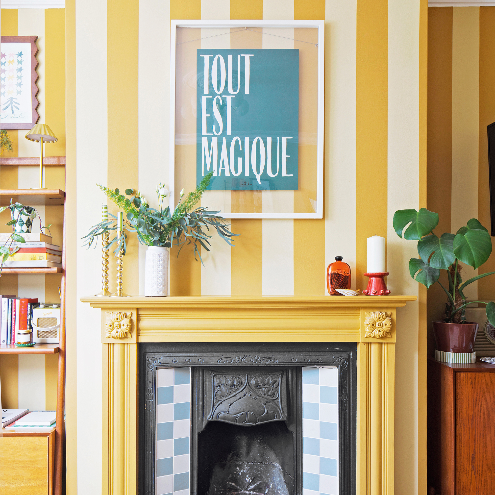
‘We had a decorator coming to paint the room, and in a rush, I picked the pale yellow colour without testing it first. When it was finished, it didn’t feel right at all.'
'I tend to gravitate towards neutral shades with bold pops of colour, so I came up with the idea of adding the darker yellow stripes to make it more interesting and save us from having to redecorate the whole room.'
'The woodwork then followed, and we recently retiled the fireplace in these blue and white square tiles, which adds another layer of interest.
Walls in Hay and India Yellow, both Farrow & Ball.
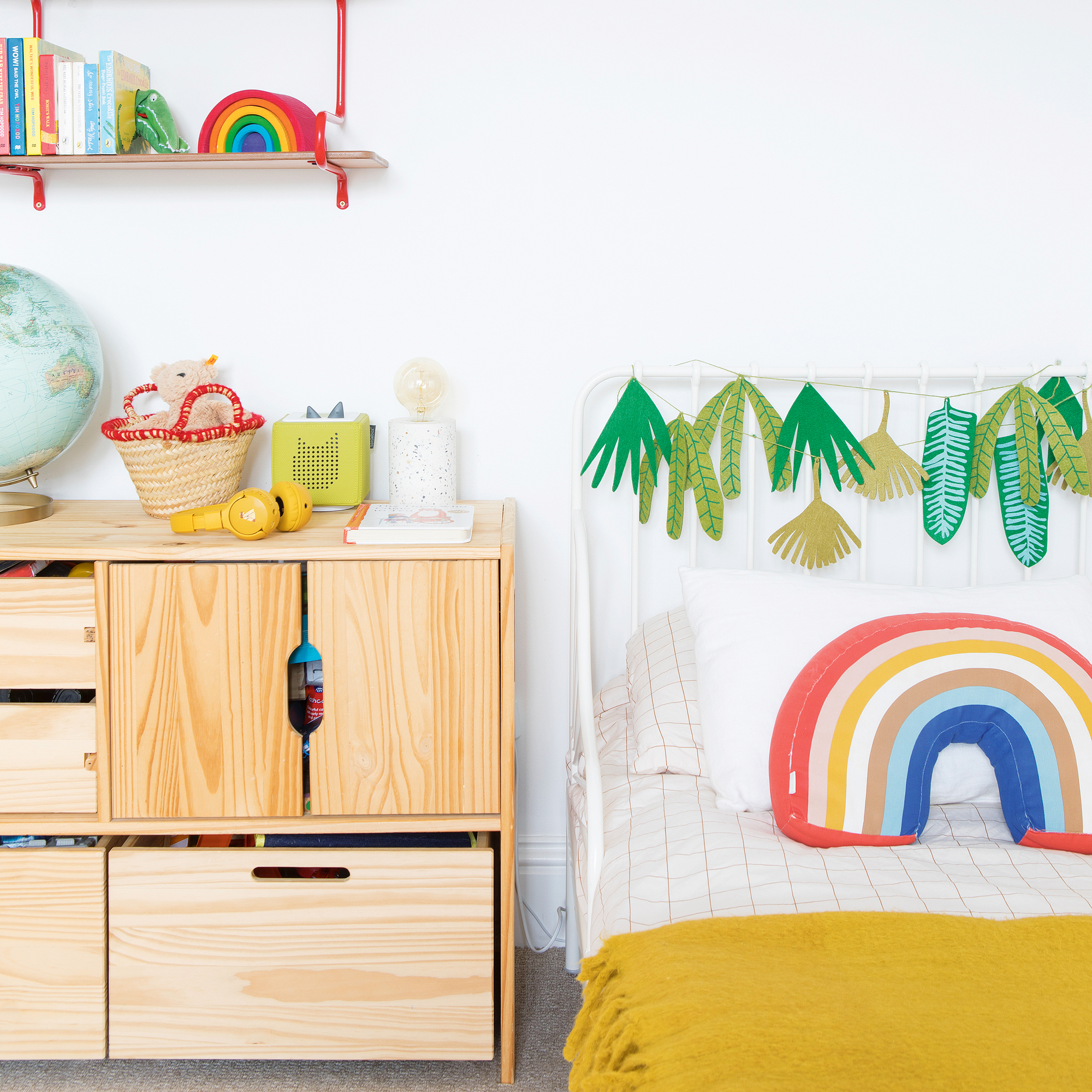
‘This bed area is a cute little corner – simple but full of character. We kept the walls fresh and neutral to let the colours pop, with plenty of natural wood to add warmth and softness.'
'I also included some fun touches, such as the rainbow cushion and hanging fabric leaves, for a nature-inspired feel that can easily be updated as the space evolves.’
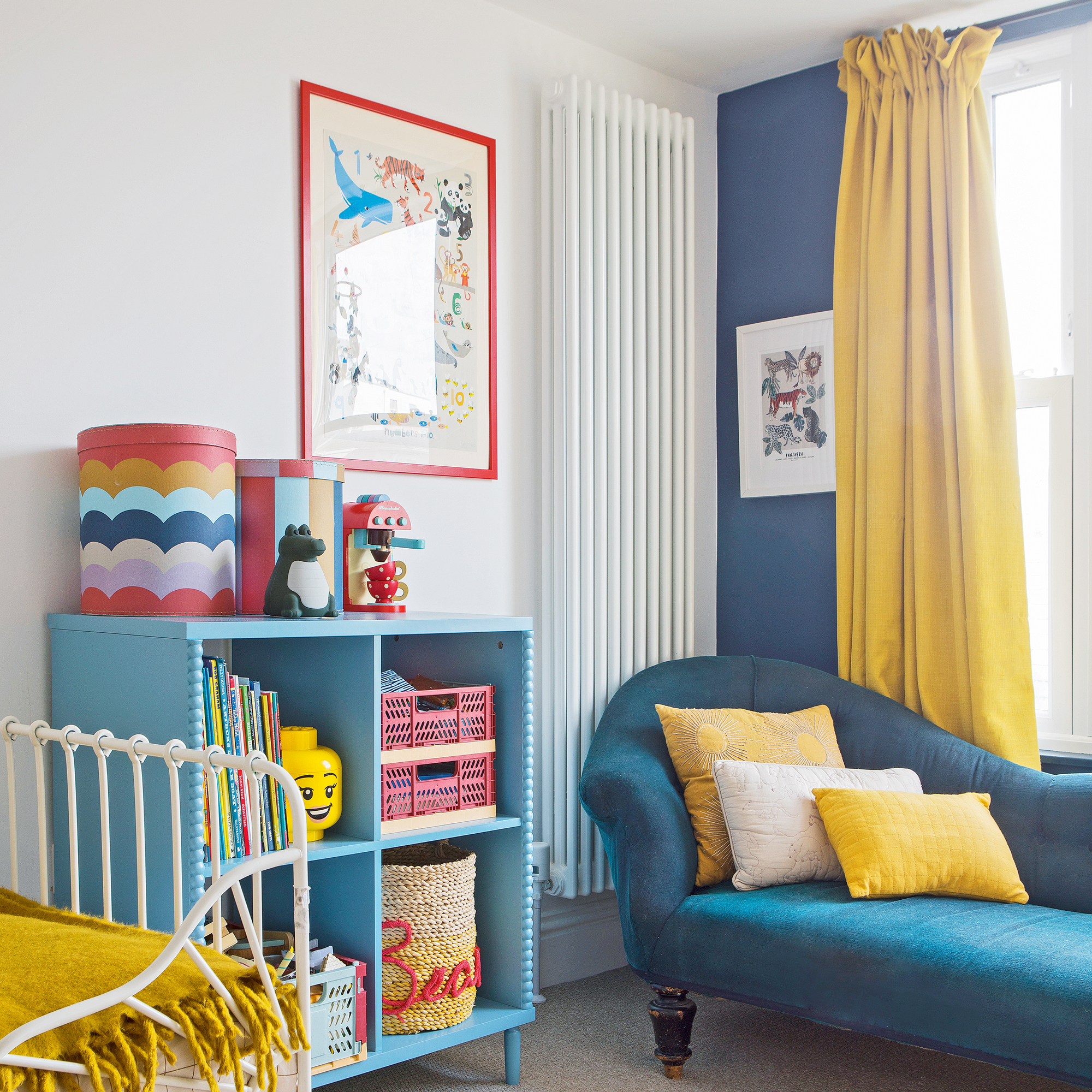
‘We added plenty of easy-to-reach toy storage ideas for our son to keep his things organised. The chaise longue used to be Oliver’s mum’s, and I painted it in navy fabric paint. It’s a lovely spot for us to curl up with a book together before bedtime.'
'We chose a deep blue for one wall to add depth, then brought in mustard yellow through the curtains and soft furnishings, along with some playful patterns to keep the room feeling warm and cheerful.’
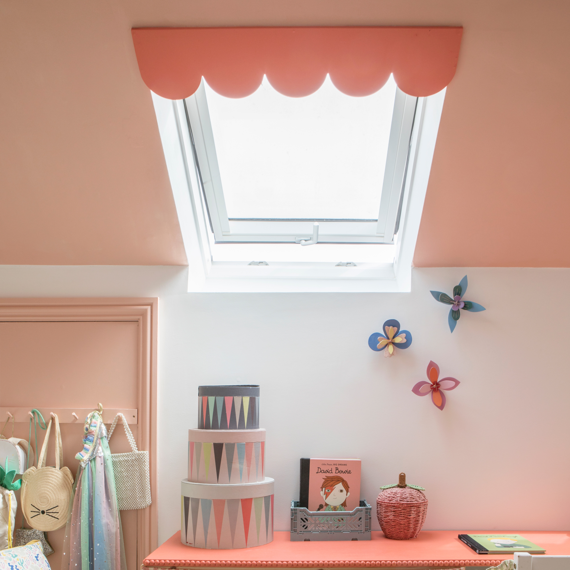
‘We wanted our daughter's loft room to feel soft and charming without being overly pink. To highlight the sloping ceiling, we used a warm peachy shade and added a scalloped detail above the skylight to create a sweet pelmet effect.’
'For the built-in desk, we used Ikea storage units topped with a run of MDF, which I customised in the same peach and finished it with a delicate bobbin trim to elevate the design and add some character.'
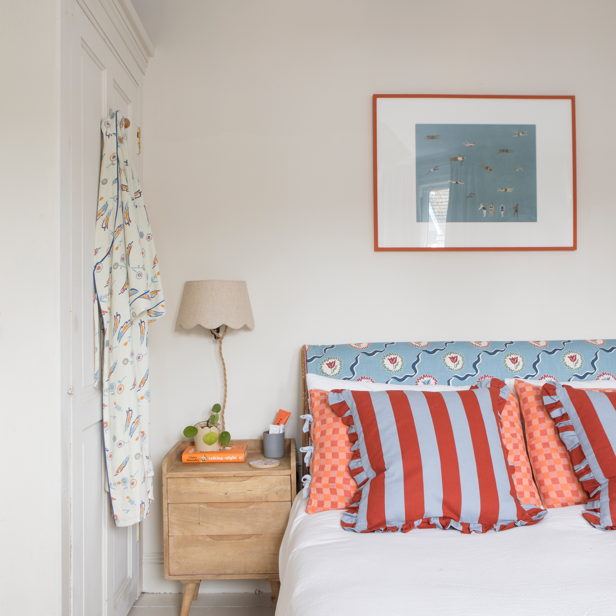
‘We wanted our bedroom to have the look and feel of a boutique hotel bedroom and be a calm retreat away from the rest of the house, which can get a bit chaotic with two young children.'
'We kept the decor neutral, adding texture and pattern to bring the space to life. Most recently, I reupholstered the bed in Ottoline's Tulips of Belgravia fabric with bold red circus piping.’
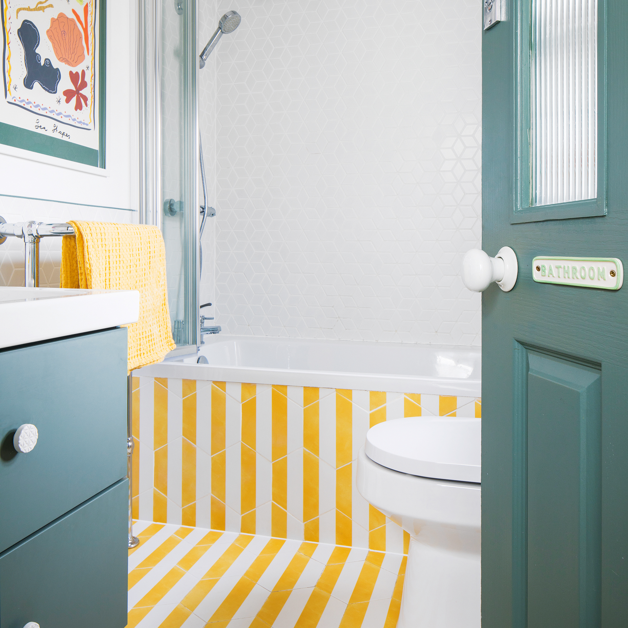
‘Green and yellow feature all over the house, so it felt only right to bring these colours into the children’s bathroom.'
'I wanted something bold but fresh, and I fell in love with these striped hexagonal tiles by Ca'Pietra – they add such a fun and playful energy to the space. We carried them up the side of the bath to create a striking feature.’
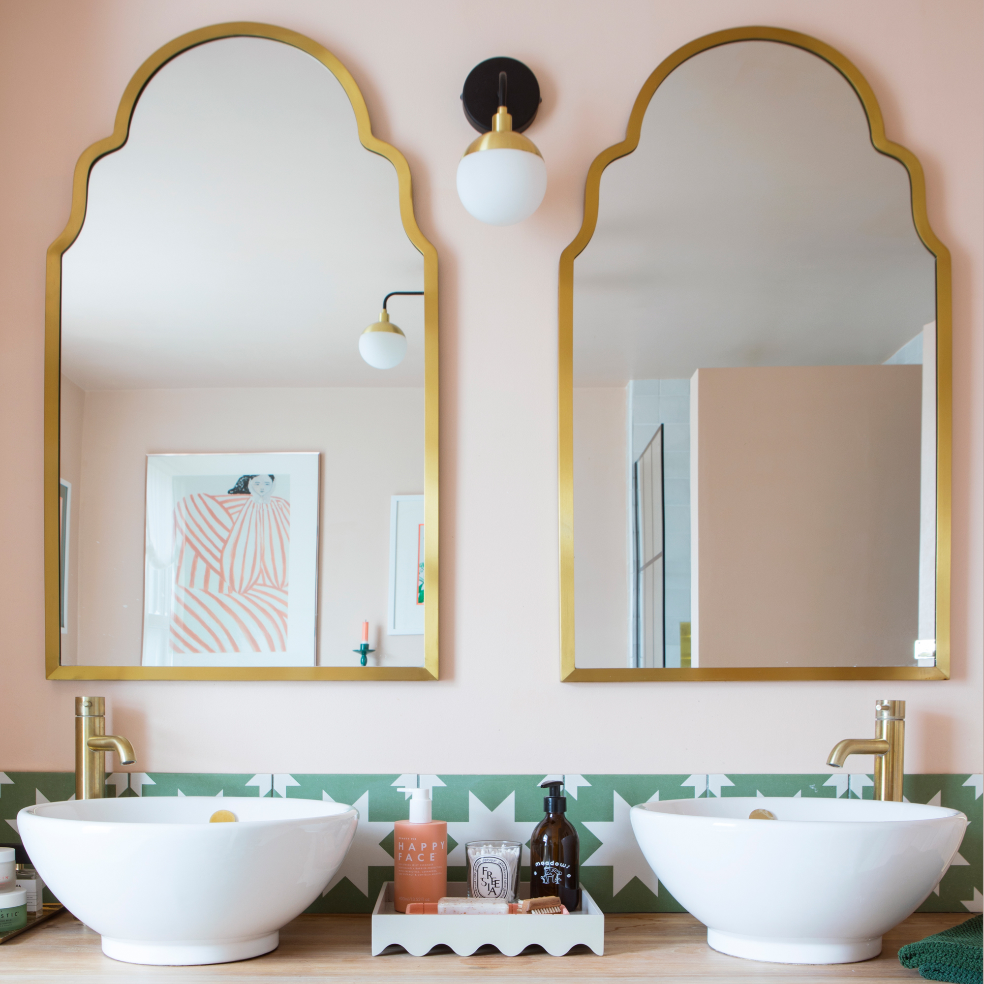
‘I’ve always loved pink and green together, so it felt like the perfect colour combination for our bathroom. We painted the walls and ceiling in a soft blush shade to make it feel warm and cocooning, and the moment I found the Livid Pradena tiles, from Bert & May, I knew they were the ones.'
'They add the right amount of contrast against the pink, and are a nod to our adventures in Morocco before the children. The brass elements bring a touch of luxury into the scheme and tie everything together beautifully.'
Journeyman Zellige White wall tiles, £54sq m, Baked Tile Co