Creating a home that feels mood-boosting is something we all want. While many aspects of home decor will have an impact on how the space feels, color is arguably the most significant.
Although color is personal to each of us, there's no question that color psychology plays an important role in affecting how we feel – whether that's calming, uplifting, or energetic. It can, however, be tricky to know where to start when choosing your color schemes with a specific mood in mind.
We spoke to Lick's color psychologist and director of interior design Tash Bradley to lean into her advice surrounding happy colors. She explains how to choose color schemes that feel mood-boosting, yet equally liveable. If you're someone who's not used to decorating with color then fear not, you can still create happy rooms without any garish hues.
1. Choose 'happy' colors
When considering colors that are known as being 'happy', Tash explains that this is subjective and varies from person to person: 'Happy colors are colors that you love and that bring you joy whenever you’re around them. Our association with and response to color is subjective, so it’s important to choose colors you connect with and experience a positive physical and emotional response to when you’re around them.'
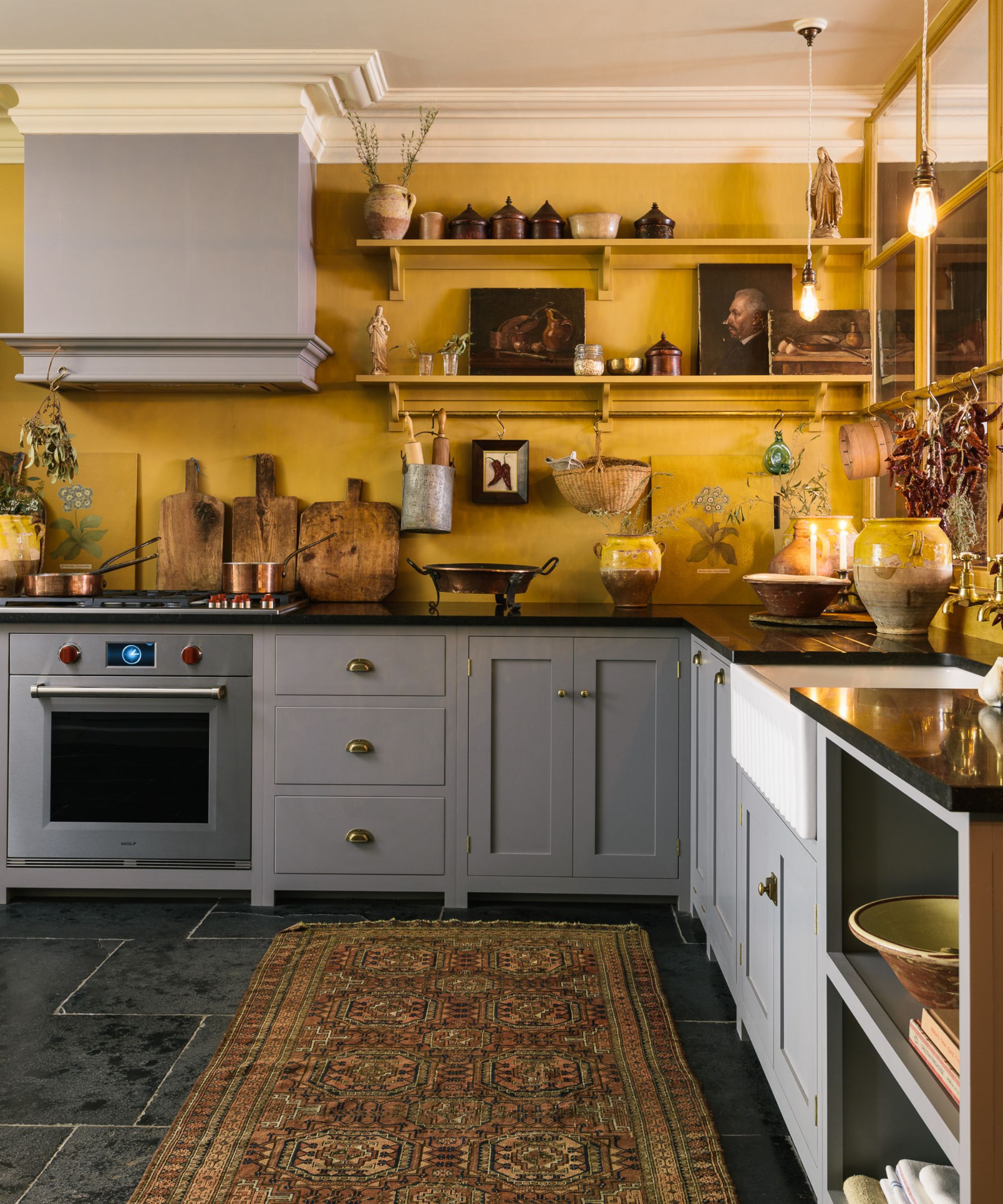
'Saying that, according to the principles of color psychology, happy colors are typically bright and warm with pink or yellow undertones. This is because pink – the color of cuddles – has the ability to physically soothe, while yellow – a dose of sunshine – is packed with positivity and energy.'
'From cozy baby pinks like Lick's Pink 04 and warming yellows like Yellow 05 to calming greens like Green 09, incorporating these colors into your home can make you feel more optimistic, open, and even happier.'
2. Add bolder colors as accents
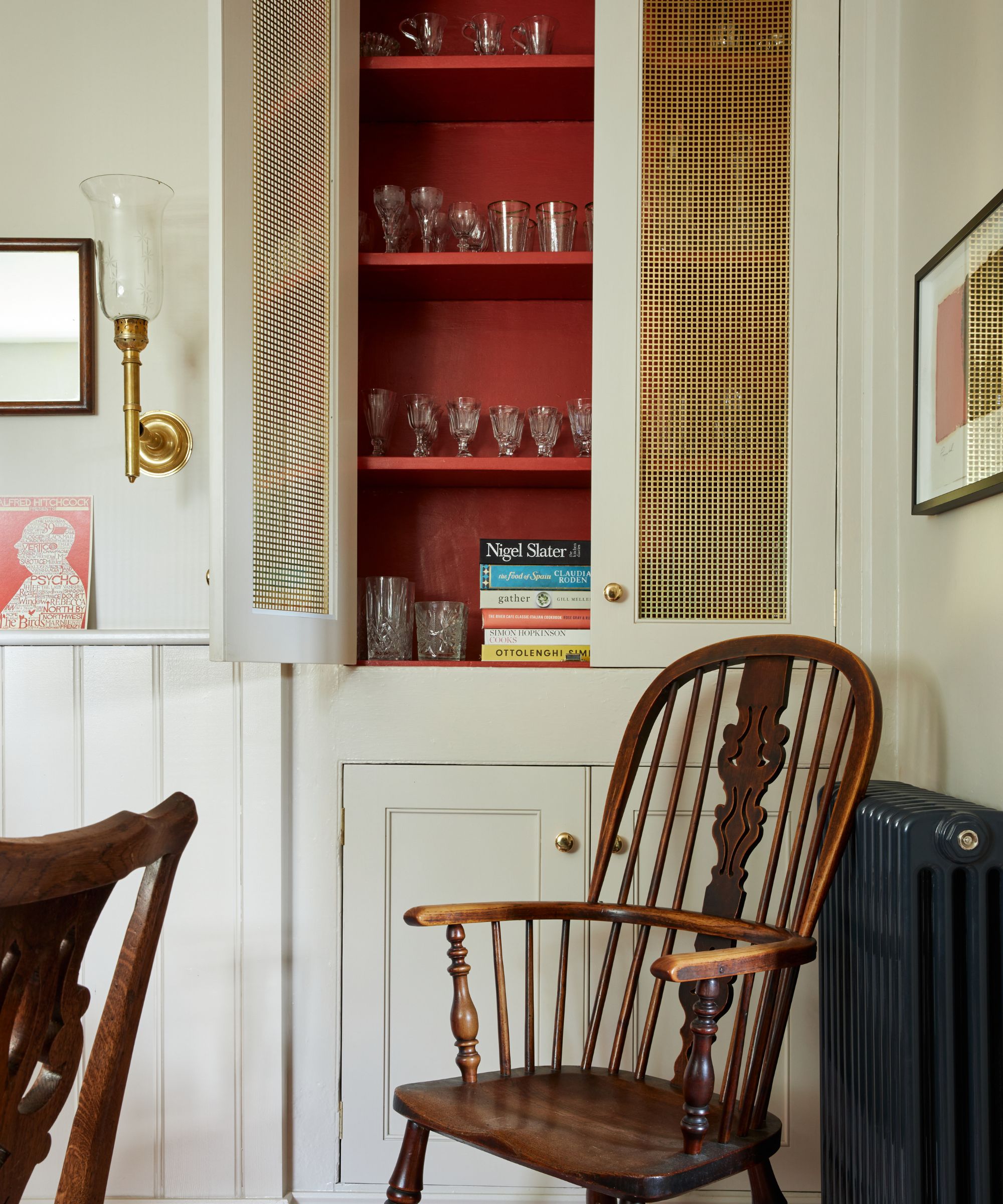
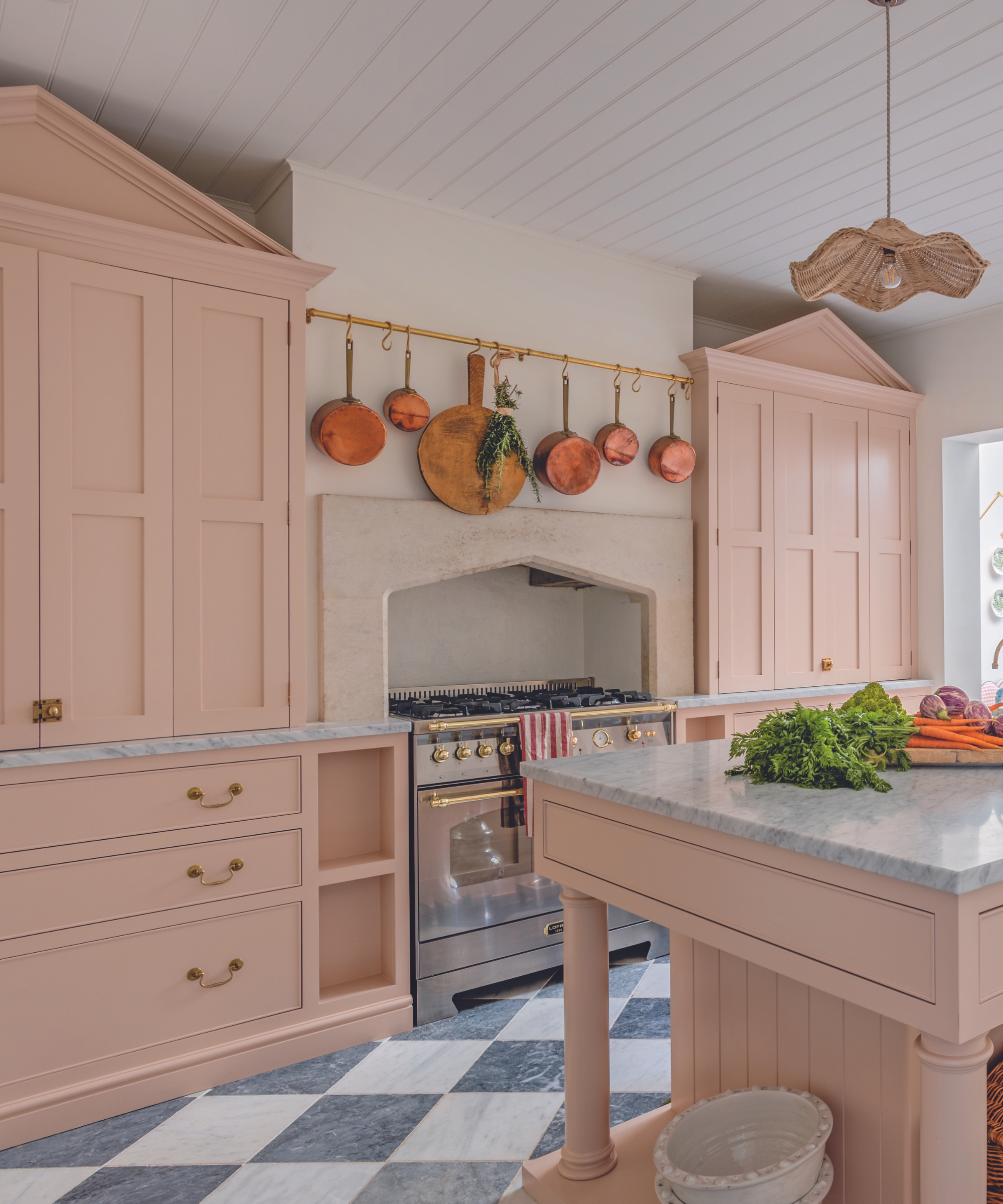
Decorating with happy colors doesn't need to mean going all out and color-drenching the whole room. While some color lovers may adopt this approach, those who are more drawn to decorating with neutrals may find incorporating even a small dose of color daunting. But, it's quality over quantity when it comes to color. Even adding a subtle amount of color through small accents can have a big impact, as Tash explains below:
'As we’ve seen with the unexpected red theory, you can still bring bursts of happy colors into your home without compromising your neutral color scheme. If you love neutrals, try introducing brighter colors as accents by painting a console, door frame, or the inside of a cabinet for a lovely surprise whenever you open it.'
'If you love traditional neutrals and are keen to keep your walls white, thanks to its warming yellow undertones, gentle White 03 is the perfect white paint to pair with brighter, more uplifting colors. It will bounce light around a room and can even make a space appear bigger.'
3. Turn to nature-inspired hues
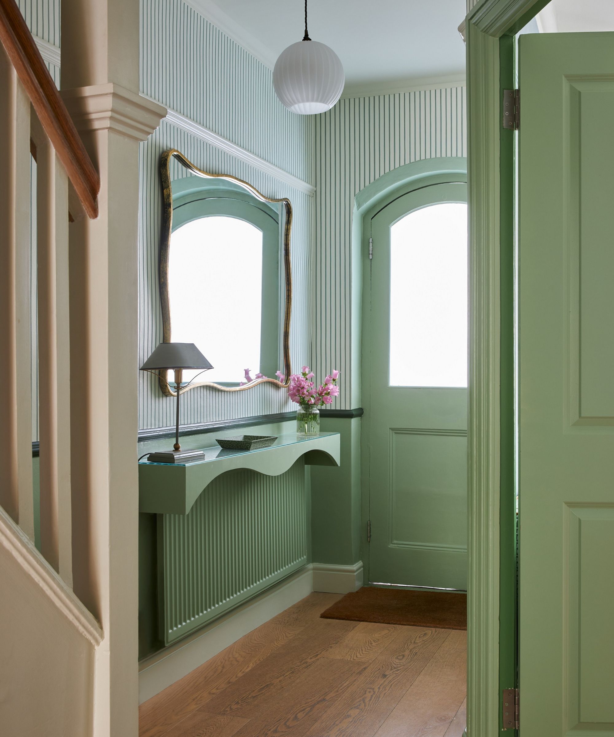
For pared-back schemes, decorating with mood-boosting colors isn't just about brightly colored accents. For schemes that feel wellness-boosting, reconsider your palette of neutrals for a more subtle take on happy colors.
'It’s also important to note that neutrals do not just come in white and you can bring uplifting colors into your home that still feel and look neutral,' explains Tash. 'Green is often referred to as nature’s neutral. It connects us to the natural world and helps us to unwind. As delicate as spring buds on trees, Green 09 fills you with the same feelings of hope and new beginnings. With a dash of yellow, it’s instantly uplifting yet still soft and gentle. Paint your woodwork or your kitchen cupboards for a rustic feel or in a bedroom or living room to create a serene space.'
Or, if you prefer soft pinks, these hues can create a similar soothing feel: 'A cuddle in a paint tin, Pink 01 is a gorgeously subtle pink, a modern alternative to traditional neutrals and a warming alternative to off-white. Perfect in a living room, bedroom, or nursery – in fact, you could use this pink anywhere in your home. It will brighten up a room whilst creating a cozy, inviting feel.'
4. Choose colors appropriate for each room

'It’s important to consider how you use each room and how you want to feel in it,' explains Tash. 'Happy paint colors mean different things in different spaces. In your bedroom, for example, feeling calm and rested might be what makes you the happiest at the end of a long day, when you want to unwind with a good book. For that, I’d suggest reaching for a warm green with yellow undertones.'
'Alternatively, in a bathroom where you want to start the day feeling mentally refreshed, look for sky blues like our Blue 08. Warm, vibrant, and full of vitality, this blue can stimulate and awaken the mind, and its breath-like, airy feel will simply blow the cobwebs away.'
'Whether you’re creating a color scheme for a whole home or a singular room, look at how the colors interact with one another. We never see color in isolation. Offset brighter colors with softer tones or natural woods if you want a balanced space. Or if you want to envelop yourself in happy paint colors and are not afraid of going bold, try color drenching.'
5. Avoid overly saturated hues
As mentioned earlier, color is personal and it all comes down to decorating with the colors that you're naturally drawn to. However, some colors are known for being overly stimulating, which you may find negatively impacts the mood of your home, as Tash explains:
'According to color psychology, some colors are known to be overpowering and stress-inducing if used in large quantities and not offset by softer tones. Primary colors are a perfect example of this. Due to their high saturation, they demand your attention and can feel physically intense in interior spaces. A room color-drenched in primary red, for example, may produce the negative psychological traits of the color, making you feel anxious and overwhelmed. It’s important to incorporate them in small doses for a burst of joy and optimism.'
When decorating with color to create a home that feels happy, make sure to think about which hues bring you the most joy. Of course, color psychology plays an important role but first and foremost, you should embrace the colors you're drawn to for a personalized, mood-boosting space.