The field of user interface design has gained more popular recognition in recent decades, largely due to mobile apps. The generally accepted UI design rules emphasise clarity, consistency, accessibility, with the aim being to ensure users can quickly understand and navigate an interface.
The consensus is that a well-designed UI reduces cognitive load and guides attention through visual hierarchy. But is Gen Z's obsession with anti-design turning everything UI designers have studied on its head? A viral social media post has got people talking.
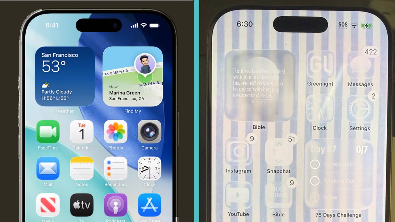
Writing on X, one designer challengers millennials who think they understand the next generation of software users to consider a photo of his 16-year-old daughter’s iPhone. He later suggest the layout could be considered a "study in anti-a11y" (accessibility, for those not familiar with developer numeronyms).
The picture shows an iPhone customised to display clear app icons against a striped background that seems to have been chosen specifically to make scanability as difficult as possible. For those people who complain that the Google icons all look the same and make it hard to find the app you want, this is not a layout for you.
Some of the people commenting have come up with some amusing descriptions for what the layout choice looks like, from "OLED burn-in theme" to a dead display matrix.
But it seems that such intentionally difficult design is a bit of a trend among generation Z. "My daughter did this exact thing to our family iPad and it’s unusable now," one person writes. "I thought my daughter was just extremely odd. Didn’t know this was a thing," someone else says.
Some have attempted to find a logic behind the contrarian design choice. It's "the next generation’s legitimate attempt to claim 'I didn’t see your message'," one person reckons. "No one over 40 can see what's on the screen," someone else points out.
Others think it's a healthy practice intended to make the phone look less appealing, so the user will look at it less. "They stare at it less. My kid does something similar, it's to limit screen time," one person says.
It may also be that kids just like the aesthetic. Y2K nostalgia has been big in recent years, this does feel a bit like it's turning back time to the busier, noisier and more personal style of the early internet.
Whatever the reason, it also suggests that younger digital natives are so familiar with their devices that muscle memory is starting to make visual UI less important.