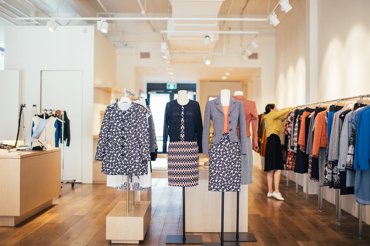
Have you ever walked into a grocery store for just a few items and left with a cart full instead? You’re not alone. Retailers are experts at using store layout changes to make you spend more. The arrangement of aisles, displays, and even the placement of products is designed to influence your decisions. Understanding these strategies can help you stick to your shopping list and avoid unnecessary purchases. In this article, we’ll break down nine common store layout changes designed to make you spend more, so you can shop smarter and keep more money in your pocket.
1. Placing Essentials at the Back
One of the oldest tricks in the book is putting everyday essentials like milk, bread, and eggs at the far end of the store. To get what you need, you have to walk past a maze of tempting displays and aisles filled with products you didn’t plan to buy. This layout change is no accident—it’s a calculated move to increase your exposure to as many items as possible.
By forcing shoppers to traverse the entire store, retailers hope you’ll grab extra snacks, drinks, or household items along the way. Next time you shop, notice how much you’re exposed to before you reach your essentials. This is a classic example of store layout changes designed to make you spend more.
2. Eye-Level Product Placement
Have you noticed that the most popular or expensive brands are always at eye level on the shelves? Retailers know that products placed at eye level are more likely to be noticed and purchased. Cheaper or store-brand options are often placed on lower or higher shelves, making them less convenient to reach.
This subtle layout change influences your buying choices without you realizing it. If you want to save money, look up or down—sometimes the best deals are hidden away from your direct line of sight.
3. End Cap Displays
The displays at the ends of aisles, known as end caps, are prime real estate in any store. These spots are used to feature new, seasonal, or high-margin products. Because they’re so visible, shoppers are more likely to add these items to their carts, even if they weren’t originally on the list.
End caps are a powerful example of store layout changes designed to make you spend more. They often feature bright colors or special offers to grab your attention and nudge you toward impulse buys.
4. Winding Store Aisles
Many modern grocery stores have shifted from straight aisles to winding or maze-like layouts. This design encourages shoppers to slow down and browse, increasing the chances of spontaneous purchases. The longer you spend in the store, the more likely you are to pick up extra items.
Winding layouts can also make it harder to find what you need quickly, leading to more time spent wandering—and more opportunities for your wallet to take a hit.
5. Strategic Lighting and Music
Lighting and music may seem like small details, but they play a big role in shaping your shopping experience. Soft lighting and pleasant music can make you feel relaxed, which encourages you to linger and browse. The more comfortable you feel, the more likely you are to spend extra time—and money—in the store.
Some stores even adjust lighting in specific sections to highlight certain products, making them appear fresher or more appealing.
6. Fresh Produce at the Entrance
Most grocery stores greet you with vibrant displays of fresh fruits and vegetables right at the entrance. This is a deliberate layout change designed to make you spend more by creating a positive first impression. Seeing colorful produce can put you in a good mood and set the tone for the rest of your shopping trip.
Once you start filling your cart with healthy items, you may feel less guilty about adding treats or indulgent snacks later on. It’s all part of the psychology behind store layout changes.
7. Impulse Buys at the Checkout
Checkout lanes are lined with candy, magazines, drinks, and small gadgets for a reason. These are classic impulse buys that take advantage of your idle time while waiting in line. The placement is no accident; it’s designed to tempt you into making one last purchase before you leave.
This is another example of store layout changes designed to make you spend more, especially on items you didn’t plan to buy.
8. Cross-Merchandising
Stores often group related products together to inspire additional purchases. For example, you might find tortilla chips next to salsa, or pasta displayed alongside jars of sauce. This technique, called cross-merchandising, makes it easy to grab complementary items without much thought.
By arranging products this way, retailers subtly encourage you to buy more than you intended. It’s a smart use of store layout changes to increase your total spend.
9. Frequent Rearrangement of Aisles
Have you ever felt frustrated when your favorite items are suddenly in a new spot? Stores regularly rearrange aisles and product placements to keep shoppers on their toes. This forces you to explore new sections of the store, increasing the likelihood that you’ll spot—and buy—items you might have otherwise missed.
This constant change is a prime example of store layout changes designed to make you spend more, as it disrupts your routine and encourages exploration.
How to Shop Smart Despite Store Layout Changes
Knowing the tricks behind store layout changes designed to make you spend more can help you shop with confidence. The best defense is a solid shopping list and a clear plan. Stick to your list, be mindful of impulse buys, and take a moment to look for deals that aren’t front and center.
If you want more tips on saving money at the grocery store, check out these grocery savings secrets or learn about how stores influence your purchases. Remember, you have the power to outsmart even the most clever store layout changes designed to make you spend more.
What layout tricks have you noticed at your favorite store? Share your experiences and tips in the comments below!
What to Read Next…
- How Grocery Store Layouts Influence Your Shopping Habits
- Why The Middle Aisles Of Grocery Stores Are Designed To Make You Spend More
- These 8 Colors And Smells Are Designed To Make You Spend More At The Store
- 10 Ways Supermarkets Influence Your Spending And How To Outsmart Them
- How Grocery Stores Use Smell To Trick You Into Spending More
The post 9 Store Layout Changes Designed to Make You Spend More appeared first on Grocery Coupon Guide.


