The power of color, from the emotions it can evoke to the effect it has on making a space feel big or small, can never be overstated.
When it comes to making a kitchen look expensive, narrowing down the options can feel overwhelming, but you can start by focusing on what you're trying to achieve in your particular space. For instance, do you hope to brighten a room that lacks natural light? Zone an open plan set-up? Highlight certain stand-out architectural features?
If you're going for an elevated, high-end look, color is your best friend, and knowing what colors work well in a kitchen is key. With this in mind, we bring you the top shades to incorporate into your design scheme to make it instantly look expensive, even if it didn't cost the earth.
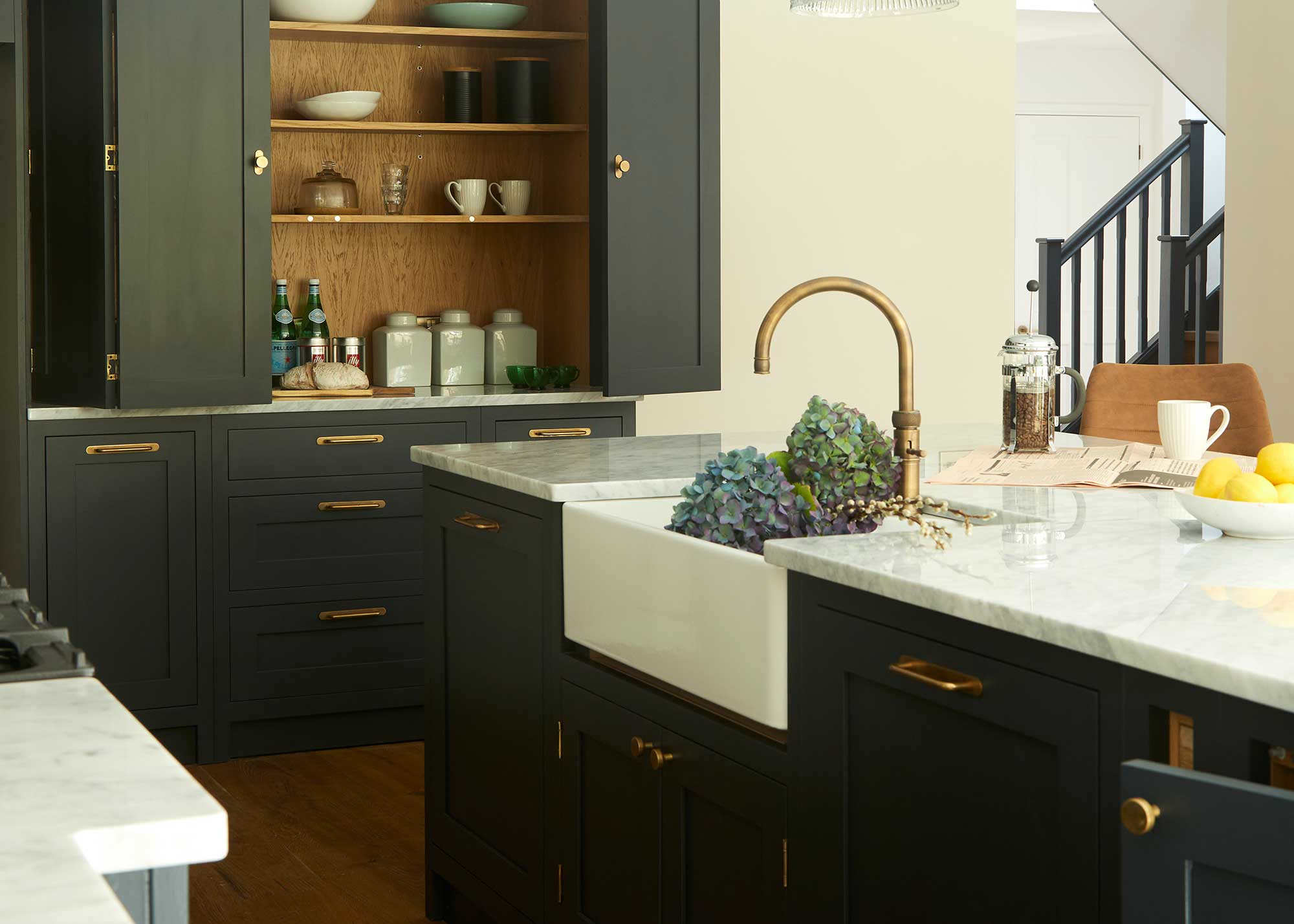
1. Black and White
Avoid trying too hard in terms of kitchen color ideas — sometimes, the shades and combinations that seem the most obvious can be the best. Black and white work so well to elevate a space — just be sure to introduce plenty of texture when using them.
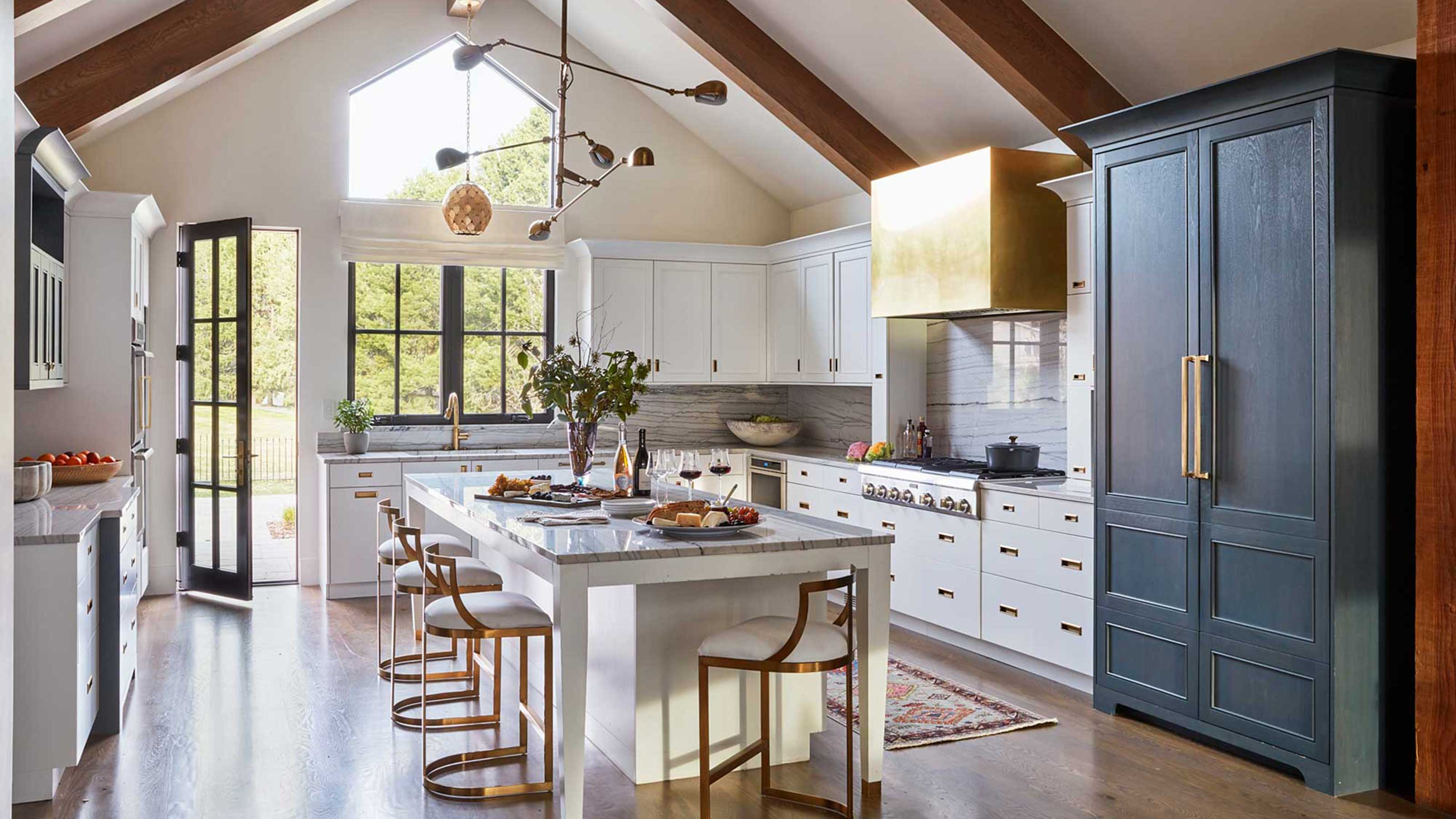
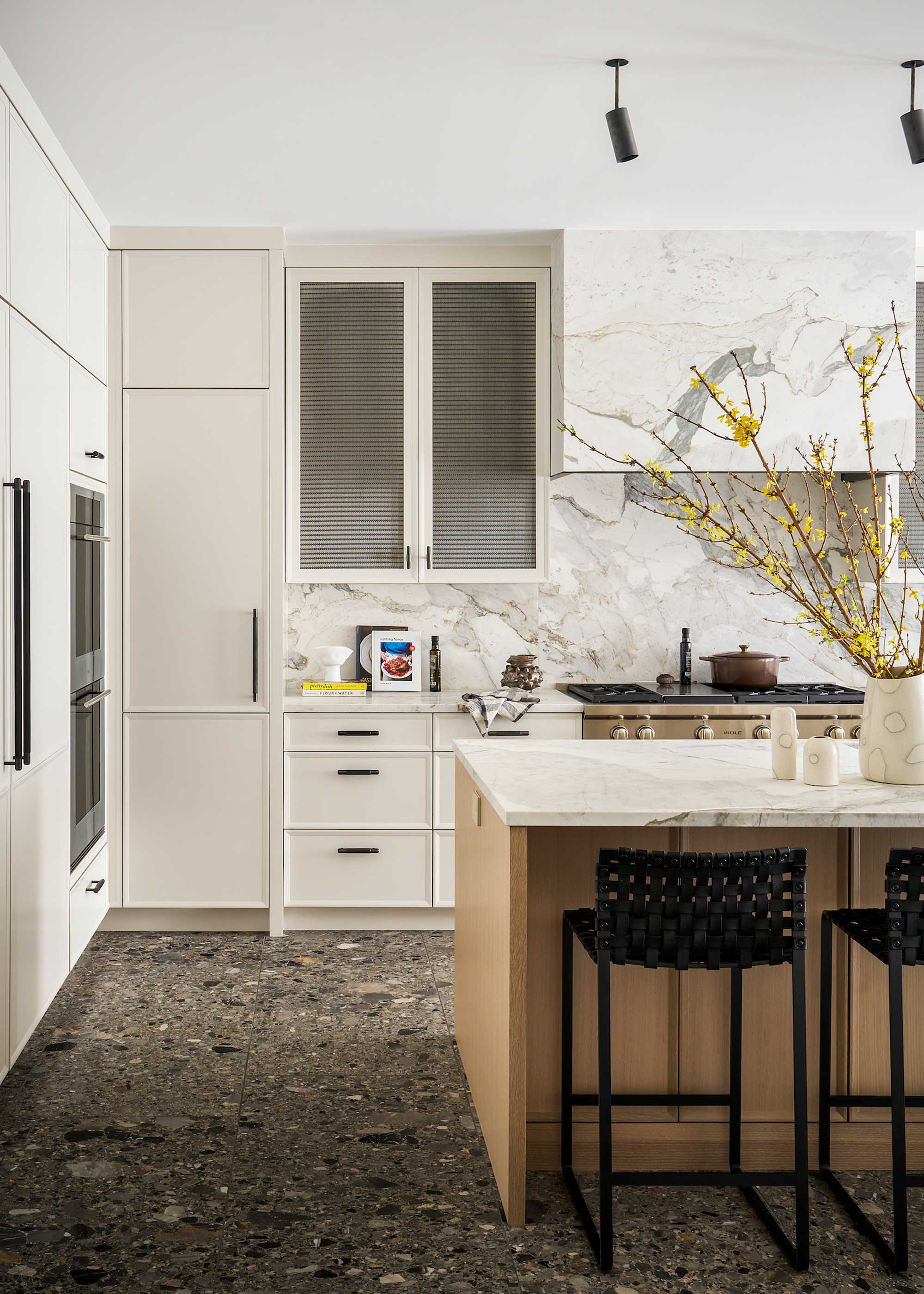
“If you're looking to make your kitchen feel instantly more luxurious, consider a palette of matte black and natural white oak," suggests Christina Garcia of Layered Dimensions Interior Design. "The matte finish adds depth and sophistication – there’s nothing flat or basic about it – while the warmth of the wood introduces a custom, elevated touch.
Christina goes on to explain how small details can lift the look even further.
"Paired with brass accents and crisp white countertops, this combination signals thoughtful design and timeless investment," she says. "It’s bold, but in a way that feels tailored and upscale.”
Mike Whitfield, luxury interiors expert at LUSSO agrees that these shades offer a quick route to a luxe look.
“If you’re designing a modern, minimalist luxury kitchen, opting for black or white oozes luxury," says Mike. "Marble tiles and brushed nickel or matte black taps help to add another layer of sophistication to the aesthetic. Neutral and natural tones, like natural woods and stone, can also help to elevate the aesthetic. Adding bright colors can detract from the overall design and undermine the feeling of luxury."
2. Rich Green
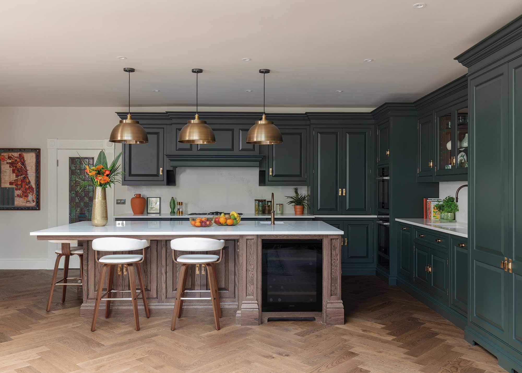
Easy to live with and, when the right shade is chosen, perfect for creating a sociable-cocoon of a space, green kitchen ideas are timeless. Those rich, forest-inspired hues also happen to be perfect for making a kitchen feel high-end.
“Try deep, regal greens and a dash of nature-inspired pattern with a heritage feel," suggests Tom Howley, design director at Tom Howley. "Think leafy William Morris prints and vintage Liberty florals.
"When in doubt, head over to your nearest National Trust stately home for inspiration," continues Tom. "We may not all have a Bridgerton budget, but we can learn a thing or two about how to create beautiful spaces just by looking to the past."
3. Pastels
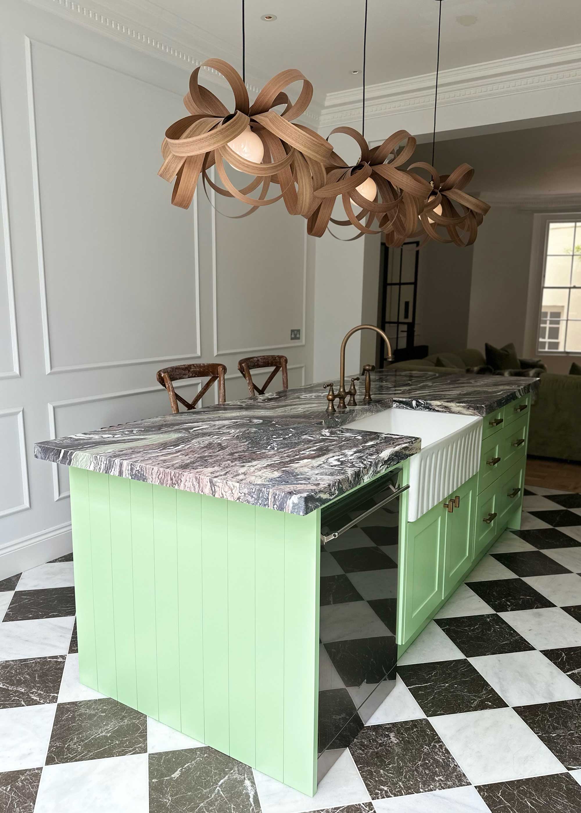
Lately, kitchen trends have very much revolved around deeper shades, such as stormy blues, forest greens and earthy burgundies — but pastels are making something of a comeback.
Think soft sky blue, matcha green and baby pink — they need not be sickly sweet and are the ideal way to introduce some individuality and a sense of self assurance.
“Opting for light airy pastel shades of blues, greens and neutrals can really help to create a cosy yet luxurious traditional feel, which can be enhanced by choosing brushed gold or aged bronze taps and metallic fixtures," advises Mike Whitfield.
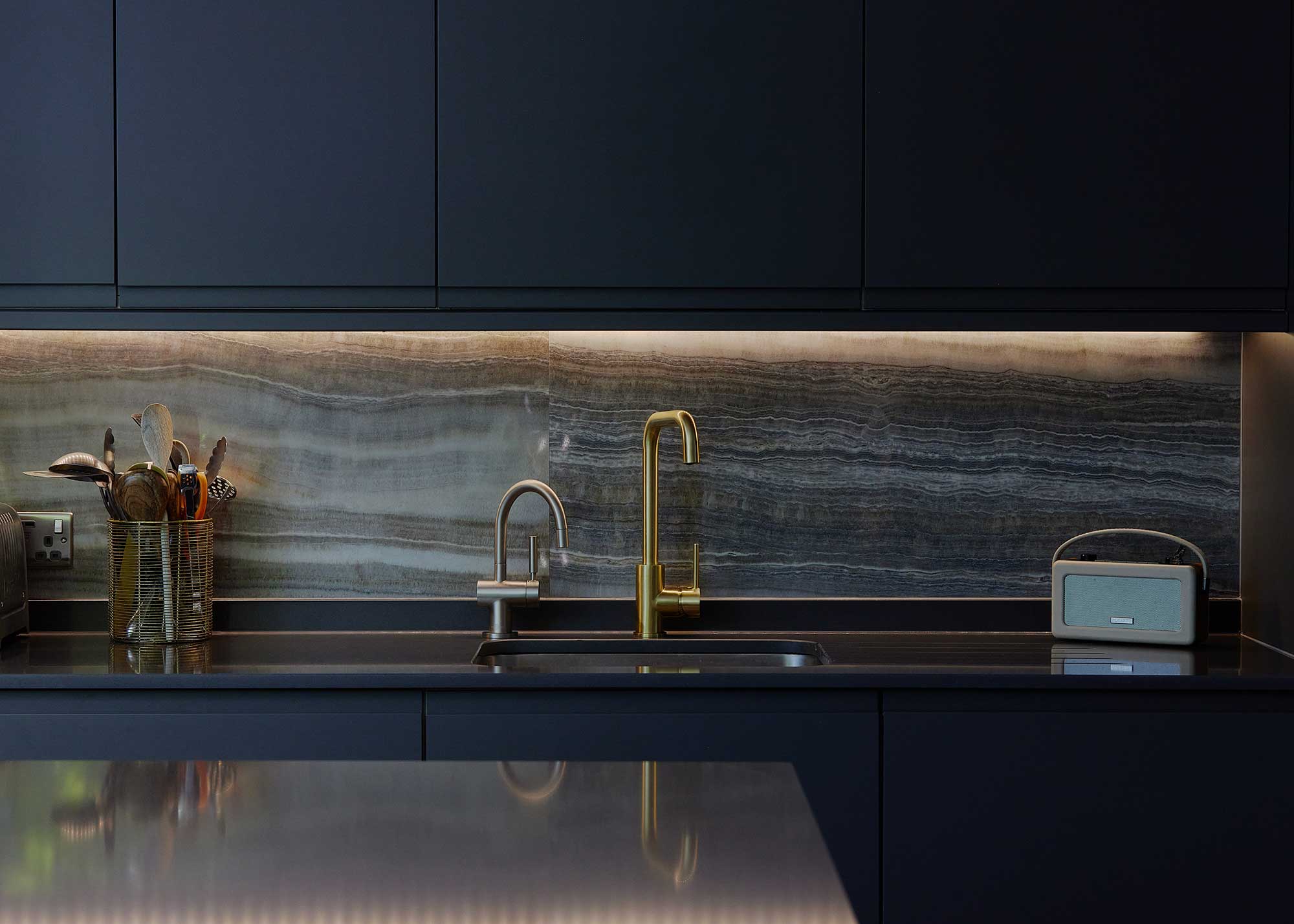
4. Stormy Blue Blacks (Especially With Green Hints)
Rarely is navy blue out of fashion thanks to its ability to sit next to a whole range of other colors and the way in which is just doesn't seem to date. For a high-end, classic look, consider teaming the deepest, almost black, blue kitchen ideas with some rich greens.
"Rich and inviting, navy and dark green kitchens offer a sense of class and timeless sophistication — adding a stylish and elevated aesthetic to any home," says Al Bruce, founder of Olive & Barr. "These colours feel bold and creative, giving your space an added depth, balance and dramatic edge.
"Dark shades also allow other materials and textures to shine, particularly cabinetry hardware and natural materials such as stone and wood, creating contrast, highlighting quality and texture," continues Al. "They feel confident without being overbearing. If committing to an entirely dark palette feels overwhelming, consider incorporating these tones through elements such as tiling or worktops."
5. Warm Brass and Bronze Shades
It isn't just through your kitchen cabinet ideas and walls that you can introduce colors to elevate the look of the space. The smaller details, such as your kitchen tap and the hardware you fit to your cabinet doors and drawers are also great vehicles for adding in new shades.
Warm metallic hues, in particular, are a fantastic way to add a premium finish to the space — think brass, bronze and even brushed gold.
"Brass worktops have become increasingly popular in the last year, and we expect this to continue, especially on feature and freestanding islands," says Al Bruce. "Practical and versatile, brass complements a range of contemporary and traditional kitchen styles and adds richness to a kitchen design, creating a jewel-box, atmospheric and elevated look."
“If you're looking to make a kitchen feel more expensive, hardware is one of the most considered details you can get right. The finish you choose can completely shift the tone of the space," advises Gareth Hull, design lead at Hendel & Hendel. "Warmer metals like dark brushed brass, burnished brass or satin brass instantly bring depth and richness, especially when paired with natural materials or muted cabinetry."
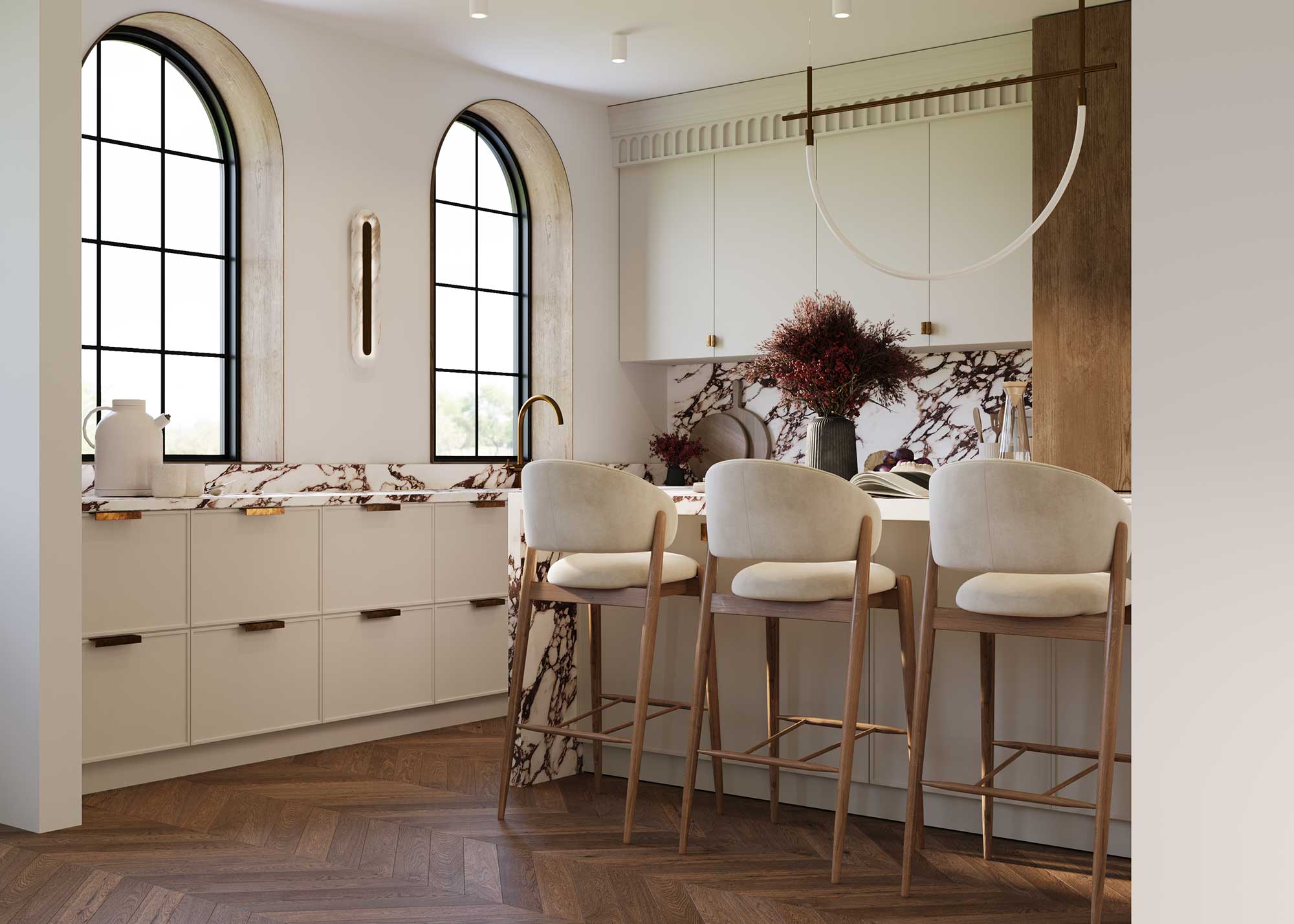
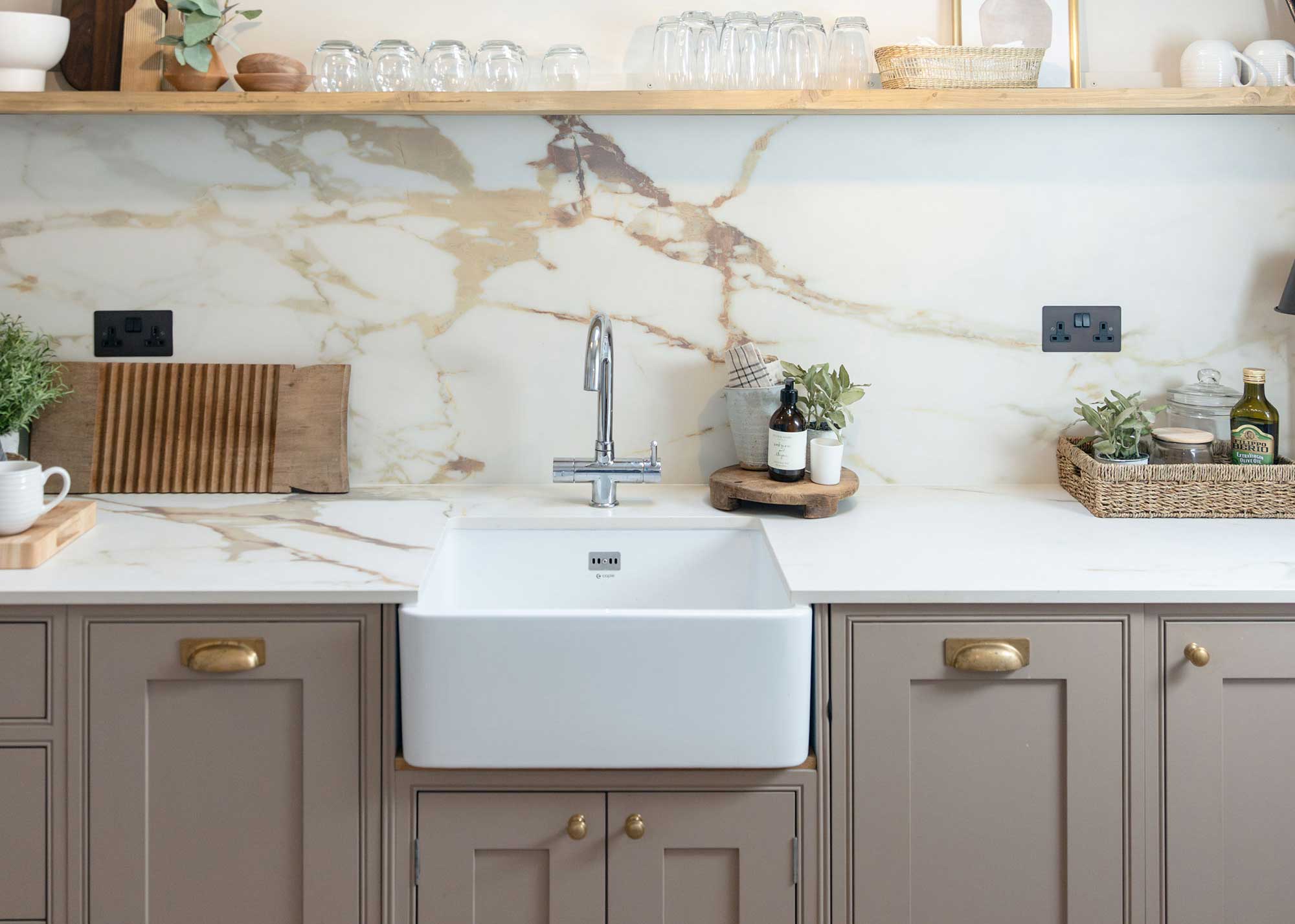
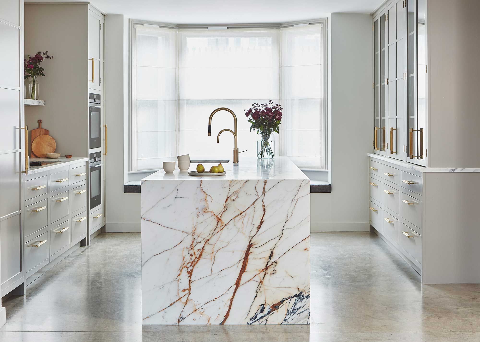
6. Neutral Colors
Sometimes, keeping things stylishly restrained by sticking to elegant neutrals is the very best way to elevate a space. Not only do these shades tend to stand the test of time in terms of changing interior design trends, but they also allow smaller details and textures to shine.
“You don’t need bold color to make a big impression," states Jennie Bishop of Bishop Studio. "It’s all about the mix: creamy cabinetry, moody stone, and just the right hit of black for edge."
Jennie goes on to extoll the impression natural materials, stone included, will have in terms of adding color and style.
"Veined marble? Total scene-stealer. It’s like nature’s own wallpaper, and it gives the whole space that ‘understated but make it fashion’ vibe,” she says.
"For the ultimate in elevated luxury, we suggest keeping things paired back and as nature intended, letting the natural materials shine in all their glory," picks up Ash McCullough, lead designer at Blakes London. "We suggest natural coloured stains on timbers which allow the veins in the timber to come through adding subtle richness and depth of texture to a kitchen scheme. And likewise for worksurfaces, you can't beat what nature created. We suggest natural marbles with deep veining and lots of movement on worktops and backsplashes. A general rule of thumb is that the more dramatic the veins, the more expensive the stone!"
7. Shades of Brown
It was, arguably, the trend none of us saw coming back — brown kitchen decor. Forget drab and dreary though, used well, brown has the ability to totally lift your kitchen to the next level.
That said, not all browns are created equal and you need to choose carefully and remember, it isn't just through the paint you use on your walls that you can introduce color. Bare wooden kitchen cabinetry, particularly in a rich timber such as walnut, paired with warm metallic finishes work particularly well. Interior designer Kathy Kuo has the perfect paint pairing for these wood finishes.
"The color Swiss Coffee by Benjamin Moore is always one of my go-to's for an elegant and upscale kitchen design," says Kathy. "This complex off-white has just the slightest hint of green in the undertone so it can easily pair with both cool and warm tones. Often, a kitchen is a mix of the cool and warm so it's important that the paint color be versatile in order to look luxurious and elevated."
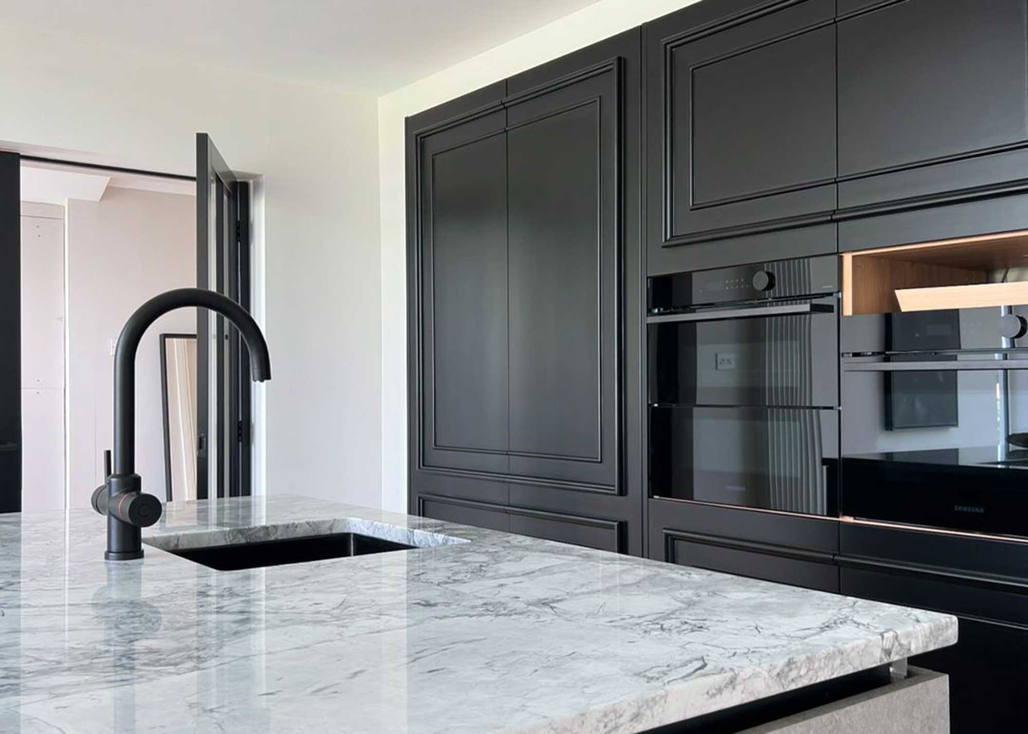
8. Black and Gold
Back to black kitchen ideas again — this time paired with a little glitz in the form of gold.
"Black and gold might seem overdone, but all it takes is opting for the right finish to create that effortlessly modern appeal that many of us chase," explains Riccardo Vicarelli, design director at We Love Build. "Matte black cabinetry with brushed gold hardware is so timeless, and it's the perfect base for those that want a kind of luxe-neutral vibe."
Ricardo goes on to discuss how to pair shades like this successfully.
"Sometimes, all you need is one colour in two different tonal depths. This kind of monotone palette is a clever twist on the current 'color drench' trend," he says.
9. White
And, last but not least, a color that, although often viewed as unimaginative, comes in a dazzling array of varieties and is perfect for every kind of kitchen space — white. The key to avoiding a stark finish with white kitchen ideas is to include plenty of texture and find a shade with undertones that bring out those tonal differences.
"Light walls are key to making a kitchen feel expansive and refined, but to truly elevate the space, we often incorporate pattern or texture," says interior designer Andrea Schumacher. "For instance, in one kitchen we designed, soft gray shiplap added warmth and a tailored finish, while in another, a woven wall covering introduced a natural, organic layer that feels both modern and timeless.
"Even classic white walls, when paired with architectural details like dramatic ceiling beams or large-scale windows, contribute to an elevated, gallery-like atmosphere."
FAQs
What Is the Most Appealing Kitchen Color?
Choosing the best color for your kitchen ideas is not a decision that can be made without taking into account a number of other factors.
"There are few wrong choices when it comes to the colors themselves, as different colors can work well with different aesthetics," explains Mike Whitfield. "However, there are colours which work particularly well, or don’t work, with certain trends, and your overarching style and design choices should influence your choice in color palette."
“When it comes to making a kitchen feel elevated and expensive, it's really all in the details," explains Camila Masi, interior designer at Otto Tiles & Design. "Color is a big part of that but it’s just as much about how you layer it, as the specific shades you choose. I personally love using deep, moody tones for cabinetry. Shades like olive green, inky blue, or even a warm charcoal instantly feel a bit more luxurious and layered. These shades add depth and look incredibly refined (especially when paired with brushed brass or burnished bronze hardware) in a way that whites or pale stone and grey often lack."
When trying to make a kitchen look more expensive, adding individual touches that show your personality can really help, and one way to do this is with kitchen wallpaper ideas.