Learning can be fun; but if you don’t want to take my word for it, I will let today’s list do the talking.
Today, we’re focusing on geography and all sorts of maps that ought to bring some perspective into the way you view territories. Ranging from maps that show how many Switzerlands one Brazil can fit or how big Somalia is compared to the East Coast in the US, among other things, the list is a fascinating way to learn more about the world around us. So wait not a second longer, delve deeper into the fascinating maps, and enjoy the journey.
On the list below, you will also find Bored Panda’s interview with an Associate Professor in the Department of English Language and Literatures at the University of British Columbia and an expert in Medieval culture and maps, Dr. Robert Rouse, who was kind enough to answer a few of our questions.
#1
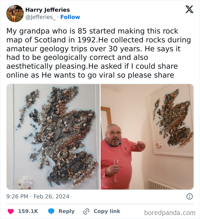
Image credits: Jefferies_
#2
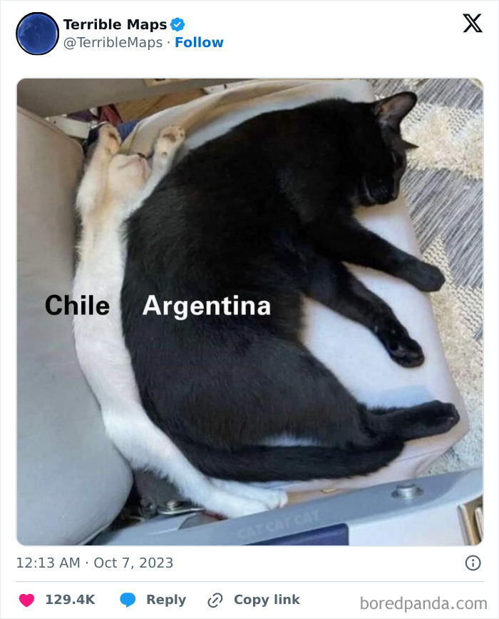
Image credits: TerribleMaps
#3
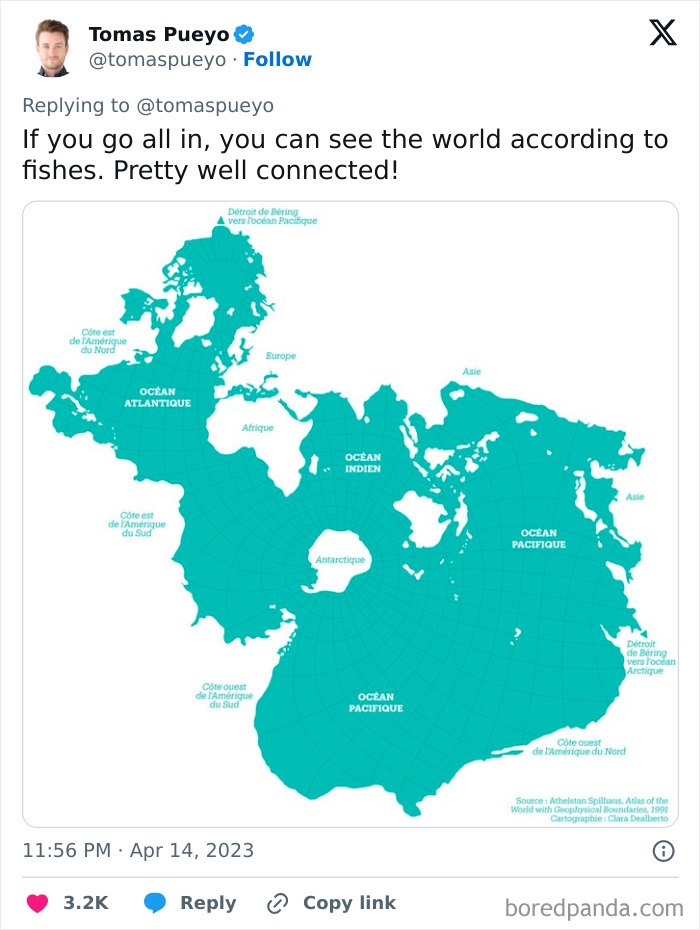
Image credits: tomaspueyo
It’s safe to assume that few people’s hearts start beating faster when they think about maps. Unless you’re a geography enthusiast, you might not be overjoyed by the prospect of staring at one.
But in addition to a ‘regular one,’ which focuses on the territories of the countries of the world, there’s a plethora of other kinds of maps depicting all sorts of interesting information, which ought to awaken your curiosity. As this list will likely show, maps can be way more exciting than most people think!
#4
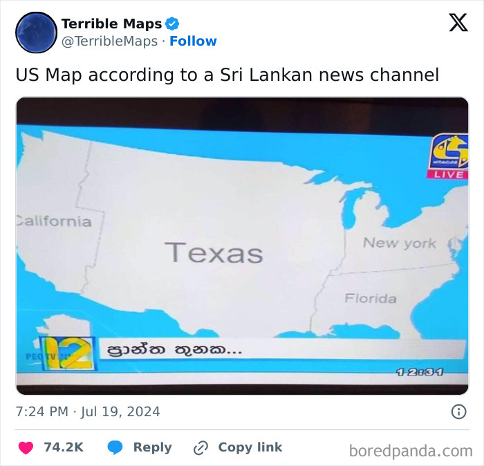
Image credits: TerribleMaps
#5
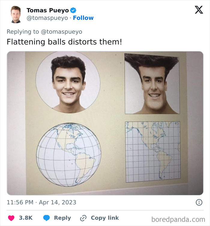
Image credits: tomaspueyo
Talking about why it is important to be familiar with maps—at least the one focused on countries’ territories—Dr. Robert Rouse of the University of British Columbia noted that if we don't know the world we live in, it’s hard to be an informed participant in politics or culture. “Maps provide us with a tool for displaying geographical (and other) information in an easily digested, readily readable format,” he said.
#6
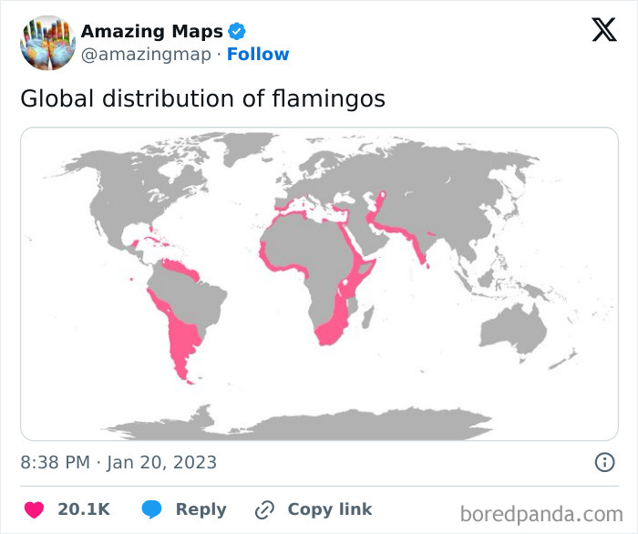
Image credits: amazingmap
#7
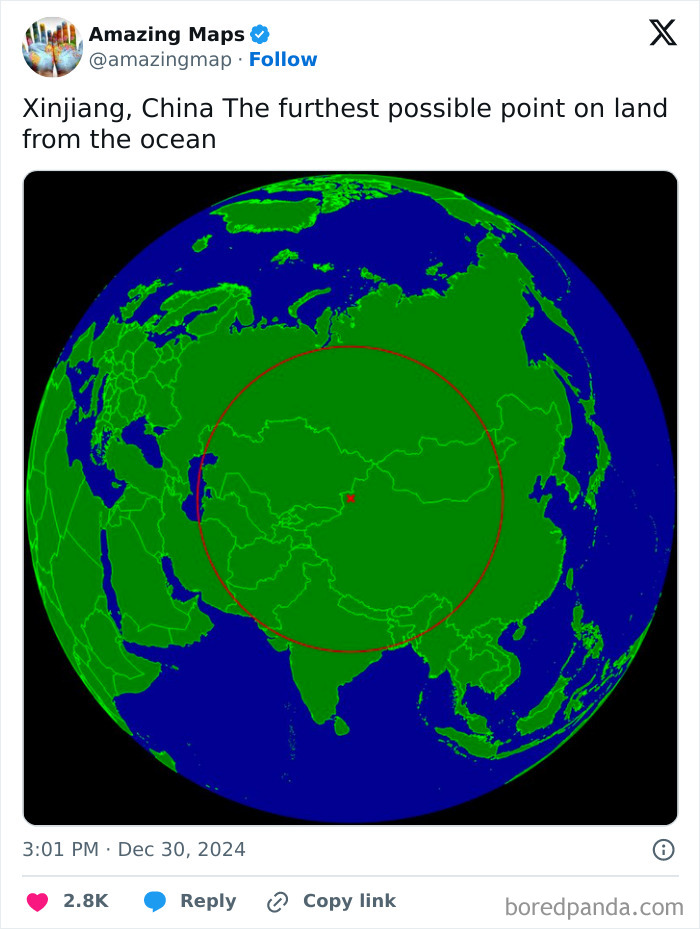
Image credits: amazingmap
#8
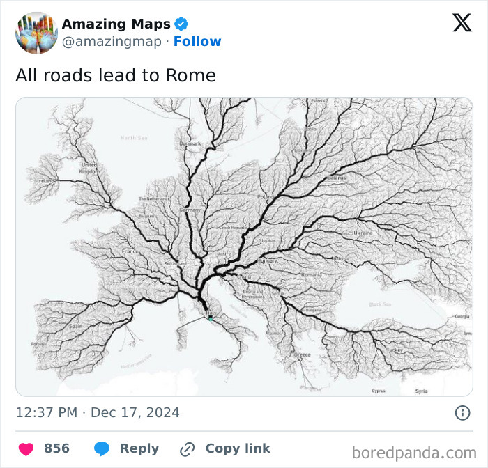
Image credits: amazingmap
Talking about maps and perspective, Dr. Rouse pointed out that many people have little idea that maps are dependent on their technological perspective.
“The Mercator projection, which is the dominant mode of map-presentation that most people are familiar with, was developed for sea navigation (as it presents longitude and latitude on a familiar x-y grid pattern), and it dramatically distorts the size and area of many countries, exaggerating those towards the poles. This leads to many people underestimating the size of countries towards the equator, and overestimating those of the global north.”
#9
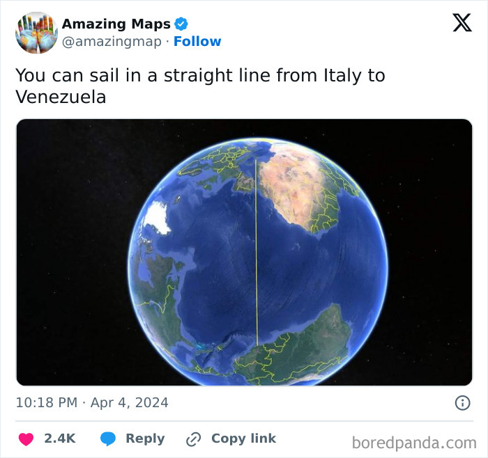
Image credits: amazingmap
#10
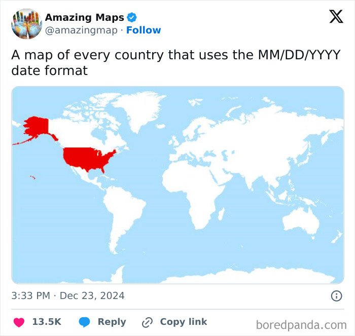
Image credits: amazingmap
#11
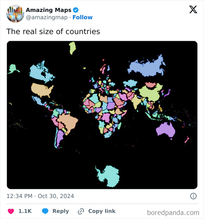
Image credits: amazingmap
The aforementioned Mercator projection (a cylindrical map projection) was presented in 1569 by the Flemish geographer and cartographer, Gerardus Mercator. As Dr. Rouse noted, it tends to distort the size of some countries, with a classic example, according to Science Direct, being Greenland—because of the projection, it appears to be much larger than it actually is relative to land masses near the equator. It also looks larger than Australia, for instance, when in reality, the land down under is roughly three and a half times larger than Greenland.
#12
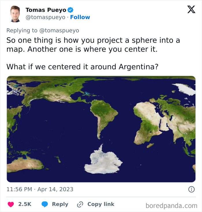
Image credits: tomaspueyo
#13
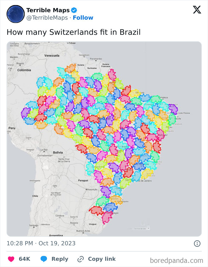
Image credits: TerribleMaps
#14
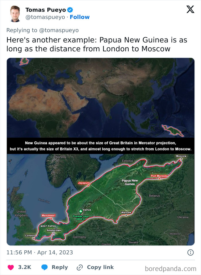
Image credits: tomaspueyo
Even though maps focused on territory lines show exactly where one country ends and another begins, when it comes to cultural issues or such things as language and faith, it’s not all that clearcut.
Discussing how maps based on social or cultural issues can help people get a better idea of how certain cultures intertwine, Dr. Rouse suggested that most maps are presented using national boundaries, but most things—race, faith, cultural beliefs, and language—largely ignore these borders. In the expert’s opinion, it makes the world “a much messier, and more interesting, place.”
“We often have much more in common with people across the border than our politicians sometimes suggest,” he told Bored Panda.
#15
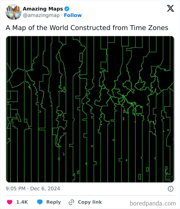
Image credits: amazingmap
#16
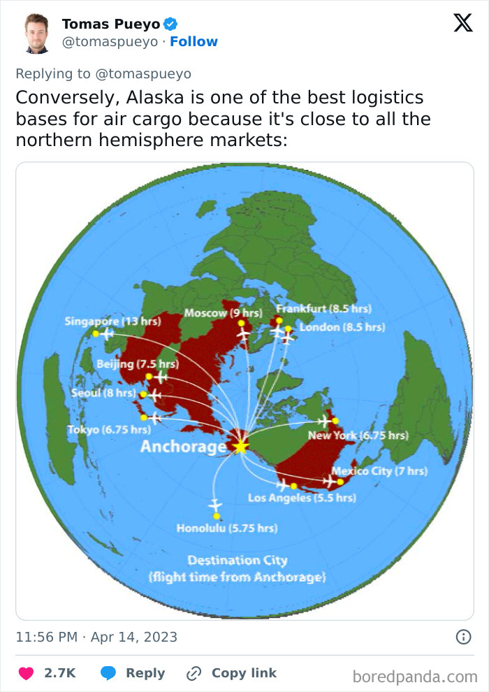
Image credits: tomaspueyo
#17
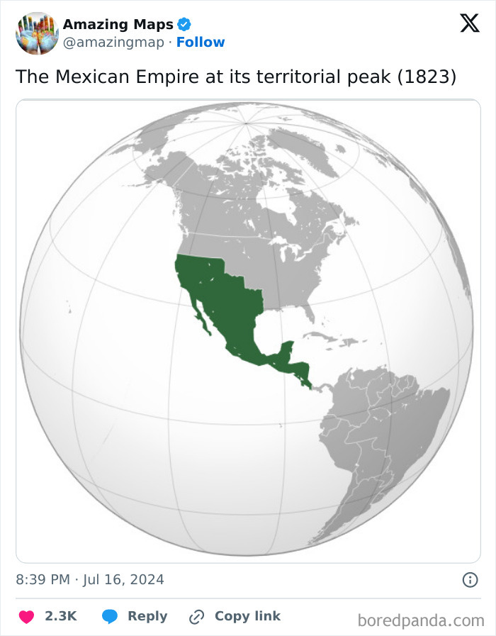
Image credits: amazingmap
While all sorts of unique maps are quite fun to analyze, according to the expert, there’s more to them than that. “They challenge us to think about the world differently, more complexly. And this is a good thing at a moment when politics seems to be becoming more insular, more nationalistic, in nature,” he said.
#18
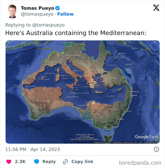
Image credits: tomaspueyo
#19
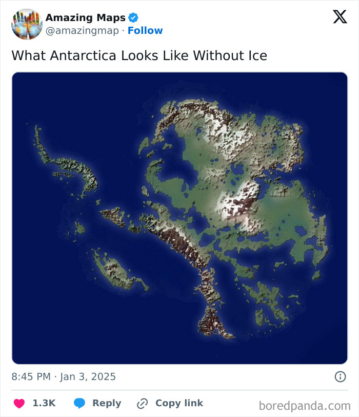
Image credits: amazingmap
#20
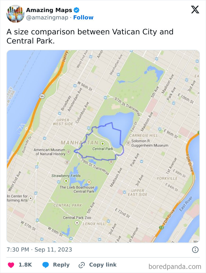
Image credits: amazingmap
#21
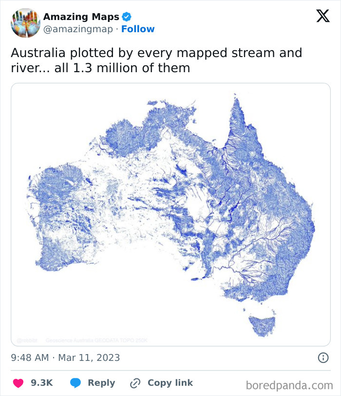
Image credits: amazingmap
#22
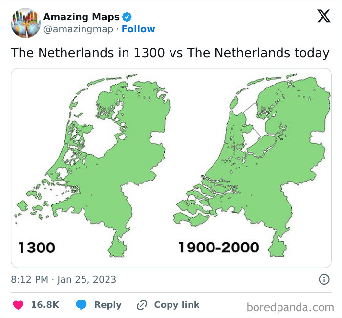
Image credits: amazingmap
#23
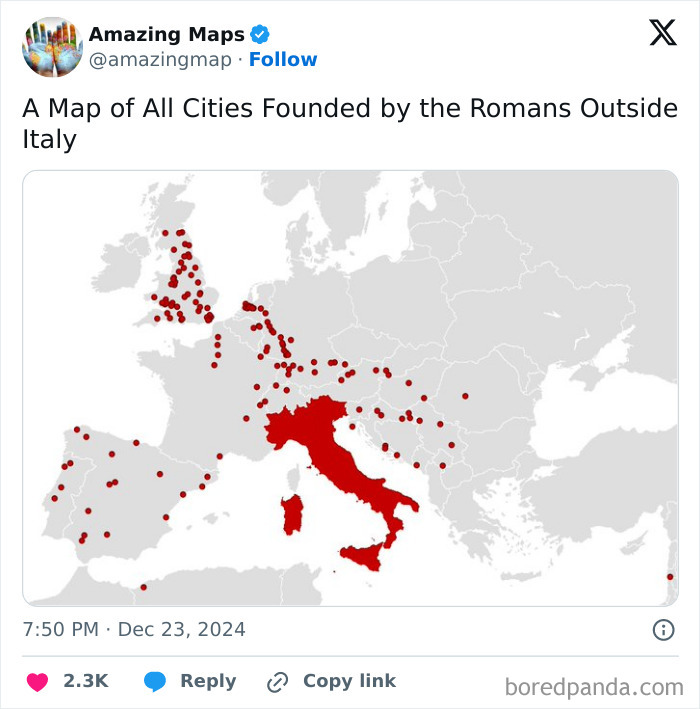
Image credits: amazingmap
#24
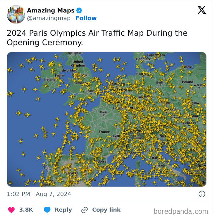
Image credits: amazingmap
#25
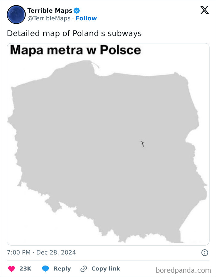
Image credits: TerribleMaps
#26
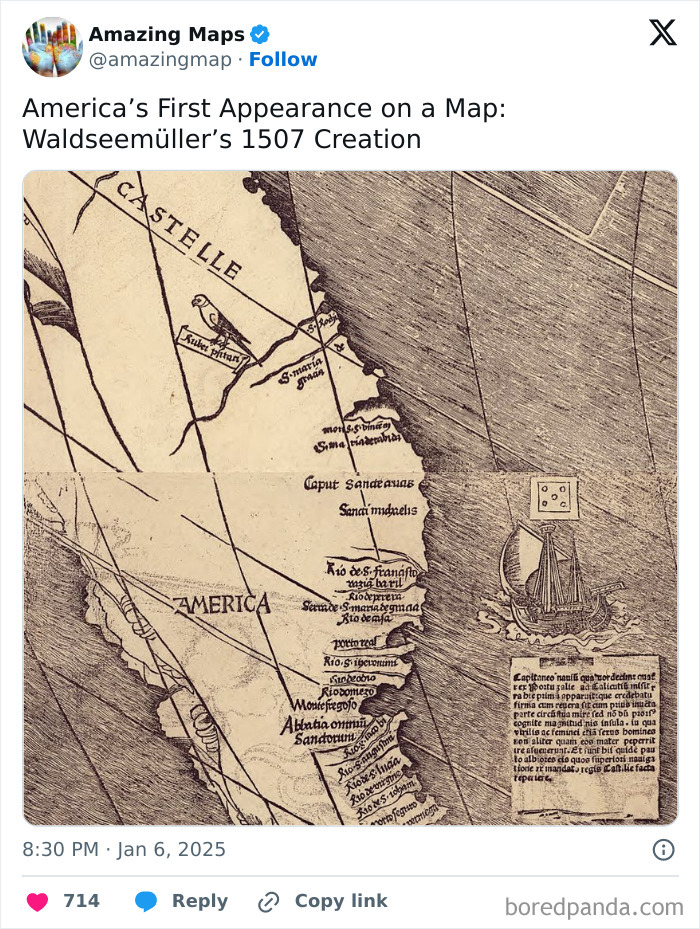
Image credits: amazingmap
#27
Image credits: amazingmap
#28
Image credits: amazingmap
#29
Image credits: amazingmap
#30
Image credits: amazingmap
#31
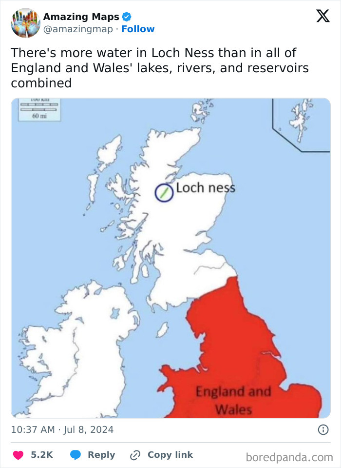
Image credits: amazingmap
#32
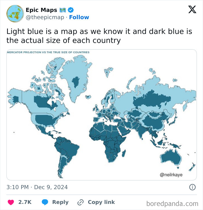
Image credits: theepicmap
#33

Image credits: tomaspueyo
#34
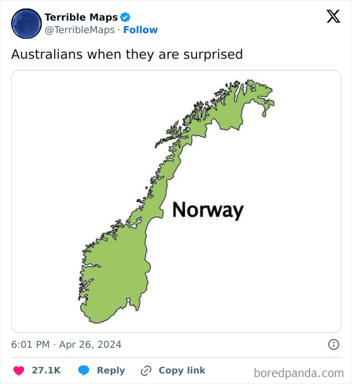
Image credits: TerribleMaps
#35
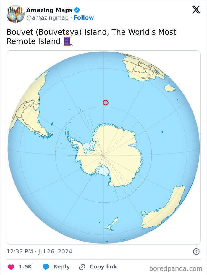
Image credits: amazingmap