Thanks to sloping ceilings just waiting to smack your skull, and dead zones that won’t accommodate a feather duster, let alone your furniture, lofts are a headache in more ways than one. But that’s not the attitude. Pop an Advil, lean into the quirks, and suddenly you’ve got a space that’s far cooler than any safe, boxy room.
The smartest loft conversion ideas don’t fight the architecture; they work with it. Maybe softening and blurring a little, maybe dialing it up, sometimes a bit of both. One thing’s for sure: ignoring the issues associated with awkward spots and angled roofs won’t end well — not least because there’s almost always a stellar design move that can solve them. Branden Wells, founder of Truecraft Construction, has the perfect example. “The biggest challenge with a steeper-pitched roof is wall height. One of the simplest solutions is erecting knee walls at four feet to provide a solid backdrop to place furniture. It forms a boundary and avoids a claustrophobic feel,” he says.
If you’re staring at a tricky loft wondering where to begin, start here. These are the design moves that will turn any awkwardness into the hardest-working and best-looking part of the room.
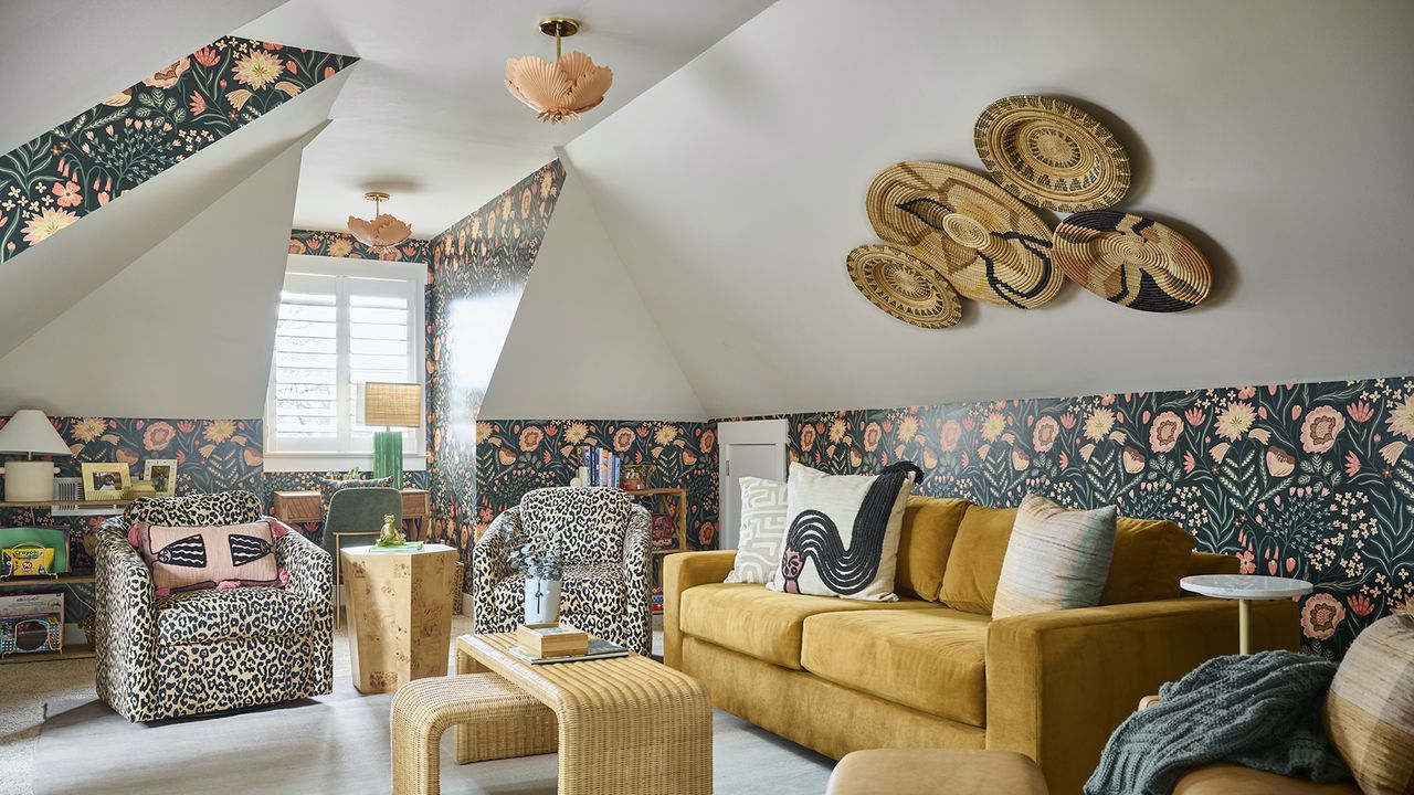
1. Play Up the Pitch With Wow Wallpaper
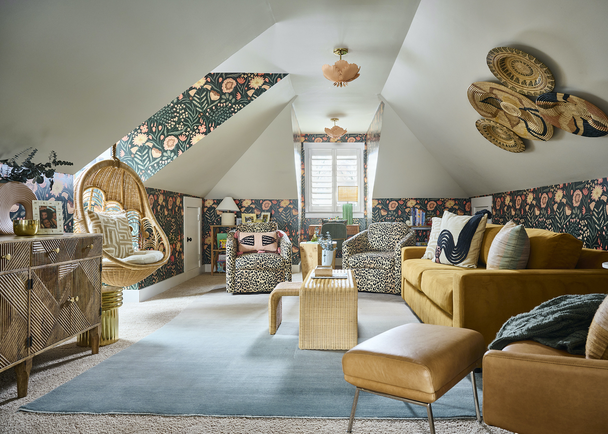
Wallpaper in a loft is not the time to play shy. Those angled ceilings and irregular wall planes are practically begging for something graphic. Like a print that follows the pitch, exaggerates it, and makes it feel part of the party. Instead of trying to visually “flatten” the space with safe neutrals, a well-chosen pattern can do the opposite in the best way possible: it celebrates the geometry.
The way to avoid utter carnage is to focus on the pattern’s scale and direction. Vertical or trailing patterns can elongate a low wall, while something more organic, like painterly florals or abstract washes, can soften sharp junctions and make the transitions between wall and ceiling feel absolutely deliberate.
There’s also a confidence to it. “I covered the bottom portion of the walls and the window dormers with a floral wallpaper from Spoonflower, transforming the once blank space into a moody forest for my guests and I to escape to,” recalls Amber Guyton, founder of Blessed Little Bungalow. Originally designed for her niece and nephews to call their own when visiting or having a sleepover, Amber wanted to create a fun space that was gender-neutral, transitional, and whimsical. “Using the wallpaper and lighting on the angled walls and ceiling generates a feeling of envelopment and intimacy,” she adds.
By committing to wallpaper in these tricky areas, you’re effectively saying the architecture is part of the design story, not something to work around. It’s a bold move, but one that pays off by sheer strength of character.
Timeless and sophisticated, this floral wallpaper has just enough color and drama to make a statement, just on a quieter scale.
2. Blur the Lines With Full-On Color Drenching
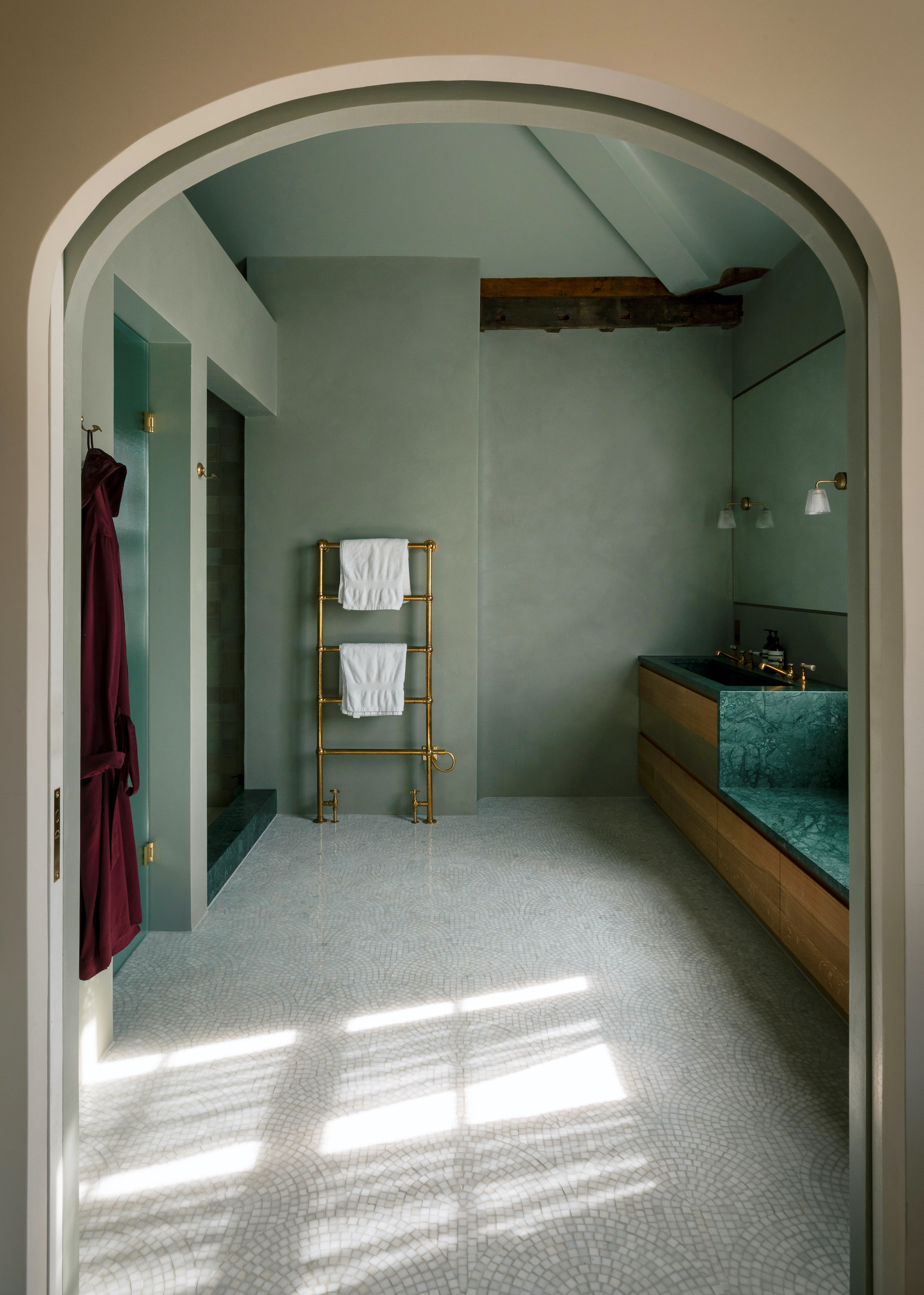
Contrast is all well and good, but sometimes you want a calmer atmosphere that leans into wellness and relaxation. Color drenching, using a single tone across walls and ceilings, is one of the most effective ways to quieten the space and let it breathe.
“Sitting at the very top of the house, away from the noise of everyday family life, this bathroom began with the ambition to create a space that feels airy, generous and calm — a place of retreat,” says Charles Tashima, founder of Studio Tashima.
In this project, stripping the ceiling back revealed the full volume of the roof, but also all its irregularities, like chimney stacks pushing through, ridge beams landing at different levels, and the inherent imbalance of a Victorian loft never designed to be read as a whole.
“It was important to use a single color to pull everything together — walls and ceilings — as a way of emphasising the three-dimensional, sculptural quality of the room while maintaining a sense of calm,” Charles explains. “We find that changing color between wall and ceiling has the effect of cutting the space in two, which undermines the wholeness of it all.”
Instead, a continuous finish softens those junctions and removes the visual noise of shifting planes. Here, a plastered surface similar to Moroccan tadelakt was used throughout, color-matched across walls and ceiling so light plays gently across it, adding depth without distraction. Subtle interventions, like easing the ridge beams into soft curves, help integrate structural elements rather than fight them.
3. Integrate Lighting to Emphasize the Architecture
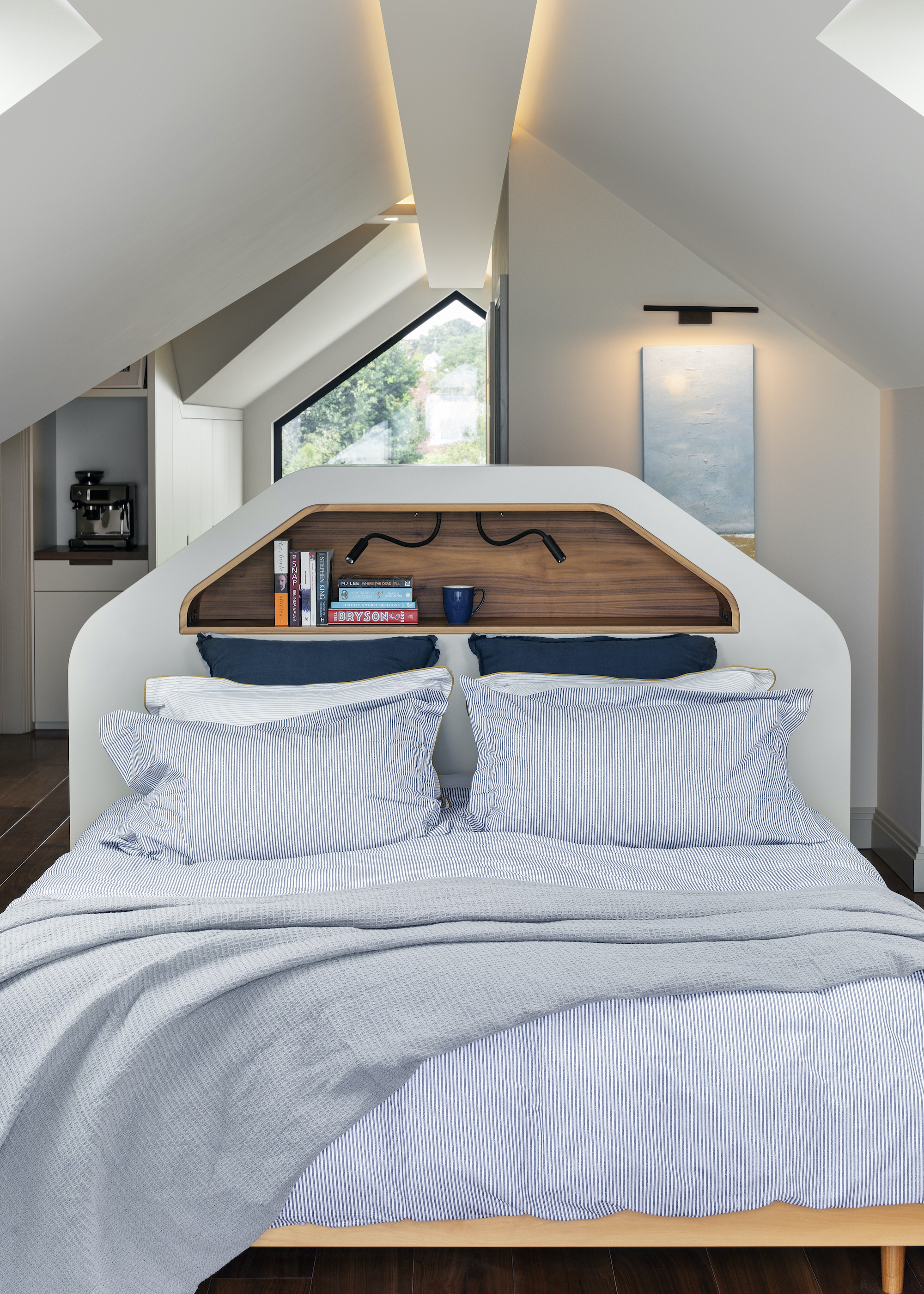
Planning lighting for your loft can be a bit of a tricky fish to fry. With limited ceiling height, no obvious spot for a central pendant, and those mad angles throwing shadows in all directions, things can easily go a bit la-la land. The trick is to use hidden light to work with the architecture, not fight it.
In this loft renovation in a 1920s detached property in Essex, the geometry of the roof was embraced as a defining feature of the space. “The bed was positioned beneath the apex, with a custom-designed bed frame and headboard tailored precisely to the architecture. This creates a natural focal point while allowing the room to feel balanced and intentional,” explains Paul Langston, of Paul Langston Interiors.
“Lighting was then carefully considered in response to the constraints of the pitched ceilings. Integrated linear lighting follows the roofline, enhancing the structure while introducing a soft, ambient glow that avoids the need for visually intrusive fittings.”
It’s a subtle move, but incredibly effective. By tracing the lines of the ceiling, the recessed lighting reinforces the shape of the space in a way that feels deliberate and atmospheric, rather than messy or just a bit awks.
Even LED strip lighting, like these Lepro Warm White LED Strip Lights on Amazon, which are flexible, easy to install, and also include a dimmer switch, would work perfectly.
4. Step It Up a Level With a Mezzanine
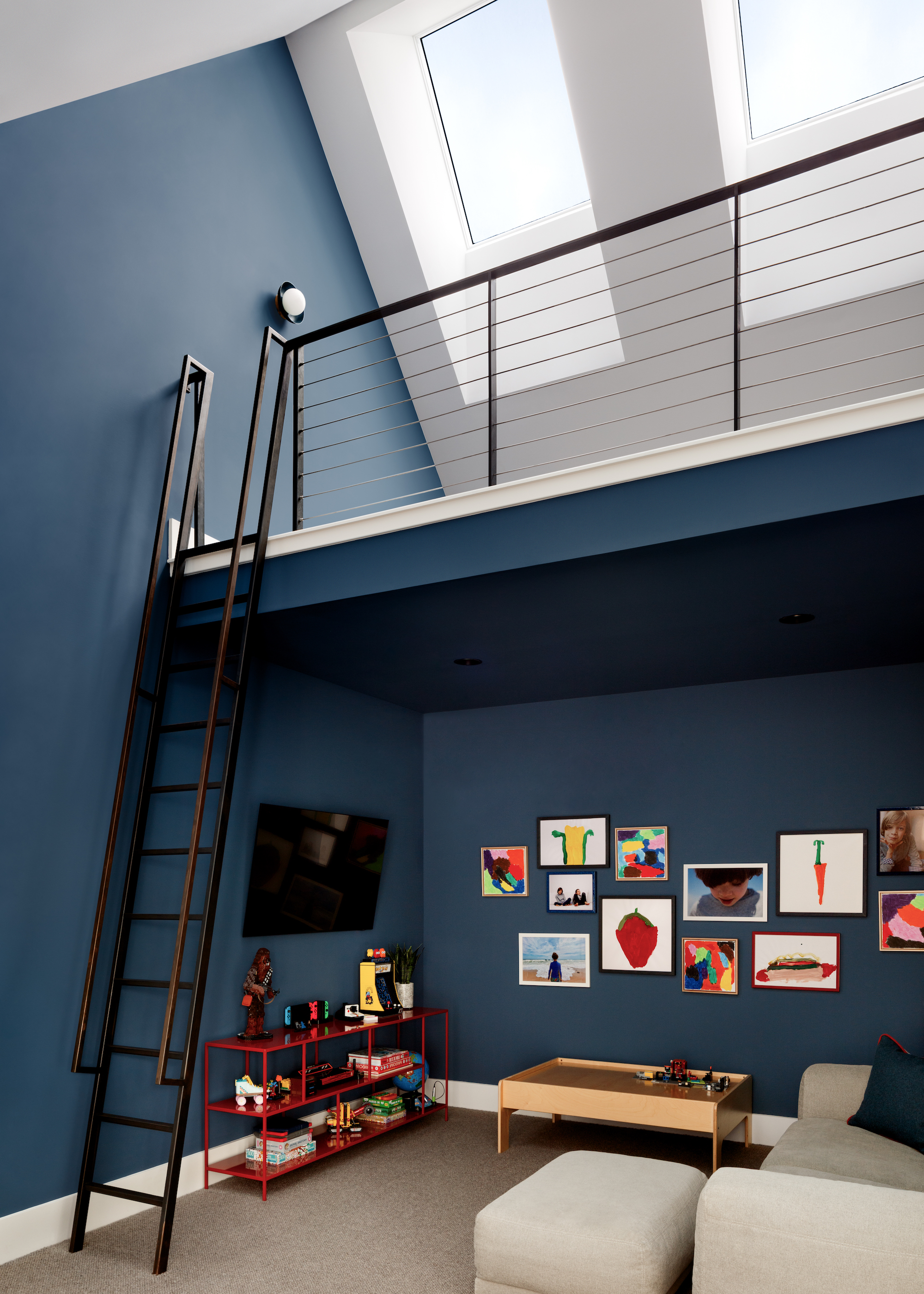
Not all lofts are gloomy old bat caves. If yours has height on its side, it would be rude not to use it. Adding a mezzanine level is one of the canniest ways to turn awkward vertical space into something genuinely useful, and maybe even a little bit magical.
“Capturing attic space is a great way to add additional volume to rooms, and if there is enough height, adding a mezzanine level is a great way to boost the square footage and create additional functionality,” agrees Yuri Sagatov, creative director of ODE Design.
“The most challenging design aspect is access to the new level. There isn’t always enough space for a proper staircase, but a ladder or spiral staircase are great alternatives. We use these most often for fun play areas, kind of like an inside tree house!”
Done well, a mezzanine draws you up into the best part of the loft, closer to skylights for better light and views. Just make sure access is safe, and head heights are comfortable, so it’s genuinely usable. And don’t get greedy. Oversize it, and it can quickly oppress the space below. It’s not just for kids, either. Think reading nook, guest bed, or even a light-filled workspace.
5. Breathe Life Into Dead Spaces
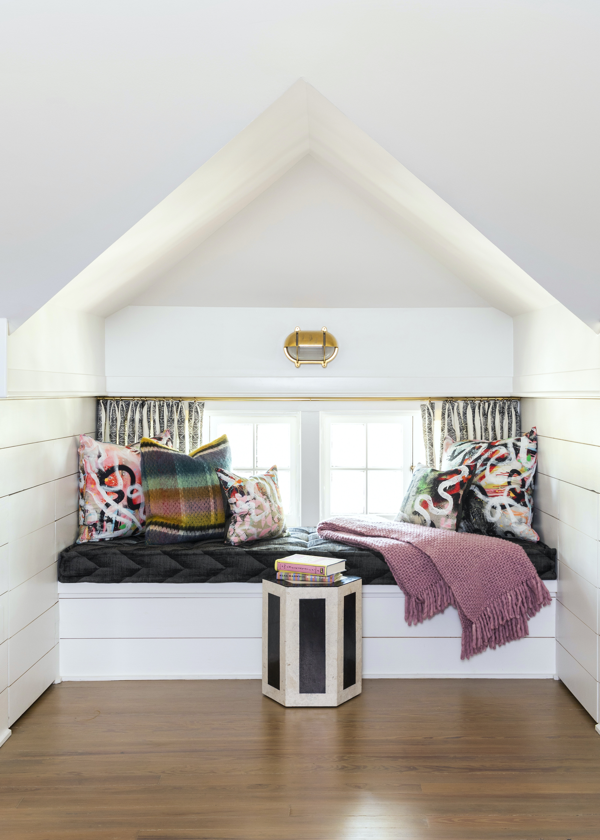
Lofts are loaded with frustrating low points where you can’t quite stand up, and they often end up as floordrobes or dumping grounds for storage boxes. But squint a little, and they’re actually prime real estate for something far more interesting. Built-in seating is one of the simplest ways to give these areas purpose, turning dead space into somewhere you actively want to use.
“One of my absolute favorite things to do with an awkward dormer or low-eave situation is to just lean into it! Don’t fight the architecture, but work with it instead,” says Courtnay Tartt Elias, principal and creative director at Creative Tonic Design. When the ceiling drops, choosing a function that benefits from that tucked-in feeling is key, and a window seat does exactly that.
Here, a custom upholstered bench is designed to nestle neatly into the dormer, creating a cosy, cocooned spot to read or unwind. “It is the perfect spot to curl up with a good book and a comfy throw — it feels intentionally intimate,” she says. Keeping walls and ceilings white allows the architecture to recede, while the focus shifts to what’s happening at eye level.
“The styling part is where you can have a bit of fun,” adds Courtnay. “We knew we wanted a bunch of soft pillows for comfort, so we opted to go bold with the color and pattern there.” A brass sconce introduces a touch of warmth and polish without cluttering the space, while layered textiles bring softness and personality.
The same thinking applies beyond seating. These low-slung zones are ideal for shallow storage, open shelving, or even a compact desk if you’re happy to sit. “The real trick is letting the architecture tell you what the space wants to be, and then running with it, rather than fighting it,” she concludes.
Nothing says cozy corner quite like a sumptuously soft throw, and this style is refined with a relaxed edge.
6. Cocoon With Wood Cladding
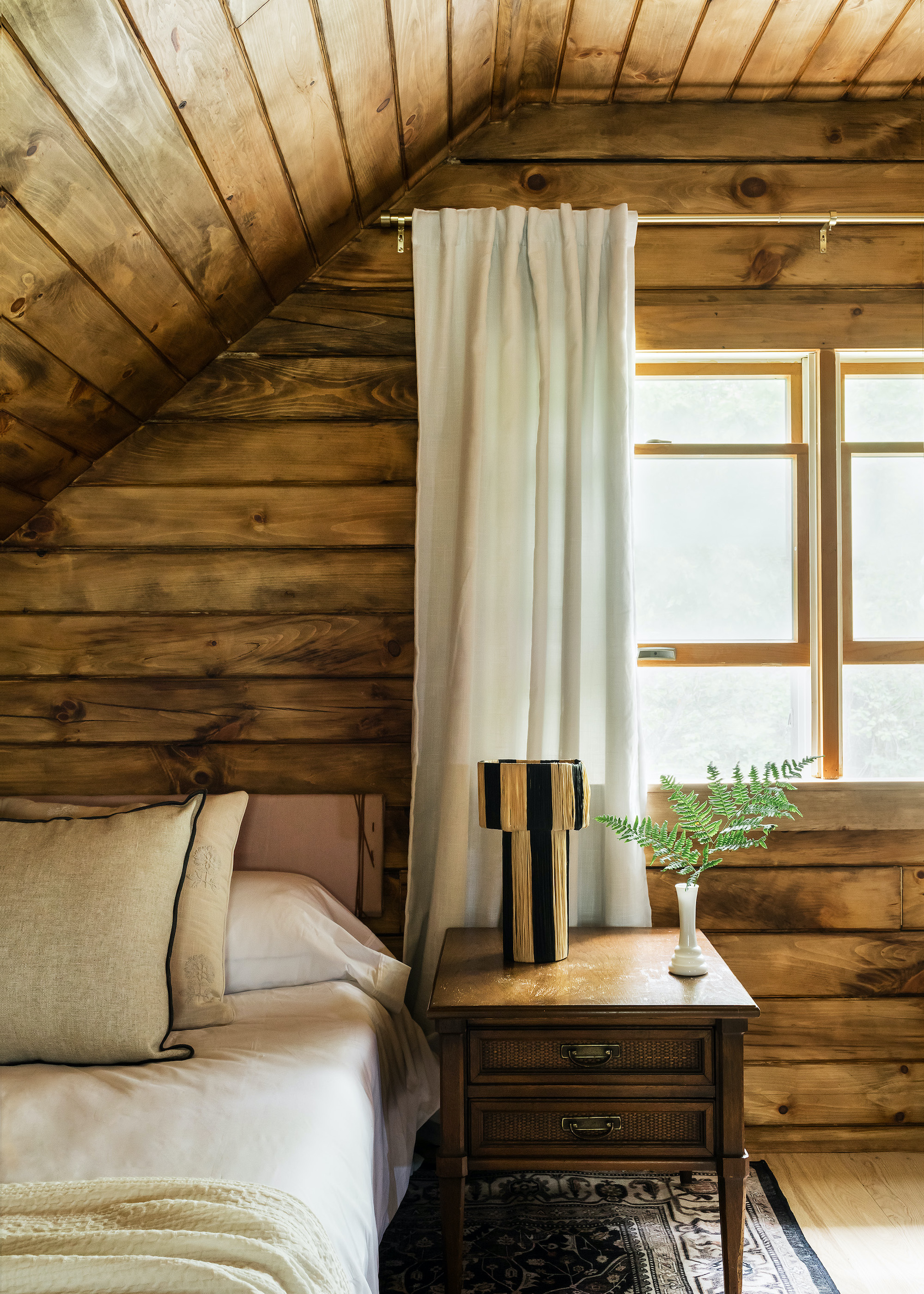
Texture is your secret weapon in a loft, and wood cladding is one of the easiest ways to create that cocooning, wraparound feel. By taking it across both walls and ceiling, you stop the space from feeling chopped up by angles and instead read it as one continuous, enveloping surface.
“Loft spaces are a great opportunity to use texture and materials to create warmth while leaning into the architecture of the home,” says Hannah Oravec, founder and principal designer of Lawless Design. “Here, I took the opportunity to stain the entirety of the wood paneled walls and ceilings the same color, to soften transitions and eliminate harsh lines. It makes the space feel more cohesive, intentional, and less confined.”
What’s particularly clever here is the shift in direction. Running the planks one way on the walls and another across the ceiling gently marks the change in planes without breaking that cocooning effect. It’s subtle, but it adds just enough structure to stop the space feeling flat, and prevents the interior from being dictated by the roofline.
7. Go for a Custom-Fit and Steal Back Storage
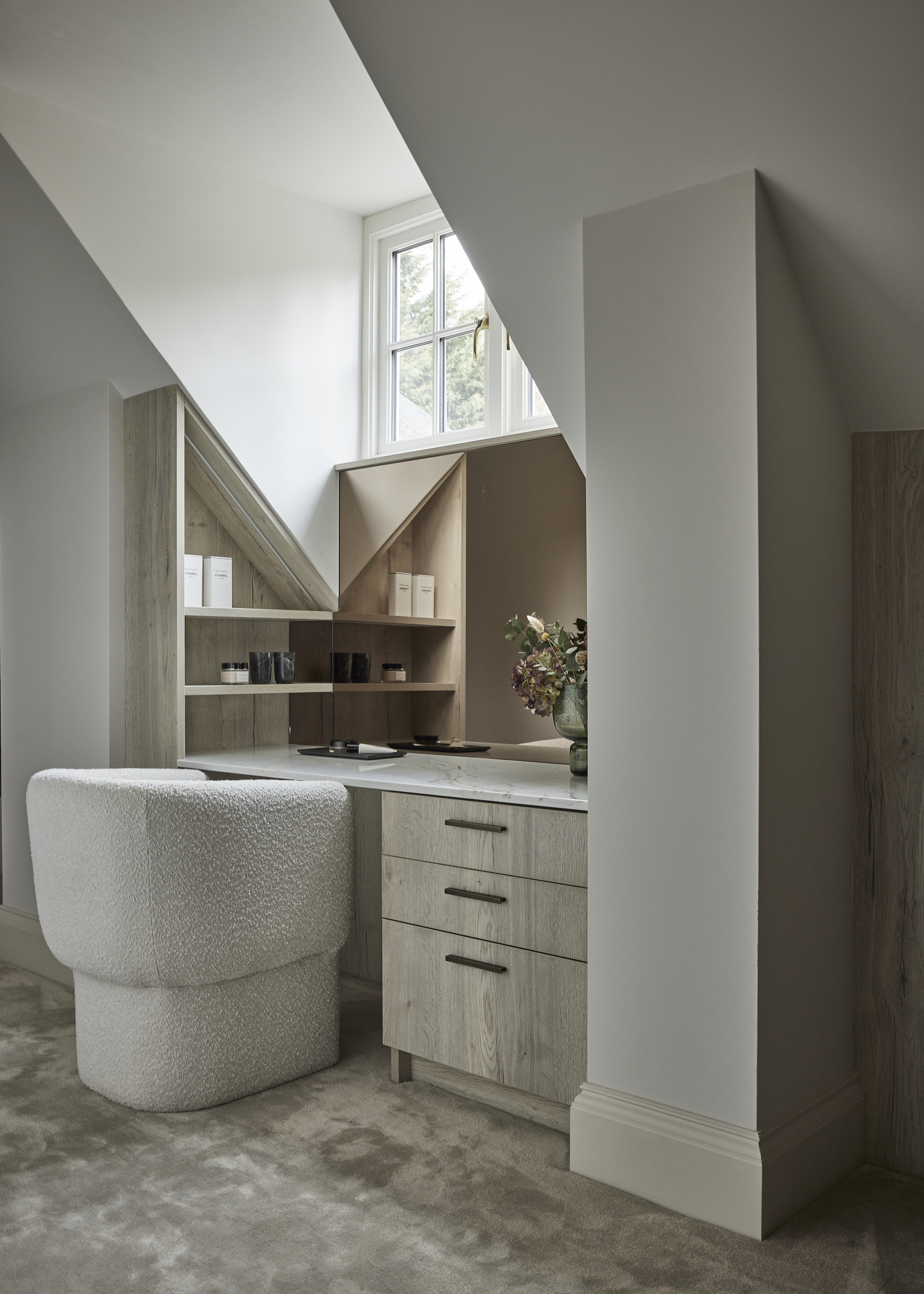
Stunted corners, wonky eaves, and low-slung skylights are exactly where investing in bespoke is worth the spend. Rather than letting awkward angles swallow valuable storage, treat them to a tailored fit. A built-in desk, dressing table, or low run of cabinetry that works around the roofline is a great way to add extra storage to your loft conversion.
“In this loft conversion dressing room within a sensitively restored Georgian property, the joinery is designed to follow the architecture rather than compete with it,” says Natalie Fry, creative director of Grid Thirteen Design Studio. “The storage works with the changing roof heights, placing hanging, shelving, and display where the space naturally allows.”
That principle of working with, not against, the structure is what unlocks these tricky spots. Here, joinery wraps across planes, with a dressing table flowing into shelving that mirrors the pitch. Triangular compartments become a feature rather than a compromise, while mirrored elements help bounce light around and visually extend the space, making it feel less compressed.
To make it work in your own space, keep shelf depths relatively shallow (around 200–300mm is often enough for display or beauty storage), stepping into deeper drawers where head height allows. Visually, softer finishes help too — pale timber, warm neutrals, or a single color across walls and cabinetry will blur edges and help everything sit comfortably within the corner.
Even better yet, choose a dressing table chair that has storage, too, and not waste any inch of space.
FAQs
What’s the biggest mistake when tackling awkward loft conversions?
The most common mistake is trying to fight the architecture instead of working with it. People often attempt to square everything off or hide the angles, which usually results in wasted space and a slightly weird ‘where am I?’ feel. Sloped ceilings are part of the character of a loft, so just show them some love. That might mean aligning furniture with the pitch of the roof, using built-in joinery that follows the line precisely, or even highlighting the angle with lighting or paneling. Once it looks deliberate, it stops feeling like you’ve lost a wrestling match with the architecture.
How do you turn an awkward corner into a space that adds value?
The key is to give every awkward spot a purpose, even if it’s a small one. Low eaves can become shallow shelving, window seats, or hidden storage, while tight corners are ideal for bespoke desks or dressing areas. It’s less about forcing standard furniture in and more about tailoring the solution to the space. Even something simple like a ledge for books or a built-in niche can utilize dead space.
And if your loft is full of tricky pitches and kooky corners, make built-in closet storage ideas your next port of call. Your floordrobe won’t thank you, but your sanity just might. And we have plenty more ideas for planning a bedroom around awkward angles, too.
For more design inspiration, subscribe to the Livingetc newsletter, and all the latest will be delivered directly to your inbox.