Advertising, when done right, is an art. After all, people have made Emmy-winning shows just about the ins and outs of creating a good ad. A simple glance at a major billboard or pre-video ad will show that more often than not, ads are pretty poorly made, so the very good ones tend to stand out.
We’ve gathered some hilarious and creative billboards and signs that netizens have spotted and posted online. So get comfortable when you scroll through, upvote your favorites and be sure to share your own thoughts and examples in the comments section down below.
#1 New Satanic Temple Billboard
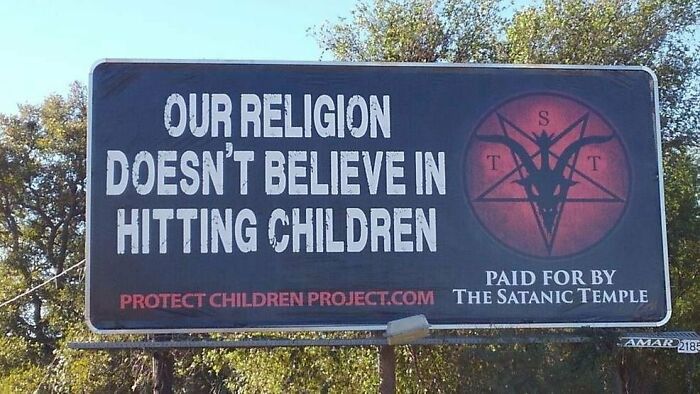
Image credits: Cult7Choir
#2 A Billboard I Found In Richmond, VA
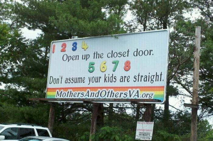
Image credits: CaptainCRK
#3 Really Bad Billboard Placement
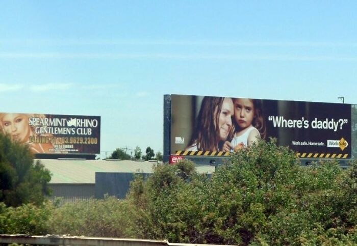
Image credits: 5_Frog_Margin
Creating a billboard that actually works is a bit like trying to tell a joke while someone's driving past you at sixty miles per hour. You have roughly the same amount of time to make an impact, and if you botch it, they're gone forever. People have only three to five seconds to process a billboard's message, which is less time than it takes to sneeze. This is why billboards covered in paragraphs of text are essentially expensive monuments to someone's inability to edit.
The golden rule of billboard design is brutally simple: keep your main message to seven words or fewer. Seven words. That's it. Not seven sentences, not seven bullet points, seven individual words to convey your entire message.
#4 This Billboard Made Me Laugh More Than It Probably Should Have
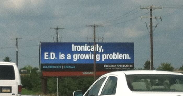
Image credits: prem5077
#5 This Safety Awareness Billboard
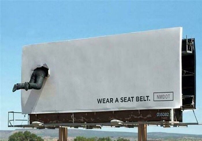
Image credits: akashdas323
#6 The Most Legit Billboard I've Ever Seen
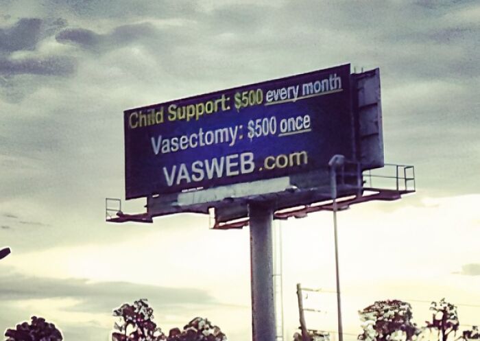
Image credits: bighommie1
The suggested industry standard for reading a billboard advertisement is six seconds, so you should only utilize about six words to convey your message. This forces a kind of advertising haiku situation where every word has to earn its place. If you can't explain what you're selling in the time it takes someone to change lanes, you need to rethink your approach or possibly your entire business model.
#7 Billboard In Houston
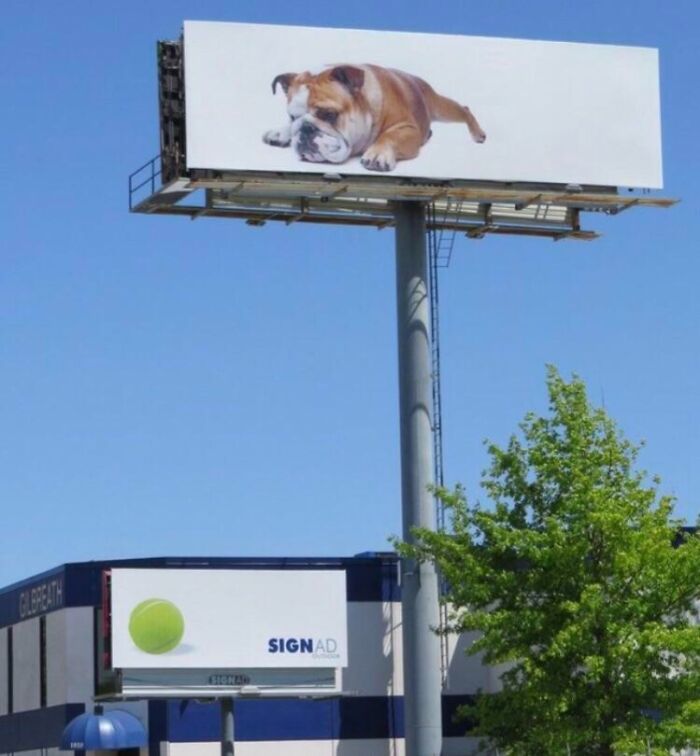
Image credits: reddit.com
#8 Clever 3m Billboard Design
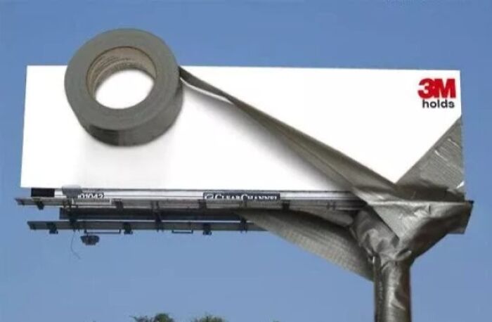
Image credits: morganmonroe81
#9 So Now They're Putting Up Billboards Just To Rub It In Our Faces?
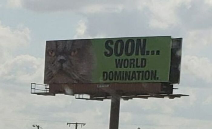
Image credits: BigQueensGambit
The "three elements rule" is another critical principle that separates effective billboards from visual chaos. Design elements should be kept to a minimum, with three being ideal, like a picture or graphic, a call-to-action, and a logo. Anything beyond this trinity is just clutter that distracts from the core message.
#10 Midwest Billboard
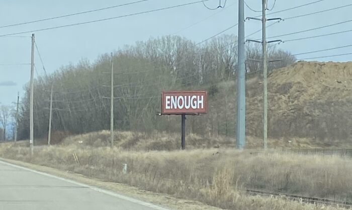
Image credits: reddit.com
#11 This Billboard Was Designed To Change The Hair Colour Of The Billboard At Different Times Of The Day
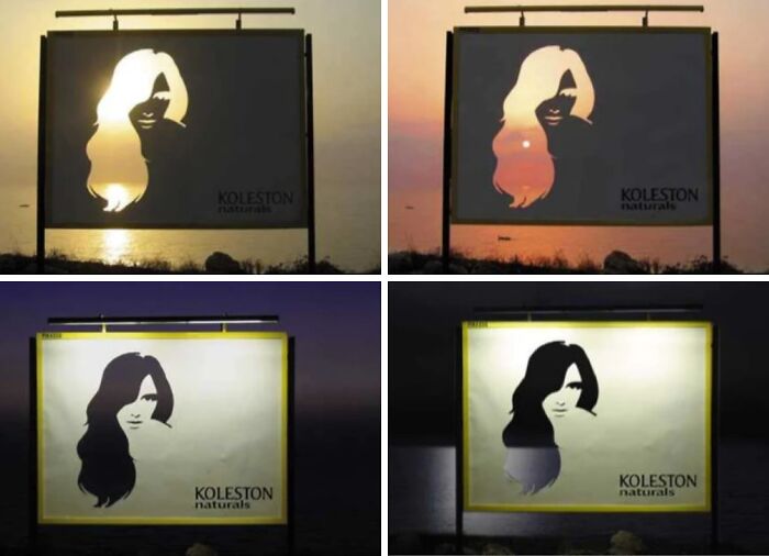
Image credits: dingusbob69
#12 Funeral Home In Canada Puts Up Billboards "Encouraging" Drivers To Text While Driving
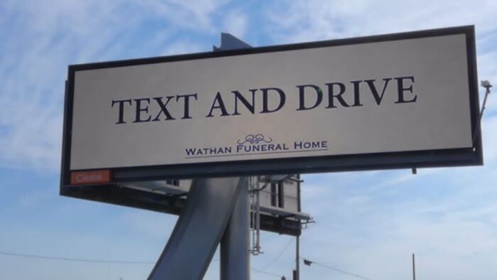
Image credits: MinneapolisWisconsin
Think of it as the billboard equivalent of Marie Kondo's approach to organizing, if it doesn't spark immediate understanding, it's got to go. Nobody's going to pull over because your billboard featured seventeen different fonts and a phone number in size-four text.
#13 I Wonder How Many Get It

Image credits: CowPigChicken
#14 This Billboard To Raise Awareness About Stutter
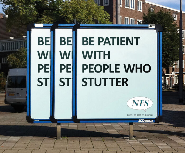
Image credits: UnironicThatcherite
#15 Clever McDonald's Billboard
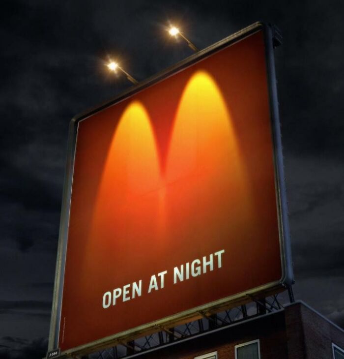
Image credits: vmast3r
Simplicity extends to the visuals as well. Messaging should be very concise and to-the-point, and simple messages get a better response, with stories told through strong visuals and elements positioned using hierarchy. Bold, clear imagery beats complex, artistic nonsense every single time when you're competing with traffic, weather, and the driver's podcast about true crime. Your gorgeous gradient background might look stunning in the design file, but from two hundred feet away at highway speeds, it's just an expensive blur.
#16 This Creative Billboard Campaign For A Superhero Show
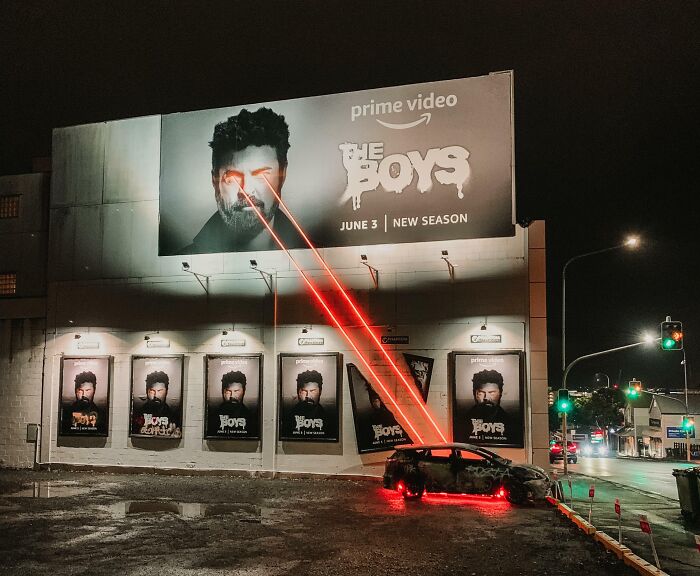
Image credits: coachm4n
#17 On McDonald's Sundial Billboard, Sun Casts A Shadow On Each Item That Corresponds To The Time Of Day You Would Normally Eat It
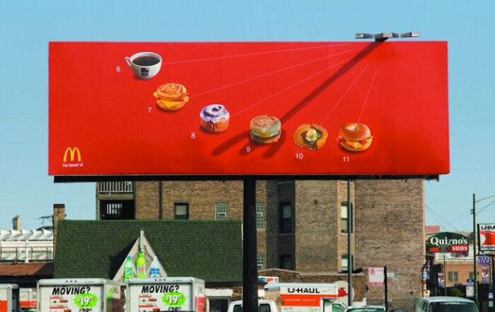
Image credits: Cautious-Damage7575
#18 New Royals Billboard In Kc
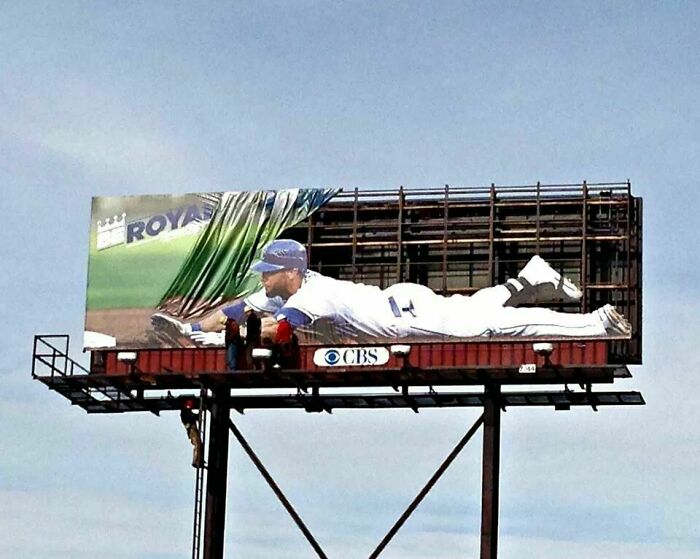
Image credits: reddit.com
The emotional component matters more than people realize. Effective billboards make good use of imagery that connects with the message and evokes a positive emotion, with how people feel when they see the billboard being how you want them to feel when they think of your brand. This is where creativity actually matters, not in cramming more information onto the board, but in creating an instant emotional connection. A clever visual pun, an unexpected image, or a genuinely funny line does more work than a comprehensive list of your business hours ever could.
#19 A Few Months Ago, My Friends And I Got Our Photos Taken At JCPenney Studios. Today, We Put It Up On A Billboard In Our Hometown
Image credits: Whodatboi69
#20 This Billboard In Rural Pennsylvania Made Me Do A Double Take
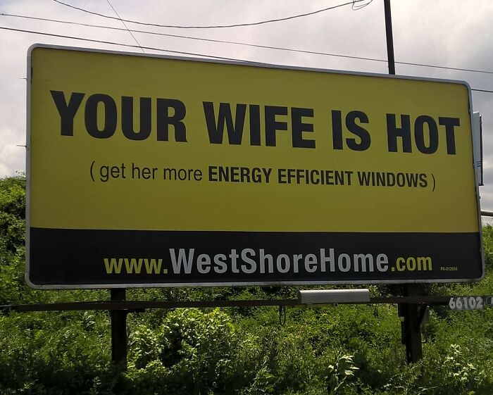
Image credits: TheyCallMeRon
#21 As Much As I Hate My Home State Of Oklahoma. This Billboard In Tulsa Is Pretty Damn Funny
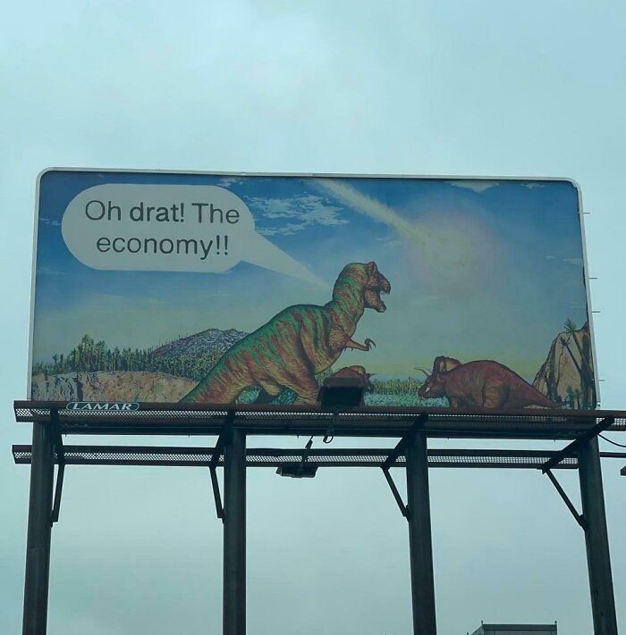
Image credits: spacesuitkid2
Typography is where many billboard designs go to die. Although you may love fancy fonts, they are not the right choice for outdoor advertising; use simple, large fonts instead. That script font that looked so elegant on your website? It's completely illegible from a moving vehicle. Same goes for thin, delicate typefaces that disappear against busy backgrounds. If your grandmother can't read it while squinting through her windshield, it's the wrong font choice.
#22 These Billboards For Uranus, Missouri
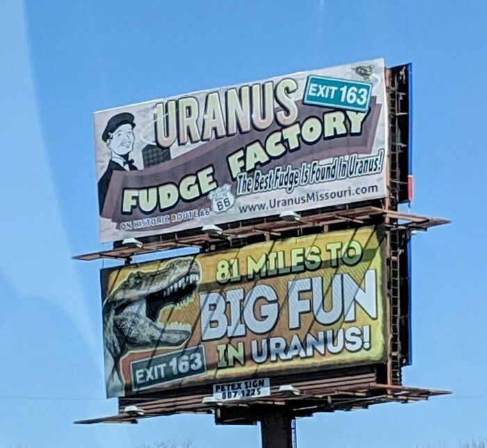
Image credits: rasicn
#23 This Billboard For A Roofing Company Gave Me A Pretty Good Laugh This Morning
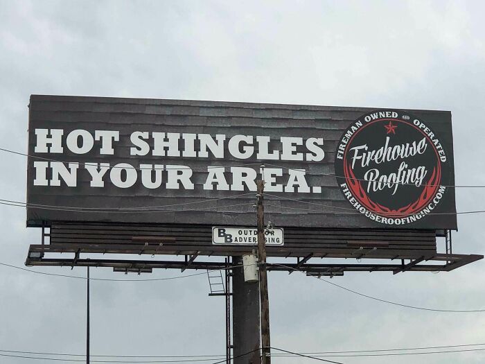
Image credits: shagrathspawn
#24 Nice And Hot
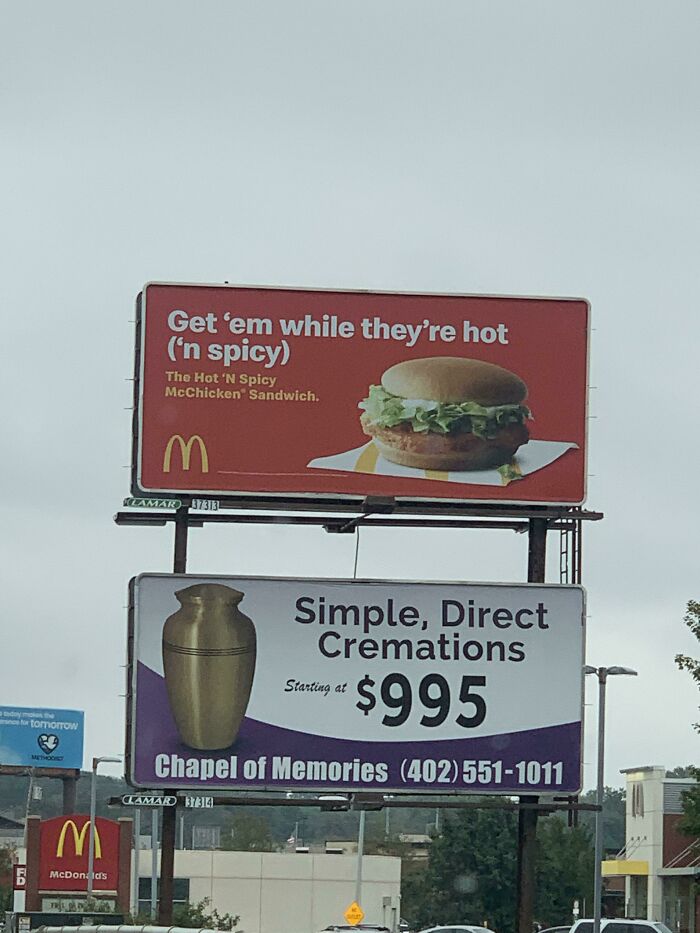
Image credits: SomeRandomSkitarii
The ultimate test of any billboard design is whether someone speeding past at highway velocity can understand it, remember it, and know what to do about it, all before they've finished switching radio stations. Everything else is just expensive artwork that happens to be outdoors.
#25 Chattanooga Zoo's Billboard
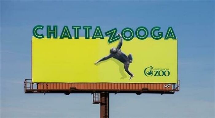
Image credits: okayokayokayokokay
#26 Clever Billboard Sign
Image credits: TrollNaSean
#27 This Wendy’s Billboard Directly Above A McDonald’s Drive-Thru In Ohio
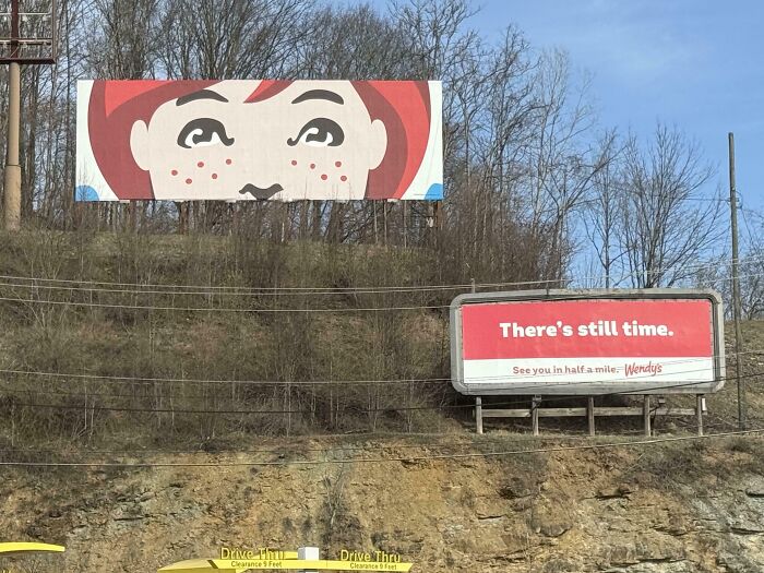
Image credits: Crazey4wwe
#28 Blursed_billboard
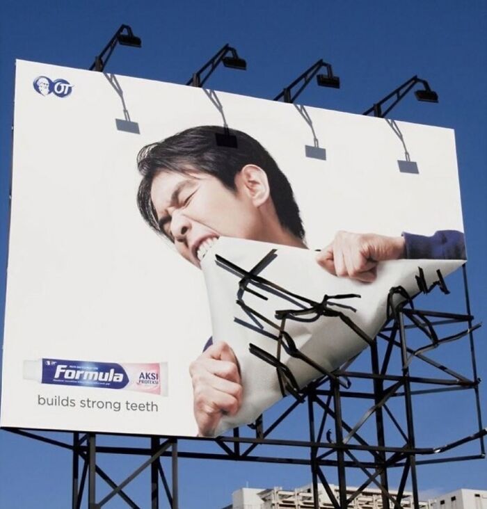
Image credits: SachinNayakK
#29 Good Work Adam
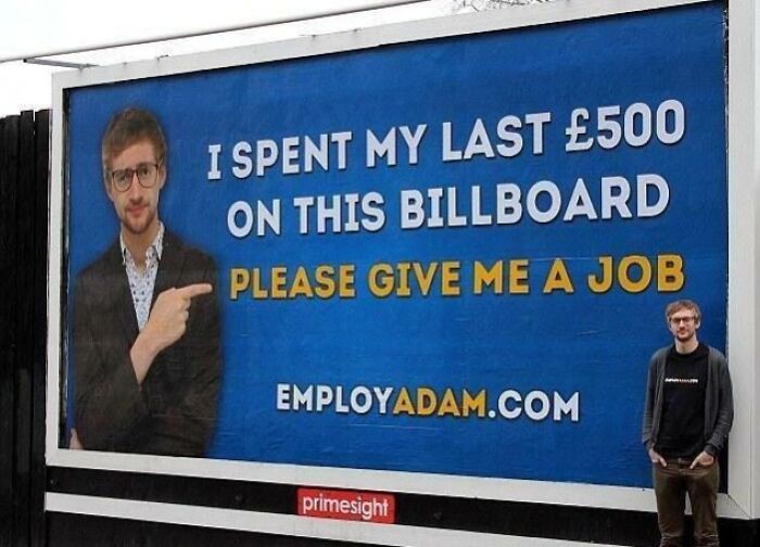
Image credits: albando
#30 Smartly Designed Advertisement Billboard
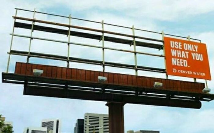
Image credits: Outside_Cockroach
#31 Netflix Marketing Staff Doing A Solid Job Promoting Wednesday
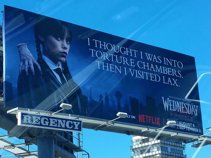
Image credits: CrueGuyRob
#32 When Dad Jokes Make It Onto Billboards
Image credits: knitlikedefarge
#33 An Electronic Billboard Outside Nicholasville, Kentucky
Image credits: Charlie_Olliver
#34 Signad Fish Promo
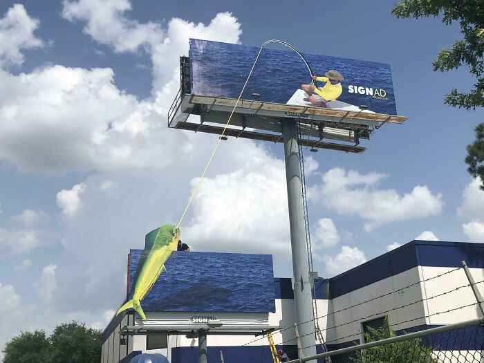
Image credits: gstephenhk
#35 Billboard In Houston
Image credits: agsebesta
#36 Billboard
Image credits: degrudv
#37 My Last Day At Work As An Art Director Making Billboards Was Yesterday. This Was My Last Client -Figured I'd Go Out With A Bang
Image credits: helvetica82
#38 Someone Was Nice Enough To Pay For This Inspirational Billboard By My Work
Image credits: reddit.com
#39 Mhh Hmm
Image credits: tired-son
#40 Clever Weather Billboard
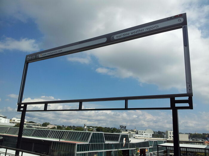
Image credits: vmast3r
#41 Found This Ominous Billboard In Hyde Park, NY

Image credits: TheShadowX4
#42 Harry Potter "Spoiler Alert" Troll Billboard
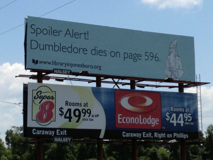
Image credits: Wrinklestiltskin
#43 This Billboard Ad For The Studio On Apple TV+
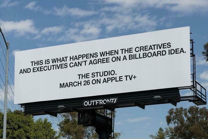
Image credits: Chillax_net
#44 Best Use Of A Billboard Ever
Image credits: reddit.com
#45 Graffiti Artist Improves The Mcdonalds Emoji Billboard
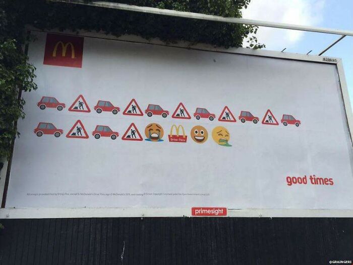
Image credits: pikadrew
#46 Mcdonald’s Bitten Billboards Ads In Paris
Image credits: vodkasolution
#47 Best Billboard War Ever
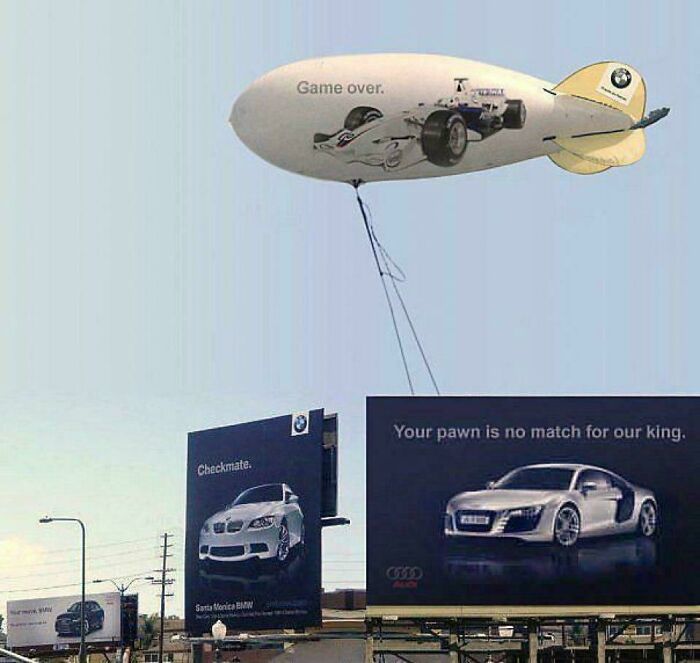
Image credits: freshandfly101
#48 An Actual Billboard In My City
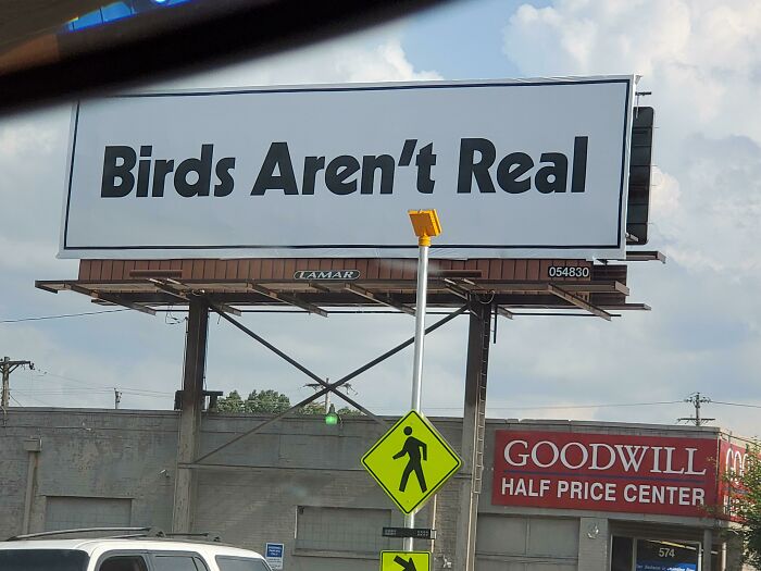
Image credits: sammyyam22
#49 Drove By One Of The Best Billboard Ads I've Ever Seen This Morning
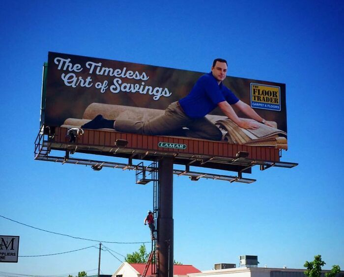
Image credits: funran
#50 This Highway Billboard
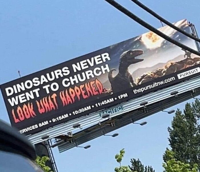
Image credits: RangoTheMerc