Stir the senses, you say? Rouse the spirit, you say? Take the breath away, you say? Decorating with saturated colors is here to answer the call. They’re more than your average red-and-yellow-and-pink-and-greens, these hues are the feisty ones. Think cobalt blue virtually crackling with life, molten vermilion pulled from the center of a volcano, glowing green spilling from a just-cut lime, ruby gleaming like a jewel caught in the sun, or fuchsia plucked from the most resplendent of tropical blooms.
I know. This sounds scary when you’re thinking about upholstery, paint, tiles, or anything home-related. Such shades feel more like decorative dreams rather than the stuff of everyday routines. But they’re so much more than visual fireworks or bold declarations. What saturated hues add when decorating with color in our homes is pure, unrefined drama. They awaken something within us no matter what mood we’re in, invigorating the senses, recharging vigor, boosting enthusiasm, elevating emotions, and igniting passion, all while making a room feel charged and alive.
But how can you use such striking vibrancy to create spaces that are still comfortable to actually live in? Are there any guidelines or rules when decorating with such intensity? Where on earth to begin? Let’s explore the art of decorating with saturated colors and how to make such brilliance feel like a friend in the home.
1. Use Color At Full Throttle
Saturation. The mere word calls to mind explosions of pigment, sunglasses-worthy shades that dazzle and dance. It feels overwhelming, intense, intimidating. These are hues that are raw, undiluted and pure, with barely any added gray, black, or white to mute them; as you’d expect they shine with a lustrous intensity, radiating depth and an almost tangible vitality.
A quick stop — while saturated colors are similar to primary shades, the saturated tones color category is much more open and inclusive. It includes the traditional crimson red, sunshine yellow and cobalt blue, but there’s room for so much more — any hue that’s turned up to full volume, from the juiciest of peaches to shining emerald green, vivid violet, crisp cerulean, and powerful persimmon.
What’s exciting is just how many can qualify as saturated — the spectrum is vast. Such diversity invites creativity and freedom in the home, encouraging us to think beyond old-school conventions and explore the full array of deliciously vibrant hues that’s out there.
2. Surrender To Saturation
In the home, decorating with saturated colors feel…wild. Unexpected. Immersive. Intense. These are tones that have opinions and what to tell them to you, loudly, able to change the atmosphere of a space with the smallest of presences.
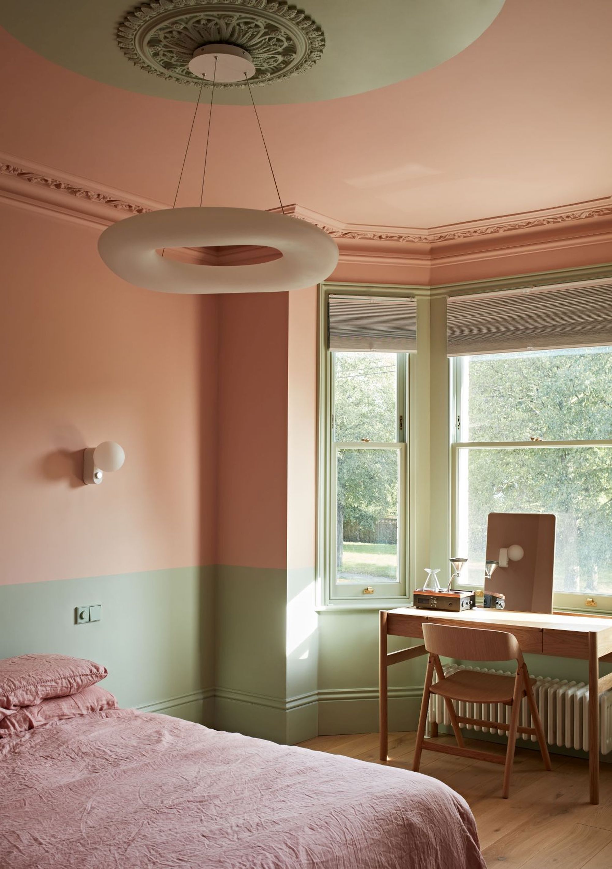
“Decorating with saturated colors can bring focus and vibrancy to a space, dramatically influencing the mood, whether it’s to create warmth, energy, calm, or intimacy,” Catrina Stewart, co-founder and director of Office S&M Architects says. “Brighter options add vibrancy and focus while deeper tones can make a room feel grounded and cocooned."
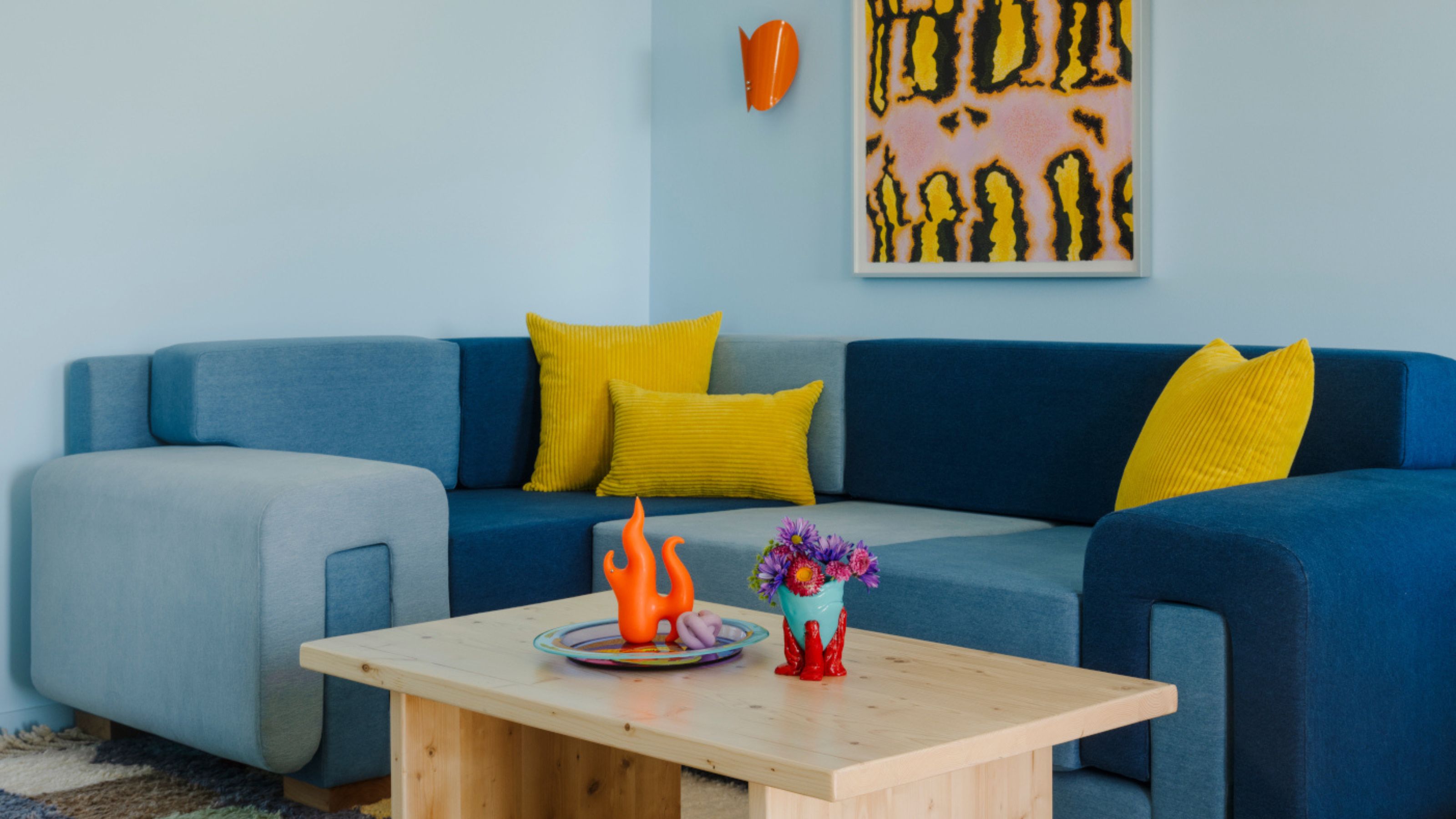
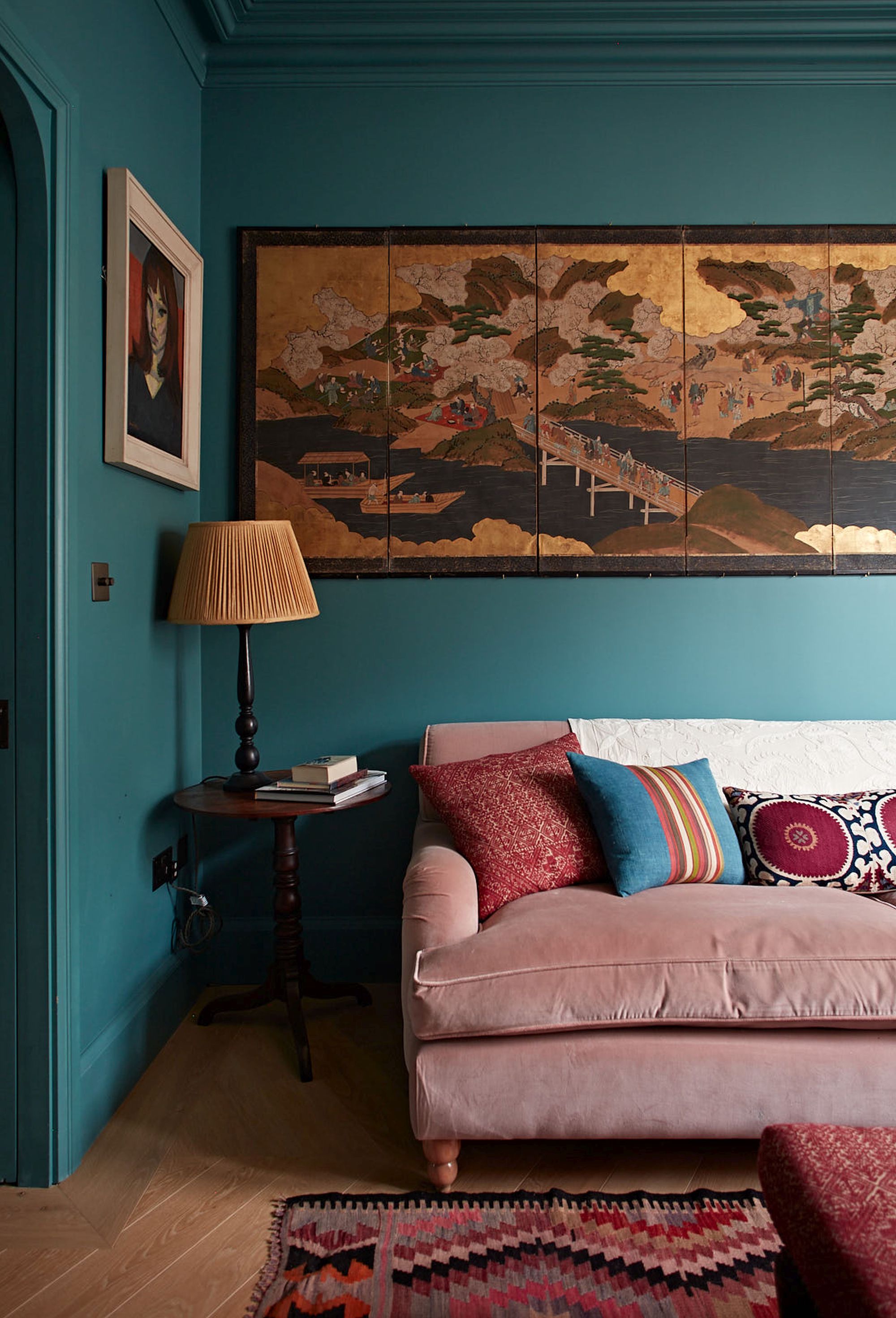
The saturated color palette has many different sides, and characters. On one hand, it can make a home feel unapologetic and audacious, but it can also feel strangely introspective, and emotive. Such potent hues are also imbued with the power to evoke emotion and foster profound depth, making spaces — and those in them — feel alive and resonant.
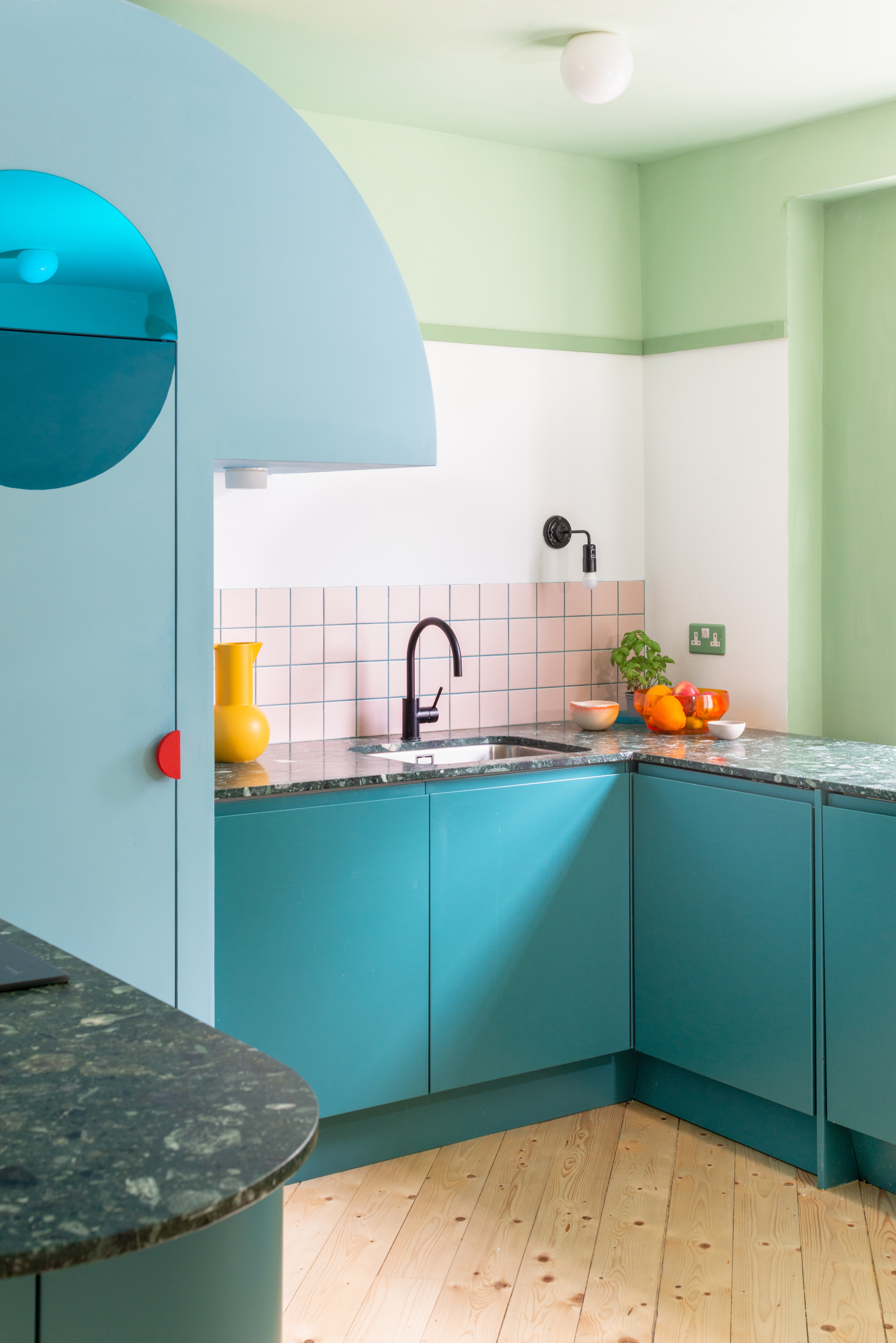
As well as booming impact, decorating with saturated colors can also create harmony. As well as shouting, these tones can sing, and if balanced cleverly with textures and other shades they can become part of a cohesive interior composition that fuses theatricality with unity surprisingly smoothly.
3. Saturate Your Space
It’s okay to start small when decorating with saturated colors indoors. Put away that paint brush — for now. Let’s ease ourselves in, perhaps with an accent or two such as lampshades, vases, cushions, or artwork. Think of it as a gentle introduction to the spectrum, which will allow you to experiment with the colors to see how they work in the space, and how they sit with you.
Once you’re comfortable, gradually increase the scale: try an adventurous ceiling color, a vivid sofa, rugs, or curtains, and then reach for the paint. The key is to build confidence in the palette — and offset it with neutrals and tactility to keep things refined and composed.
Balance is our best friend here. Saturated colors need more space to breathe than other hues, so mix in soothing neutrals — soft whites, gentle grays, warm beiges — to let their vibrancy shine without talking over the whole room. As with any area, it’s good to have some textures to hand too — the likes of timber, fabric, or stone always help to ground a space and counteract intensity by reminding us of nature’s delicate beauty.
Of course it’s vital to consider the function of the room and how you want it to feel when picking the palette, but why shouldn’t bold colors go where no saturated tone has gone before?
“There really are no rules,” says Pereen d’Avoine, founding director of architectural and interior design practice Russian For Fish. “People often assume that you shouldn’t decorate smaller rooms in bold tones, for fear of overpowering the space for example.”
Yes, we’re putting together a palette for our soon-to-be saturated homes, but it should still involve a variety of tones and shades, as well as supporting colors to add dimension and flow. Saturated hues work best when they’re part of a layered approach, rather than standing alone.
“Begin by developing a palette that includes bold and muted tones to give structure to your choices,” Catrina Stewart advises. “Test colors in different lights, and use the strong hues to highlight features by painting large samples on wallpaper and moving them around the room. Plan well, observe closely, and don’t shy away from bold choices — the biggest regret is often playing it too safe.”
Light has a unique way of coaxing out the personality of a saturated color and changing its temperament depending on where the sun lies. “Choosing the right saturated shade depends on how a space is used and how it feels throughout the day. Natural light and orientation are key,” says Catrina.
The best colors for south-facing rooms are often deeper tones, she adds, while north-facing spaces may need warmer colors to lift the mood.
4. Conquer the Color Combos
Using different tones and shades alongside saturated colors adds a sense of subtlety, accompanying hues acting as dampeners to soften intensity and offer juxtaposition to prevent the palette from overwhelming. This blend enhances the overall composition, creating an environment that feels nuanced, engaging, and well-considered.
To start with — build in the non-vibrant shades to allow the saturated to really pop by creating contrast, allowing the them to command attention while maintaining a well-rounded and inviting ambiance (and preventing the space from feeling too chaotic).
“Saturated colors are most effective when grounded by more muted tones that allow them to take focus without overpowering a space,’ agrees Catrina Stewart. “We often build a palette that creates a sense of flow by layering bold shades with softer backgrounds. For example, if you are using a bright peach, pairing it with a gray that contains a touch of pink to create a more natural combination.”
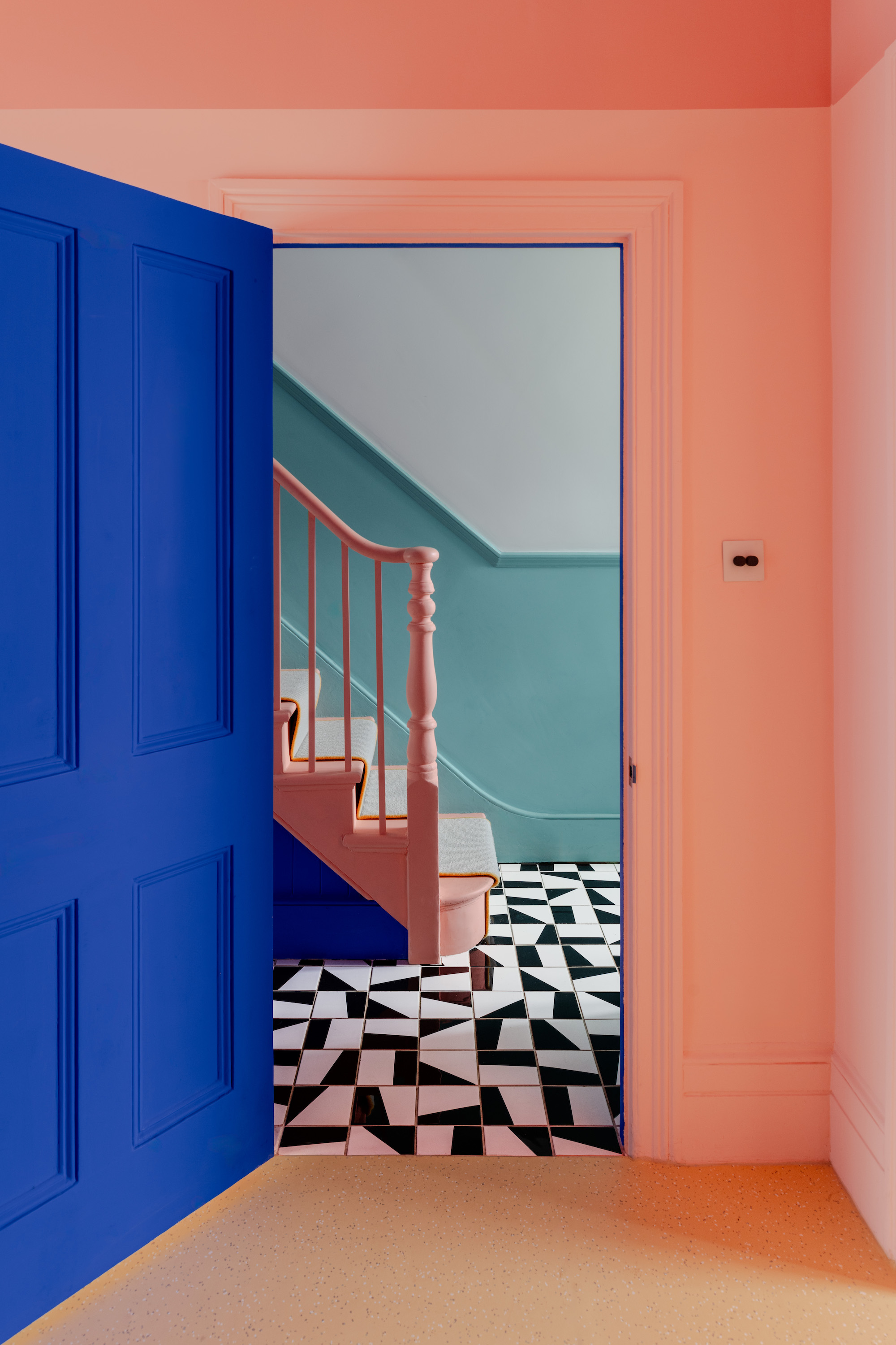
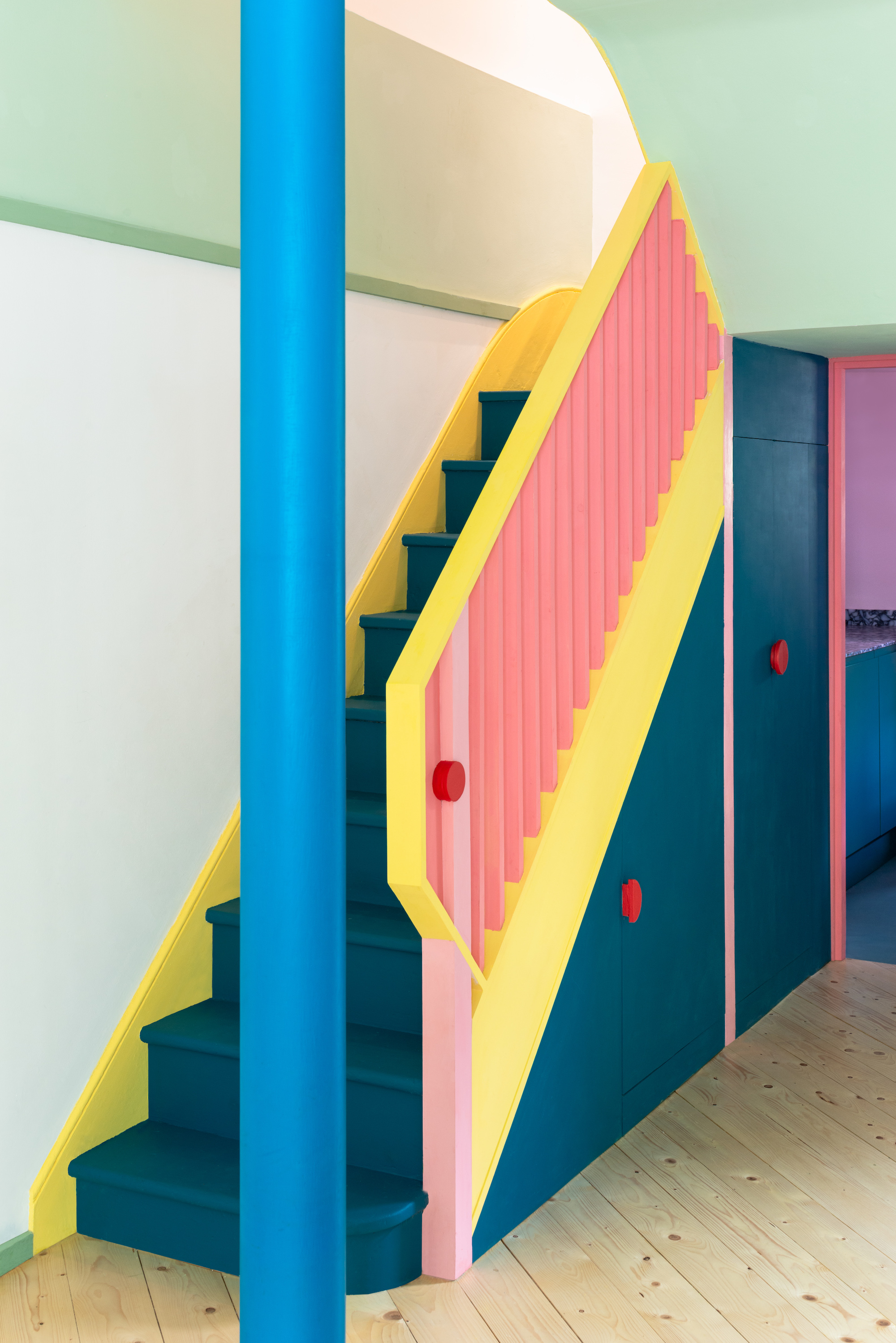
Bright-plus-bright is allowed, and encouraged, too — teaming several vivid hues injects a striking complexity into a room. When carefully selected, these intense tones interact in ways that enrich a home, producing a spirited yet unified quality. “The more the merrier, and don’t be afraid to mix and match!’ says Pereen d’Avoine. “We love seeing combinations of complementary colors — a brilliant yellow paired with a rosy pink for example.”
When grouping saturated colors, you can fall back on what the color wheel in interior design teaches us. For a — slightly — less impactful pigment-filled palette, choose warm tones that complement each other such as marigold and scarlet or flame red and apricot, or on the cooler side sapphire and aqua, emerald green and teal or royal purple and indigo.
If you’re feeling ultra-adventurous, mix warm and cool saturated shades for a highly expressive, vibrant clash, such as tomato red and ice blue, magenta and emerald or coral and azure.