Pantone is a brand created by designers for designers, and as such, time after time it has made made high-level branding decisions that have strategically turned the functional colour communication company into a lifestyle choice.
Here, we’ve put together a list of Pantone’s top six branding moves that have all played a pivotal role in forming a brand whose logo on a water bottle or notebook is all you need to spot an artist out in the wild. For more great branding, see our best logos of the decade series.
01. The Pantone Colour Match Card
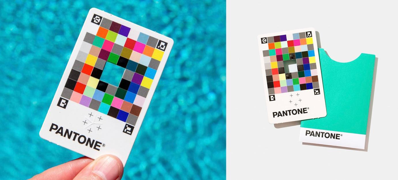
Although print is not as widespread in the media industry as it used to be, the communication of colours is still an essential part of digital publishing – any self-respecting company will have the hex codes of its signature brand colours noted down somewhere. To reflect this shift in the publishing industry, Pantone released the Colour Match Card and its connecting app, Pantone Connect, in 2020.
The Colour Match Card works as a QR code for colour. It has a square cut-out in the middle surrounded by squares of classic Pantones colours, and holding the wallet-sized card up to anything allows the Pantone Connect app to identify the matching Pantone hex code when pointing the camera at the card. This Pantone can then be saved and either exported as a PNG or sent to your Adobe account.
The Colour Match Card was released during the Covid pandemic, so reflected the need for artists to be able to work in a more dynamic way. It was a move that recognised the freelance designers and those who work from home in its customer base, firmly establishing Pantone as a company not just for big companies, but for freelancers and small agencies too. On its release, the Colour Match Card quickly became something to show off on your Instagram story or LinkedIn page.
02. Pantone Colour Connect/Studio
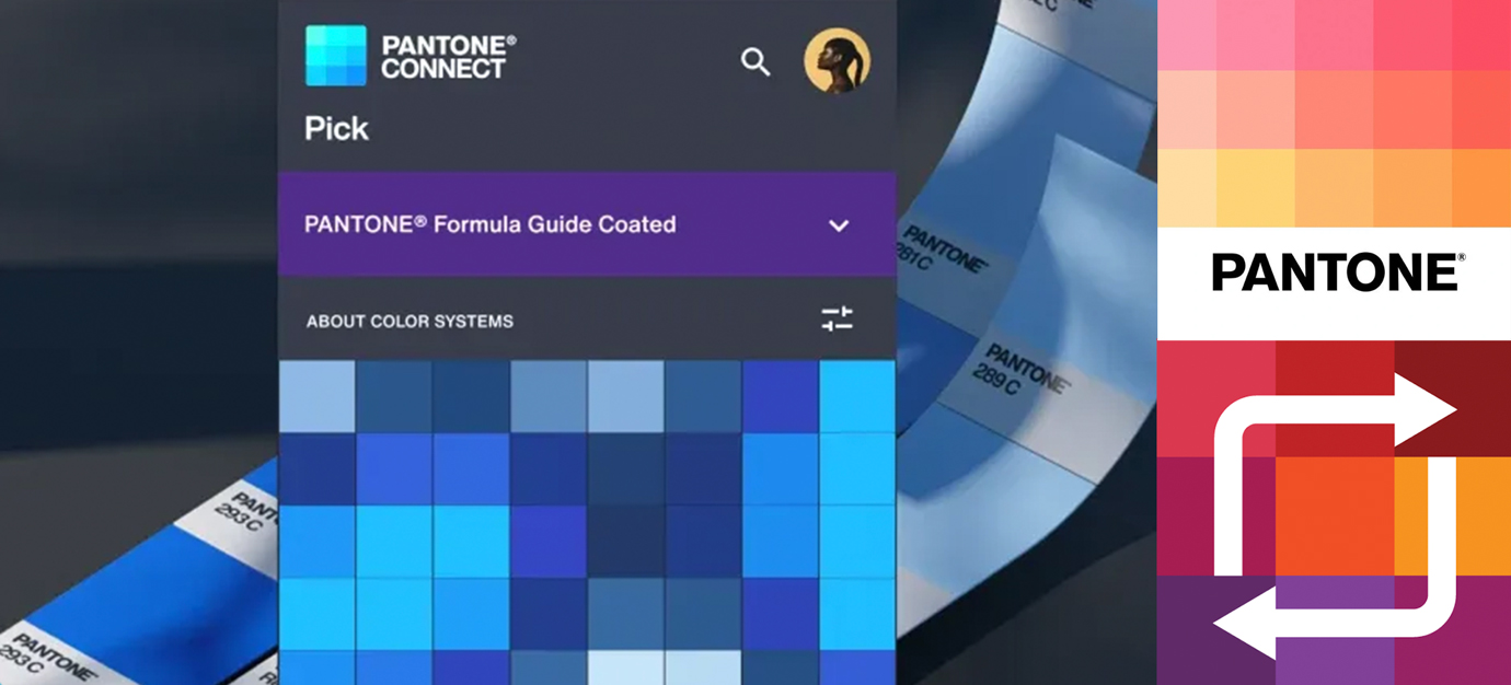
The main purpose of Pantone Connect is to scan colours into the app using the Colour Match Card. However the app also includes a 'Trends' section, where you can explore features and articles on current colour trends as well as featured pieces of artists’ work that use Pantone colours. You can also browse through all of Pantone’s digital colour swatches and select certain Pantones to use to form your own palettes.
You can create as many colour palettes as you like, and these can then be saved as PNGs or sent directly to your Adobe account, although it is worth noting that Pantone Connect Premium costs an extra $14.99/£14.99 on top of your monthly Adobe fee.
The selection of colours and the accompanying colour palette tool is probably the most valuable aspect of the Pantone Connect app, as it allows you to create your own palettes on the go and save them as individual files to have to hand to use in your Adobe files, which saves time compared to creating your own palettes in Photoshop. It also means that the colours you pick up on the go using the Colour Match Card can be saved, added to your palettes and used in the exact hex code that you picked them in. This is just another tool which adds to the seamlessness of boundless colour communication.
03. Pantone products
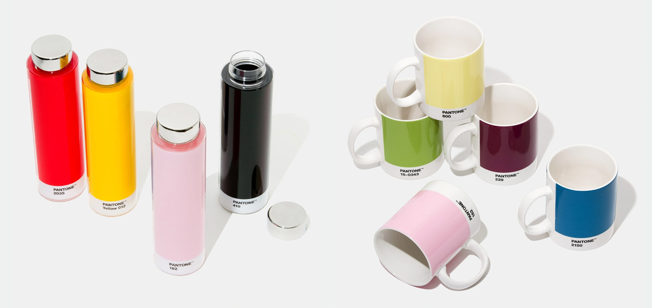
The Pantone lifestyle range has become a staple of the desks and bags of all artists and designers. Not only are they beautiful products simply because they display Pantone’s flawless and iconic brand design, they also give creatives an opportunity to put their love and use of Pantone on show.
Pantone’s branded water bottles, mugs and tech accessories have been a feature of the London Graphics Centre for a while, but over the last few years you might have noticed Pantone’s lifestyle products cropping up in your local stationery and art shops. Because of this, Pantone’s brand has started to attract people who would usually be unaware of the colour company, and the more widespread its lifestyle products have become, the more Pantone’s profile has emerged into the mainstream.
04. Pantone's Colour of the Year
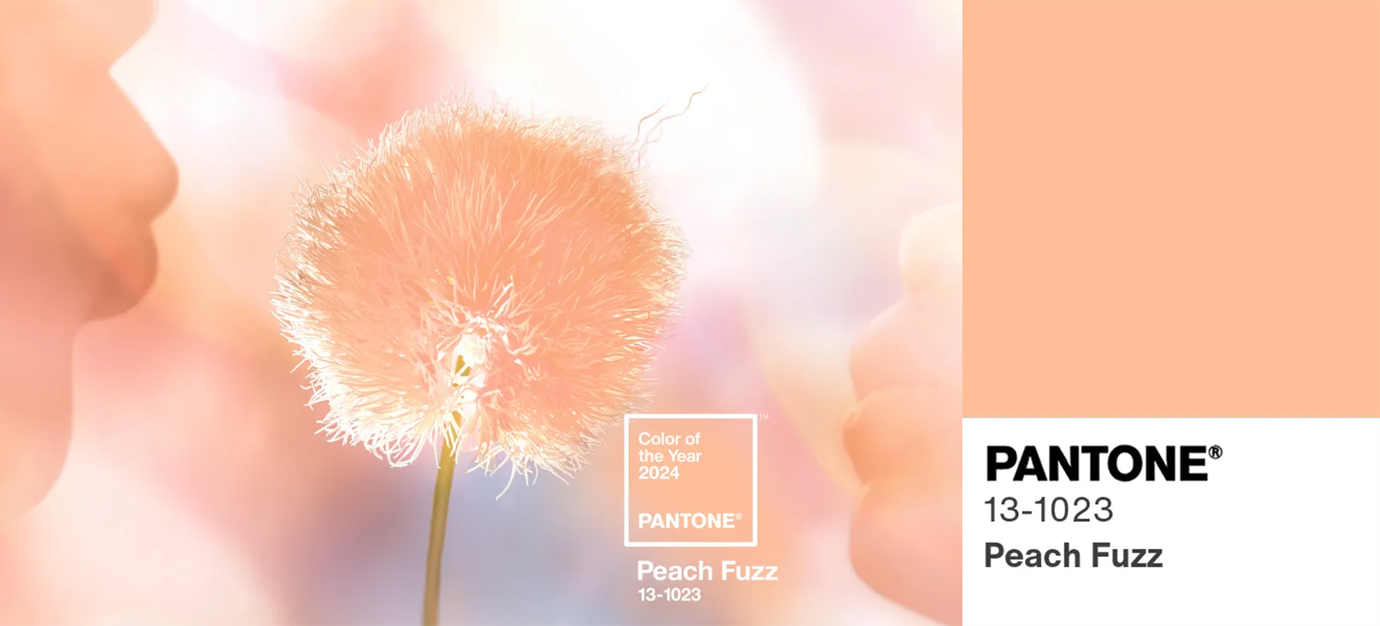
A concept launched in 1999, Pantone’s Colour of the Year has become a heavily anticipated moment in every artist’s December. It is easy to assume that it’s a prediction of graphic design and artistic trends for the coming twelve months, but Pantone actually claims that it chooses its colour of the year in accordance with current trends and what’s happening in arts and culture at that exact moment in time.
Although it is not intended as a prediction, Pantone’s Colour of the Year is such an important cultural moment in art and design that it often ends up informing the creative decisions of designers and artists and influencing the colour trends of the year. In this way, it has become so influential that it often ends up becoming its own self-fulfilled prophecy and operating as a prediction anyway. It's another great piece on branding that keeps Pantone in the public eye and has helped it become a household name.
05. The creation of trademarked colours
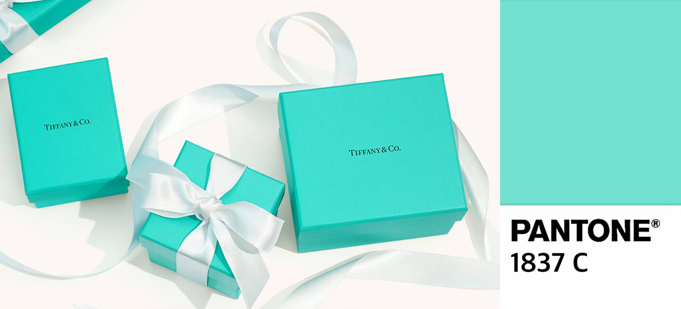
In 2001, Pantone was asked to create a blue especially for Tiffany and Co., after the original blue colour apparently started to develop an off-green tint. The ‘medium robin egg blue’ created for Tiffany and Co. was Pantone’s first trademarked colour developed especially for a high-end brand and following this, Pantone was commissioned to create the also culturally iconic Christian Louboutin red, which was trademarked in 2018. Pantone also created ‘Jay Z blue’ as well as 'Minion yellow', ahead of the Minions film in 2015. The yellow behind the branding of the iconic record label Third Man Records was also created specifically for the company by Pantone.
All in all, Pantone’s portfolio of clients stack up to some of the most influential and key brand names in high-end fashion as well as the music industry. Pantone has been key in the creation of some of the most recognisable brands in the world, but the clever thing is that all of these commissioned colours have also played a key role in establishing Pantone’s own brand. By branding other companies, it has also branded itself. This branding decision has arguably been the move that has most significantly thrown Pantone’s weight around as the only company there is room for in the colour communication market.
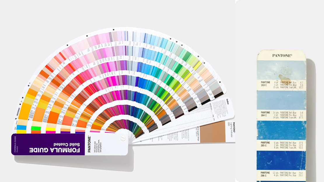
06. The Pantone Reference Library

As a combination of all of Pantone’s much sought-after swatch books, the company sells a full Pantone ‘reference library’, for the hefty cost of $2,101/£1,822.80. The bundle is a library of all of Pantone’s colour chips, including large folders for both coated and uncoated chips, as well as a folder especially for metallics and another for pastels and neons. It also includes eight official Pantone swatch books.
Although the price looks hefty, the two thousand pound pricetag is actually an incredible discount on a lot of sought-after Pantone material that when bought individually could end up costing a couple of thousand more.
In the art world, once you can afford your own Pantone swatch book, you’ve made it, so if you can afford your own Pantone reference library, that’s a new level of creative success. The creation of this Pantone reference library is the sort of branding decision that creates something above just a few Pantone swatch books and creates an object ultimate goal for artists to aspire to. This on its own is not only a business-savvy move, but also makes a big difference in positioning Pantone’s place in the industry; as it manufactures the dream product for which half of its appeal is the brand name.
For more on colour, see our piece on colour theory, or explore these uses of colour in branding.