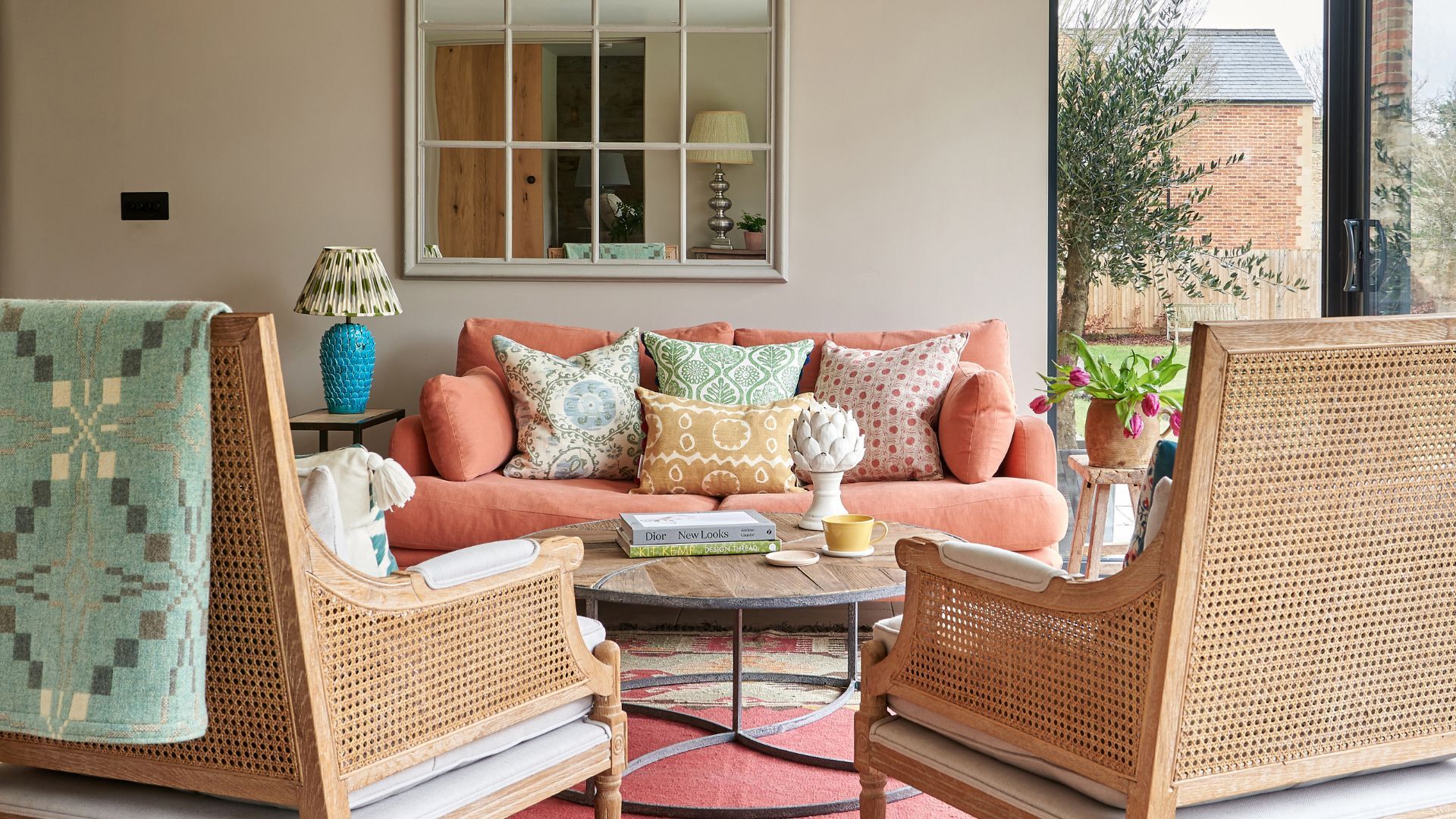
Once dismissed as dull, beige is having a major revival. No longer just a background player, this versatile shade has stepped confidently into the spotlight, offering warmth, depth, and elegance in equal measure. It's the kind of color that quietly transforms a space without demanding attention.
Unlike fleeting fads, beige has proved it’s more than a passing phase. Beige paints continue to top bestseller lists and are a cornerstone of current color trends, striking that perfect balance between cozy and contemporary. That said, not every beige is a winner. The best beige paints today avoid yellow undertones and resist veering too cool. Think rich, grounded tones that feel calm but never flat.
If you're flicking through magazines and trawling the web for beige room ideas that you love, but unsure which beige paint should be enlisted to create your desired effect, happily, to help narrow the search, we have turned to designers and color specialists for their top beige paint picks for 2025.
14 best beige paints chosen by interior designers
1. Slipper Satin, Farrow & Ball
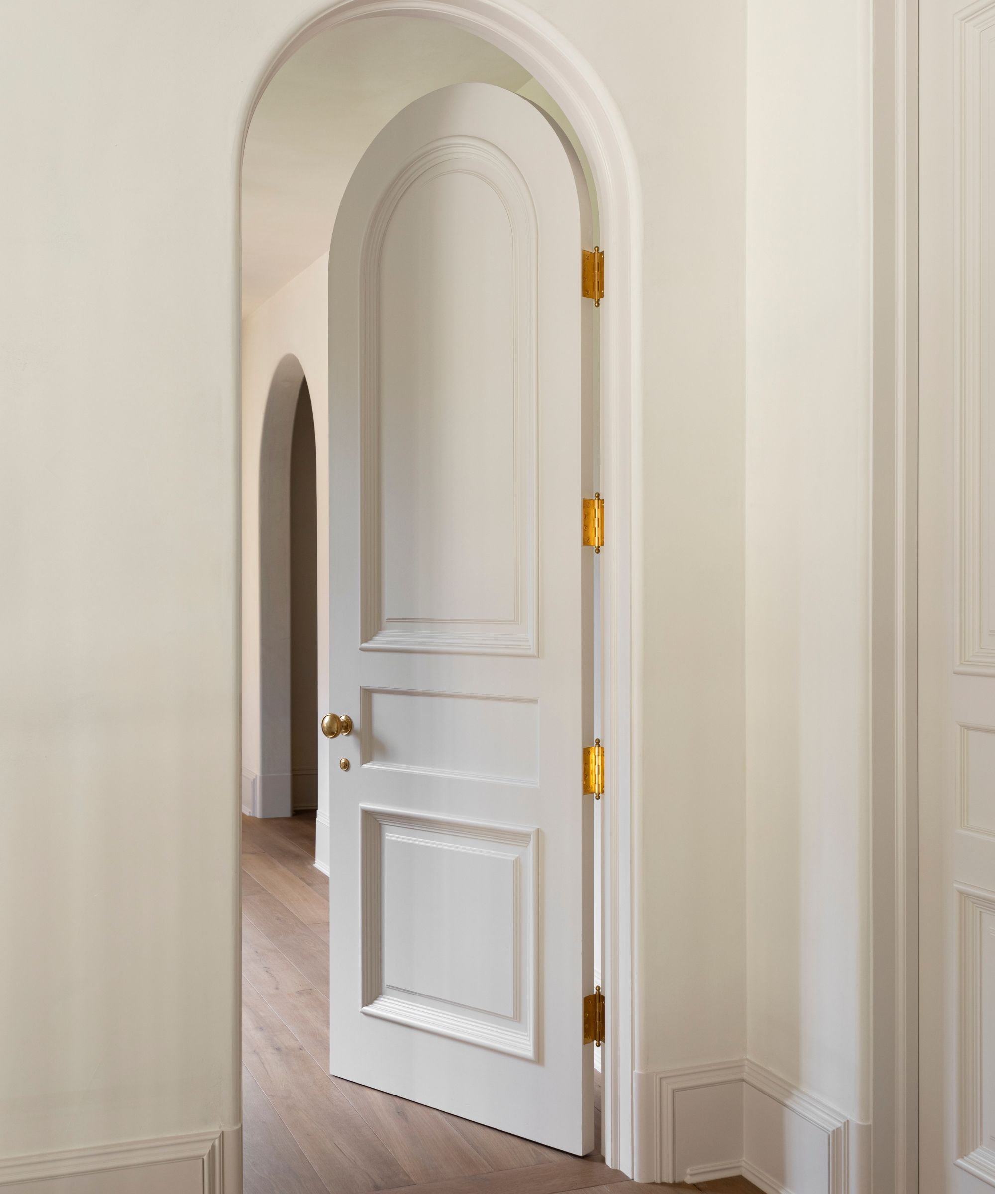
Slipper Satin by Farrow & Ball is a beautifully pale, unsaturated beige that is so gentle and soft, it is closer in many ways to an off white, and in some cases can read as a creamy, soft gray paint. If you are searching simply for a mild, well-mannered pale beige and want to forgo the warmth of a toasty beige, this is the color to choose.
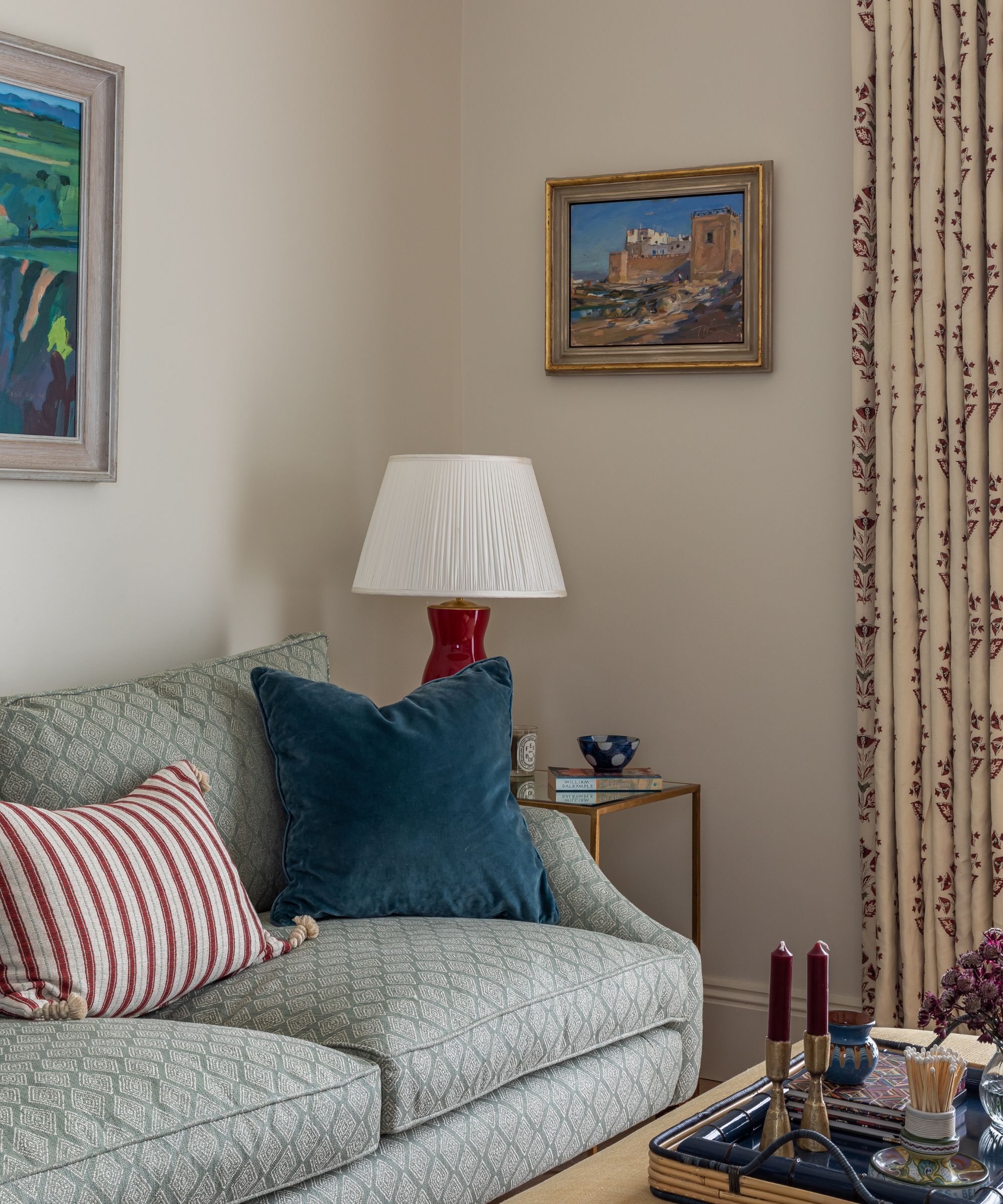
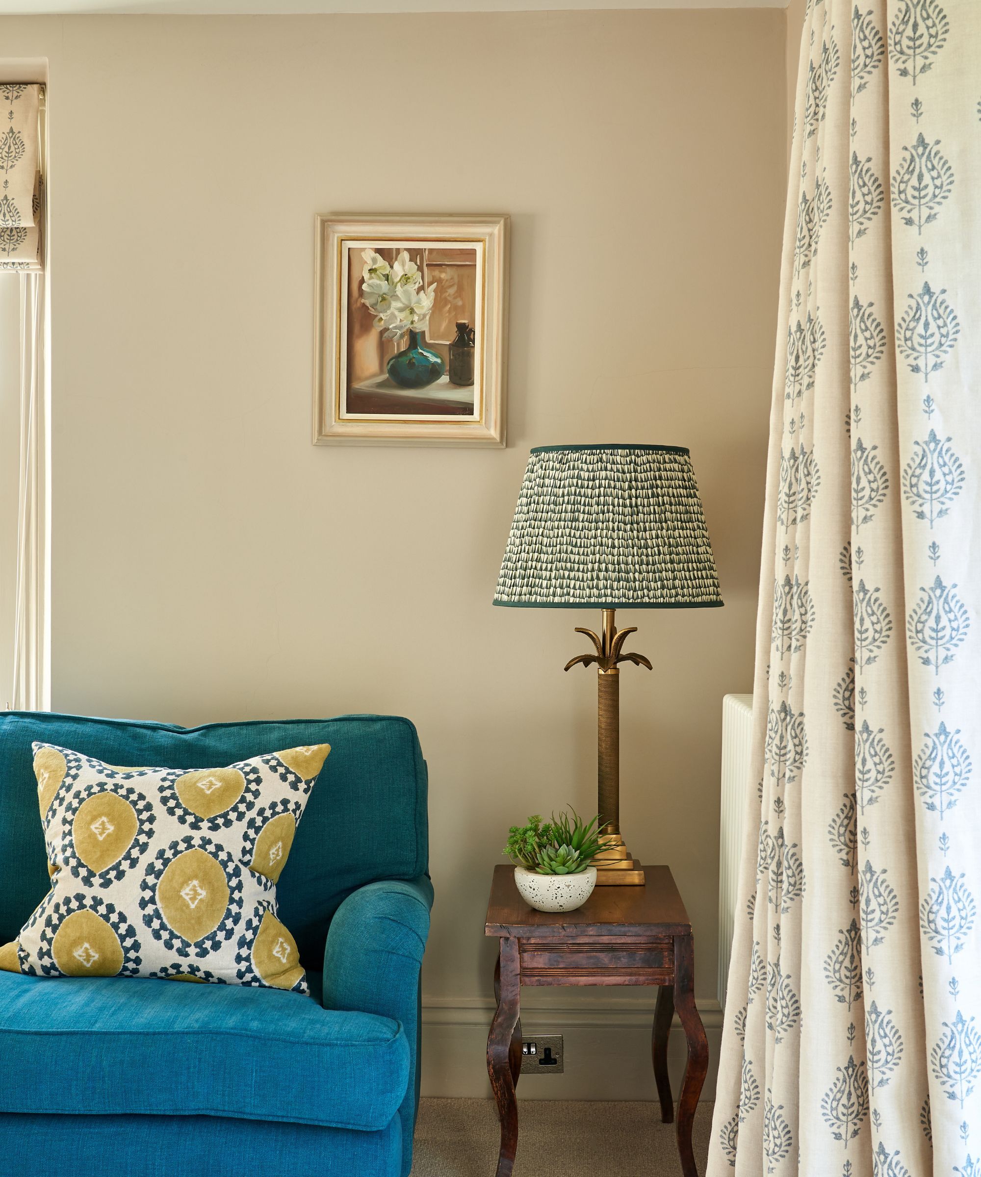
Alex Keith, Design Director at Otta Design, a UK-based interior design studio, and with over 13 years of experience in residential interiors, nominates Slipper Satin as a tried and true beige paint.
‘In this small London pied a terre we designed, the clients wanted the fabrics and furniture to take centre stage, so we decided to use the wonderfully versatile Slipper Satin by Farrow & Ball on the walls, its a very soft, subtle, creamy beige that works beautifully, particularly here in this example with the background of the curtain fabric.’
Slipper satin has a very pale tinge of ballet-slipper pink, hence the name, and so is a particularly flattering and calming color. If you are finding it a task choosing between the many beige paints on the market, Slipper Stain is certainly one to swatch, particularly because it neutralizes to a nuanced off-white paint in full daylight, so it is very easy to use and doesn’t overwhelm a space.
2. Portland Stone, Little Greene
‘I use often Portland Stone by Little Greene as a failsafe neutral backdrop for a room as it’s a great warm beige that suits all rooms, no matter what, whether that be a hallway or a living room,’ explains UK-based interior designer Caroline Borgman.
Caroline wholeheartedly recommends this shade as a wildly versatile and easy-to-use beige. ‘One of the best things about this Little Greene shade is that it works beautifully when teamed up with colorful furniture and soft furnishings. I use it a lot with blues and greens, and it also works beautifully with warm rusts and burnished orange hues.'
When Little Greene developed Portland Stone, they also made two sister neutrals, Portland Stone Pale and Portland Stone Dark, which are very similar, although, as befits their names, one is slightly paler and the other slightly darker, but all three are designed to work in perfect harmony with one another.
‘If I’m looking at a tonal beige scheme in a neutral living room, for instance, I would pick out any cabinetry in a stronger level, such as Portland Stone Dark, and on the ceiling I might use a lighter shade, such as Portland Stone light.’ Caroline adds. ‘Portland Stone is also a great external color, and I’ve recently finished a project where we have used Portland Stone Dark on the front door - it looks incredibly smart and sophisticated. I highly recommend it.’
3. Oxford Stone, Farrow & Ball
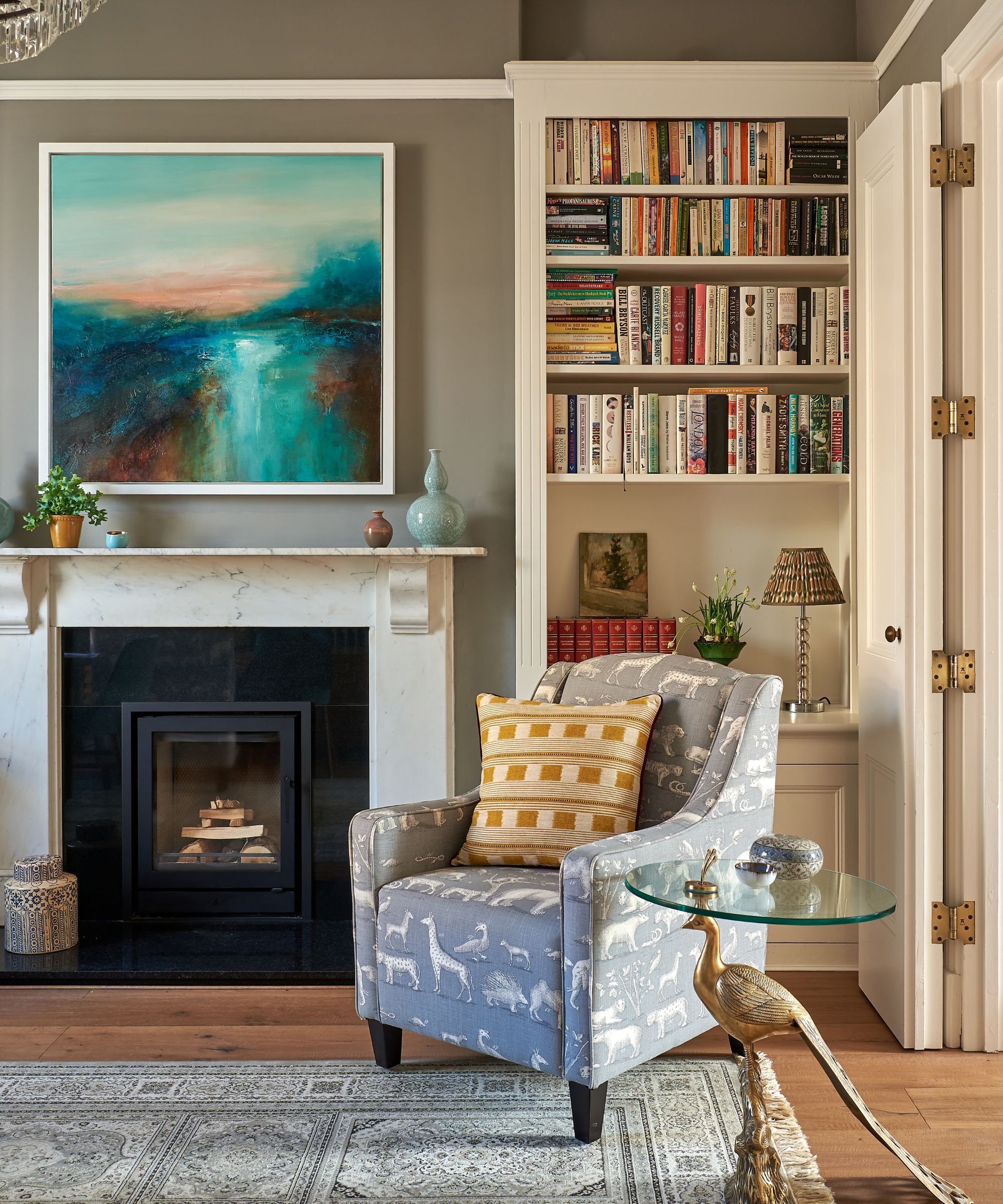
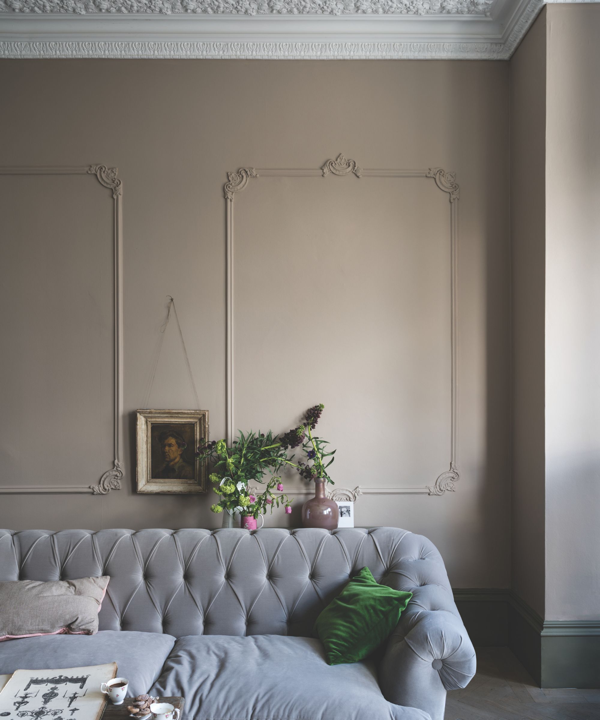
‘Oxford Stone by Farrow & Ball is a darker, warmer neutral,’ explains Alex Keith. The color is modelled on the sumptuous honey colored houses dotted across the Cotswolds in rural England. As such, it has a nostalgic and comforting feel to it, brimming with warmth and richness.
‘Oxford Stone envelopes this kitchen,’ explains Alex, 'it adds unmatchable depth and complements the veining in the marble worktop. With a subtle pink undertone, it sits comfortably alongside the island painted in Farrow & Ball Brinjal.’
If you are looking for an earthier, richer beige, but don’t want to veer into anything too muddy or brown, Oxford Stone, whilst warm and cocooning, is not stifling and oppressive, as some burnt sienna and coppery beiges can be. That said, it's worth bearing in mind that in light-deprived rooms it will read particularly warm, great for a chilly north-facing room in need of an injection of warmth, though less desirable for a small room you want to make feel spacious and fresh.
4. Slaked Lime, Little Greene
Slaked Lime is one of Little Greene's all time best selling paint colors, and one that we hear interior designers praise time and time again when they discuss their go-to colors for decorating with neutrals.
'Slaked Lime is a good all-round neutral which works so well with almost all palettes and in almost all rooms,' notes Caroline Borgman. 'I also tend to use it a lot on kitchen cabinetry, as well as in entryways and living spaces, namely because it is so timeless it will never go out of style. It has slight green undertones, which give a gentle and soft appearance. I love the fact that it creates a calm backdrop for a lot of my schemes.'
If you are looking for a color that will make rooms look bigger, then this sophisticated and understated shade will almost certainly deliver. If you like what you hear, but just want something that little bit warmer and buttery, its partner color, Slaked Lime Deep is a wonderfully chic color with an enduring feel.
5. Jitney, Farrow & Ball
‘Beige tones have such a beautiful, grounding quality, bringing a quiet warmth that feels both modern and timeless,’ says Jaime Zhener, founder and principal designer at JZ Interiors, a celebrated California-based interior design studio that specialises in older beach cottages and a relaxed West Coast aesthetic.
‘One of my all-time favorite shades is Farrow & Ball’s Jitney as it has a soft, sun-kissed depth that works beautifully in both contemporary and traditional spaces.’ Jitney is a brown based beige, warmer and earthier than Oxford Stone, but it remains very unobtrusive and grounding.
‘Jitney pairs effortlessly with natural materials like linen, stone, and wood,’ notes Jaime, ‘creating a layered, lived-in warmth. Whether on walls, cabinetry, or even trim, Jitney envelops a space in an inviting, organic softness that feels incredibly calming.’
6. Adobe Dust, Benjamin Moore
If you're searching for a rich, rustic, terracotta-inspired beige and planning to decorate with earthy colors, then Benjamin Moore's Adobe Dust is worth considering. It has distinctive warm and earthy undertones of orange, red, and brown, which set a natural, easygoing tone, wonderful at creating warm, intimate, and informal spaces.
This warm beige is often used by the prestigious interior designer Jon de la Cruz of de la Cruz Interior Design, an award-winning interior design firm based in San Francisco. 'One of my favorite beige, clay-inspired hues for a room is Adobe Dust by Benjamin Moore. It is a warm, grounding color that feels both natural and elevated,' Jon explains. 'It was the perfect choice for this house in San Francisco, designed to be a welcoming, casual space where kids and adults can play games, unwind with a nightcap, and simply enjoy being together.'
7. White Dove, Benjamin Moore
'Two of my favorite beige paints are White Dove and Pale Oak. I use White Dove in so many of the homes I design, and I particularly love using it in a foyer as my center hall base color,' explains designer Tova Kook, Lead Designer of TK Design. Tova, an artist herself, has an innate understanding of the power of color, and since 2013 has been bringing this knowledge to her interior design projects.
'I find that warm whites and taupes are more fresh versus cooler crisp whites such as Decorators White and Chantilly Lace, which used to be very popular, and tied to gray colors often,' notes Tova. It would appear that Tova agrees that in some instances, there are times you should never paint a room gray. 'I have moved away from designing gray spaces, and I think many designers would say the same! This goes along with the idea that beiges and taupes are the new grays and cool whites.'
'White Dove and Pale Oak both look great from morning until night, especially in spaces that do not have that much natural light. Some beiges turn too yellow, while White Dove and Pale Oak specifically always hold their ground. When working with base and casings, I do not like to do contrasting whites, as I think contrasting with stark white molding is passe. Additionally, White Dove looks clean on the walls and is applied to the base and casings. I do an eggshell finish typically on the walls and satin on the base, casing, and doors,' adds Tova.
8. Swiss Coffee, Benjamin Moore

'Swiss Coffee OC-45 is an essential white with just the right amount of warmth. It is a popular choice for people looking to avoid the clinical feel of a pure brilliant white paint, while still creating a clean and understated look. This hue is very flattering in bathrooms as it brings a sense of softness to the space, contrasting hard elements such as tiles, mirrors, and fixtures.' explains Helen Shaw, Director of Marketing at Benjamin Moore.
I used this shade in a recent bedroom renovation in lieu of a traditional white, and the result has been a calming, cool yet fresh and airy feel in the bedroom, which I adore.
'It's one of those wonderful colors that has just the right amount of warmth. These warm undertones add depth to any space and play well with other creamy shades and golden hues. It’s a great backdrop for any room as the design potential is endless. It is this versatility that makes it such a popular color.'
'A modern approach would be to pair the color with a contrasting black trim. The warm neutral provides the perfect base for experimenting with daring dark accents. Alternatively, layer with a range of subtle and muted color tones. Layering creams and whites on top of one another alongside different textures and materials will add depth and interest to your design,' suggests Helen.
9. Modern Gray, Sherwin Williams
'Despite the word 'Gray' being in its name, Modern Gray by Sherwin-Williams is a lovely, warm, and adaptable beige,' says Mollie Ranize, founder of Dmar Interiors, an interior design firm renowned for their California Modern style, and founded almost twenty years ago by Mollie herself. 'It feeds off of its surroundings, so when paired with other warm tones like wood, it's a soft and soothing paint color.'
That is something to bear in mind when choosing the best beige paint. Beige is one of those shades that can quite dramatically change depending on the light or the colors you pair it with. As Mollie mentions, you can usually up the warmth in a beige paint by combining it with a warmer color or wood tones. Likewise, if you were to pair it with a cooler tone like a gray or a crisp white, it might show cooler.
10. Biscuit, Farrow & Ball
'First, it was beige then greige, and then gray became the paint color to which everyone turned most likely because it is reasonably straightforward to put together a neutral scheme,' explains the illustrious UK-based interior designer Joanna Plant. 'And now it seems beige has returned, although reinterpreted as buff and biscuit, probably because we are still feeling nostalgic and these colors do speak of a ‘below stairs’ palette.'
'I am particularly faithful to Biscuit, an archive Farrow & Ball color which we are currently using for a laundry room. Farrow & Ball Cord I have used very successfully in drawing rooms for years as it’s impossibly smart and looks really great with pictures. Another favourite is Edward Bulmer’s Clove which we are using over and over again at the moment – it’s neither too pink nor too brown but a very pleasing, soft color that works very well in bathrooms.'
11. Canvas Tan, Sherwin Williams
'When it comes to beige paint colors, our top recommendations include Accessible Beige, Canvas Tan, and Wool Skein all by Sherwin-Williams. However, Canvas Tan stands out as our favorite for its ability to infuse spaces with a soft, inviting warmth,' explains designer Jennifer Davis, who has 25+ years of interior design experience and a long history of trying out many iterations of beige paint.
'Canvas Tan is my go-to choice because it effortlessly complements diverse design styles, offering a sophisticated backdrop that adapts beautifully to various lighting conditions. Canvas Tan's subtle warmth pairs beautifully with white woodwork, creating a clean, crisp, and fresh contrast.'
Canvas Tan is described by Sherwin-Williams as a 'khaki-tinted white', so it has more olivey undertones rather than yellow which gives it a fresher feel. It's still very warm as most beige paints are, but it's less close to cream, more close to a griege paint.
12. Accessible Beige, Sherwin Williams
'Beige is both classic and complex, and is one of the most versatile colors that plays beautifully with any hue. I have many favorites, but if you’re looking for a classic beige color, Accessible Beige by Sherwin-Williams is one of our go-tos, which has beautiful, warm gray undertones,' explains designer Audrey Scheck.
This beige paint is an ideal mid-tone, it's not too dark but it's got more going on than a white. It's a nice choice for softer spaces like bedrooms and living rooms. It also works well in rooms that don't get all that much natural light – it will appear darker and more gray in these spaces but still warm and snug-like.
13. Revere Pewter, Benjamin Moore

'Revere Pewter by Benjamin Moore is a classic neutral that bridges both warm and cool tones that pairs nicely with an array of colors,' continues Audrey, who listed this ever-popular shade in her list of best beige paints.
Decorating with Revere Pewter is simple, it's 'an iconic neutral that provides a versatile bridge between warm and cool tones. It feels contemporary and harmonious, yet adds warmth to an otherwise sterile gray. Its versatility means it can effortlessly work with a breadth of design styles and accent colors, making it a perfect base to build any scheme,' agrees Helen Shaw.
14. Drift of Mist, Sherwin Williams
This is a shade that comes up time and time again when talking to designers about neutral color schemes. Drift of Mist by Sherwin-Williams is one of the brand's best-selling neutrals, and it's the perfect gray-toned beige. It's ideal for rooms that lack natural light as unlike some beige paints it doesn't become too dark when used in a darker room.
'Although not a true beige, this greige is one of my favorite neutrals – especially for areas that receive a lot of golden hour light. With a hint of gray, it helps neutralize warm tones for an inviting yet airy feel,' explains Lauren Sullivan, founder of Well by Design.
Beige is most definitely the color that is replacing gray in the home. There has been a significant shift away from cool, minimal, gray spaces and a movement toward softer, more welcoming spaces - something that beige and warm neutral tones are well equipped to offer.
With that in mind, if you are tackling a particularly empty and stark room and wondering, how can I add warmth to a room? The first thing to remember is that layering in interior design is paramount for a warm, welcoming, and lived-in feel, decidedly not like a soulless showroom. Start with the walls and the woodwork, adding a gentle hum of warmth to these areas will set the whole tone for the room, and allow you to layer on top easily. The beauty of beige is that it works in nearly every room and complements a whole range of palettes, so there's very little room for error.