Apple is known for sleek, minimalist design, from its products to its branding. We've already recapped the Apple logo history, but what about Apple typography? What font does Apple use to back up its brand identity?
Typography plays an important role for any brand, and that's doubly true for a tech giant like Apple, which uses type in its marketing but also in the UI design of its software. Today, Apple uses its own San Francisco typeface for both, but the Apple font history has seen some surprising and sometimes controversial decisions on the way.
A brief history of Apple fonts
This isn't an exhaustive account but six key moments in Apple typography, from its early pre-Macintosh branding to the present day brand and system typeface.
01. Motter Tektura: the future according to the late 70s
It might seem surprising now that Apple would use a non-custom typeface as its brand font, including even for its logo, but it's used subtle variations of off-the-shelf type options for much of its history.
Before the launch of the first Macintosh in 1984, the Apple logotype and product labels – most famously the Apple II – used a typeface designed by Othmar Motter of Vorarlberger Graphik in Austria 1975.
Motter Tektura might not be a household name like Helvetica or Arial, but this quirky sans serif got about a fair bit in late 1970s, making appearances in the logos of Reebok and the notebook and binder maker Trapper Keeper.
Apply modified it slightly and used the 'a' to fit into the bitemark in the Apple logo. It looks quaintly retro futurist today, but you have to imagine that in 1977 it was just futurist, conjuring up visions of an optimistic techno tomorrow.
02. Classy Apple Garamond
With the launch of the Macintosh in 1984, Apple ditched its by now slightly cartoonish vision of the future for something altogether more elegant: a narrowed custom version of a classic 17th century serif.
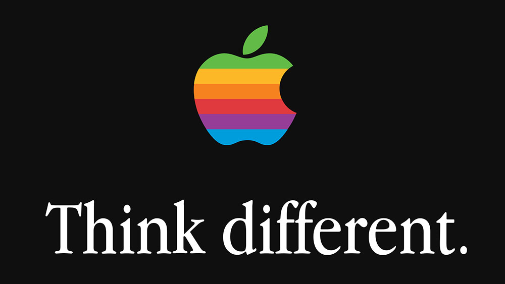
The brand would use Apple Garamond in its marketing for 18 years, minus a brief dally with Gill Sans. Even when Apple told us to 'think different' in the late 90s, it was with this traditional-looking font, which exudes class and refinement. The serious bookishness of the type contrasts with the vibrant colours of the rainbow Apple logo for a more mature vision of tech.
03. Modernising Myriad
Garamond might be elegant, but it screams luxury fashion more than bleeding-edge tech. In 2002, a year after launching the iPod, Apple wisely decided it was time for a more modern look to match the new device's sleek minimalism. Since sans serifs are generally considered the better choice for digital displays, sans serif it would be.
Apple's choice was Myriad, a font made for Adobe. Again, Apple had the typeface modified, which was done by Galápagos Design Group, but there are only minor spacing and weight differences from the standard version. It was clean, readable, accessible and highly adaptable, fitting a wide range of applications, even if it wasn't exactly original.
04. Pioneering Chicago
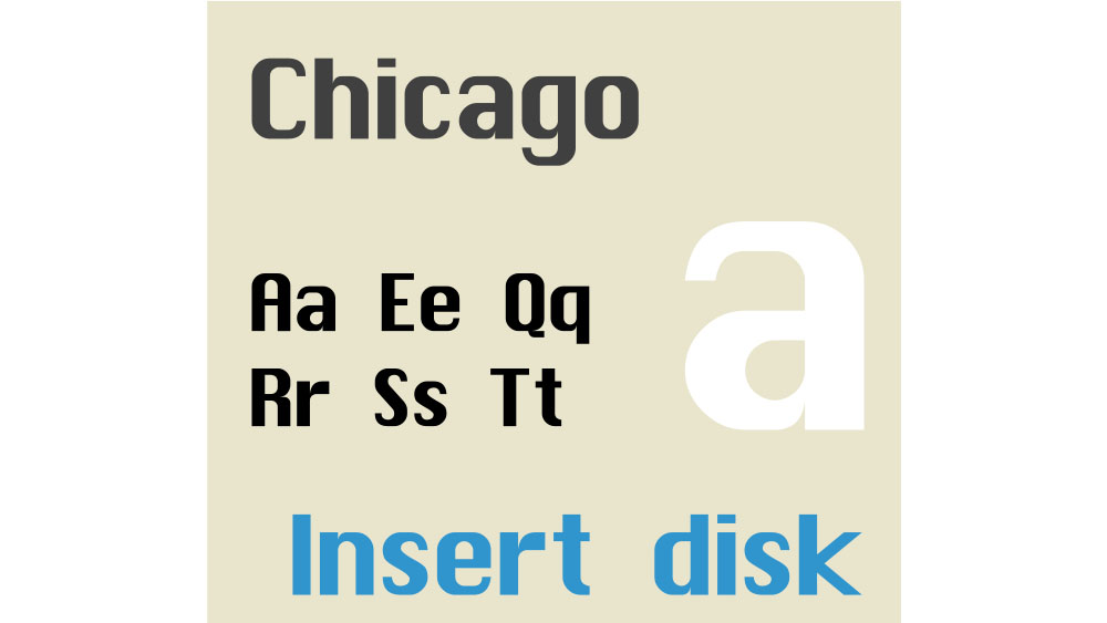
Let's go back a bit, because we should also look at Apple system fonts. We saw in our piece on why graphic designers use Macs that Apple was pioneering in its attention to typography on its early computers. That's often ascribed to the personal interest of Steve Jobs, who credited the decision to use multiple typefaces to a calligraphy class he attended at Reed College in 1972.
Created by Apple's in-house graphic designer Susan Kare, who also designed the Mac icons, Chicago was trailblazer as a custom system font. It was one of the first proportionally spaced fonts, allowing letters to take up as much or little space as needed, unlike monospace fonts. This would shape the objectives of early digital typography around legibility and user-friendly design.
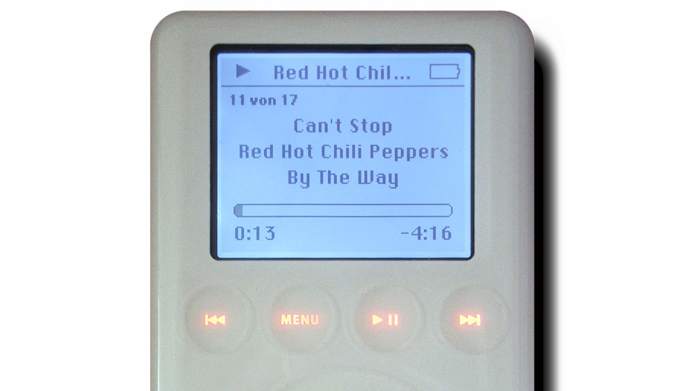
On Macs, Chicago was superseded by David Berlow's Charcoal in 1997 and then Lucida Grande from 2000, but the iPod would later use a variation of Chicago.
05. The great Helvetica controversy
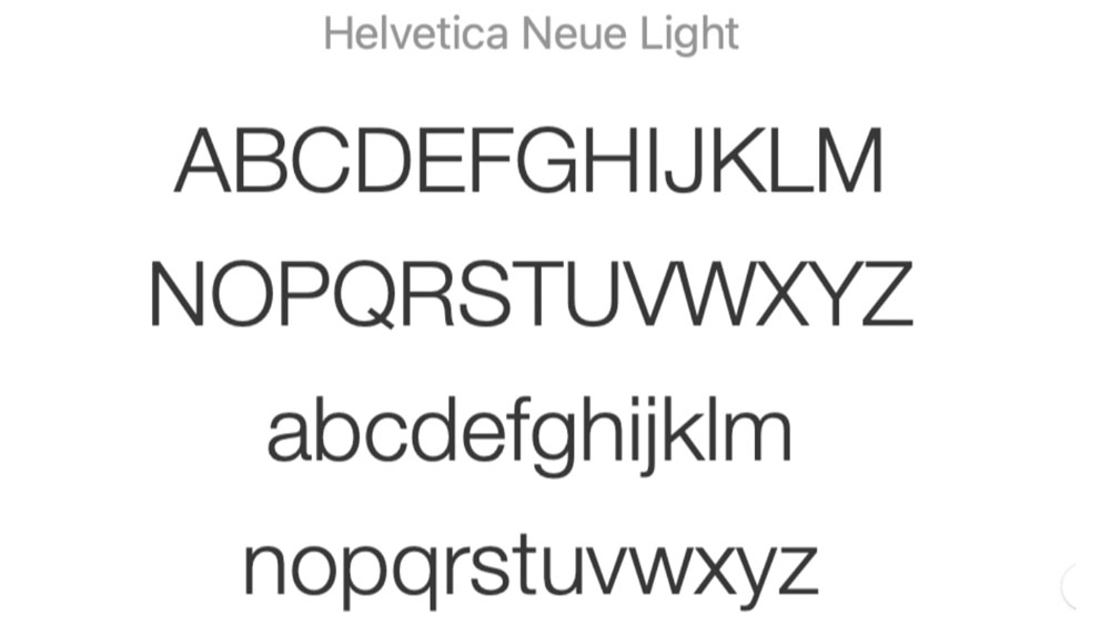
After pioneering the use of custom system fonts, Apple would fall back on third-party options in the 2000s. It opted for Helvetica for the iPhone, and then, for iOS 7 in 2013, the extra-thin Helvetica Neue Light.
It's not often that Apple gets design decisions wrong (apart from the Magic Mouse), but the reaction to this choice of system font was savaged. UI designers said it was too thin and light for small, lower-resolution mobile screens, and many users agreed.
Apple tried to improve things by switching to the slightly thicker Helvetica Neue, which it also used it for OS X Yosemite, unifying its system fonts, but the complaints about the poor legibility continued. Just two years later, it gave Helvetica the heave-ho.
06. San Francisco brings everything together
It's not great to switch fonts again after only two years, but Helvetica Neue just wasn't up to the job. Happily, the next phase in the Apple fonts history brought everything together with a bespoke typeface that could work as both a brand font for marketing and as a system font, unifying Apple's typography.
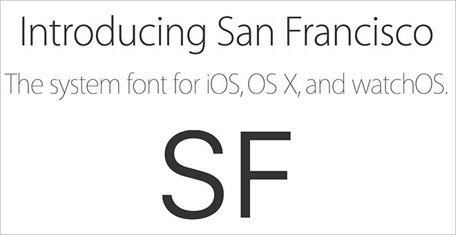
Rolled out in 2015, San Francisco was the first in-house typeface Apple had designed in more than 20 years, and it felt overdue considering that Google had introduced its Roboto custom system font in 2011 and Mozilla started using Fira Sans in 2012.
The differences with Helvetica may look subtle as first glance, but San Francisco is notably bolder and friendlier. It's clear that the typeface was designed to resolve those legibility issues once and for all, with clean shapes a slight roundness, enough amount of space between letters to work on Apple Watch and optimisations for both small and large text.
Our Apple fonts history has a happy ending. A decade on and San Francisco is still doing its job well, cementing Apple's brand identity across marketing and UI design, and I expect it will see us through the launch of the rumoured foldable iPhone and beyond.
For more type inspiration, see our font design tips and our guide to what is typography?