We’ve all painted our homes thinking it’s the ‘perfect’ color, but then we quickly realize it looks outdated. There are a couple of reasons why this might happen. Sometimes we get too taken by a color trend and fail to consider if it will actually look good in our home. The most important thing is to choose a color based on your preferences and tastes and to avoid being too influenced by paint trends and color trends.
Go for longevity, and don’t shortcut on quality either: ‘Color is only one part of what makes a good paint; you need opaque coverage, indulgent finishes, and hardwearing properties so your home looks fresher for longer,' says Annie Sloane, founder of her eponymous paint brand. 'Paints that chip, get greasy, have a thin finish, or poorly balanced pigments will never look good, even if the color is the hottest thing in interiors. Essentially: don’t just choose a paint color because it’s popular, and make sure it’s a good quality to avoid any chromatic catastrophes.'
Still, it’s good to be aware of what’s coming and going. So what’s on the horizon? Well, uplifting, joyful pastels aren’t going out of fashion any time soon. That’s what Matt Siberry, head of home at Pinterest, says: ‘This year, we’re seeing people step out of their comfort zone when it comes to color inspiration in their home. Soothing pastel room colors grew popular in 2022, and it’s an interior design trend that has continued into this year. Searches for ‘pastel pink aesthetic wallpaper’ have increased by 35% in the last year, showing that lighter, yet statement colors are here to stay.’
‘Mood-boosting colors that revive and excite will be significant for 2023,’ agrees Lauren Chiu, head of color and materials at trend forecasting agency, Stylus. ‘Think lively, joyful pastels and warm, retro-inspired brights that can help people to inject more joy, fun and creative expression into their daily lives and environments.’
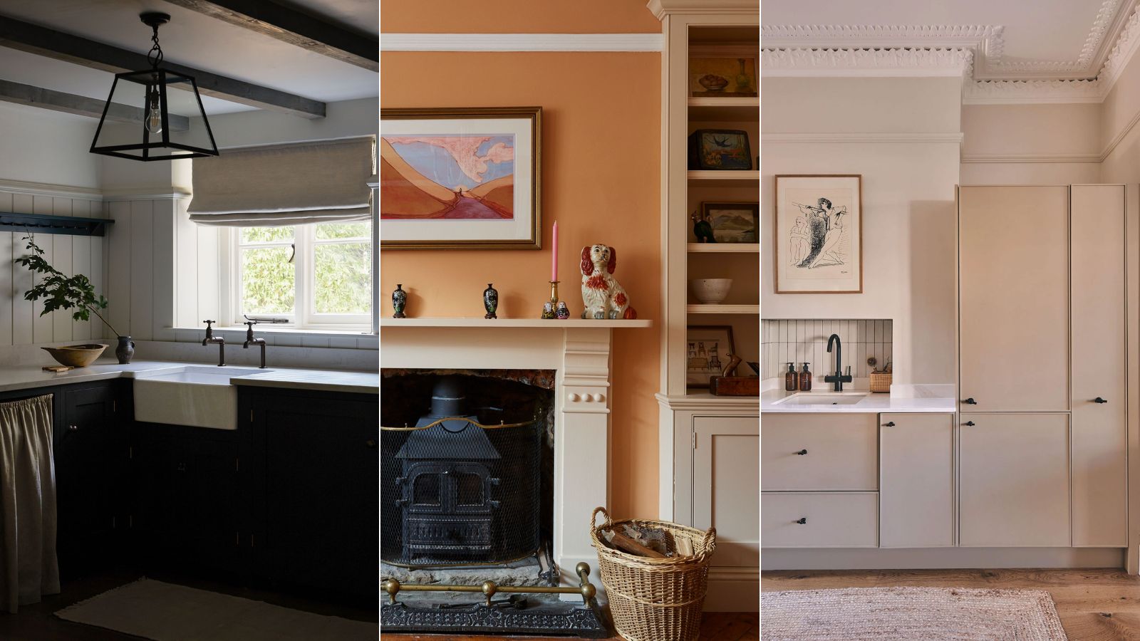
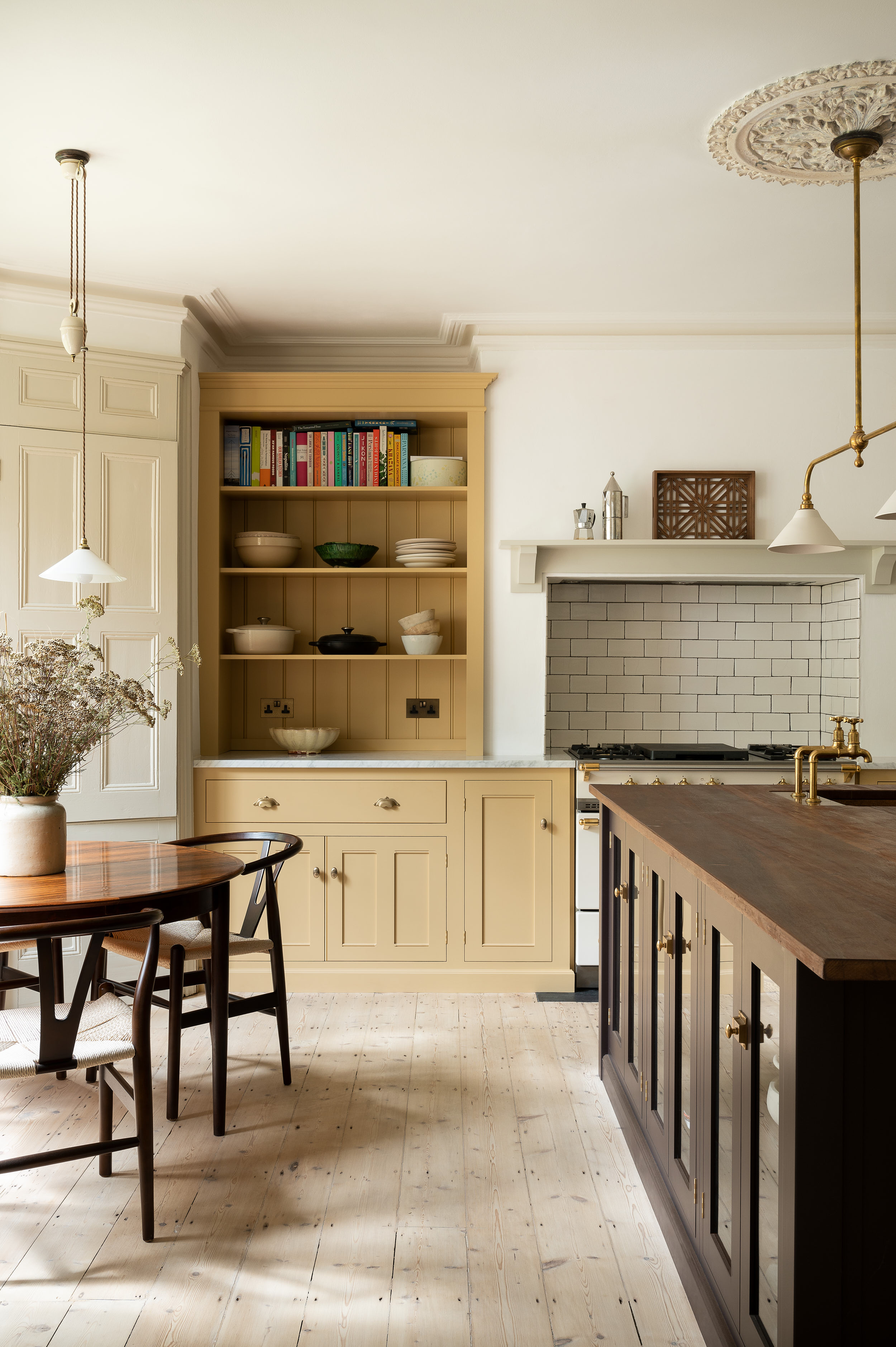
1. Pass on the magnolia in favor of pastel yellow
Magnolia isn’t seeing much popularity these days. 'Step far away from the neutral magnolias of yesteryear,' says Athina Bluff, founder and lead designer of Topology.
But where are we heading instead? Katie Brigstock, creative director of Style Your Spaces says that ‘beautiful buttery soft yellows’ as an improvement on the traditional magnolia. This soft, pastel yellow, says Brigstock, ‘pairs well with antique furniture, delicate patterned fabrics, and also looks fabulous on kitchen cupboards, and heavy linen curtains – think Rose Uniacke muted tones.’
Lee Thornley, the founder of Bert & May, says this pastel yellow ‘has continued to grow in bathroom and kitchen design’ since it’s an incredibly versatile shade. ‘It evokes feelings of warmth, happiness, and comfort.’
Wallpaper designer, Annika Reed, advises that this kind of yellow is best for ‘rooms where you spend a lot of time first thing in the morning or during the day –essentially, the moments when you need that positive energy the most,' she says. 'I’d suggest using this mood-enhancing hue in kitchens, home office spaces, and sunrooms if you wish to feel happier at home.'
2. Switch out mauve in favor of a gentle peach hue
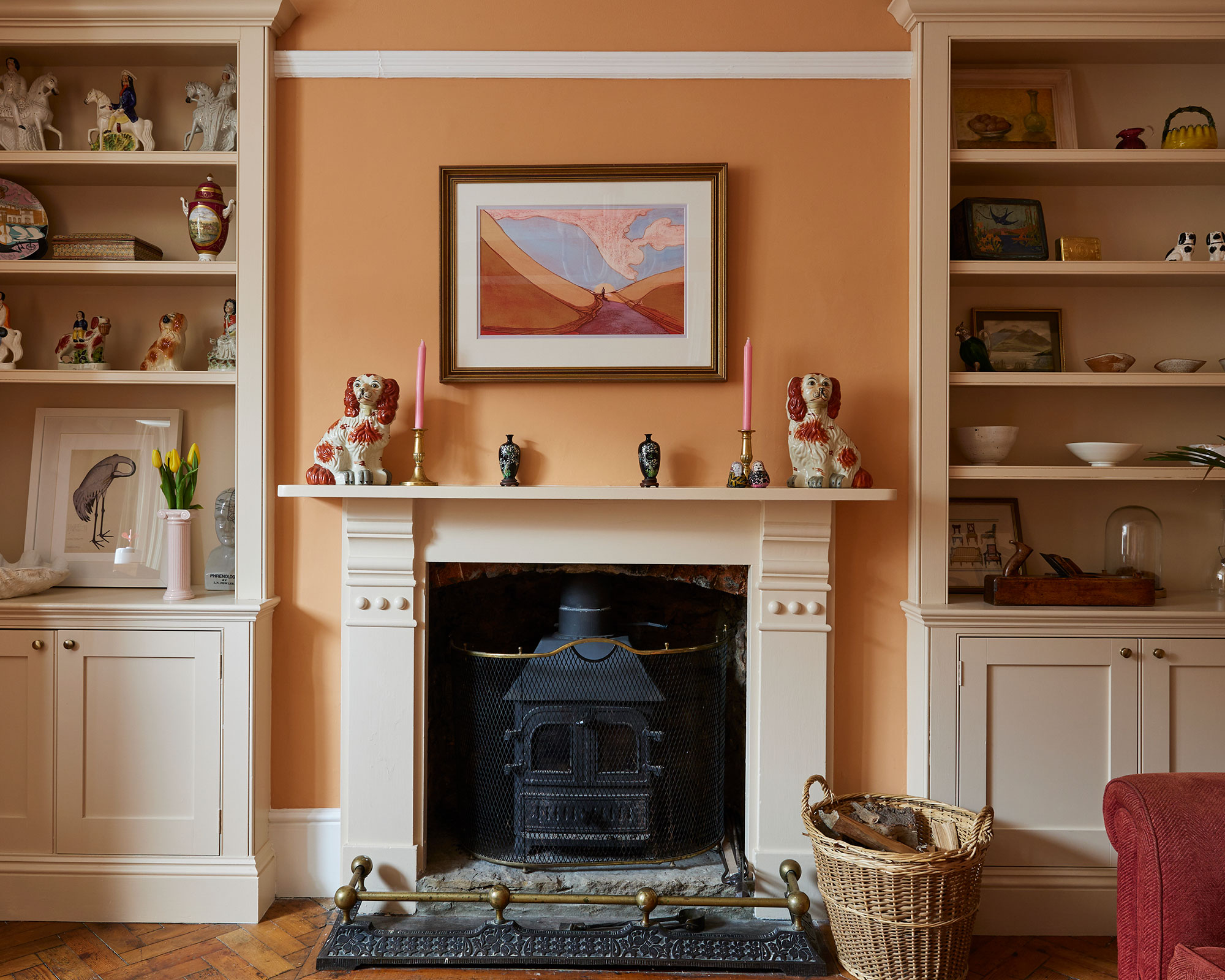
It could be time to leave the fading charm of mauve behind and welcome the allure of apricot. A mauve’s dusty dark pinks can flatten a room, but a refresh with a palette of apricot just might do the trick to bring a room back to life. Apricot has this unique warming, sun-faded luminosity, but feels distinct enough to make a statement without overpowering a room.
A touch of apricot seems to be trending instead these days. WGSN has called ‘Apricot Crush’ the color of the year for 2024. Wallpaper designer Annika Reed decided to paint her drawing room in this apricot hue, and it’s now become her ‘go-to color for a warm and inviting living space.’ Its rich and earthy undertones, she says, make it versatile: it can create a cozy ambiance in winter and an uplifting feel in summer.
3. Swap light gray for a contemporary mushroom gray

Decorating with gray isn’t going away. ‘Even though bright colors are in vogue, we can’t discredit the timeless and versatile gray, which we are seeing people still feature through furniture accents across all rooms,’ says Matt Siberry, head of home at Pinterest. 'But what we’re noticing is a shift away from clinical, cool gray to a warmer, welcoming gray that is based on nature.'
According to a 2023 survey by 1st Dibs, for example – when asked about the most on-trend hues for 2023, light grey received the fewest votes, coming in at just 5%.
Athina Bluff, founder and lead designer of Topology agrees that using ‘mushroom tones’ is a trend we should all replicate. ‘Everyone is all about soft mushroom-toned colors at present. Anything that feels like a warm hug. It’s truly a tone that goes with all decor styles from retro 70s, to super modern, to Japandi, to Soho House vibes. It can also be warmed up to feel rich and decadent, or made more muted & pale to feel light yet cozy.’
4. Forgo synthetic-looking greens in favor of an enduring sage green
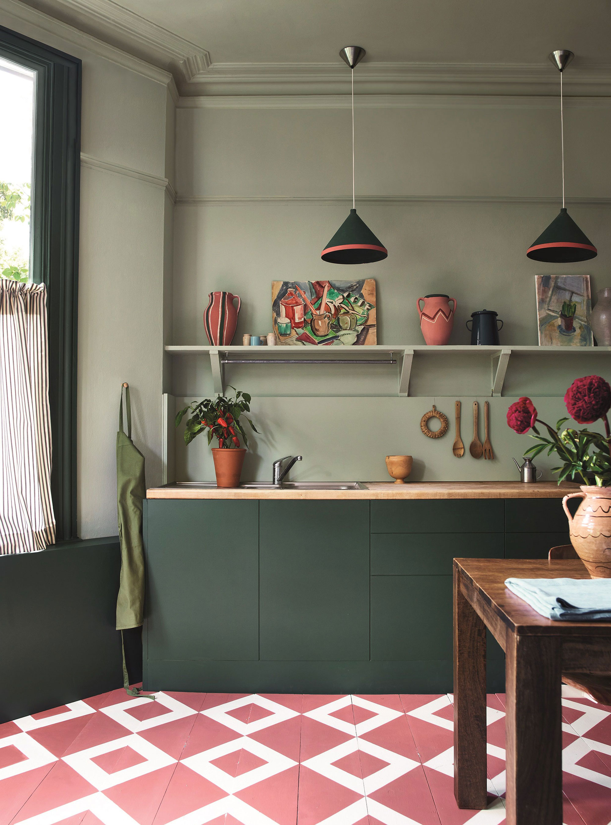
‘This year is ultimately about colors that have a clear connection to nature,' says Lauren Chiu. 'I predict that sage green is a color that will prevail past the color fads.'
‘Sage green is not only a paint color trend, but it also evokes a mood and aesthetic, says Annie Sloan. 'Even the name itself suggests wisdom, taste, and mellow maturity. ‘We’re seeing the world in a more nuanced way, prioritizing organic and sustainable practices and ways of life over the runaway fast fashion trends that have spread into homeware – and earthy, soothing, naturalistic greens reflect that.’ Sage green isn’t going out of style anytime soon, so it’s worth considering a color that’ll stand the test of time.
Kate Hawkins is equally drawn to sage green’s enduring appeal. Selecting her sage green for her wallpapers from a post-war 1918 design at the V&A archives, she sees this cyclical appeal of sage as a balm of gentleness for the home, that we are somehow drawn to its qualities of calm following moments of societal crises.
5. Choose charcoal over an outdated navy blue
While navy blue holds its position as a staple color, the discerning eye of freelance interior designer Lauren Jennings sees the remarkable versatility of dark charcoal for interior spaces, especially as an accent color for rooms that have an emphasis on wood, stone and textures like sea grass.
Lauren Jennings says charcoal accents in a home ‘exudes this elegance and a touch of warmth and coziness. It’s a color that emerges as the perfect choice for those seeking a refined and contemporary ambiance.’