If you're eagerly planning a decorating project to kickstart the new year, you may be wondering what design experts have to say about what colors you should choose — and, more importantly, whether you're accidentally reaching for a now-outdated color (trends move fast, people).
For a lot of us, 2025 saw a bolder approach when it came to color trends, especially when considering the years that came prior. But among the many viral shades that led to some heated online debate (looking at you, butter yellow), we're now questioning how much longevity color really has — especially since Pantone named 'Cloud Dancer' its Color of the Year for 2026.
So, before you pick up the paint brush, we asked interior designers and color experts which colors will date in 2026; the color trends they're ready to call time on. These were the five they shared, along with subtle shifts you can make if you've already invested (don't worry — it's not too late). So, here's what to avoid.
1. Cold, Pure Whites
Despite Pantone's Color of the Year for 2026 being revealed as Cloud Dancer, an airy white, many people aren't convinced that it's time to decorate with white all over again — particularly stark, pure whites.
"After Pantone’s announcement, the reaction alone showed that white simply doesn’t resonate the way it once did," says color consultant Charlotte Cropper. "While it works as a supporting color, white as the ‘main act’ is no longer enough. And while this color has only just launched, I wonder how much it will actually show up in our interiors next year, if at all."
Tash Bradley, color psychologist and director of interior design at Lick, agrees that "True Brilliant whites" are still out in 2026. "They don’t offer the warmth or comfort people now want from their homes," she explains. "They can make a room feel stark, shadowy, and overly architectural. And unless you live in a sun-drenched space, they’re rarely flattering."
Instead, she recommends warm-toned whites or creams that have enough undertones to bring coziness to a room, such as Lick's White 06 or White 05. "They’re calming, elevating, and far kinder in UK lighting," Tash shares. "They create a glow rather than a glare, which feels much more aligned with where interiors are moving for 2026."
Instead of painting your walls with harsh, bright whites, go for a soft, warm white such as Pointing, which will keep things feeling cozy and welcoming.
2. Overly-Pretty Pastels
2025 was a year full of color confidence, but some of the brighter shades may not still be the most favored for the year ahead. According to Tash Bradley, highly saturated pastels are already starting to feel outdated.
"Pastel blues, lavenders, and sugary pinks had their moment in the dopamine decor wave," she says. "They were joyful, playful, and full of energy, but they were never going to be long-term players. Their saccharine quality can feel a little too whimsical now, especially as people design homes with longevity and emotional depth in mind."
For a more modern (and timeless) look, Tash points towards "dustier, chalkier, moodier pastels with gray or brown undertones," such as Lick's Taupe 03. "These are grown-up pastels: still soft, still gentle, but so much more sophisticated and livable," she notes.
Bring earthy, dusky pink into your home with this velvet cushion. Its fringed edges bring a retro touch to keep your space feeling fun.
3. Butter Yellow
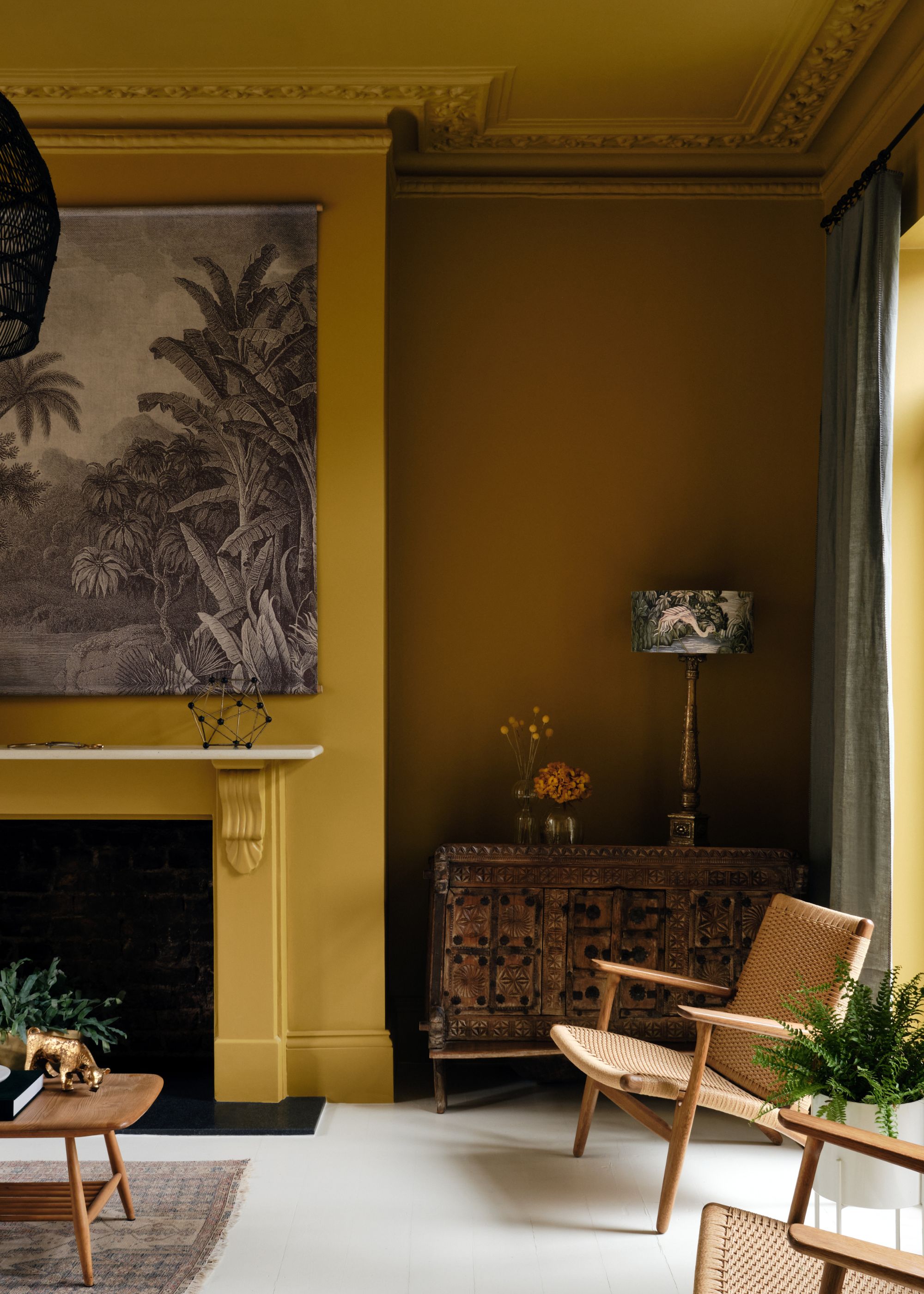
Yes, we've all loved butter yellow decor for the past couple of years, but is its appeal here to stay? "I think the butter yellow story may begin to soften," admits Charlotte Cropper.
"Yellow is a complex color both emotionally and visually, and while it had a moment in the spotlight these last couple of years, it’s also a color that we tire of more easily in our homes," she adds.
Similar to the shift away from pastel tones, experts are favoring richer tones that can feel a bit more grown-up and timeless than butter yellow. "I can see this being replaced with deep ochres that carry notes of green or black," says Charlotte. "Colors that nod to the warmth of yellow but feel much more timeless and grounding."
This warming ochre-colored throw is a great way to bring these muddy and richer hues into your home — whether styled on your living room sofa or bed.
4. Acidic Chartreuse
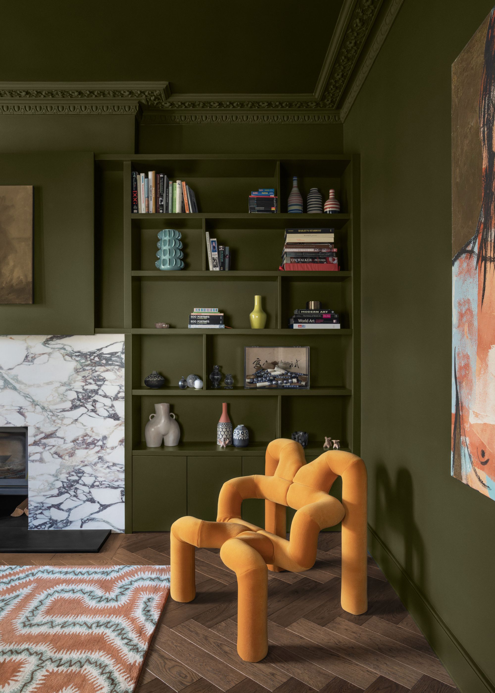
Chartreuse is one of the more niche color trends we've seen cropping up in interiors this year, but its vibrancy may mean it's not here to stay. "For me, sour chartreuse feels like it’s destined to be short-lived," admits Livingetc's color expert Amy Moorea Wong. "It so obviously goes against design convention, stinging the eyes in a way that feels playful, provocative, and rebellious, but not necessarily a sensation you want to live around long term."
And what's replacing it? "I’m feeling something organic, leafy, and earthy that speaks more of serenity, and might blur the lines between color and the neutral," adds Amy.
It's apparent across most trending colors; it's all about earthy tones that feel moody and timeless rather than artificial. "Try a green with a hint of brown, which represents the not-always-perfect nature we can see through the windows, such as Edward Bulmer’s Drab Green," suggests Amy. "It feels grown up with a moody edge, creating depth and an inherent calm, and quietly bringing the outside in a way you almost don’t notice."
Refresh your bedding for the new year with this olive green set. Its mossy and earthy hue feels more aligned with the latest trends than other shades of green.
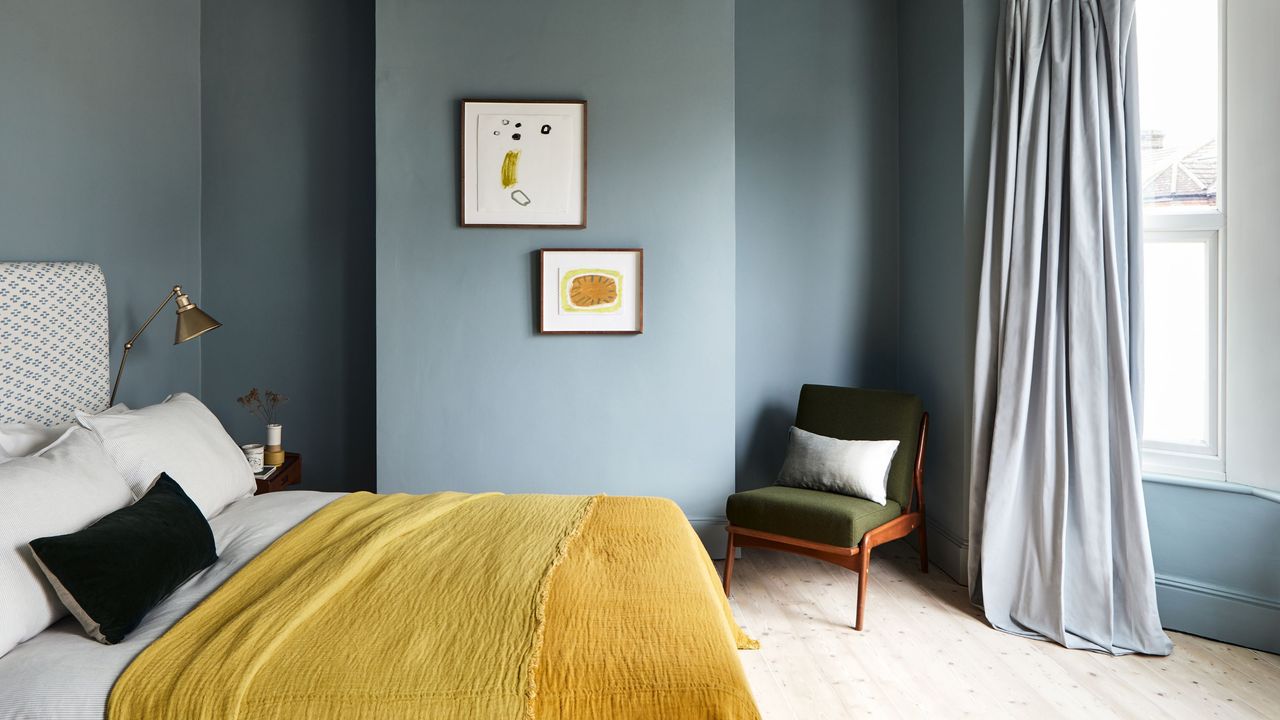
5. Sharp, Clean Blues
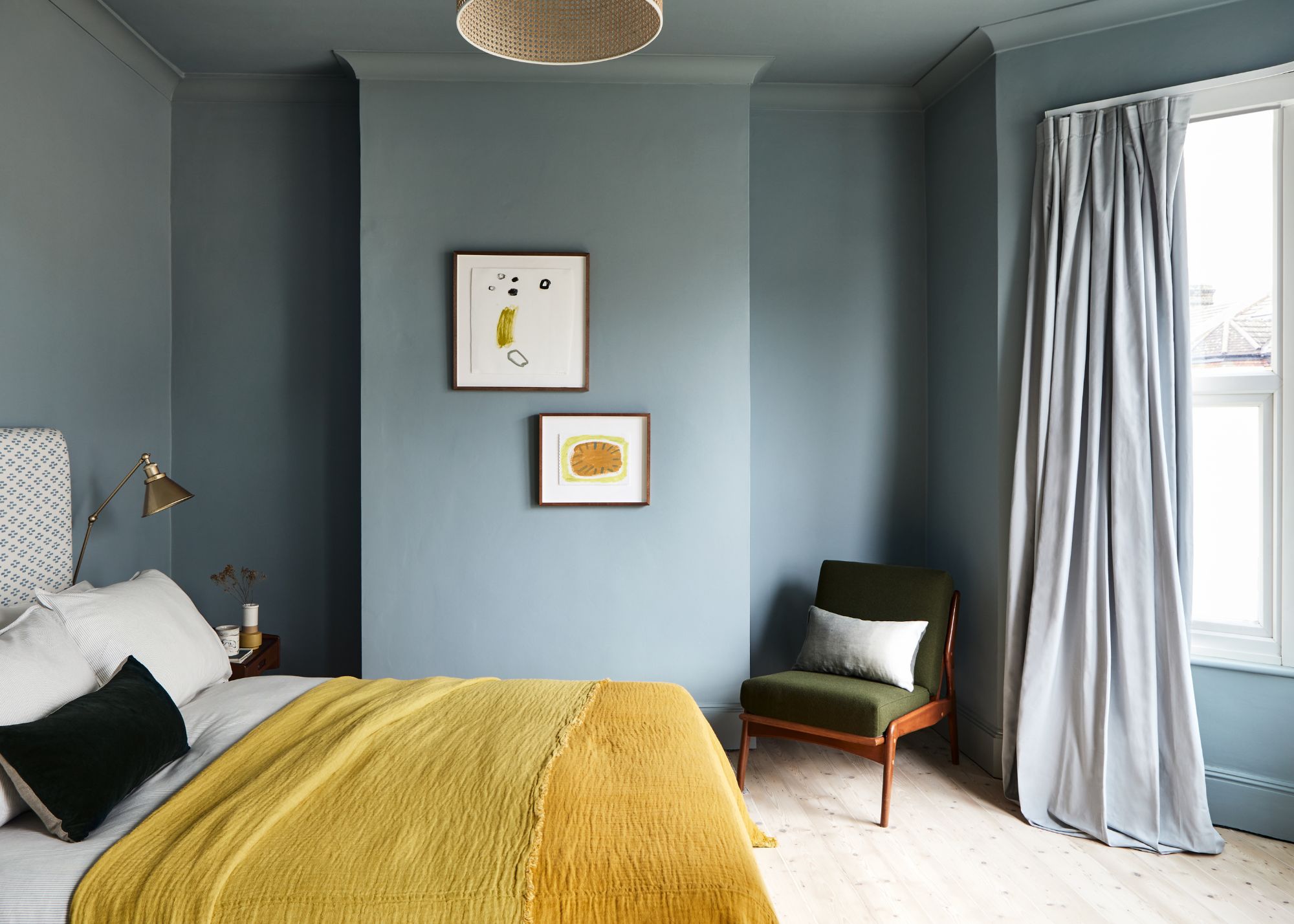
When it comes to decorating with blue in 2026, experts are favoring muddy tones rather than clean and sharp blues. "Pale blue has had a real moment this year, and Dulux recently announced the comeback of stronger blues for 2026," says Charlotte Cropper. "And while the nation’s favorite color will always be a timeless option, I think the cooler, cleaner blues will be pushed aside in favor of warmer, muddier tones."
"We have been gravitating towards colors with more depth; colors that feel rich in personality and nuance, rather than sharp or saturated," she adds. "Those brighter or primary blues look fantastic in small, high-impact doses, but most people don’t actually want to live with them on their walls every day."
If you want to bring blue to your walls in 2026, look to colors such as Bone China Blue, which feel a bit more muddy than true blues.
While these are the outdated colors designers are moving away from in 2026, keep in mind that color is subjective, and first and foremost, you should decorate with those that bring you joy.
Or, to play it safe, and go for the most classic colors that won't date anytime soon.