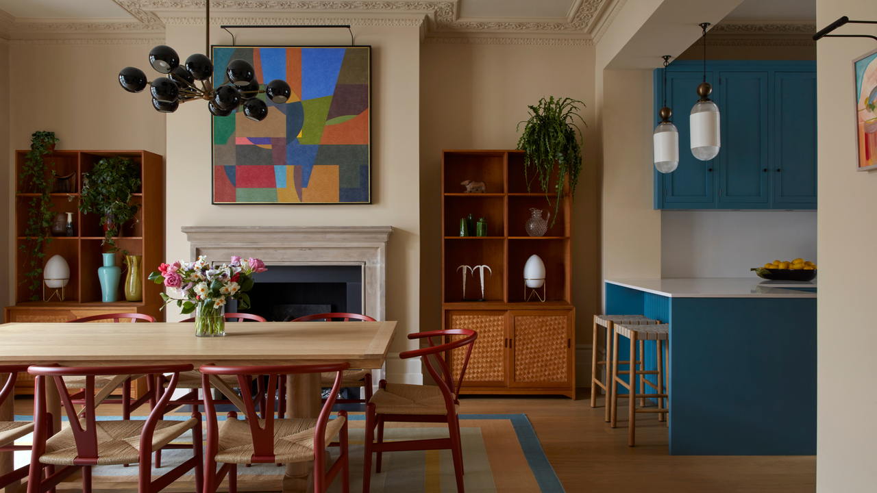
We all have colors that throw us off, make us feel like we’re being aesthetically attacked, or affect our mood in distressing or stressful ways. Think of them now, and you’ll find your skin slightly crawling — the very idea of bringing uncomfortable colors into our stylish, sanctuary-like homes is nothing short of a decorator’s bad dream.
The hues we’re so repelled by are often deeply personal, affected by individual experience, cultural context, and how our specific vision works, but certain colors bring us together in a collective shudder. Yes, the emotional impact of color is complex and subjective, but some uncomfortable colors find it very difficult to please the eye (or find a place in the home).
While we can all agree that color-drenching a living room in fluorescent orange probably won't be a great idea, there are still ways we can welcome these tricky tones into our interiors, adding some unexpected nuance and audacity without overwhelming the senses. By understanding the nuances of color psychology in interior design, you can harness uncomfortable hues and decorate with color at its most daring, playful, and provocative.
1. Neons
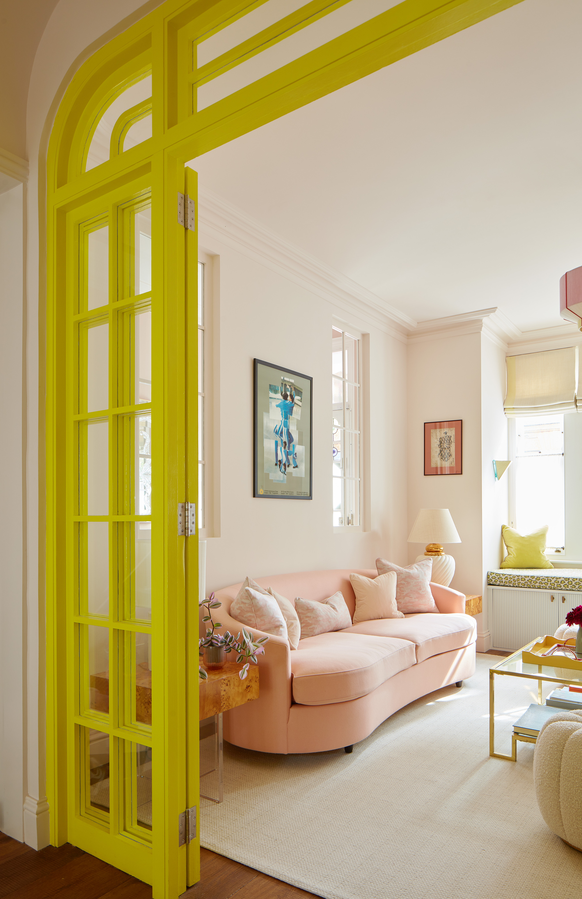
The neons sit at the upper limit of how saturated a color can be, which makes them visually ‘shouty’ and aggressive. Electric blue, hot pink, lime green, and acid yellow can be painfully difficult to relax around, making rooms feel overstimulated and chaotic (as well as causing actual eye strain).
"Neon and acid-based tones are tricky to ground in a scheme, as they don’t necessarily create harmony," explains Ellen Cumber, founder of Golden. They’re uncomfortable colors that can jar and dominate a space, demanding constant attention and creating imbalance — we cannot help but seek them out, rather like looking into the sun.
Neons thrive drizzled through an interior as graphic details — think cushions, decorative objects, and small furniture pieces for a jolt of unexpected do-I-dare-ness. What really matters is the surrounding hues.
"In a recent project, we were looking to incorporate fresh, energizing color, and neon yellow really sang against light pastels," Ellen shares. Also, try them with natural materials and tones to turn down the volume — shocking turquoise set against pale oak, vivid purple with navy, or electric blue meeting sandy beige, suddenly seem grounded rather than garish.
2. Bright Yellow
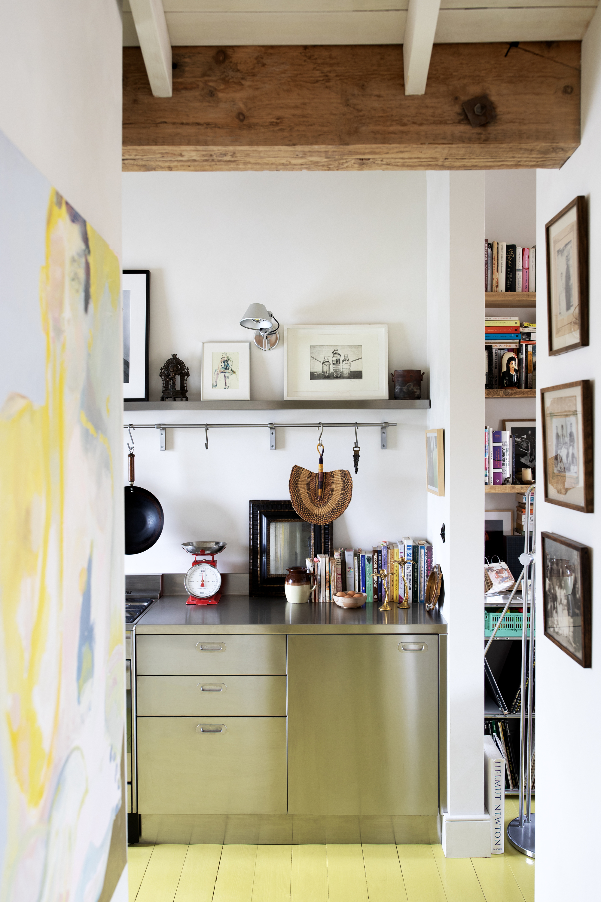
Yellow cranked up to maximum saturation feels like a direct beam of bright light — glaring, sharp, and almost confrontational. It can make a space (and us) restless, uneasy, or agitated (perhaps it’s time to go into another room?).
Also, is it just me, or is it trying a bit too hard to be cheerful? It comes across as forced, a bit fake and exaggerated, and it’s all a bit unsettling. Decorating with saturated colors can be scary, I get it. For yellow, focus on ways to energize without it all becoming too much. How about incorporating it into a pattern — wallpaper, rugs, etc. — to break up the brightness, toning down its impact while clinging onto the cheer?
Yellow pairs beautifully with blues or green, the cool tones softening the intensity without dulling the optimism and creating a grounded sun-sky-and-field feel. "Bright yellow and green is a classic combination," agrees Tom Rutt, founder of TR Studio. "It’s punchy and energetic — so perhaps not ideal if you’re after some calm."
3. Vivid Red
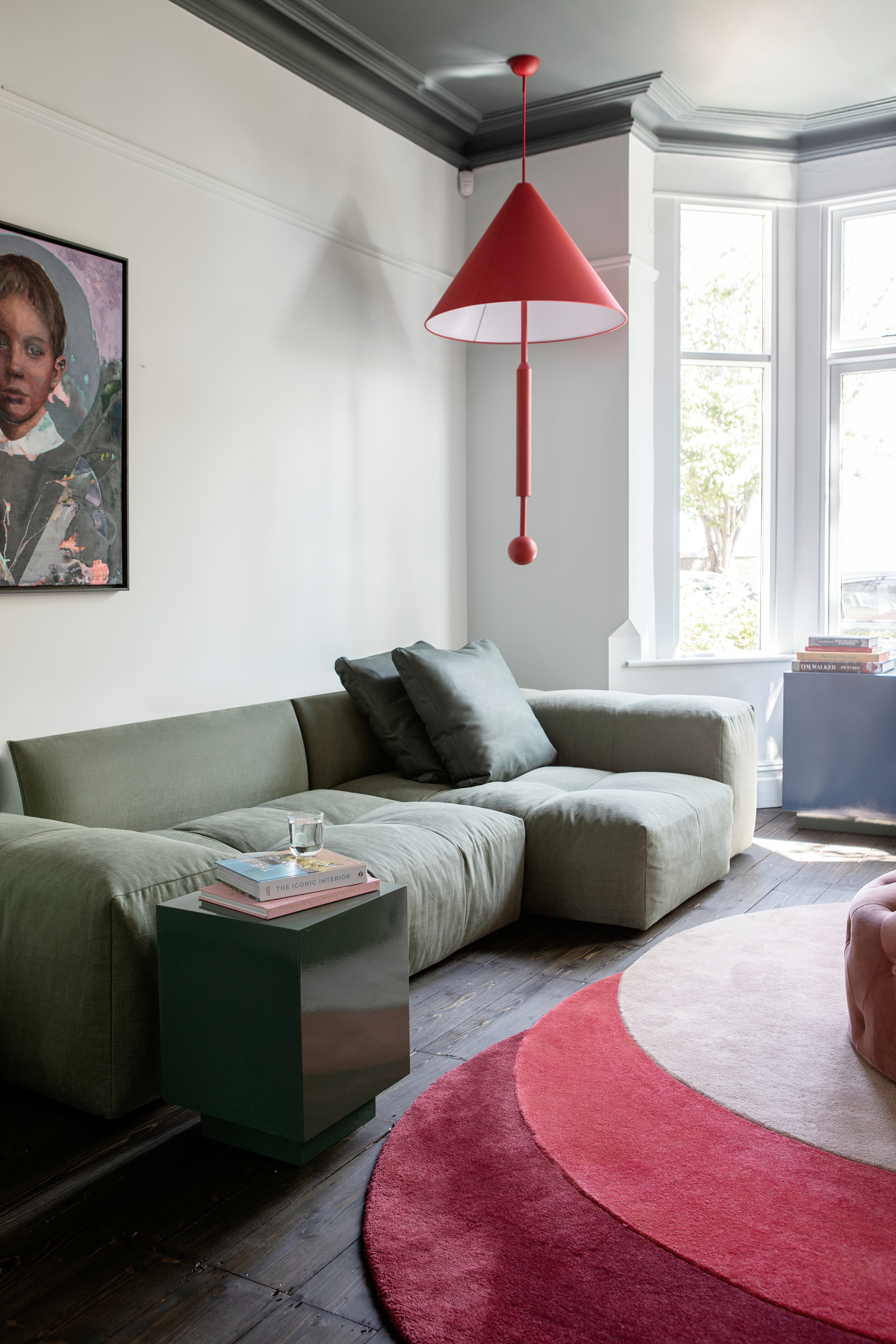
Pure, undeniable red is another color that can be uncomfortable to look at and live with. It’s emotionally intense, able to raise energy levels to the point of agitation, and in large swathes it completely dominates and can radiate charge, tightness, and pressure.
"We have never had a client ask us to paint a room red," admits Ellen Cumber. "It's one of the most divisive colors out there and hasn’t really had its moment of coming back into fashion in full force."
And it’s a hard no for wind-down spaces, unsettling rather than soothing. "While a vibrant red can look amazing in a particular area, if you’re hoping to use it in a calming space, it may not be the one to go for," agrees Kate Guinness, founder and director of Kate Guinness Design.
But ways to seamlessly decorate with red in the home go beyond the 'Unexpected Red' theory. If you want a more vivid red than a few pops, consider upholstery — the deep pile of velvet or bouclé tempers the heat of red, turning it into richness and warmth.
Similarly, vivid red in art or ceramics brings drama in a way that’s easy to control. Team the uncomfortable color with natural greenery or gentle neutrals for an organic, serene style, or mustard for an offbeat retro kick.
4. Dark, Muddy Browns
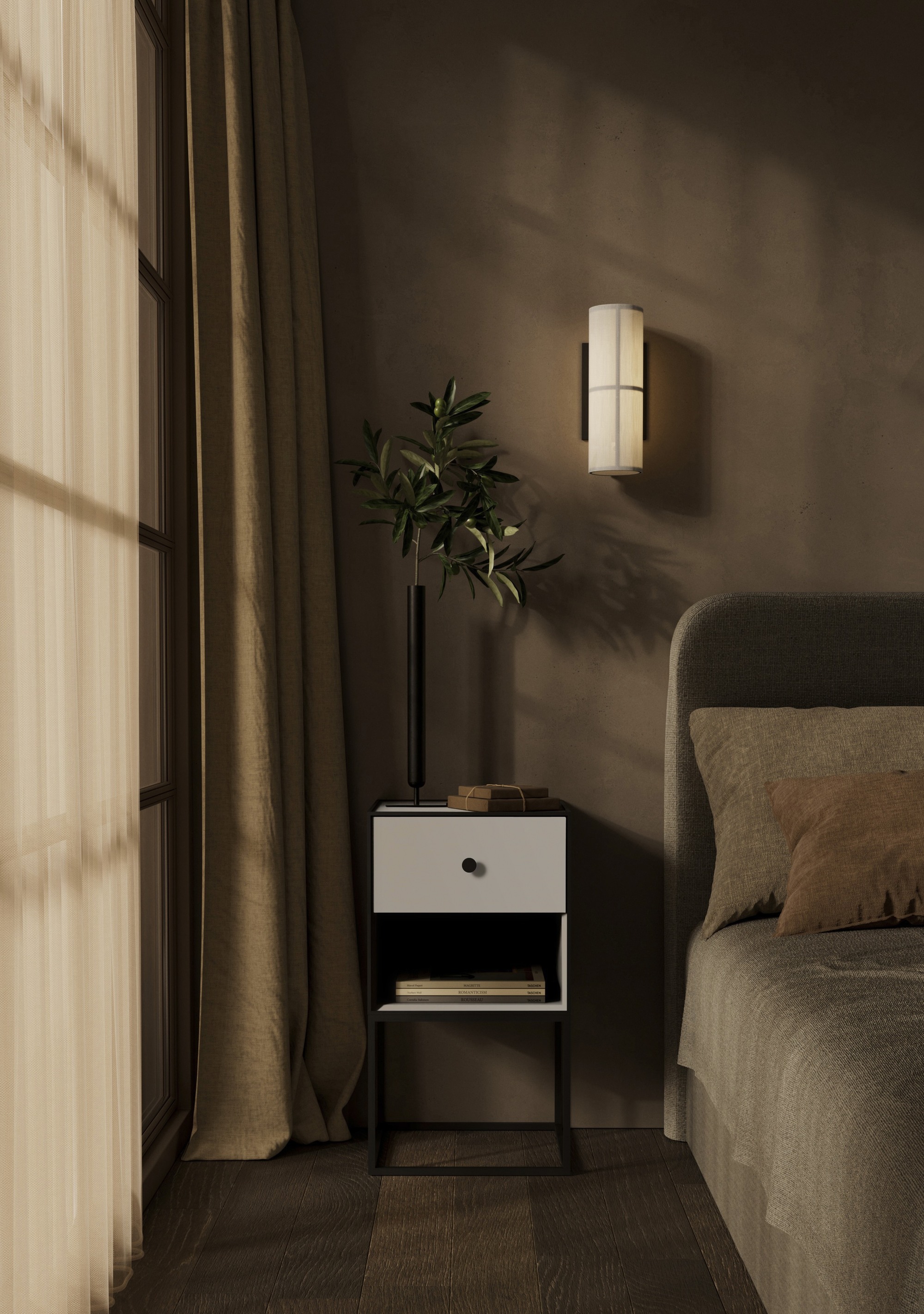
Heard of Pantone 448 C? The sludgy, depressed green-brown is dubbed ‘the world’s ugliest color’, and in fact, its entire family of somber, swampy browns are — to no one’s surprise — not comfortable colors to live alongside.
Decorating with muddy, olive-y browns makes rooms seem smaller, darker, and somewhat claustrophobic. Eeyore-like, they sap inspiration and good vibes and replace them with dullness and dourness, feeling flat, heavy, and like they’re trying to drag you down with them (into some kind of bog).
But. Work your magic to support the uncomfortable color, and it’ll all come together. "Even something as deep and moody as Farrow & Ball’s Salon Drab can feel inviting when paired with the right light and accents," says Tom Rutt, of the self-deprecating flat chocolate brown. "It’s all about the mix — a challenging shade can feel instantly softer when layered with complementary textures, contrasting colors, or warm natural materials to break up the intensity."
Try muddy browns on cabinetry, joinery, or flooring, as well as textiles — this is a tone for solid, functional areas. Ground it with earthy neutrals to balance it, or give it a lift with contrasting hues such as petrol blue, burnt orange, or teal.
5. Pure Black or Pure White
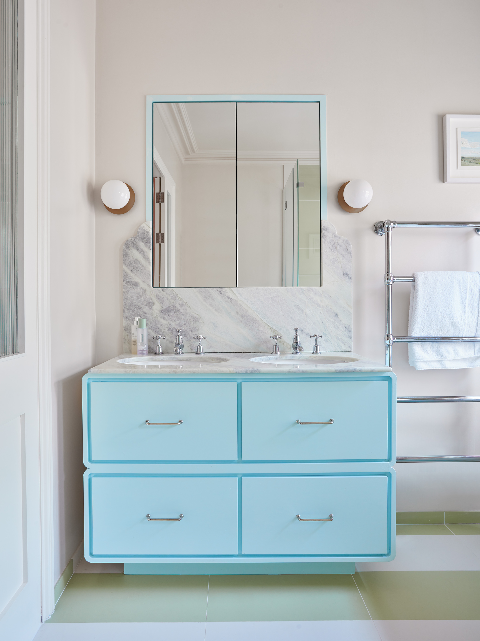
Charcoal? Ebony? Alabaster? Cream? Bring them in. But stark black, or brilliant white? No, no, no, no. Pure black is heavy and oppressive, making those around large expanses of it feel confined, and it smothers details, hiding them in shadow.
Pure white, meanwhile, reads as sterile and cold, creating an am-I-in-a-dentist’s-waiting-room or a don’t-touch gallery aura. The harshness strips a room of comfort, making it hard to relax in, as well as reflecting glare and highlighting imperfections.
Make the most impactful shades work by experimenting with finishes — light-absorbing matte black can be sleek and grounding, while glossy white brings a sense of luminosity and sharp definition.
The extreme shades also work as framing devices, on a window frame or an architectural trim color, they add clarity and emphasis without becoming too much. Tone them down with naturals — try black with rust or terracotta, and white alongside nudes such as stone or sand.
Just remember, "What is uncomfortable to one person will be exactly what someone else is drawn to," Kate Guinness reminds us. "And what one person finds comfortable or uncomfortable can vary across a home depending on what spaces are used for."
So, think of color (and color trends) as an exploration, not a set of rules. Magnetized by muddy brown? In need of some neon? Ready to add some red to your home? You. Do. You.


