From moody, deep tones to bright pops of color, there's plenty of room for experimentation when it comes to your kitchen tiling.
When so much of your kitchen design revolves around practicality and durability, your tiles feel like the one place you can really bring some personality into your space, not just through color, but through the texture and materiality, too. Even in the most simple, neutral kitchens, a colorful tile can provide all the depth and complexity your space needs, breathing life, movement, and visual intrigue. And as kitchen trends evolve, so too do the tile colors designers are choosing.
This year, the experts are favoring warm, gentle neutrals, with a heavy reliance on the colors you'd find out in nature. Gone are the days of a flat white finish or a cool gray subway tile; nowadays, we're seeking out texture and movement in tiles, with colors to match. These are the kitchen tile colors to keep an eye on.
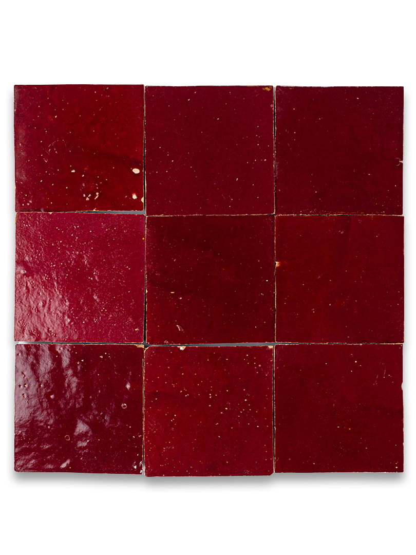
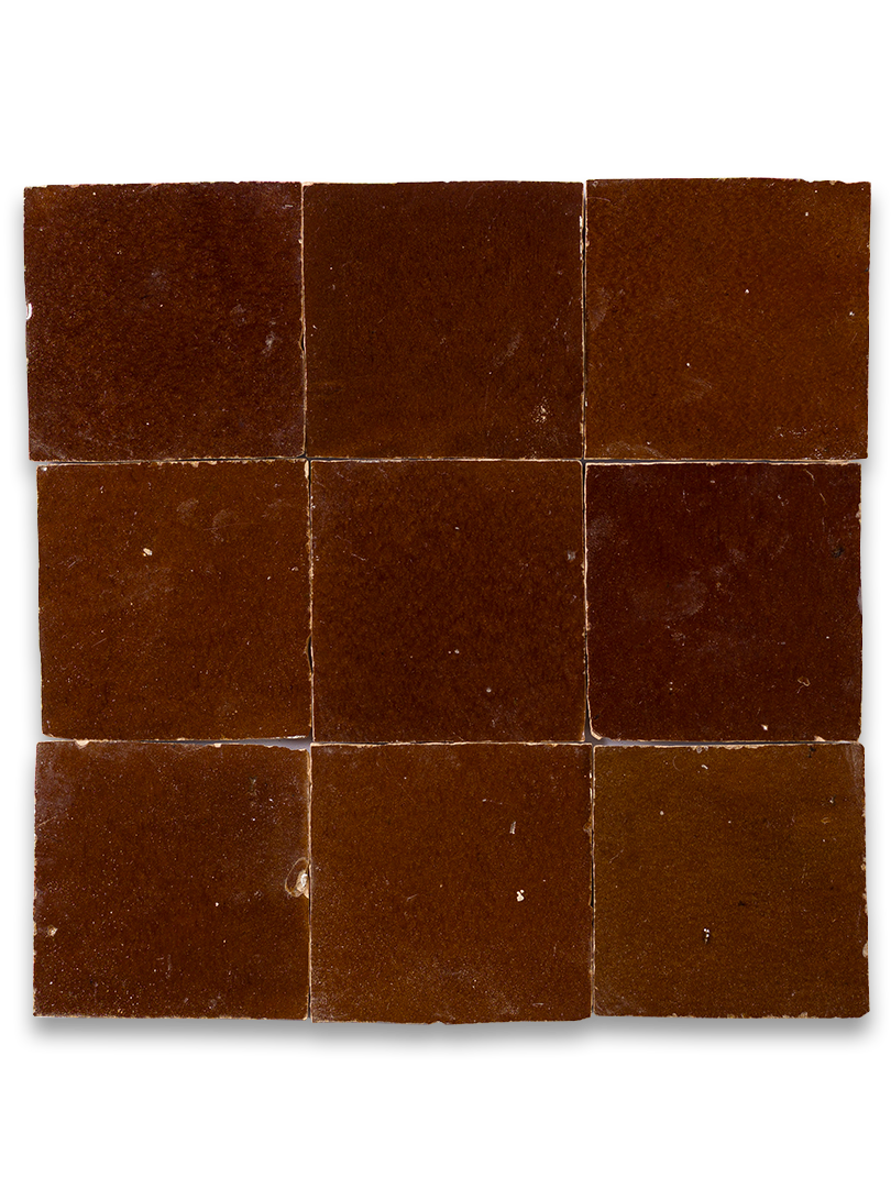
1. Warm Browns
In a stark contrast to the bright white kitchens of the 2010s, over the past few years people have increasingly turned towards moodier, darker kitchen tile colors, and it's easy to see why. There's a quiet confidence in a dark kitchen; an understated elegance that feels cozy and inviting, especially when you opt for a deep, red-toned brown.
For many, burgundy has become the tile color of choice. "There is a richness to this deep, wine-toned hue that feels grown-up and warm without tipping into anything heavy or dated," notes Simon Mayhew, founder and interior designer at TXTURED. It signals a desire for more depth and character in our homes, says Simon, who adds, "After years of cool grays and safe off-whites, clients are craving rooms with real personality, and a saturated berry shade delivers that instantly."
Similarly, Grazzie Wilson, from Ca'Pietra, notes, "Brown is having a very good time in kitchens, and quite right too. After years of playing it safe with pale, polite tiles, people are remembering that caramel, coffee, and cocoa shades can do something rather clever: they make a kitchen feel instantly warmer, more lived-in, and far less showroom-like."
Though you could opt for a color-drenched effect, Simon prefers letting the tiles do the talking, keeping the rest of the room neutral. "The trick is teaming it with a warm neutral rather than letting it work alone," he says. "Pairing wine with a chalky shade like canvas, ideally in a chequerboard, gives the eye somewhere to rest and lets light bounce around the space, so the color reads as inviting rather than enclosing."
My favorite approach is to build a color story around the tiles, pairing them with other warm, textural finishes and materials, for a richer, more all-encompassing look. This can work particularly well in dark, wooden kitchens, where the two materials complement one another, enhancing the beauty of both.
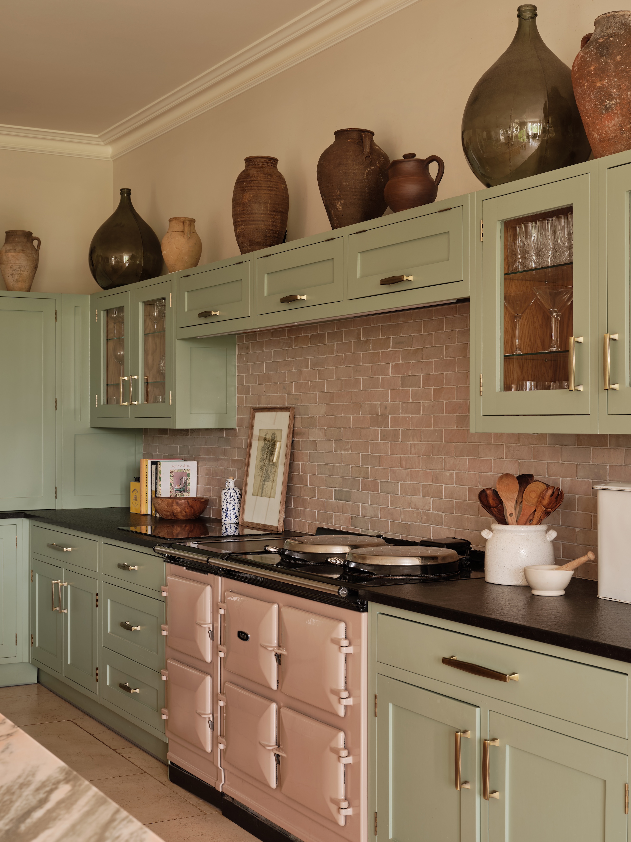
2. Earthy Neutrals
If there's one kitchen tile color palette that has ruled them all for the past few years, it's an earthy color scheme. "One of the most popular tile colors at the moment is soft, tonal natural neutrals that add texture and depth to a kitchen, without overwhelming it," agrees Alex Main, director at Main.
Stone, clay, mushroom, and greige all offer a subtle warmth that feels more interesting than a flat white finish, while maintaining that light neutrality.
They're also super easy to design around, Simon adds. "Thanks to their versatility, this soft color palette creates a neutral backdrop, allowing other elements of the kitchen to take center stage," he shares. If you're planning a statement color for your kitchen cabinetry, this could make for a brilliant tile option.
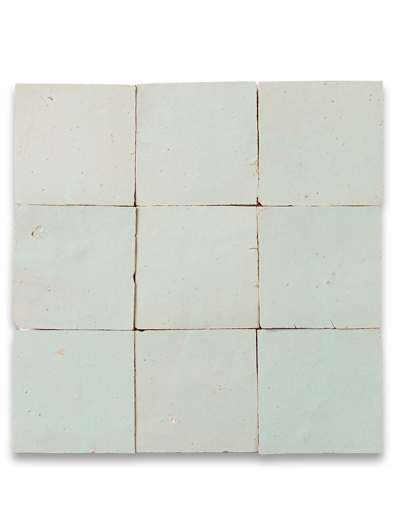
3. Sky Blue
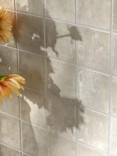
As much as I love a warm, earthy color palette, there's something about a fresh, sky blue shade that I also can't get enough of. Though you may assume it will be overly cool and uninviting, in reality it has the opposite effect, providing a refreshing, calming atmosphere, which is especially welcome in the kitchen.
It's a kitchen tile color trend Damla Turgut, founder and creative director of Otto Tiles & Design, has also noticed lately. "In the US in particular, everyone is loving light blue zellige right now," she shares. "It feels just so fresh and uplifting, but it’s not too vibrant."
When done well, a blue kitchen can feel like a complete breath of fresh air, invigorating yet comforting and far more intriguing than a classic white finish. And in a zellige finish in particular, this kitchen tile color trend can benefit from the way the uneven, glossy tiles catch the light, bringing even more life and movement to the shade.
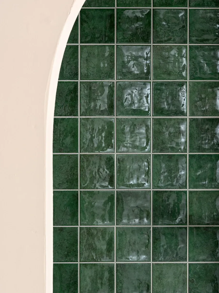
4. Deep Greens
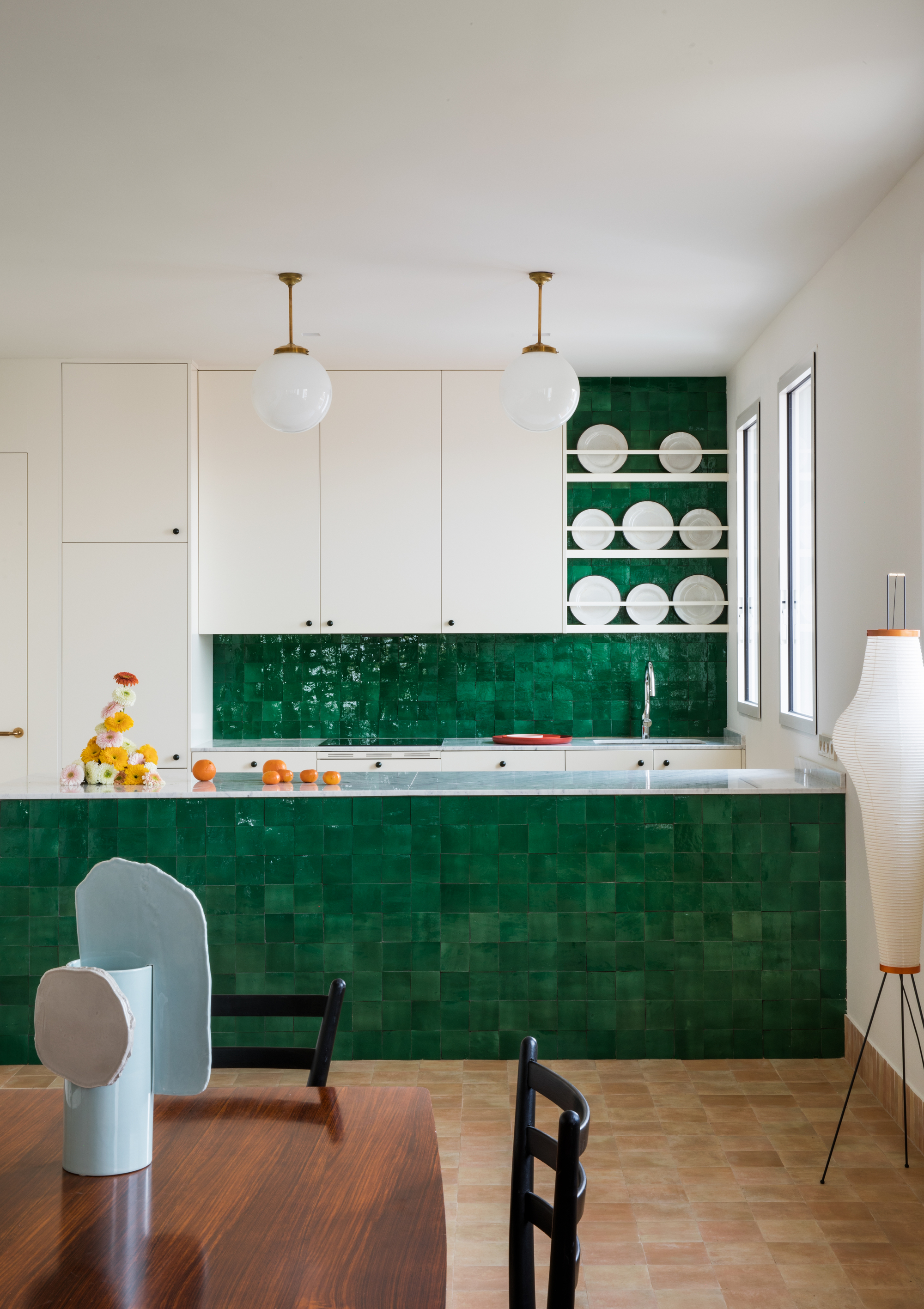
"One color we're seeing increasingly used in kitchens is deep green," notes Sophie Chapman, associate and interior designer at The Vawdrey House. In line with our desire for colors that refer back to nature, a deep, forest green feels more grown-up than the uber-popular sage green kitchen of the past, while still offering that pleasant, calming effect.
"It brings depth and character without feeling overly bold and works particularly well alongside natural materials," says Sophie. It's a surprisingly versatile shade, too, working well across various design styles and color palettes.
There's also a longevity to this color that makes it a particularly appealing choice for homeowners. "Green has a timeless quality that allows it to feel both contemporary and established, which is perhaps why it continues to resonate with homeowners looking for longevity rather than short-lived trends," Sophie adds.
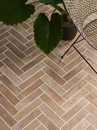
5. Terracotta
Not a new kitchen tile color trend by any means, terracotta is a classic in Mediterranean design, but according to experts, the way we use this material is changing. "Terracotta is one of those tiles people think they already know. It has spent years being cast as the lovely rustic floor tile, usually somewhere warm, with a jug of olive oil nearby. But the really exciting thing now is seeing it climb the walls," explains Sophie.
Moving beyond its typical use, terracotta wall tiles are becoming a growing trend in warm, rustic kitchens, where the color provides a lovely base for the rest of the design to bounce off.
Despite the material's prominence in more traditional settings, when used as a wall tile, it can feel surprisingly fresh and modern. "You still get all the warmth, but because it is on the wall, it becomes part of the kitchen’s everyday backdrop rather than just something underfoot," adds Lesley Taylor, founder of Baked Tiles. "The color is a big part of that, of course; those baked clay tones sit somewhere between apricot, rust and paprika, which makes them brilliant at warming up timber, stone and metal finishes."
There's a natural effortlessness to a terracotta finish, full of imperfections and tonal differences; it signals a more laid-back, relaxed design approach and can help balance harsher, cooler finishes in your kitchen.
Size: 20 x 20 cm
Size: 28 x 7 cm
Size: 20 x 20 cm
Size: 10 x 10 cm
Size: 10 x 10 cm
Size: 10 x 10 cm
While keeping up with the latest kitchen tile color trends is helpful, ultimately, it's best to choose something you will still be happy with in several years to come; with that in mind, these are the three kitchen tile colors to avoid if you want your space to be timeless and stylish, according to experts.
And for more design ideas and advice, subscribe to Livingetc's newsletter.