WOW!house is one of the Livingetc team's favorite events of the year. If you're unfamiliar, it sees a show home erected in the Design Centre Chelsea Harbour, where some of the very best British designers, alongside designers from across the globe work, hand in hand with prestige interior brands to create carte blanche rooms, setting the tone for true creativity in design.
These rooms often prove an outlet for interior designers' most interesting, out-there, experimental ideas, and are filled with small, impactful details that you can get up close and experience during a walkthrough at the Design Centre.
With designers including Studio Enass, Róisín Lafferty, Russell Sage, and more taking on rooms at this year's WOW!house, here are some of the biggest takeaways from team Livingetc from the showcase.
1. Silky Textures
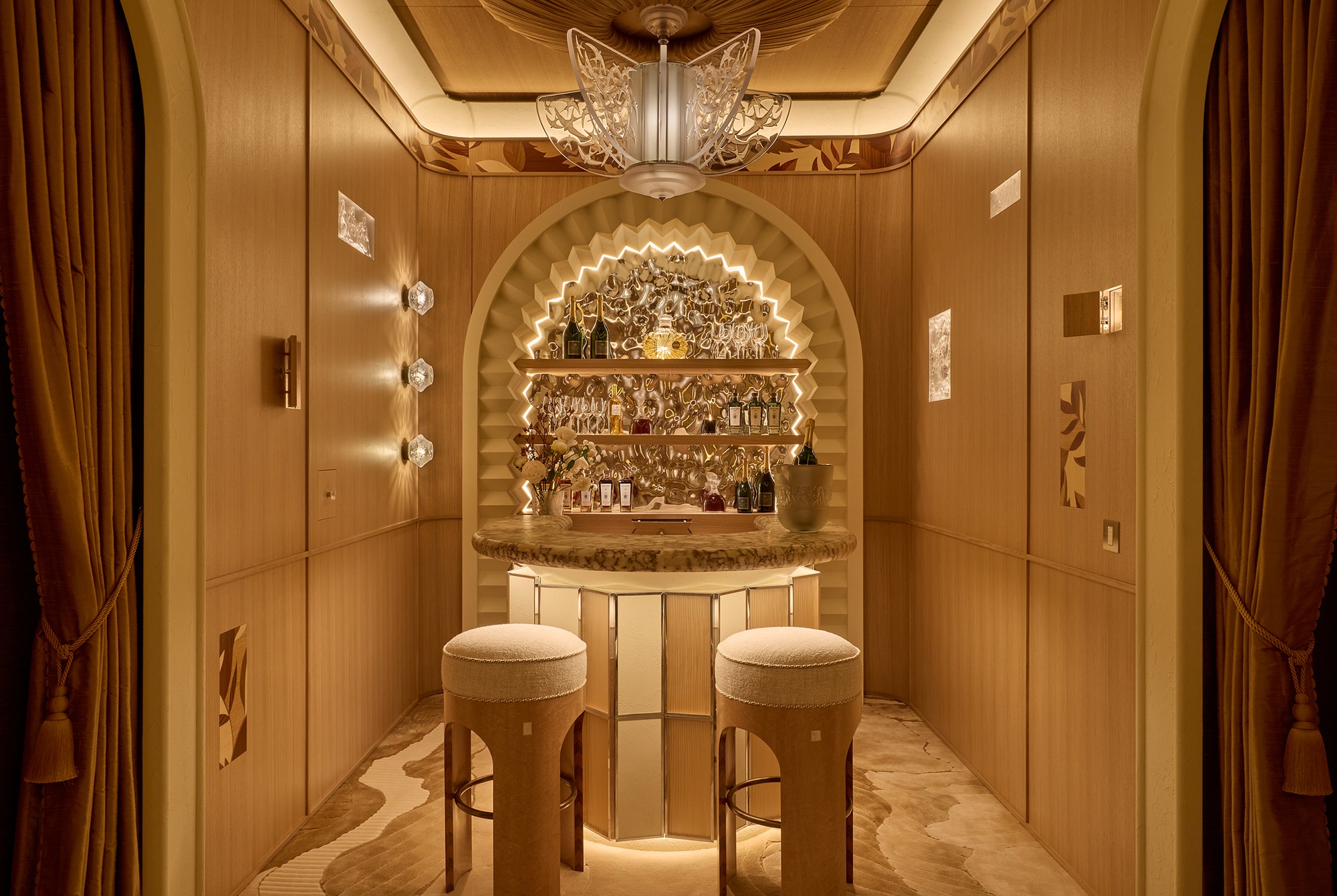
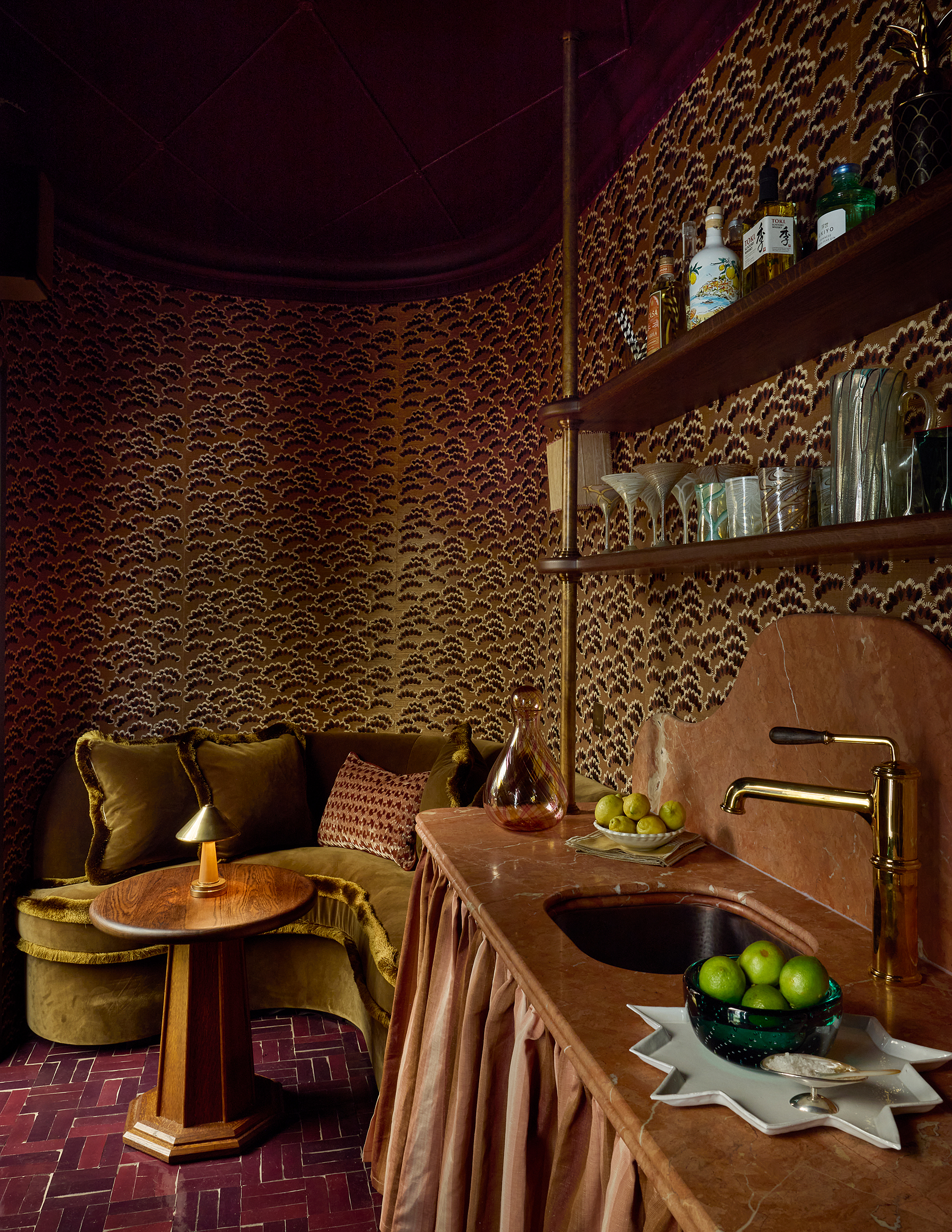
One of the spaces from this year's WOW!house that instantly stands out for its glamor is the Lalique Bar, designed by Elicyon. Named 'Box of Delights', it's a small but richly decorated home bar that impresses with its materiality, but especially the use of silk textures. "The use of bamboo silk throughout the room really stood out," says Designlab by Livingetc stylist Miaad Latoof, who recently visited WOW!house, "from the ceiling to the chandeliers and wall insets."
"Elicyon specifically chose bamboo silk because the softness and natural imperfection made the space feel more tactile," she adds. "It also created this beautiful sense of repetition, letting your eye move gently throughout the room."
Aside from this wallpaper trend, interesting textures abound throughout the WOW!house rooms, and contrasts in materials, between the matte and the polished, the textured and the smooth, were an important recurring theme.
2. Soft Green Palettes
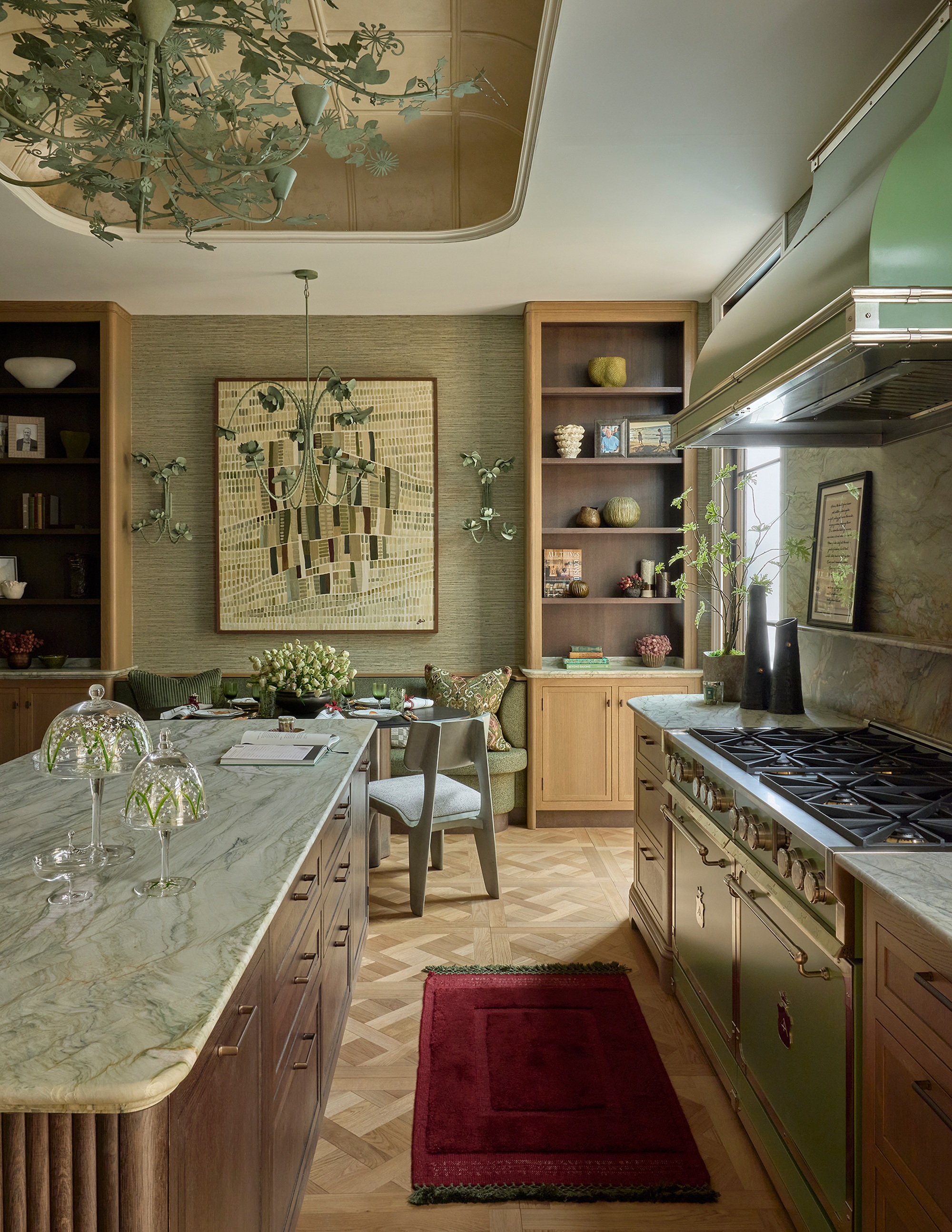
A lot of the spaces in WOW!house lean into the dark, dramatic nature of the space, however, if there's one unexpected color trend emerging from this year's rooms, it's a soft tonal green palette. Take, for example, Samantha Bartlett's kitchen in collaboration with Martin Moore, with its Porta Romana chandelier, and soft green range cooker.
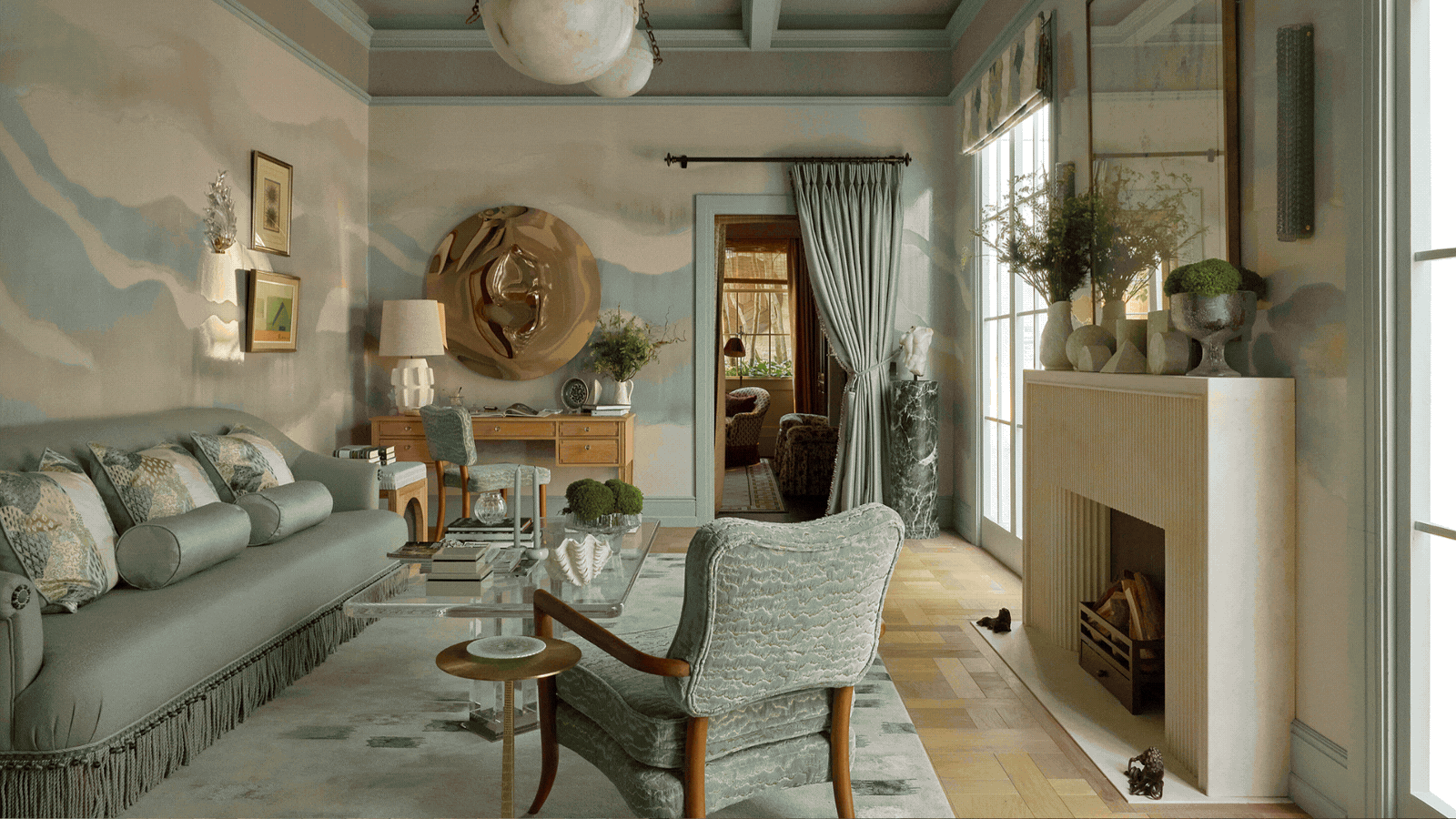
Elsewhere, in Sara Cosgrove's Morning Room for Phillip Jeffries, pale green, blue, and silvery gray make for a palette that feels peaceful, but with depth. "The first thing I noticed was how calming the room felt without relying on obvious minimalism," says Designlab by Livingetc stylist Iokasti Sotirakopoulou. "The palette was soft, but the lacquered finishes stopped it from feeling flat."
3. Tassels on Tassels
WOW!house designs often lend themselves to layered textiles as a way to showcase the rich variety of trimming and fabric brands at Chelsea Harbour. However, the intriguing use of tassels, in particular, was a design moment that caught our eyes this year, especially in the garden room by interior designer Studio Enass.
"And not just on furniture, but across wall trims, tables, curtains, and different design styles," Miaad says. "They added movement and a sense of craft. I loved seeing tassels used in a way that didn’t feel obvious. They added movement and became part of the layering rather than just a finishing touch."
4. Unexpected Contrasts
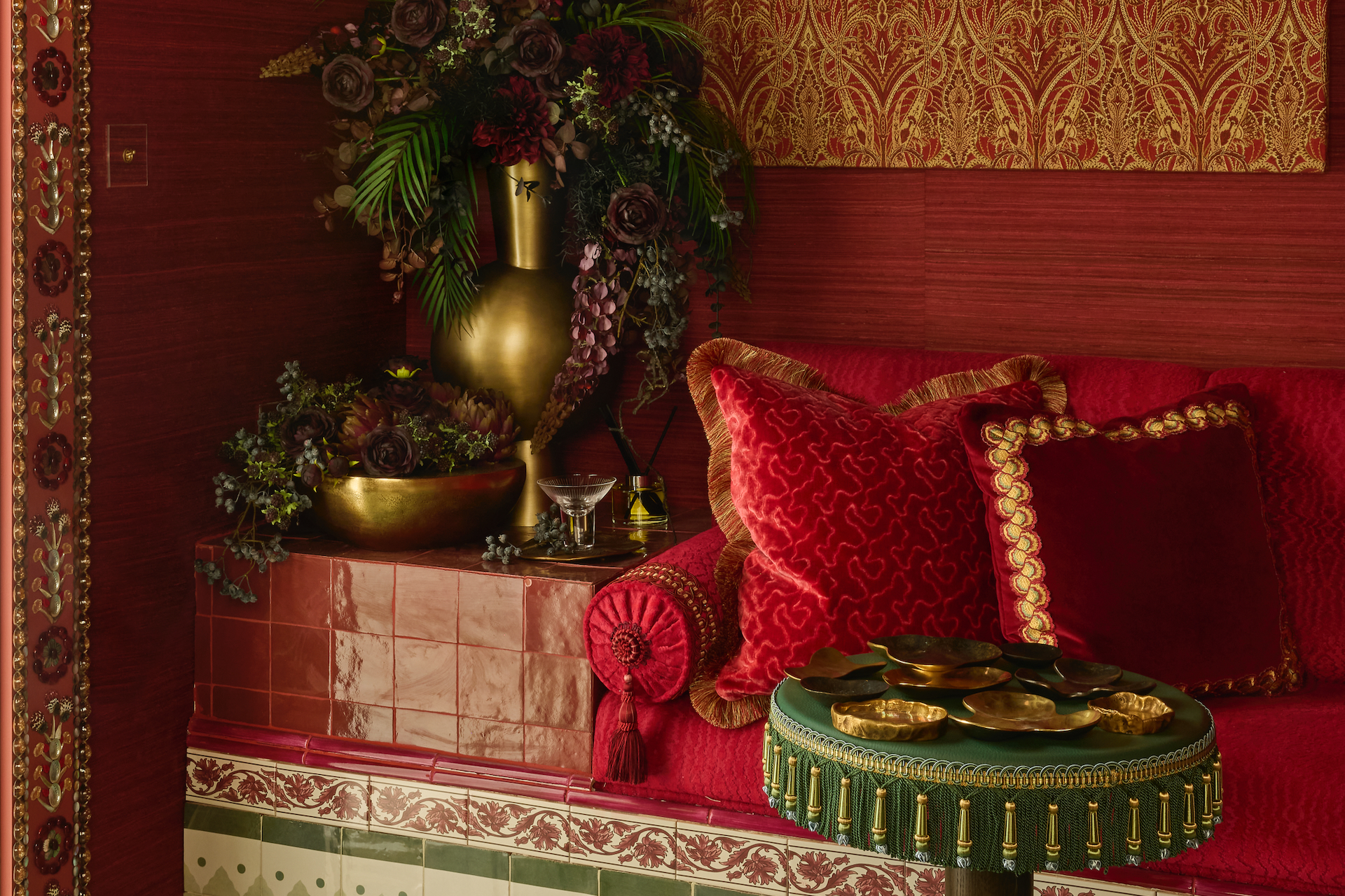
"Rich color palettes dominated the rooms," says Iokasti. "Deep browns, oxblood, olive greens, rust, plum, butter yellow, and lacquered neutrals appeared repeatedly." However, the standout idea isn't just that these colors were used, but that they were layered in interesting contrasts that challenge traditional color schemes.
In Studio Duggan's room for Black Edition by Romo, a mustard yellow curved cocktail sofa sits on a rich, cherry red zellige tile, while in the main part of the salon, a combination of green and purple brings some excitement to the space. "I particularly loved the contrast between the deep rust curtains and the green carpet with the lilac trim," Iokasti adds.
5. The Beauty of Burl Wood
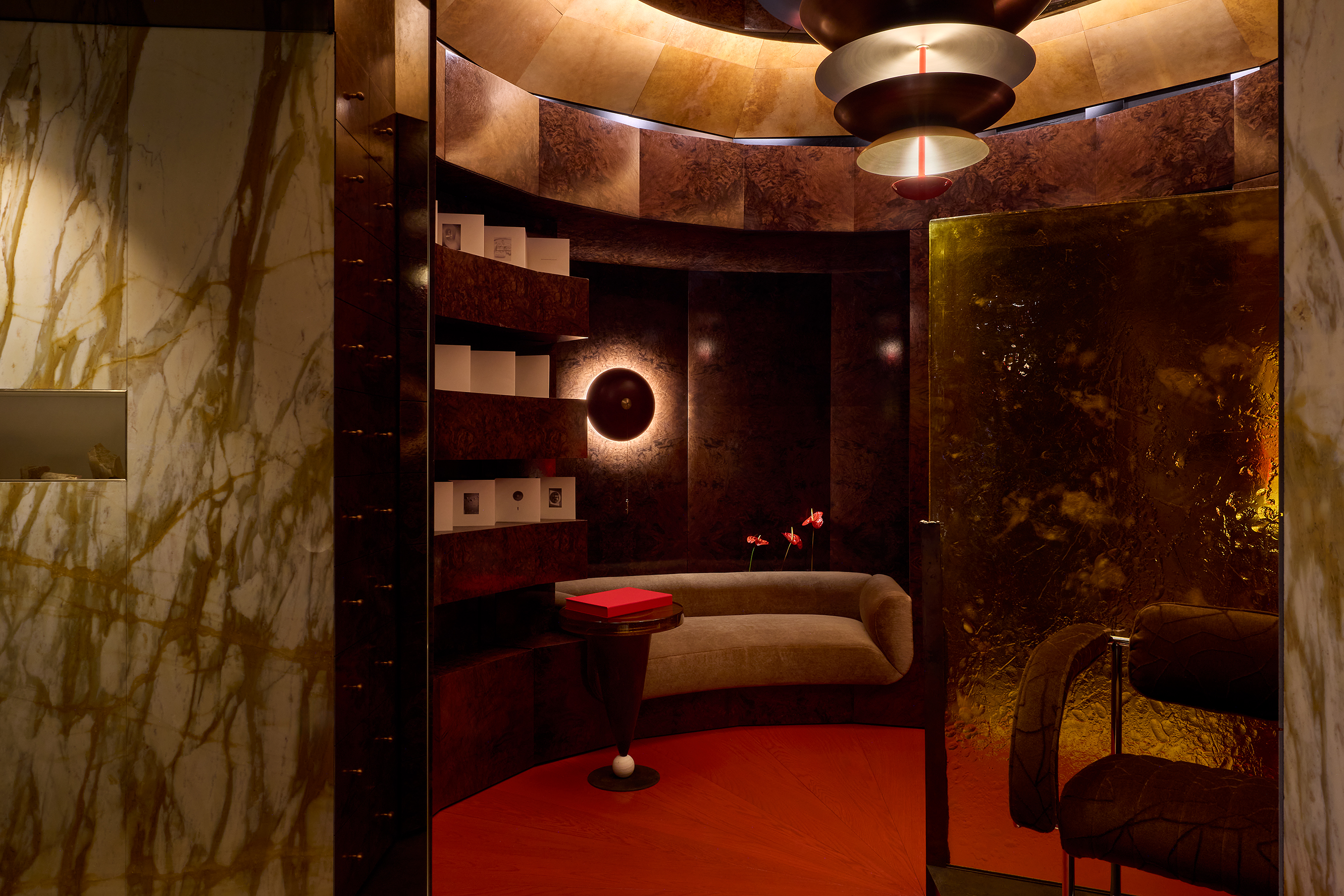
The presence of burl wood could be felt throughout WOW!house this year, bringing a rich, dark feel to schemes, including Róisín Lafferty's Shepel' Library. "Used throughout the space, it created this moody and rich, emotional atmosphere that felt ever so glamorous and fully immersive," says Miaad. "It's proof that one material can completely define a room."
WOW!house is an event open to the public between June 2nd to July 2nd, and why not combine your trip with our exclusive talk at Design Centre Chelsea Harbour, Nature-Led Design: How To Create Spaces that Nurture The Soul, with Livingetc editor Pip Rich?