It's always a good idea to keep one eye on design trends, whether you choose to use them in your work or not. Here, I explain five trends that are dominating right now, and explain how each one is being used in the design world.
For more on design trends, see Creative Bloq's predictions for graphic design trends this year and if you'd rather take a trip down memory lane, then see these pieces on best 90s logos and best 80s logos.
01. Acidic hues

This colour trend reflects the desire of brands to connect with and attract new customers, particularly among Gen Z. As this generation starts to succeed in the professional world (the oldest are now 24) and have an increasing level of consumer spending power, it’s not surprising that it’s going mainstream.
These sharp, bright colours are super saturated, attention-grabbing and impossible to ignore. They are also inherently fun, adding a youthful energy to brands across a myriad of sectors.
Fintech brand Bolt is a great example of this. A checkout technology platform, Bolt strikes out against the sea of sameness and reliable blue when it comes to finance branding, instead leaning into an acidic yellow colour palette and an unapologetically youthful #shopperganger meme-led marketing campaign.
In food and drink, 7UP has also sharpened its look with a simplified can design and a saturated, acidic colour palette that edges towards neon.
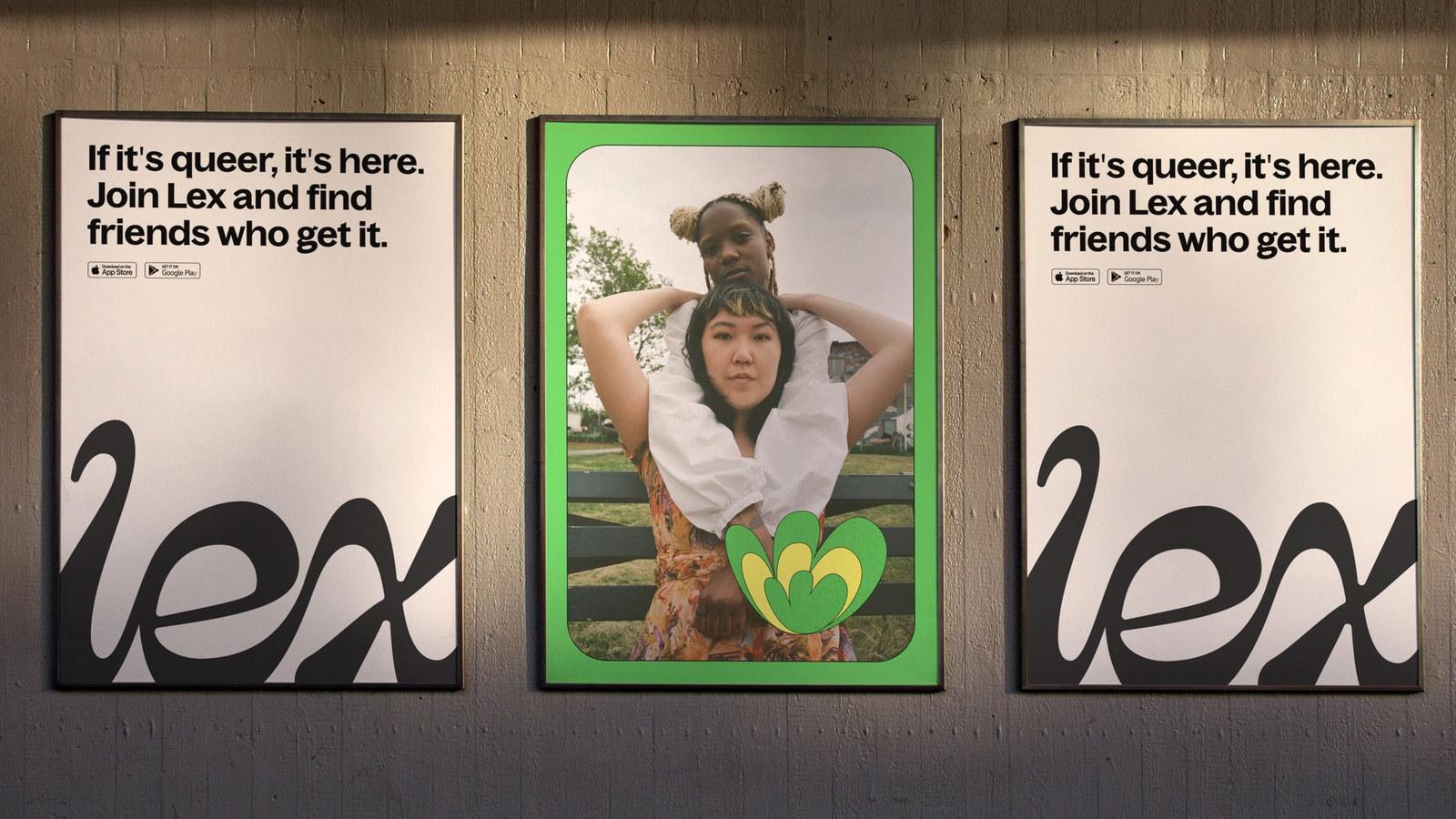
The rebrand of LGBTQ+ app Lex also exemplifies this trend, with a fresh, hyper saturated palette of green, yellow and purple. Additionally, the vibrant colours are layered with a sticker book aesthetic trend that brands are also using to connect with younger, gen Z audiences.
02. Loosely interpreted letter marks
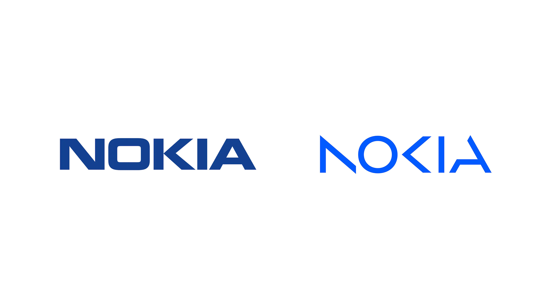
The new Nokia logo leans into one of 2023’s biggest logo design trends of brands leveraging loosely interpreted letter marks.
Rebelling against the standard expectations around legibility, designers leveraging this trend use geometric shapes and white space to make patterns out of letter forms that take logo design to a new dimension.
Nokia’s rebrand sends a clear signal around a marked strategic shift. By creating visual distance between the phones for which the business is most well known, the brand communicates a fresh, future-facing direction that encapsulates where the company is going in its growth within the B2B and enterprise space.
The design itself pulls together lighter, abstract shapes that only read Nokia when they are seen together. Given the company’s new purpose, which is that ‘At Nokia, we create technology that helps the world act together’, this detail adds a clever layer of meaning and authenticity in the visual expression of the brand.
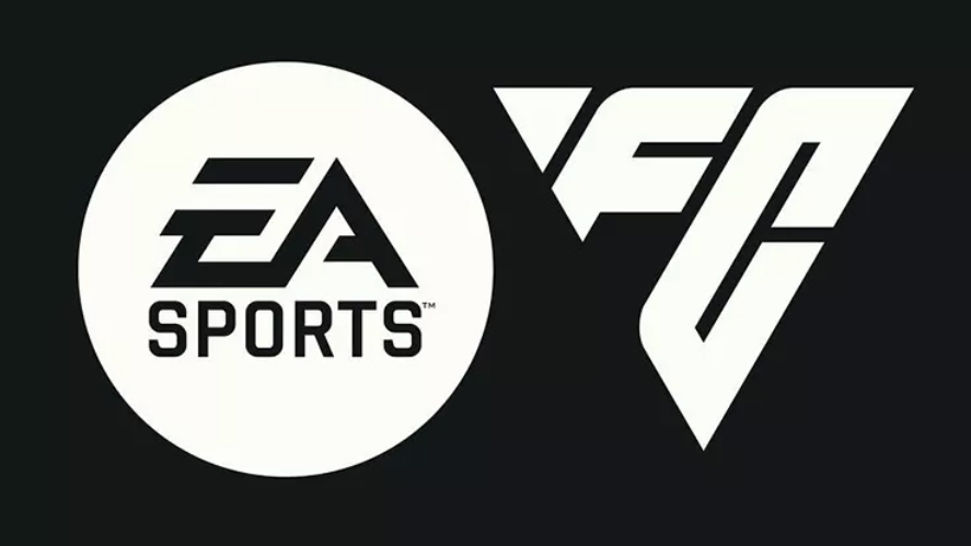
And whether you’re a fan or not, the recent EA Sports FC logo leverages this trend in a different way, using abstract letter forms to create the overall logo.
03. Illustrated ingredients
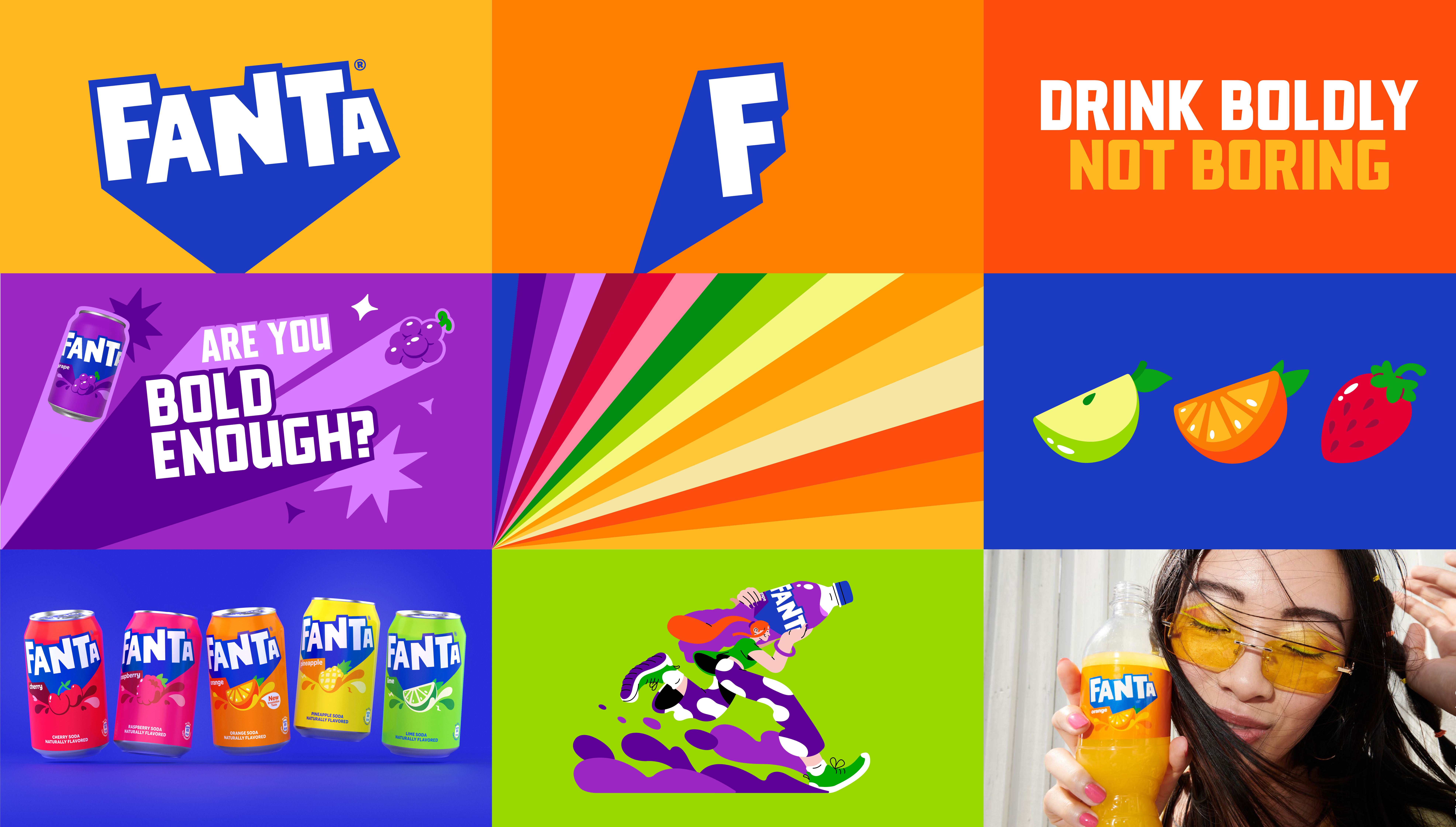
Food and drink brands are leaning into this packaging design trend that sees illustrated ingredients in punchy colour palettes taking centre stage.
The drinks industry as a whole is getting a shake up in 2023 with major rebrands, most notably from Pepsi and Fanta. While Pepsi leans into its heritage with a bold retro visual update, Fanta has taken a huge leap forward in a move that sees its first consistent global brand roll out. While the orange has been dropped, the consistency achieved by retaining a very similar word mark goes a long way in maintaining consumer recognition of a much loved product.
The new can designs are unapologetically bright, landing with a splash of vibrant colour and tapping into a dynamic design trend currently taking the packaging world by storm. By putting the ingredients front and centre of the design system, the branding stands out in a sea of competing products, and is attention grabbing whilst also adding a transparency that appeals in markets around the world.
Robinsons has also unveiled a rebrand for its iconic squash products, taking a similar approach by focusing visually on the real fruit contained within the drinks to stand out to consumers, alongside a simplified logo and bright, bold colour palette.
04. Vintage serifs
There’s no doubt many designers are welcoming the return of serifs. Whether tall and narrow or subtle and delicate, vintage serif fonts are fast becoming the subtle but effective way for legacy brands to nod to their rich heritage in 2023.
Taking inspiration from print’s golden age where typesetters favoured elegant serif fonts, they are also a great way for brands to foster a classic, familiar sense of nostalgia in a digital era.
Nostalgia is a common, overarching theme in this year’s design trends, with many of us seeking comfort in the familiarity of the past – making it a smart move for established brands wanting to create connections in 2023.
In 2018, Burberry unveiled a stripped back, minimal sans serif wordmark at a time where it seemed every major fashion house was doing the same. With the arrival of new chief creative officer Daniel Lee, the logo has had yet another makeover - this time, reintroducing a subtle, elegant serif and bringing back some of the history to the brand.
With the reintroduction of the Equestrian Knight Design from 1901, Burberry’s complete logo mark also taps into the logo trend of modern twists on traditional designs. Paired with this fresh new serif and electric blue colourway, it cleverly ties the brand back to its rich, British heritage while creating a striking contemporary version of the brand.
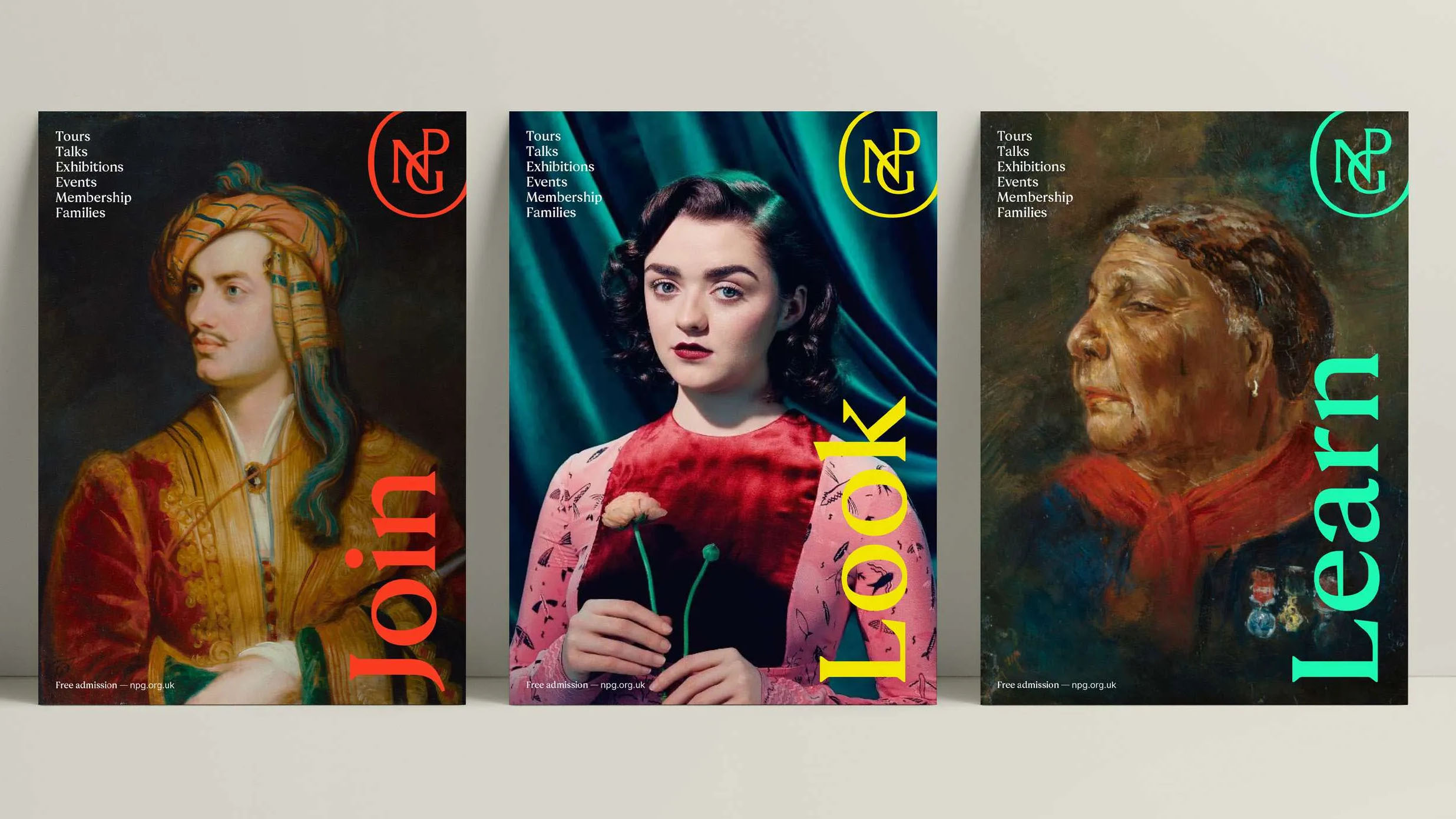
London’s National Portrait Gallery (NPG) also unveiled a stunning new brand system this year, featuring a striking tall, vintage serif. The mark of a great new brand identity is one that looks like it has always been that way and the combination of NPG’s new typeface, monogram and logo type and refreshed colour palette is just that - the perfect embodiment of the history, heritage and diversity of the both the building itself and the works within.
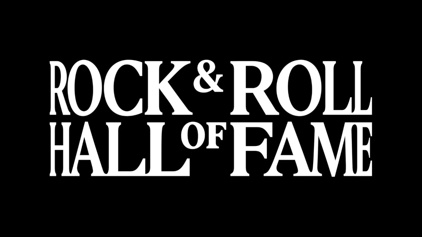
05. Distorted fonts
Another typography based trend we’re noticing taking hold in 2023 is around distorted fonts that take centre stage and kick against the ‘blandification’ of logo marks that can get lost in a sea of sameness.
The Rock & Roll Hall of Fame new brand identity, with its audio responsive logo is the pinnacle of this trend. Created by Base Design it’s a type based audio responsive logo that reacts to music and sound.
The brand system, with its ‘Acid House’ colour palette, also intersects with a number of other design trends making a name for themselves in 2023, particularly with younger generations – acid graffix, mall goth, anti-design – creating an overall effect that is very of the moment.