Curtains are like the jackets of interior design — you might not always need them, but they introduce an additional level of interest, a layer of protection, and, of course, a bit of style. Choose the wrong style, though, and the entire look goes astray. That's why it's worth knowing the curtain colors going out of style in 2025.
This year, curtain trends suggest that these fabrics are no longer about blending into the background — they're for standing out, elevating a room, and finishing a space with the utmost style.
To help you get the look right, I asked interior designers which curtain colors are no longer fashionable, and here's what they told me (which, thankfully, includes what colors to replace these dated designs with).
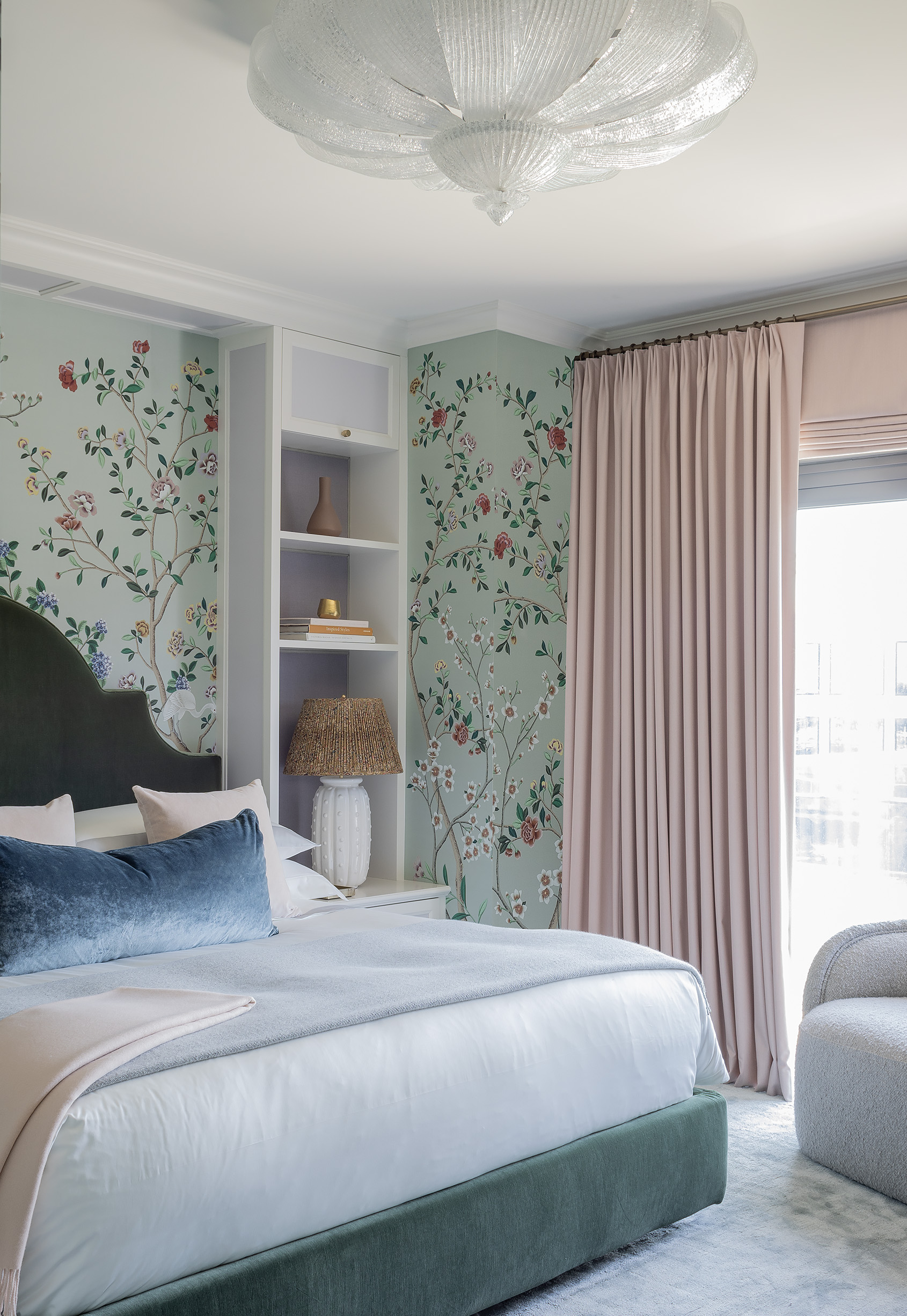
1. Navy Blues
Decorating with navy is common in interior design because it's classic. For those hesitant to experiment with color, navy feels like a safe bet due to its neutrality — not too dark, not too bright, and it doesn't inherently overwhelm a space.
That being said, navy doesn't necessarily bring a whole heap of excitement to a space, either. And when it comes to curtains, interior designer Manuela Hamilford says the color is too safe, and risks feeling uninteresting.
Instead...
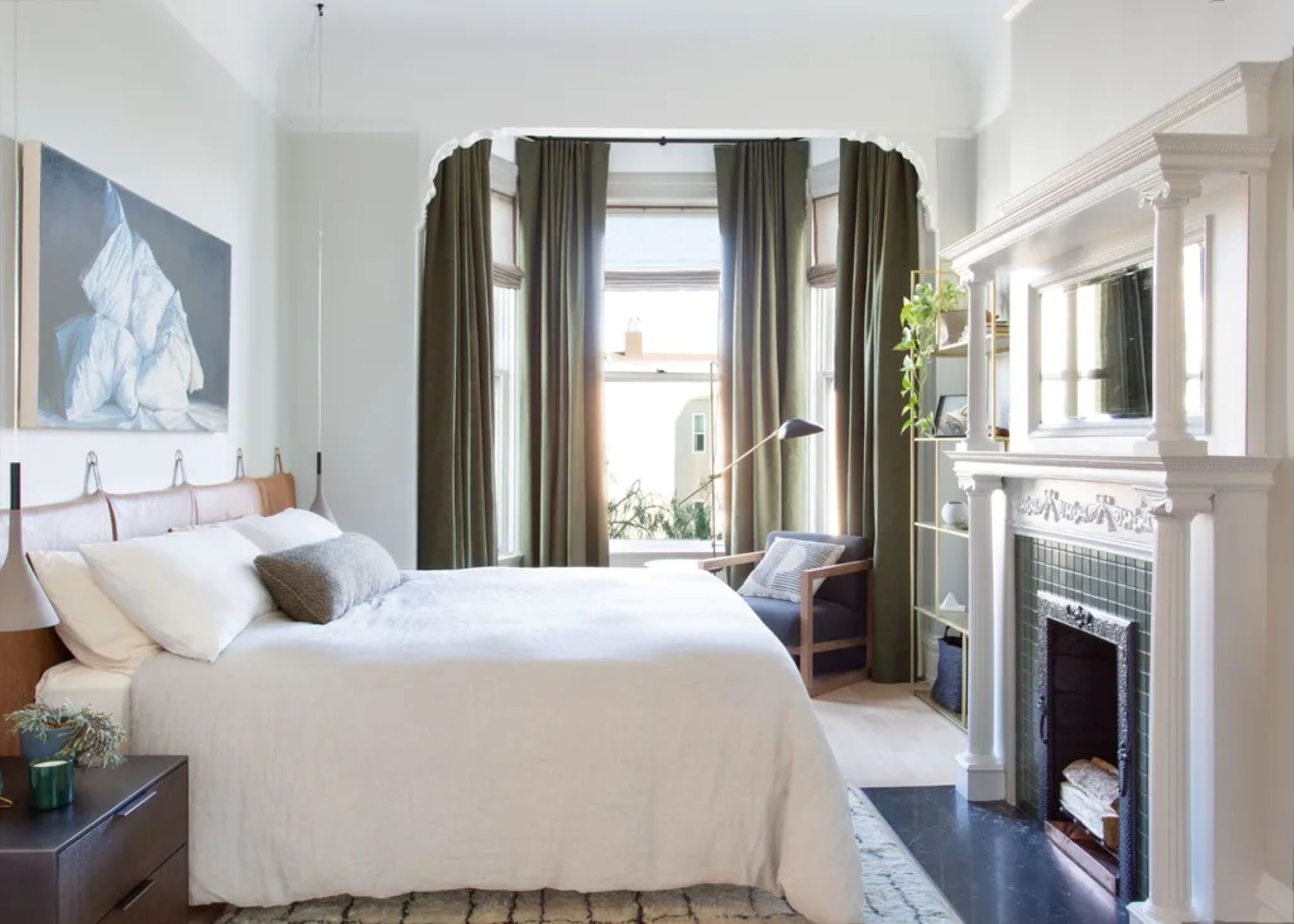
Now, there is certainly nothing 'wrong' with navy curtains, but if you want to curate a space that feels a bit more design-forward, opt for a deep green instead, says Manuela.
Recent color trends are leaning towards nature-inspired tones; "it's a return to classic, timeless tones that offer stability, while also incorporating modern expressions of bold color," says Manuela.
An earthy shade of green can be the perfect replacement, inviting a natural calmness to the space in a subtly eye-catching manner.
Although a deep, rich green, these curtains still feel light and airy thanks to their linen fabrication. They can ground a room with a natural elegance and simultaneously act as a pop of color in a neutral space.
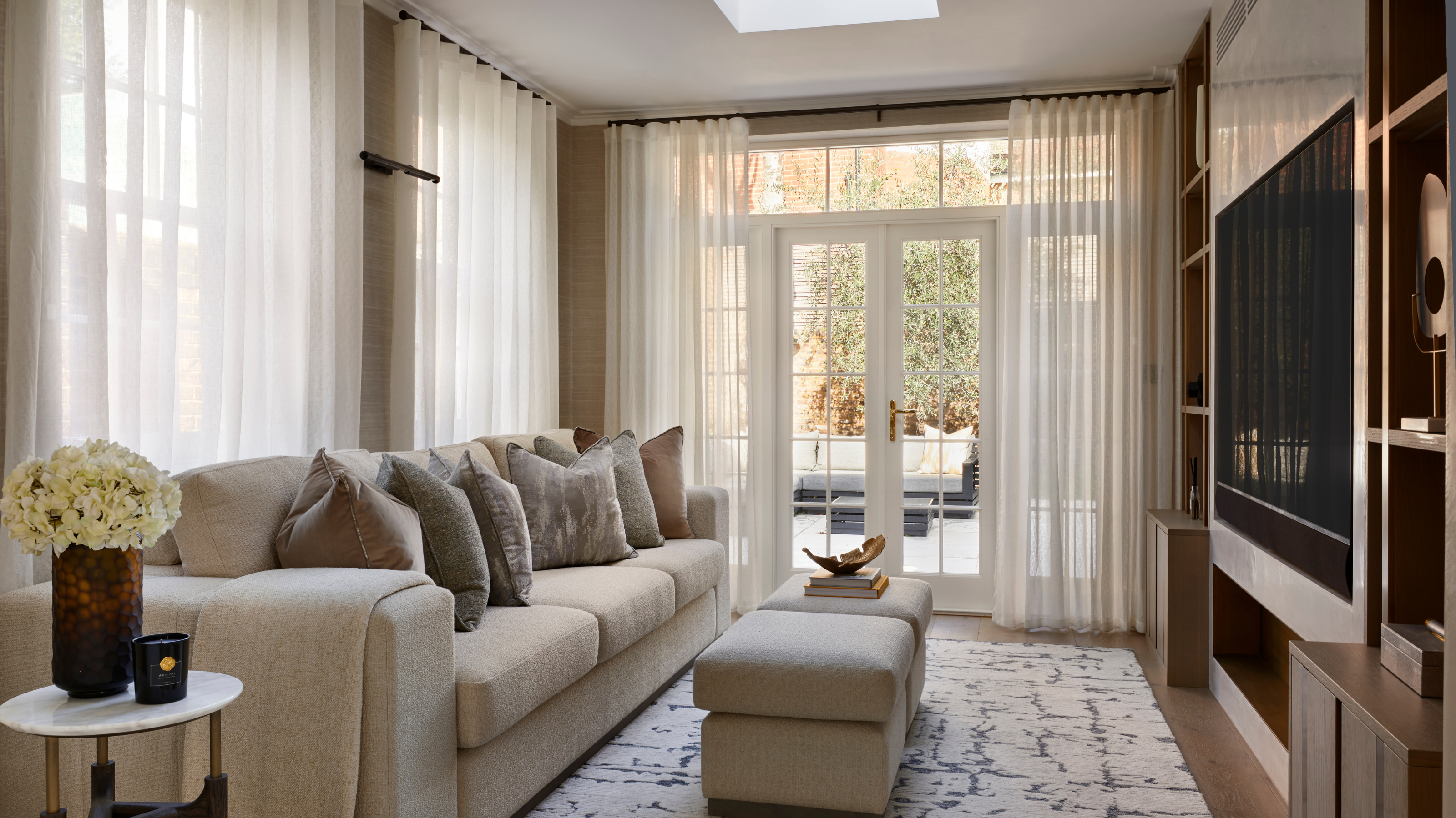
2. Solid Whites
Don't get me wrong, I love decorating with white. It's the most timeless neutral, and a color that goes with almost everything. In the past, that made it an ideal color for curtains — serving their purpose as classic window coverings, nothing more and nothing less.
But in 2025, curtains are doing more than simply shading sunlight, and because of that, solid white styles are falling flat.
The color lacks interest and warmth, and as interior designer Raili Clasen says, "doesn't seem to add much to a space."
Instead...
Because white is such a classic color, it's not a complete faux pas, per se. But instead of choosing a solid white curtain with high opacity, designers say to look for styles that are lighter and more transparent in their fabrication.
Similarly, warmer shades of white that aren't as harsh or sterile as a solid, bright white can create a more inviting ambience in a room.
Interior designer Melissa Roberts says to look for warm white or near-white neutral curtains to dress your rooms in 2025. And for more privacy, to pair curtains with shades.
Or to give white curtains more interest, try layering them with other window coverings. Melissa suggests a sheer white curtain over a Roman blind, for instance.
These curtains are just the right level of sheer. They'll let light into a room while still maintaining a level of privacy. Plus, their ivory color feels significantly warmer and more inviting than a stark white curtain.
3. Dull Grays
Gray is a highly debated color in interiors. Some love its neutrality and versatility (Not to mention, it pairs well with loads of colors), but others find gray to be boring, uninteresting, and honestly... rather dull.
When it comes to the best curtain colors, designers recommend staying away from gray. Raymond Yang, founder of Deconovo, has seen a noticeable shift away from cooler-toned gray curtains, which he said dominated curtain sales just a few years ago.
And in Manuela Hamilford's opinion, gray curtains can look slightly dated and unfashionable in 2025.
Instead...
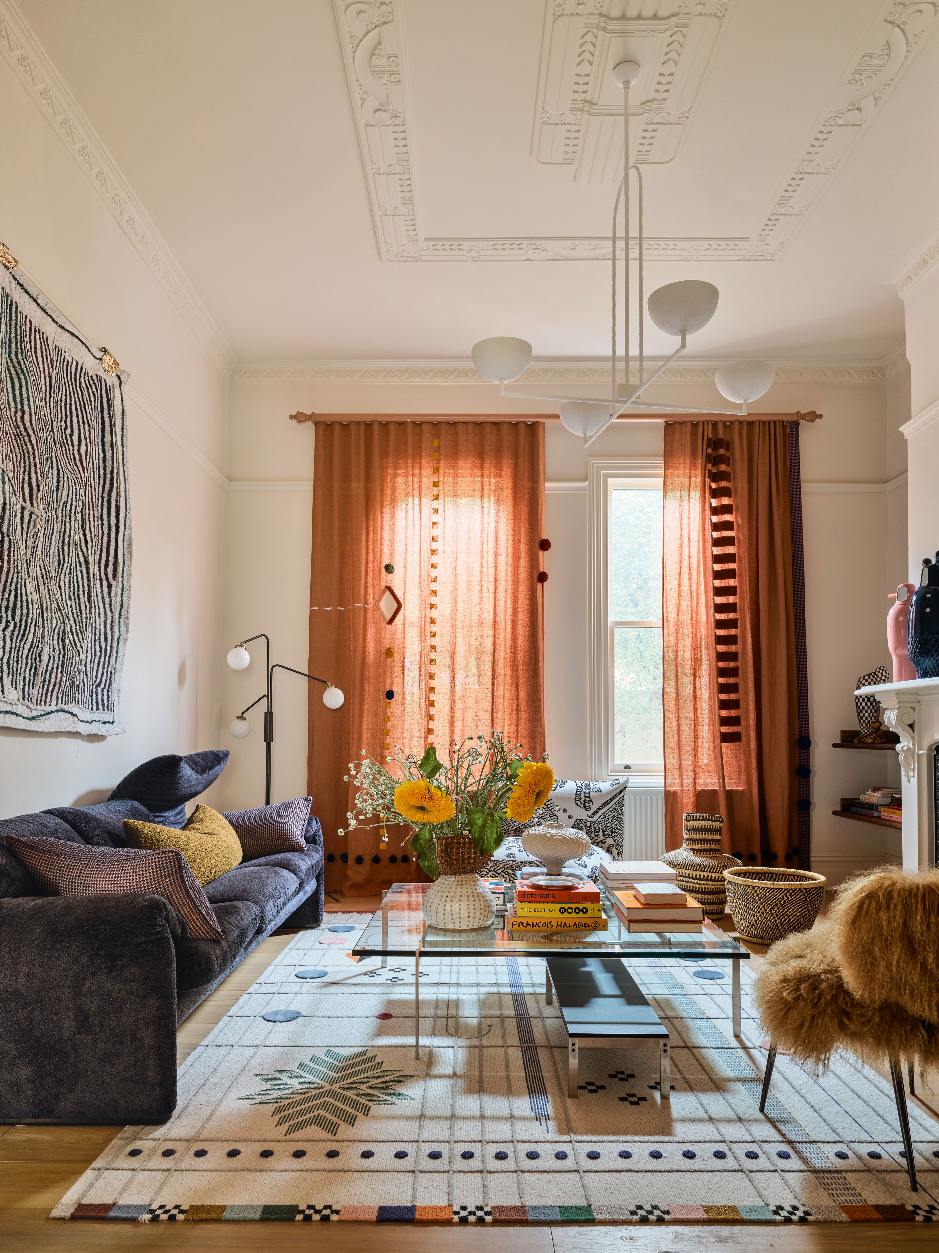
To spark some energy and develop a space that feels welcoming, Raymond suggests decorating with earth-toned curtains. "As homeowners and renters aspire to create warmer and more inviting spaces, they’re beginning to gravitate more towards earthy tones and nature-inspired hues including warm neutrals, olive greens and terracottas," he suggests.
A terracotta curtain can invite a neutral pop of color into your space, and with its burnt orange and red accents, it'll feel warm and inviting.
With a medium opacity, this curtain will subtly filter light into a room. And because of it's terracotta color, it'll create a rich and inviting ambience wherever you hang it.
4. Moody Reds
Sometimes, curtain colors that are too rich can unintentionally make a room feel overwhelming. And this year, according to Melissa Roberts, homeowners are straying from "heavy, ornate curtains that tend to weigh down interiors."
Curtains in a shade like a deep, moody red can certainly add interest to a space, but it's best to err on the side of caution when choosing colors that strong.
Because of their intensity, deep red curtains can go from moody to overpowering if not styled correctly.
Instead...
If you like the pop of color that comes with a shade of red, but don't want to overwhelm your space, opt for curtains in soft pastel shades. "Muted pastels such as sage, dusty rose, and soft blues are taking center stage this year as customer favorites, allowing consumers to maintain that soft and calming aesthetic they love, while still giving the room personality," Raymond tells me.
And don't forget about fabrication. "I think people are gravitating toward light, airy curtains that feel romantic and move gently with the summer breeze," designer Amy McCoy adds.
Muted pastel colors in soft and light materials such as polyester, cotton, or linen certainly won't overpower your space in the way a heavy, dark red curtain can.
This light pink curtain can act as a soft introduction of color. Made from polyester, it's light and airy, and can hang in front of your windows in a stylish manner, letting a soft passage of light into the room.
5. Muted Beige
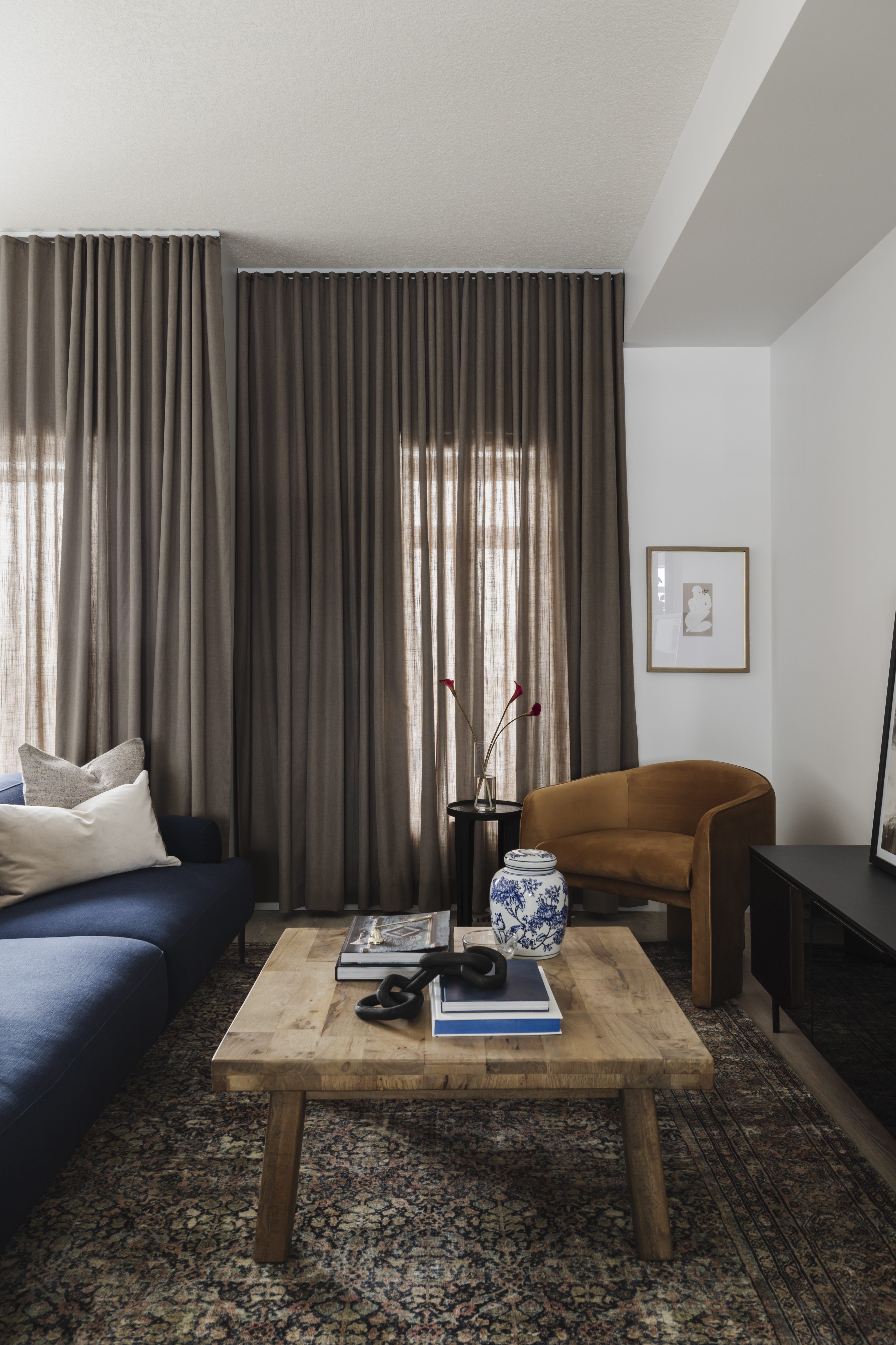
Beige has a reputation for being a color that's... a bit boring. Sure, it's a neutral base, a versatile foundation upon which other colors can shine, but like I said, it can come across as uninteresting and simply boring.
Beige might seem like an ideal choice for curtains because it creates a neutral backdrop, but it can make your room's overall design fall flat.
Instead...
Now, there certainly isn't anything wrong with beige — beige rooms can look luxurious when styled with the right decor. But when it comes to curtains, it's best to avoid solid beige. Manuela Hamilford suggests stylizing the color instead. "Neutral beiges can work if they are highly textured," she notes.
But if you'd like to avoid beige altogether, look for something with a bit more character. Darker shades of brown, like sand, taupe, camel, or even chocolate, can look significantly more intriguing than beige curtains. These colors can add some visual interest to your space, and can even create a moody ambience if desired.
This stylish woven fabric can transform into an elegant made-to-measure curtain — a curtain that's both stylish and sophisticated with its medium brown color.
It's helpful to know the curtain colors going out of style in 2025 so that you can make the best design decisions for your home.
But if all that seems too overwhelming, here's something to ask yourself: do your windows even need curtains? Yes, believe it or not, there are some situations when you don't need to use window coverings.