First impressions are important. When someone walks inside your home for the first time, what is the message you're trying to send? What is the look you want to convey? Of course, as they progress further into your home, your chance to communicate your taste and style increases, but your best chance at truly wowing a guest is the second they step inside your home, so it pays to know the best entryway colors to use.
Pulling back even further, it's the color that sets the foundation for your entryway ideas. Are you going with big and bold — a strong red or a bright yellow — or a simple neutral? A calming surprise — soft blue comes to mind here — or a timeless eggshell white? It's all in how you choose your entryway color, though some are understandably better than others.
“The entryway sets the tone," confirms interior designer Julie Mays of Julie Mays Interiors. "It gives guests a tiny glimpse of what to expect throughout the home." So you want to pick the best entryway color. Below, you'll find a list of the best entryway colors picked by designers, including soft greens, warm neutrals, and more.
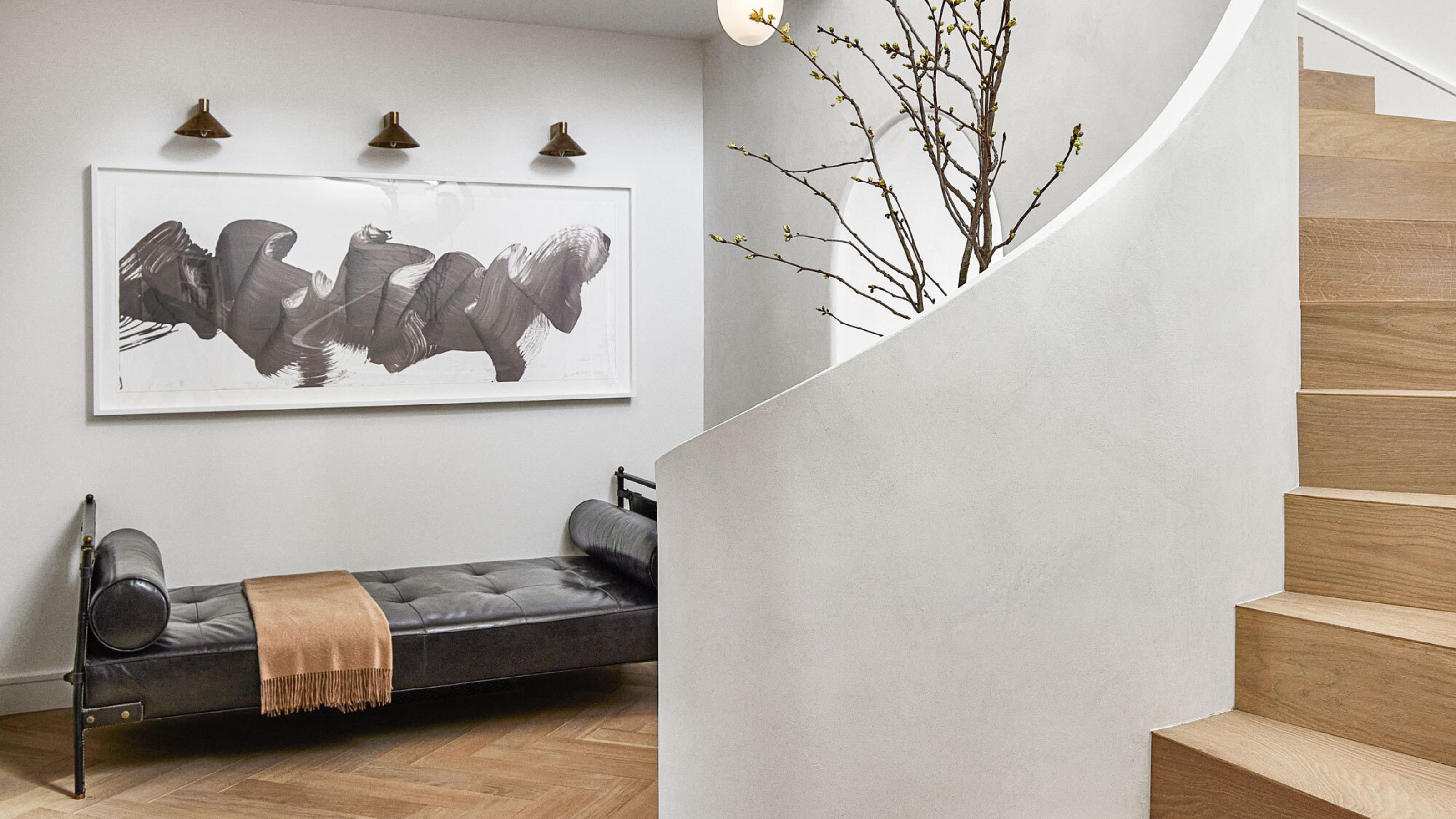
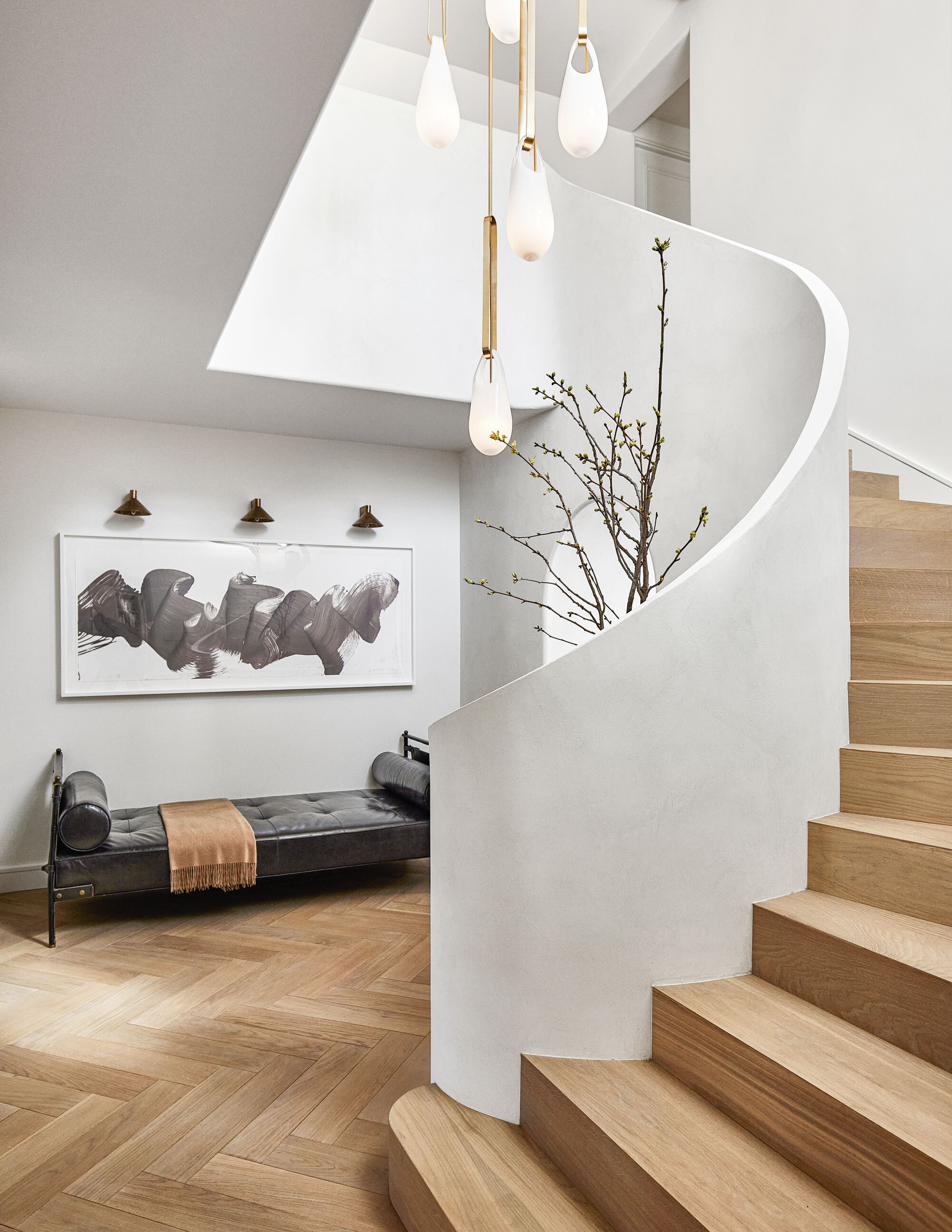
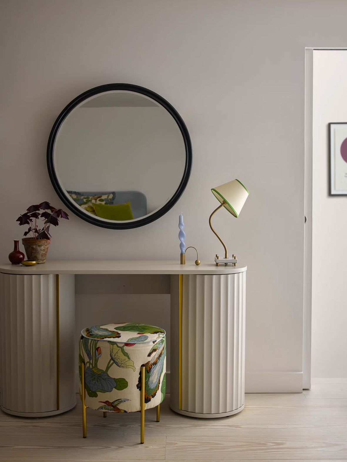
1. Soft Taupe/Beige
A good neutral entryway paint color will never go out of style. When it comes to entryway color ideas, these shades are particularly timeless and versatile, which makes them a great choice for these high-traffic areas.
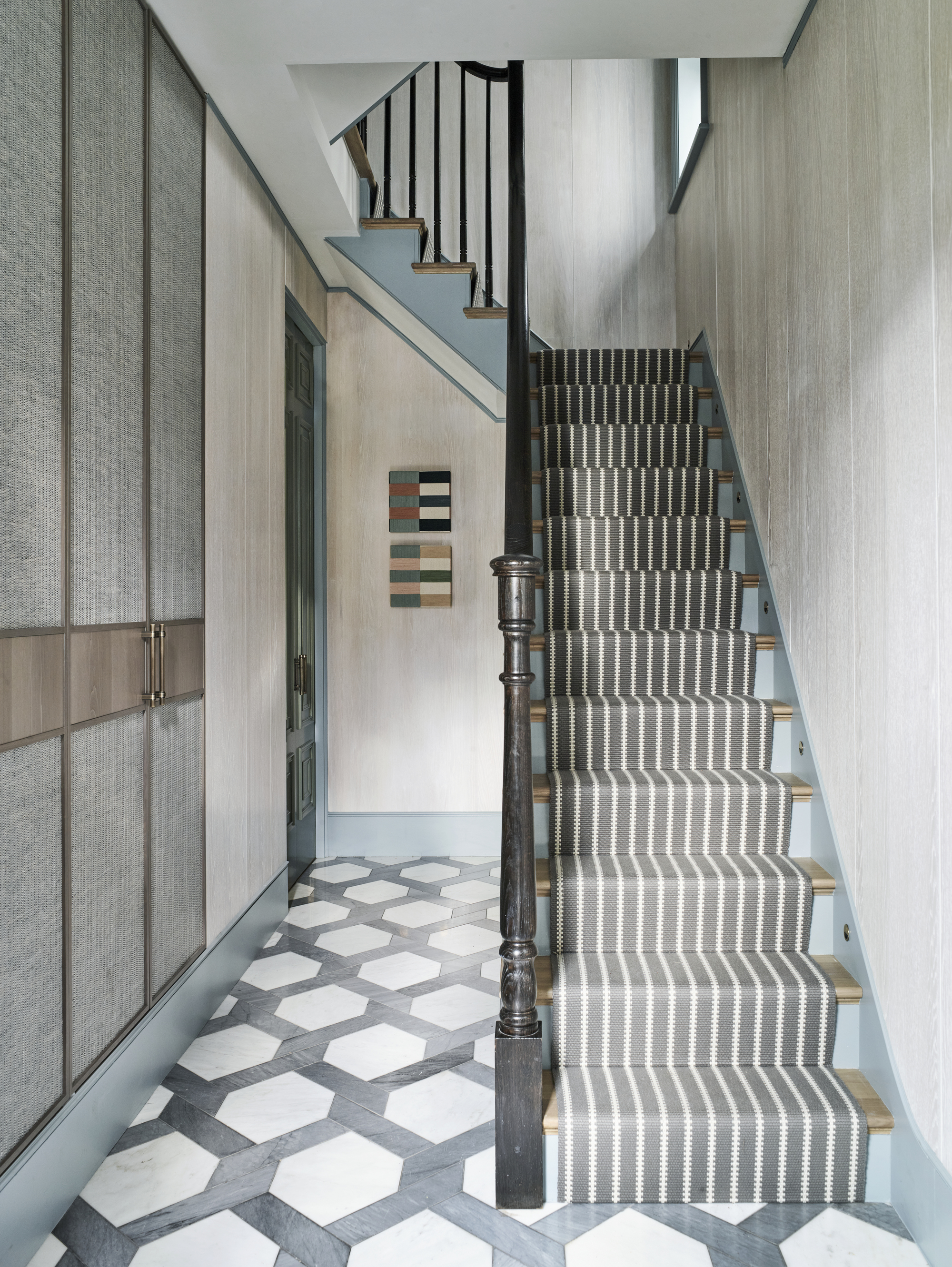
Interior designer Crystal Sinclair (who designed the space shown above), says, "For an entryway that doesn't see any natural light, I like to go with something semi-dark. A soft taupe does the trick."
"These colors create a welcoming, versatile backdrop that feels both calm and open," adds Alice Moszczynski of Planner 5D. "They’re fantastic for creating a soft and inviting entry that works with just about any decor style. And they allow artwork or accent pieces to really pop without feeling overwhelming."
Price: £5.50/sample pot
This gray-beige shade is a perfect colour to complement any space. The neutral tone adds a cool, earthy feel.
2. White
White is another tried-but-true entryway color idea; it matches everything, it's bright, and it's easy to find.
"Because the entryway is both the first impression of a home and a space that likely connects a lot of different rooms, I like to keep things neutral but bold," says Allisa Jacobs, the owner and stylist at Allisa Jacobs, LLC. "Typically, I prefer true neutral whites like Benjamin Moore's Chantilly Lace. This shade serves as a great backdrop for warm materials like wood shelves, benches, and tables."
Price: £5.75/sample pot
Fuji is a classic white shade that works well for any space and is a design classic.
3. Light Blue
A bright and light blue is one of the best entryway colors, and makes for a dramatic statement, says interior designer Crystal Sinclair.
"Personally I love to use light, fresh, and airy colors in entryways," adds Carr Lanphier of Improovy, a house painting service. "Your entryway is welcoming people into your home and setting the stage for the rest of your home, and using lighter colors can create a much more inviting atmosphere in my experience."
"Blue tones create a cool and clear look," adds Rusudan Tumanishvili of The Wall Design Studio. "Calm, secure, comfortable, noble, but a little melancholic,' says Rusudan.
Price: £5.50/sample pot
This stunning, dusty blue shade brings a soft and calming effect to any space.
4. Sage Green
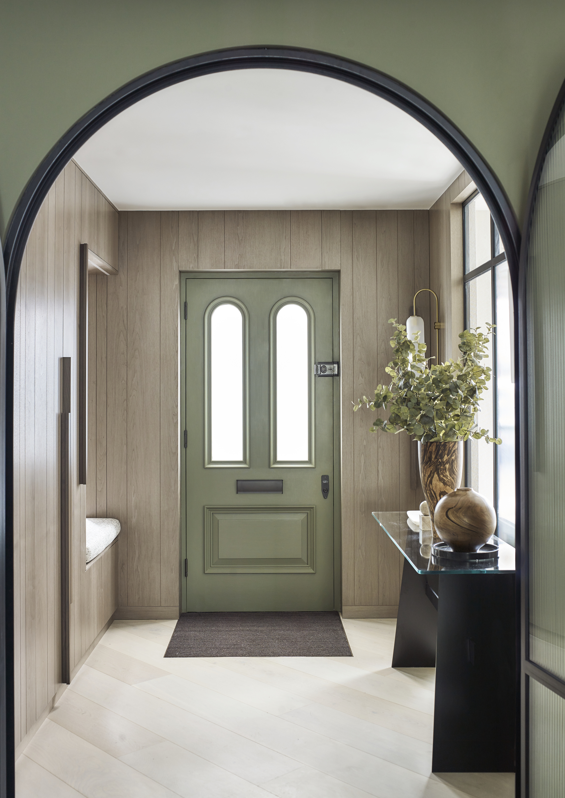
Any interior design junkie knows sage green has exploded in popularity these last few years, especially in the kitchen. But designers say it's one of the best entryway colors, too. (Plus it's a good feng-shui choice).
"It’s a muted, natural tone that brings a sense of calm and tranquility to the space," Alice tells me. "The subtle green works especially well with plants or natural textures like wood, giving the entryway a fresh, organic vibe. It’s a color that feels current but timeless at the same time."
"If I’m after a soft green, Farrow & Ball’s Card Room Green is my go-to," she continues. "It’s muted but still rich in tone, offering a calm, organic feel that’s perfect for an entryway. The color feels fresh without being overpowering, making it a lovely option for setting a peaceful tone as you enter the home."
Price: £2.50/sample card
This faded, olive shade of this green colour creates an earthy feel. The subtle blue and grey undertones, allows Town Hall Whisper to be a calming and sophisticated.
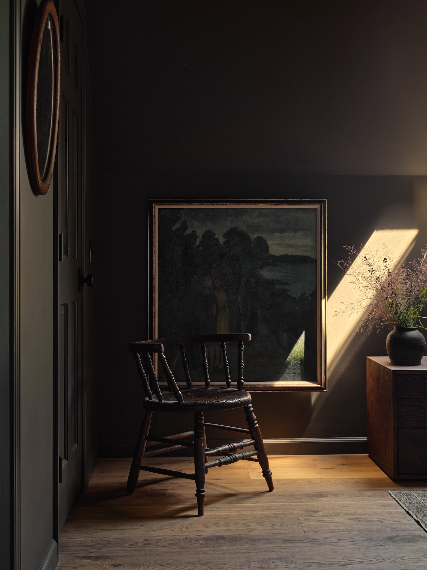
5. Navy Blue
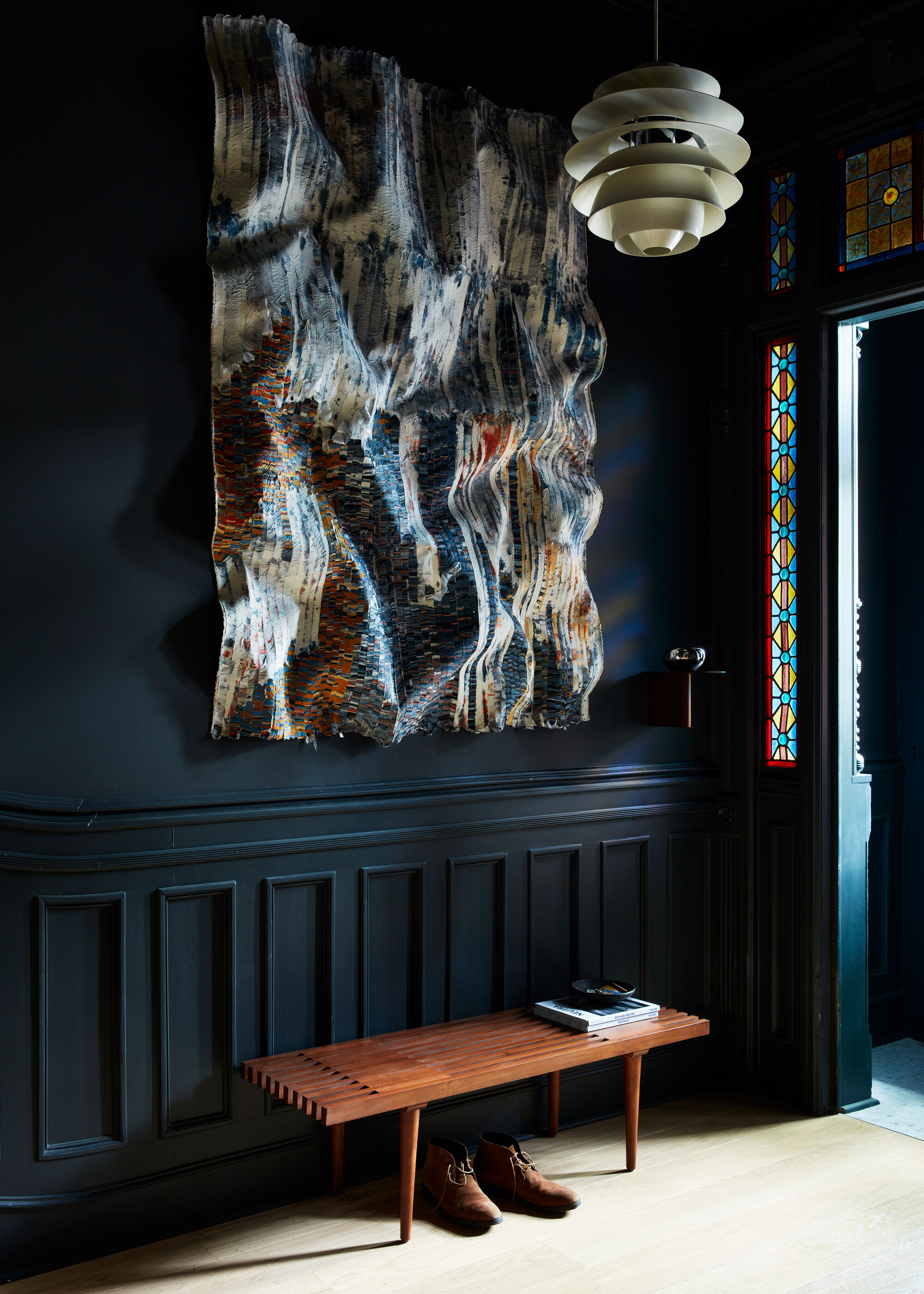
If bold statements are in your blood, a navy blue entryway might be perfect for you. And don't be afraid of using dark shades for dark entryway ideas.
"Depending on the aesthetic of the entire home or apartment, the darker the better," says Crystal Sinclair. "I've had many painted black!"
"If you're looking for something a bit more dramatic, navy blue is a favorite of mine," Alice adds. "It brings a touch of sophistication and depth to the entryway, making a bold first impression while still feeling refined. Navy pairs beautifully with warm wood tones or metallic accents like brass."
Price: £5.50/sample pot
The perfect cross between a navy and a lighter blue/gray, Stiffkey Blue gets its name from the colour of the mud along Norfolk beach.
6. Pink
If you want to introduce some warmth through your entryway color ideas, opt for light pink. "Colors that have an underlying red or yellow base through them, from gentle neutrals such as Farrow & Ball's String or romantic pinks like Templeton, will add just a hint of warmth," says Farrow & Ball's color expert Patrick O'Donnell.
Pink is also one of the best entryway colors because it has the perfect amount of color and saturation, too, which comes in handy in such a busy part of the home.
"Entranceways can be high-traffic areas with busy families. Use a wall color with enough of an undertone to hide the occasional dent or bash," recommends Jacqui Mitchell, an interior designer at Twill Interiors.
Price: £2.95/peel & stick sample
This peachy, pink shade adds a flush of colour whist remaining neutral and versatile.
7. Light Gray
When it comes to the best entryway colors, gray and white have a lot in common. But in our #2 option, we were talking about pure whites — shades of whites that, for the most part, lack undertones that skew the hue one way or another. Here, we're talking exclusively about those that lean lightly gray.
Shannon Askinasi, founder and lead design expert at Ash & Pine, thinks light grays make for a wonderful base tone for entryways, especially when you want to add just a touch of extra depth to a white wall.
"Sometimes a room calls for a hint of beige, and if that's the case, Benjamin Moore's Classic Gray is a wonderful option," Shannon tells me. Benjamin Moore describes this color as an "ultra-light" shade of gray that could also work as an off-white.
Price: £5.75/sample pot
This universal neutral is perfect for any space and will complement any colour it paired with.
8. Brown/Terracotta
When in doubt, you can always look to nature for inspiration for entryway color ideas. Naturally occurring colors often exude calm and tranquility, which makes them one of the best entryway colors.
"We love to decorate with earth tones like warm browns, muted and soft terracotta," says Amy Hart of The Little Brick Studio. "These shades bring a natural and grounded feel to the entryway. They evoke a sense of calm, warmth, and coziness, providing a welcoming atmosphere."
To further bring the space to life, complement the color with natural materials. "We often suggest indoor plants to complement this style of entry, either within the space or via adjacent glazed areas," Amy adds.
Price: £5/sample pot
This deep mahogany shade gives a luxurious feel to all interiors, as well as a warm cosy feeling, thanks to its organic undertones.
9. Dark Gray
Sometimes, a darker shade can be used more as a side dish than a main. In that case, try dark gray for your entryway color idea.
"If you have wainscoting in your entry, you can add a second darker neutral either on the paneling or on the upper walls," Shannon of Ash & Pine suggests.
If that sounds like you, and you're looking for "a bold, dark paint," she adds, "Benjamin Moore's Amherst Gray and Kendall Charcoal are my go-tos. They are deep warm grays with green undertones, giving them an earthy feel. Best of all, they work with so many color schemes."
Price: £5.50/sample pot
This deep, charcoal gray provides as a stunning statement colour. With its subtle olive tones, Vulcan could pair with any green colour perfectly.
FAQs
How to pick the best entryway color?
- Consider the mood you want to create — "Color acts like a subliminal message, influencing your thoughts and emotions," says interior designer Kim Colwell, "Dynamic color combinations stimulate our imagination and when color is dissonant it can trigger a stress response."
- Identify your color preferences — "We can look at options and what they invoke in general but selecting what resonates with you and personal feelings and preference is important," says Angela Higgins, principal designer at Nourished Home.
- Consider the natural light your entryway receives — "Light colors, like soft neutrals or pastels, can make a small entryway feel open and more expansive, while darker shades like navy, charcoal, or forest green add drama and sophistication to spacious entryways, especially those with plenty of natural light," says Lucy Searle, content director at Livingetc.
- Understand color relationships — "For example, pinks and greens go hand in hand, and being complementary colors they work to elevate each other yet are far less contrasting and harsh than green and red," says Helen Shaw, director of marketing at Benjamin Moore.
-
Connect your entryway with adjacent spaces — "Create a uniquely welcoming feel with dark sumptuous colors, selecting a shade that gives a sense of continuity and transitions seamlessly from room to room, providing a sophisticated, cocooning feel," says Ruth Mottershead, creative director at Little Greene.
What colors should I avoid for my entryway?
Of course, you can choose an entryway color that's not on this list, but be warned there are colors to avoid in an entryway, such as "super bright or neon shades," Alice tells me.
"Colors like bright red, neon yellow, or electric green can feel overwhelming and jarring in an entryway," she explains. "I prefer colors that help set a calm, welcoming tone rather than ones that might cause sensory overload right as you step inside."
What are the qualities of an ideal entryway color?
So if you're choosing a color not on this list and want a gut-check as to whether you're picking correctly, experts say to look for something soothing, bright, and open.
"In my experience, the best entryway colors are welcoming, versatile, and soothing," Alice explains. "They set the tone for the rest of the home, creating a smooth transition from the outside world into your space. I always look for colors that will make the entryway feel open and bright, even if the area is a little smaller or lacks direct natural light. The ideal color should complement the rest of the home’s design while offering a bit of personality."
Carl from Improovy agrees: "I’d say that sort of fresh, light feeling is something the best entryway colors have in common. They’re all going to be colors that welcome you in and make you want to see more."
How can I help my entryway color withstand high traffic?
When it comes to picking low-maintenance color choices for your entryway, light colors in high gloss finishes are a great option, as they're less likely to show scuff marks, dirt, or fingerprints compared to matte or flat paints.
But there are other things you can try. "One easy trick is to use one color in two finishes — paint the lower half of the wall in gloss, carrying over the baseboard for even more drama and accentuated height," says Farrow & Ball's paint color expert, Patrick O'Donnell. "Then, paint above in a washable matte — a fully washable finish."
This technique can ensure the entire space is easy to maintain and can withstand the wear and tear of daily use.
Ultimately, the best color for your entryway will depend on your personal preferences, the atmosphere you wish to create, and lifestyle. While color trends and expert advice can guide you, only you truly know what will resonate with you and your family.
That being said, it’s important to remember that your entryway serves as the first impression of your home and should feel inviting and reflect your personality. Whether you prefer a bold statement or a calming retreat, aim to create a space that makes you and your guests feel immediately welcomed and at ease the moment you step inside.