A beautifully designed kitchen isn't defined solely by its finishes or fixtures. Color choices play an equally important role, influencing everything from the mood of a space to how luxurious it appears.
As kitchen color trends continue to move away from one-size-fits-all neutrals, designers are embracing shades with greater depth and personality. The result is a new generation of kitchen color ideas that feel more bespoke, more characterful, and ultimately more expensive.
Whether it's a buttery yellow inspired by historic homes, a deep blue rooted in the landscape, or a rich red that adds instant gravitas, these are the colors designers are using to help kitchens look more expensive in 2026.
1. Rich Burgundy Red
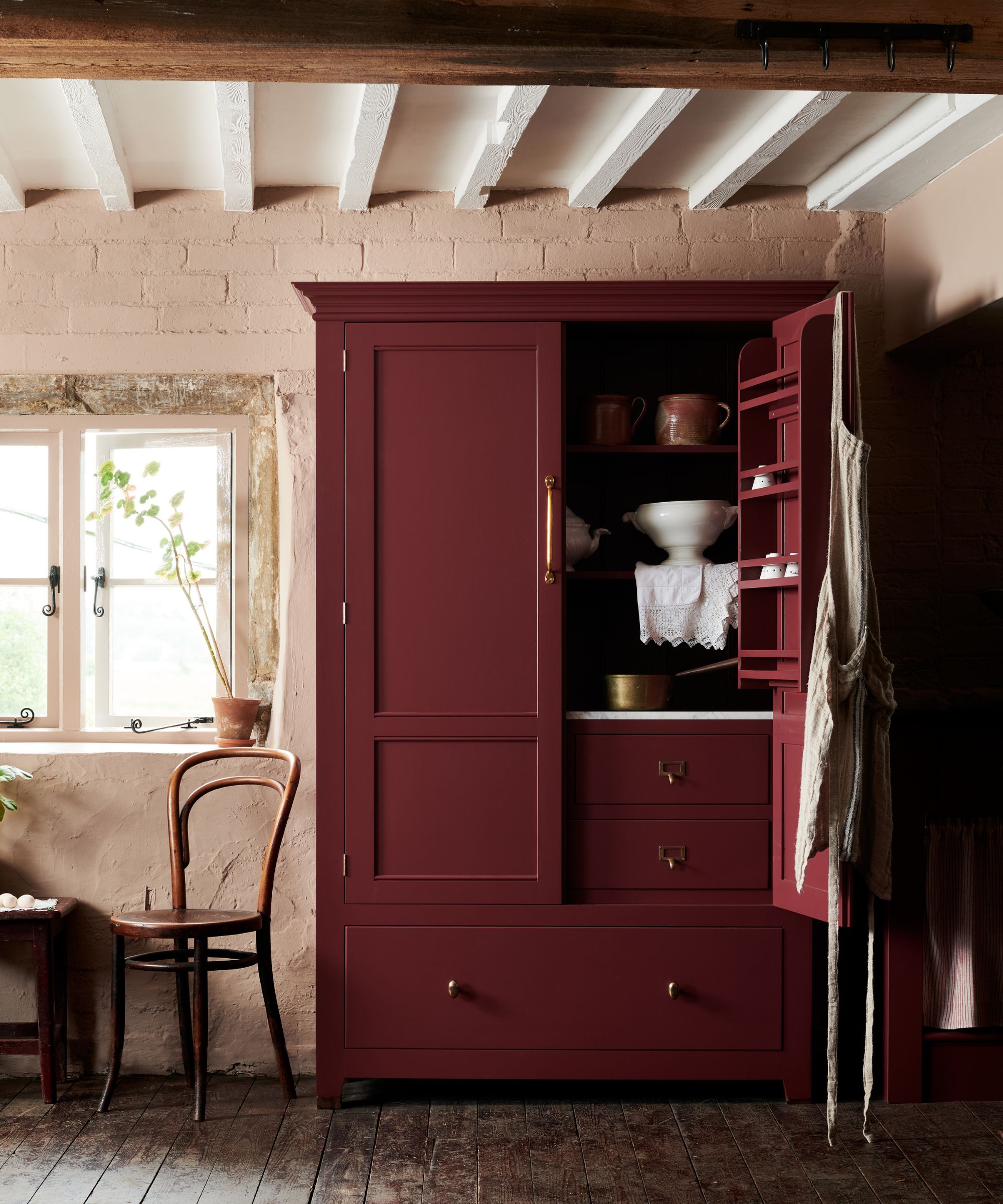
Decorating with burgundy has long been used in traditional country kitchens, bringing warmth, depth, and a sense of permanence to hardworking spaces – such as in this Leicestershire kitchen in a converted mill in the UK.
Burgundy kitchen ideas are making a confident return – a perfect example shade is deVOL's Refectory Red, a heritage-inspired paint that instantly gives cabinetry a grander presence. Rich and enveloping without feeling overwhelming, it has the ability to make even simple furniture feel more refined and substantial. The color works particularly well alongside authentic materials such as black granite, slate, aged brass, and dark timber, creating the layered, luxurious look often associated with historic English interiors.
2. Butter Yellow
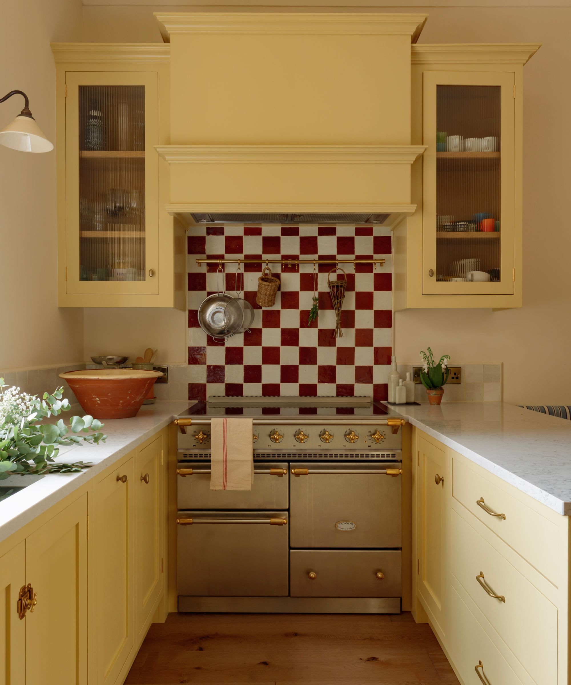
Yellow may not be the first color that comes to mind when designing an expensive-looking kitchen, but the latest iterations prove otherwise. Designers are embracing soft, butter-yellow kitchens that bring warmth, personality, and an effortless sense of optimism to a space.
In a coastal kitchen in Edinburgh, Scotland, designer Ailsa MacConnell of Studio Mac used Farrow & Ball's Hay to bring warmth to the space without sacrificing its relaxed, understated feel. With its dusty character and subtle green undertones, the color responds beautifully to the cooler quality of northern light, creating a scheme that feels sunlit even on overcast days. ‘We wanted the kitchen to feel as though it was filled with sunshine, even on a gray Edinburgh day,’ Ailsa explains. ‘Hay has a beautiful buttery quality to it, and its subtle yellow undertones brought exactly the warmth and sense of joy we were looking for without feeling too sweet or overpowering.’
Unlike stronger yellows, which often demand attention, Hay has a quieter presence. It softens the room, complements natural materials, and gives the kitchen a warmth that white kitchen cabinet ideas often struggle to achieve.
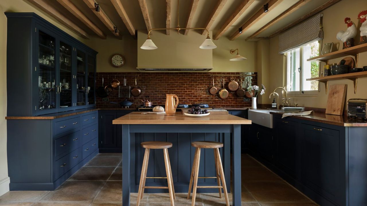
3. Nuanced Navy Blue
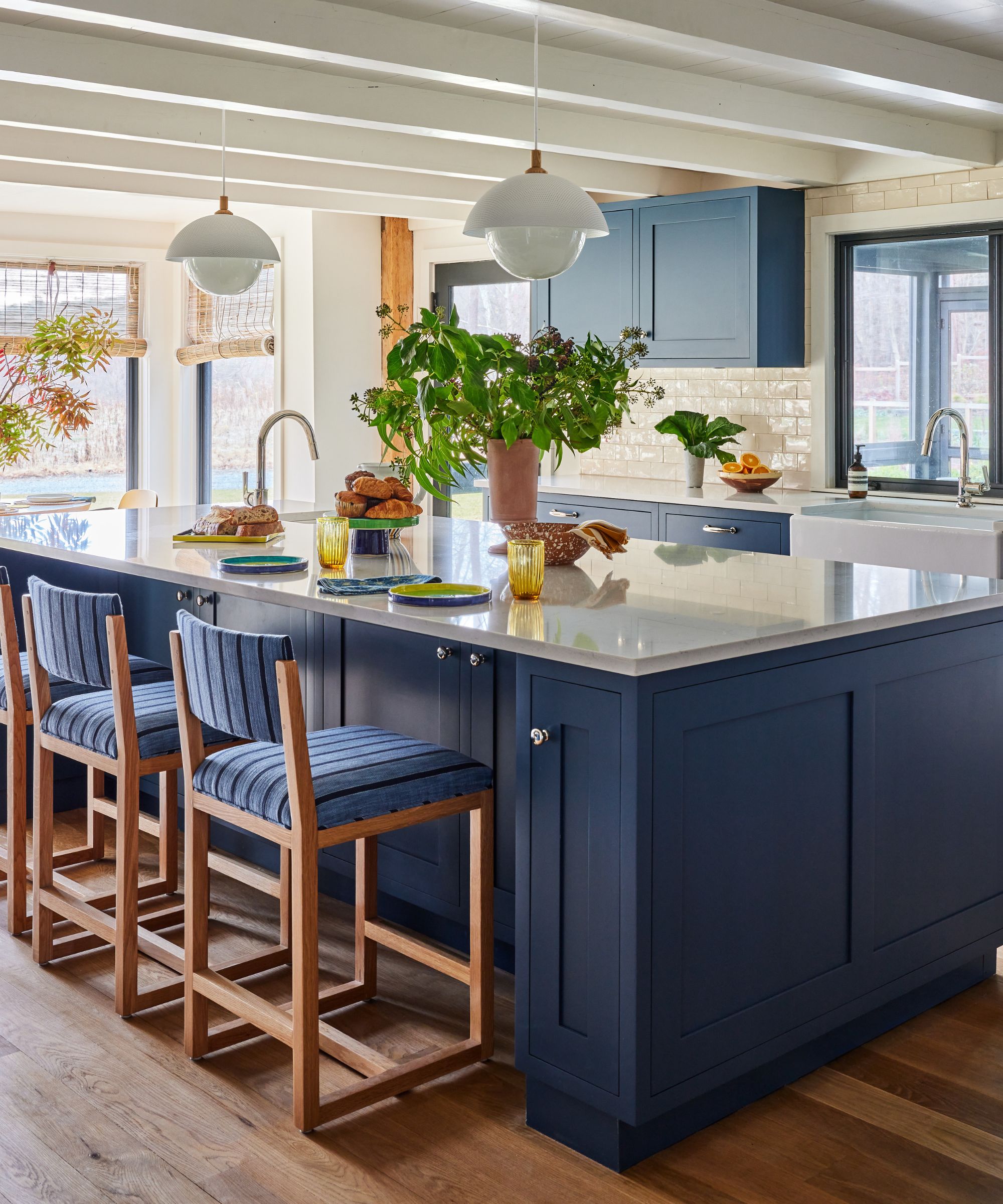
Navy has long been a kitchen staple, but in 2026, designers are gravitating toward more complex interpretations of the classic shade. Rather than crisp, traditional navies, today's most sophisticated blue kitchen ideas have a chalkier, weathered quality that feels more relaxed and connected to the landscape.
For this kitchen, designer Sarah Lederman chose Farrow & Ball's Stiffkey Blue, a shade inspired by the salt marshes of the Norfolk coast in the UK. ‘I tend to gravitate toward colors that feel as though they've existed for centuries rather than colors that feel tied to trends,’ says Sarah. Against warm wood floors and painted beams, the color feels rooted in its surroundings. Sometimes reading as navy and at other times appearing almost charcoal, it offers a softer, more contemporary alternative to traditional dark blue cabinetry.
4. Midnight Blue
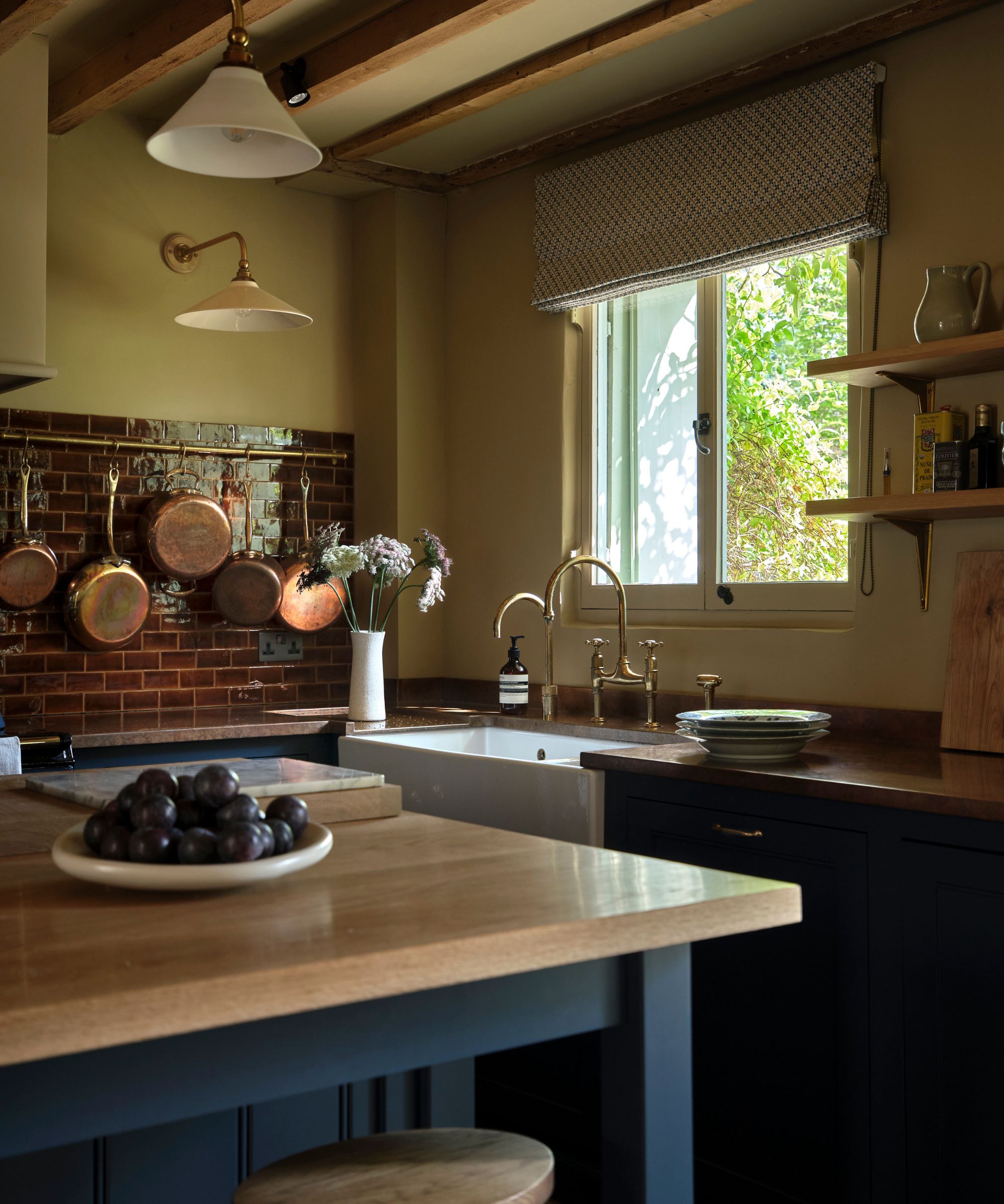
In this countryside project, dark blue cabinetry was chosen to bring depth and comfort to a naturally darker room with low ceilings. Rather than fighting the lack of natural light, the design embraces it, creating a cocooning atmosphere that feels calm and welcoming throughout the day.
‘We went bold with darker colors to create a confident statement in a dark room,’ says Nicky Mudie, founder and director of Violet & George. ‘The dark blue worked well against warm oak and patinated copper worktops, aged brass and rich brown glazed tiles.’
Far from making a space feel smaller, deep blue can have the opposite effect when paired with the right materials. It blurs hard edges, softens the room’s architecture, and creates the kind of enveloping atmosphere that makes people want to linger.
5. Clotted Creams
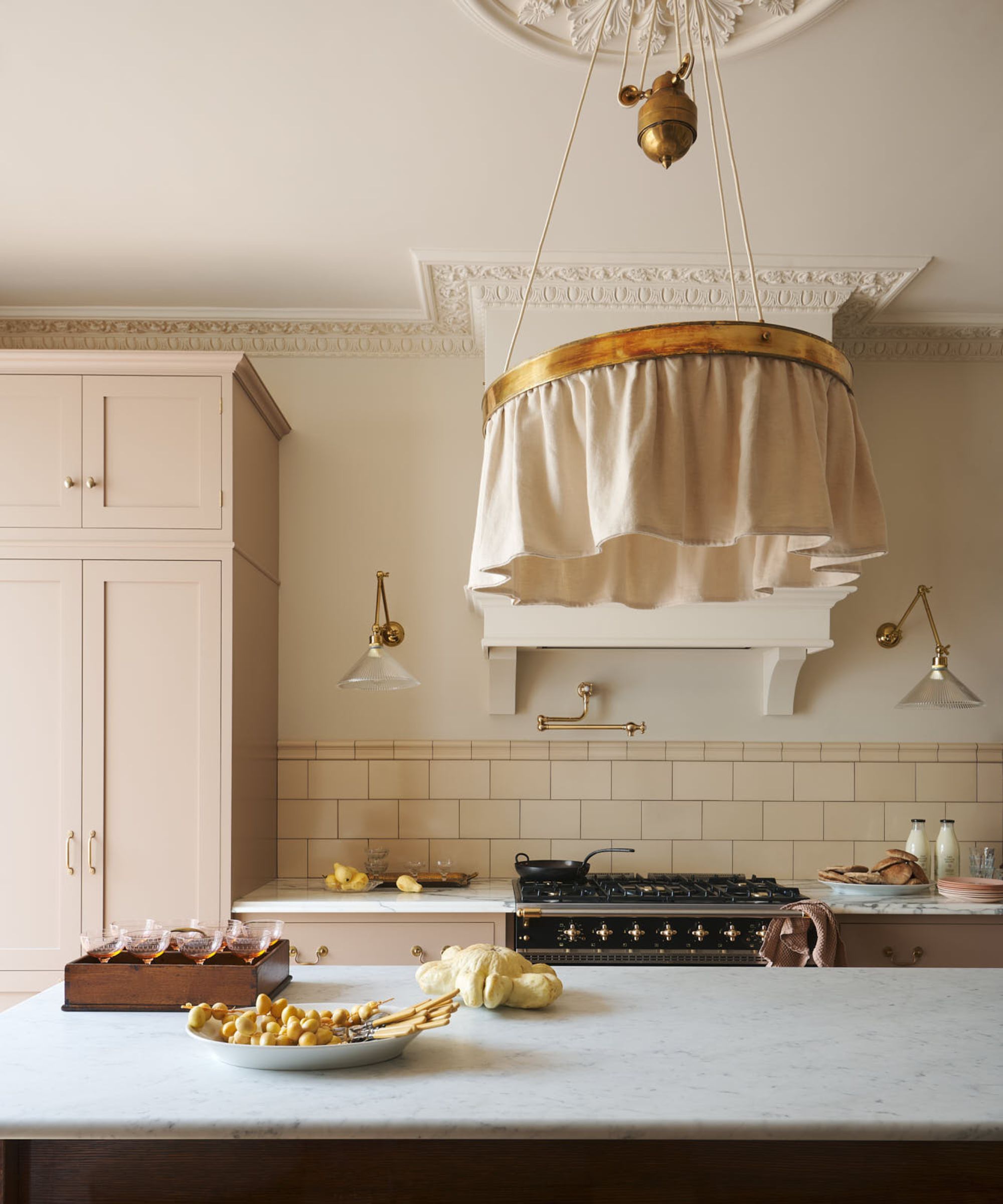
While richer colors may be dominating kitchen trends, designers agree that a beautifully judged cream remains one of the most refined choices of all. The key to this neutral kitchen idea is to choose a shade with warmth and depth rather than the cooler, flatter neutrals that have defined kitchens in recent years.
Today's heritage creams feel inspired by natural materials and traditional interiors, allowing craftsmanship, texture, and architectural details to come to the fore – such as this Edwardian home in London clad in cream subway tiles. Helen notes these warmer neutrals are becoming increasingly popular. ‘At deVOL, we are installing cupboards in rich but pale creams; we think of it as a clotted cream,’ she says. ‘These gentler, more earthy natural colours sit perfectly with wooden or honed Carrara marble worktops to give a warm, light and airy feel to a room.’
As kitchen ideas continue to evolve, color is becoming one of the most effective ways to create a space that feels elevated and enduring. The shades designers are gravitating toward for 2026 interior design trends aren't necessarily louder or bolder; they're simply more nuanced, drawing inspiration from heritage interiors, natural landscapes, and time-honored materials.
Whether you opt for something cocooning or more classic, the key is choosing a color that feels connected to the architecture and atmosphere of your home. When used thoughtfully, the right shade can make a kitchen feel instantly more expensive.