Painting furniture is such a quick and easy way to update your furniture. In just a few hours you can give a tired looking piece a whole new lease of life. But just as you pay considerable time deciding on what colors will work best for your walls, it's worth thinking about what colors will work best when painting furniture too.
While we are never one to shun a certain shade, when it comes to painting furniture you do have to think practically. Certain colors and finishes can withstand the wear and tear, whereas others will age your furniture fast and are best avoided.
We asked interior designers for their opinions on what colors are best to avoid when it comes to furniture if you want your upcycled pieces to last, both in terms of style and substance.
5 colors designers warn not to use on furniture
When it comes to paint, it's personal. So choosing the best color to paint your furniture will very much depend on the colors you are drawn to and the space you want to but the piece in.
As Paul Staden, founder and designer at Pilgrim explains, 'Taste is very subjective, and colors can divide opinion, often very emotively. It’s color choice that takes the longest for our customers to decide. There are certain colors we wouldn’t use as they wouldn’t be right for our design handwriting, but I honestly don’t think there’s a color I wouldn’t recommend, it depends so much on the room, the scheme, light, etc.'
But there are certain colors that will work better than others, and certain colors that are perhaps best left to walls rather than furniture.
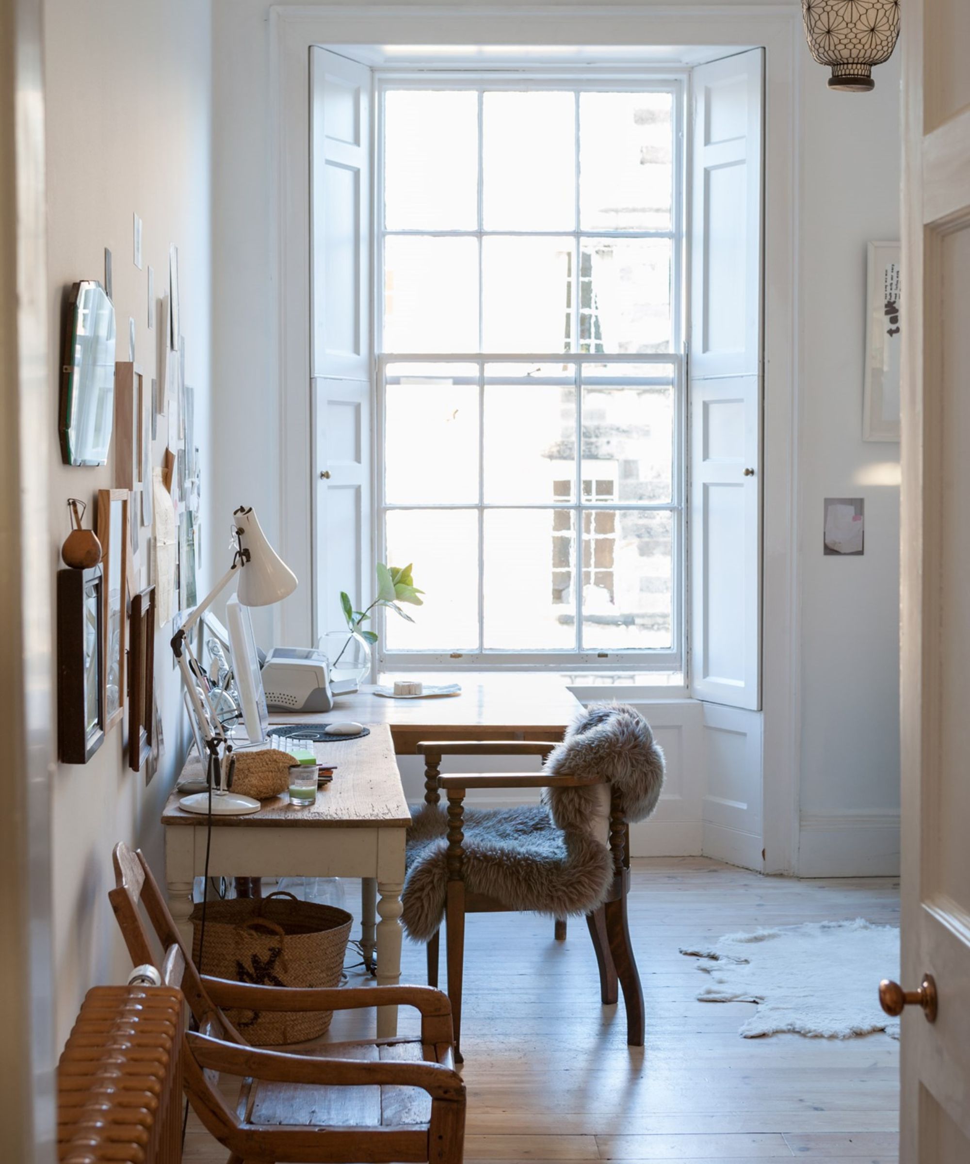
1. Pale pastels

Although we love decorating with pastels and they can look fabulous on walls and ceilings, they're not often ideal for furniture.
'When it comes to paint colors for furniture, pale colors like sky blue often show scuffs and scratches more prominently than darker colors, so it's probably best to avoid these in busy, hard-working homes.
Darker colors with a low sheen will hide imperfections much better than paler, more reflective surfaces. Deep navy, off-black and earthy, deep neutrals like a rich red would all work really well on furniture,' says Anna Hill, brand director and color consultant, Fenwick & Tilbrook.
2. Bright white
'White is easy peasy to use, but if you want to avoid things looking clinical I would incorporate some personality into the room by painting your furniture in a really bright, fun, bold color that reflects your personality,' advises Annie Sloan CBE, color and paint expert.
Instead, choose warming shades of turmeric or coral, both look great with pale pink and will work well in North-facing rooms. And if you do want to opt for white, go for a warm white paint and choose a hardy finish that will withstand a few scratches. Alternatively, embrace the rustic look and distress the white paint so then any further wear and tear will look intentional and still work.
3. Primary reds
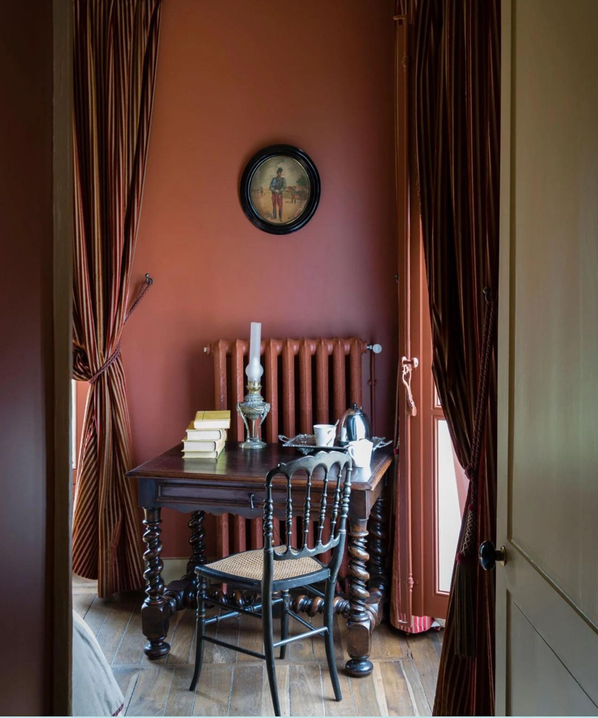
Primary colors like red can be too intense because they take up visual space without allowing any other elements in the room to shine.
'I do love red, and I am seeing it now more than ever. However, paint a piece of furniture in a bold primary red and you create an instant focal point. It can be tricky then to bring in other shades or draw attention away from that one piece,' explains Hebe Hatton, head of interior design, at Homes & Gardens.
'Instead, I would stick with red on the walls, a deep rich terracotta red. And then paint any furniture in a deep brown of just off-black to create some contrast and ground that very earthy shade.'
4. Colors that won't enhance the space
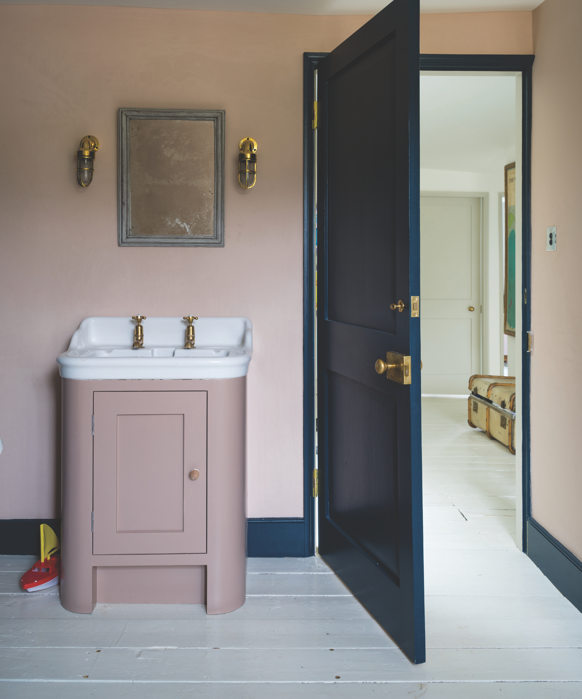
When you're considering what to paint your furniture it's worth looking at the space it's going to sit in. In small rooms like a bathroom a great idea is to paint the piece in the same color as your walls. This will help it blend it and therefore flow better visually. Darker colors will jar and catch your eye.
'Softer pinks, those without too much blue through them can be totally flattering and a great color choice for a small bathroom where their gentle tone will add some warmth without overpowering the space. Try Setting Plaster for a delicate atmosphere. This color is also beyond flattering to the complexion so it’s a win-win,' says Patrick O'Donnell, international brand ambassador at Farrow & Ball.
5. Anything too trend-led
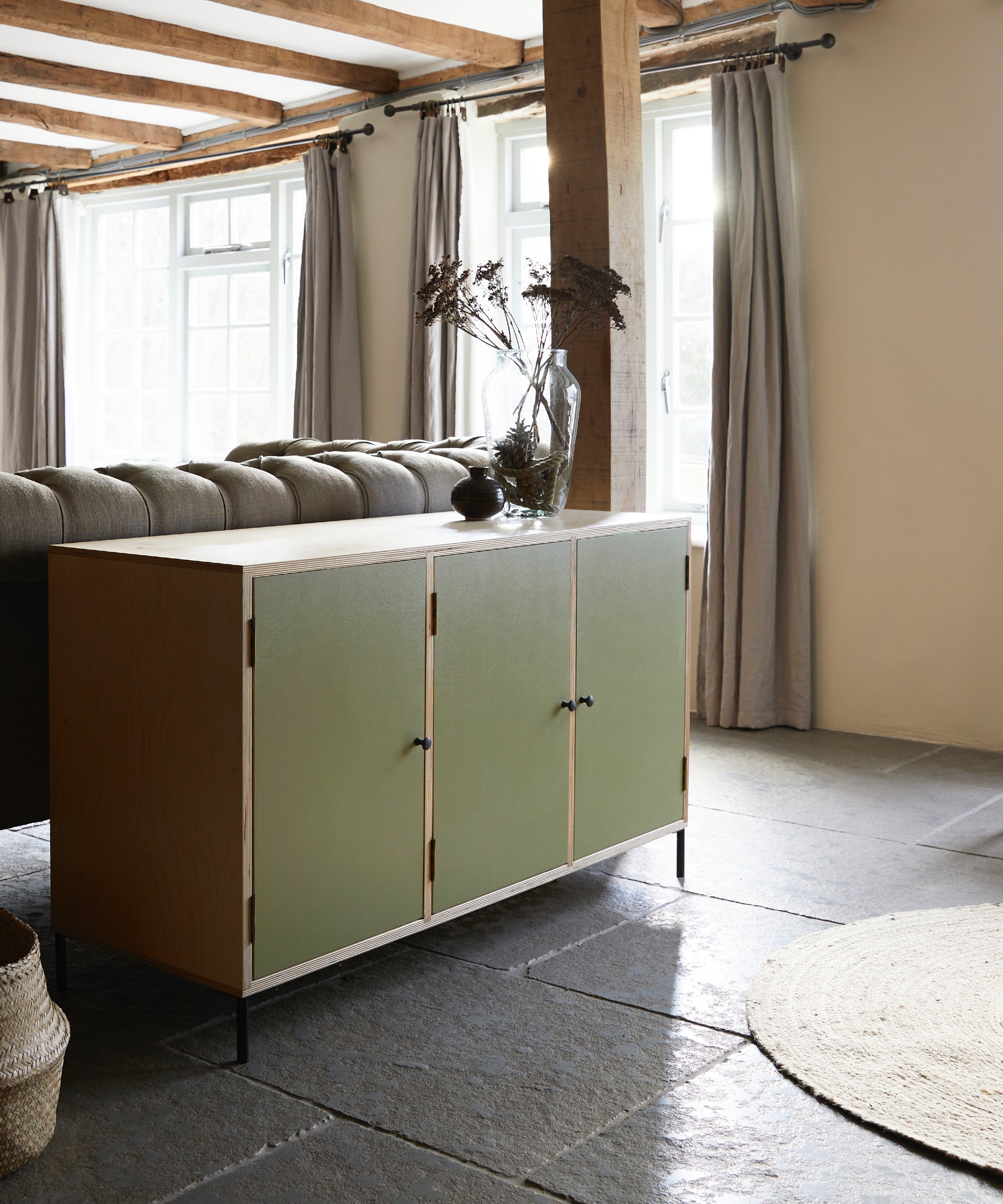
It's tempting right? When new color trends get released every season it's hard to resist jumping straight on them and remodeling our spaces with them, but unless you really love the colors it might be worth choosing a shade that's got a little more longevity.
'We would always, always, urge customers to avoid trends or the ‘latest thing’. Perhaps be influenced or inspired, but never use a bang-on-trend color. It is exactly that, a trend and that trend will fade, sometimes very quickly. Although some stand the test of time, most go as quickly as they arrive.' says Paul.
'We would suggest going with something more timeless and using a pop of trend color somewhere that can easily be updated. That said, all our furniture is hand-painted, so if you did go for the latest equivalent of an avocado bathroom suite, it can be repainted when the need is there!'
What color paint hides imperfections best on furniture?
'Dark colors tend to hide imperfections, simply because any shadow cast from, a dent for example, won’t be such a contrast,' says Paul. 'We would also recommend using an appropriate undercoat too, i.e. a dark undercoat for dark top coats and a light undercoat for light top coats, this way if the furniture gets chipped, the contrast between coats won't be as visible.'
The huge pro of painting furniture, especially smaller pieces, is that it's a quick job that you can experiment with. So try out different options in your space, and remember just like painting a wall you can still test out a shade on a section of your piece to see how it works in situ.