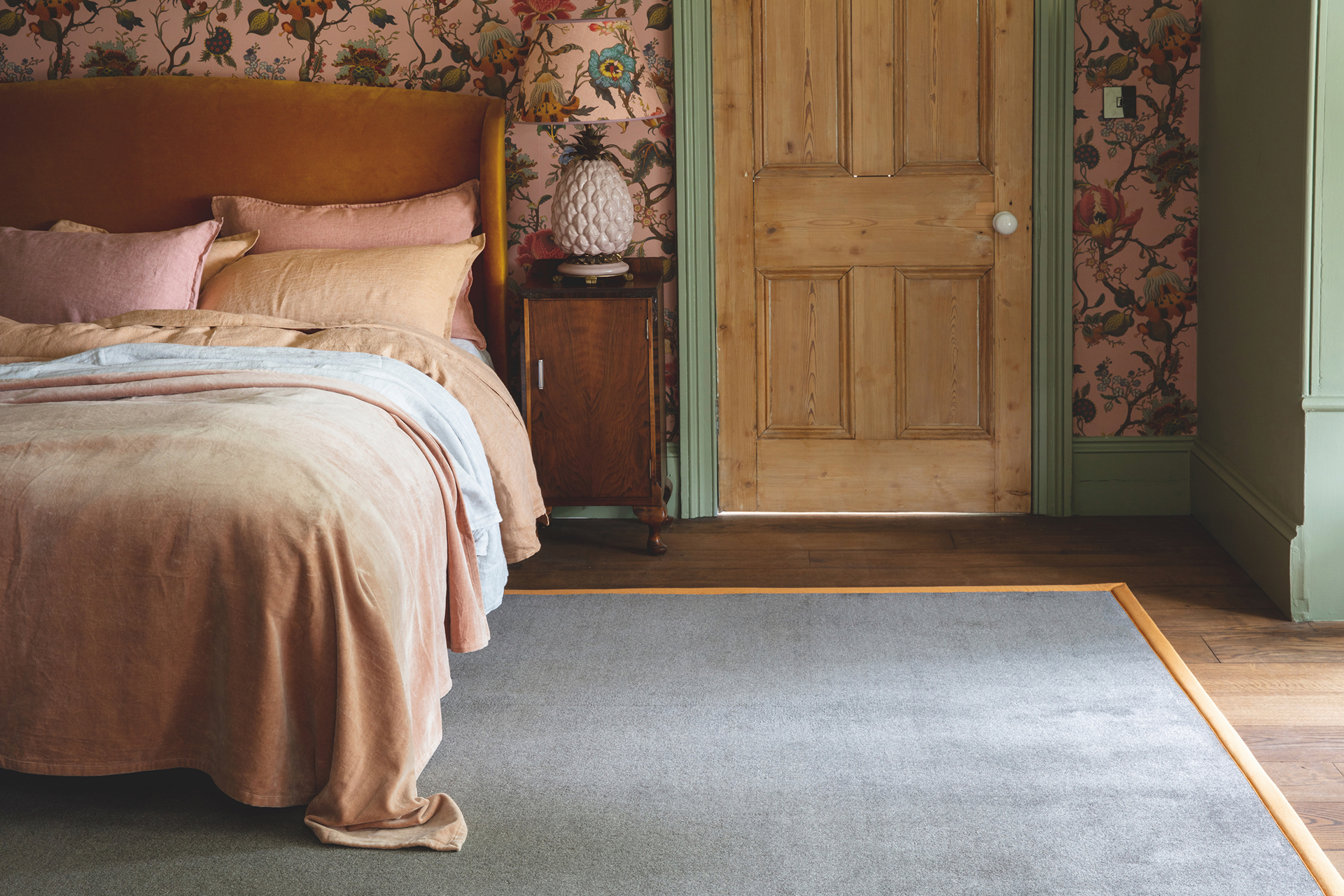
Carpet is back where it should be, at the heart of the home. It not only offers good looks, seductive warmth, and softness underfoot but has heat-insulating qualities too, which is good to know in these days of rising fuel bills.
The carpet trend today is to use carpeting more selectively than simply wall-to-wall, to add coziness, or to muffle noise. But, as well as the material you select, it is worth considering the color of your carpet in the same breath.
Color really can be transformative in interior design, so choosing the right hue for a carpet can present endless choices to understand and overcome, but if you've been following certain color trends and rules religiously you could be doing more harm than good.
Choosing which colors to decorate with for any room color ideas can be a daunting process as there are so many to choose from, but becoming your own color consultant is easier than you think, and we are on hand to help you pick a carpet color with confidence.
Carpet colors to avoid
Fashions in flooring come and go, but few floor coverings can match the vast choice of color, pattern, and texture offered by carpet.
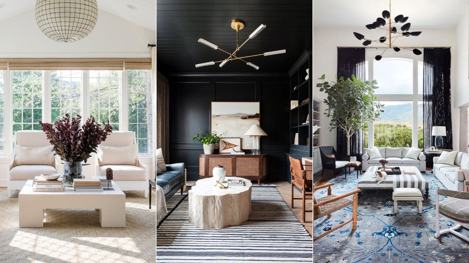
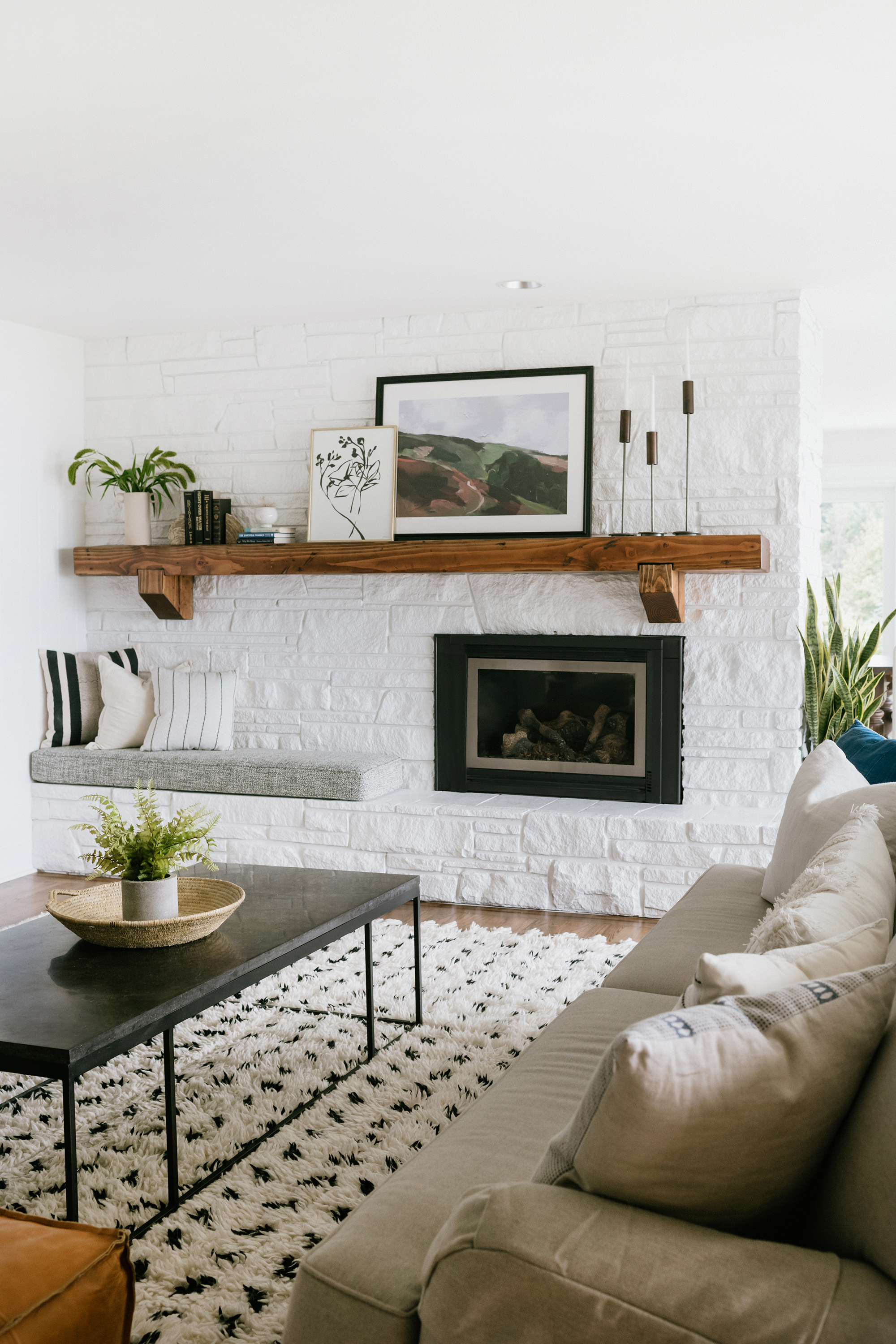
Although the vast majority of us still opt for carpets in a neutral shade, subtle changes are beginning to appear. Traditional gray and stone tones are currently being replaced by beige, taupe, and golden shades, while strong color is now being used in the same manner as wallpaper and paint, to create an accent or feature. Plum tones are popular at the moment, while some collections, even include black.
1. Swap overdone gray for a contemporary beige
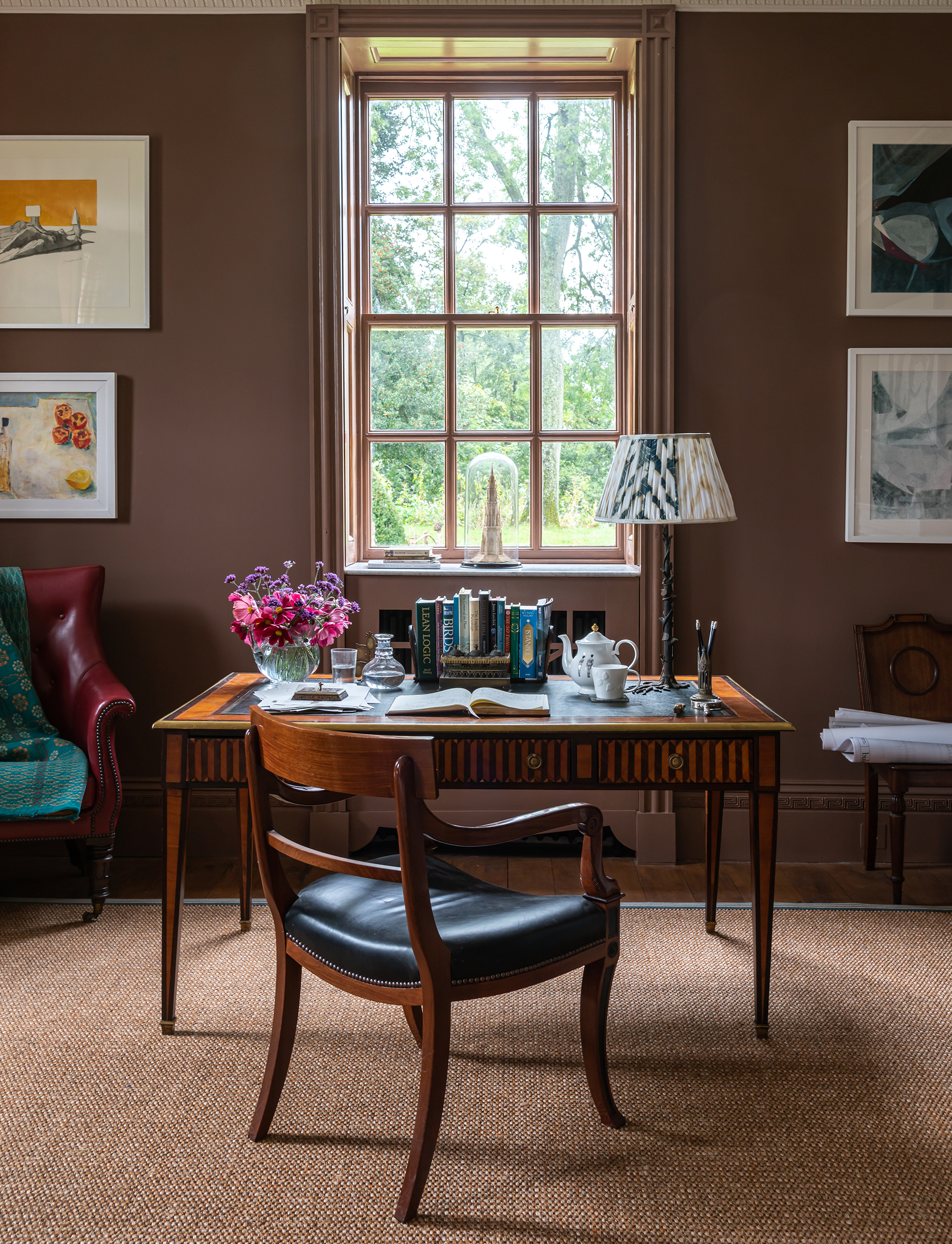
At H&G, we've been singing the praise of beige for a while. After all, it is said to be the color that is replacing gray. Of all the neutrals, gray is the one that always held the most gravitas with designers and decorators, however, gray is slowly being replaced by beige – the new neutral. Not to be confused with the colder palettes that were popular in the early noughties, these new neutrals, such as beige and taupe, are warm by nature.
Plains in soft tones can be used to create a timeless, long-lasting base to a room scheme. 'A neutral is not overpowering and does not demand attention. Instead, it brings a sense of calm and functionality that no other shade can,' advises Emma Cassidy, head of creative design, at Brintons.
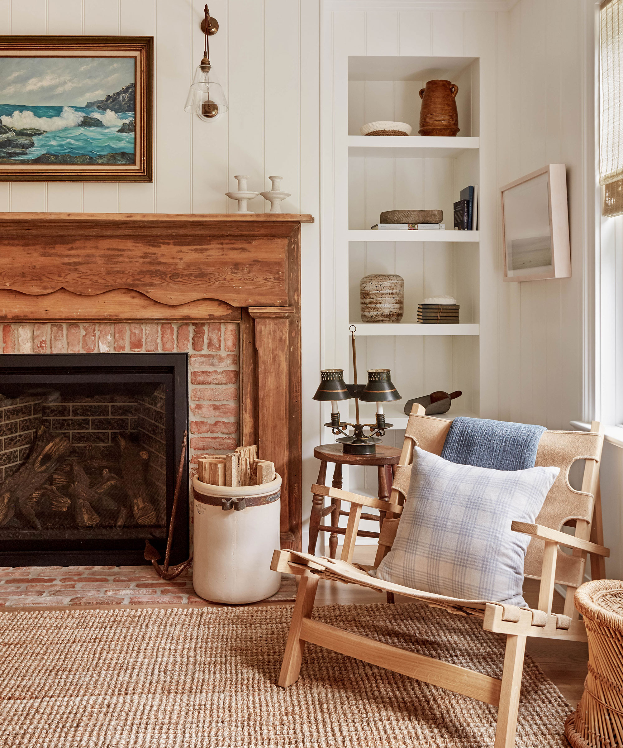
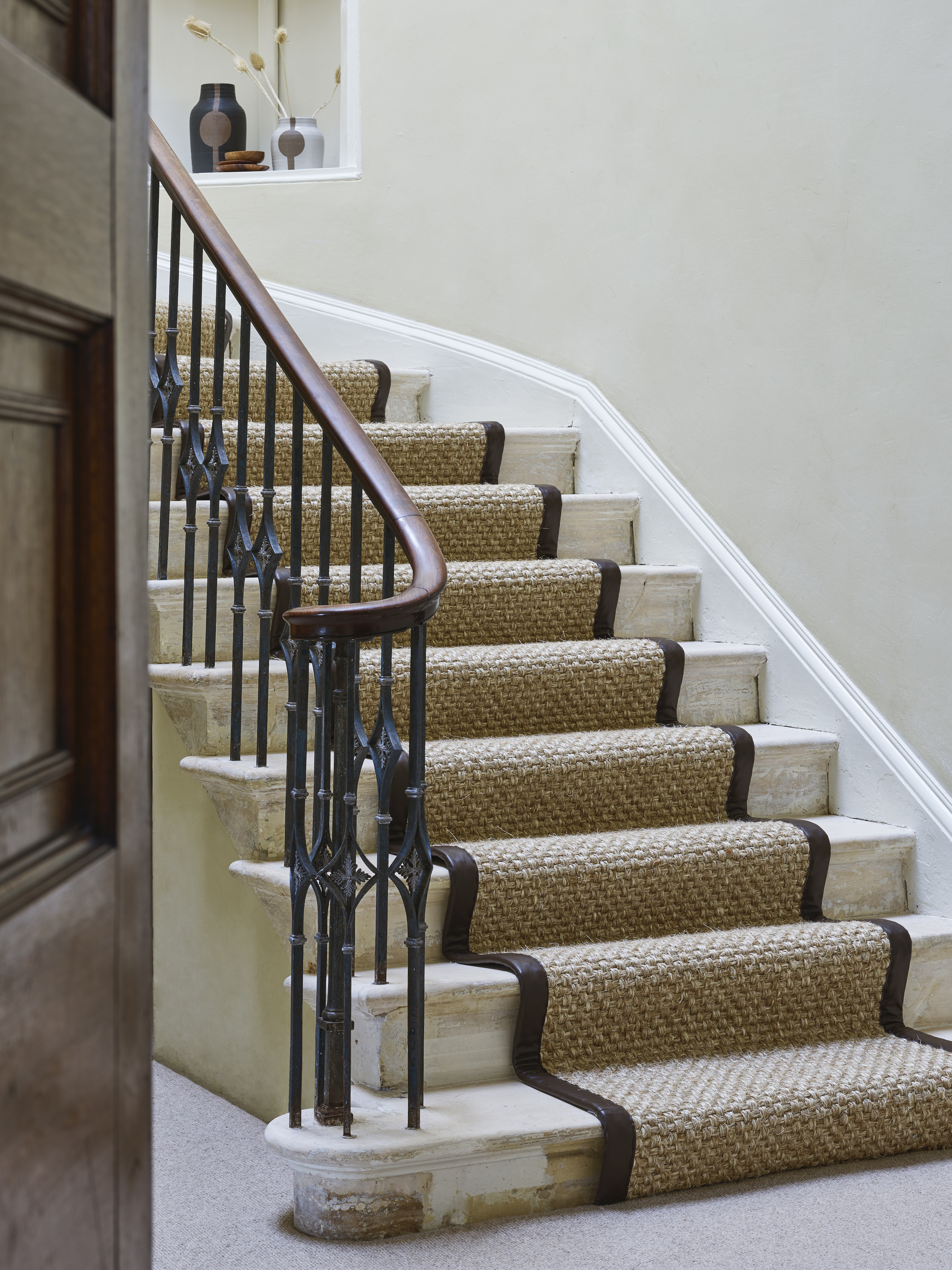
Below, Becca Casey of Becca Interiors has used a jute rug overlay to warm up the living room in New York. Available in an assortment of natural shades, jute has a silky luster with a softer feel than some other plant fibers.
'There is a growing trend for natural floor coverings with subtle pale accents of color, texture, and pattern for adding individuality to a room scheme,' says Becca Casey. 'If you don’t want to cover the whole floor, consider a made-to-order rug. There are several natural options to choose from, each with its own characteristics.'
2. Avoid white if you have young children
White is one of the most important shades in interior design, but while we often sing the virtues of white room ideas, if you regularly entertain or have young children, you will be wise to steer clear of white carpets.
Not only will white carpet show unsightly spills and stains, but it can make a home feel clinical and cold. ‘When working with neutrals, my only rule is to steer clear of white floors,’ says interior designer Rachel Chudley. ‘They work well in galleries for the very reason that they create a blank canvas, which is perfect for focusing on one piece of art, uninterrupted by anything. However, in a living space, you need a touch of color to add a bit more depth and reflect the light around the room.’
However, if you do prefer a paler carpet, try something more hard-wearing. Sisal is a great option in a busy household. The large fleshy leaves of this agave plant produce fibers that can be dyed and woven into many different styles, making this a versatile material. Sisal floor coverings are hard-wearing with a subtle sheen.
3. Do away with stressful red in favor of earth tones
When choosing a carpet color for your home, it is important to think about the context. 'When you use a color in the wrong context, you will create undesirable behaviors,' says Karen Haller, color psychology specialist, and best-selling author of The Little Book of Color.
'Red is a good example of this theory. It's the one color that we are unable to live in large quantities. It helps to be mindful of the visceral impact color can have on our mindset, and think about what color is good for health. For this reason, I would avoid red flooring, and only use this stressful color in small doses, unless, of course, it is a color that truly resonates with you.'
If you do love red but are concerned about its negative associations, why not try something a little more subtle instead? 'With their earthy tones, taupes and chocolate browns are a subtle nod to nature and complement beautifully with natural materials such as wicker, rattan, and stone finishes, all very popular as we continue to look to embrace the beauty of the natural world in our homes,' says Ruth Mottershead, creative director at Little Greene.
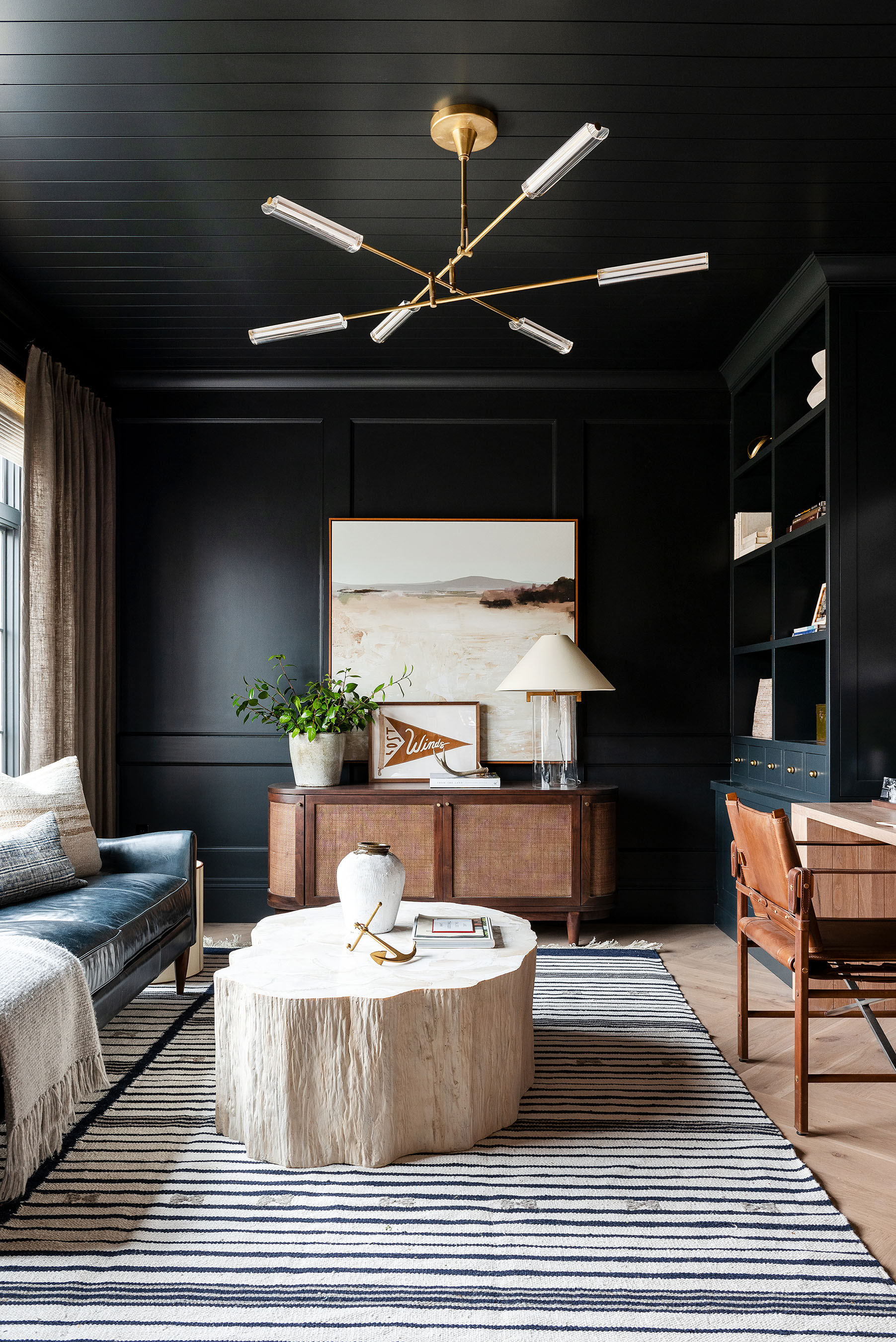
4. Switch out all-over black for a subtler accent
Black may seem like a good option for your floor, but you'd be mistaken. The opposite of white, you may have been led to believe that black carpets are good for busy households, but the truth is black highlights just as much debris, if not more, than white carpets, especially if you have pets.
While it might seem a strong option to disguise dirt, black carpets tend to accumulate grime over time, too. It also makes it tricky to know which areas are actually clean.
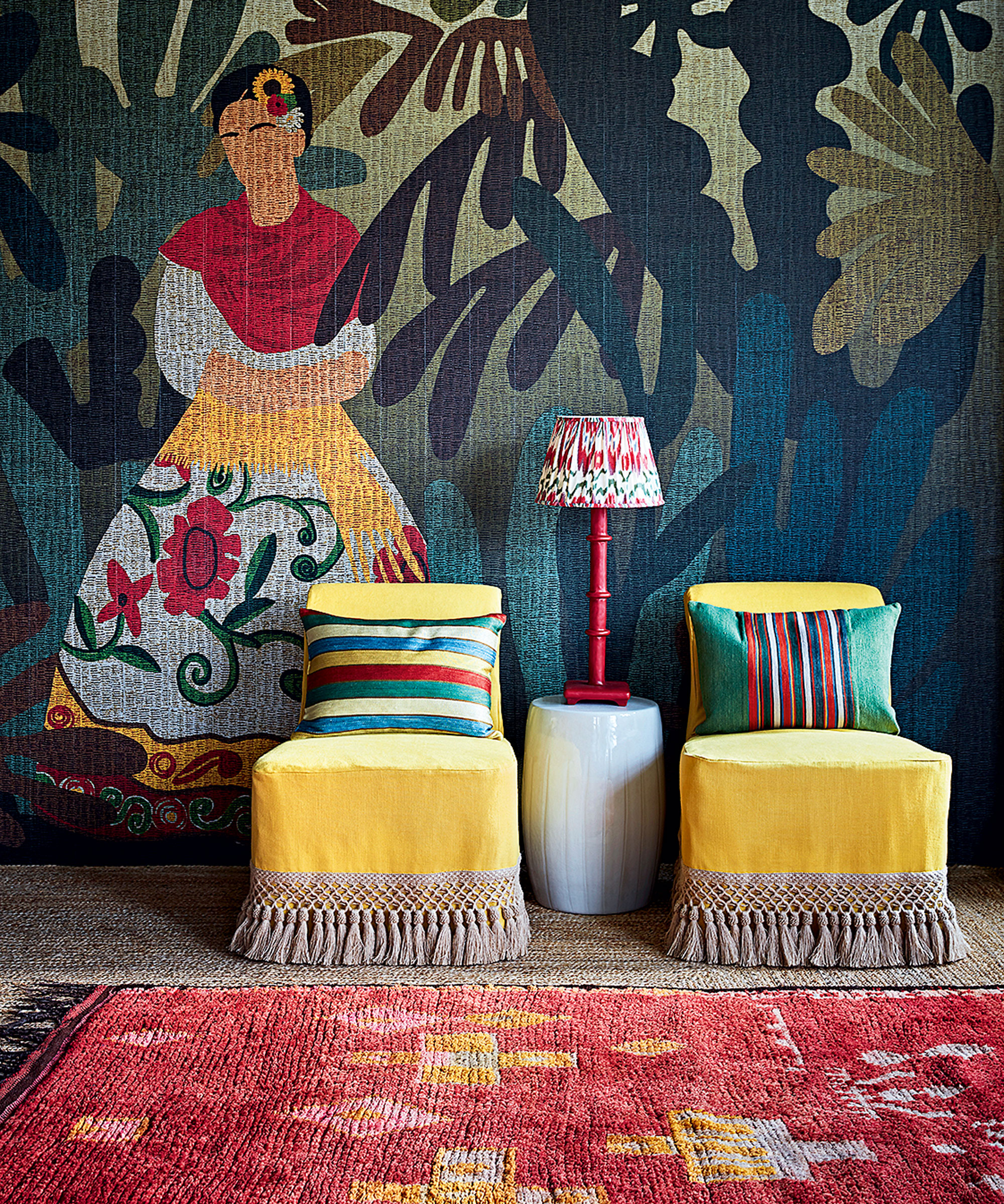
If you do love decorating with black, try using this shade in smaller accents. In this contemporary black room (below), designed by Shea McGee of Studio McGee, a striped black and white rug is the star of the show.
There’s a lot of interest in striped flooring and in surface design in general, believes Mark Findlay, founder of vinyl flooring specialists Harvey Maria. ‘Floors are no longer an afterthought; they’ve become an integral part of interior design and are now seen as a key feature,’ he says.
Until recently, carpets tended to be plain, neutral and for the bedroom only, but patterned carpets are now coming back into favor, and moving into the living room and dining room, too.
In the right hands, patterned carpet designs are akin to introducing a work of art into a room and setting a strong design tone. Think of the floor as the room’s main canvas, says Shea McGee. ‘We believe that a design scheme should start from the floor up, with the carpet being the basis for all the design choices,’ she says. ‘Pattern and color have been brought to the forefront to create a statement.’
5. Ditch outdated purple in favor of cool blue
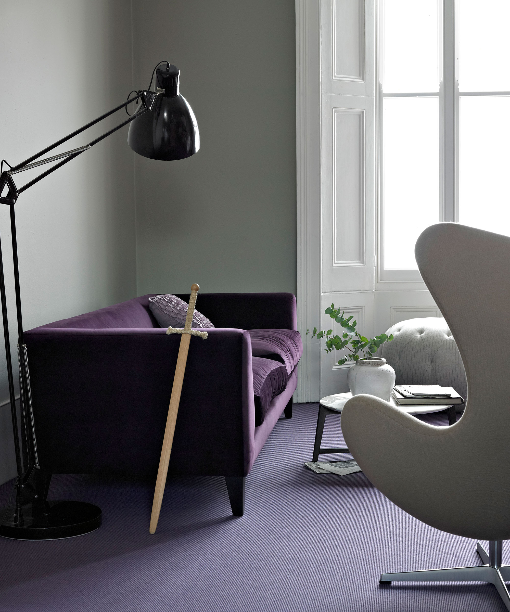
If you love bold color schemes, choose a carpet that sings instead of shouts. Purple flooring might have been a pivotal trend in the nineties, but this statement color only has surely had its day.
Homes & Gardens editor-in-chief Lucy Searle adds a word of caution: 'Purple is quite a defining color – and once you have committed to a carpet, you are equally committed to the limited number of colors you can use to complement it. When it comes to choosing a purple carpet, especially for a living space, I would advise investing in one that's much nearer to classic beige than vivid purple, which will be easier to coordinate and redecorate around.'
That is not to say we should shy away from strong, decorative designs on our carpets. 'A heavily patterned design is a bold decision, but if you love it, go for it, recommends Jessica Bennett, owner and designer of Alice Lane Interiors. ‘It will withstand room renovations for years to come because you can pick out different colors and design details to carry through to the wider scheme. Patterned flooring can successfully be used for zoning and defining of areas, and this is particularly useful in schemes that focus on one large open-plan, multi-use room.'
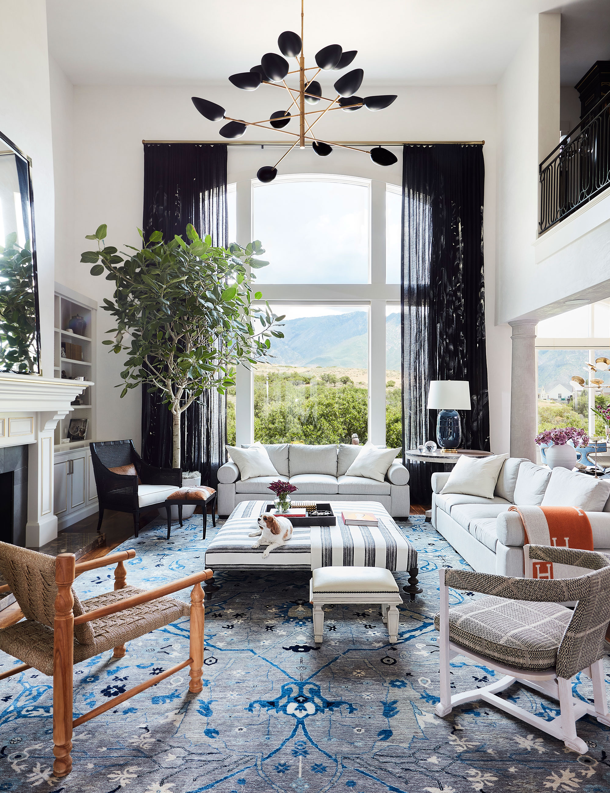
Blue is a great color if you want to make a statement. It can be loud enough that it makes a room come alive, but its calming qualities mean it doesn't overpower or overwhelm. Dark blue can aid focus and concentration, while a paler option is believed to reduce mental stress and relieve tension.
FAQs
How do I choose a carpet color?
Far from being an afterthought, choosing a carpet color is a key element of any moodboard, so start looking at options and gathering swatches when you begin to plan your scheme.
According to current carpet trends, neutral tones remain popular, though Richard Meager, founder and managing director of Jacaranda Carpets, reports a shift towards the 'warmer' naturals including beige and taupe.
'When it comes to texture, the latest styles are hand-plaited and crocheted, creating a heavily sculptural effect,' says Paul Vowles, managing director of WovenGround. Whatever you choose, view a sample in the room and see how the colors look and are affected by changes in natural light during the day and lamplight in the evening.