If there's one color that almost everyone has somewhere in their home, it's cream. A versatile neutral that offers a warmer hue than a standard white, cream is integral to several interior design styles. But with such popularity, there are so many cream paint colors to choose from, and that selection is ever-expanding.
When searching for room color ideas, you'll probably come across plenty of different variations of cream-colored spaces, and even though having variety is great, it can make finding that perfect shade seem almost impossible. Different tones offer a completely different finish – some offer a yellow undertone, others are more white, yet some lean almost pink.
So, what is the best cream paint? The good news is, this timeless shade is a staple for interior designers, and they've tried plenty of them. With that in mind, we've asked them to share their favorite cream paints, and their selections don't disappoint...
5 expert-approved cream paints to try
Let's be honest, it's not always easy to know exactly how cream paint will look on the walls just from looking at the tin, or an image on a website. So before you start buying paint that you hope will look right, take a look at the cream shades recommended by experts, with a preview of how they look in situ.
1. Harvest Moon by Backdrop
If your usual bug-bare with cream paints is the yellow hue they can give off, your best bet is opting for a cream shade that leans more warm white in tone, or something with a very subtle yellow undertone. 'Our go-to is Harvest Moon by Backdrop. It isn’t quite ‘cream,’ it’s more of a white shade with a subtle, warm (almost creamy) undertone,' says Kristina Khersonsky, principal at Studio Keeta.
'We like to use this shade because it provides warmth to the room, without it feeling too yellow. When using colors with warm undertones, sometimes in differing lights or times of day, the color can feel a bit dated and yellow. That’s not the case for this shade.'
This warmer tone is perfect for a more understated design, without feeling cold and stark. The added benefit to this shade of cream is that it works beautifully in a range of interior design styles, from modern farmhouses to Japandi and Wabi Sabi schemes.
'All of our whites have a lunar reference and, as many brands have hundreds of whites, it was important that Backdrop had a curated palette with memorable and descriptive colors,' explains Natalie Ebel, co founder of Backdrop. 'Harvest Moon is our warmest white. It has a hint of yellow so tends to have a bit more softness, and gives so much depth and richness to a space.'
2. Alabaster by Sherwin-Williams
If you're looking to add a brightness to a space but retain a sense of sophistication, a staple cream paint that offers a warm white hue can make all the difference. 'Our favorite cream-colored paint is Alabaster by Sherwin-Williams,' says Luis Carmona, owner and interior designer at Verde.
When decorating with Alabaster, the subtle undertone adds a comforting ambiance without feeling dated. 'It is the perfect shade to give a space a subtle touch of color without being stark white. Alabaster shows well in rooms with both natural and artificial light.'
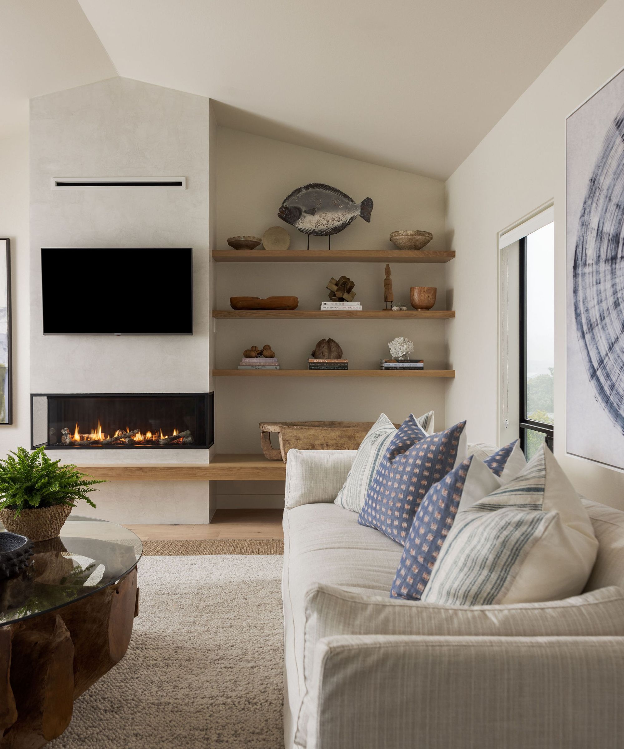
3. City Loft by Sherwin Williams
Yellow-toned creams have received a bad rap in recent years, but when done right, they offer a warm and airy feel to a room without that dated look you probably associate with the tone. Ami McKay, creator of PURE Design, has found the perfect cream paint in City Loft by Sherwin Williams, and it's now a staple in many of her designs.
'This color is subtly warm with yellow and red undertones. It is light and soft with very good light reflective qualities. It is neutral and works well in most interiors as it is warm and cozy. It is one of Sherwin Williams's best-selling paint colors.'
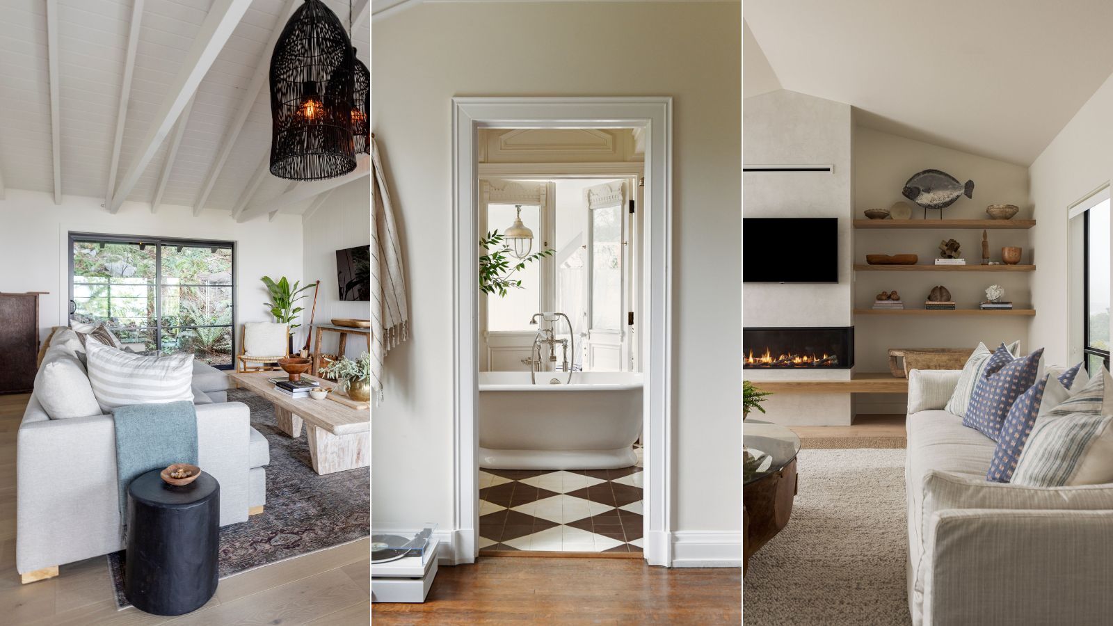
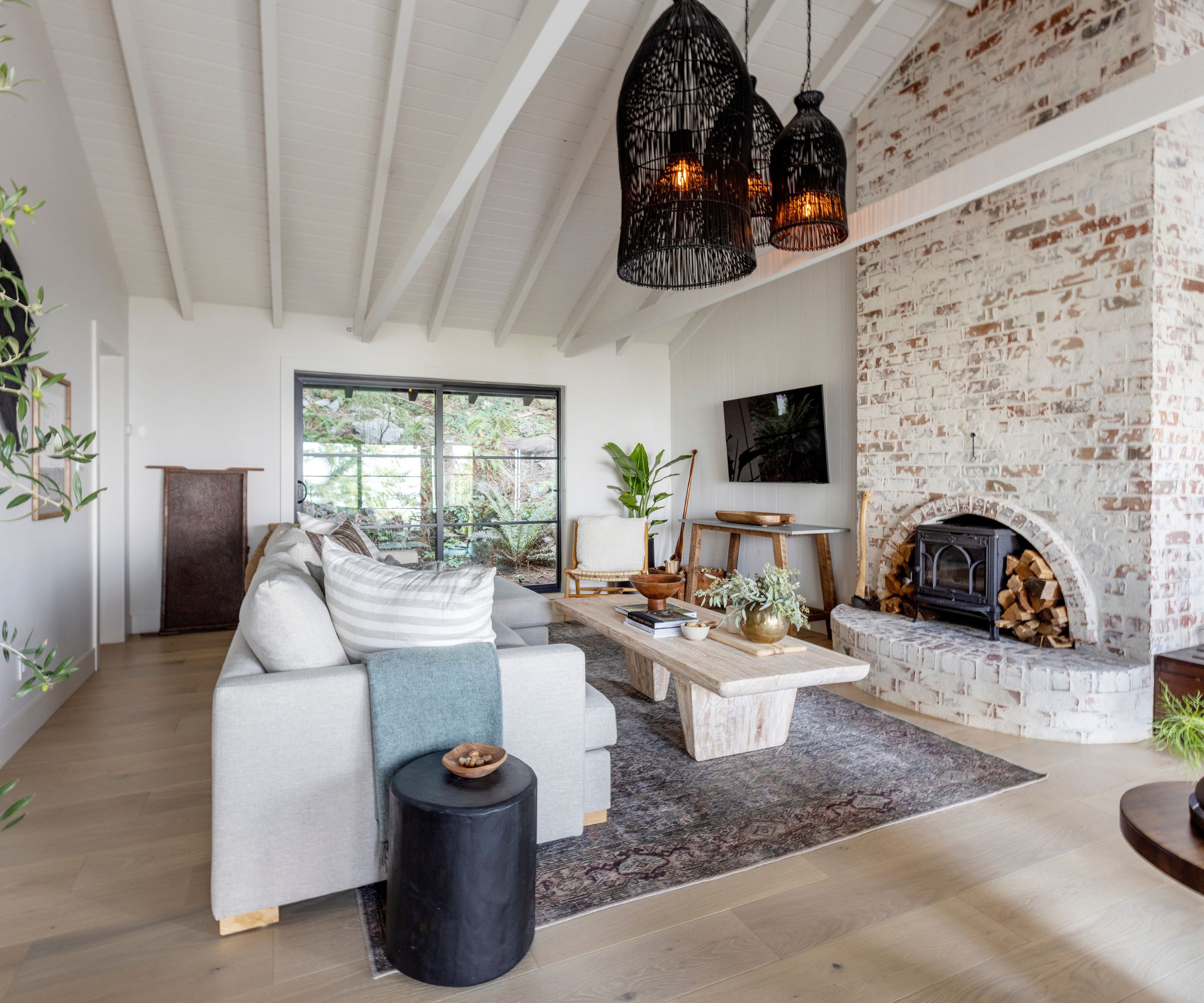
In this living room, this cream paint color has been applied to the walls and the ceiling, pairing beautifully with the exposed brick chimney breast. Combined with natural wood tones and black accents, the overall scheme feels bright and cohesive, while retaining a sense of coziness.
4. Natural Choice by Sherwin Williams
Warm whites are usually favored when it comes to cream paint tones, especially in schemes that lean more modern in design. 'I love a good creamy off-white and one of my favorites is Sherwin Williams' Natural Choice,' says Tama Bell, of Tama Bell Design.
'It is a warm off-white that creates a calm and inviting feeling. It has a presence that feels both modern and grounded without being too bright or stark. For me, it creates the sense of being enveloped in a cloud.'
For a fresh, modernized design, pair this cream paint with light wood tones and neutral furniture. 'In this recent Sea Ranch project we used it en masse on the walls, ceilings, doors and trim to lean into the grounding and then paired it with white oak to add contrast in a more subtle way,' she adds.
5. Shoji White by Sherwin Williams
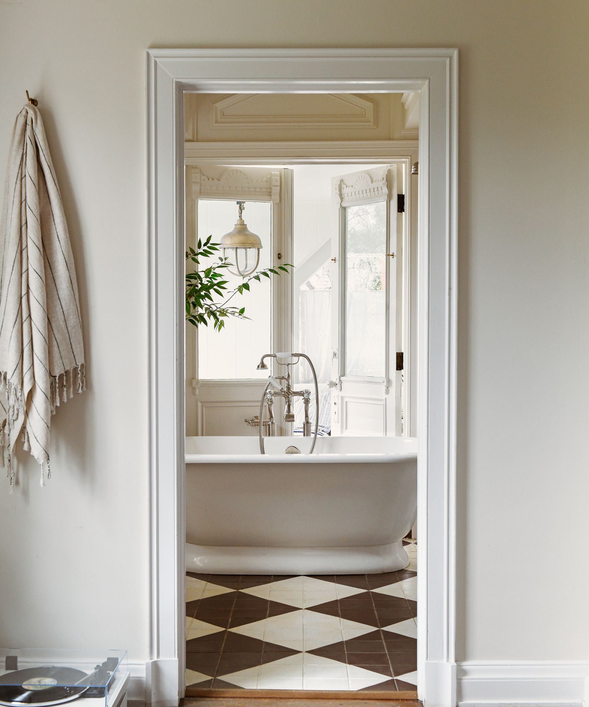
There is a necessity for cream paint in more traditional interiors, too. Warmer tones work beautifully whether they're paired with rich, heritage colors or blended with more neutral palettes. For interior designer Leanne Ford, Shoji White by Sherwin Williams has become a firm favorite.
'It's a warmer, more natural-feeling white that is still clean and bright,' she explains. 'It has a kind of ceramic feel to the color and I love how that adds depth to any space that it is used in.'
In this bathroom, Shoji White on the walls is paired with a brighter white tone on the woodwork, emphasizing the warm undertones of this cream shade, which works beautifully with the brown chequerboard floor tiles. The result is a truly timeless bathroom scheme that feels fresh and inviting.
It comes as no surprise cream paint is a must-have for interior designers and home DIYers alike, after all, it's the perfect neutral shade. For the experts, warmer tones that feel timeless are preferable and more useable across interior design styles, so choose something that doesn't have an undertone that shows up too colorful. So, if choosing a cream paint has been holding up your next home makeover, try one of these expert-recommended shades.