As someone who can turn choosing a single paint shade into an exceedingly long and needlessly obsessive ordeal, I'm continually impressed at how confidently interior designers execute color schemes. Given my tendency to overthink interior choices, I've largely stuck to a neutral backdrop at home; however, I often find myself drawn to richer and more cocooning bedroom color trends.
"Bedrooms are almost always intended to be restful spaces, but I think there has been a shift in what that means," Leo Wood of London-based Kinder Design tells me. "A pale wall used to be shorthand for calm, but I think more people are comfortable with the idea that deep, saturated, enveloping bedroom colors can be just as restorative, sometimes more so."
The team at interior studio Duet say bedrooms are always the spaces they design with the client's personality and brief at the forefront of their minds, and experimenting with color trends plays a huge part. "It is such a huge honor to be entrusted with creating a space that becomes someone's safest place to be, so we make comfort, emotional wellbeing, and a sense of belonging our highest priorities," explains co-founder Shannon Shlom.
To this end, I went on the hunt to find the biggest and best bedroom color trends, and here are five that have seriously tempted me.
1. Pale Blue
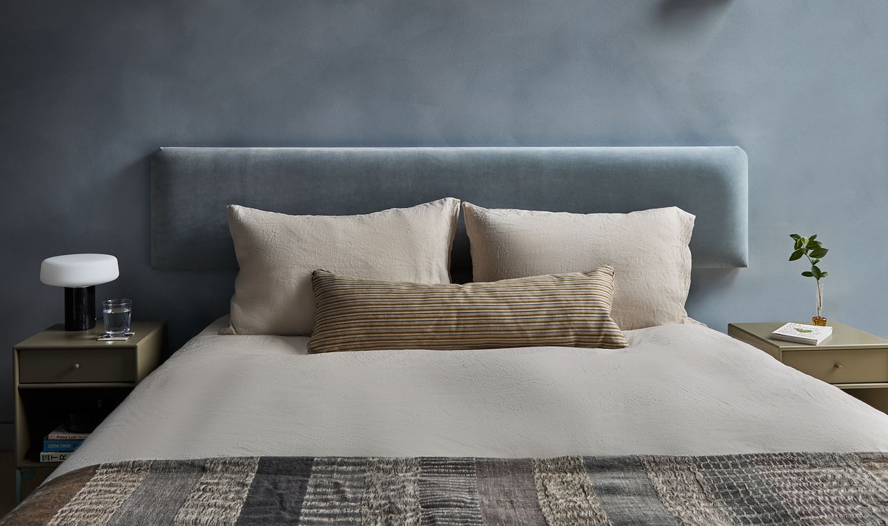
Livingetc has already reported that mineral blue is the new neutral color trend replacing beige and gray walls, and the same can be said for bedrooms. A beautifully executed example of a cool-blue backdrop, this airy space pictured above is the work of Yond Interiors. The studio offset the icy undertones of this pale and soothing paint color with a palette of warm shades, namely mustard, iron red, and powdery pink.
"This is a guest room, so our main objective was to make it feel just as considered as the other areas of the home," explains Yond's Julia Miller, who advocates washing a room in one color for a more cocooning experience.
"We needed this space, which was part of a redesign of a Federalist home in Colorado, to be a little brighter, and so used the pale-blue wall color to liven up the room," she adds. This feels like an easy entry point.
2. Aubergine
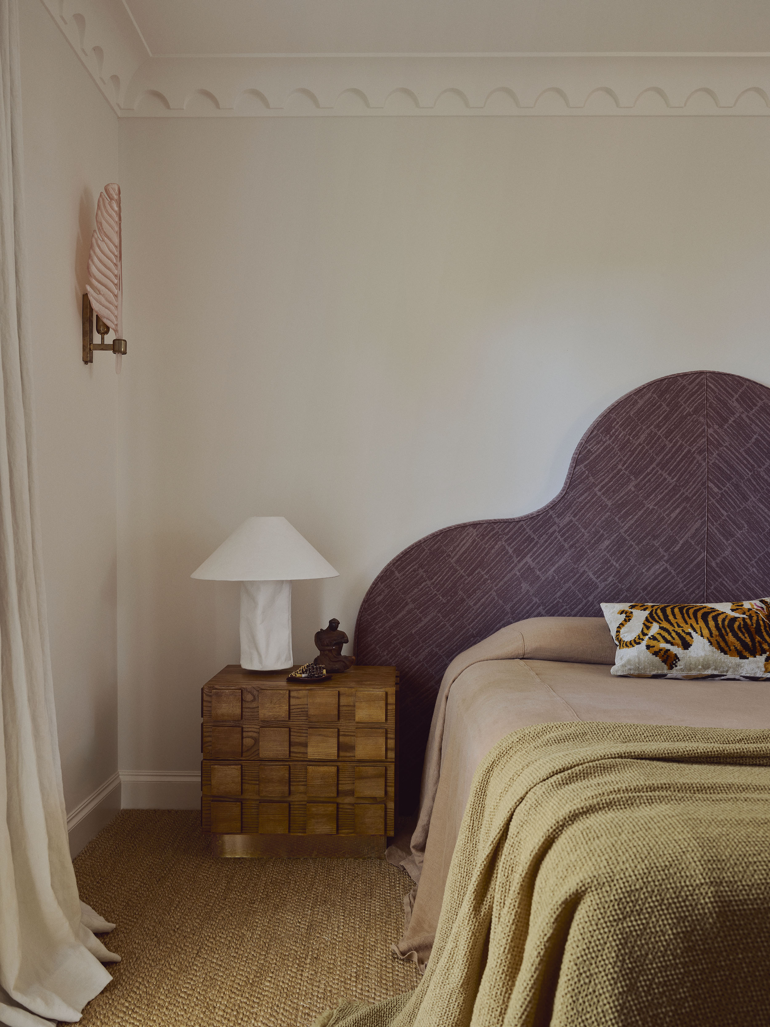
A natural progression from the dark neutrals and earth tones that have been dominating interior palettes, aubergine is everywhere at the moment. If you're understandably reluctant to commit to painting your wall in this potentially polarizing shade, take a small-dose approach à la studio Duet.
Founders Shannon Shlom and Dominique Brammah paired a curvaceous deep-purple headboard with bed linen in brown and khaki to bring "depth, individuality and a sense of quiet confidence" to the space.
"The layering of color and texture creates warmth and visual interest, preventing the room from feeling flat, while still maintaining a peaceful, restorative atmosphere," says Shannon.
"We wanted the room to reflect both the softness and strength of our client's personality, with the richness and saturation of the colors preventing the scheme from feeling delicate or overly sweet," she adds. "All the tones are harmonious and warm, giving the space an inherent glow and adding personality and visual interest without overwhelming the senses."
3. Sienna and Burnt Ocher
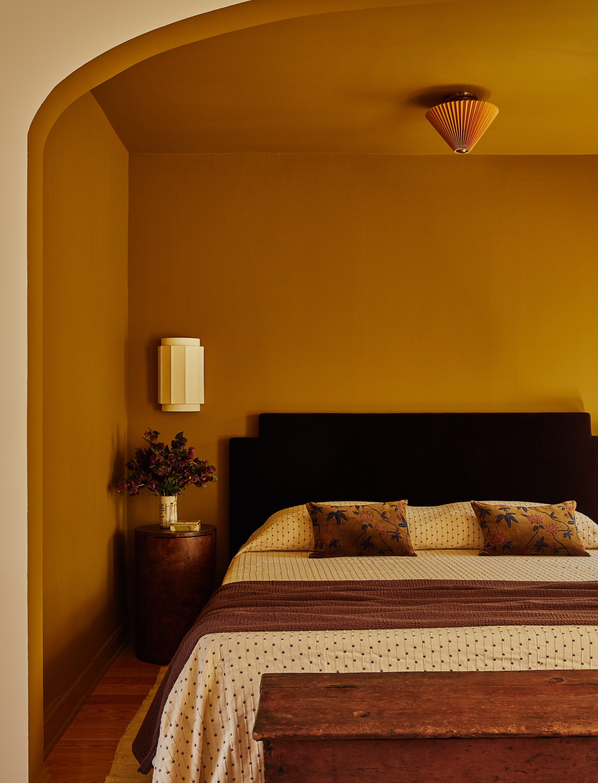
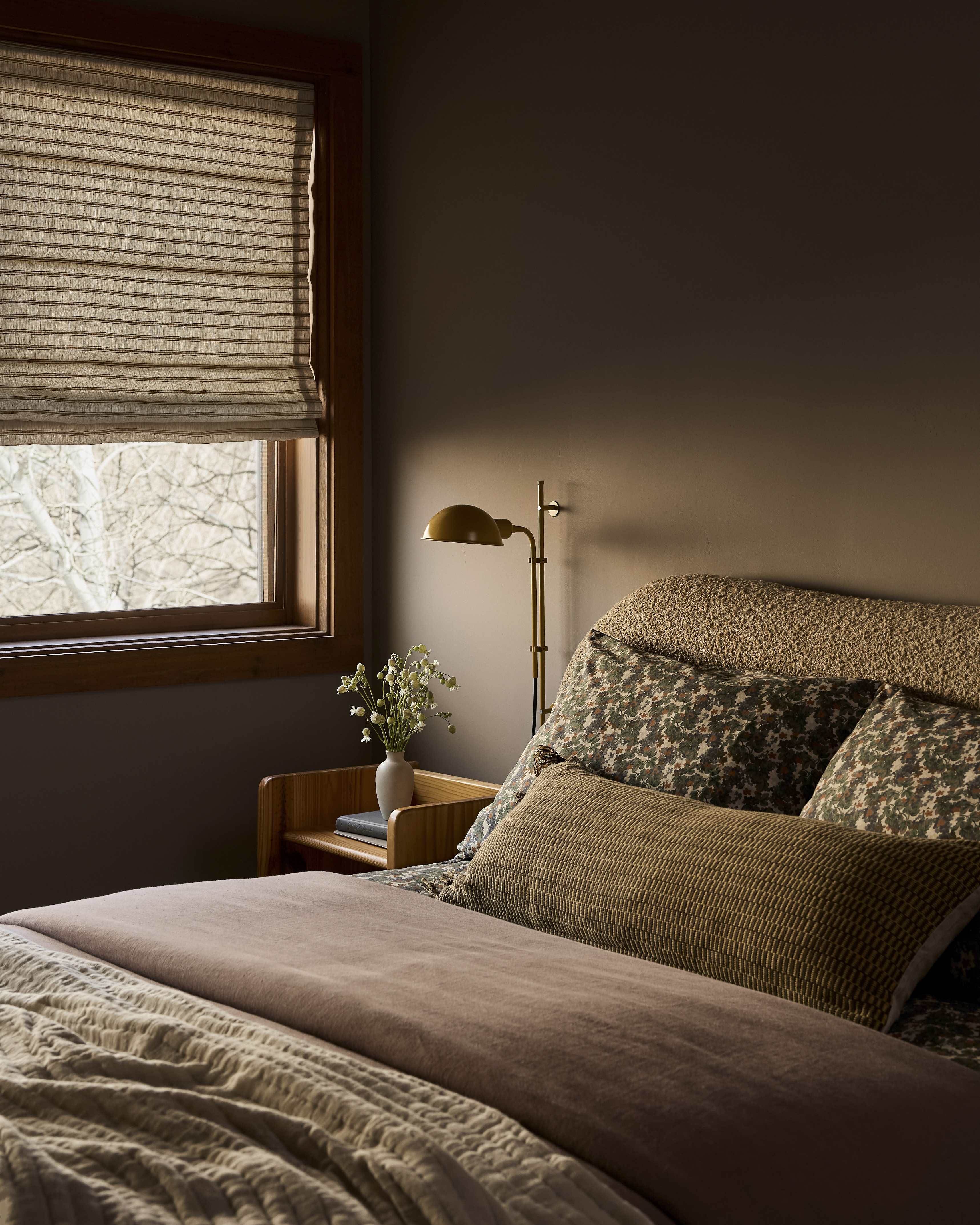
Undeniably uplifting, ocher is a timeless choice for spaces of all eras and styles. When interior designer Andie Hamm was enlisted to reinvigorate the Brooklyn townhouse pictured above, she used the bold shade to accentuate the existing arched alcove. "Rather than downplay it, I leaned in and used the architecture as an opportunity to create a cozy, color-drenched sleeping nook," she explains.
She chose a deep, saturated ochre color, which was applied from floor to ceiling. "From there, the palette built out beautifully with a chocolate-brown mohair bedframe, vintage wooden pieces, linen and velvet textiles, and minimal but unique light fixtures. Each of these pieces contributes to a room that feels intentional, warm, and elevated," Andie adds.
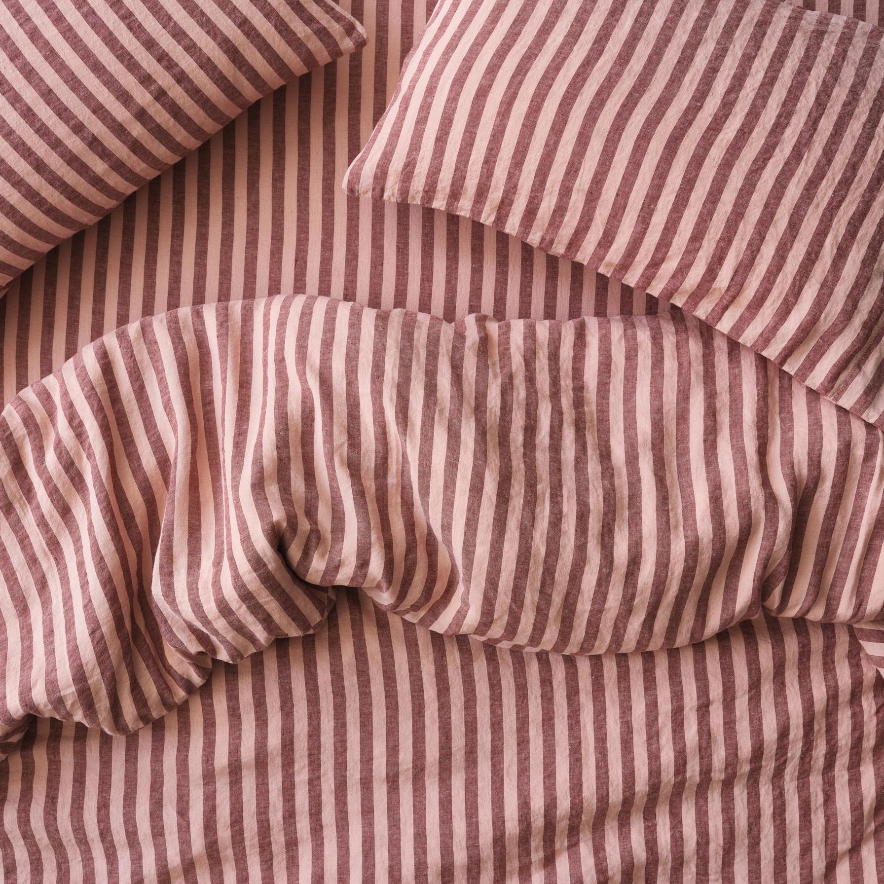
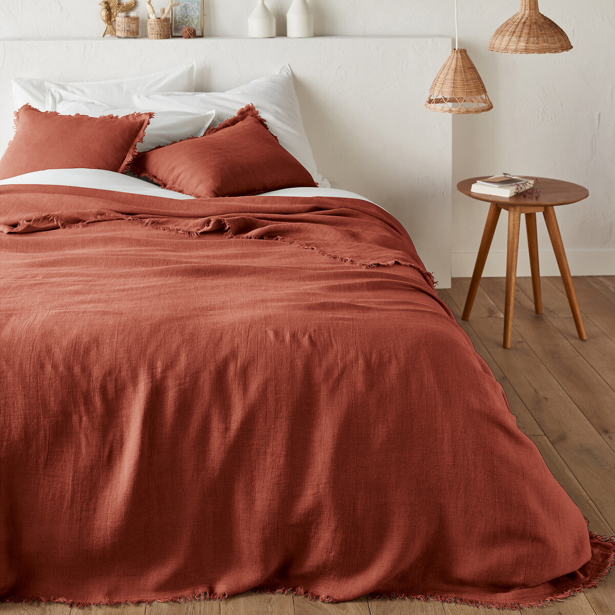
Whether you call the color trend Tobacco, Sienna, or Ocher, it's hard to miss the character this rich hue brings to a bedroom. For the second space pictured above, Cetti Wearmouth of Tiano Studio chose the color for the bed linen and bedhead, letting them find their place without competing for attention. "The Sienna bedcover by Cultiver matches the room's presence, saturated in color and sitting in harmony with the space as a whole," she explains. "The result is a bedroom that feels both enveloping and alive."
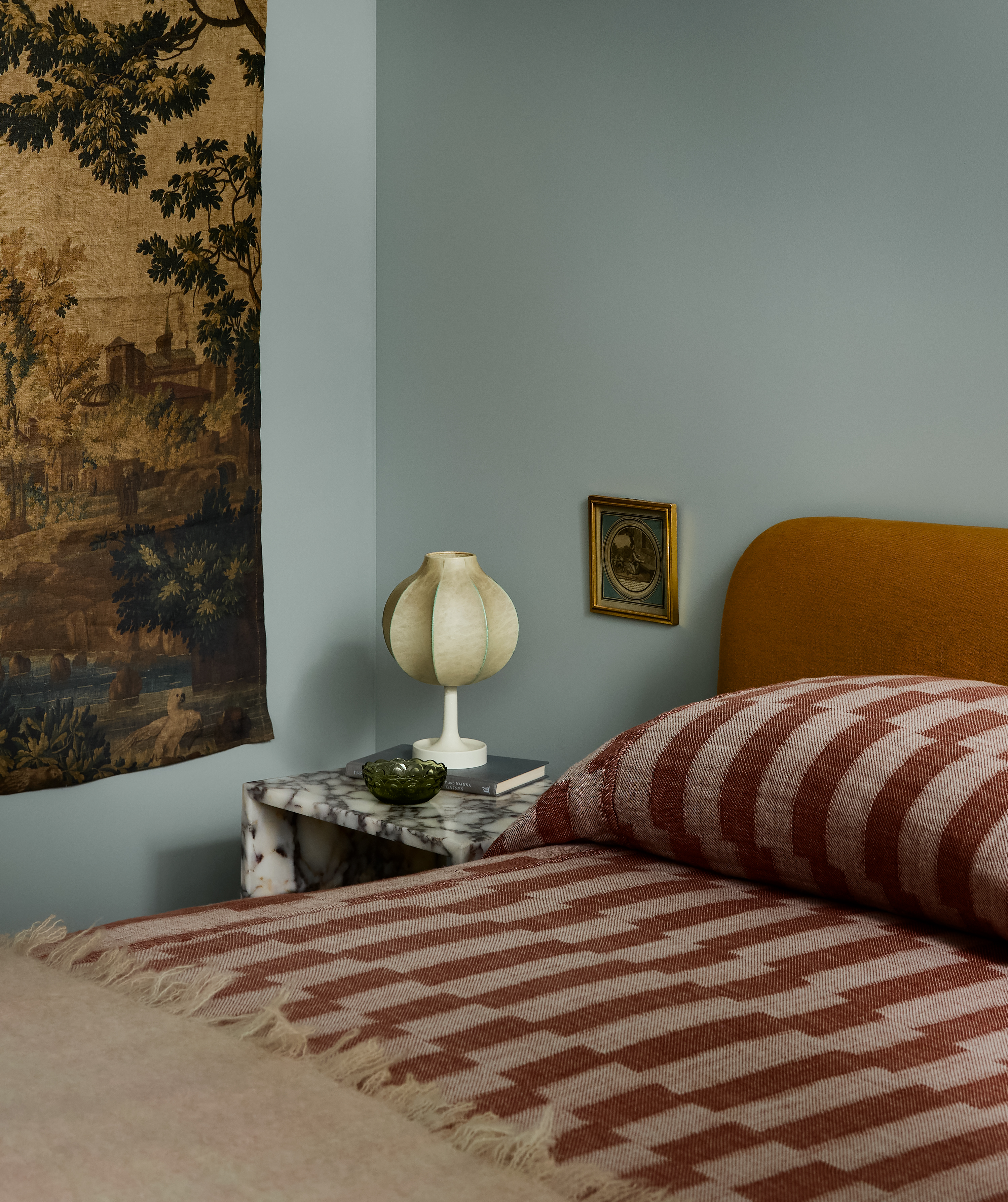
4. Silvery Blues
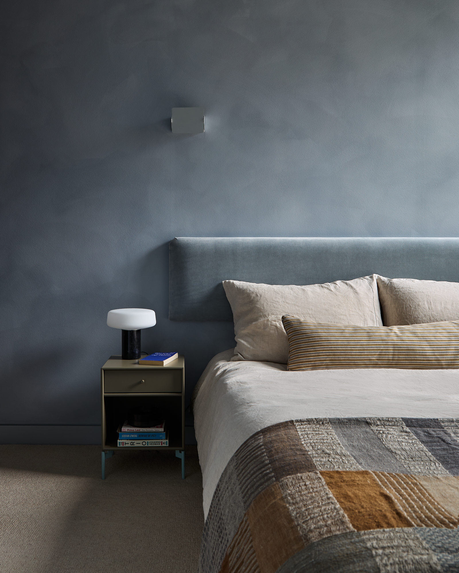
Alongside a resurgence in cool-toned metals, we're seeing silvery blue shades creeping into bedroom color trends. This restful hue is a perfect match for this space, as proved by Kinder Design's compact Bankside apartment.
"This tiny apartment is located in the futuristic, Norman Foster-designed Neo Bankside building, so I took my lead from this context," says studio founder Leo Wood. "There's quite a lot of red and blue in the apartment, and I felt that this particular shade of blue would create a calm counterpoint."
Leo decided on Bauwerk's Forget Me Not limewash paint for the walls. "This adds an essential textural layer to soften the space," she explains. "We wanted to reduce the drama in the room, so we designed a custom velvet headboard that matched the walls, and dressed the bed in simple linen bedding with a custom cushion."
5. Muted Mushroom
There are few bedroom color trends more grounding than soft browns and earthy pinks, which can be used together to create an impactful palette that doesn't overwhelm.
Another guest bedroom by Yond Interiors, this layered space is a continuation of a cozy and textural scheme designed for a ski home in Sun Valley. The interior features wood-paneled walls that are complemented by an array of rich yet muted shades that artfully avoid feeling heavy.
"The spare room in our Sun Valley project needed to relate to the rest of the home, so a more muted palette with earth tones, botanical prints, and texture felt at home here," says Julia Miller.
When it comes to bedroom color trends, Leo says her clients are now more open to using deep colors, favoring immersive, color-drenched spaces. "I am absolutely convinced of the amazing power that color can have on how we feel in a space," she adds.
For more inspiring interior palette ideas, tour this 120-year-old Berlin villa, which is a masterclass in confident color application, and subscribe to Livingetc's newsletter to have inspiration delivered straight to your inbox.