Struggling to remember or make sense of complicated information? Maybe a visual makeover with an eye-catching chart or graph will help! And if you have doubts about its effectiveness, allow us to introduce you to a subreddit called “Data Art”. It's a community dedicated to sharing “aesthetically satisfying data visualizations that you'd be proud to hang on your wall”.
Since its creation in 2017, "Data Art" has grown into a thriving community of over 65 thousand members who share passion for blending aesthetics and data. From evolution of the Shanghai Metro to the largest empires of history, these visualizations are not only informative but also pleasing to the eye. Scroll down to experience the beautifully presented data.
- Read More: 40 Times People Summarized Data In Interesting Charts That Might Clear Some Things Up For You
#1 How Different Piano Notes Reverberate Through A Bowl Of Water

Image credits: MusicMadeVisible
#2 U.S. Flag But Each Star Is Scaled Proportionally To Their State’s Population, In Roughly It’s Geographical Position

Image credits: jmerlinb
#3 A Cool Guide To The Evolution Of The Alphabet

Image credits: Global-Cheesecake131
#4 European Roads To Rome
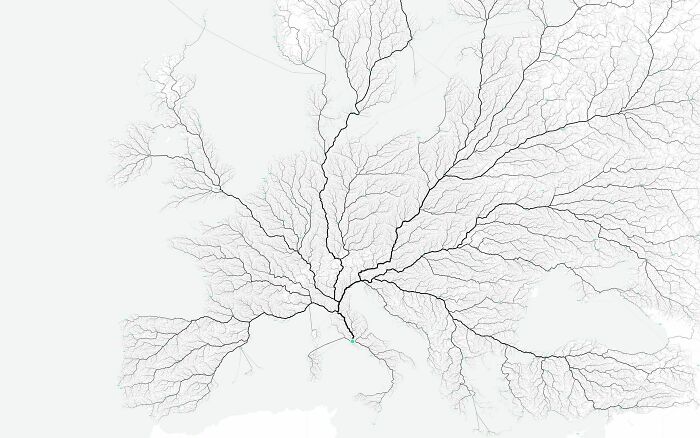
Image credits: jmerlinb
#5 Long Exposure Of A Roomba Vacuum With A Color Changing Light On Top

Image credits: zoliva
#6 Language Family Tree
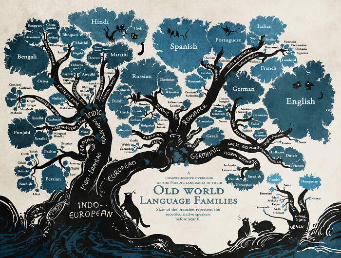
Image credits: Stand Still. Stay Silent
#7 Literal Art!
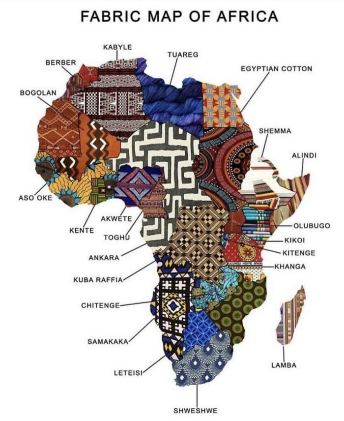
Image credits: Earl Sweatshirt
#8 All These Countries Fit Inside Africa
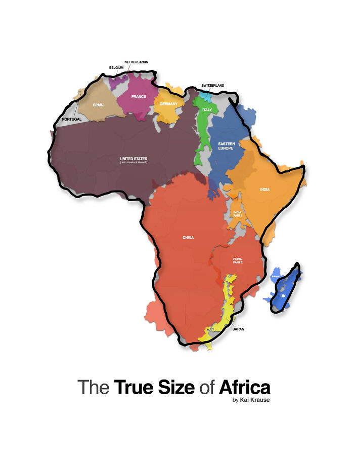
Image credits: Kai Krause
#9 Nyt's Front Page For 21 Feb. Each Dot Represents A Life Lost To Covid-19 In The Us

Image credits: sendhelpandthensome
#10 Paths Of 800 Unmanned Bicycles Being Pushed Until They Fall Over

Image credits: GJenkins4
#11 These Diagrams Show The Paths Traced By Mercury, Venus, Mars, Jupiter And Saturn As Seen From Earth

Image credits: Vanilla35
#12 A Map Of Finland's Bear Population, Made Up Of Bears
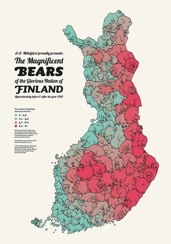
Image credits: jmerlinb
#13 This Map Is Drawn Entirely From Shipping Logs From 1945

Image credits: jmerlinb
#14 Hey Jude Lyrical Composition [oc]
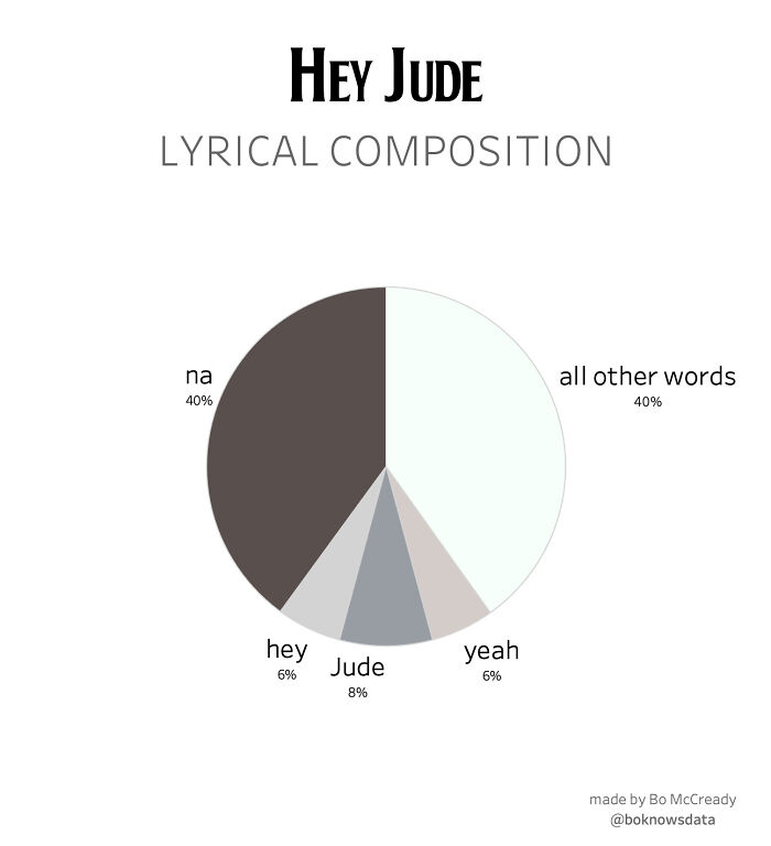
Image credits: BoMcCready
#15 [oc] My Wife Made This Blanket That Indicates A Certain Temperature For Every Day Of The Year. 2016 Pennsylvania

Image credits: jmerlinb
#16 How Long Animals Live - The Lifespan Of 50 Animals Visualized On A Spiral
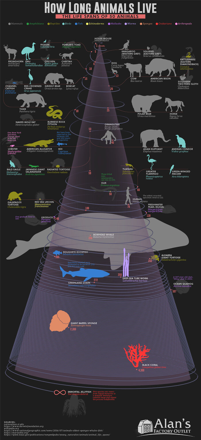
Image credits: alansfactoryoutlet
#17 [oc] I Rendered Every Single Road In Tokyo Area On One Map. Love The Results
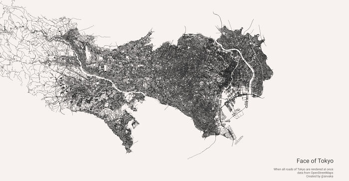
Image credits: jmerlinb
#18 Every Lighthouse In Ireland, With Accurate Timings, Flash Patterns And Colours
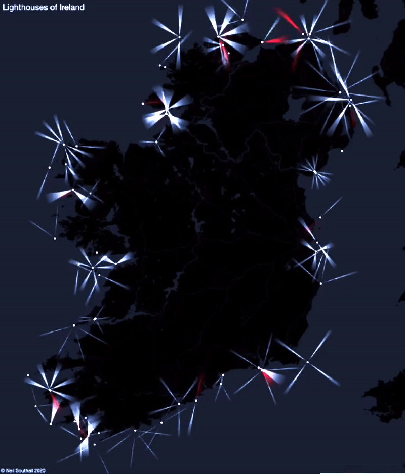
Image credits: jmerlinb
#19 Smarties Colour Distribution

Image credits: Koljax
#20 Anatomy Of The Human Body, In The Style Of The London Underground Map

Image credits: jcsimmo
#21 [oc] Words For "Mother" Descended From A Common Proto-Indo-European Root
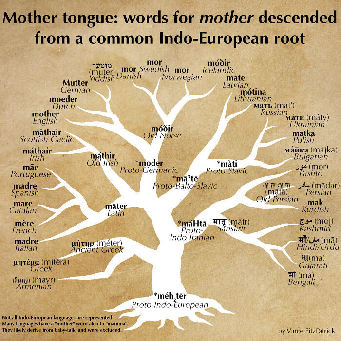
Image credits: UWillAlwaysBALoser
#22 [oc] This World Map Is Made Of Only Air Currents. If You Look Closely, You'll See Country Outlines

Image credits: Jack Merlin Bruce
#23 Morse Code Guide By Google

Image credits: 11irondoggy11
#24 Wow!!!

Image credits: akasaiga
#25 History Of The Mississippi River, As Drawn In 1944
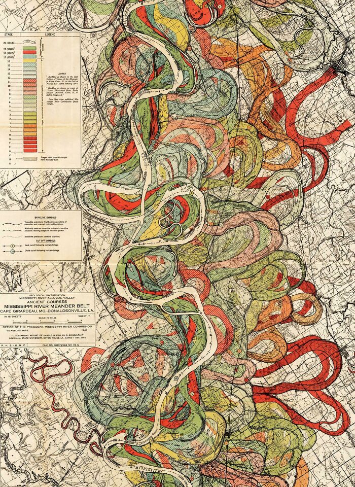
Image credits: Harold Fisk
#26 Worldwide Earthquake Density 1965-2006 [oc]
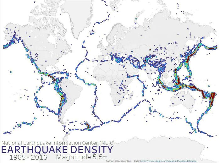
Image credits: ZachBowders
#27 From Flowing Data. Coral-Like Cities To Show Road Networks
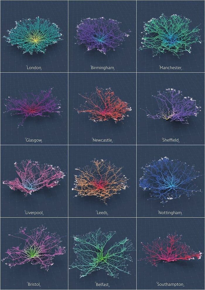
Image credits: redflavormp3
#28 Real Proportions Of All Land Masses Revealing Actual Areas Of Countries, Territories And Major Islands Without Any Distortions (By Art.lebedev)
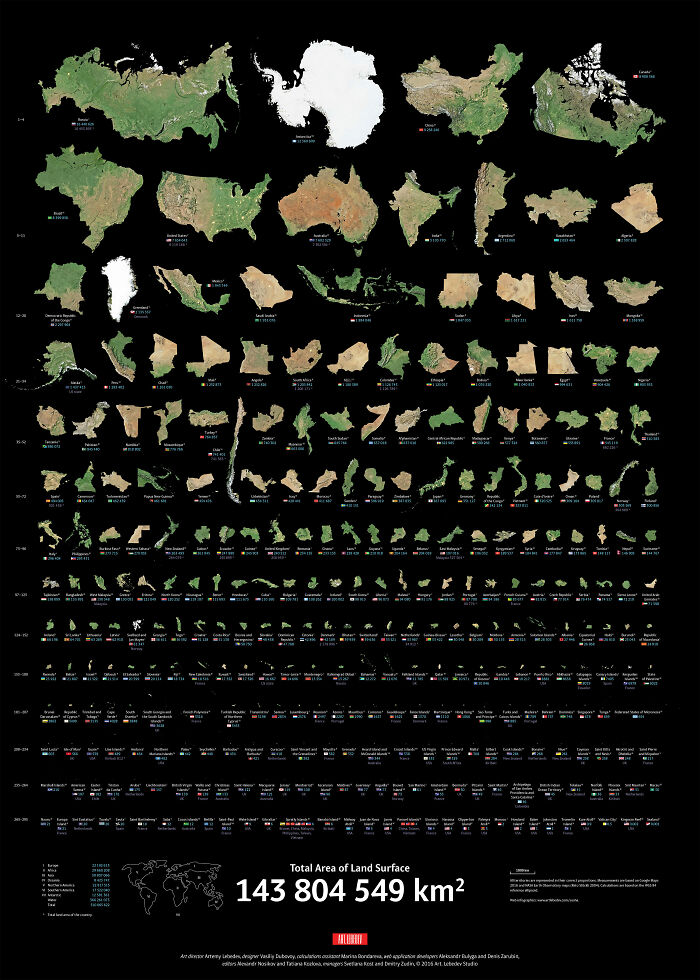
Image credits: artlebedev
#29 How To Build A Human

Image credits: tabletopwhale
#30 I Made A Bar Graph Of My Favorite Quarantine Beers

Image credits: reddit.com
#31 The Globe Centred On Honolulu - Topographic Map From A Single Spiral Line
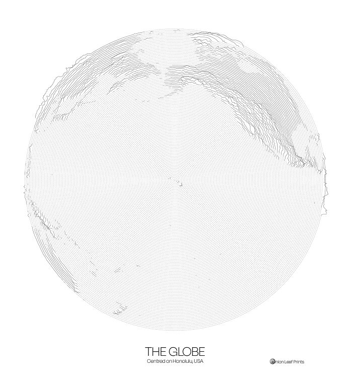
Image credits: onionleafprints
#32 This "Photo" Of The Sun Uses Neutrinos Instead Of Light, And Is Taken At Night By Looking Through The Earth

Image credits: jmerlinb
#33 The Sentiment Scale: How Positive Or Negative A Word Sounds
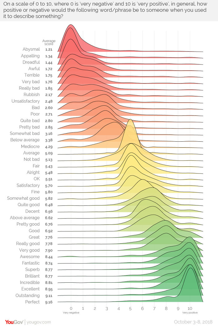
Image credits: yougov
#34 World Temperature Anomalies [oc]
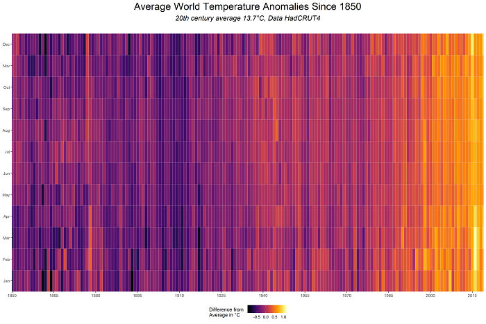
Image credits: cavedave
#35 139 Years Of Global Temperatures Knit Into A Baby Blanket

Image credits: itsacalamity
#36 Lat And Long Data Of Every Town In The World With More Than 1000 People
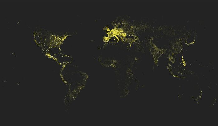
Image credits: black_red_ranger
#37 (Some Of) The Largest Empires Of History, Visualised As Planets Orbiting Earth
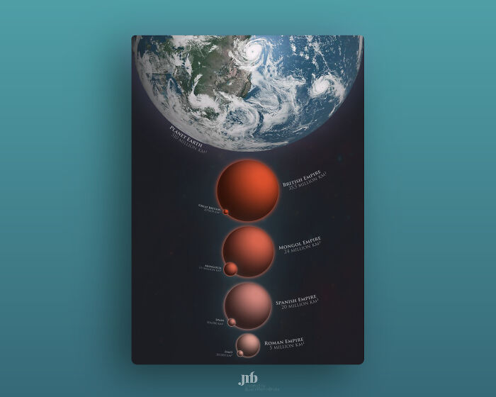
Image credits: Jack Merlin Bruce
#38 90 Minute Public Transit Commuter Zone For London vs. San Francisco
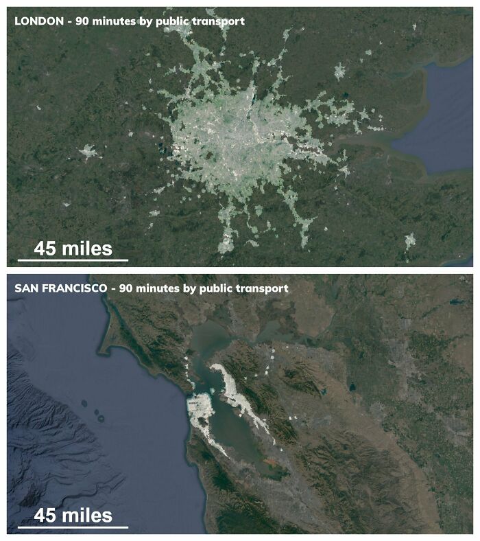
Image credits: undertheraedar
#39 Most Common Themes Of 8000 Picasso Paintings, Visualised In The Style Of Picasso
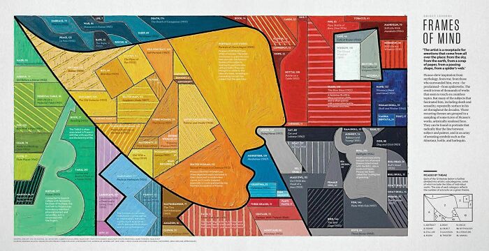
Image credits: Alberto Lucas López