As the temperature drops and evenings become longer, it’s perhaps natural that many of us gravitate toward deeper, darker shades for our homes. Winter color palettes bring a sense of cocooning comfort and can create a feeling of warmth, but they can also be surprisingly adaptable — no matter the season.
When you’re decorating with color, nuance is key. “In autumn and winter, these colors offer a cozy, comforting atmosphere, but in spring and summer, you can make them more uplifting by pairing them with lighter finishes and more natural light,” explains interior designer Katerina Tchevytchalova.
So, which shades are trending for a winter color palette — and how do interior designers use them in a way that works all year round? Read on for their best tips and tricks.
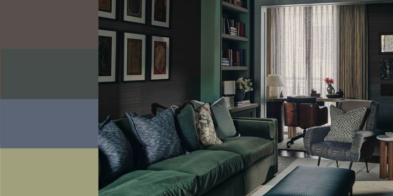
1. Juniper and Midnight
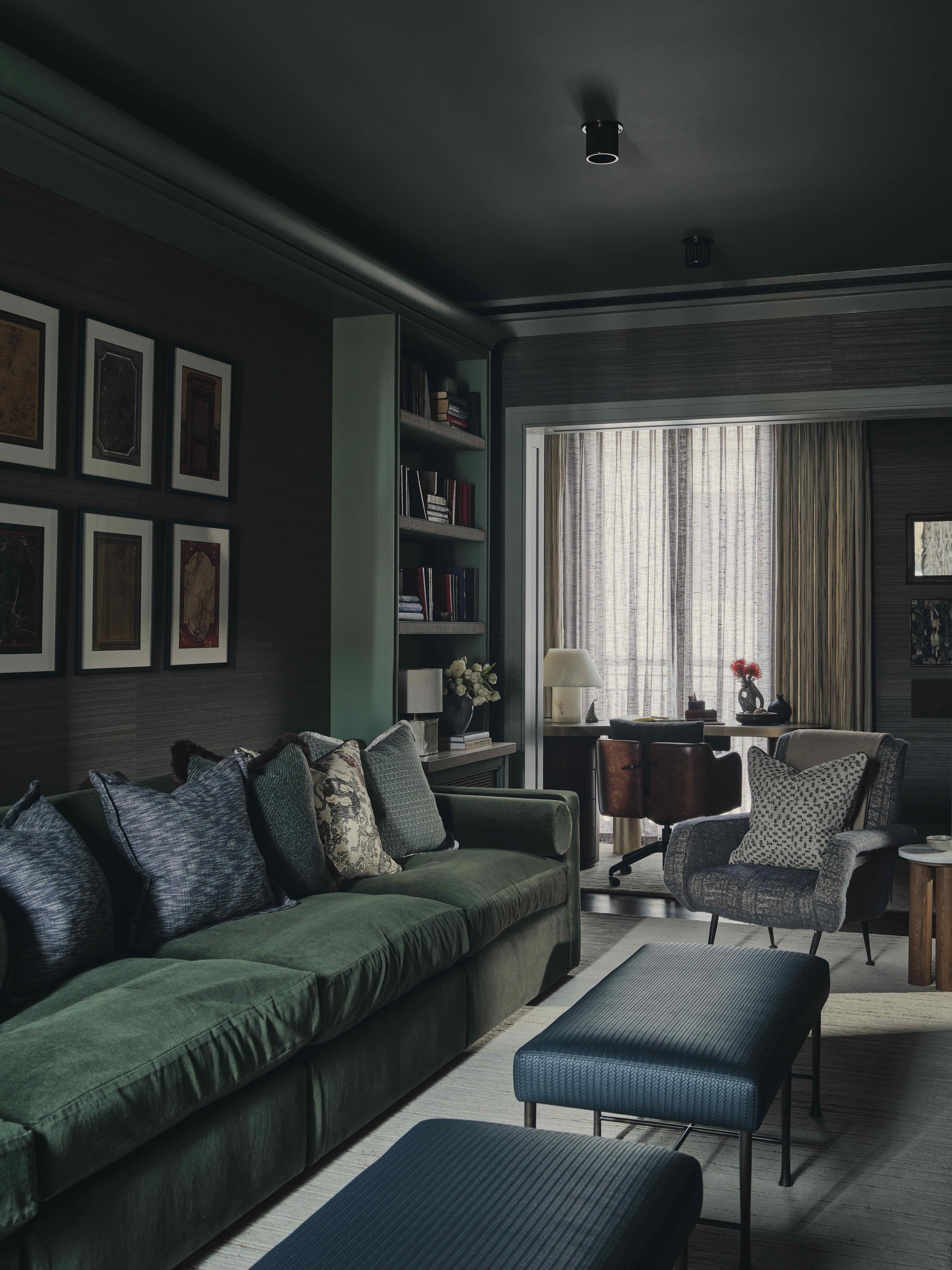
Shades of darkest blue and deep botanical green can create a sense of drama in a space, but they are surprisingly cocooning and warm too. “They’re both deeply rooted in nature, so they tend to have a calming and restorative feeling to them,” explains Christian Bense, who created this jewel-box snug for the 60 Curzon development in London.
“The colors work well in isolation, but complement each other when used side by side,” he says. “The sofa here, covered in deep emerald green merino wool velvet, contrasts beautifully with the blue armchair and cushions to create a space that feels cocoon-like, intimate, and warm.”
To make these dark shades work in the brighter days of spring and summer, layering is key. “Introduce a variety of tones from the same palette, going from dark to medium to pale,” instructs Christian. “Switching and layering colors can create a softer feel.”
Texture is an important element in this space, too. “Variety in materiality helps to bridge the gap between both colors, making this room feel more tactile and inviting," he says. "It’s about creating a layered aesthetic that can transition between the seasons.”
2. Chocolate, Terracotta, and Blackened Teal
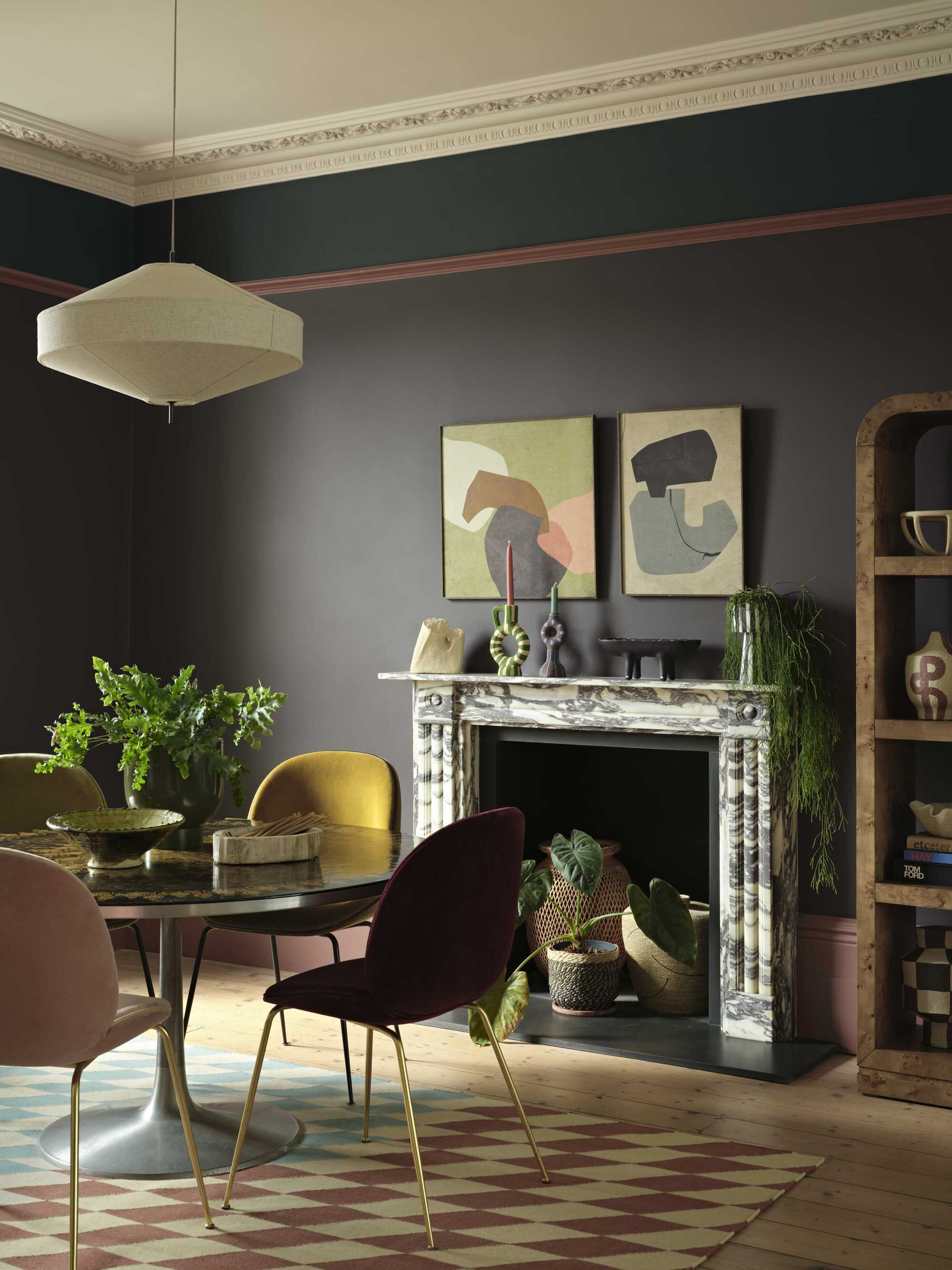
Silhouette, the primary paint used in this dining space, has recently been crowned as Benjamin Moore’s Color of the Year 2026, and is paired here with the brand’s Narragansett Green and Southwest Pottery (on the trim).
“This rich, nature-inspired palette has a wonderfully timeless appeal,” says interior designer Lucinda Kellaway. “Echoing the tones of charcoal, clay, and foliage, it feels cozy for winter but has the versatility to carry through the seasons.”
“The key to embracing darker shades like Silhouette year-round is contrast,” she suggests. “In this space, the atmospheric depth is lifted by color pops in the rug, the mix-and-match chairs, and lively greenery. This gives the eye moments of relief from the darker tones.”
“Balance the moodiness with playful patterns and lively accents in spring and summer, before adding in layered textiles and richer materials in fall and winter to shift the room’s character without losing the palette’s soulful energy,” Lucinda instructs.
3. Denim, Blush, and Violet
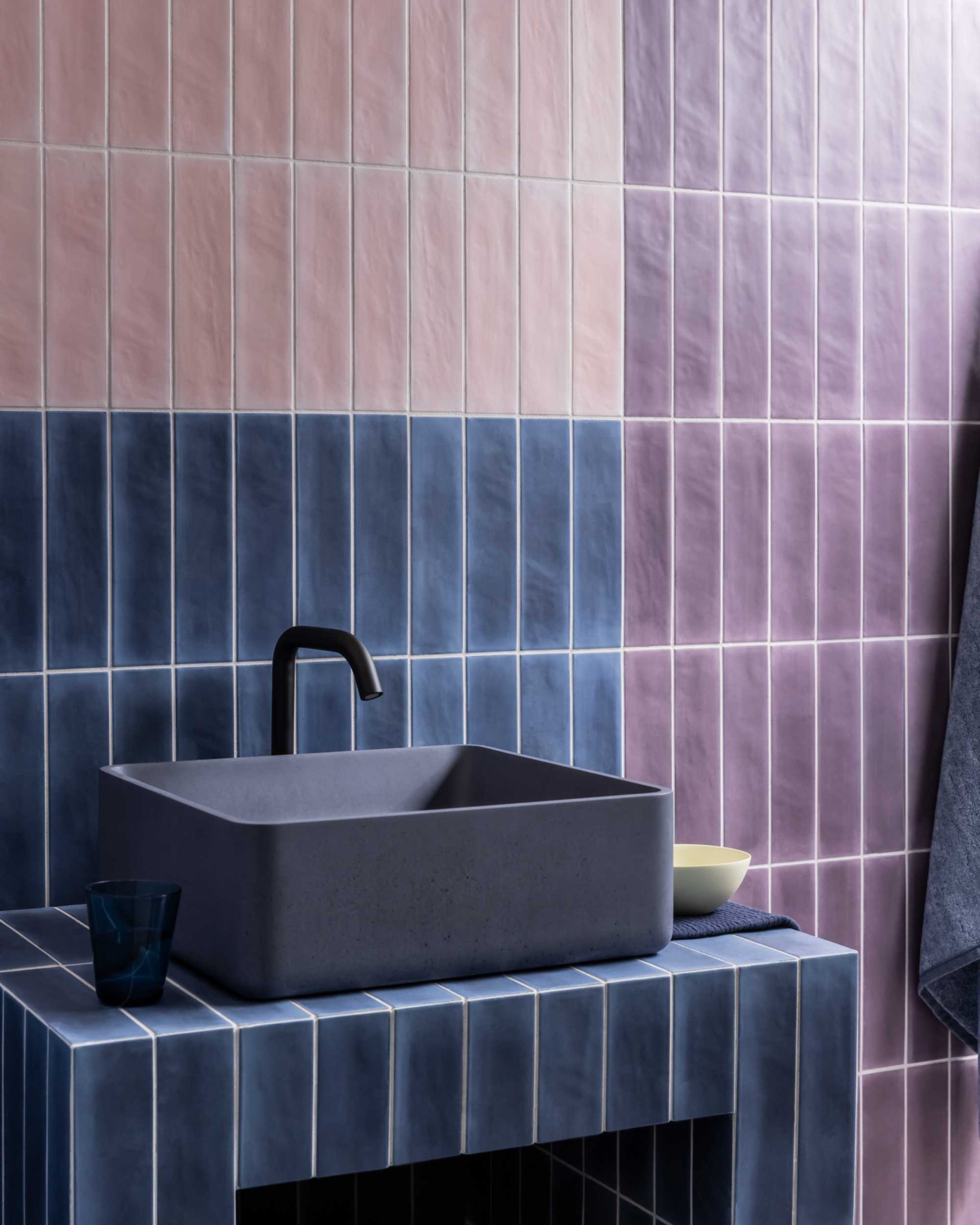
“As blue, pink, and purple are adjacent on the color spectrum, this combination isn’t unusual,” suggests Katerina Tchevytchalova, founder of K’Arte Design. “This powder room’s balance of saturation and temperature, however, makes the mix feel fresh and contemporary.”
“In winter, these deeper blues and muted purples offer a cozy, comforting atmosphere,” she explains. “They feel cozy and enveloping, but also sophisticated and quietly playful. The mix of colors creates structure and visual balance.”
The colors can take on a different appeal as the seasons begin to shift. “They absolutely behave differently depending on the time of year,” adds Katerina. “In spring and summer, the pastel tones can become more prominent and make the palette appear airier and brighter.”
To emphasize this, use accessories to enliven the look. “Texture and finish matter, and can help set the emotional mood you want to create,” she says. “Changing up towels and adding in different tactile accessories will make a noticeable difference and prevent your scheme from feeling flat.”
4. Brick, Pine, and Ink
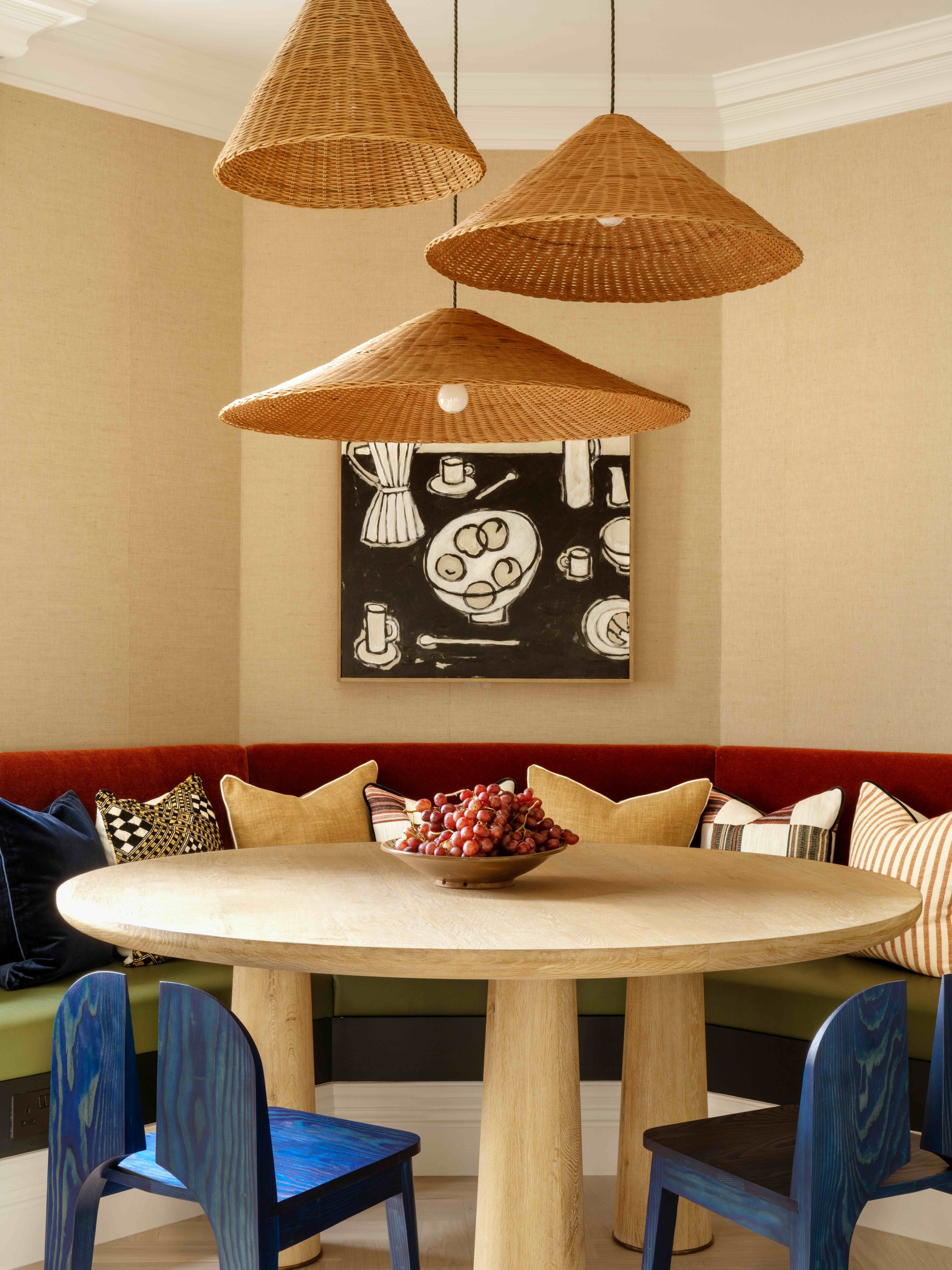
Darker tones typically associated with a winter color palette can become much more approachable against a lighter backdrop. “A grounding color lets shades complement rather than compete,” says Venetia Rudebeck from Studio Vero.
“In this space, the brick mohair banquette creates a quiet depth, while the pine green helps ground the curved shape,” she explains. “The stained Douglas Fir chairs introduce a cool, inky counterpoint, and it’s the interplay between these tones that gives the space a calm character.”
“Here, the lighter paperweave walls create the framework of the room, while the deeper tones sit within that structure as accents,” says Venetia. “Repeating the darker shades in small, thoughtful ways brings coherence without making the palette feel heavy.”
How did the studio know these colors would work well all year round? “We always look at different shades in changing light,” she explains. “If a color holds its tone from morning to evening, it will carry across the whole year.”
While dark paint colors and furniture upholstered in sumptuous materials might seem an obvious choice for this time of year, it’s clear that they can work just as well during the warmer months, too. They bring a sense of glamour and add a rich, layered feel to a room, so it’s no wonder interior designers are increasingly selecting them as a seasonless decorating choice.
In the mood to give your own space a makeover? Take note of 2026’s emerging color trends and discover the difference between warm vs cool colors before you begin your remodel.