The best thing about rules (at least some rules) is that they're meant to be broken. To be bent, manipulated, pushed, and challenged. And it seems to be the case when it comes to color. What was once considered the key to decorating could now be a cage that's holding you back. So, what are the outdated color rules worth breaking in 2025?
Color rules ensure the way you use color doesn't overwhelm a space — helping a color-drenched room feel enveloping, not exhausting, for example. But they are theories designed to be played with, basic principles to expand upon. Follow them too closely, and you may actually end up with a space that feels somewhat flat and one-dimensional.
So, if it's sometimes worth ignoring color theory, what are the outdated color rules in 2025? To find out, I asked interior designers and color experts, who shared their thoughts, along with what to do instead to ensure your space still feels balanced.
1. The 60/30/10 Rule
By now, you've probably heard of the 60-30-10 color rule: where the dominant color is 60 percent of the room, the secondary color is 30 percent, and the accent is 10 percent.
While this is still a good rule for those just starting to decorate with color, senior stylist Paula Taylor, a trend specialist at Graham & Brown, says, "Designers are becoming more comfortable embracing bolder color schemes, whereas this rule can be quite limiting."
For the brave, we're starting to see more daring color moments. Techniques such as double-drenching a room in a tonal or complementary palette are becoming more popular, making an argument for approaching color with more gut instinct than mathematical equation.
2. Having Only One 'Accent' Color
"A singular accent wall today feels like a bad mullet — party all on one wall, and back to business on the rest," says interior designer at Vitale Design Group, Alex Vitale. And I couldn't agree more. Long gone are the days of one accent wall carrying the only color in the room.
Paula Taylor adds that a new trend we're seeing is 'color accenting', which she describes as "Creating a real showpiece by accenting a detail in the room with the complementary color on the color wheel."
A successful color-accented room typically uses accessories, decor, and even larger furniture items to create a statement that draws the eye around the room. For example, using a split complementary color palette helps create movement, dimension, and cohesion in a space, rather than relying on one singular element to carry the entire room.
3. Avoiding Dark Colors in Small Rooms
One of the most outdated color rules in 2025 is that you shouldn't use dark colors in small rooms. Instead, they're now the shades most designers reach for in these spaces.
Interior designer Amy Courtney of Amy Courtney Design says, "Decorating with saturated colors is being embraced to create depth, mood, and character, especially in spaces meant to feel cozy and grounded."
Think deep burgundy kitchen cabinets or a color-drenched home office. When used intentionally, darker tones can bring a sense of sophistication and warmth that lighter palettes sometimes lack.
Plus, you can use them to make the room more intimate. "Colors like Graham & Brown’s State Room or Rhapsody work well for cocooning the space and creating a cozy feel, especially in spaces like dens and media rooms," says Paula.
4. Walls and Trim Have to Match (and Be White)
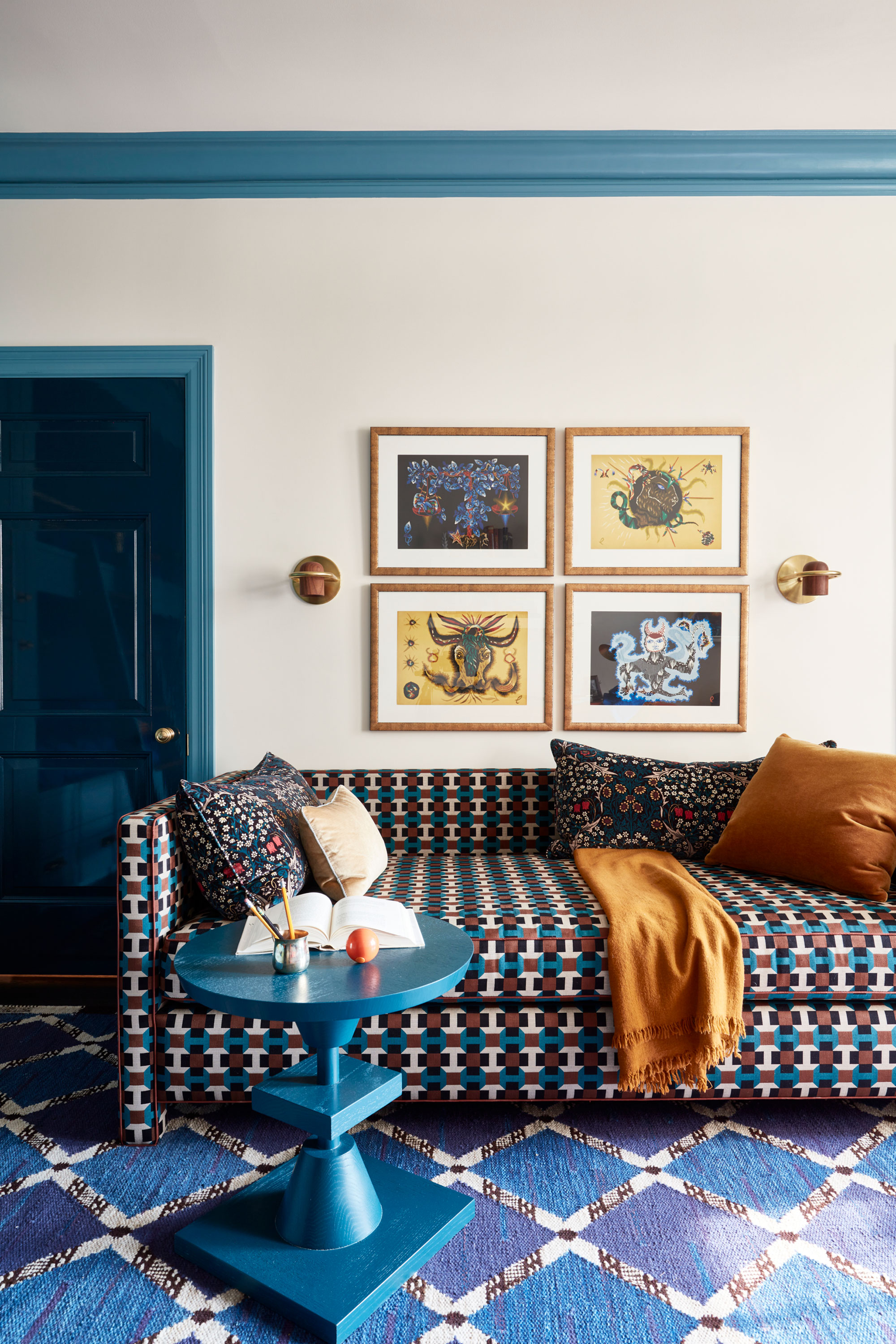
And lastly, the designers I spoke to mentioned that any rules regarding the color of your trims (especially in relation to your walls) are outdated in 2025. "The idea that trim and doors are always white has definitely expired as well," says Alexis Vitale.
Instead, use your door and trim color to show a bit of personality. "Tone-matching trim or even colorful trim creates a seamless, modern, or moody aesthetic," she adds. These little details are the best way to incorporate color in a room without having to repaint an entire wall.
Rules when it comes to color are meant to be broken — sure, they help with ensuring cohesion and harmony in a space, but the best interiors push, play, and challenge them.
Now you know the rules worth breaking, the next step is finding out the outdated colors in 2025, to ensure you design a room that feels fresh and on trend.