Some color combinations are tried-and-tested classics, and with good reason. After all, no one has yet tired of a lovely navy-and-cream kitchen. However, as lovely as a classic color combination may be, when it comes to creating some excitement in your kitchen, you may have to look elsewhere.
Opting instead for a more surprising, unexpected color combination in your kitchen design can be the very thing that takes your space from looking safe to striking. Even with all the same appliances and materials, changing up your kitchen color ideas is a great way to elevate your space to new heights, making it feel more design-forward and intentional, without breaking the bank.
And it's not all neons and fluorescents either — surprising doesn't have to mean shocking. This approach is as much about subtlety as it is surprise; these color combinations are intended to provoke intrigue, a twist on what's expected, while still looking thoroughly cohesive. The experts have shared some of their favorite color duos, the ones they turn to when they want something slightly out-of-the-ordinary, that's guaranteed to look good. So, if you want your kitchen to stand out against the rest, these are the combos to look out for.
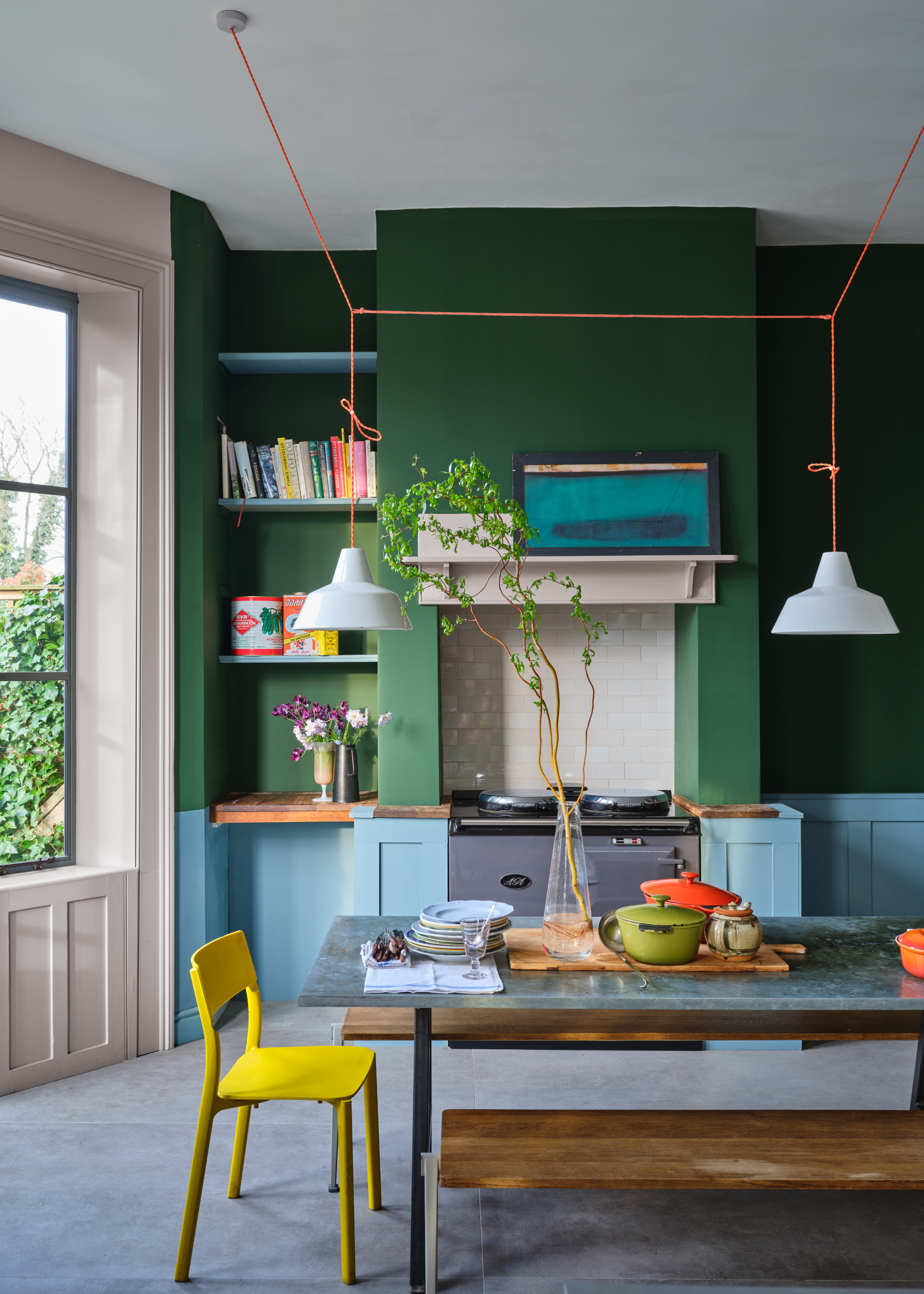
1. Green and Pink
It may sound a tad wild, but in practice, pink and green can make a delightfully inviting color scheme in a kitchen. More specifically, a deep, forest green, paired with a muted, chalky pink.
This combination is a favorite of Richard Davonport, managing director at Davonport, who explains, "When these tones are carefully calibrated, they create a kitchen that feels both grounded and quietly expressive rather than overtly decorative."
There is plenty of scope for exploration within these two colors, but when you hone in on these specific shades, the resulting design can appear surprisingly neutral, despite how it may sound. When used across the walls as a backdrop for your design, a soft, warm pink paint can act as a comforting base to work from, immediately making your space feel more inviting than a stark, white paint would.
While the green, "Provides depth and a sense of permanence," explains Richard, next to one another, the two colors can look remarkably balanced.
And it's not just Richard who's a fan. Cathryn Sanders, head of creative at Earthborn Paints, adds, "When thoughtfully combined, green brings grounding and freshness, while pink introduces warmth and softness; together they create a palette that feels both unexpected and completely harmonious."
Of course, this effect is entirely dependent on the exact tone and shade of paint you select. For the most cohesive finish, "Both colors need to sit within a similar tonal register so that neither dominates, allowing the contrast to feel intentional and composed rather than abrupt," Richard explains.
This deep, moody green is often used as an alternative to charcoal, thanks to its subdued depth.
A dusty, peachy pink, with soft, gray undertones, this shade works beautifully as a warm, neutral backdrop for any room.
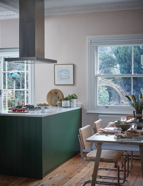
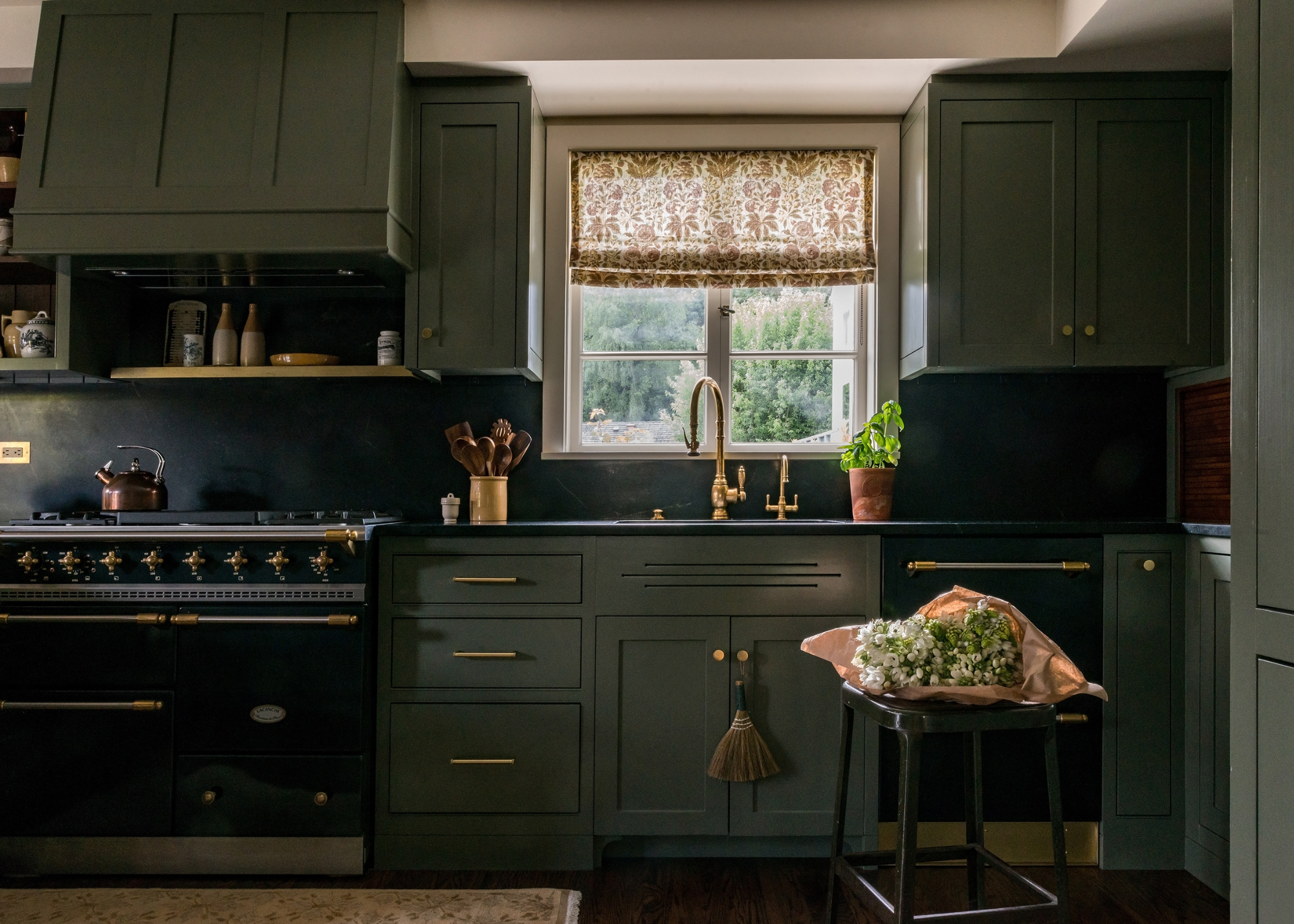
2. Charcoal and Olive
Once you step away from the belief that kitchens have to be bright and airy to be beautiful, a whole new world of kitchen design opportunities will open up to you.
One particularly effective color combination for a deep, moody kitchen is olive green and charcoal. While these two shades would not typically be paired because they sit at similar levels of color tone, they work more effectively than you may expect.
Charlotte Butler, kitchen design manager at BK Eleven, says this combination "challenges the assumption that dark gray kitchens require stark white to lift them." Instead of attempting to brighten and 'lift' this inherently dark shade, this combination plays into that darkness and depth, while the natural, earthy undertones in the olive hue bring a softness to the color scheme that prevents it from feeling too harsh.
Although subtle, this connection to nature can bring the entire look together, pairing seamlessly with other natural materials and metallic finishes within the design. As Charlotte says, "Olive introduces a subtle natural undertone that softens the contrast and connects beautifully with timber flooring, aged brass hardware, or honed stone surfaces."
Inspired by Soho House's Roman venue, this dusty olive shade is lifted by the warm, golden undertones, giving it an energizing quality.
Thanks to its warm undertones, this deep charcoal paint feels surprisingly inviting.
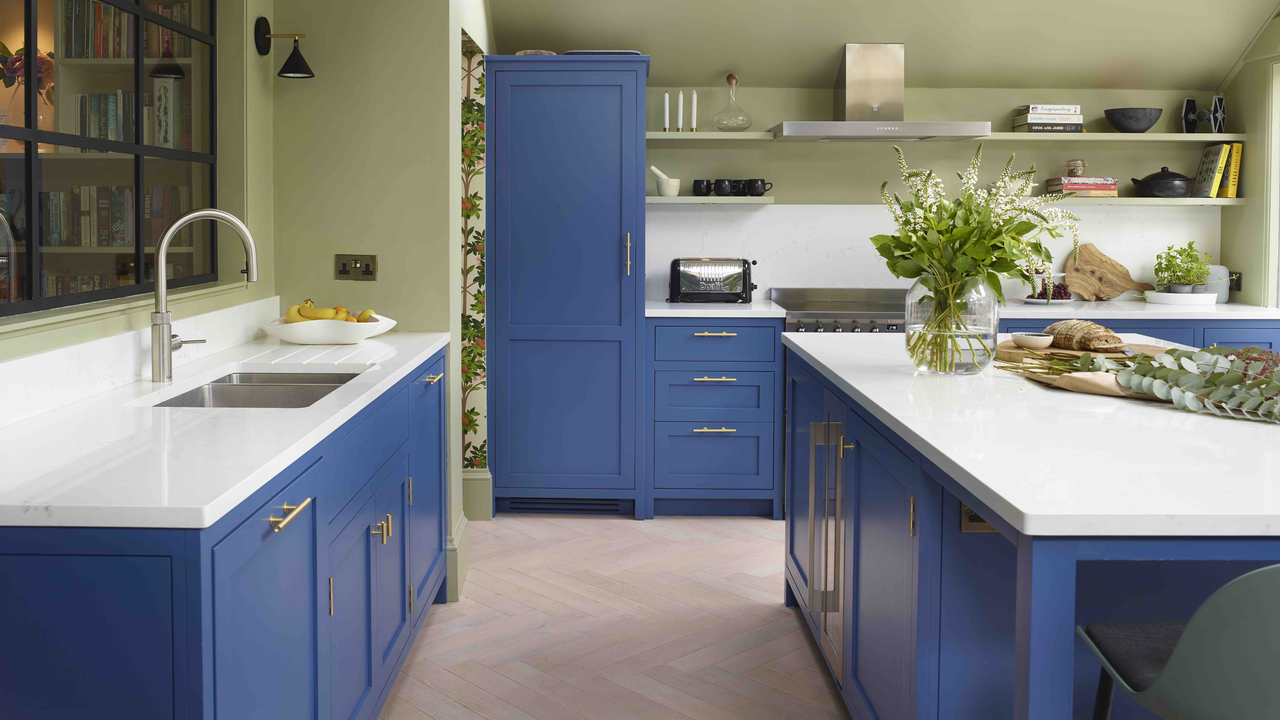
3. Blue and Green
Color theory often encourages combining colors that sit across from one another on the color wheel to create a contrasting, but complementary design. And yet, even though these two colors sit directly next to one another, there is still something delightfully comforting about the combination of green and blue in the kitchen.
It's no secret that earthy color palettes are in right now, but this combination takes it a step further, borrowing directly from the natural world, for a pairing that never grows old.
As Nicole Forina, of Forina Design & Co, says, "A blue-green combination is endlessly versatile." What makes this combination so unique is its ability to feel both energizing and calming, two seemingly contrasting effects. "It feels fresh and organic, rooted in nature yet still dynamic," says Nicole.
Of course, though, the success of this look comes down to the styling. "Varying the saturation levels, mixing matte and polished finishes, and incorporating natural materials like wood, stone, or woven elements ensures the palette feels nuanced rather than flat," suggests Nicole.
Bring in other earthy, natural materials and finishes, like wooden flooring and a marble island, for a more balanced, nuanced look.
"Ultimately, making unlikely color combinations work comes down to balance," says Nicole, "Pair boldness with texture, depth with lightness, and always anchor the palette with materials that tell a cohesive story."
While so many blue paints can feel quite child-like, this one is surprisingly sophisticated, with smoky, grey undertones that create a calming, elegant effect.
This uplifting, apple green, feels effortlessly joyful and, true to it's name, works beautifully in the kitchen.
When styled well, even the most unlikely of combinations can work alongside one another in your kitchen. "By paying close attention to undertones, balancing darker shades with reflective surfaces, and allowing one color to dominate while the other plays a supporting role, combinations that initially seem unlikely can create kitchens that feel distinctive yet enduring within the wider home," explains Charlotte.
There are, however, some particular kitchen cabinet colors that designers say are impractical and should be avoided.
For the latest in kitchens, color, and much, much more, why not sign up to the Livingetc newsletter so you never miss a thing.