Considering paint options for a kitchen is no mean feat, and these become even more tricky the smaller the space you are working with. A paint color can either make or break your space, so it goes without saying that it's a high-stakes decision; as such, it makes sense to invest in tried-and-trusted paint brands, and who better than interior designers' favorite, Farrow & Ball.
With countless iconic shades and numerous different finishes, Farrow & Ball makes it easy to find exactly what you're looking for. The only downside to this breadth of choice, however, is not knowing what shade to go for. With hundreds of colors and no clue what will work for your small-space cabinets, sounds like a recipe for decision paralysis disaster.
So, before you begin your descent into a paint-powered frenzy, with mountainous piles of samples building up in your kitchen, take some pointers from the experts. I've asked some of the best designers what Farrow & Ball kitchen colors they love for cabinets in a small kitchen, and their answers did not disappoint.
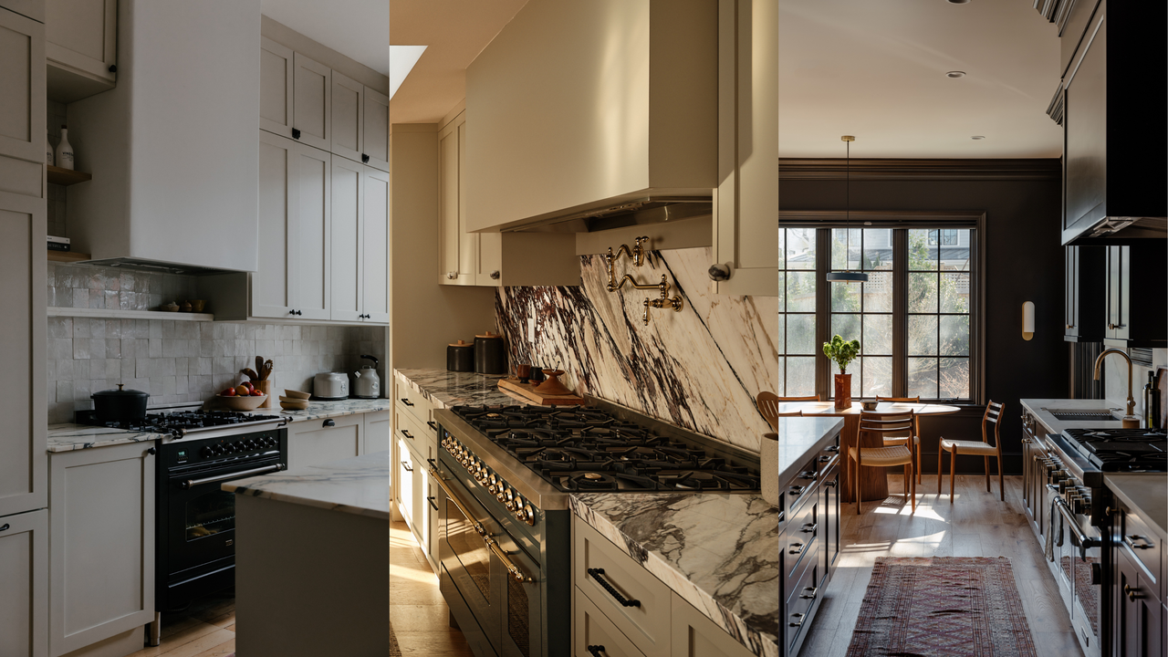
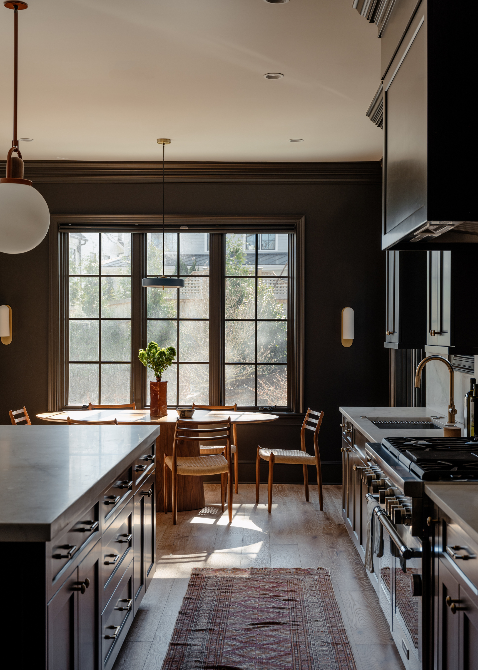
1. Railings
It's often believed that light colors make a room look bigger, with people typically opting for bright, airy neutrals in smaller rooms in the hope that color theory will trick the eye into perceiving a greater expanse of space than there actually is. And while there is indeed some merit in this belief, in action, it can often leave your space feeling rather... flat.
Instead, you might be better off embracing the constraints of your space and playing into the intimate, cozy feel of a more petite kitchen. And for this, dark, rich tones are your best friend.
"In a compact space, depth is your friend," says interior designer Zoe Feldman. While bright whites can help open up a space, they lack depth and intensity. Instead, Zoe opts for a "rich color like Railings, which creates a sense of intimacy and confidence, and instead of trying to make the kitchen disappear, it gives it a clear point of view."
One of the best Farrow and Ball paint colors, Railings is a deep, inky charcoal shade with blue undertones. Softer than a true black, Railings has an enveloping warmth that gives any space an inviting sense of intimacy. "It’s deep and moody, but it has a softness that feels surprisingly expansive rather than heavy," explains Zoe.
While you may imagine dark tones would emphasize the lack of space in your kitchen, it can actually have the opposite effect. "While it reads dark, it has a softness and complexity that allows it to visually recede, which can actually make a compact kitchen feel more expansive and intentional," explains designer Kimberly Oxford. This moody neutral brings a richness and depth to your space, without overwhelming it.
However, because of this intense sense of depth, it's important to introduce some balance through your styling, counteracting the coldness from the blue undertones with soft, warm materials and finishes. "Think honed marble, unlacquered brass, aged oak, or even a creamy zellige tile," suggests Zoe. "The contrast keeps the kitchen from feeling too formal and adds that layered, lived-in quality we’re always after."
Plus, if you're worried that your space might feel too dark or heavy, you can always introduce some more brightness throughout the rest of the kitchen. "Keeping surrounding walls in a gentle off-white, such as School House White or Slipper Satin, helps maintain lightness while allowing the kitchen cabinetry to feel grounded and architectural rather than heavy," says Kimberly.
Though if you're feeling brave, this shade lends itself beautifully to a full color-drenching moment, especially in a vintage-inspired space.
Railings No.31 is often used as a softer, more welcoming alternative to black, with a strong blue undertone that can appear more intense depending on the lighting,
2. London Clay
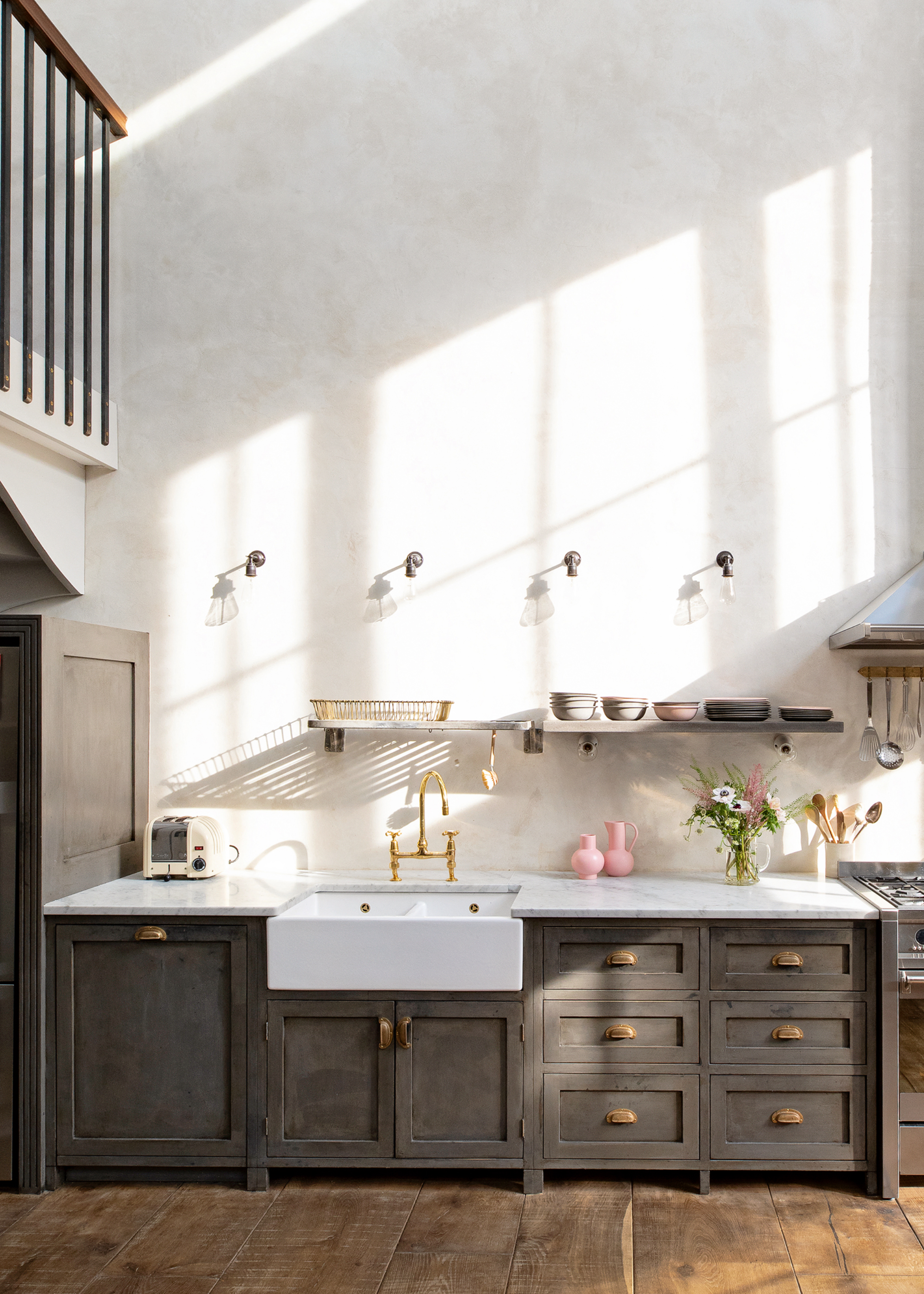
Over the past few years, we've seen warm, earthy color palettes reign supreme. Endlessly adaptable, welcoming, and gentle, it's easy to see why. And in compact kitchens, these popular tones are, arguably, at their best.
Opting for soft neutral colors with brown undertones is an easy way to ensure your kitchen has warmth and depth, without relying on overly dark shades.
If this approach sounds appealing, London Clay might be the Farrow & Ball color for you. "It has depth and warmth without feeling heavy, and it creates a grounded, architectural backdrop that makes a small space feel intentional rather than busy," Amanda Leigh and Taylor Hahn of House of Rolison explain.
In smaller spaces, you have to be particularly conscious of visual clutter, and this doesn't just mean keeping your kitchen countertops organized; it also bleeds into the colors you use.
A soft, warm shade like London Clay is neutral enough to blend into the background, acting more as a beautiful backdrop for your other design elements to bounce off of, rather than the focal point. It's a more welcoming, inviting alternative to stark white or an intense dark color, while still creating the same sense of neutral minimalism.
Because of this, London Clay can work well with a variety of accompanying materials and finishes. But, if you're a fan of the soft kitchen aesthetic, Amanda says, "London Clay pairs beautifully with natural stone like honed marble or limestone, warm woods such as oak or walnut, and aged or unlacquered metals."
Against this backdrop, the texture and tones of these materials shift into the foreground, so playing with richly veined marbles and other natural stones can be especially effective.
This warm, deep brown tone is a step up from Farrow and Balls' popular London Stone shade. With the same soft neutrality, London Clay offers some more intensity to your home.
3. Shaded White
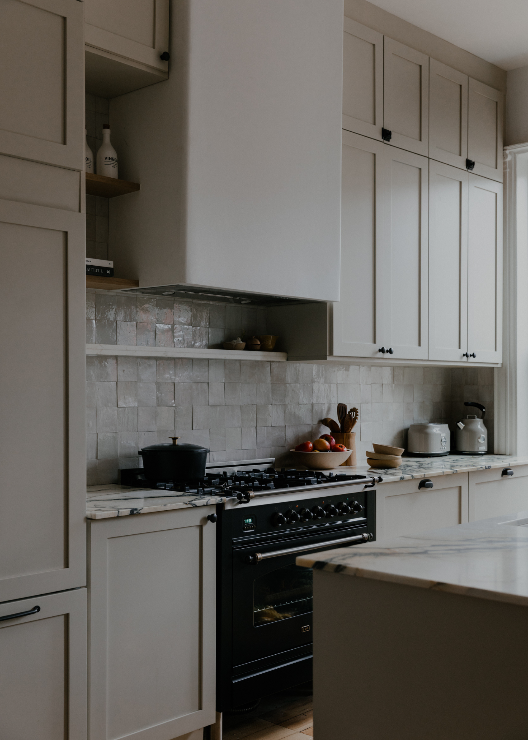
Although the experts clearly love using deeper, more intense tones in small-space kitchens, this approach is, understandably, not for everyone. As lovely as a moody, cozy kitchen can be, sometimes a bright, airy space is all you want, and you don't need buckets of space to achieve it. With the right colors, even a tiny, narrow kitchen can feel like a breath of fresh air.
What you'll want to prioritize is finding a shade that captures the same warmth as the previous shades, without all that darkness, so you can still have some sense of depth in your space. That means no stark white paint, no matter how much you might want it.
Instead, find a light color with warm undertones, like Farrow & Ball's Shaded White, a favorite of interior design duo The Brownstone Boys.
"Shaded White is one of our go-to cabinet colors for small kitchens because it has warmth without heaviness," they explain. "It reads as a soft, nuanced neutral rather than a stark white, which helps a smaller space feel calm and cohesive instead of overly bright or flat."
A more subdued, light neutral like this has a more tactile quality, blending seamlessly with other natural materials and aged finishes, which can look awkward and disjointed when paired with stark white. "It also shifts beautifully throughout the day, adding depth without visually shrinking the room," they say.
Play into this gentle warmth through the rest of your kitchen materials. "We love pairing Shaded White with natural stone countertops, especially honed marble or limestone, along with warm metals like unlacquered brass," says The Brownstone Boys.
"It also works incredibly well with wood accents — white oak shelving, butcher block details, or original millwork, which helps layer warmth and character into a compact kitchen."
A true neutral — Shaded White is neither too warm nor too cold, landing somewhere in the middle. It's a gray-toned beige, with a welcoming depth that keeps it from ever feeling boring.
What to Pair Them With
When in doubt, go for School House White. The ultimate go-with-anything shade, it's the lighter version of Shaded White, and maintains that same true neutrality and gentle softness.
Much like School House White, Slipper Satin is a brilliant backdrop for other, more intense shades. The lack of cool undertones lends this color a chalky, gray quality, making for a subtle, welcoming wash of color.
If you want something slightly cozier for your backdrop, opt for the lovely Mouse's Back shade. A fawny gray-toned brown, it has an earthy softness that pairs beautifully with other deeper shades.
If you're looking for more inspiration, the kitchen cabinet color trends for 2026 will elevate even the smallest of spaces.