Color can make or break your kitchen. It's an element that adds personality and style, but also dictates whether your design will endure. While there are plenty of shades to choose from, designers say some once-popular palettes are falling out of style.
There's no denying that kitchen color trends have shifted quite significantly over the past few years. And as such, palettes that were once the most coveted are now tell-tale signs of a dated design.
So, if you want your cooking space to feel timeless rather than dated, characterful instead of stark, these are the dated kitchen colors to avoid, and the chicer hues to consider instead.
3 Dated Kitchen Colors Designers Won't Be Using in 2026
Whether you're searching for a calming kitchen color to add a sense of serenity to your cooking space or the best hue to color drench your kitchen, make sure you avoid these 3 palettes for a stylish scheme.
1. Bright Shades of Blue and Green
There was a period where bold shades of blue and green dominated kitchens. It was a brighter alternative to the subdued hues that came before, but it's a palette that is now synonymous with dated trends.
'Several of the saturated paint trends of the past few years are starting to feel tired. Deep emerald, statement cobalt, and bubblegum blues or greens can feel a bit like a trend cycle rather than something timeless,' says Natalie Rebuck, principal designer at Re: Design Architects.
'The painted kitchen trend, especially all the green variations we have seen for years now, is starting to feel tired. Those tones were comforting for a while, but when every project begins to look the same, the color loses its freshness,' agrees interior designer Amy Pigliacampo.
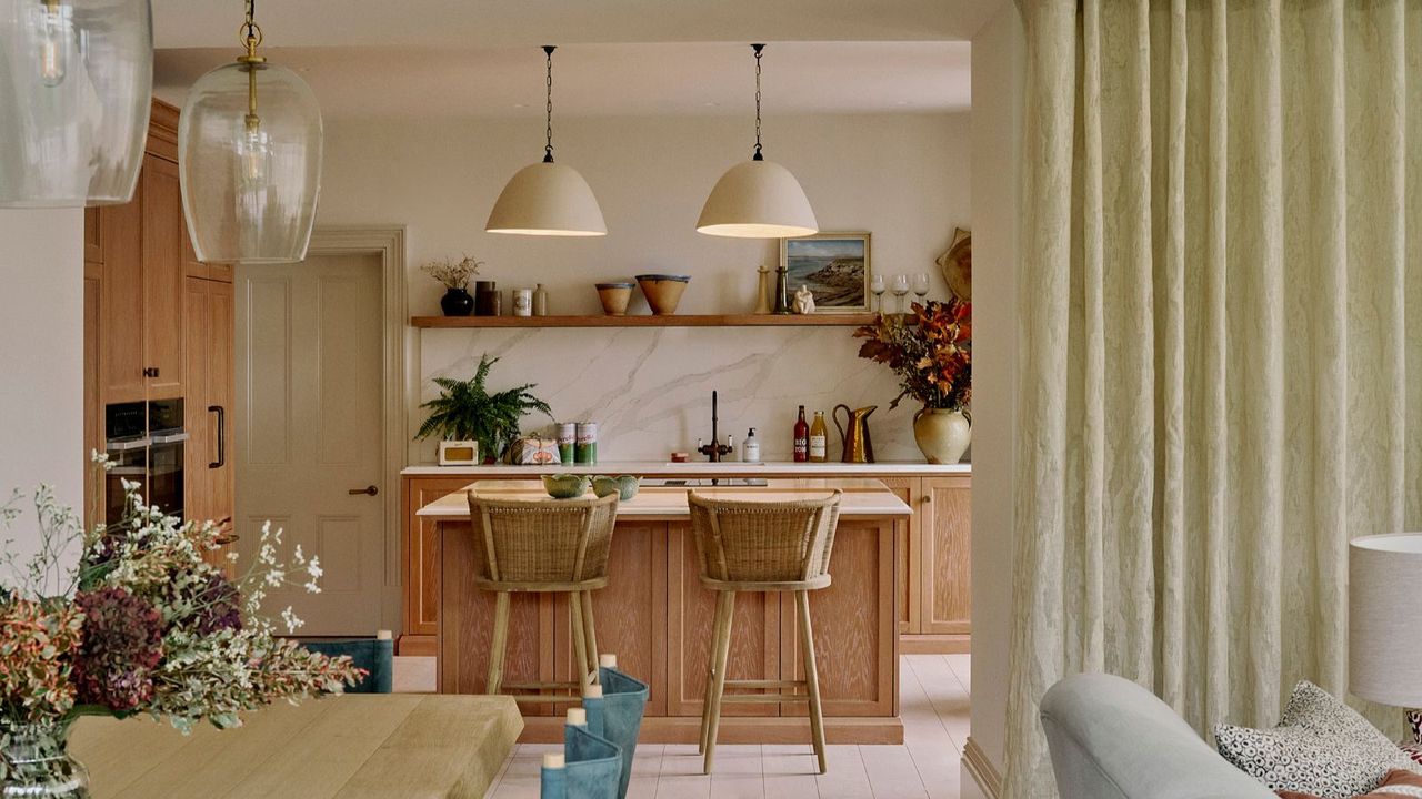
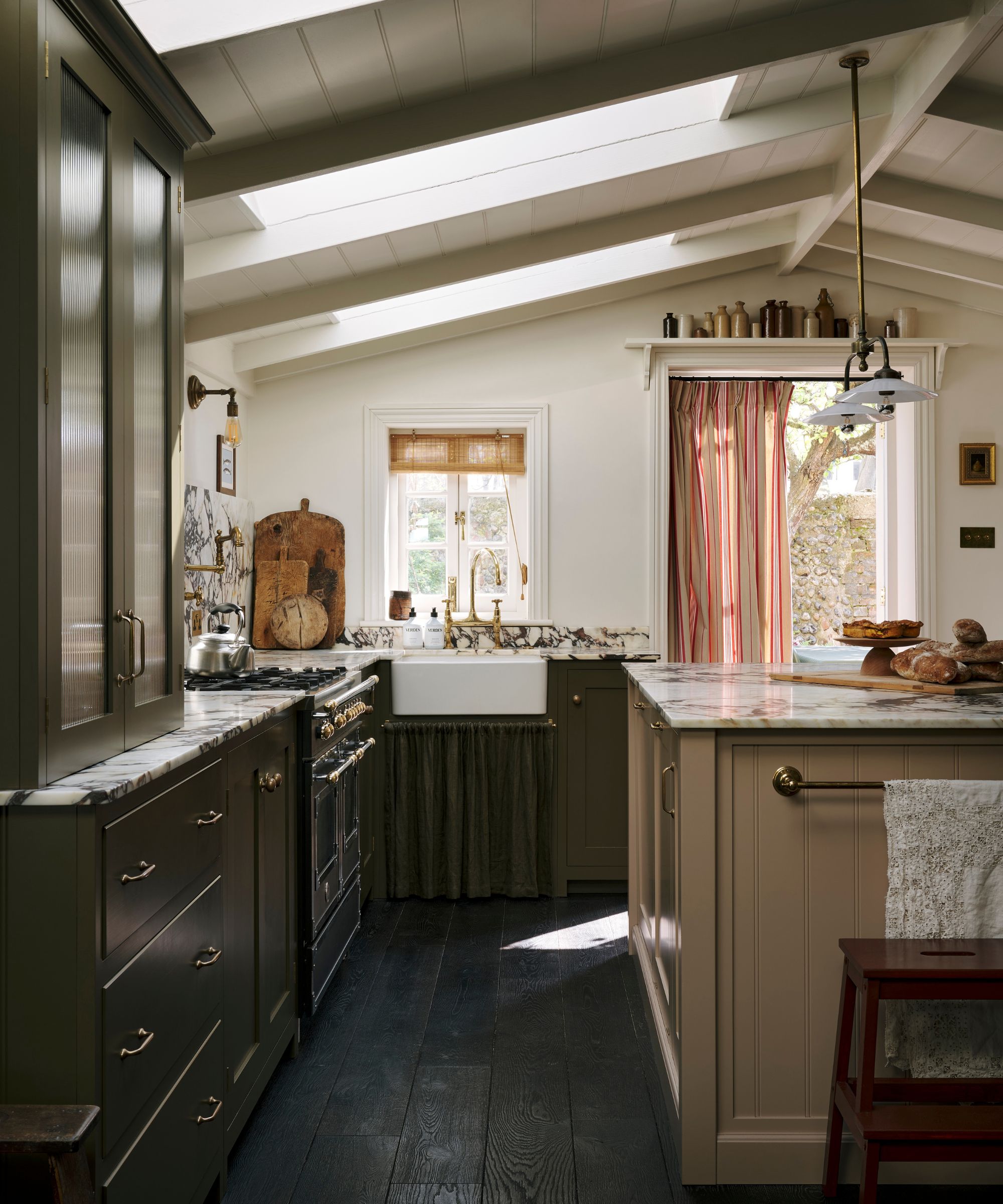
Instead, designers are favoring something simpler and refined, classic yet natural. From wood finishes to earth-inspired hues, these finishes inspired by nature prove to be endlessly timeless – something almost everyone is craving right now.
'It feels as though clients are really looking for kitchens that feel timeless, tactile, and connected to nature. Surfaces with depth and patina simply age better than high-gloss trend colors. The kitchens that feel most current are layered with wood, stone, and natural color families rather than loud color moments. And I do think this really will stand to be timeless as it makes room for other, smaller updates over time,' says Natalie.
'Sage greens and warm terracotta feel grounded and organic, not trendy, as are natural browns ranging from burnt amber to saffron and even mustard. Italianate influences with earthy clay tones, warm creams, and soft stone hues feel collected instead of over-designed,' she suggests as alternatives.
It's always handy to have matches in the kitchen, but who says they need to be boring? This charming design hits the trend for organic, terracotta hues, but in a pretty-meets-practical way.
If you prefer something more colorful, sage green is another great option suggested by designers. These pasta bowls are a playful choice, adding subtle sage stripes along the wavy edge.
Wood in the kitchen is a classic, and adding accents in a white kitchen makes all the difference. This trio of serving bowls is handy for hosting and looks so chic on display in your kitchen.
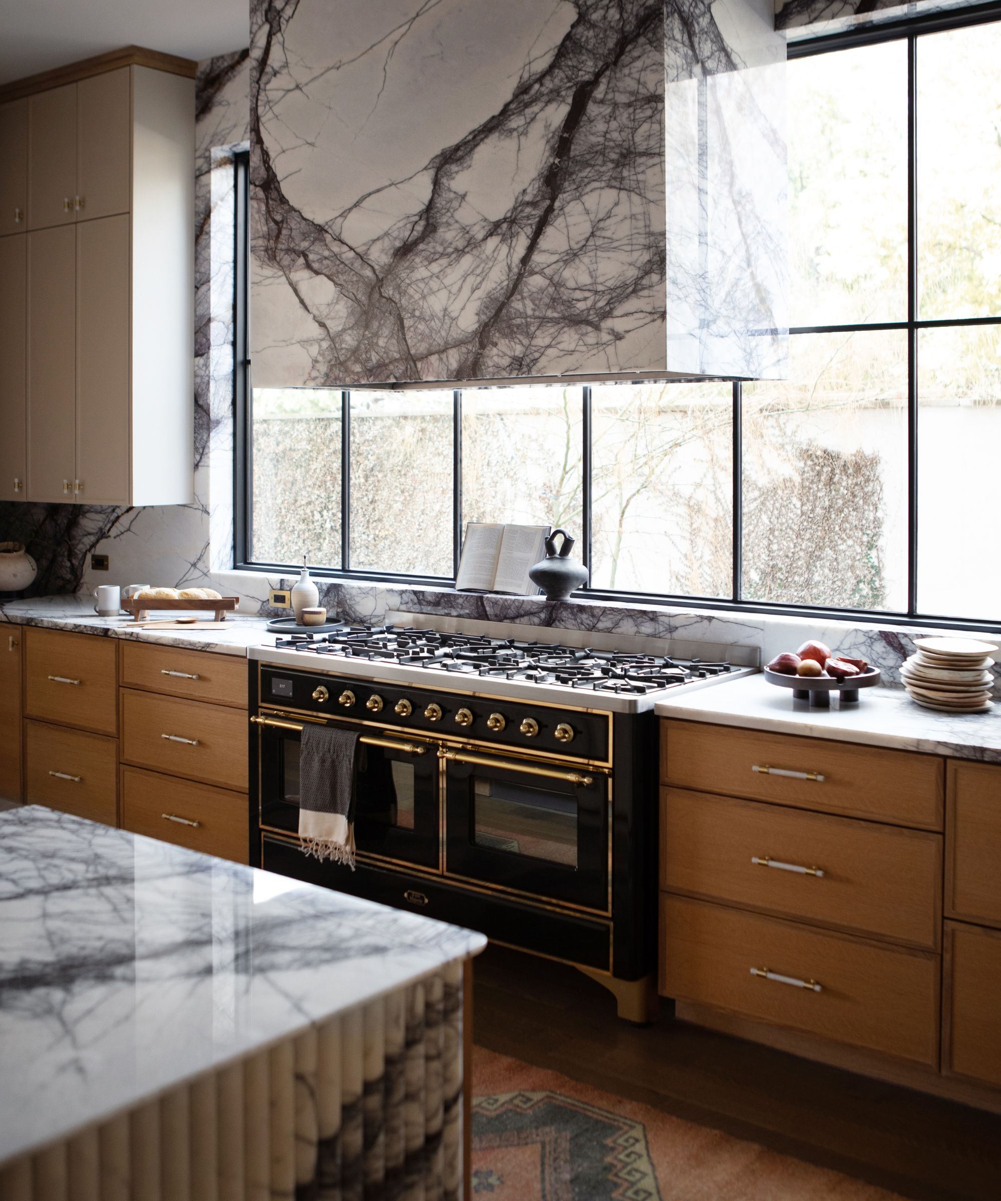
2. Deep Navy Tones
Blue and white is widely considered one of the most classic color palettes, from fashion to interiors. And while it's a pairing that will always have a place in our homes, a navy-dominated kitchen is starting to feel less desirable due to overuse.
'As we head into 2026, navy kitchens are starting to feel a little dated. It can sometimes feel heavy and overused, and no longer gives the warmth or personality that people increasingly seek in their homes,' explains interior designer Lauren Gilberthorpe.
'Instead, I would suggest bringing in tones that feel connected to nature and the garden beyond the kitchen window. Chocolate browns, fresh greens, and terracotta all work beautifully and give a sense of warmth and life,' she suggests.
If you want to introduce more contrast to your kitchen, she also recommends a mix of natural wood cabinetry and a painted island, or vice versa, which instantly creates a more grounded color palette that feels a bit more considered.
'Using materials such as oak allows flexibility, as cabinets can be lightly sanded and repainted when the mood changes, ensuring the kitchen evolves with the home. Choosing colors and materials in this way creates spaces that feel grounded, layered, and welcoming rather than cold or formulaic,' she adds.
Chocolate browns add a moody air to kitchens, and this marble board is a chic way to introduce it. A chic alternative to navy blue accessories, it adds a touch of luxury to your kitchen countertops
Bring in warm brown tones through your cookware with this 7-piece ceramic, non-stick set. Displayed on your cooktop when not in use, it brings a more characterful detail to a kitchen.
Painting your cabinetry isn't the only way to add trending hues. This rich brown serving bowl is a chic alternative to a normal fruit bowl, perfect for displaying on your kitchen island.
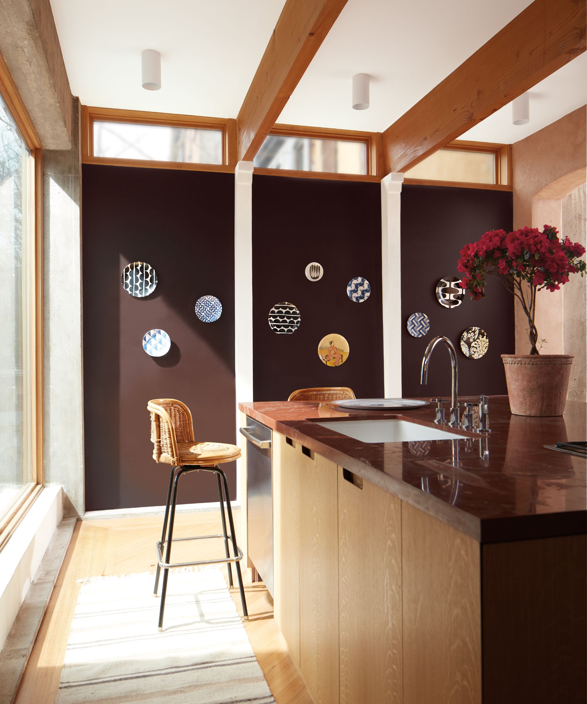
3. Stark Neutrals
This one probably comes as no surprise. Despite Pantone's Color of the Year 2026 being a nuanced shade of white, it's still a color designers aren't gravitating towards in the kitchen. In fact, any stark neutral hues are out.
'Colors like bright white and cool gray are popular neutrals, but they tend to make a kitchen look sterile and a bit harsh. These colors can fall flat, especially if there’s a lack of texture and depth throughout the room to infuse visual interest,' says interior designer Kathy Kuo.
The emphasis here is that stark shades that cover the whole kitchen feel dated. As Chad Hogan of Chandler Farms notes, 'all white kitchens are over. White can feel clean and modern, but can also be a default option when you’re scared of color or texture.'
So, what's the alternative? 'Consider using warm hues like a soft cream or an off-white with subtle beige undertones to create an atmosphere that’s inviting and cozy. I also adore kitchens in earthy, mid-toned greens for a design that feels grounded, serene, and timeless. Pair these paint colors with rich brown wood and aged brass finishes to inspire a classic, enduring look with a heritage feel,' Kathy suggests.
And if you want to spruce up an all-white design, there are plenty of colors and finishes you can add for warmth and contrast. 'I have personally been loving the return to wood textures and real wood cabinetry with pops of color that complement the wood and counters. Faucets, appliances, power outlets, and pendant lights are a great way to bring color into your kitchen without painting anything,' adds Chad.
Window treatments in warmer tones are a great option to replace stark white curtains. This beige linen cafe curtain is a charming choice, adding warmth, texture, and privacy in one.
Those earthy green tones that Kathy mentioned are a big trend of 2026, and an elevated oil cruet like this design is a fun way to introduce it. It adds a fun decorative detail, too.
Aged brass brings a vintage feel to neutral kitchens, and hardware is a great place to start. Pottery Barn offers this classic bar pull in an aged finish, perfect for adding texture to your space.
While there is a time and a place for all of these colors, in 2026, your kitchen is not one of them. Tastes are shifting towards warmer, softer, more characterful designs, and the color you choose is key to this. Whether you embrace wood, warm neutrals, or rich, earth tones, heed this designer-approved advice for chic alternatives to dated kitchen color trends.