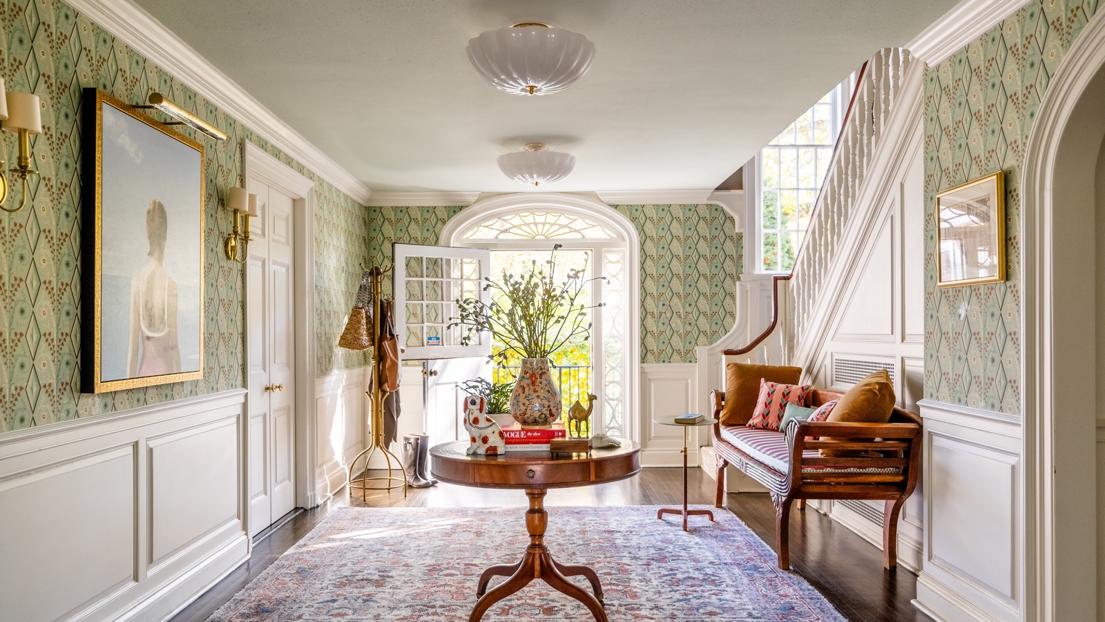
There’s very little else as satisfying as finding a wallpaper you love. It can feel like being a kid in a candy shop, gazing wide-eyed at the sherberts and bonbons, except now they’re replaced with florals and stripes, damask and grasscloth.
When you’re considering different wallpaper ideas for a particular space, the most key decision is that you want something timeless, something you won't tire of in the years to come.
Here, we ask top interior designers which wallpaper prints they never tire of. What are the patterns that never fail to deliver, and how do they, among the vast array of choice, pick a design that will outlast wallpaper trends and avoid the dreaded pattern fatigue?
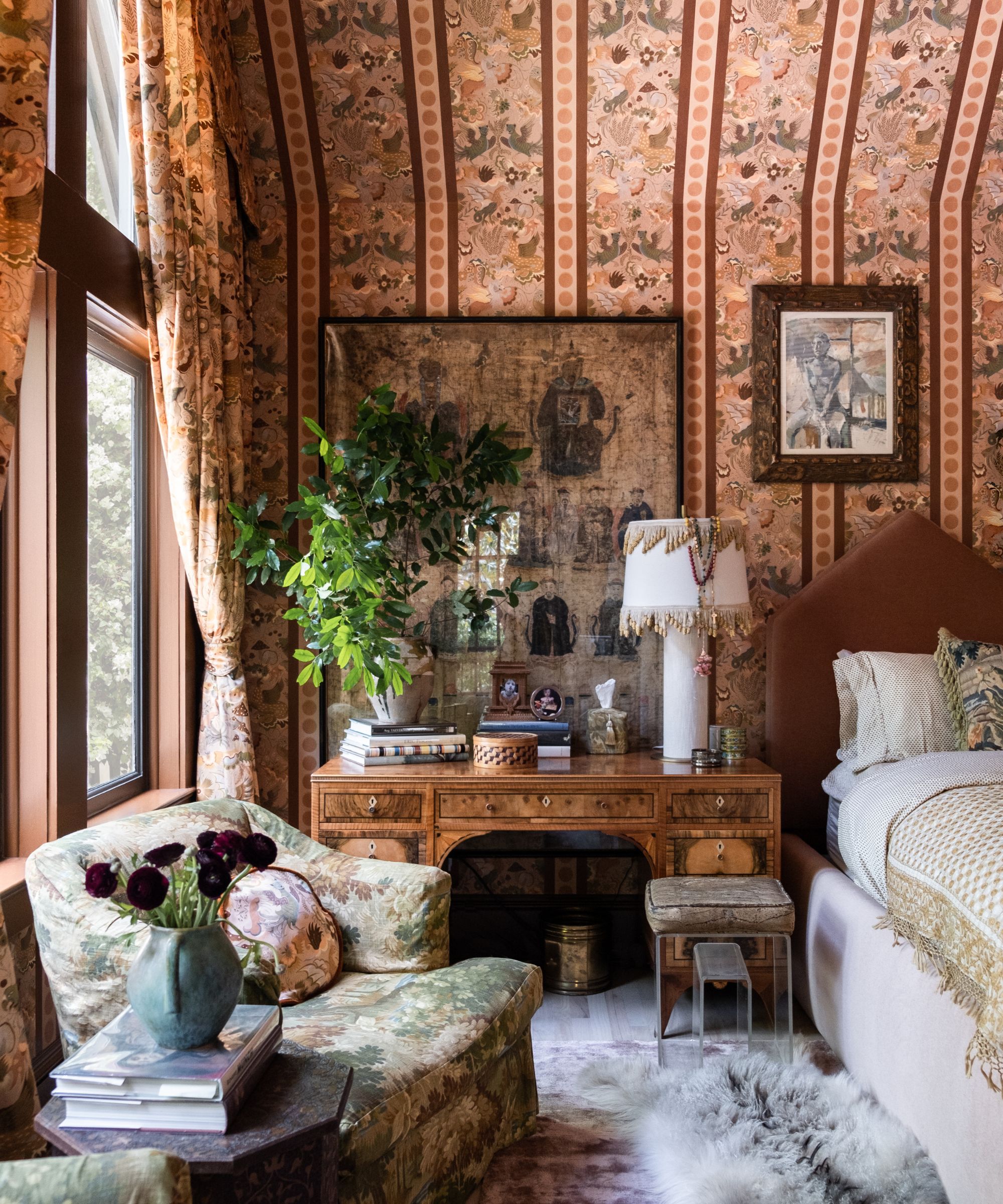
Wallpaper decision fatigue can be as frustrating as it is wearing. It's further pressure to consider if your favorite wallpaper will feel in years to come, after having your walls expensively repapered, what if you tire of the pattern you once adored?
'Wallpaper designs can inject color, pattern, and interest into a scheme. But you do need to choose carefully, as you don't want to tire whatever is adorning your walls!' says interior designer Fiona Duke
'Timeless designs that mirror your style are likely to work better than following the latest interior design trends. Think about what you will be using the space for and what scale of design will work best. If you are thinking of making more of a statement and want to be a bit more daring, being mindful of the space's function will help to prevent any wallpaper pattern fatigue.'
So here are three wallpaper styles top interior designers say will defy trends:
1. Ditsy florals
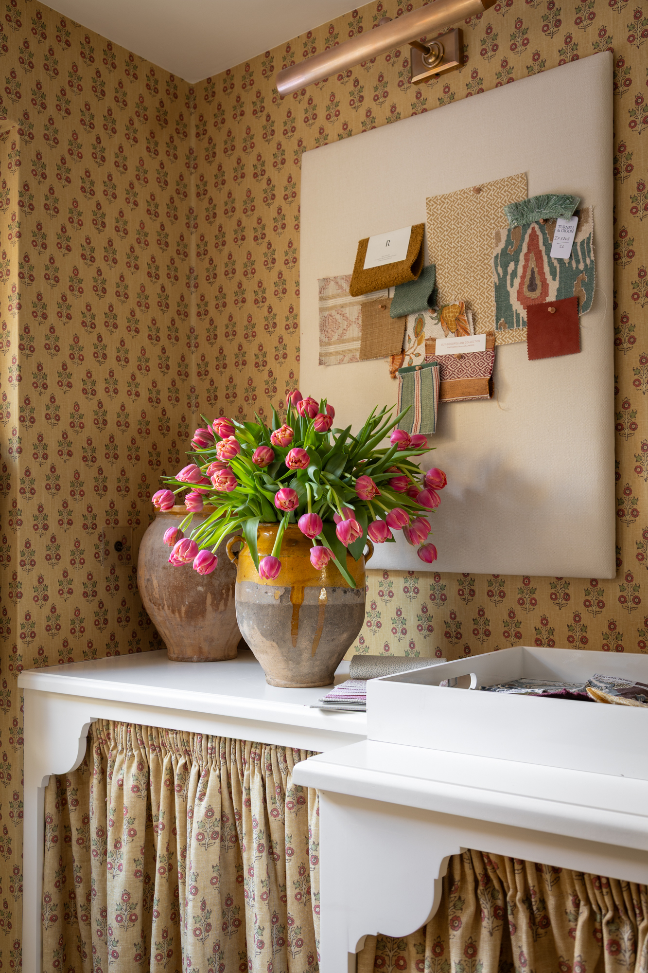
‘It’s so hard to pick my favorite wallpaper ever, but I always gravitate towards ditsy small-scale prints,’ explains interior designer Sean Symington.
‘There is something about them that adds a subtle touch of depth to any space. Currently, I’m obsessed with the Poppy Sprig wallpaper from GP&J Baker. So much so, we wrapped my entire studio office space in this! It has such a lovely warmth and texture, and three different colors incorporated, which makes it so much easier to dot those colors around the space in different ways, making for a holistic scheme.’
‘Wallpaper can be such a fun incorporation into any room, so my top tip, first and foremost, is to go bold and have fun with it!' Sean advises
'Getting the scale of the wallpaper print is the next most important thing; if a scale is not right for the space, it may have the opposite effect on how you want to accentuate the room. Then, pick a design that has color dimension to it, that’s really how to make something timeless and not tire of it.'
'This way, the wallpaper becomes more of a backdrop, quietly tying the room together rather than dominating and being the main focal point, allowing your interior choices to evolve around it and shift the mood of the space over time.’
An utterly classic floral motif that will always look beautiful in any season, in any year. The depth this colorway and motif adds to a room is quite extraordinary and can make an icy cold room feel much toastier and cozier almost instantly.
A maximalist's heaven, everything House of Hackney produces is timeless with a rock 'n' roll edge. Their Hollyhocks floral wallpaper is a favorite from this season's range: retro-inspired and wistfully nostalgic yet perfectly judged for mid-century modern, traditional, or contemporary homes.
There is perhaps nothing as beautiful as fabric wallpaper. This stunning saffron fabric by the talented Bunny Williams is inspired by an almost-but-not-quite naive vintage embroidered textile she stumbled upon, this iteration is in the most beautifully warming turmeric hue.
2. Small scale geometric prints
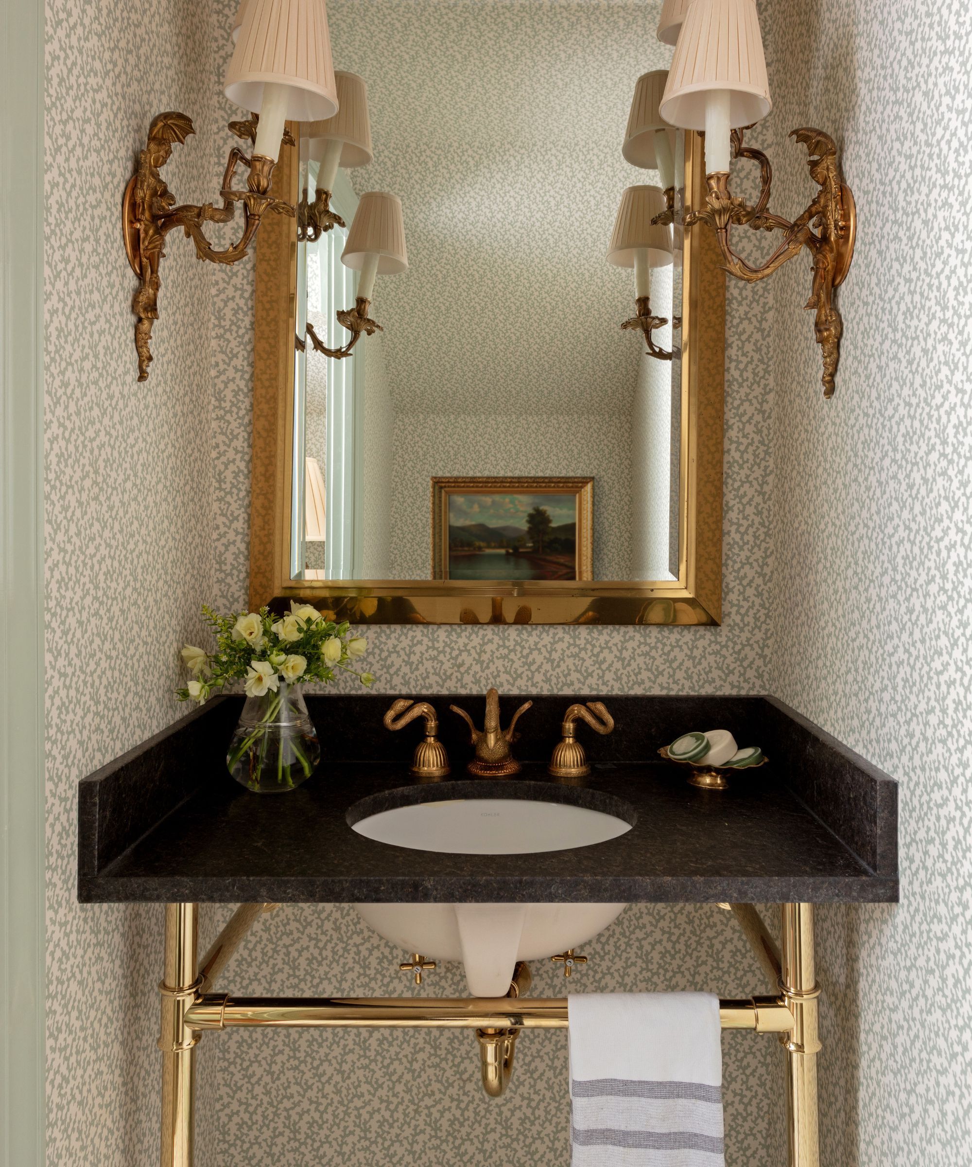
Tennessee-based interior designer Jen Bienvenu also thinks you can't go wrong with small-scale prints, but her preference is more abstract.
'Veere Grenney’s Folly wallpaper for Schumacher is right up there with my favorite wallpapers,' says Jen. 'Chintz and floral patterns follow a cyclical cycle of falling in and out of fashion, but Grenney’s Folly pattern has real staying power.'
'Reminiscent of coral, it’s one of my favorites because of its versatility. It feels at home in both large and small application settings. It can read geometric or floral based on its movement. And depending on the colorway, it can read coastal or find itself at home applied to the walls of a cabin in the woods.'
'When I study this paper, I’m unsure of what organic shapes I’m staring at. Is it more sea-like or twig-like? Either way, it has that mysterious quality that draws us into our appreciation for the world.'
London-based fabric and wallpaper brand, Ottoline, is one of the most distinguished and recognizable wallpaper brands. The wallpaper designs range from a riot of chintz to more playful schemes. This 'Madame Ziggle' wallpaper is one of the most coveted designs of the season.
A beautiful, classic design by Serena & Lily featuring large artichoke motifs on a bright green background. It's a classic antique English motif awakened by modern color. It is available in three colorways, including navy and cream, but the bright and bold green is certainly our favorite!
Ocean fragments wind and wander in this dainty and oh-so pretty wallpaper pattern. The color is gentle and cooling, so it befits coastal homes as you might expect. Despite being a busy pattern, it does not feel jarring or heady, but soothing and hushed instead.
3. Classic stripes
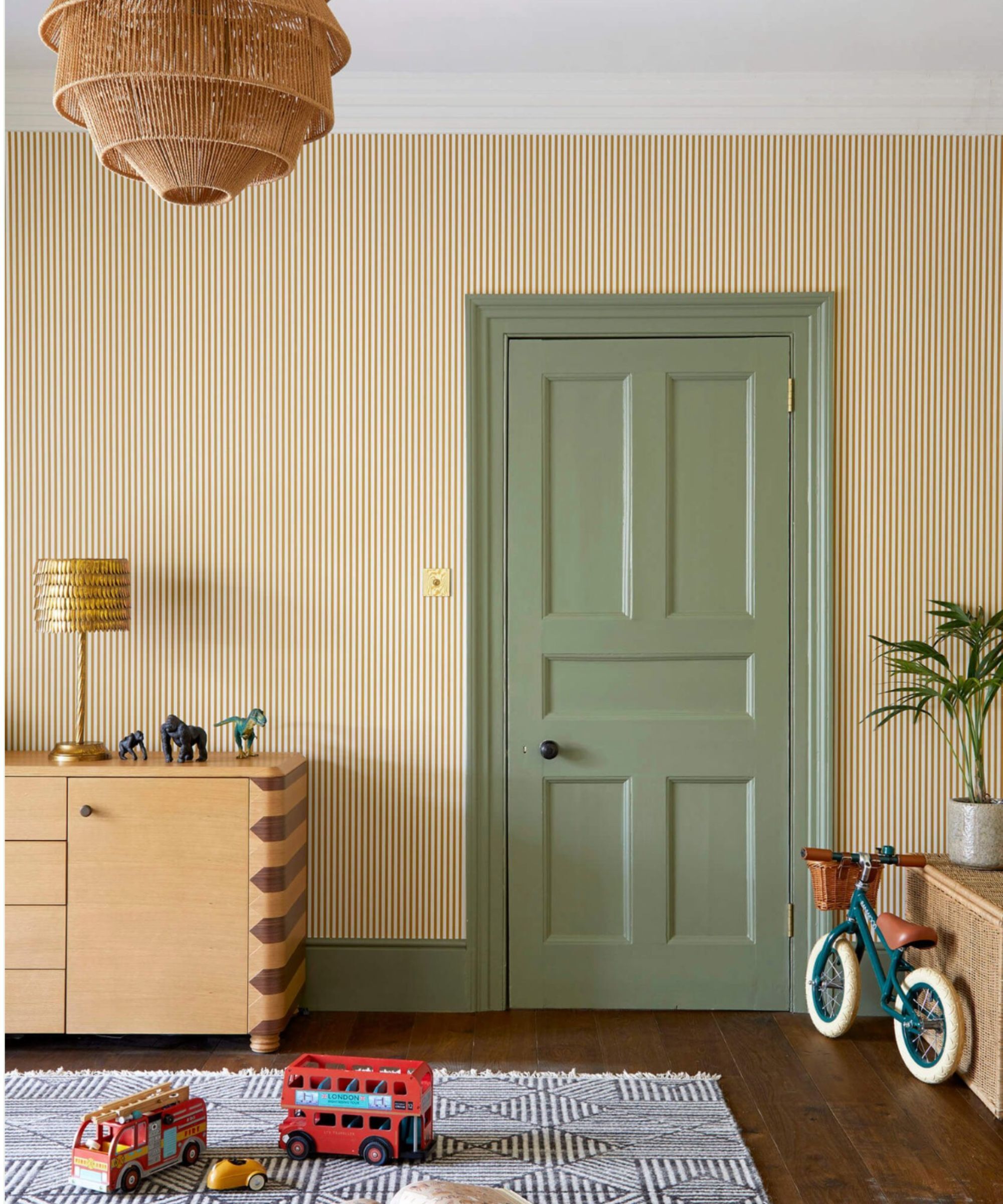
'I never tire of decorating with stripes,' says Fiona Duke. 'And the Estelle wallpaper by Sandberg wallpaper brings vibrancy and happiness in abundance. The striking design is bold and brave, yet also able to blend into the backdrop of a room design. It's very adaptable and feels super classic too.'
‘If you are going to opt for striped wallpaper, I prefer wrapping it around a whole room. It shows you've committed to the design and are being purposeful with the placement,' she adds.
'If it's for a bedroom, then you need to be mindful of the overall impression this will give. Opt for small-scale designs and softer color tones, as you don't want it to feel too overpowering. However, if you're installing in a space such as a powder room, then fewer rules apply and you can afford to go big and bold. Make a statement. Get people talking. Create a buzz around this room!'
The classic stripe in a beautifully rich, verdant green. It's a classic style for very good reason. Always tasteful and never too much or too little.
If you adore stripes but want something a little more relaxed and laidback, this stripe will deliver the desired effect. It's bold enough to bring visual impact to the room, all while reflecting an aesthetic grounded in organic appeal.
Not all stripes were created equal. On first glance, stripes can look similar, but look again and you will see the unique pattern can be very different from wallpaper to wallpaper. This stripe has some irregularity to it, which can make the repetitive pattern a little softer on the eye.
If you're on the hunt for the best wallpaper for your space, these designers have plenty of inspiration to offer. It's worth keeping your finger on the pulse with current trends, but on the whole, trends come and go, so take inspiration from these experts' advice and put your personal preference first, choosing prints you know you will never tire of.


