Classic color palettes transcend trends. They’re the sort of colors that evoke a sense of familiarity, permanence, and quiet elegance. They’re versatile enough to adapt to different styles, yet grounded enough to reach far beyond generations and trends.
Picture a warm ivory wall, layered with a sage green accent chair and dark wooden furniture. While classic color palettes remain familiar across spaces, the nuances of how they're used help them ebb and flow with ever-changing contemporary design — and that quiet adaptability is exactly what keeps these colors a classic choice.
Where color trends typically favor bold, playful shades that reflect the immediate zeitgeist, classic color palettes go hand-in-hand with an effortless sense of timelessness. To curate a classic home, you simply need to know the combinations to use, and for that, I've asked interior designers to share the most classic.
What are Classic Colors?
Classic colors belong to a category that rarely changes; they're timeless colors. "Classic color palettes don’t scream, they whisper with confidence, and are rooted in nature, memory, and really good taste," says Andrew Bowen, designer and co-founder of ASH Staging NYC.
Chances are you already know these colors. Shades that stay classic are typically grounded neutrals with depth; for example, bone white, camel, navy, and charcoal. These colors feel effortless and work with a wide range of materials and styles.
"Classic colors have presence without overpowering a space, which is what allows them to remain timeless," explains interior designer Lauren Saab, the founder of Saab Studios, a Dallas design studio.
"What shifts over the years in classic color palettes are small details, like the temperature," she adds. "Cool tones like gray and crisp white were dominant for years, but now warmer tones like taupe sand and brown are taking the lead."
These changes happen slowly, but the role of classic color palettes remains the same: to bring an anchoring calm and to make it feel grounded and reliable without feeling static.
In other words, "The vibe shifts, but the soul stays," says Andrew. "Yesterday’s oxblood is today’s chocolate. Classic doesn’t mean unchanged — it means unfazed."
Examples of Classic Color Palettes
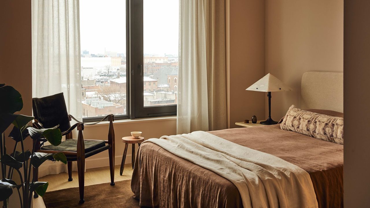
1. Bone, Camel, and Espresso
The classic color palettes conversation wouldn't be complete without mentioning neutral paint colors. It should come as no surprise that a sleek combination of browns, tan, and beiges is first on the list.
Lauren specifically highlights bone, camel, and espresso as a warm and inviting classic color palette to start with. "These colors create a trio that feels grounded and composed," she explains. "The mix is warm without tipping into heaviness."
Interior designer, Regan Billingsley, further describes this palette as, "Neutrals with depth, like ivory, chocolate browns, and caramel. They are layered in tone but subtle in presence."
And though a room full of neutrals may seem quite minimalist, a classic white can take on new character depending on its application. You can elevate the classic with a limewash paint or DIY bas relief. "A high-gloss millwork or velvety matte walls also does the trick," adds Regan.
This classic color palette is about letting texture talk. "Linen, leather, wool, wood — mix them like a cocktail," adds Andrew Bowen. "Keep it simple, but never flat. The palette should feel lived-in, not looked-at."
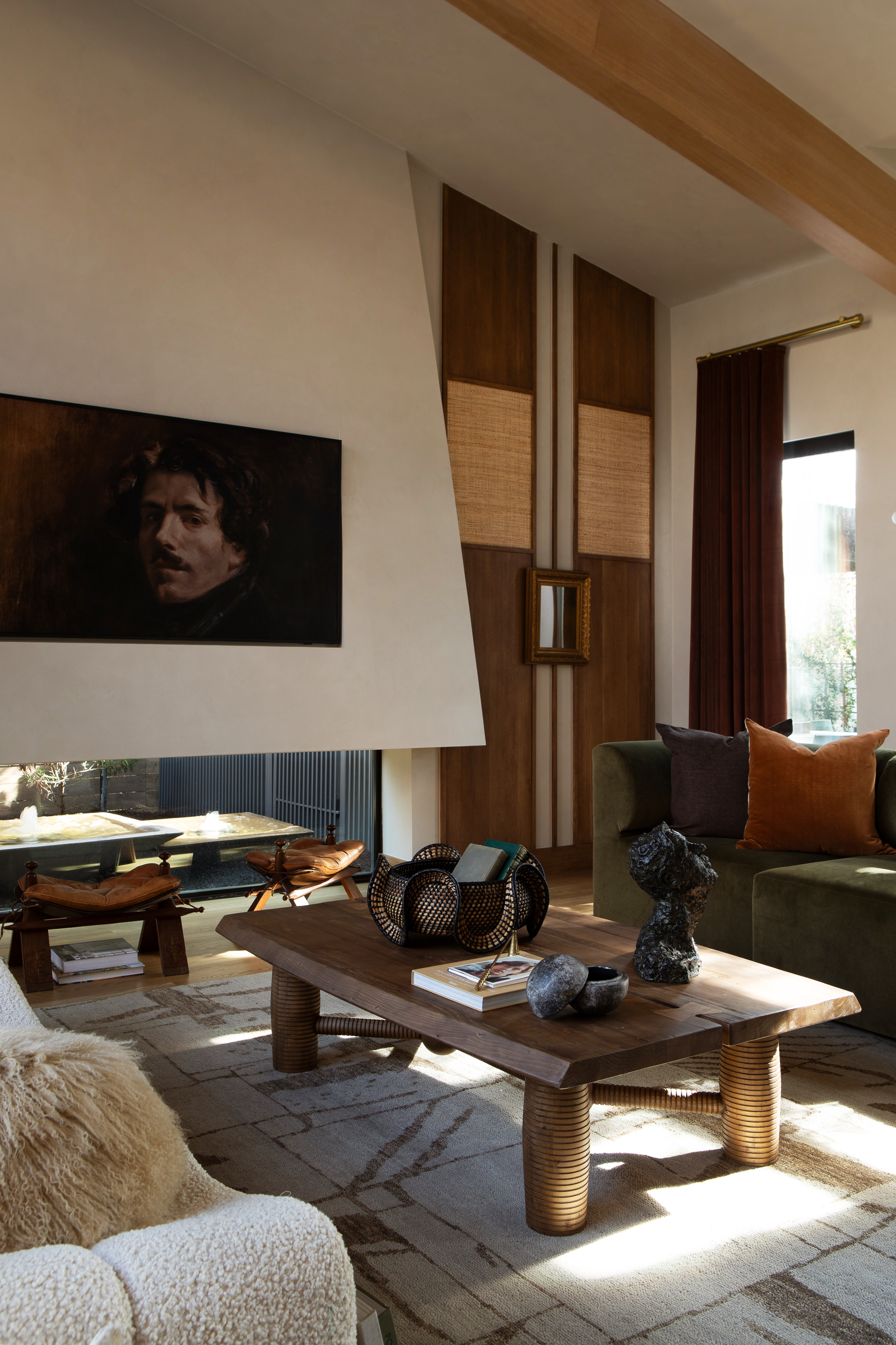
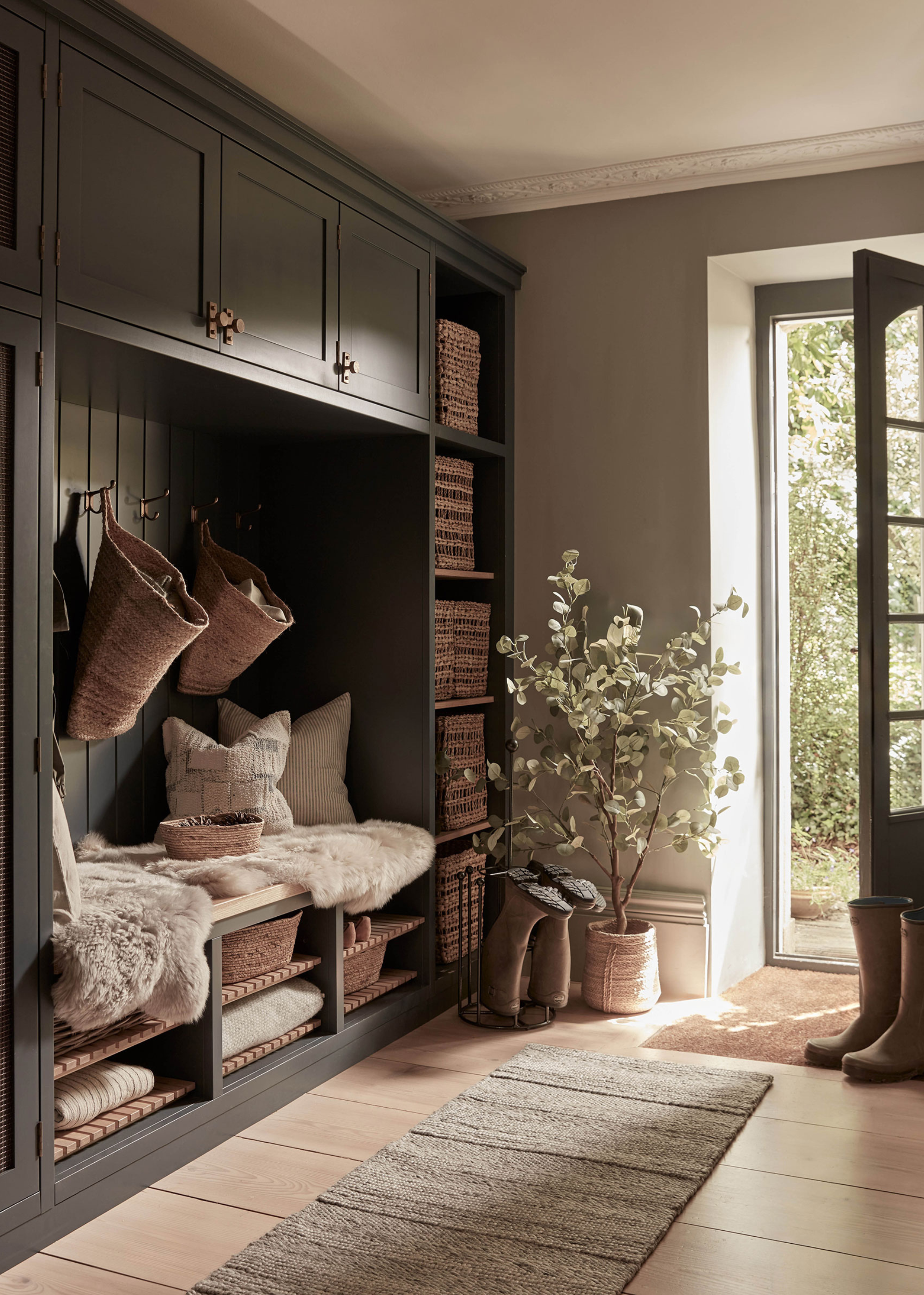
2. Ivory, Sage, and Blackened Bronze

For another option, Lauren says, "Ivory, sage, and blackened bronze is a classic color palette that stays subtle yet never dull." When paired together, these three hues have a gentle contrast that reads as refined.
Soft ivory is a layered neutral with warmth and texture, while charcoal and warm blacks are quietly dramatic and architectural, making this classic color palette a great base for layering.
"The sage green provides a craftily colorful canvas that allows you to incorporate meaningful objects, handcrafted textures, and personal color moments — whether it’s a vintage ivory textile, an inherited piece of art, or a metallic finish," adds Regan.
And you don't have to be confined to sage green; other green colors, like olive green and moss, will bring the outside in and age gracefully.
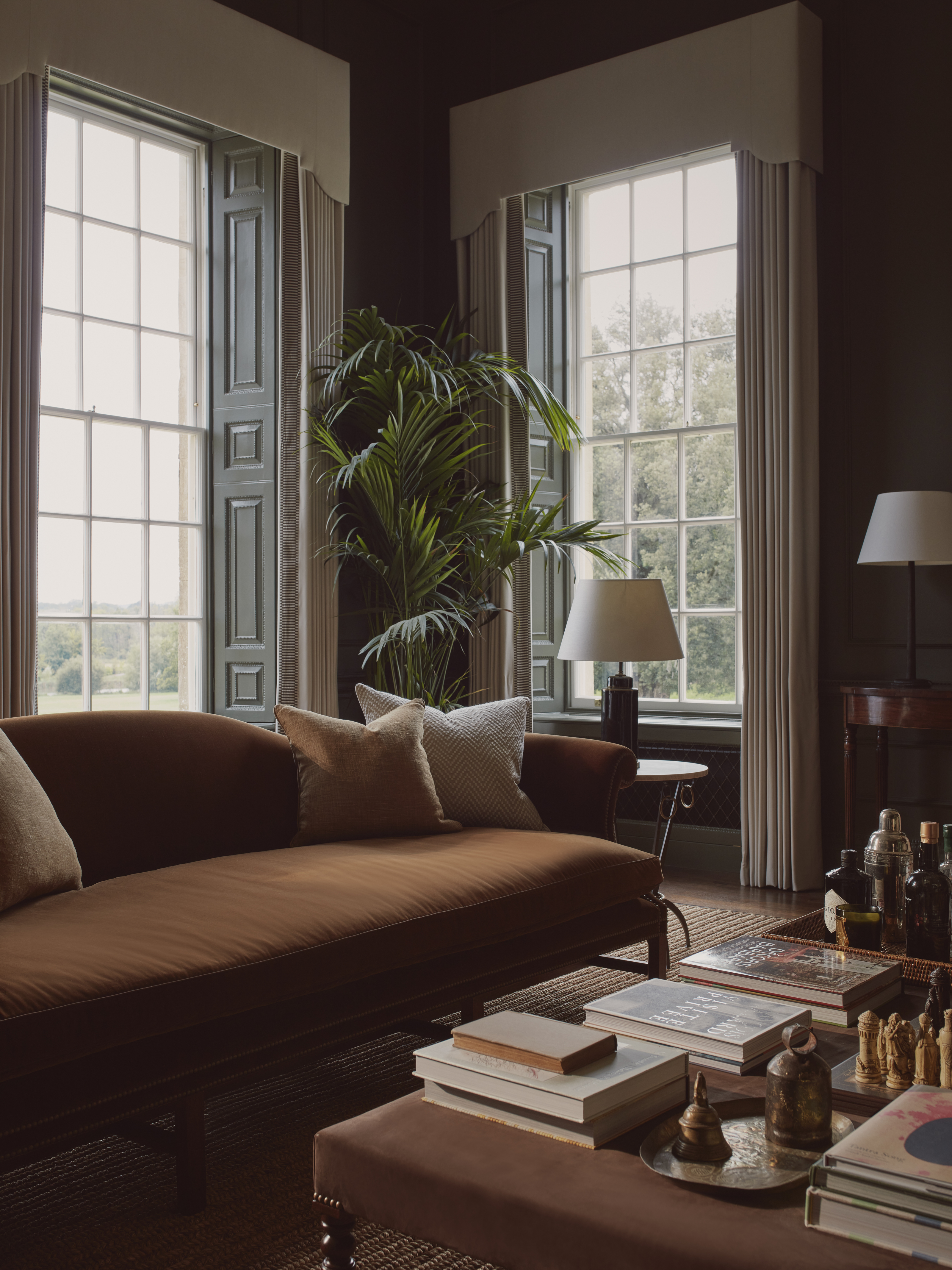
3. Stone Gray, Charcoal, and White Oak
And last but certainly not least, a calming mix of grays and whites will lead you to the ultimate classic color palette. "Stone gray, charcoal, and white oak always land on the tailored side," says Lauren. "Something about this combination feels clean, balanced, and effortlessly refined."
While gray is considered by many to be a color trend going out of style in 2025, Regan notes that, "When thoughtfully integrated, these palettes become part of the architecture — not just the decor — and can evolve alongside the people who live with them."
For instance, a chalky white makes the perfect backdrop to let craftsmanship speak. Just remember that with such a neutral and cool-leaning palette, it's extra important to find balance in your interior design, through aspects like warm and cool tones, matte and gloss, light and shadow, and textured and smooth surfaces. This will ensure your gray feels fashionable, rather than flat.
The most important thing when working with classic colors is to commit to a tight palette and repeat with intention. Use the same two or three shades consistently across the space, not just in paint but in materials and finishes, too.
"Let the tone of oak floors reappear in wood furniture or open shelving," says Lauren. "Let bronze show up in hardware and lighting. Keep contrast subtle by leaning on texture instead of adding more color."
This kind of restraint creates a space that feels cohesive, considered, and, of course, classic. Which also happens to be the perfect way to coordinate paint colors throughout a house.