Choosing the right bedroom color ideas can feel like opening up an overwhelming can of worms. Scroll long enough, and everything starts to blur.
With so many shades, finishes, and trends in circulation, it’s easy to end up with inspiration that feels disjointed rather than directional. The bedroom ideas that truly work, however, aren’t built around a single color, but a considered scheme.
Rather than offering a scatter of ideas, we’ve brought together the bedroom colors designers rely on – whether you’re designing a calm retreat or something cozier and more enveloping. From soft neutrals to cocooning darks and bolder hues, here, you'll find a shade you’ll want to wake up to every day.
1. Fresh White
This bedroom by beloved interior designer Marie Flanigan proves that decorating with white is anything but plain.
Here, a soft white sets a calm foundation, but it’s the layering and balance between crispness and warmth that gives the room depth. The white bedding keeps things feeling fresh and tailored, while the addition of earthy tones prevents the palette from feeling stark or clinical.
White bedroom ideas should never exist in isolation. Pair it with tactile materials, tonal contrasts, and at least one deeper accent color to ground the look.
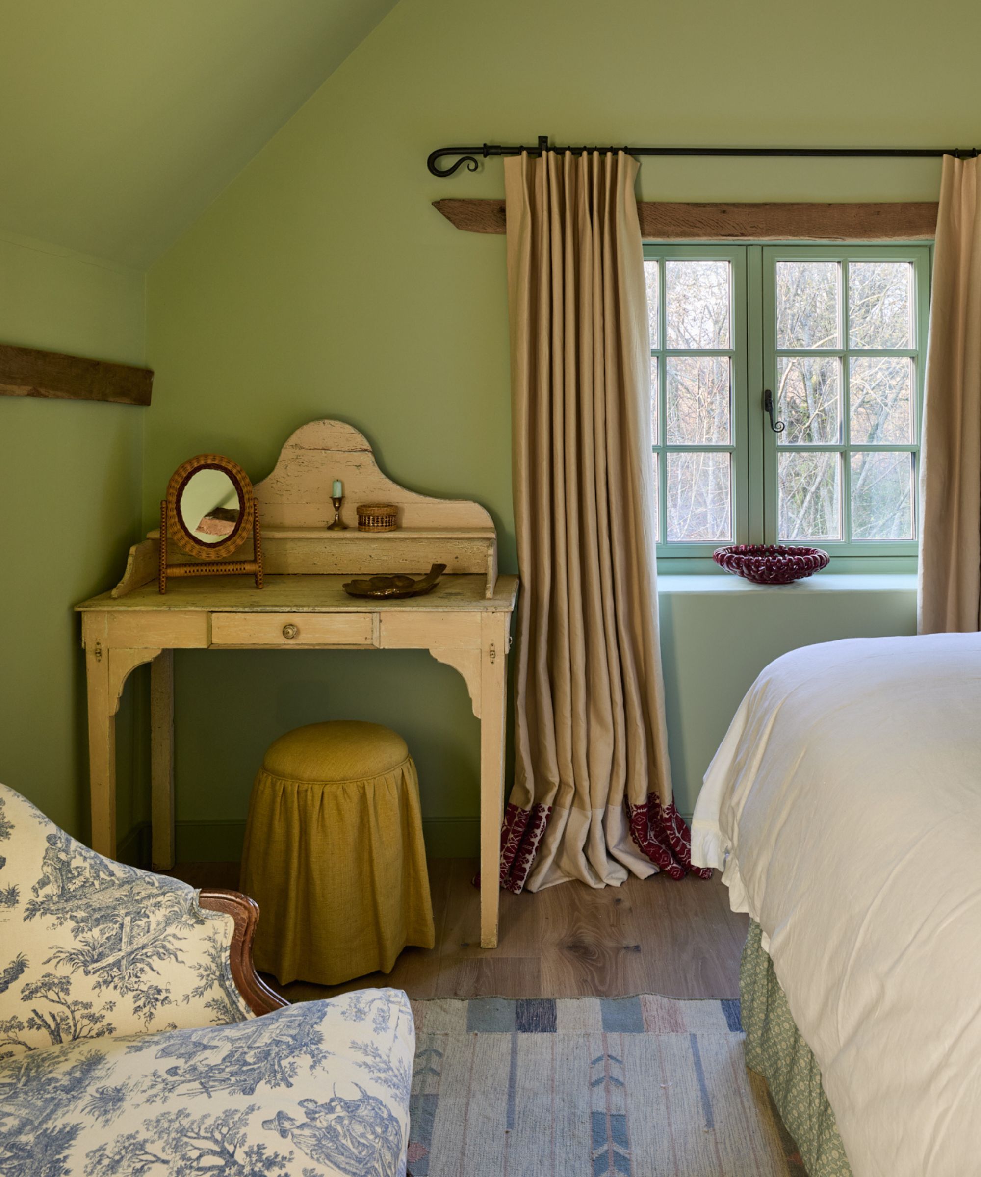
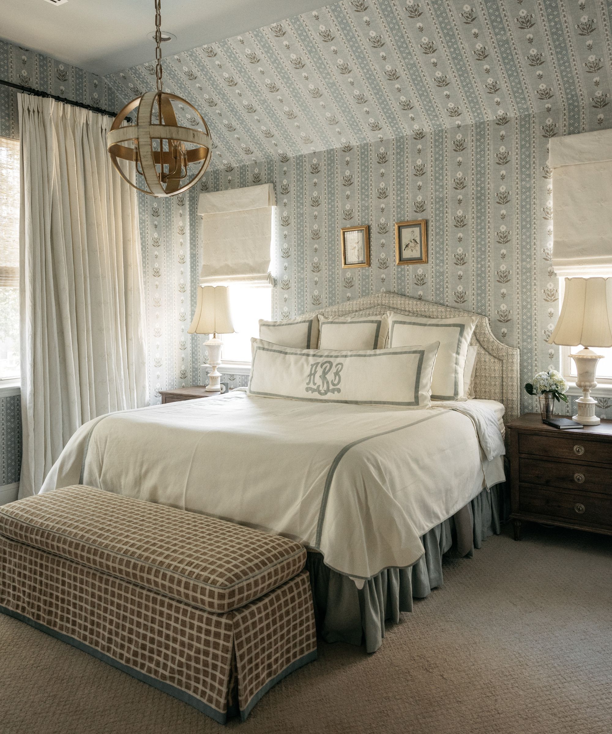
2. Warm Neutral
If white feels a little too crisp, the bedroom in this renovation of an old Victorian house offers a softer alternative. Painted in Farrow & Ball’s Dimity, the walls read as a barely-there taupe with the gentlest hint of warmth.
What works so well here is how the color supports – rather than competes with – the rest of the scheme. The upholstered headboard and textiles introduce pattern and movement, while the deep red painted furniture and wooden desk bring in slightly earthier tones that anchor the palette.
Dimity’s gentle red undertones mean it pairs particularly well with this warmer scheme, which is the key to picking your warm white well – understanding the undertones and layering the rest of the scheme with accents to suit.
3. Moody Plastered Walls
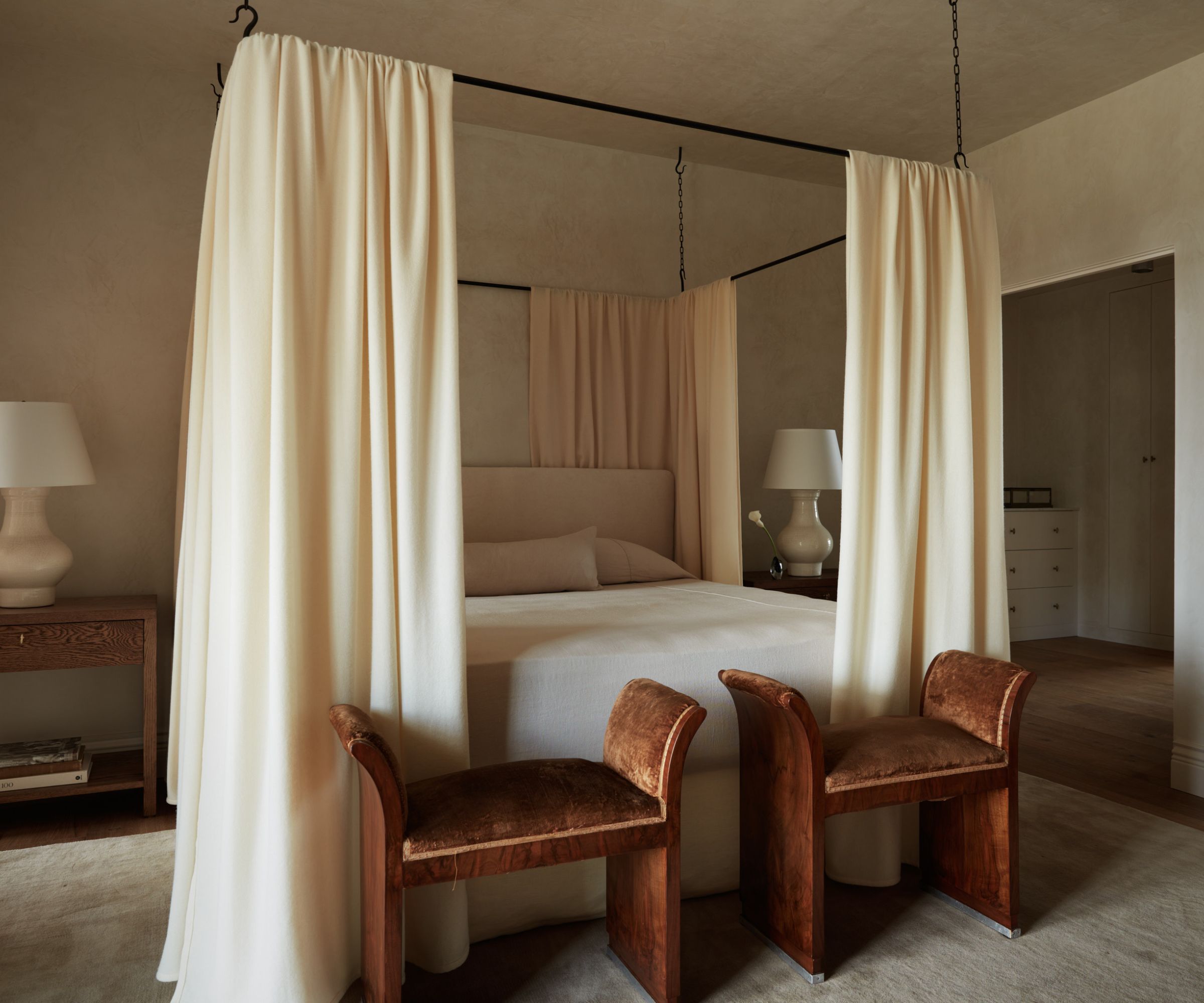
If ever there were a case for decorating with neutral bedroom ideas, this bedroom in Molly Kidd's characterful remodel shows just how elevated it can feel when handled with intention.
Rather than relying on flat paint, the walls here are finished in plaster. ‘We did all the walls in plaster, and that creamy texture and movement that it has adds so much depth and richness,' Molly explains of the backdrop.
Everything sits within the same tonal family here, from the flowing drapery to the stools, but nothing feels flat. The element of symmetry helps too, ‘I just always want every bedroom to have a feeling of peace and retreat, and the natural order of symmetry really does help achieve that,’ Molly adds.
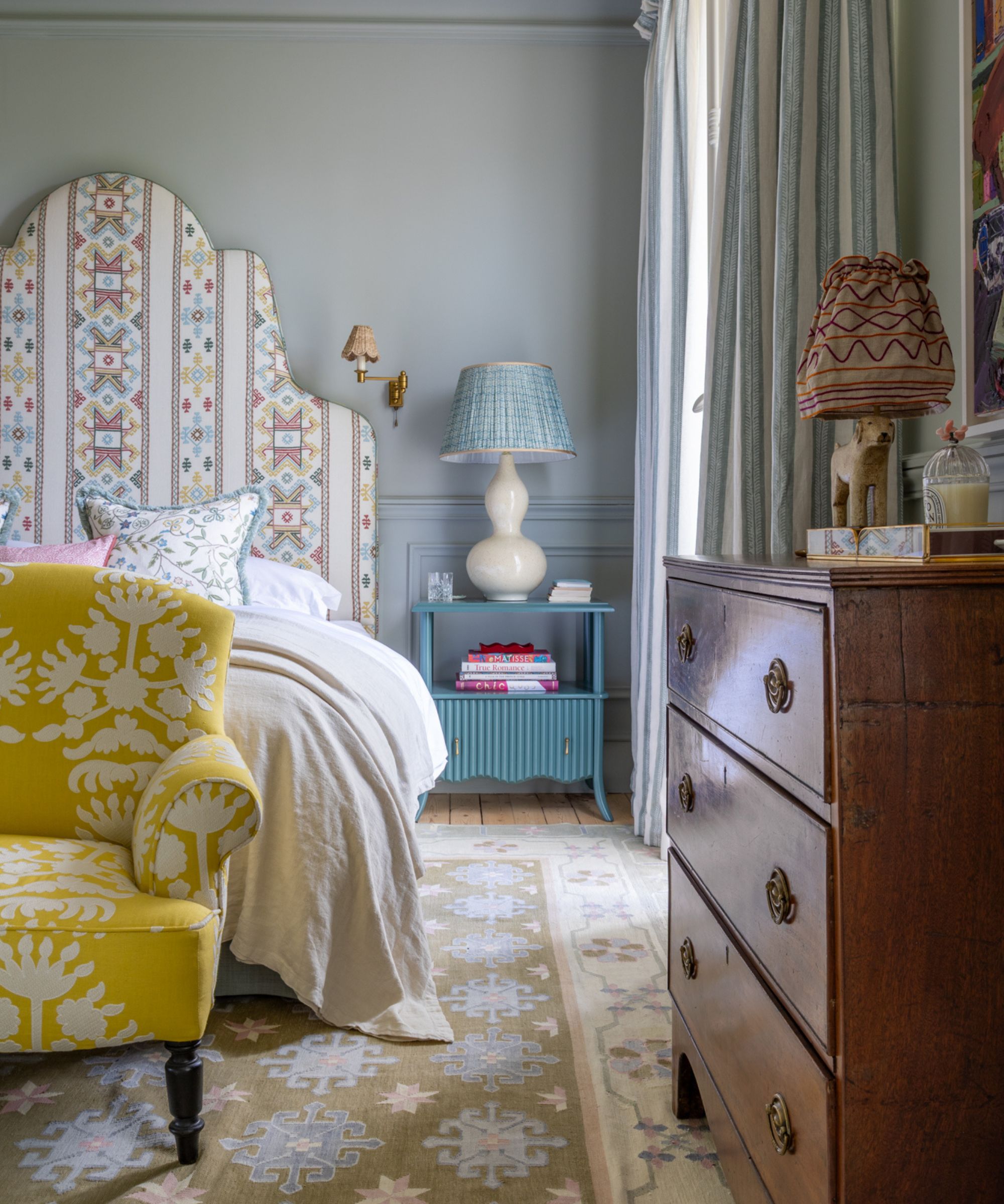
4. Soft Pink Pattern
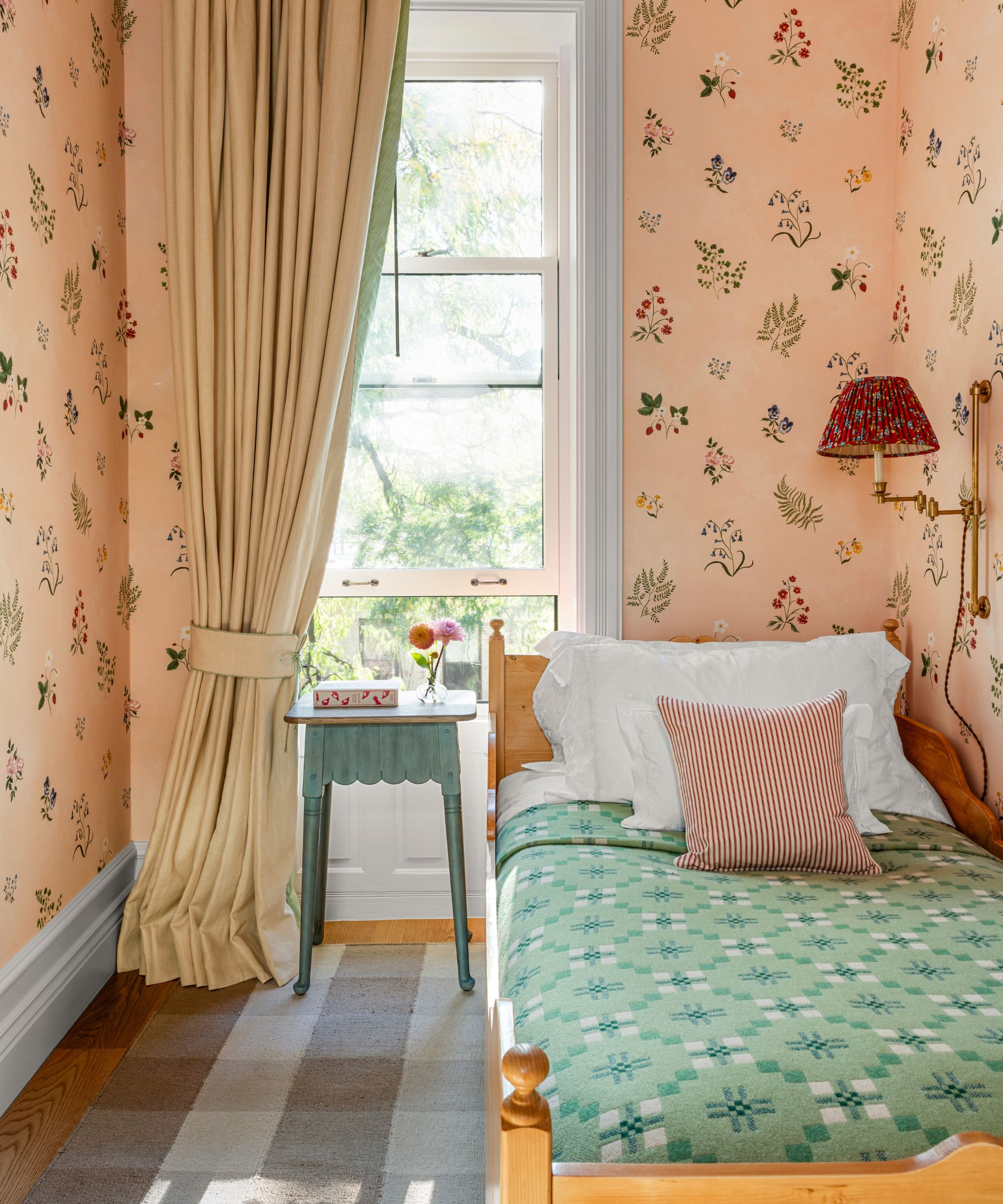
Long gone are the days when pink was just for bedroom ideas for girls. Pink’s comforting qualities make it a perfect pick in a bedroom for all genders, but to make it feel modern, avoid the sugary sorts and opt instead for pinks with brown undertones, from orange-laced terracotta to a natural blush.
This bedroom shows just how sophisticated decorating with pink can be. Tucked away in a New York brownstone full of color and pattern, the walls are wrapped in a delicate floral wallpaper, offering a gentle wash of warmth.
'We used a Tess Newall wallpaper on the walls, which we took up onto the ceiling to make the room feel more cozy,' explains designer Sarah Brown. The introduction of contrasting tones like the mint-green bedspread, the striped cushion, and the deeper red of the wall light add just enough tension to stop the palette from feeling overly pretty.
5. Dusty Mauve
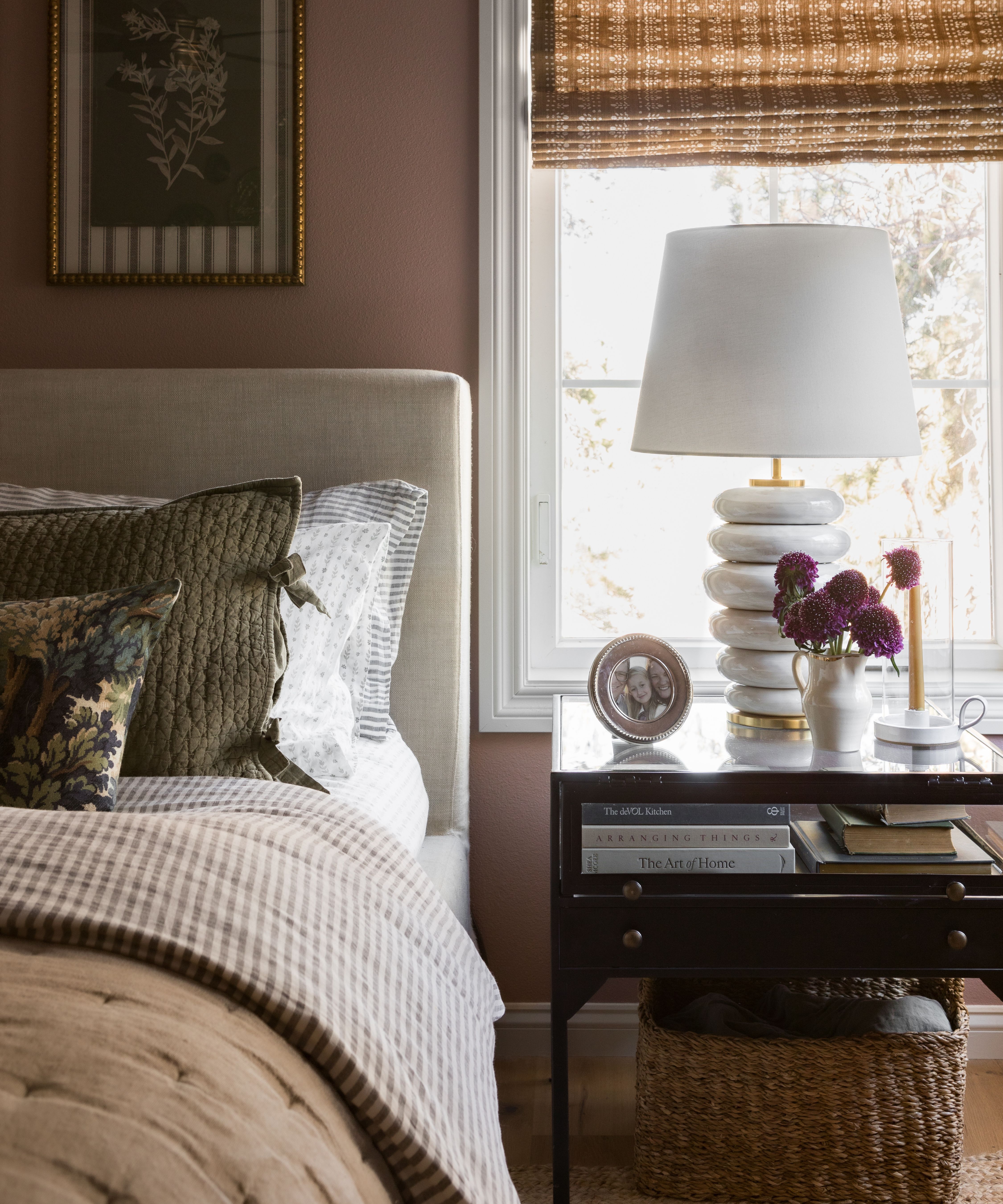
This master bedroom in an English-style carriage house in Colorado is a perfect example of how decorating with pink can feel entirely grown-up.
'The primary bedroom is wrapped in Farrow & Ball’s Sulking Room Pink, which is somehow sophisticated and playful at the same time,' Melissa, founder of Oho Interiors, explains. The walls read less as a traditional pink and more as a soft, powdery rose with depth and warmth.
The upholstered headboard, layered bedding, and woven accents all sit within the same tonal family as the walls, creating a palette that feels cohesive without being overly matchy-matchy. At the same time, subtle contrasts with the darker wood nightstand, the crisp window trim, and the patterned Roman blind introduce just enough difference to keep the look feeling balanced.
6. Warm Terracotta
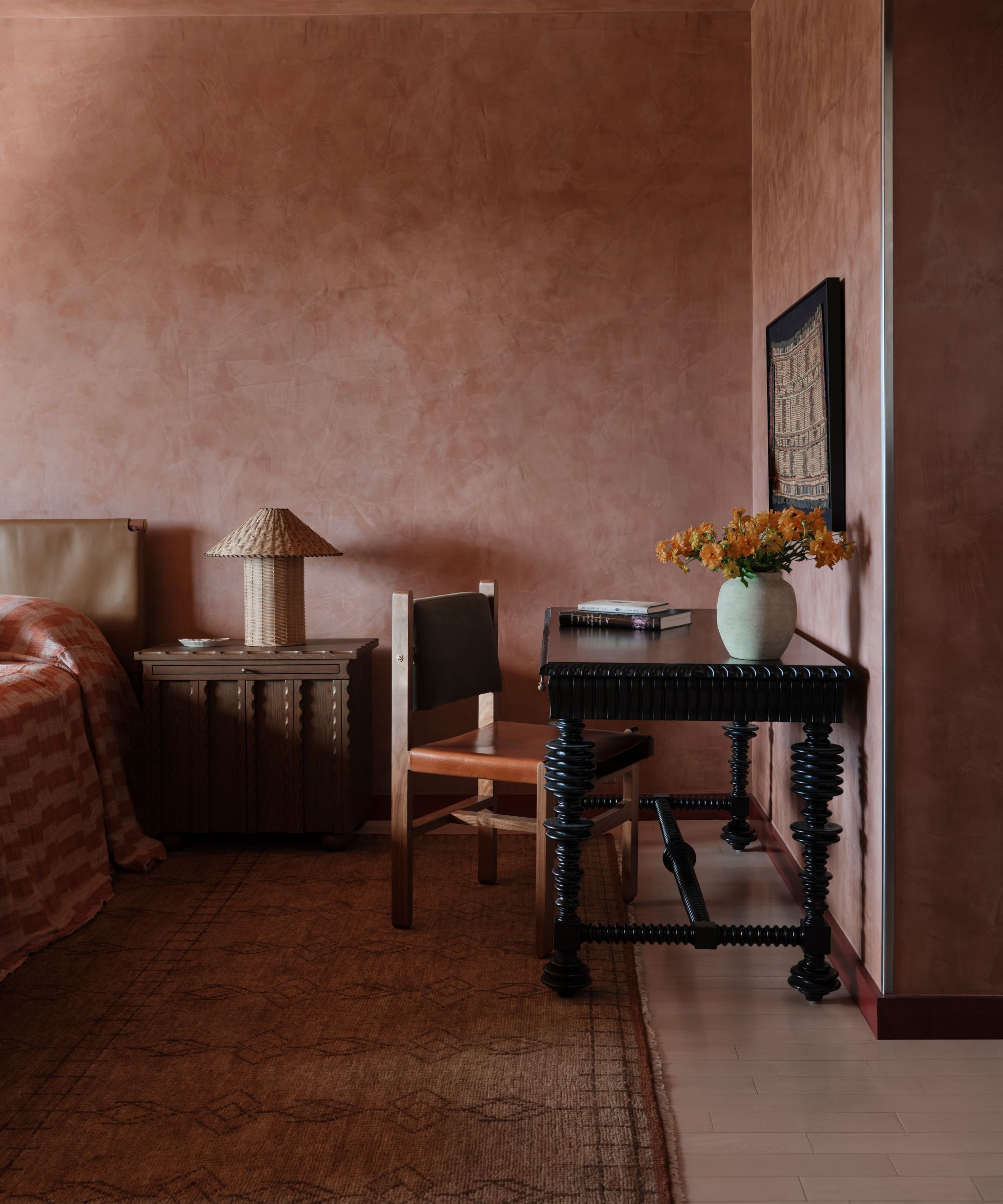
This bedroom is a masterclass in using earthy reds in a way that feels grounded rather than overwhelming. Inspired by the tones of the American Southwest, the walls are finished in a Portola Roman Clay paint that brings depth to what could otherwise be an intense pink bedroom idea.
'It gives so much variation throughout the day and subtly reflects morning light and becomes moodier and cozier as the day goes on,' explains Evan Krenzien of Shane & Pierce. 'Using a red tone paint in a bedroom may seem bold, but the natural texture softens things, and the end result is actually very soothing.' The rest of the palette then follows suit
'We love to play with colors like reds and golds, which may not traditionally be seen as calming or soothing like blues and greens are, and make them feel extra cozy and serene,' Evan adds.
7. Clay Tones
The clay-toned walls in this cosseting bedroom by Sherrell Design Studio sit somewhere between warm brown and soft aubergine, and wrap the room in a depth that instantly makes the space feel more cozy.
As founder Sherrell Neal explains, 'Clients are loving bold, immersive bedrooms with rich colors like aubergine, deep brown, and velvety green. They create a sense of enclosure, like a hug.'
Here, that effect is softened slightly by the warmth of the chosen paint color and the addition of pattern on the ceiling, which draws the eye upward, adding another layer of interest without disrupting the calm.
'I think what feels fresh is the contrast, layering these saturated palettes with quieter moments in bed linens, window treatments, and upholstery to keep the room balanced,' she adds.
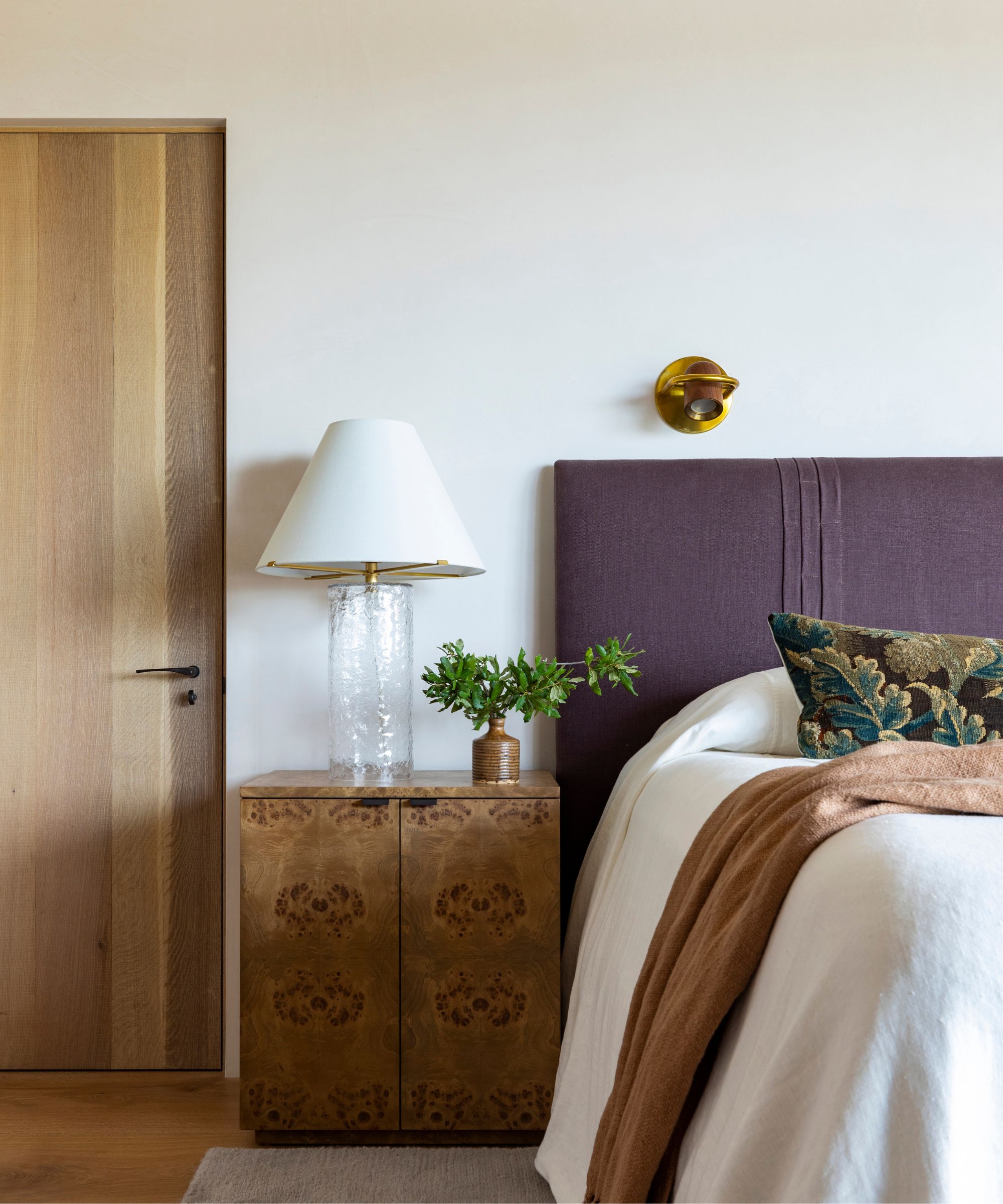
8. Deep Plum
This bedroom by Studio Duggan leans into darker tones with confidence, proving just how effective a rich, enveloping palette can be in a sleep space.
The walls are painted in a deep plum tone that shifts subtly between brown and purple depending on the light. And rather than closing the room in, the color drenching adds depth – blurring edges and softening the architecture to create a cocoon-like effect.
'As a bedroom colour, deep purples are particularly effective, creating an intimate, cocooning atmosphere that feels both luxurious and restful,' says Helen Shaw, Director of Marketing (International), at Benjamin Moore.
What makes this scheme particularly chic is the way the darker walls are balanced with softer, tonal layers. The upholstered bed in a muted olive-green velvet introduces contrast without disrupting the mood, while the neutral bedding and pale rug lift the scheme just enough to keep it feeling inviting.
9. Chocolate Brown
In this charming home full of unexpected features, designer Heather Peterson chose a bold, color-rich hue for the primary bedroom that shows just how effective decorating with brown can be when you lean in.
The walls are painted in a deep chocolate tone, instantly creating a sense of intimacy and comfort. Rather than reading heavy, the color feels grounding, and as color psychology suggests, brown is closely tied to feelings of stability and connection to the natural world, which is exactly what you want in a space designed for rest.
Crisp white curtains and bedding cut through the depth of the walls, bringing lightness and balance, while softer neutrals keep the look feeling layered rather than bold.
10. Orange Accents
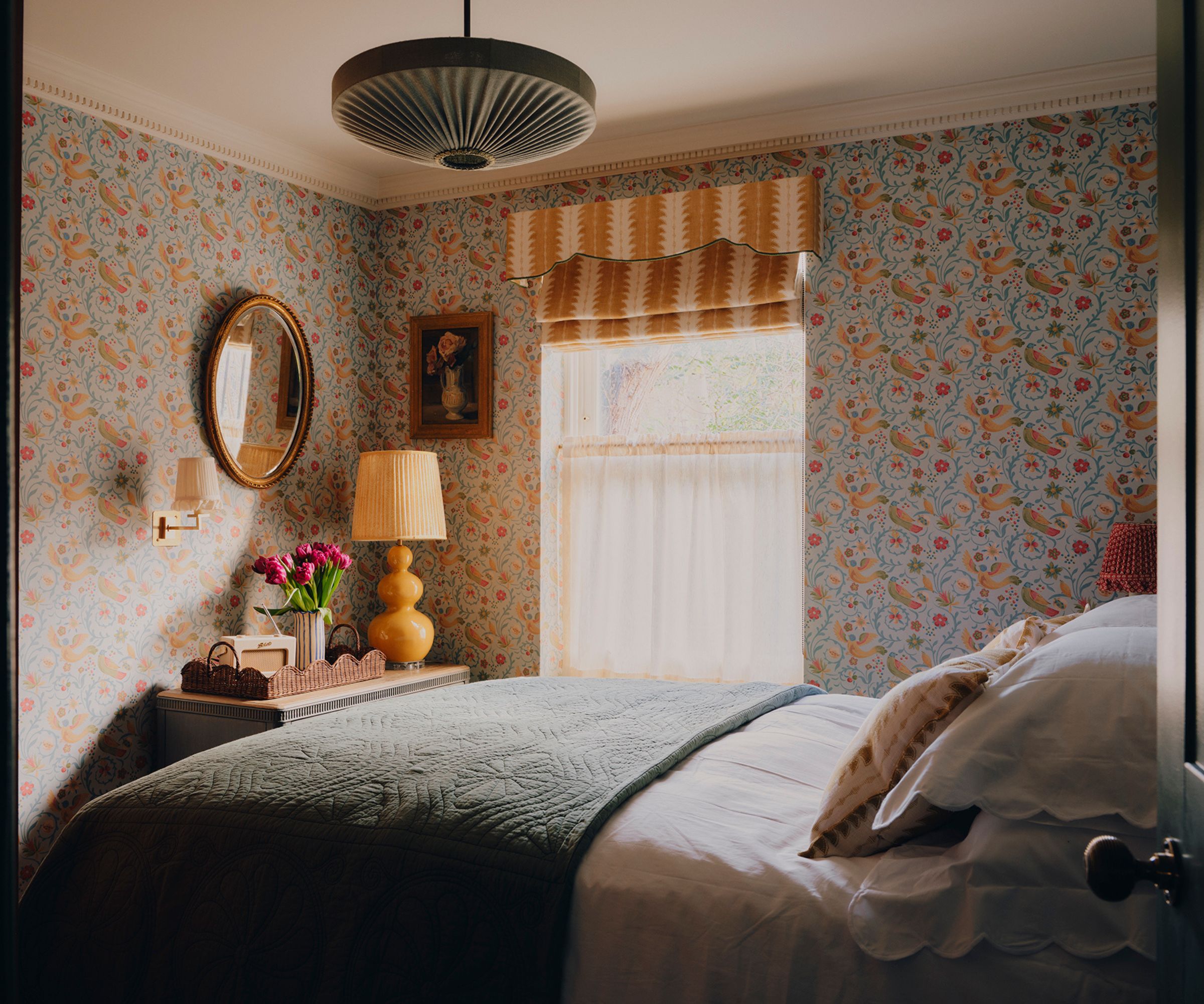
This jewelbox bedroom in a tiny London apartment by Uns Hobbs is a perfect example of how to decorate with orange in a way that feels uplifting rather than overpowering.
Set against a detailed wallpaper, the orange comes through in softer, sun-washed accents – in the trim of the blind, the lamp base, and the subtle tones running through the print.
'The walls feature a playful yet calming wallpaper by GP & Baker that has movement and interest without being overwhelming,' says Uns. 'There's a real sense of abundance in the scheme, nothing feels sparse or minimalist,' she adds.
It’s less about a single bold color statement and more about a thread of orange woven throughout the scheme, echoing the layered, personality-filled approach seen across the apartment.
11. Rich Ochre
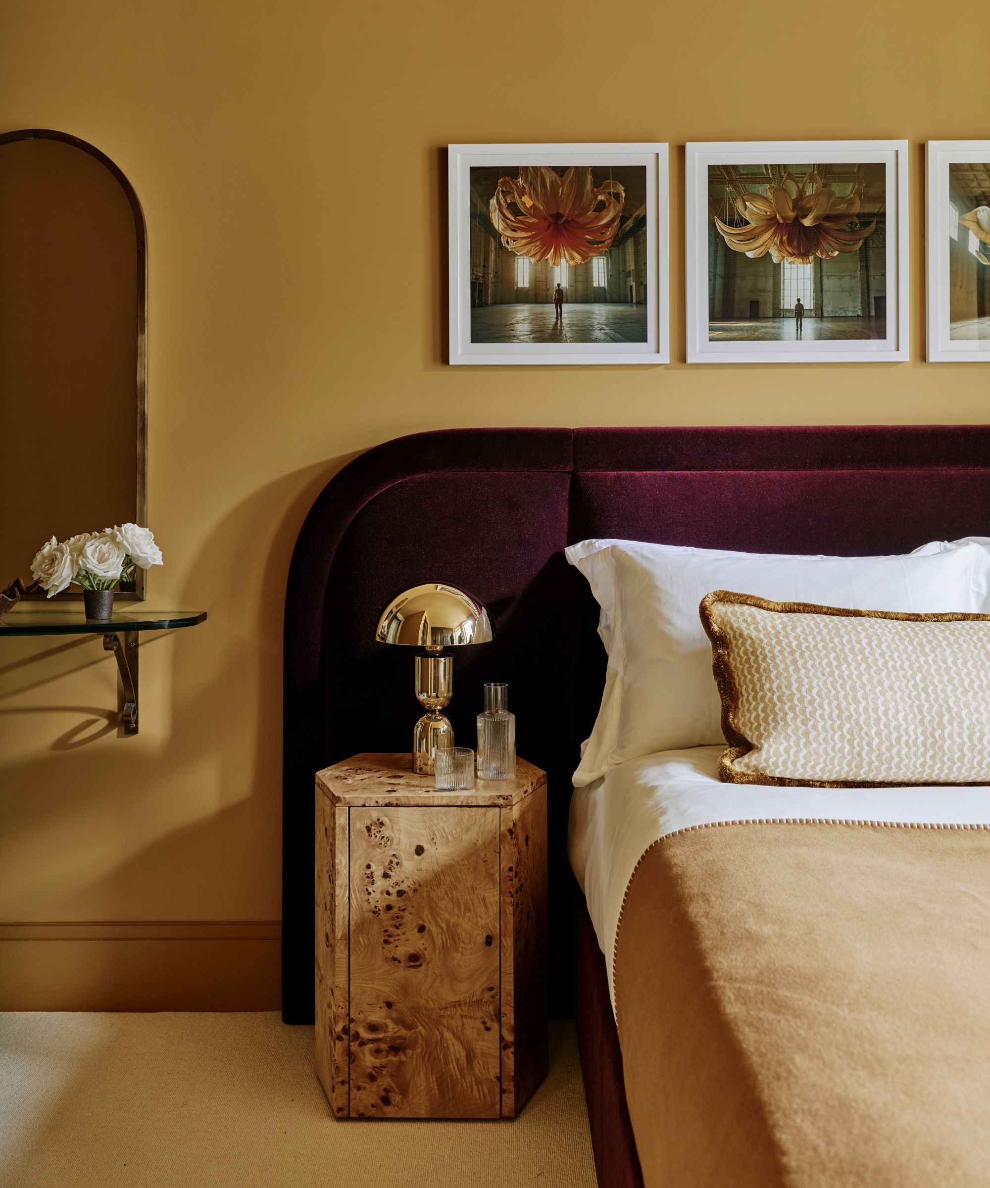
This yellow bedroom by Studio Squire shows how yellow, when deepened and grounded, can feel far more sophisticated than its brighter counterparts.
The walls are painted in a rich ochre tone – closer to mustard than primary yellow – which immediately brings warmth and a sense of intimacy to the space. Rather than feeling overly energizing or sharp, this shade reads as mellow and enveloping.
What makes the scheme particularly effective is the pairing of this golden hue with more saturated tones. The burgundy velvet headboard introduces contrast, while the burl wood nightstand and brass lighting echo the warmth of the walls without blending into them.
Crisp white bedding and a soft neutral throw lift the overall look, ensuring the space still feels fresh and balanced despite the richness of the colors.
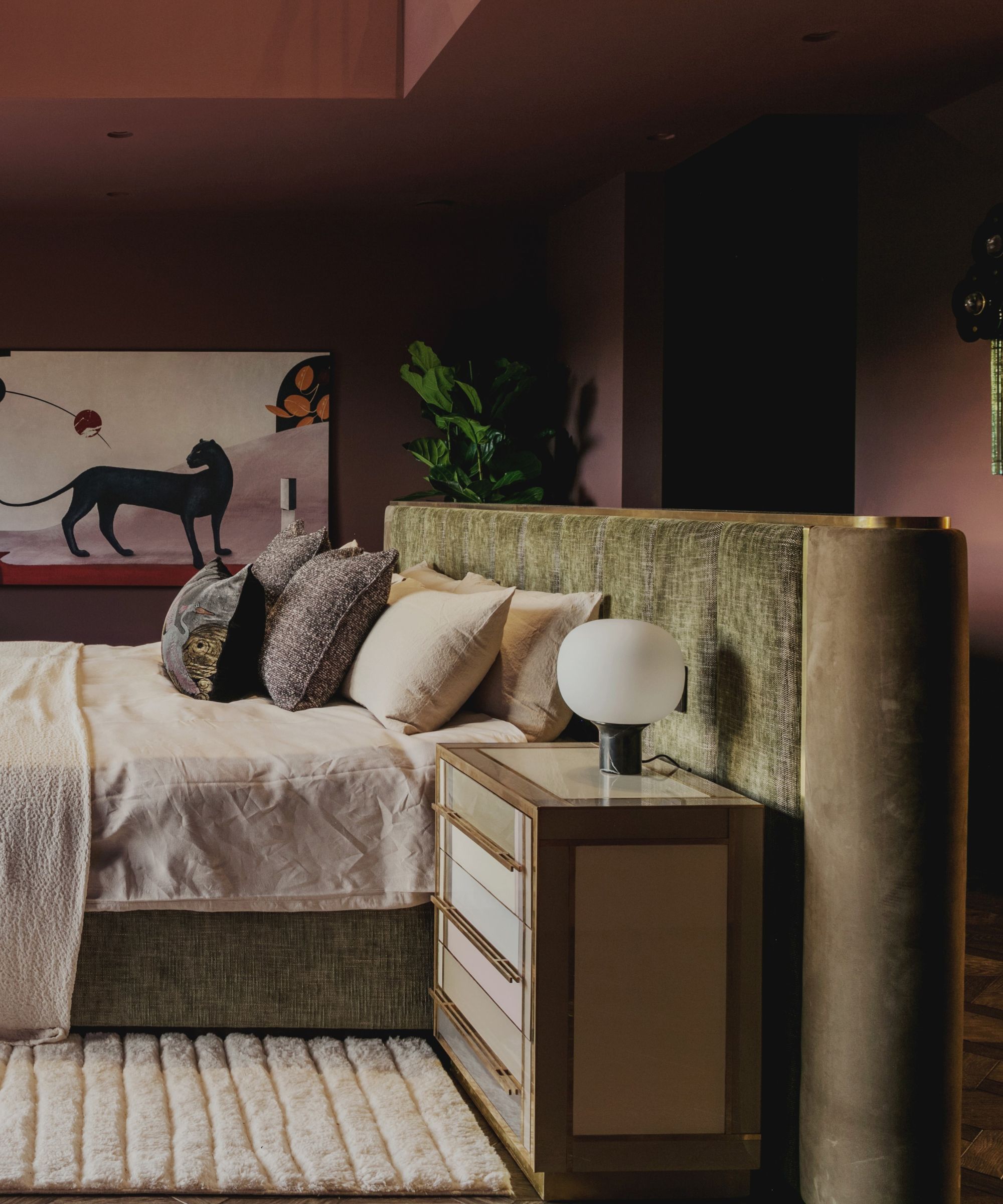
12. Chartreuse
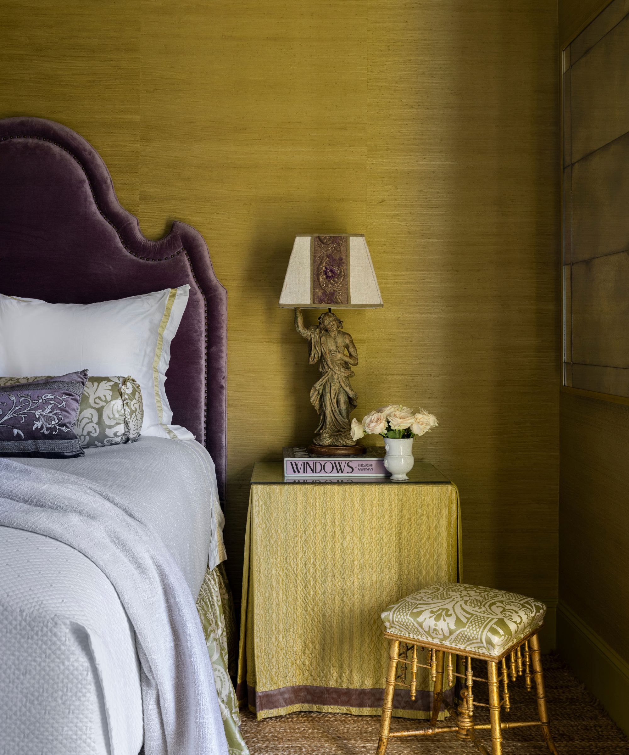
Wrapped in chartreuse grasscloth, the walls in this bedroom by designer Kara Childress have a luminous quality. Yes, it's an unexpected choice, but the chartreuse color trend is only growing stronger.
As Kara explains, 'Color can be both a mood and a material… the foundation here began with a chartreuse grasscloth, which I love for how its natural texture tempers the brightness of the hue and gives the walls a soft, almost glowing depth.'
What gives the palette its real impact, however, is the contrast. A deep, saturated mohair purple headboard introduces richness and a sense of drama. 'The relationship between chartreuse and violet is a bit unexpected, and that tension is what gives the palette its energy,' Kara notes.
'To soften it and make it feel more lived in, I layered in antique textiles for the pillows, each with subtle variations in tone and patina that keep everything from feeling too defined,' she adds.
13. Soft Green
Green bedroom ideas are endlessly versatile. Painted in a soft, grassy tone, the walls in this country bedroom by Vaughan Design & Development bring a sense of freshness and energy, while still feeling entirely restful.
It’s a shade that sits comfortably between uplifting and calming – light enough with yellow undertones to brighten the room, yet grounded enough to feel connected to nature, especially with the garden views beyond the window.
The vintage furniture and warm curtains soften the green, preventing it from feeling too much, while subtle accents – like the mustard stool and hints of deeper red in the trim – introduce a touch of playfulness.
'Green is a naturally grounding color that feels both energizing and tranquil, one that evolves as the light shifts throughout the day,' says designer Kathy Kuo. 'It's one of those rare colors that can feel earthy and elegant at the same time, which means it works just as beautifully in a relaxed, carefree kid’s room as it does in a more tailored, sophisticated primary suite.'
14. Green Gray
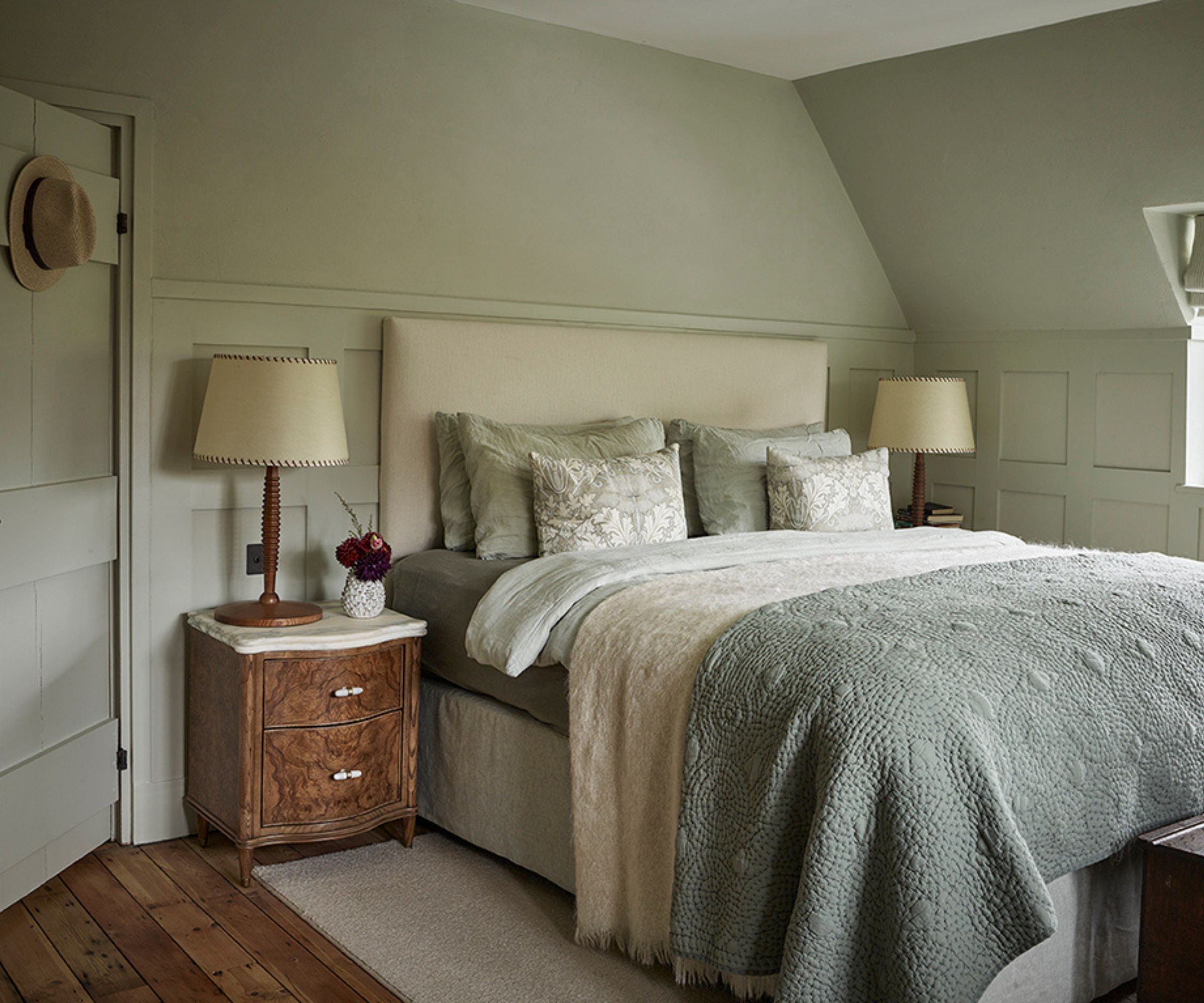
This bedroom in an Arts and Crafts Hampstead cottage in London captures the appeal of decorating with green in its most subtle, liveable form.
Painted in Cromarty by Farrow & Ball, the walls read as a soft green-gray, a shade that feels almost neutral, yet brings far more character than a standard off-white. 'The room is finished in a calm, muted gray-green, creating a restful atmosphere,' designer Marion says.
The paneling, upholstered bed, and textiles all sit within the same gentle palette, creating a sense of cohesion that feels effortless rather than overly styled. Then Marion added some warmer elements with the burl wood bedside tables, soft beige throw, and traditional lamps.
15. Blue-Green
This guest bedroom in a Connecticut home with English country charm by Carta Creatives captures exactly why blue-green is such a designer favorite – it sits in that perfect middle ground between freshness and calmness.
'We’re seeing more willingness to go deeper with color, especially in smaller or more intimate bedrooms. Rich greens, clay tones, even muted aubergines can feel incredibly grounding when used thoughtfully,' says founder Elana Tenebaum-Cline.
'A soft green paired with warm wood tones and creamy whites feels especially fresh right now. It is timeless but still has a point of view,' she adds.
This balance between cool and warm is what gives the room that signature British country charm: relaxed, lived-in, and quietly elegant. Done well, as it is here, the result is a bedroom that feels calm but not flat, characterful but still timeless.
16. Touches of Blue
Nothing is more classic than the blue and white bedroom color combination.
In this primary bedroom by Burkle Creative, a soft blue-and-white palette is introduced through a wallpaper that continues seamlessly across the walls and ceiling, creating an immersive, almost cocooning effect without relying on saturated color.
As founder Javier Burkle explains, 'The client gravitates toward blue and white, so we leaned in fully, using pattern in a more immersive way by carrying it across the walls and ceiling.'
'The key was balancing that boldness with restraint, pairing the pattern with tailored bedding, soft neutrals, and warm wood tones to keep the room feeling livable and relaxed.' The result is gentle rather than bold – a room that feels layered, airy, and enveloping.
17. Light Blue
If you crave a calming atmosphere in your bedroom, blue bedroom ideas – in all its variations – could be the solution.
Painted in Farrow & Ball’s Light Blue, the walls in this bedroom in an elegant yet playful family home by Sean Symington add a gentle brightness to the space while still feeling calm and composed.
For Sean, a scheme begins not with paint, but with fabric. 'Our starting point in the bedroom is almost always a fabric, often used for the headboard or a half tester, and we pull the entire scheme from there.'
'At the moment we're particularly drawn to greeny-blue tones, which bring a lovely sense of calm while still feeling genuinely colorful and considered,' he adds. Paired with warm woods, soft neutrals, and playful patterns, a shade like this feels inviting rather than cool.
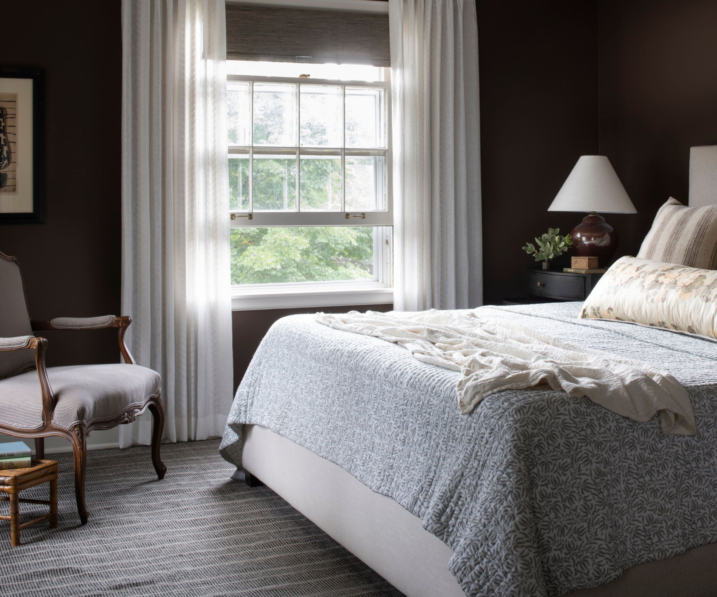
18. Mid-Toned Blue
The walls in this sophisticated bedroom by Bethany Adams Interiors are painted in a muted, mid-tone blue that brings a sense of serenity to the space without feeling cold or flat.
As Bethany explains: 'The right color for a bedroom depends on so much: the age of the home, orientation of the house, client preferences, etc., but I love using muted soothing hues regardless of the overall palette.'
'Deep blues are always a relaxing choice and make a real impact, while lighter colors make it easier to greet the day on dark mornings.' Here, the chosen shade sits comfortably between the two – soft enough to feel restful, yet saturated enough to give the room presence.
What makes this scheme particularly striking is the use of both drenched blues and contrast. The rich burgundy curtains introduce depth and drama, while crisp white bedding and pale upholstery keep the space feeling fresh and balanced.
What is the best color for a bedroom?
There isn’t a single “best” color for a bedroom – the right choice depends on the mood you want to create, the quality of light in your space, and what you naturally feel drawn to. That said, designers consistently return to softer, more muted tones.
'I’m drawn to bedroom palettes that feel warm, layered, and rooted in nature,' says designer Mel Bean of Mel Bean Interiors. 'Rich soil browns, muddy olive greens, muted mustard tones, and smoky blues bring personality while still creating a cozy, enveloping environment. These colors feel especially beautiful when layered with texture and subtle pattern.'
It’s less about the color itself and more about how it’s used. Even deeper shades like chocolate brown, plum, or terracotta can feel incredibly restful when balanced with lighter textiles and natural materials.
'Earthy tones such as terracotta and clay are a beautiful way to bring renewed warmth into the bedroom,' suggests Helen Shaw, Director of Marketing (International), at Benjamin Moore. 'Their soft, muted quality absorbs light rather than reflecting it, creating a calm, cocooning atmosphere that feels inherently restful - perfect for a space designed for relaxation.'
What is the most relaxing color for a bedroom?
The most relaxing color for a bedroom is down to personal preference, but blue has been proven to induce a calming effect on the brain and is therefore an enduring favorite in the bedroom. Pair with crisp whites for a fresh look, or layer muted tones for a softer scheme. It even works surprisingly well en masse in darker shades – wall-to-wall navy blue is a growing favorite that looks stylish and is super relaxing.
Outside of blue, consider its closest relatives. After a year or so of being stuck indoors, green is gaining popularity for its affiliation with nature. Choose shades of sage and olive to stay on-trend, or create a jewel box effect with emerald. Purple works well for a warmer scheme, while soft greys are an on-trend choice for a soothing, neutral scheme.
'Soft color drenching creates calm, cohesive interiors with a more relaxed feel,' advises Nicole Hirsch of Nicole Hirsch Interiors. 'Keeping walls, trim, and ceilings within the same airy palette helps the room feel unified and quietly layered without strong contrasts.'
And relaxing hues don't end with your paint or decor choices. Instead, experts have shared the best bed sheet colors to improve sleep, so you can rest easy that every detail in your room is working well for your well-being.
Love beautiful design ideas, expert advice, and inspiring decor trends? Sign up for our newsletter and get the latest features delivered straight to your inbox.