I don’t know if you’ve noticed but pink is currently one of the most popular living room colours. While the days of decorating with Barbie pink are firmly behind us, there are more subtle shades that have taken over as the trending pink living room ideas. And I’d argue they’re more timeless and sophisticated, too.
Ideal Home has visited a number of homes in recent times that featured this particular living room colour scheme, all done in slightly different yet equally as stylish ways. And if you’re currently considering a pink living room colour palette, I recommend looking to these lounges for inspiration.
‘Pink is and has always been hugely adaptable in design – from the delicate nudes and pastel shades of the art deco period to more contemporary, bold shades, this welcoming colour family offers endless possibilities to home styling,’ says Helen Shaw, international director of marketing at Benjamin Moore. ‘What makes pink especially relevant now is its ability to feel both modern and sophisticated, playful yet grounded, easily bridging the gap between minimalism and maximalism.’
1. Use pink as a neutral
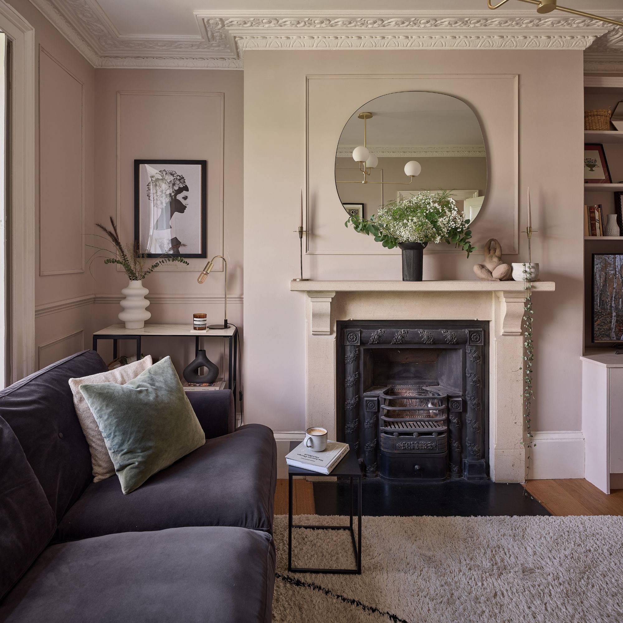
Pink is getting so popular that it's becoming the new go-to neutral. But you have to know what pink shade to go for. The most neutral-looking (and feeling) pink is a plaster pink. Farrow & Ball has reported that their aptly named Setting Plaster shade has been their most popular 'neutral' shade.
Meanwhile, Ideal Home's Digital Editor, Rebecca Knight's opted for Little Greene's Masquerade pink shade in her living room which is in many ways similar to Setting Plaster.
'I was on the hunt for an earthy neutral that looked like a freshly plastered wall,' Becky explains. 'The paint that hit the mark was Masquerade from Little Greene. Masquerade is a beautiful powder-hue pink with earthy undertones. I first spotted it in Zoe Ball's living room and kitchen, and I loved how it provided the perfect background to all her colourful belongings without being overwhelming.'
Setting Plaster has been one of Farrow & Ball's most popular shades for a while now, loved for its subtle injection of colour inspired by the shade of newly plastered walls.
2. Highlight period features
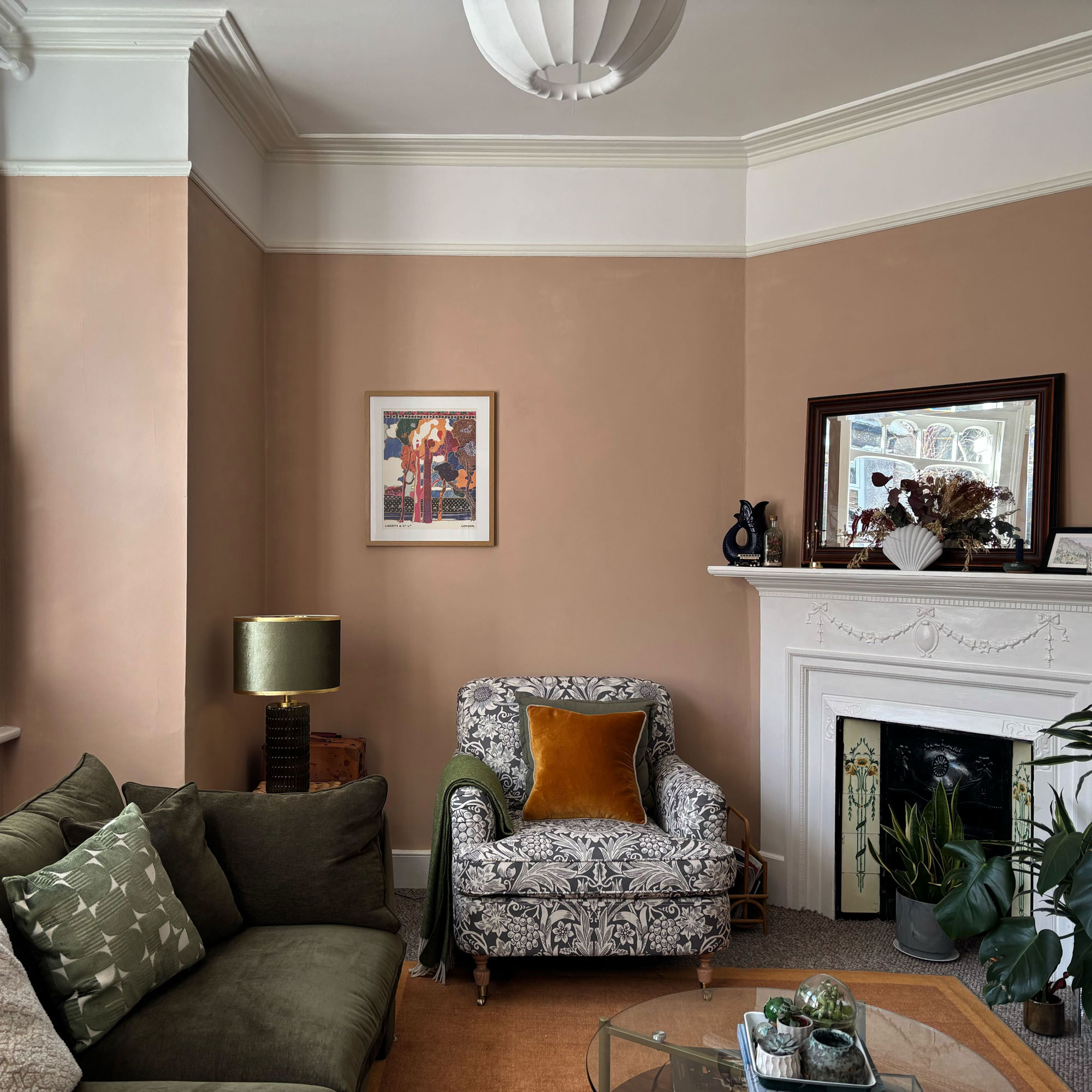
If you're working with a period property with original features that you want to honour while also injecting some colour, opting for a subtle rose pink shade like Little Greene's China Clay Deep is the way to go as Claire Hill has discovered when making over the living room in her Georgian family home in Bristol.
‘We added panelling and repainted this space over one weekend in lockdown. I’ve always felt it’s important to honour the spirit of a house, incorporating features into period properties that might have always been there,’ Claire explains.
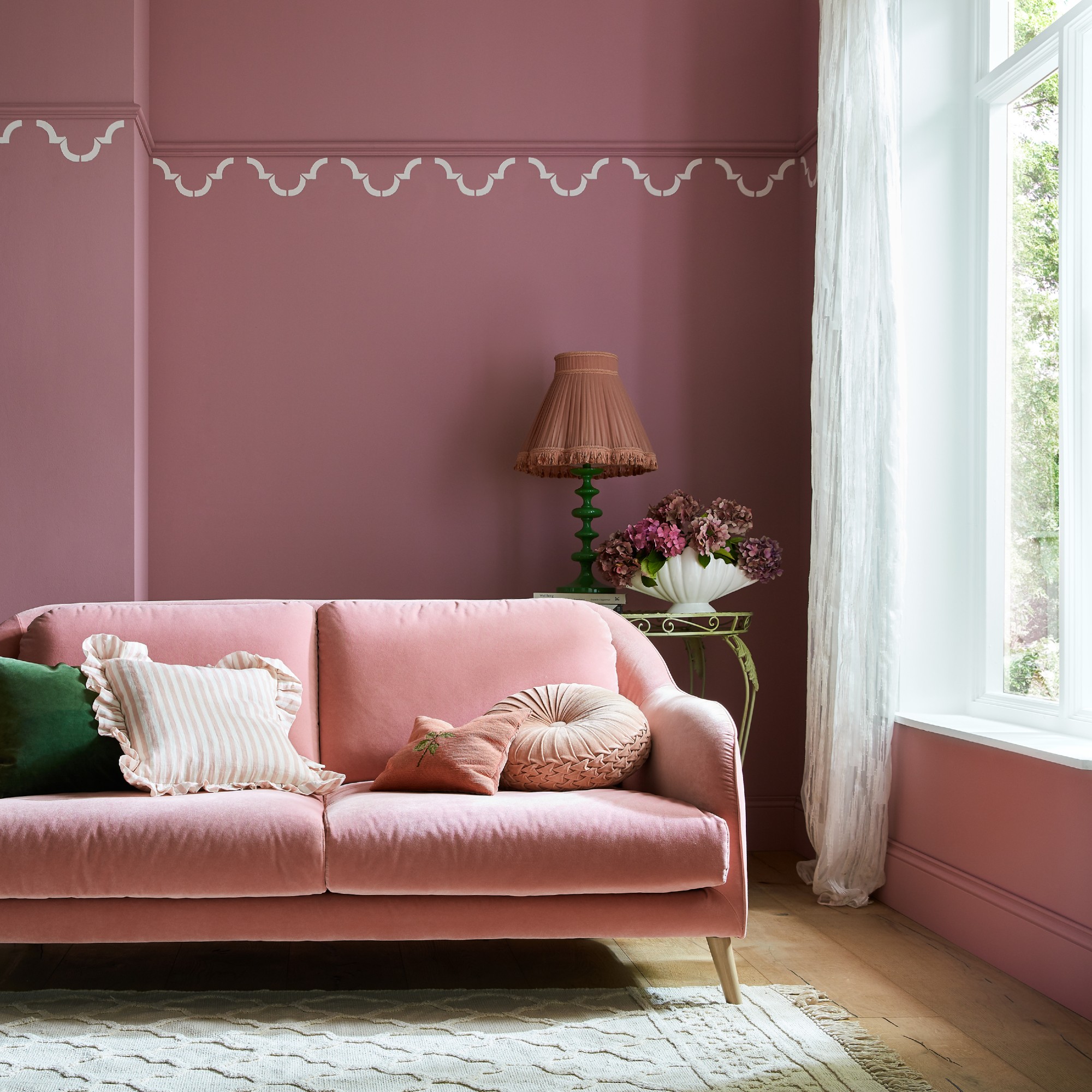
3. Go for a dusty pink
If you're want a cosier feel to your pink living room, going for a touch darker shade often referred to as dusty pink is the perfect way to achieve that. That's exactly what Kim Price has done in her colour-drenched living room (pictured above) painted in Farrow & Ball's popular Sulking Room Pink.
‘Often known as “dusty pink” or “dusty rose”, these pinks tend to have a slightly brown undertone which enables it to work beautifully as a statement colour within a neutral palette,’ says Chloe Barrow, interior expert at Laura James. ‘Because of its brown undertones it can be a nice step into a world of colour for those that are used to neutral aesthetics or have a lot of light-neutral furniture. I’ve seen this colour work perfectly with creams, beiges, and even greys.’
Farrow & Ball's Sulking Room Pink is one of the most popular dusty pink paint shades, recreating an old world charm.
4. Colour drench in pink
Pink is a favoured colour choice when it comes to colour drenching, which is a decorating technique covering the whole room in the same hue, as seen in model Charli Howard's London home.
'The whole house used to be white, but I wanted something richer. It feels warm and feminine, but not girly,' Charli says.
Bailey Oates, colour expert at Earthborn, continues to explain why pink is a good choice for a colour drenching scheme, ‘Colour drenching a living room in pink can be a joyful and quirky way to instantly add joy while also adding relaxing properties. To truly accomplish this style, add furniture and accessories in the same shade, or paint highlights in varied colours of the same colour to make the space feel stylish and intentional,’ Bailey at Earthborn says.
5. Go all out
You can take the colour drenching - or double drenching idea - even further by pairing pink walls with a pink sofa and/or other furniture as the couple in this maximalist home in Leeds has done in their snug. But it can be recreated in a living room, too.
The owners of this particular home hasn't completely colour-matched the sofa to the walls which is where the double-drenched or two-toned element comes in and it gives the space more of a dimension.
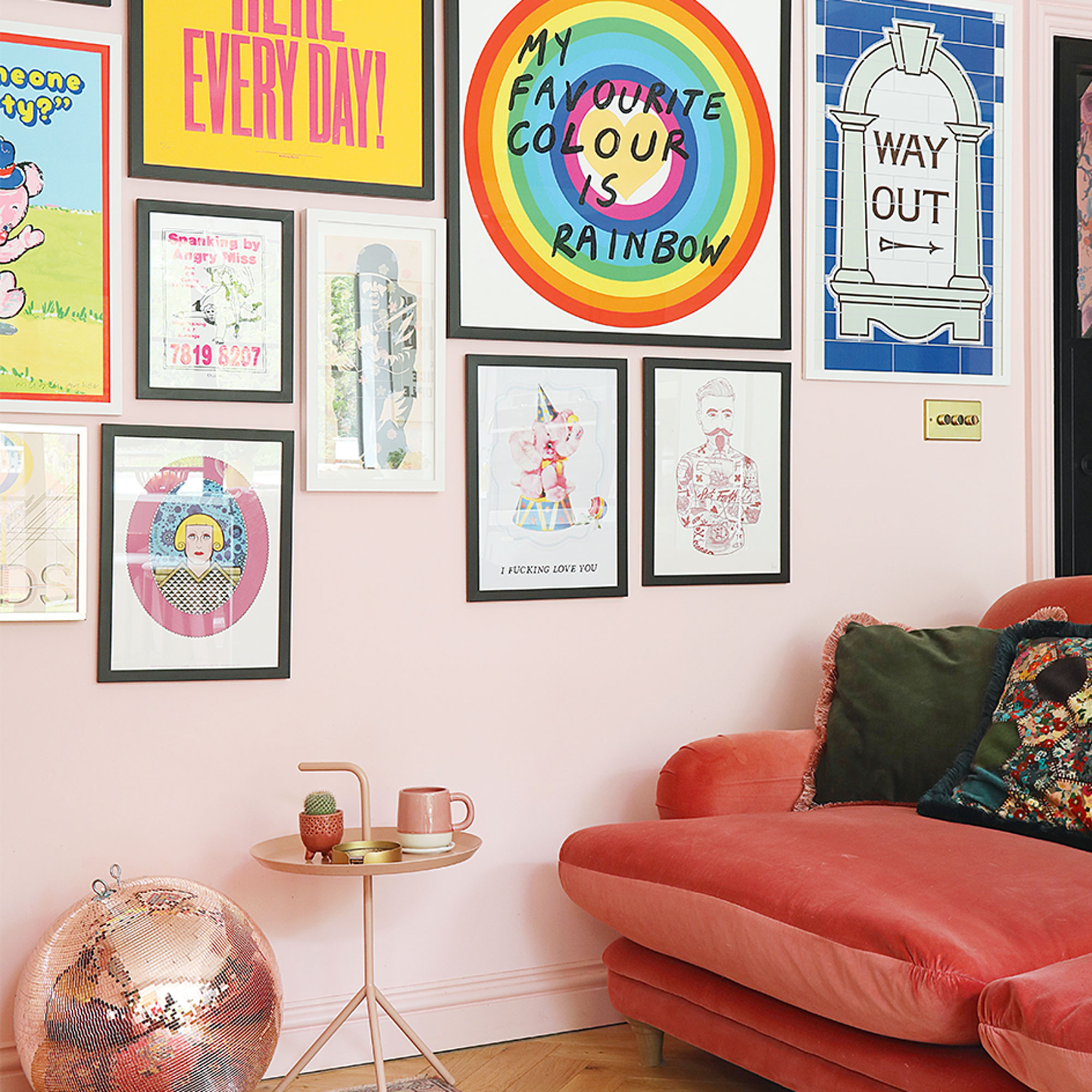
6. Pair soft pink with statement art
As already mentioned, nowadays, soft, muted shades of pink are largely favoured over bright tones that are too in your face. And that's especially true if you want your art to be the main event rather than the paint colour as was the case for this couple's coastal home in Kent.
'As big collectors of art, we couldn’t wait to finally have somewhere to hang all our paintings, prints and posters that we’d amassed over the years. I think the key is to find a common colour that ties the art to its surroundings, and fortunately, our eclectic collection features lots of calming colours,' the couple explains.
If you want just a hint of pink on your walls then we're big fans of Dulux's Blush Pink - it's extremely versatile and pared-back.
7. Pair pink with green
Pink and green are a match made in heaven – and I highly recommend leaning into this complementary colour palette in your living room as Nigel Hunt has done in his little Cotswold cottage.
‘Pink pairs beautifully with soothing green tones,’ says Flora Hogg, interior designer and colour consultant at Craig & Rose. ‘A hearty and full-bodied green is a rich, atmospheric shade that calms even the busiest of spaces. Creating a contemplative atmosphere, a complex hue like sage green adds elegance and maturity to a space whilst still providing that grounded feeling. Pair with an earthy pink such as Alhambra Stone from Craig & Rose.’
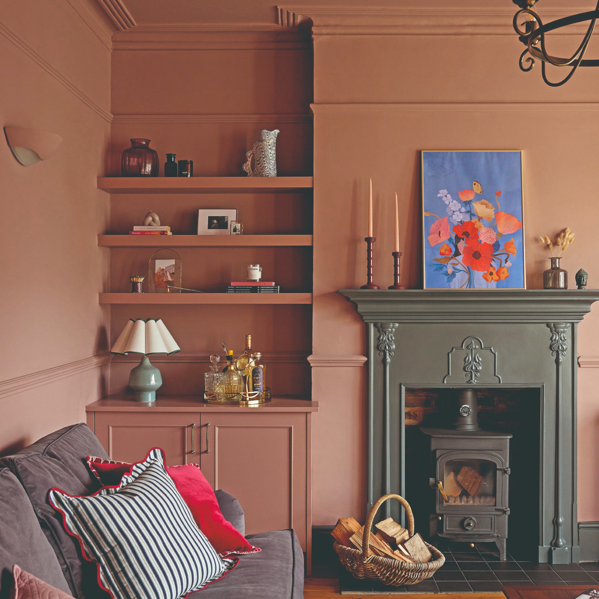
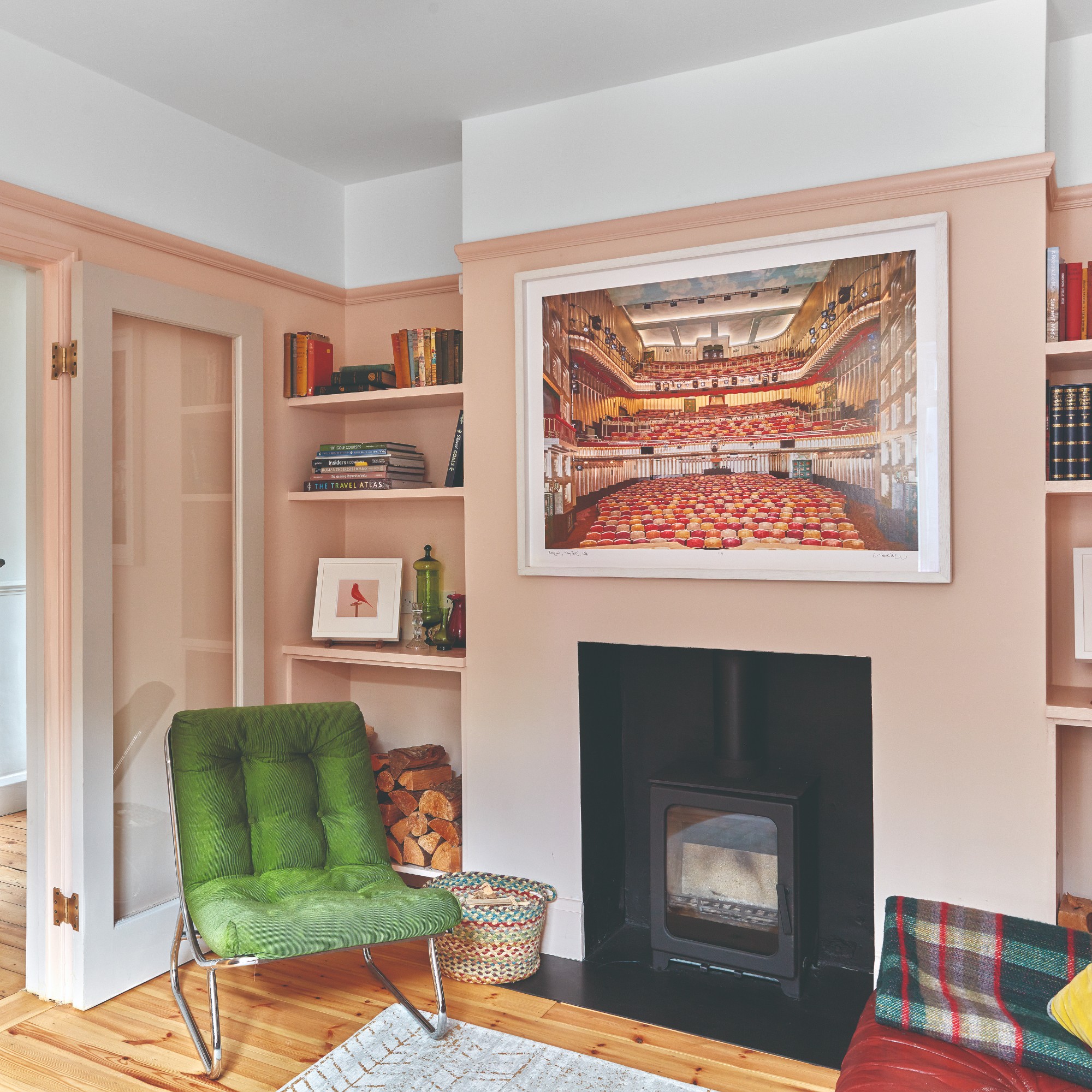
8. Ground your space with earthy pinks
Earthy shades are one of this year’s biggest home decor trends as we all crave cosy, cocooning homes where a sense of relaxation and wellbeing reigns supreme. So even when it comes to the shades of pink people often go for, a warm, earthy undertone is usually favoured as seen in radio presenter Rosie Madison's living room (pictured above). And earthy pinks have become so popular that they're replacing beige in 2026 as the go-to neutral.
‘Earthy, clay-toned pinks are very in right now, as they tie into the trend for warmer, more organic interiors,' says Alex Stubbs, Flitch interior stylist. 'These hues feel grounded and work well with natural textures like wood and linen, making them an easy choice for a cosy, stylish living room.'
Farrow & Ball describes this shade as a 'historic-feeling pink'. We call it an earthy pink, living on the edge of pink and beige.
9. Invest in a pink sofa
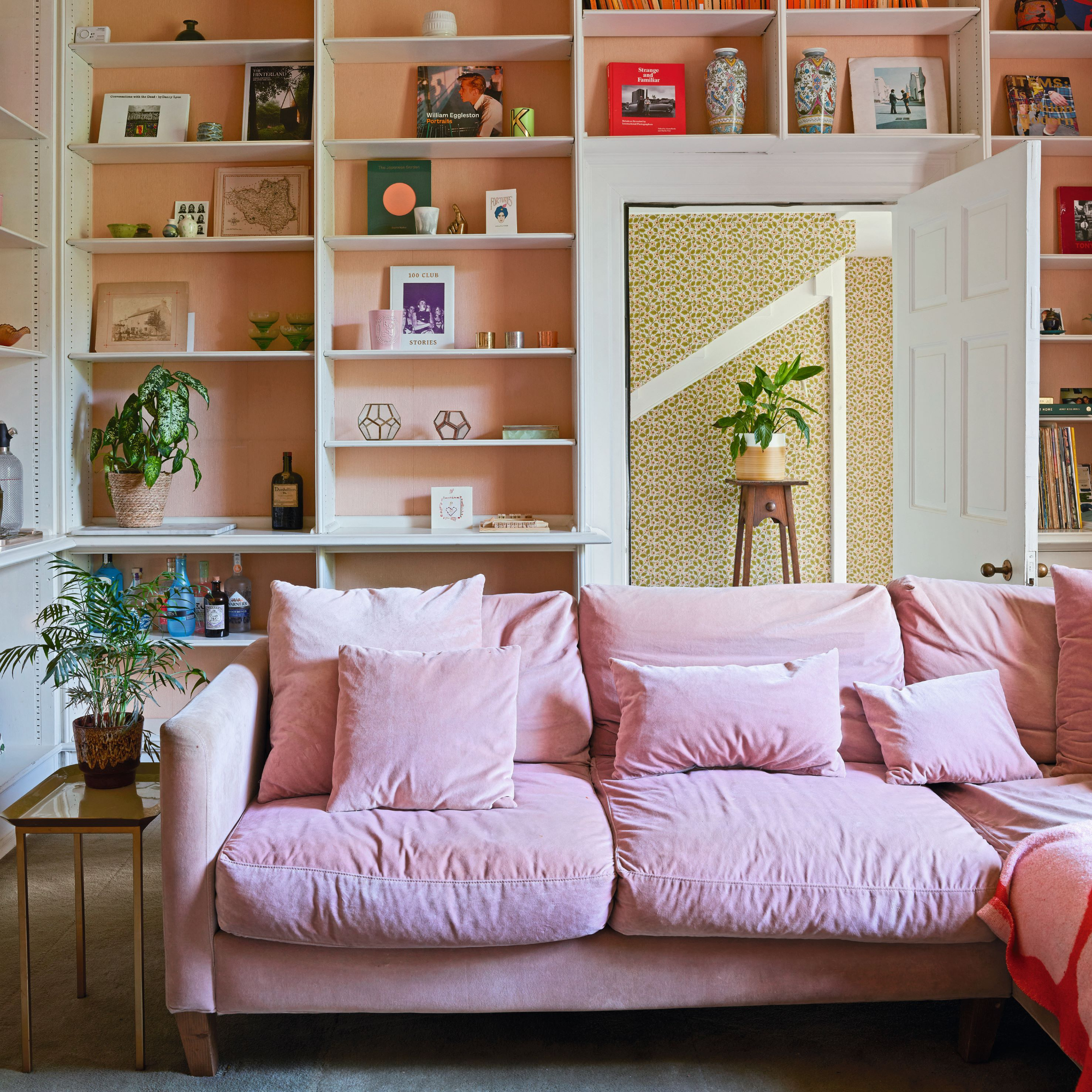
Neutral shades like grey and white are no longer the default sofa colour trends. Instead, actual colours are taking over the space – and pink and coral sofas are rising in popularity rather rapidly.
‘If you’re unsure about committing to pink walls, introduce it through upholstery. A pink velvet sofa is a showstopper and can subtly bring warmth into the space,’ Alex at Flitch says.
10. Opt for a moody, retro look with mauve pink
If soft and earthy pinks are not for you and you’re after something with a little bit more saturation then a mauve pink shade is the way to go. It has a retro quality, as well as a sense of moodiness which works really well in a living room. Bailey from Earthborn demonstrates this on the brand’s paint shade Gosh Golly.
‘A gentle yet vibrant shade, Gosh Golly, adds positive energy and a touch of retro charm, perfect for creating a lively and inviting space. Providing warmth and a subtle elegance through its mauve undertones, this hue projects positivity and sophistication that can be incorporated into a range of interior styles. This rich hue immediately adds a sense of warmth and cosiness, making the room feel more inviting and intimate,’ she says.
Not only is this paint beautifully coloured in a deep, rich and moody mauve pink, it's also extremely breathable and thick, usually requiring less coats than most other paints.
FAQs
Is pink a good colour for living rooms?
Pink is a good colour for living rooms. It's a great colour for any room in fact, simply because it's so versatile. There are so many varying shades of pink that the look can be entirely different from one living room to another.
Pale pinks are ideal for those looking to inject warmth to a colour scheme without feeling overwhelmed by the use of 'colour'. Very pale pinks can work as a warm neutral.
For those who love colour there's a whole spectrum of deeply saturated pink shades to add vibrancy to living spaces.
Does grey go with blush pink?
All shades of grey go with blush pink, meaning there's a colour combination for all settings. Stronger, more dominant shades of grey from charcoal to slate grey take on blush pink as a soft accent shade, best used for accessories throughout the living room to break up the strong colour scheme.
While gentle, paler greys work in perfect harmony for blush pink – creating a balance blanket fo muted colour.
How can I add pink to my living room?
You can add pink to a living room at many different levels. Firstly for a more impactful approach to colour you can paint the walls. Whether opting for a bold cerise pink or a sophisticated dusky pink tone, painting walls is the best way to really embrace pink in a living space.
Adding hints of pink via furniture choices, in an otherwise neutral scheme, helps to add bursts of colour rather than saturate the space.
Which pink living room idea are you tempted to embrace in your lounge?