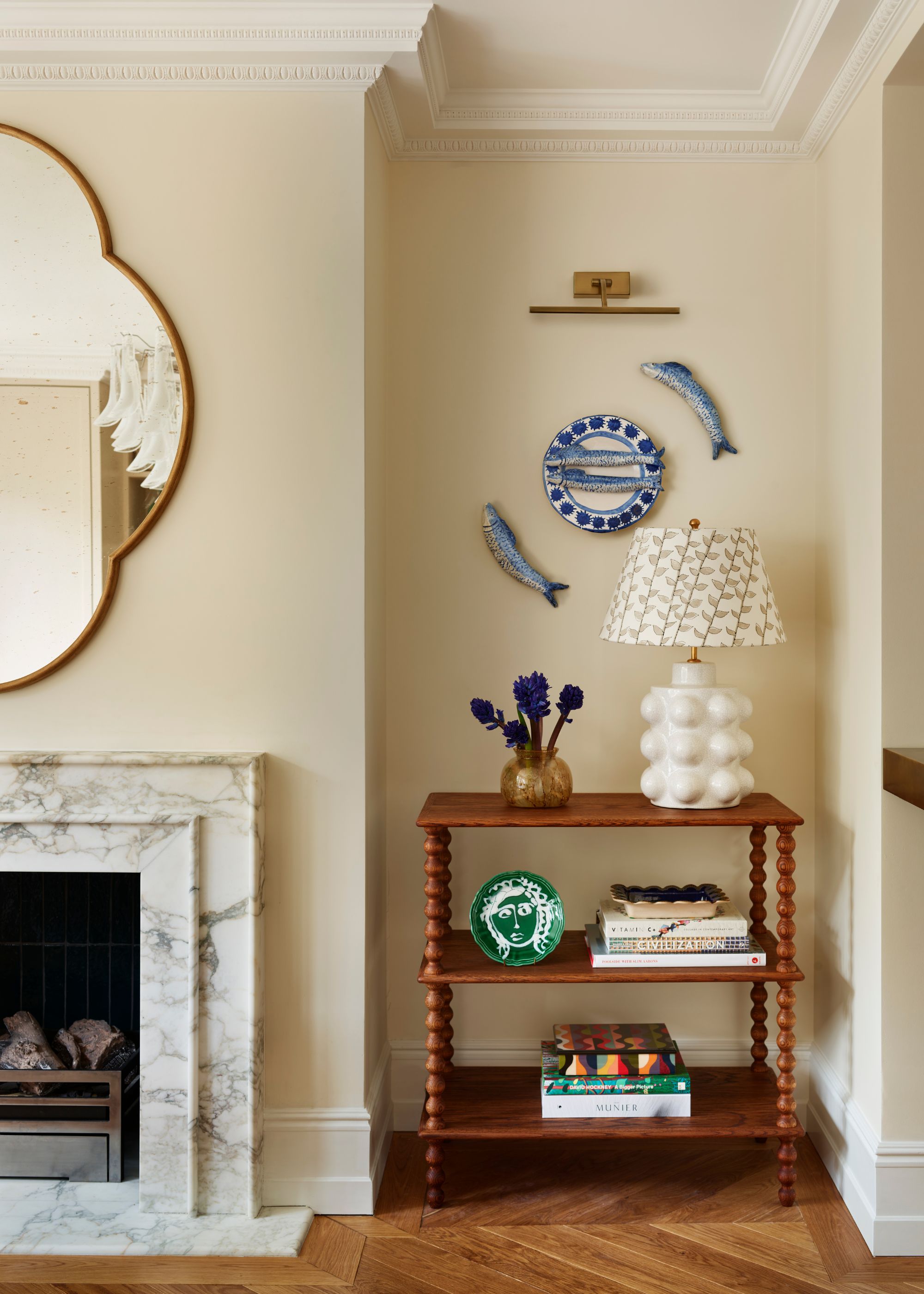
When decorating a room with the intention of creating a space that feels calm, it's easy to turn to a palette of soft neutrals. And while these mellow tones are certainly soothing, there are plenty of other colors (some a lot richer) that can lend the same restful feeling, while injecting more personality into a room.
"I always say this to clients: calm isn’t a color, it’s a feeling," says Tash Bradley, color expert at Lick. "And to create that feeling, we have to first understand the function of the room. A bedroom needs a very different type of calm than a living room; a hallway needs a different type of calm than a home office. Once we know the purpose of the space, then we can choose a tone that supports the energy you want to feel the moment you walk in."
From earthy greens to plaster pinks, to timeless whites and dark reds, below, interior designers and color experts share their very favorite specific paint shades for creating calm color palettes.
1. Farrow & Ball's 'Pointing'
Farrow & Ball's 'Pointing' is a warm white that feels fresh as well as calming. “It's calming because it sits in that perfect space between white and stone," says designer Alicia Meireles of OWN LONDON.
"It has a gentle warmth and a chalky softness that stops it from ever feeling stark or clinical," she adds. "The subtle pigment gives it depth, so it shifts beautifully with the light rather than sitting flat on the wall. It feels quietly architectural and grounding — a color that allows the room to breathe, creating a sense of calm, balance, and understated elegance.”
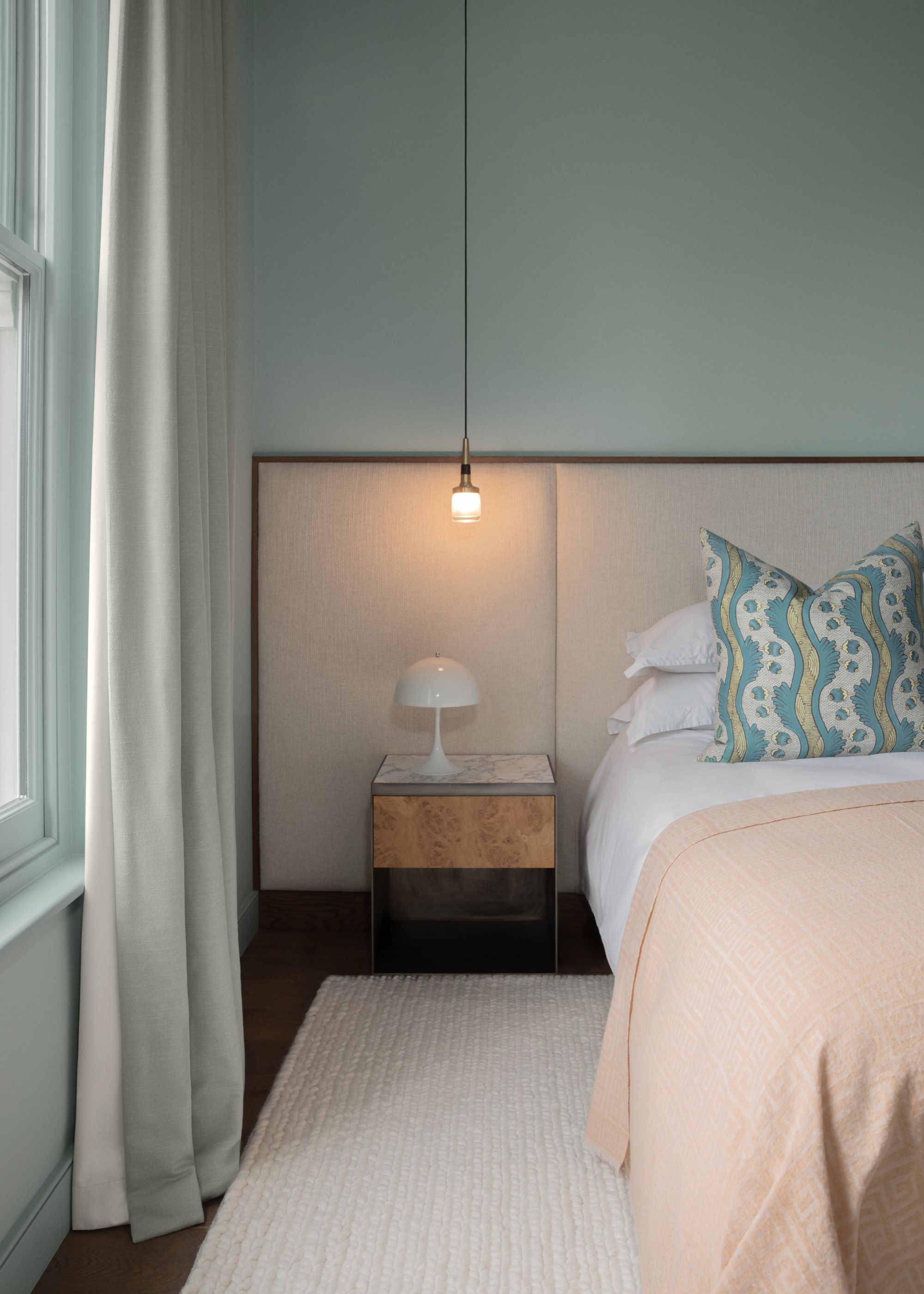
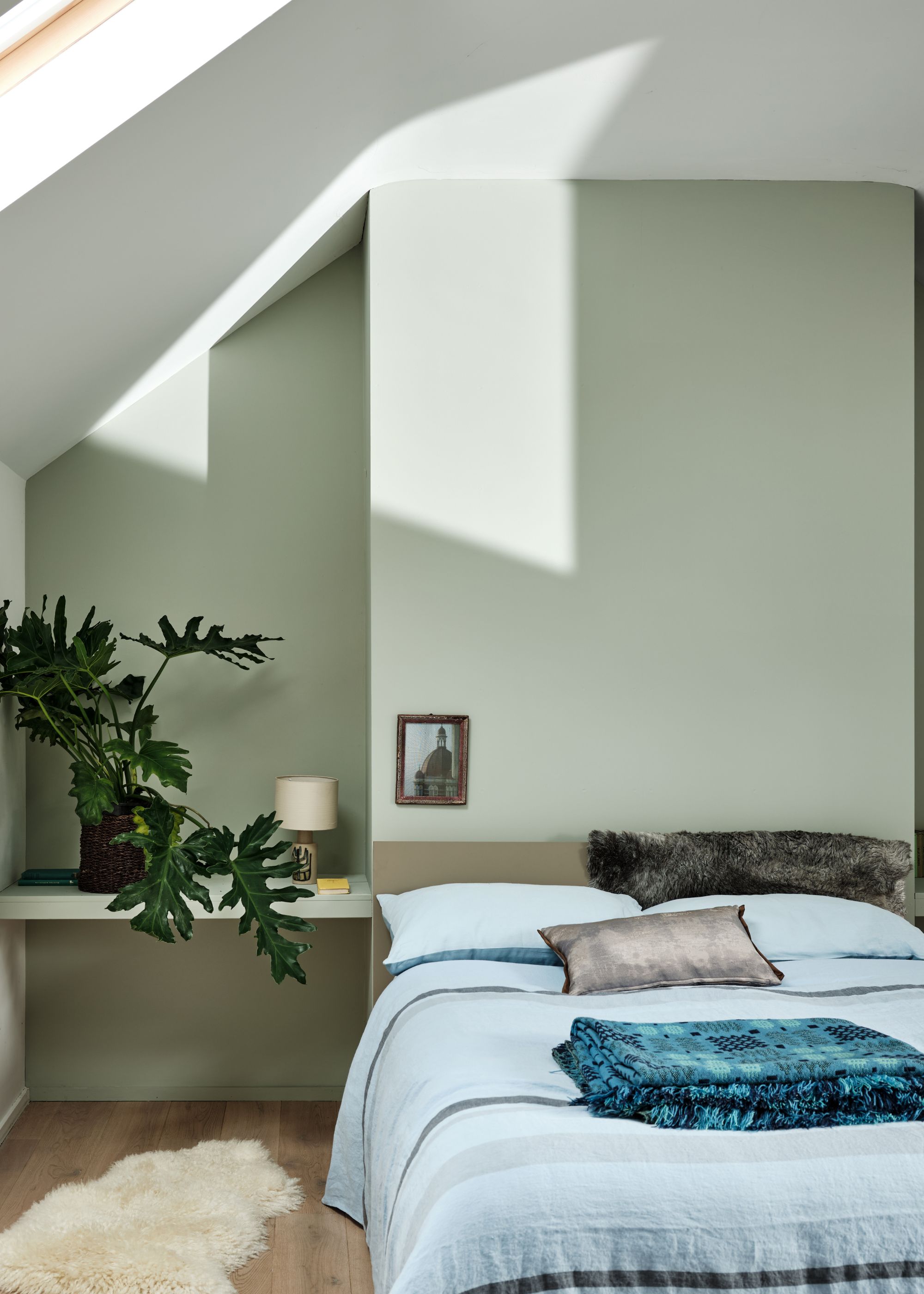
2. Farrow & Ball's 'Pink Ground'
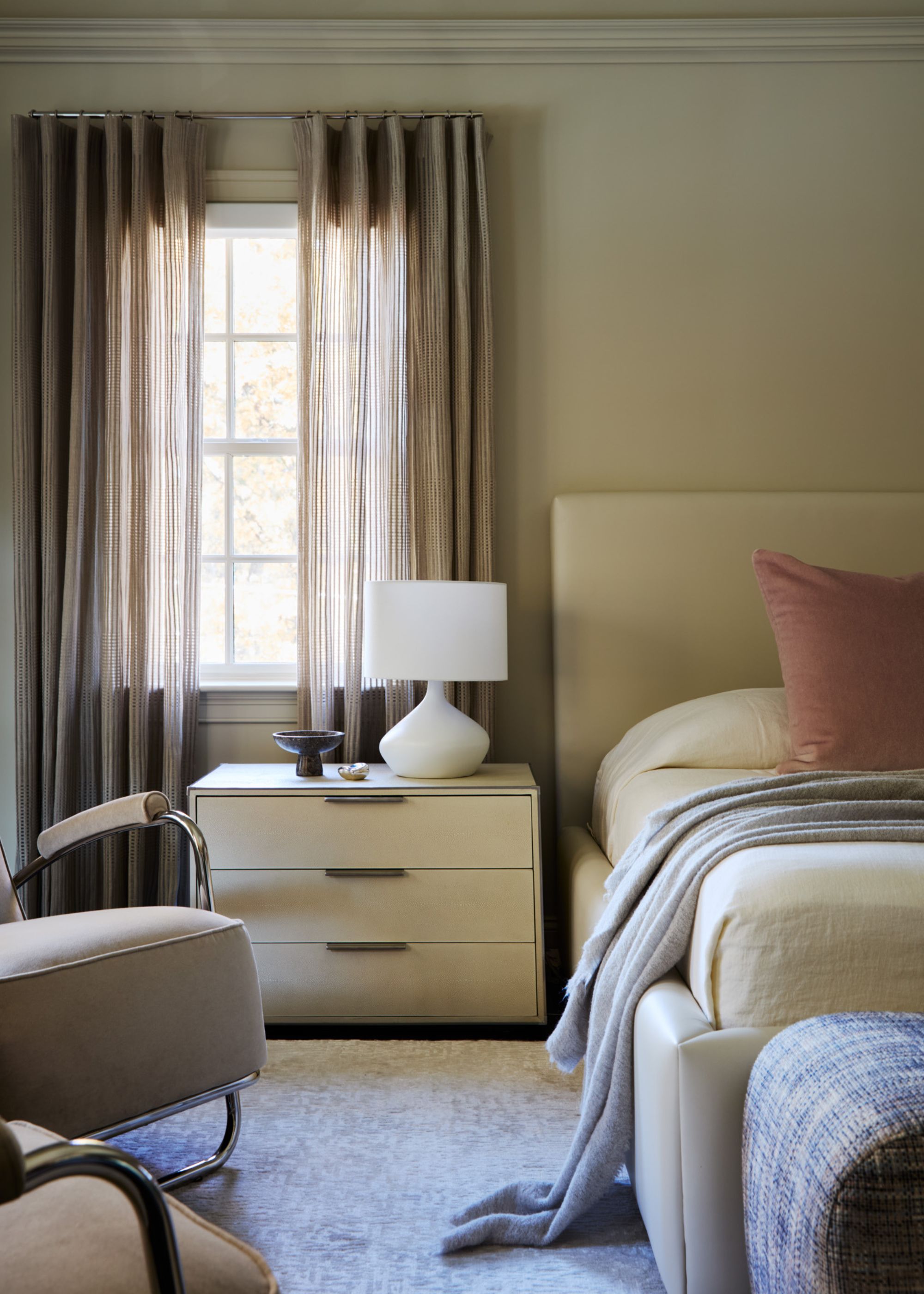
“I love Farrow & Ball's Pink Ground because it almost behaves like a neutral — interesting without ever becoming overpowering," says designer Kate Cox of HÁM Interiors, who used this soft pink paint in the bedroom pictured above.
"It has such warmth, which is why it works in so many settings," she adds. "It seems to sit well in almost any space, particularly on a landing, where it brings a softness. You can use it as a full drench for mood or keep it lighter as a backdrop — it has a balance that complements rather than competes.”
3. Little Greene's 'Slaked Lime'
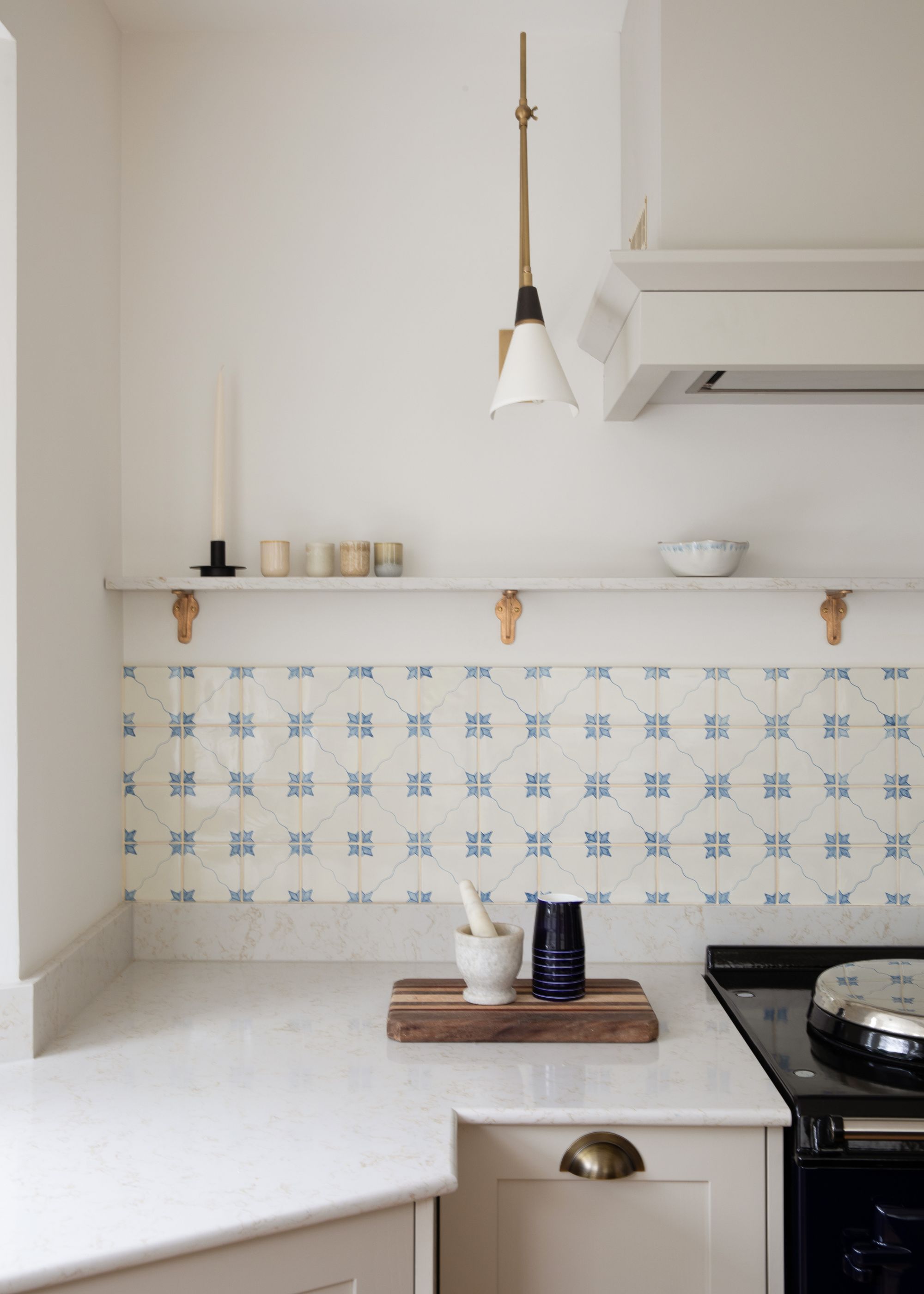
While some white paints can be too stark to lend a calming feel, Little Greene's Slaked Lime has enough warmth to keep things soft and soothing. "It's one of our favorite paints, as it takes on a warm life of its own depending on the levels of natural light within a scheme," says designer Samantha Watkins McRae.
In the space pictured above, Samantha used Slaked Lime as a kitchen wall paint color. "As the ultimate calming neutral, it has so much capacity to be adapted within a modern or period property," she shares.
4. Lick's 'Blue 03'
Don't rule out blue paints when imagining a calming scheme. "Lick's Blue 03 is one of the most mentally soothing colors in our palette," says Tash Bradley, color psychologist and director of interior design at Lick. "It’s a light blue with a gentle drop of green in the undertone, which means the eye doesn’t have to work hard to adjust to it, creating an instantly restful, clarifying feel."
It works well in bedrooms or any space where calm is the priority, she adds. "For a truly soft, cocooning scheme, I often recommend painting the woodwork in the same shade and pairing it with a warm neutral ceiling such as White 03 or White 05," says Tash.
5. Lick's 'Taupe 03'
Lick's Taupe 03 adds a touch of pink to a room but still feels neutral enough to be calming. Tash describes it as "a color that genuinely lowers the shoulders the moment you step into the room."
"With its brown-pink undertone, it feels warm, grounding, and quietly enveloping, making it ideal for living rooms and bedrooms," she adds. "Its softness means it can take richer accent colors layered on top, from burgundies to mossy greens, without ever feeling heavy."
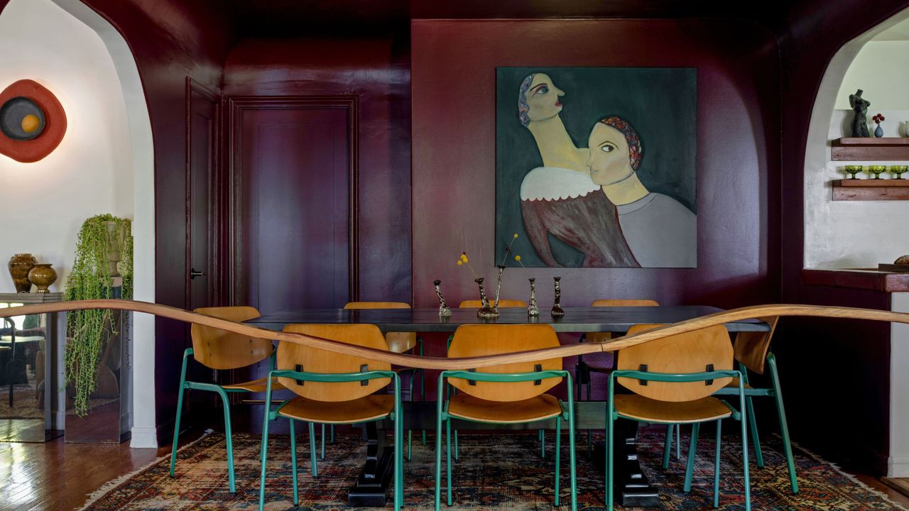
6. Farrow & Ball's 'Preference Red'
Livingetc's color expert Amy Moorea Wong turns to dark paints when creating calming spaces. "It’s the rich, deep shades that wrap around and envelop us that slow my heartbeat and make me feel most safe, content, and cozy," she says, highlighting Farrow & Ball's 'Preference Red' as a favorite.
"It’s calming in the way that a huge bear hug soothes the soul; its embrace is heartfelt, instinctual, steady, and easy," she adds. "Yes, the color is powerful, but its velvety complexity and the heavy shadows it produces add depth that feels rich, absorbing, and like something you just want to dive into."
As for how to use it best? She recommends an all-over drench in a room you use semi-infrequently. "I’m thinking the guest room, dining room, or some kind of secret snug," she adds.
7. Little Greene's 'Olive Colour'
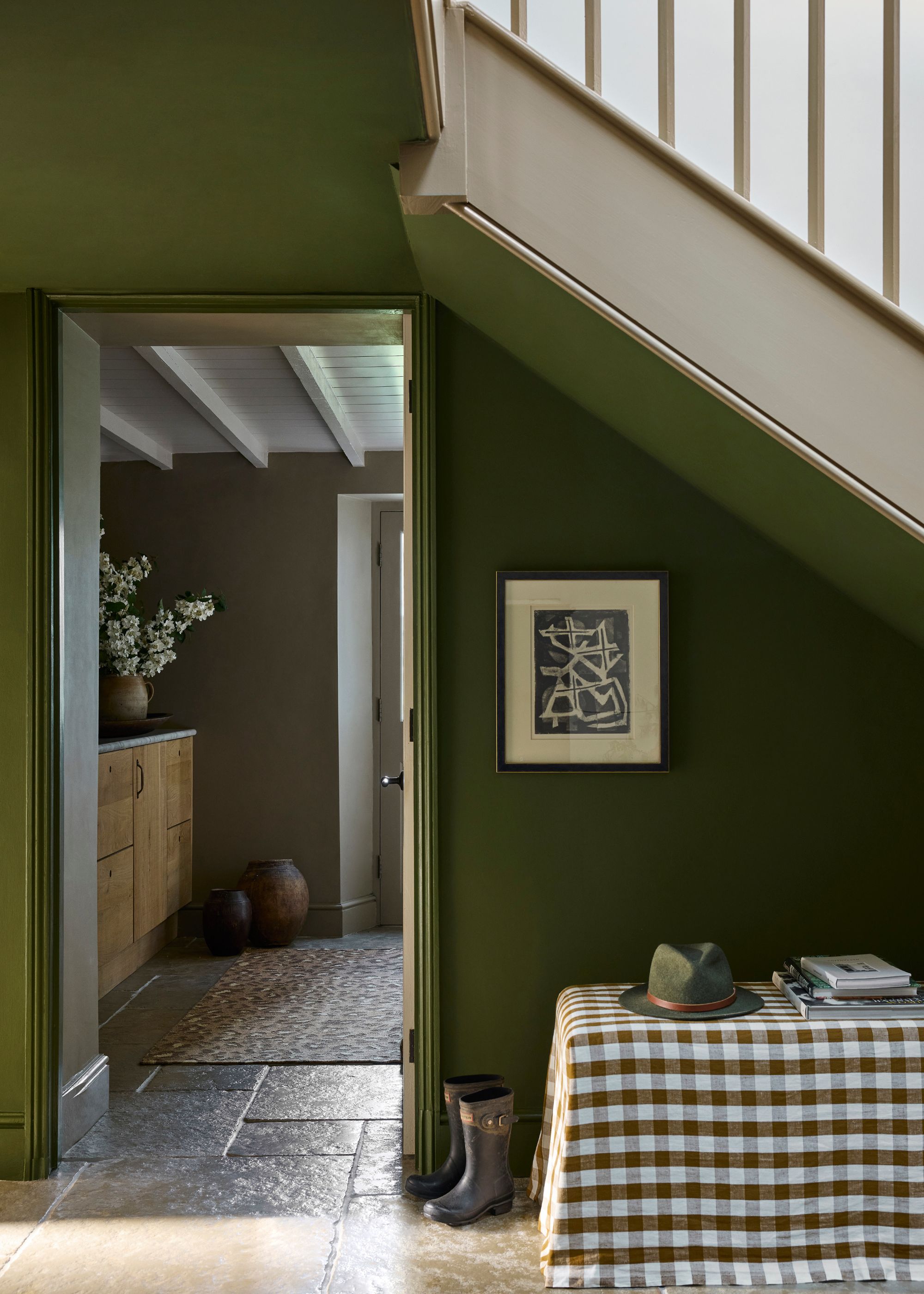
Little Greene's Olive Colour is another option that proves dark paint colors can be just as calming as light ones. "Warm greens such as Olive Colour are wonderfully grounding shades that bring an immediate sense of calm and positivity to an interior," says Little Greene's creative director Ruth Mottershead.
"Deeply connected to the natural world, they evoke the quiet reassurance of foliage and landscape, which is why they feel so inherently soothing within the home," she adds. "Olive greens pair effortlessly with other earthy tones, particularly the soft, warm hues of Portland Stone or Bath Stone."
8. Farrow & Ball's 'Mizzle'
If you're looking for a pale green paint that feels livable and fresh, Farrow & Ball's Mizzle is a good one to try. Patrick O’Donnell, color expert at the brand, describes it as "a calming pale mint that feels incredibly soothing, but thoroughly modern."
"It will team really well with stronger colors such as our bolder Pigeon or even the charcoal notes of Off-Black on kitchen cabinetry with Mizzle as your wall color to temper the boldness of your kitchen units," he adds.
9. Mylands' 'Beata White'
Another option, if you enjoy decorating with white for a calming and understated look, is Mylands' Beata White.
“Beata White BH. 01 is a soft white with a warm undertone that performs well in kitchens, living spaces, and anywhere you want a clean, welcoming feel, as its balanced tones create a calming backdrop," explains Dominic Myland, CEO of Mylands.
10. Benjamin Moore's 'Silhouette'
Benjamin Moore's Silhouette (the brand's Color of the Year for 2026) is a rich espresso color that's bold and dark yet still somehow calming. Helen Shaw, color expert at Benjamin Moore, says that colors like this one "reflect less light, making a room less active and therefore more restful."
"These hues also have a natural association with nature, which is innately soothing and grounding, helping to calm us throughout the day," she adds. "To further this effect, layer the room with plenty of natural materials such as ceramic clay vases, linen, and rattan furniture that soothe the senses."
11. Farrow & Ball's 'Setting Plaster'
Color consultant Charlotte Cropper highlights pink as one of her favorite calming colors. "As a tint of red, it retains a sense of warmth but loses the intensity, which is why it's often used in environments designed to soothe and comfort," she explains.
As for her favorite paint shade: it's Farrow & Ball's Setting Plaster, which she describes as "a much-loved shade that manages to suit any style or architecture."
She says that plaster pinks "behave almost like warm neutrals, as they flatter skin tones, soften architectural edges, and bring a gentle glow to a space."
12. Farrow & Ball's 'Green Smoke'
Another green paint that designers turn to when creating calming schemes is Farrow & Ball's Green Smoke — a dusky and muted hue that's grounding rather than lively.
"Green Smoke is an exquisite, deep hue that captures the essence of nature, warmth, and moody sophistication, making it inherently calming," explains designer Jennifer Worts. "This earthy color is wonderfully anchoring, providing a stable backdrop that eliminates visual noise and promotes tranquility."
"For maximum effect, apply it generously," she adds, "extending the color to your trim and ceilings further enhances this comforting, cocoon-like embrace, making any room feel deeply restful and established."
13. Benjamin Moore's 'Clay Beige'
"We often find the most calming paint colors to be soft and neutral," says designer Nicole Hirsch. "Something versatile enough that it could be paired with any other color but never reads as jarring or too bright. One of our go-tos, particularly in bedrooms, is Benjamin Moore's Clay Beige."
"It creates a cozy and inviting look when enveloped throughout the room," she adds. "We paired it with blush and cream, and it makes the entire room feel cohesive."
From light neutrals that will always be timeless to richer shades that wrap rooms with warmth and coziness, these calming paint colors cater to lots of different room types and styles. To keep things fresh for 2026, take a look at the biggest color trends to complete your soothing scheme.