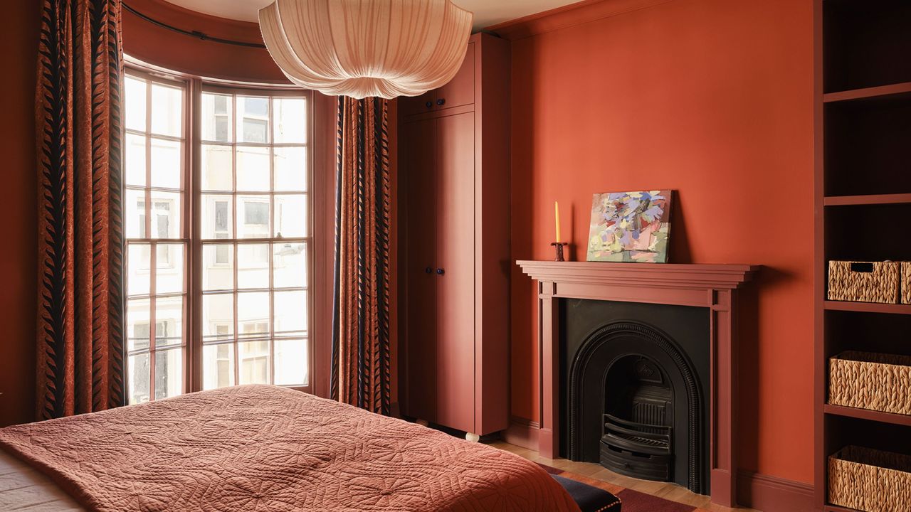
Did you know that depending on the light at any given time, the appearance of your paint color can change significantly? In fact, the same shade can look completely different in a well-lit room compared to a much darker one, and that's especially true for 'chameleon' paint colors.
Unlike pillar box red and sunshine yellow, chameleon shades are more nuanced with interesting undertones, and it's this variation that makes them so flattering in situ: they work with the natural light to amplify certain tones and certain times of day.
Below, designers talk us through their very favorite chameleon shades, explaining how lighting affects paint colors and can take your room from vibrant and bright in the morning to cozy and cocooning in the evening. (And why that's a good thing.)
1. Farrow & Ball's 'Dimity'
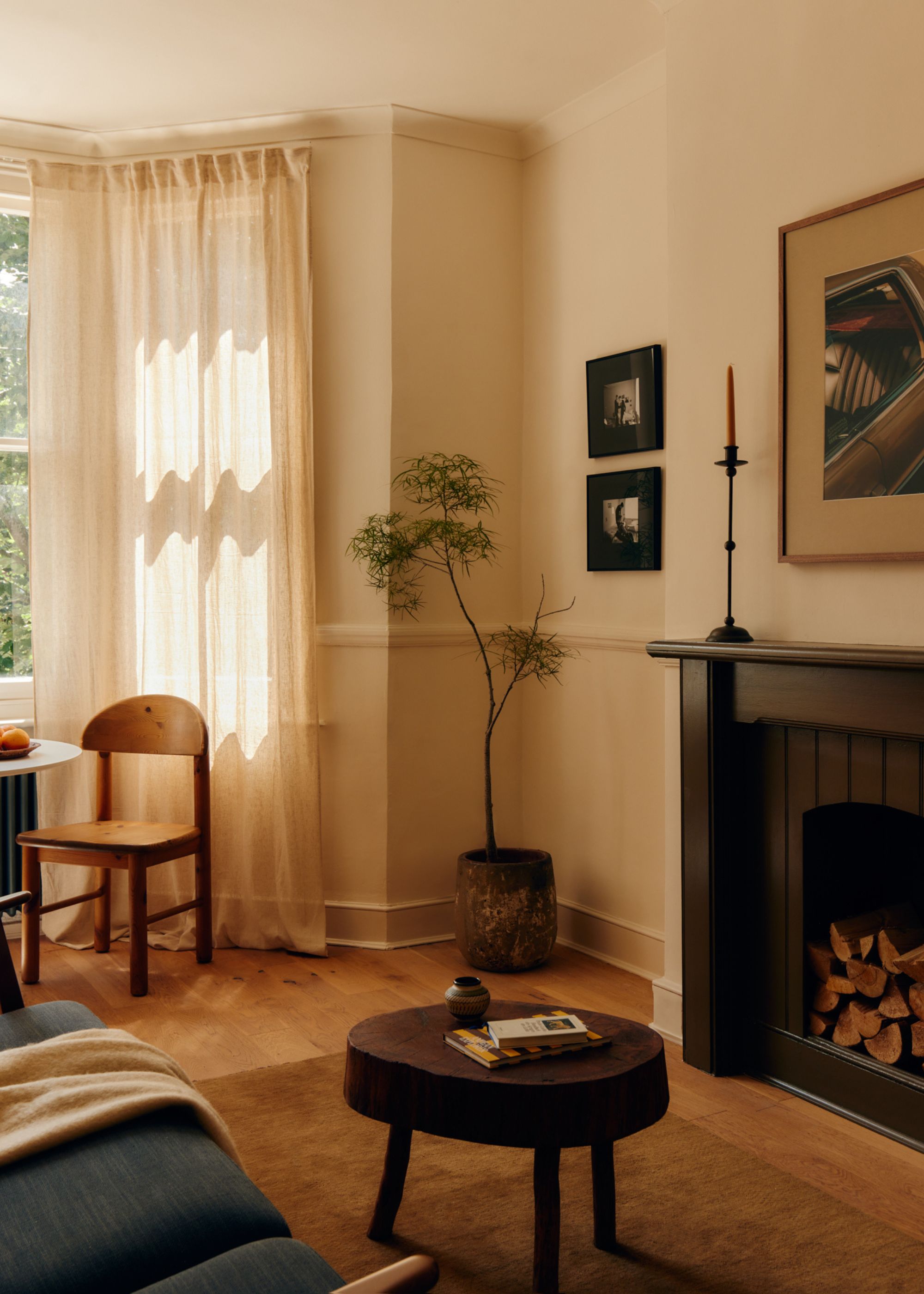
"One paint color that immediately comes to mind is Dimity by Farrow & Ball," says designer Filippo Calvagno when asked about chameleon paint colors.
It's a light neutral paint with soft pink undertones. "It’s a wonderful chameleon shade that really shifts throughout the day depending on the quality and direction of the light," Filippo says. "In some spaces it reads as a soft, warm neutral, while in others it can take on slightly pink or greige undertones, which makes it incredibly versatile and interesting to work with."
In this living room, Dimity was used on the walls and woodwork, creating a subtly warm backdrop that allows the decor to do the talking.

2. Little Greene's 'Split Pink'
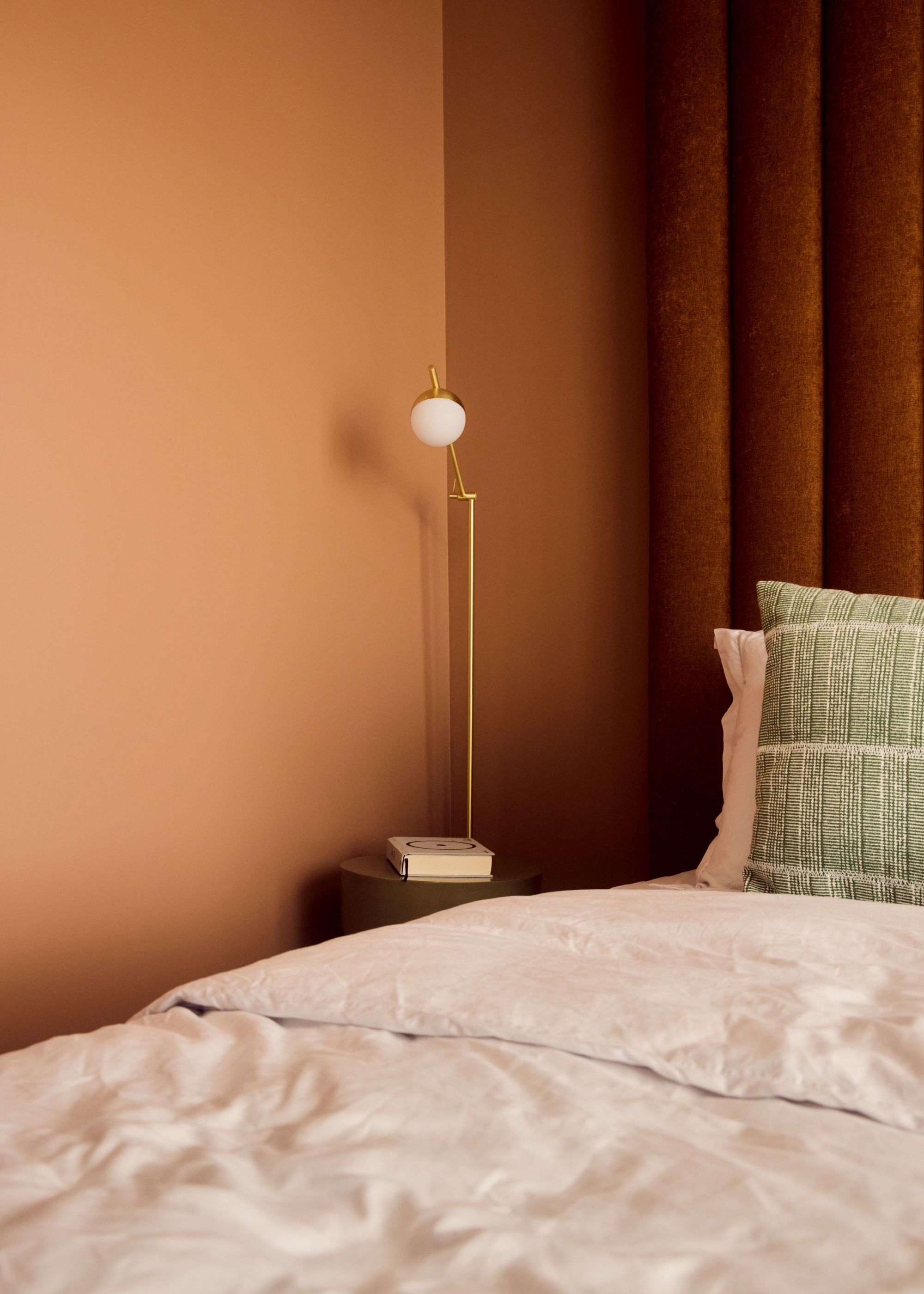
Despite its name, Little Greene's Split Pink is more of a soft brown than pink. It's a favorite for designer Matt Smith-Wood, who used it as a bedroom color in this project.
"I'm always drawn to colors that do more than one thing, and Split Pink is exactly that," he says. In this Lisbon project, it changes hue depending on the time of day. "It absorbs the city's warm terracotta pigments in the afternoon sun and turns to something cooler and more contemplative in the evening," he describes.
"During the day, it feels bright, fresh, and optimistic; by night, it becomes completely cocooning, wrapping a space in warmth and comfort," Matt adds. "That quality is what makes it so livable — it never becomes one thing you grow tired of."

3. Little Greene's 'Basalt'
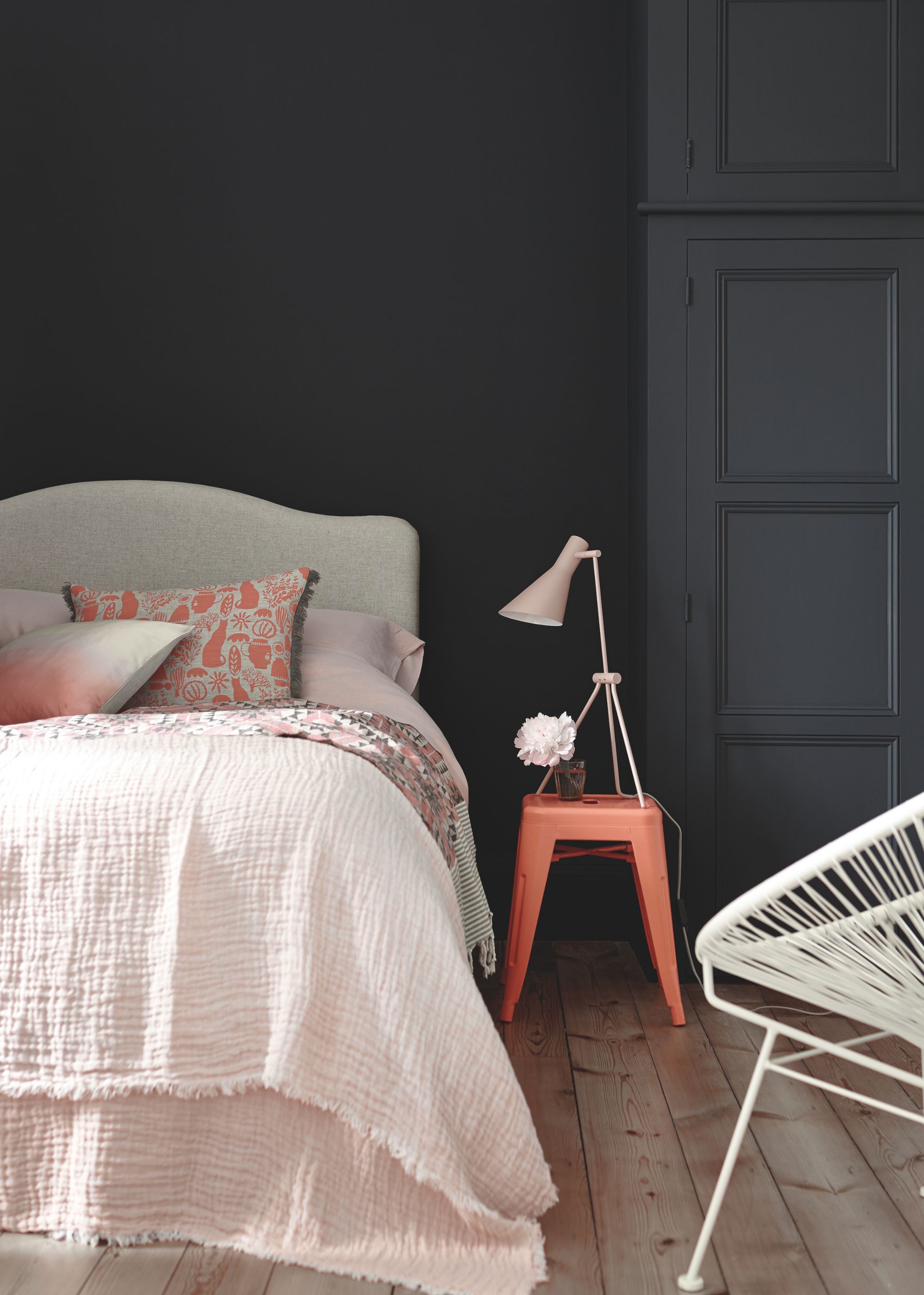
At first glance, Little Greene's Basalt can appear as a black paint, but it's actually a deep blue paint color. "Basalt is a true chameleon color, sitting somewhere between a very dark blue and an inky black," says Tori Young, interior design lead at HollandGreen. "Its ambiguity is exactly what makes it so versatile."
"Equally suited to contemporary schemes and period homes, it adapts effortlessly to its surroundings and the changing quality of light throughout the day," she adds. "It’s my go-to dark shade because it’s difficult to define, yet remarkably easy to live with, bringing richness, sophistication, and depth without feeling harsh or flat."

4. Backdrop's 'School Blazer Blue'
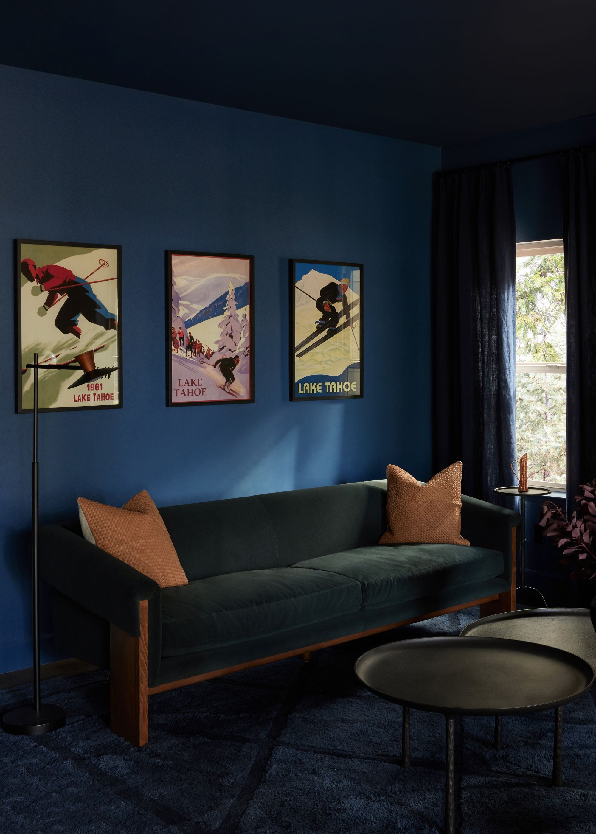
Chameleon colors don't stop at neutrals — dark paint colors can shift in tone, too. Backdrop's School Blazer Blue is a rich navy blue paint, used in this snug room. "It’s a tone with complexity rather than a flat, uniform blue," explains Los Angeles-based designer Kristina Khersonsky of STUDIO KEETA.
"In the morning light, it read as slightly brighter and crisp, bringing in a sense of freshness," she says. "As the sun moves through the day, the color softens and takes on a richer, cocooning quality. The lower light even evokes a subtle gray undertone. By the early evening, when the light begins to set for the day, the room becomes more enveloping and moodier, which creates a calm and intimate feeling."
While Backdrop isn't available in the UK, Benjamin Moore's 'Van Deusen Blue' is a good alternative.

5. Little Greene's 'Normandy Grey'
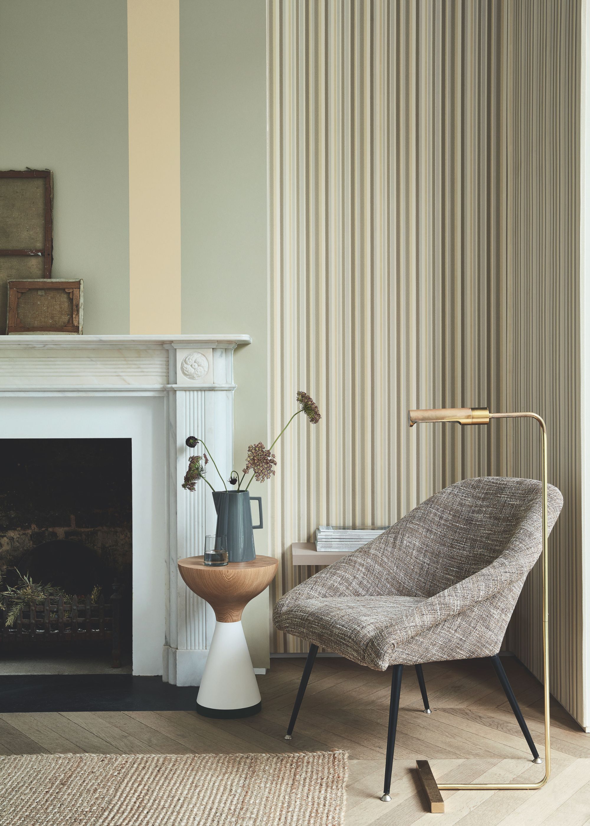
While its name implies otherwise, Little Greene's Normandy Grey is a warm hue that looks distinctly green in certain lights.
"Little Greene’s Normandy Grey is a wonderful color that changes throughout the day and seasons," says Charles Mellersh, founder of Studio Mellersh. "Depending on the light in the room, the color transforms from cool to warm, from gray to green, and has a wonderful, quiet confidence that is very soothing."

6. Atelier Ellis' 'Solstice'
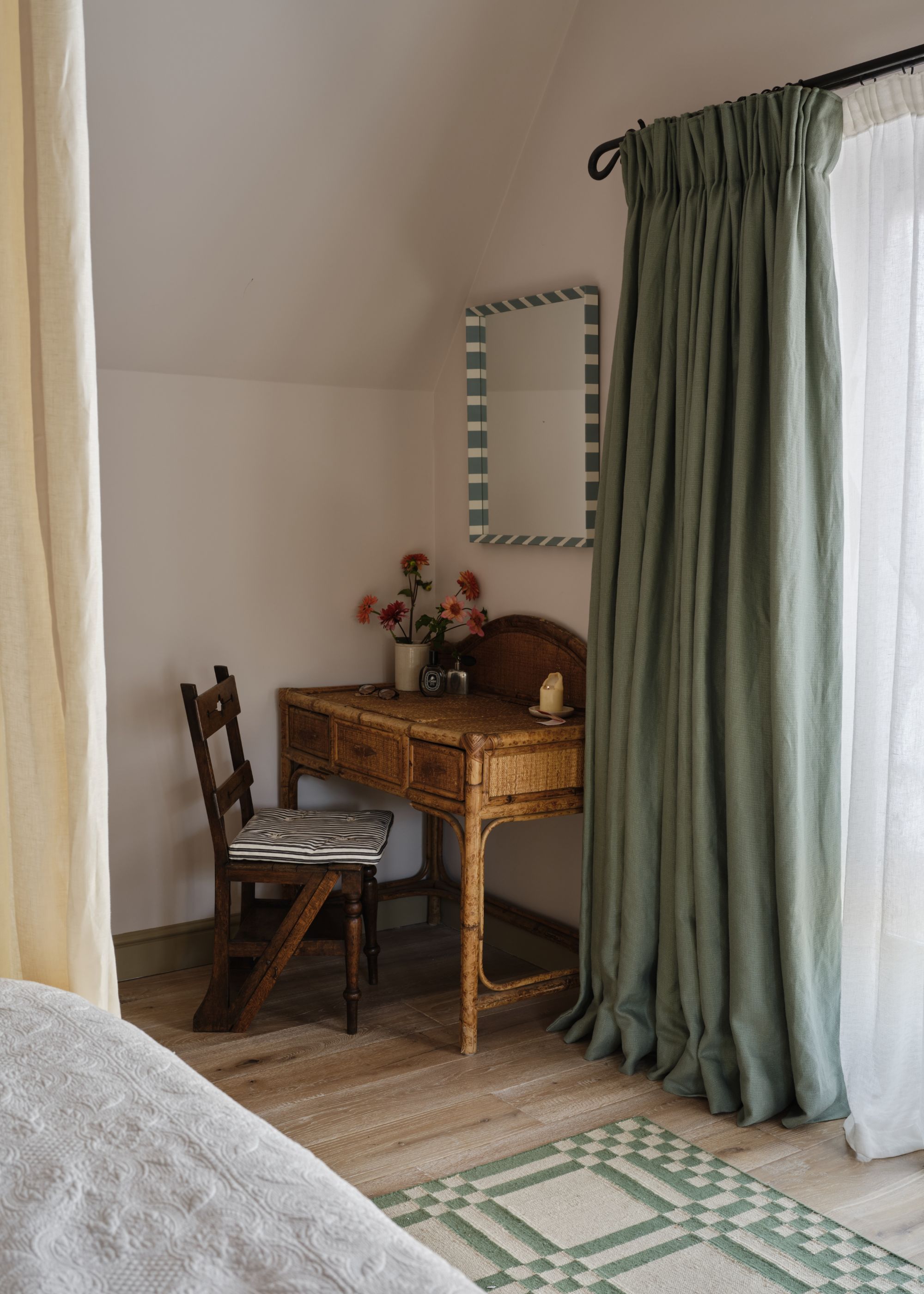
If you're looking for a much lighter pink paint, Atelier Ellis' Solstice is a stylish pick — reading as a neutral in some lights. "This pinky-toned neutral is such a lovely tone that shifts with the light throughout the day," explains designer Holly Vaughan of Vaughan Design & Development.
"It can be a touch more pink in some lights, and a touch more browny-neutral as the light fades," she adds. "This can really lift and calm your mood, and it also works tonally with a lot of other colors, so it’s a great color choice for many different spaces."

7. Atelier Ellis' 'Putecotte'
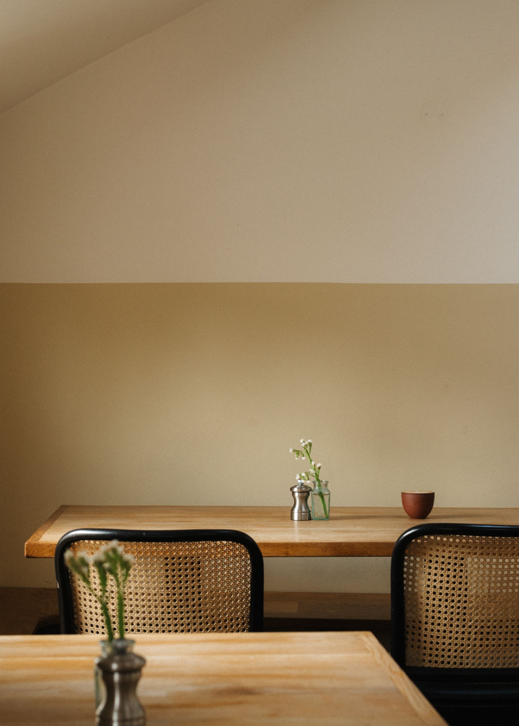
If you're looking for a richer neutral, Putecotte by Atelier Ellis feels like an on-trend choice. It's a favorite for Ali Childs, founder of Studio Alexandra, who describes it as "a beautiful pale butter yellow that in some lights seems to glow, while it brings a soft dustiness in dimmer lighting."
"It is a favorite for the way it helps to change the mood of a room throughout the day as the light changes, without ever being flat," she adds.
If you're wondering what rooms it works best in, there are plenty of options, according to Ali. "It works in any room setting, but we particularly love it as a gentle focal point on the entrance door of a hallway."

8. House of Hackney's 'Lantana'
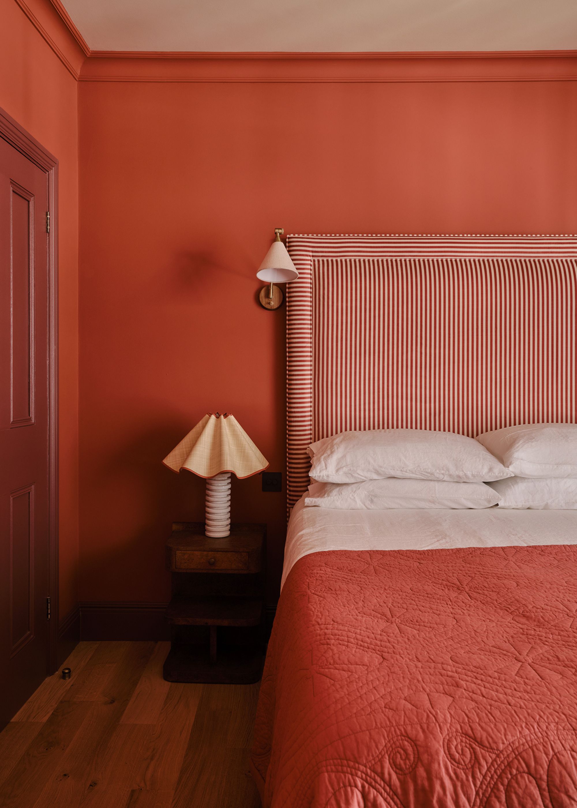
Red paint colors can have a chameleon quality, especially those with earthy rust tones rather than classic pillar box red, such as House of Hackney's Lantana.
Natasha Lyon, the interior designer behind Appreciation Project, opted for this energizing hue for this bedroom color scheme, where it creates a fun, modern look.
"It’s a bold and brilliant tone," says Natasha. "In the sunlight it's warming and bright, creating a vibrant and uplifting atmosphere, and in the evening light it's cozy and cocooning."

9. Bauwerk Colour's 'Stone'
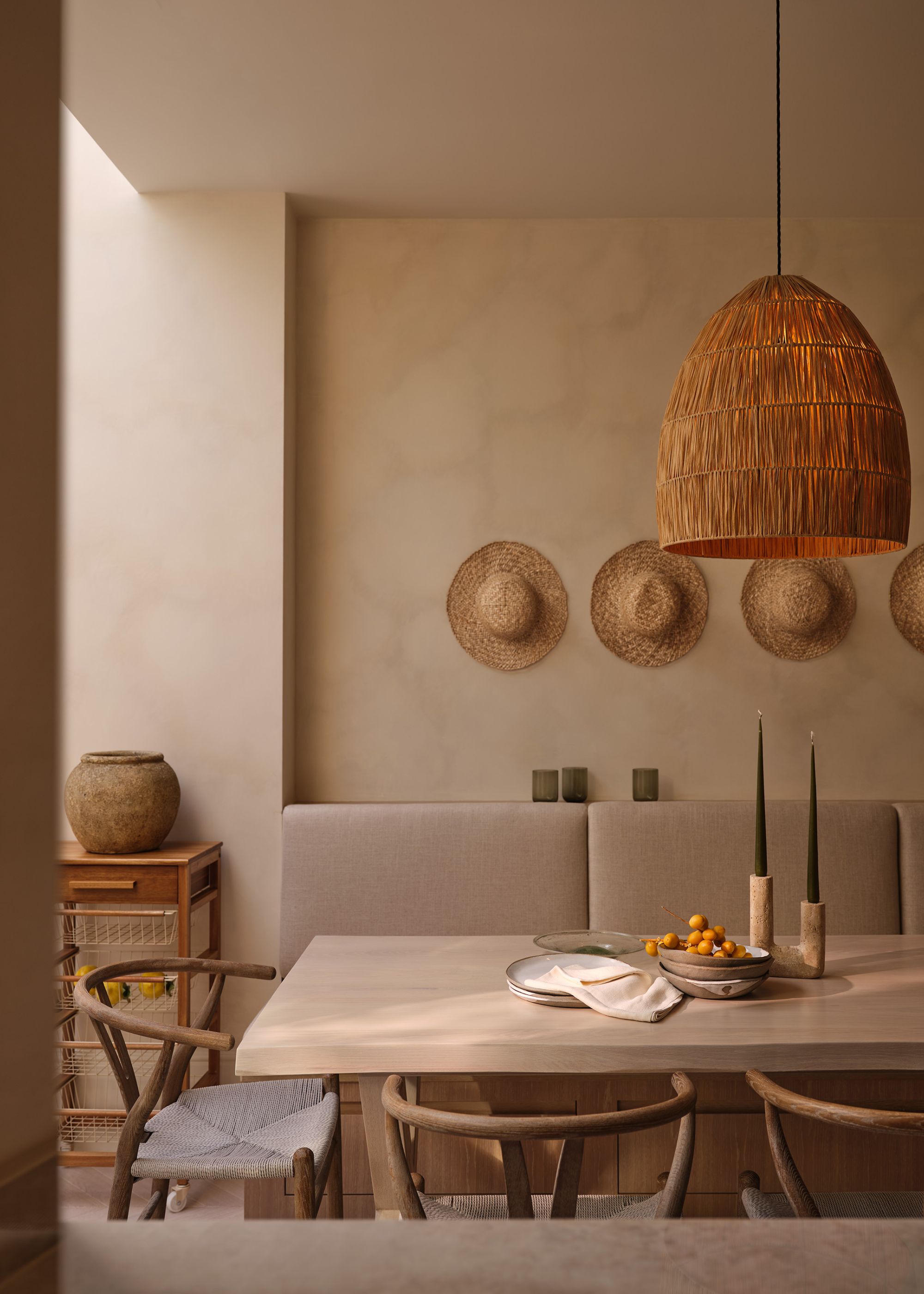
The undertones of white paint can change significantly throughout the day, especially when you choose a limewash paint finish, such as Bauwerk Colour's Stone. "We often describe it as a living neutral," say designers Eris Koutsoudakis and Maria Kachramanoglou of Meraki Design, based between London and Athens.
"Its mineral composition catches and reflects light differently throughout the day, moving between soft limestone, warm sand, and muted taupe tones," they explain. "This constant subtle shift gives the room depth and character while maintaining a serene, understated palette."

10. Little Greene's 'Clay - Pale'
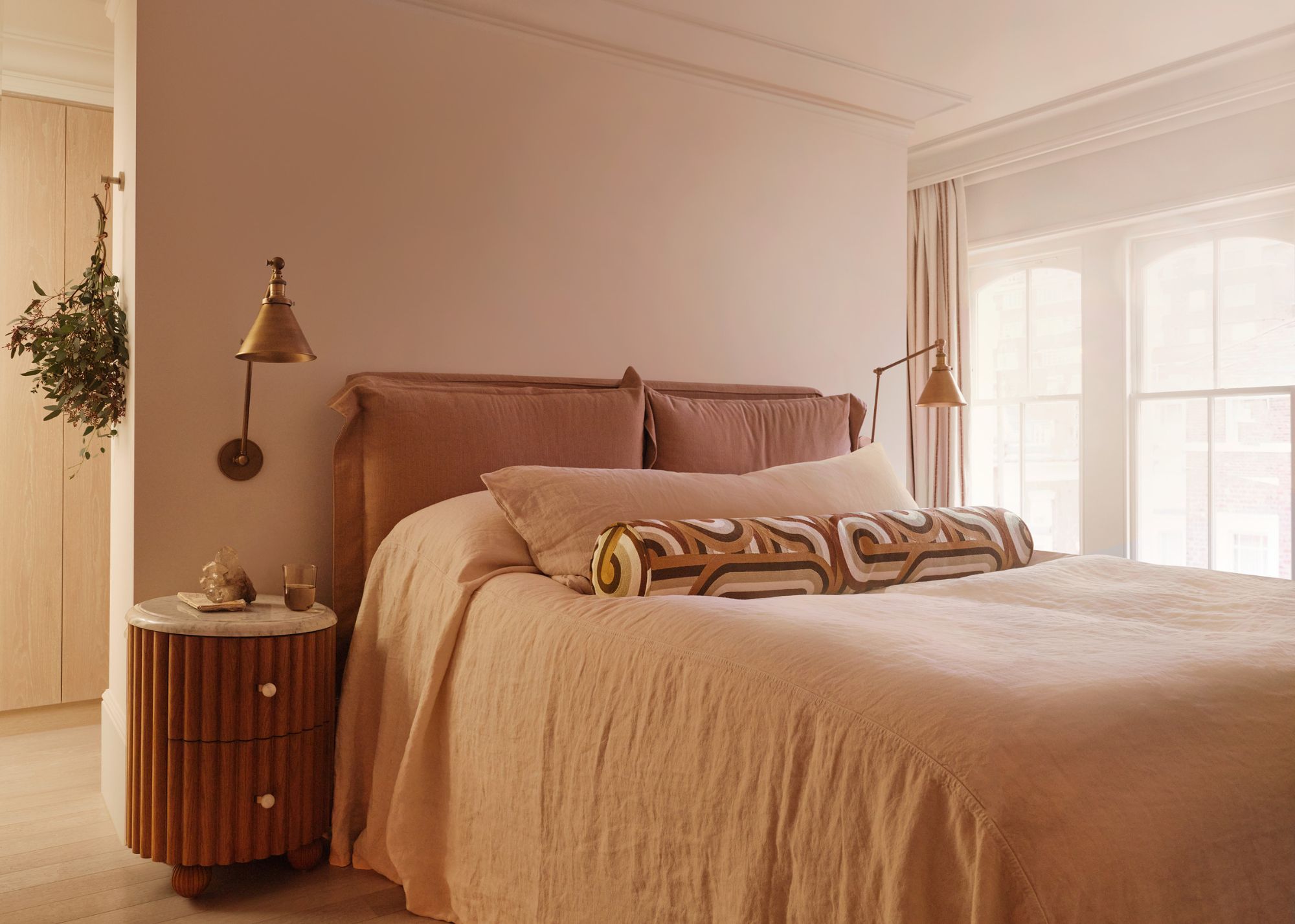
Another favorite chameleon paint color of Meraki Design that shifts in tone throughout the day is Little Greene's Clay - Pale. Delicate and soft, it has more depth than white without appearing muddy.
"Clay - Pale is an incredibly versatile neutral with a gentle warmth to it," Eris and Maria explain. "It provides a calm backdrop that feels sophisticated in every light condition."
In this neutral bedroom, Clay - Pale creates a soft yet quiet backdrop, relying on texture to add interest. "Its understated character allows texture, natural materials, and soft furnishings to take centre stage, creating a bedroom that feels effortlessly serene and timeless," Eris adds.

11. Edward Bulmer's 'Lilac Pink'
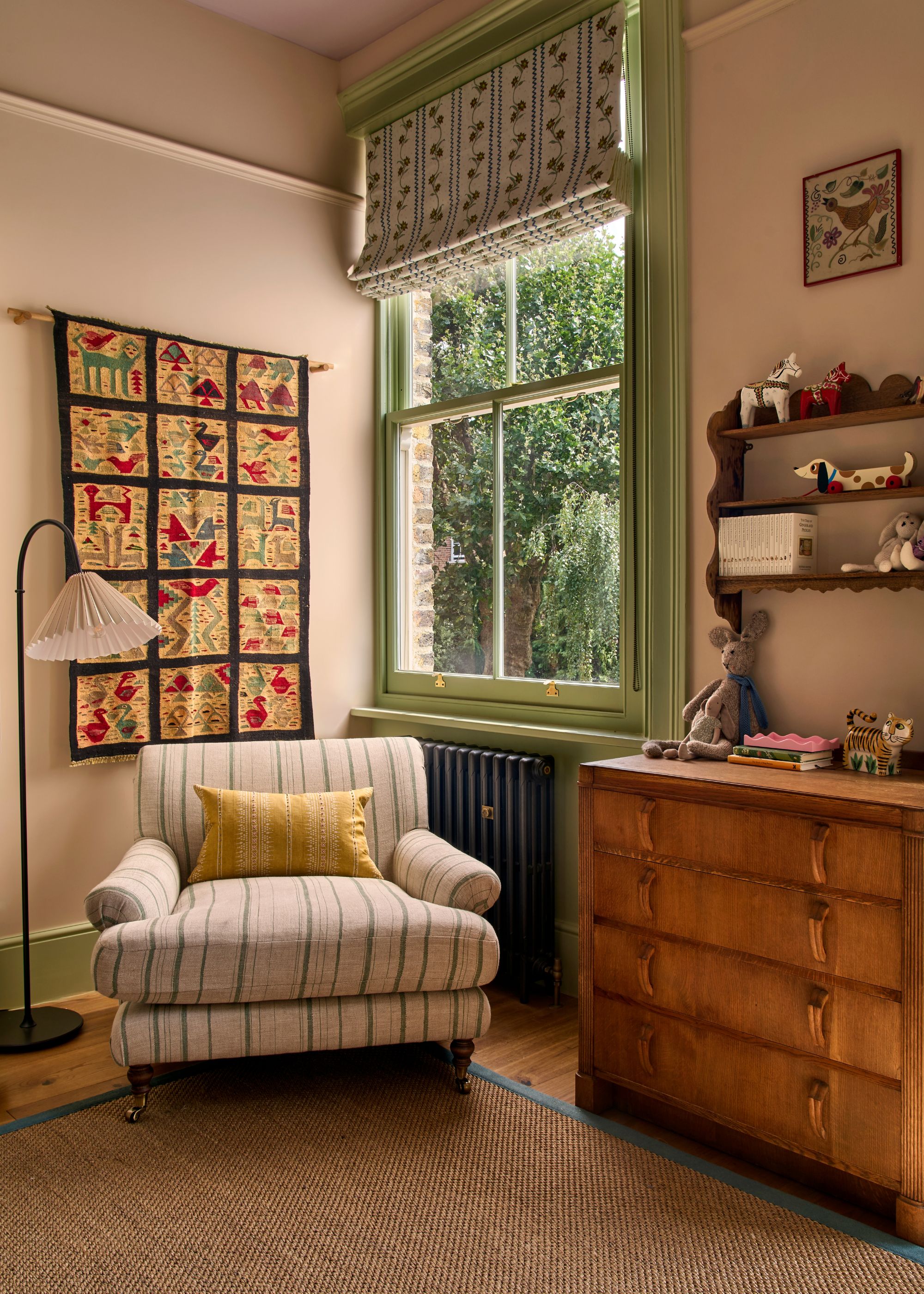
Edward Bulmer's Lilac Pink is a popular neutral that shifts between the warmth of lilac and pink throughout the day.
It's a favorite for London-based designer Lonika Chande, who used it here. "It reads as a warm white in the morning light, gradually revealing a beautiful soft pink as the day goes on," she says. "By evening it’s wonderfully cozy and enveloping."

12. COAT Paints' 'Factor Fifty'
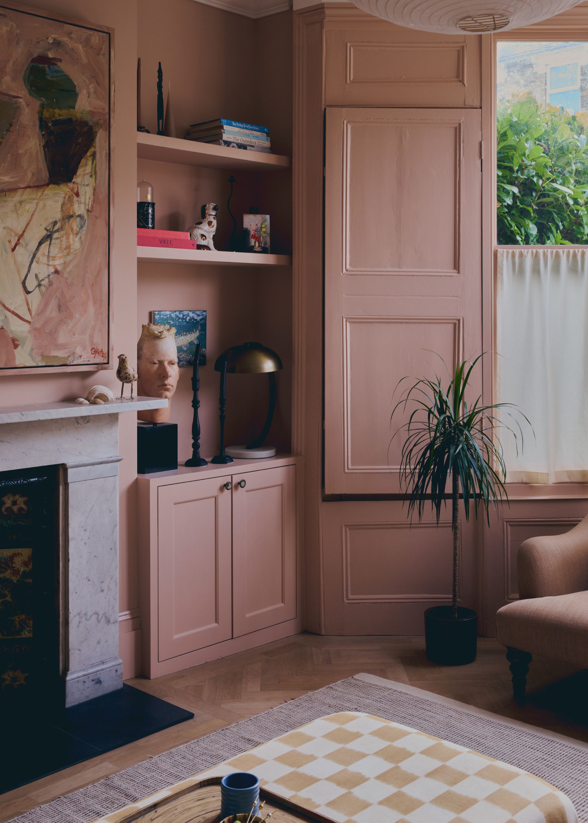
Plaster pink paints are renowned for having a chameleon quality, due to their blend of different tones that are emphasized depending on the light in a room. For designer Leo Wood of London-based Kinder Design, this is what makes them a flattering wall color. She describes plaster pink paints as "a winner in almost any situation and at any time of day."
Among them, COAT Paints' Factor Fifty is a favorite of Leo's. "It's such a good natural warm plaster color — not too pink," she says. In this living room, it takes on a moody, earthy quality, but in brighter spaces, it can read as more of a neutral.

Chameleon shades are among the best for avoiding paint colors that feel flat, since their nuanced undertones respond to the changing light. Make sure to sample shades before committing so you can see how they shift as the day goes on — something that's especially important with neutral paints.
And for more inspiration, subscribe to Livingetc's newsletter.